Design
Tutorial: How to make a responsive photo collage in email
Photo collages (also called photo galleries) are a great way to add visual muscle to your email campaigns.Readers increasingly scanemails on mobile devices while they're on the go. Withonly a few seconds to capture subscribers' attention, photography is a great way to make an impact (especially if you're in thefood or fashion industries, where product pictures can make or break a campaign).A photo collage in email is the perfect way to display stunning images and tell a compelling visual story while avoiding the pitfalls of a single-image email. With great stock photos now easier to get than ever, even free of charge (we particularly likePexels), you're in the driver's seat.
Today we'll show you how to build a beautiful, responsive photo collage in email so you can design a message that looks awesome and converts.
Inspiration for our photo collage in email
Many subscription confirmation emails look the same, but recently we took a look at how some brands are breaking the mold by giving subscribers a warm welcome and standing out from the crowd (on that, seeDesign a standout subscription confirmation email).One of them came fromCook Smarts, a company that emailscooking lessonsand recipes. After signing up for their mailing list, we received this confirmation email. The original, high-quality images made our mouths water. Thephoto collageserves as a delicious preview for the meal plans to come. Whata great way to get readers to tap"Yes, subscribe me to this list"!
But when we checked out the email on iPhone, we noticed it wasn't responsive.
The text doesn't get any larger (it's actually a bit hard to read), and the photo collage is all one image, so it scales down significantly to fit the screen's width. Sometimes, not having a responsive collage isokay—you might want the images in your collage to remain in place, even on a small device. It depends onthe amount of detail you want to maintain and if losing that detail due to scaling is okay for the purposes of your message. If you make a collage that's a single image, you'll have to do it in Photoshop or a similar program, but you can make a totally responsive photo collage entirely in our drag-and-drop BEE email editor, without needing to pre-format. Here's our quick video recap of today's workshop:
Tutorial: How to build a responsive photo collage
We recreated the basic structure of the Cook Smart email in the BEE editor to get started. Starting with a basic single-column layout, we brought in the logo as an image for the header, formatted the email background color to gray and the content background to white, and copy-and-pasted the text into the email. We also formatted our bulletproof CTA button. (For tips on how to make these formatting changes, check out our post on modular design and HTML colors in email).
Setting up the photo collage structure
What we need to do next is set up the structure of the photo collage. While so far our email is a single-column layout, we'll need to add a two-column structure to arrange our photos. From the Structure menu, we'll drag one in.
Now we have a placeholder for our content.
From the Content menu, we can drag and drop in four image placeholders, two in each column.One...
Two...
Three...
Four...
Ready to rock and roll!
Adding photos to the collage
We took Cook Smarts' single image collage and saved each portion individually so we have four separate images to work with. Now we'll drag them in one at a time into our placeholders.
The content placeholders automatically adjust in size to fit the heightof each image, making it super easy to maintain the look and feel of the Cook Smart collage.
We can continue to add the images on at a time, dropping each one into place, until all four are in place.
Fine-tuning with padding adjustments
The photo collage looks great, but we can more closely mirror the layout of Cook Smart's collage by adjusting the white space between the images andalong the outside borders on the right and left. We can adjust padding on any piece on content in BEE by clicking on it and navigating to the Content menu that appears on the right.To add white space on either side of our collage, we'll click the content row (the blank space to the right or left of our collage), so we can adjust both sides at once. Here's how:Turn on the "More options" slider under Padding.
In Column 1, we'll want to adjust the padding on the left only. By increasing the padding to 30px, we create a nice strip of white space on the left of our collage, similar to the original Cook Smart one.
In Column 2, we will bump up the Right padding to 30px as well. Now there's white space on either side of our collage.
Looking good! Finally, we can make a similar adjustment for each image, so that there is a thin white border around the photos. Click on each photo, turn on "More options" for Padding, and fine-tune away! Here's our collage after we finished:
Ta da! The photos from Cook Smart are stunning and already look great, but the BEE editor also has a built-in image editor, from Aviary, that you can access to crop, orient, resize, and edit your images in countless ways. To access Aviary, just select an image, navigate to the menu on the right, and click "Edit image."
Aviary will load, and you can edit away!
Previewing our new email
To get a glimpse of how our new responsive photo collage will look on mobile devices, we can preview it in BEE. Select "Preview" from the Actions menu in the upper left corner.
And here's our mobile preview:
I love how we can see these beautiful images at full-resolution and takeadvantage of the full width of the smaller screen. The text is much easier to read, too. The email looks great, is fully responsive, and was easy to build! Give the BEE editor a try and tell us aboutyour creative collages in the comments.
5 Subscription Confirmation Email Best Practices and Examples
What is a Subscription Confirmation Email?
A subscription confirmation email is an automated email your reader receives immediately after they subscribe to your mailing list. These emails can take a few different forms. For example, a single opt-in confirmation email that tells the person they have subscribed. While a double opt-in confirmation email requires the person to take additional action. Either way, these emails are part of crossing your Ts and dotting your Is for a stronger email program.
Why are Subscription Confirmation Emails Important?
Whether you choose a single opt-in or double opt-in confirmation email, there are several benefits to the practice:
- Improving deliverability - When a recipient marks your email as spam, this makes your emails more likely to be auto-labeled as spam for other recipients too. A way to avoid this is to ensure that your emails only go to people who want them.
- Maintaining GDPR compliance - Part of GDPR compliance is receiving confirmation from people that they are consenting to receive your emails, and confirmation emails give you a record of that consent.
- Making email data more reliable - In your email program, tracking data like open rates, click-through rates, and so on will give you a gauge of how successful each email is and why. Confirmation emails are an additional way to ensure that people actually want to receive your emails.
Single vs. Double Opt-In
As we’ve briefly touched on, there are two types of subscription confirmation emails: single opt-in or double opt-in. Let’s take a closer look at each of these and when they might be the best choice.
What Is a Single Opt-In?
A single opt-in subscription confirmation email is the simplest route to go. After a person fills out the form, they receive an automated email to notify them that their subscription was added. There are pros and cons to this method:
- Pro: Fewer blockers to new subscribers. Email subscriptions are like any other type of conversion: the more steps it involves, the fewer people will follow through. A single opt-in process is simple and only requires one step. If someone subscribes by accident, the confirmation email gives them the opportunity to unsubscribe.
- Con: More fake emails. Because no confirmation is required, you may have emails on your mailing list that are fake or incorrect. This lowers your deliverability.
What Is a Double Opt-In?
Most email service providers require new subscribers to go through a two-step process to sign up for a mailing list. A double-opt-in requires a two-step verification process where a subscriber needs to confirm their subscription. Until they complete the second step, they aren’t subscribed.As with a single opt-in, there are advantages and disadvantages of a double opt-in system too:
- Pro: Cleaner mailing list - Asking readers to confirm their subscription makes for a cleaner, more engaged subscriber database. Readers who confirm their subscription want to receive your emails; there’s no chance they signed up by accident. It also reduces spam complaints and ensures subscribers' consent and security.
- Con: Losing intended subscribers due to a lack of follow-through - Not all initial subscribers will confirm their subscription and thus won’t make it onto your list. According to Campaign Monitor, up to 20% of initial subscribers will not complete the final confirmation step. The email might get overlooked or accidentally deleted, or readers may not understand the confirmation process. To reduce that problem, send an automated follow-up to remind them again to confirm their subscription.
Subscription Confirmation Email Best Practices (with Examples)
It’s important to remember that subscription confirmation emails are your first opportunity to make an impression on readers and confirm their desire to receive emails from you.
Use a Large, Easily Accessible CTA Button
When there’s something you want people to do (in this case, to confirm their email subscription or perhaps take another action), make it as easy for them as possible. In designing your confirmation email, include a prominent call-to-action button that says “confirm your subscription” or “complete your subscription.” While that CTA will be the focal point of the email, you should also have a brief explanation of what this email is doing and why they need to click through to confirm.Note that we said this button should be “prominent.” What does that mean? It means you should use the design to make it visually stand out: make it somewhat large, use bright or eye-catching colors, and have enough white space around it that it draws the reader’s eye.
Write Brief but Effective Copy
A subscription confirmation email doesn’t have to include a lot of copy, and you want to keep it brief so your readers don’t make the classic decision of “that looks like too much reading so I’m going to skip it entirely.” Be concise but still make sure your copy is warm and welcoming, on-brand, and enthusiastic about having them on board.Here’s a great example of custom, on-brand, welcoming text from the agency Edenspiekermann:
Check for Brand Consistency
Your confirmation email is one more opportunity to make your brand more recognizable to subscribers, so take advantage of that opportunity. The design should reflect your branding elements: use brand colors, use brand fonts, include your logo, and so on. Make it look like a true match with your website so the subscriber recognizes the imagery immediately. This makes subscribers feel more comfortable that the email is coming from you and not a scammer, and it also builds trust and familiarity with your brand.
Use Humor to Make a Statement
Want to grab your readers’ attention and establish a better relationship with them? Relate to them by making them laugh. While subscription confirmation emails don’t seem exciting and they have a very straightforward (albeit a bit dull) purpose, you can make them fun.We got this email from Parabo, the print shop app, and smiled. Instead of the very standard “Please confirm subscription” header text, we were greeted with a funny, whimsical hello that’s totally in their brand voice. “We really want you to want us” is a clever way to break up the usual mundane greeting, and reaffirmed why we thought we wanted to sign up for their emails in the first place. Parabo also includes their logo in the header, and the HTML background color and call-to-action button have been customized to be on-brand pink. The email is simple, it only takes a second to read, but it still makes an impression. Job well done.
Top Subscription Confirmation Email Examples
Need some inspo before you dig in and start designing a subscription confirmation that brings smiles to readers’ faces and gets the job done? Ask and we shall deliver. Check out these subscription confirmation email examples that put best practices to use.
Example #1: Be Design Forward
We’ve written about The Daily GOOD email newsletter before. It’s always well-designed and well thought-out, so it’s no surprise that the subscription confirmation email has a smart design. It’s simple, yes, but GOOD does something we haven’t seen in any other confirmation emails: the header is an animated GIF.
The rest of the email is simple but in a distinctly on-brand way. It uses brand colors, and the design’s minimalistic look and abundant white space make it very clear that you need to click the button to complete your subscription. What a great way to show readers a preview of the beautiful, design-forward thinking from the newsletters to come.
Example #2 - Expectation Manage with Your Audience
Cook Smarts' subscription confirmation email serves up a delicious welcome. Their beautiful, high-quality images are engaging and enticing, while the copy tells subscribers exactly what to expect next (a welcome email with freebies) and when to expect it (within the hour).The info is useful for readers, encourages them to confirm their subscription, and tells them something about what to expect from Cook Smarts: great, timely communication. It goes to show how a little bit of thought can go a long way when you’re making an effort to make a strong first impression with potential subscribers.
Putting It All Together: Crafting a Successful Subscription Confirmation Email
Your subscription confirmation email is one of the first contacts you may have with your new subscribers. Taking advantage of the best practices for these emails can give you a more engaged, enthusiastic mailing list. In this guide, we’ve laid out some of the key best practices for subscription confirmation emails, including:
- Designing a prominent and clear call-to-action button
- Writing copy that is brief but engaging and on-brand
- Incorporating brand-specific design choices
- Using humor to stand out
We’ll admit that putting all this together into an expertly crafted subscription confirmation email isn’t easy. The good news is you don’t have to start from scratch. Our catalog of 1,500+ email templates is designed to guide you with these best practices in mind. All templates are easy to customize with your own unique brand elements. Try them out for yourself with your free Beefree account.Editor’s Note: This post was updated on June 2023 to ensure accuracy and comprehensiveness.
Quick Video: How to customize social media icons in email
Did you know you can customize social media icons in your email message? Yes! Watch how to customize them in this quick video tutorial. For more info, check out our workshop tutorial: How to customize your social media icons in email...and try it out in the BEE email editor! http://beefree.io/
Tutorial: How to customize your social media icons in email with Beefree
Earlier in this week's Design Inspiration post, we looked at how different brands use social media buttons in email: where they put them, how the color/shape/size is customized, and what purpose they serve (to share or follow).
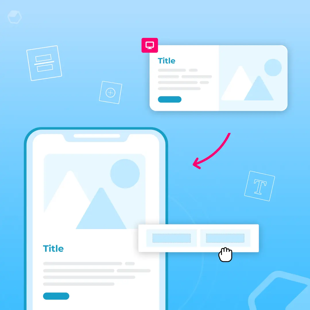
Today's workshop
Today, we'll show you how to customize social media buttons in Beefreeso next time you're designing anemail campaign, you can give a little extra thought to those very important little buttons.Follow along as we show you:
- How and where to place social media buttons in your email
- How to add or remove different buttons
- How to customize the look of the buttons
- How to fine-tune with alignment, spacing, and padding
1. Position your social media icons
Most brands place social media follow icons at the header or footer of anemailwhere readersinstinctively lookforstandard info found in menus, like contacts and social media links. Design-wise, and from a message-comprehension point of view,it makes sense to placesocial media buttons at the opening or close of your email where they aren't interrupting the flow of your central message. An email's primary call-to-action is generally not about getting readers over to social sites; it's about getting them to make a purchase, sign up for an event, or take some kind of action. So it makes sense that social media buttons are positioned in a way to not steal the show.Let's review how toadd social media buttons to your email's header, similar to this email from Martha Stewart Everyday Food.
We'll need a two-column structure that accommodates a header image on the left and social buttons on the right, so we'll set up our header structure with this block:
Then, from the Content menu, we'll pull in an image placeholder in the left side of the structure,and social media icons on the right.To add social media buttons to any email in Beefree, simply go to the Content menu and drag and drop theSocial content block into your email's structure, as we see below:
Here's our email header, ready to be customized:
We'll pull in our header image (in this case, we took a screen shot from the Everyday Food email).
And now we can focus on customizingourbuttons!
2. Add and remove social media icons
Now that the social media buttons are positioned in our email, we can click on them to activate our Content Properties menu to make changes.
To mimic the Everyday Food email, we'll need four icons: Facebook, Twitter, Pinterest, and Instagram. From our Content Properties menu, we can configure our icon collection. Click the trashcan icon on the Google+ icon bar to delete it. Then, select"Add new icon" tobrowse for the ones we need.
From the Social Follow menu, we select the Pinterest and Instagram icons. Beefree also provides built-in buttons for LinkedIn and YouTube, and, from the "Other icons" menu, an option to link or email content. To rearrange the order of the buttons, just drag them into your preferred position in the same menu on the right.Here's our new header with the social media buttons we need.
Remember to link each one to the appropriate account. Simply click "Edit" for each icon and add the appropriate URL.
Each social button also has two editable fields--with default "Instagram" text, for example, in the image above. These are thetitle text HTML tag andthe ALT text HTML tag, respectively. Unlike BEE's bulletproof HTML buttons, social media buttons are images, so it's wise to fill out these fields.
3. Customizing your social media icons is easy!
Now that we have the buttons we need, we can format them in one easy step. Beefree offers four built-in icon collections to choose from. The Select icon collection option is the first formatting choice in the Content Properties menu. From it, we can choose betweentwo monochrome collections (all gray or all blue) and two multicolor collections, one with square icons and one with circular.
To keep the look of our header clean, we'll choose the gray scale.
If your brand has custom social media buttons, like these brand-colored orange ones for Everyday Food, you could bypass using the built-in social media icons from Beefree and drag in your own icons as images, linking the once they are in place.
4. Fine-tuning: how to apply alignment, spacing, and padding
Now we can fine-tune the exact position of our buttons--and the space around and between them--so we're happy with the layout and balance of our header. To match Everyday Food's header, the icons need to come down and to the left, so they're centered within their structure.Back in the Content Properties menu, beneath the collection customization options, we have three more properties to configure: Align, Iconspacing, and Padding.
First, we'll change the alignment so the icons are center-adjusted (selecting the middleoption). This moves our icons over, so we go from this....
...to this:
Next, we can increase the spacing between the icons themselves with the Icon spacing option.It's set to a default of 5px between each, which looks good, but if we wanted to, we could increase to 10, 15, or 20:
Lastly, we can adjust the padding around the buttons. By turning on the More options switch, wecan increase padding specifically on the top, bringing the buttons downward.They're going in the right direction, but I'd still like them to come down a bit, even after adjusting the top padding to its 30px max:
To get more white space over top, we can further adjust the padding, not just on the buttons, but on the content container holding our buttons. Here's how: Select the row of content containing our entire header. The menu will change to view Row properties and Column properties.
Since our social media buttons sit in the second column of our two-column header (remember that 2-column row structure we selected at the very beginning?), we can select Column 2 under Column Properties and continue to increase the top padding! Now it's just right. What do you think?
Adding and editing social media icons takes just seconds in the Beefree. Once you format the look of your buttons, you can also drag and drop them to the header or footer and test which position works best for your company and audience. Give it a try! And let us know how you do in the comments.
How to create responsive emails: Optimizing your multi-column email design
Originally published on December 28, 2015. Last updated July 30, 2021.The reign of single column layout is over. It used to be common advice that single-column emails render better on mobile devices. Luckily, responsive design tools like BEE Pro are here to save the day.It’s true that single-column works best for mobile and that 50% of users check email on mobile devices. But responsive emails show up in the best format no matter which device is used. That means you can design a multi-column email and still be confident that it will render well on both mobile and desktop.Why is this important? From a graphic design perspective, the single-column email view is pretty boring. Multi-column design takes advantage of F and Z patterns to create a visual hierarchy, rather than creating an endless one-column scroll.From an email marketing perspective, users are 65% more likely to click through if they open your email on a different device.What this means is that emails are opened in different environments by the same user. So you can’t just optimize for mobile or just optimize for desktop. You have to optimize for both. That’s where multi-column design comes in.Let’s learn more about when to use multi-column design and how to optimize your next marketing campaign.
When to use multi-column email layout
The multi-column email layout allows for endless design flexibility and has a number of benefits. Just a few pros of multi-column design:
- Get more creative with your designs. Columns, multiple CTAs, bright images. You can use these in single-column, but multiple columns allows for much more creativity.
- More opportunities for CTAs. Buttons, links and images allow for more opportunities to get your audience to act.
- Recurring components. Repetition and patterned elements can come off as repetitive in single-column. When used in multiple columns, it creates an aesthetically pleasing effect.
Here are some examples of when you should use a multi-column email template:
- To display products. Arranging products on a grid allows you to showcase a lot of items quickly, maximizing the amount viewed above the fold.
- For image-driven email with little-to-no text content. If your email is almost entirely image-based, and the images don’t require descriptive text, multiple columns might be the optimal layout.
- Multiple calls to action. Having a simple, clear, focused message with a single call-to-action is a wise strategy for busy readers. But if you have more than one call-to-action and no strong hierarchy to your message, multiple columns can be beneficial.
- To link to secondary content. Many publishers send emails with a feature story at the top, followed by secondary content in multiple columns underneath it. This layout, that goes from first a single column then to multiple columns, can be used to focus readers’ attention on the most important piece of content but still provide additional information.
Benefits of multi-column email design
Now that we have some examples as to when we can use multi-column email design, let’s listen to an expert. Yuliana Pandelieva, a graphic designer at BEE, shared some key insights on why multi-column is the best email design choice:
- Flexible width columns. You can resize and adjust the width of any column you choose. This allows you to add 5-6 columns to each of your rows.
- Design for mobile. When you design emails, you want to make sure it renders just as well on mobile as it does for desktop. Check how your designs will render on mobile right in BEE Pro for easy and fast creating.
- Responsive with no code. The diversity of your layout will not require you to code anything. The endless features will allow you to simply focus on the elements for faster production time.
- Proper text alignment. The multi-column design allows for more copy without repetitiveness. Rearrange the copy within multiple columns to avoid repetitiveness for more visually appealing emails.
- Reverse stacking. Rows containing multiple columns will render vertically on mobile. You are able to override this function, but you are also able to reverse the way in which those columns are stacked to avoid zig-zag looking designs.
“Multi-column email layouts with BEE Pro give you more design freedom - you can easily alternate between different layouts, widths and see exactly how it will render with mobile design mode - it’s painless creativity”. —Yuliana
Wrap up
When it comes to email design preference, a responsive multi-column email is optimal. This layout has numerous benefits due to its design flexibility. Try BEE Pro and access our template catalog for design inspiration. If you have questions or just want to let us know how it goes, reach out to our team or get in touch on Instagram.
Design tips for season's greetings and thank you emails
This week, as the working world starts to quiet down a little, we're inspired by the companies and organizations who took the time to send season's greetings emails saying "thank you" and cheers for the year ahead. We know inboxes are more crowded than ever in December, but in a sea of deals-and-discounts messages, these emails are refreshing—even uplifting.There are no prompts or pleasto buy or save or donate or register. And while season's greetingsmessagesare still "email marketing" (no doubt a strategic way to strengthen relationships withcustomers and keep your brand top of mind), if done well, these emails canbenefit business as much as they delight readers, leaving themwith a positive association of your brand as we roll into 2016.Here are some inspiring season's greetings emails we've received so far. Incorporate these design tipsas you prepare your company's message for the end of 2015 or beginning of 2016.
Tip #1: Have fun
This email from Vimeo made us smile. From the subject line (We love you wondrous humans) to the punny copy to the sparklingcontent, it's clear Vimeo is having fun, and it's contagious.
"Come the end of the year, some companies release 'annual reports' full of charts and numbers detailing the total cups of coffee they ingested," they write. "Other companies build interactive websites to share awesome videos from 2015 with their equally awesome communities."And build an interactive website they did. Click the Mood Screen GIF in the center of the email...
...and you're taken to the "Mood Screen" website, where clicking anywhere delivers an assigned mood and accompanying Vimeo video.
The concept is relativelysimple but incredibly clever. It's a perfect example of the Vimeo brand in action. And its shareability is sure to generate buzz online.
Tip #2: Gift holiday-themed branded content
This simple season's greetings email from Jean-Georges restaurants gives readers a festive recipe while also sending wishes for a happy holiday.
The image is actually an animated GIF, making us really feel the warmth.
Spend a little time developing an angle that ties together existingbranded content witha holiday theme. Giving away content helps brands positively position themselves and can even provide an opportunity tolearn about and grow your target audience. Come up with something yoursubscribers would enjoy—like a free-to-download ebook or a printable holiday card—andturn it into a gift.Design tip for animated GIFs: be sure to follow our best practices for using animated GIFs in email and crop your GIF.
Tip #3: Keep it sweet, simply
This two-line email from Deva Curl, a line of hair care products for curly-headed women, is straightforward—and merry!
The email isfestive, on-brand (all about those curls!), and will take readers two seconds to digest. Remember, your subscribershave probably beeninundated with emails all month, so a really short message that cuts to the chase is effective. The emphasis here is on the fun illustration, which—you guessed it—is actually another animated GIF (that links back to the Deva Curl website, of course):
Deva Curl should be wary of the hazards of sending an image-only email, but otherwise,we think this email is great. It's smart to give subscribers a break fromcontent-loaded emails. Allow your sweet and festive message to shine through.
Tip #4: Be yourself
Maybe your brand has a really stellar web presence with a great website, blog, all the social media accounts possible, a longsubscriber listand a regularly-sent newsletter, and more. You put a lot of content out there, positioning yourself as a subject-matter expert and developing respect in your industry and among your clients and readers. But, who's behind all thatcontent? Chances are, your readers are kind of curious about that. Don't be a robot; be yourself. That's exactly what the Email Experience Council did with their season's greeting email:
Looks like they're having almost as much fun as Vimeo! It's fun and refreshing to see realpeople. Head over to EEC's website and you'll find a very professional aesthetic and tone, without any personal information of the employees behind the operation. But peoplewant brands to be friendly and personable.Showing the people behind your brand bolsters a feeling ofconnection with your readers.
Tip #5: Wrap up your year
It's the time of year when many of us—businesses included—are reflecting on the previous 12 months. If your company hit some milestones this year, remind readers of your accomplishments in a succinct, easy-to-read way. Braven Brewing Company does a great job of that with their bulleted list:
In just a few lines, they wrap-up their 2015 on a positive note. And they're sure to show their gratitude and thank their supporters—an essential part of their message.
Tip # 6: Break the mold
Food 52 sends really beautiful emails that typically follow the same format: high quality photography and a sleek grid-layout. They look like this:
That's why this recent email from them reallycaught out eye:
The illustration is a completedesign 180 for Food 52.It's a festive, fun change-up for the holidays, one that's sure to garner attention among readers who aren't expecting it. Refreshing your email template is a smart way to kick off the season, making readers feel the festive spirit andhopefully encouragingclicks.
Season's greetings emails wrap-up
Our favorite season's greetings emails have a lot in common: they're playful, highly visual, and short and sweet. At a time of year that can often be a bit chaotic, we appreciate the brands that took a moment to send something bright and merry to our inboxes, without asking anything of us or taking much of our time. It's not too late to put together your own season's greeting email. Keep our design tips in mind:
- Have fun! Brainstorm a playful and unique concept that can stand on its own, like Vimeo's Mood Screen, and maximize shareability beyond your existing audience.
- Give away content. Make it valuable, special, and on-brand, then present it to your readers in a simple, visually-appealing email.
- Be sweet & simple. A few lines is all it takes. Be thankful, and offer good cheer! And a pun or two won't hurt ;)
- Show readers who you are. It's a great time for brands to peel back the curtain on their operations and take a more personable approach. It could be as simple as a photograph in the signature line or a company picture.
- Mention the year's achievements. But keep it short. Let readers know your grateful for their support, and because of it you've come a long way this year.
- Change up your usual style. This is the season for refreshing your template and doing something special.
How Star Wars emails became a force in our inboxes
There's a little movie coming out this weekend.... maybe you've heard of it?When tickets to the new Star Wars movie, "Star Wars: The Force Awakens," were first released in October, fans clamoring for early tickets crashed ticket sites like Fandango; during release week it dwarfs every other trending topic on Twitter--by the millions; and Star Wars-themed products, from cereal to makeup to laptopsare top of mind for every Jedi fan around the world.But perhaps no where is Star Wars fervor more apparent than in email inboxes. Brands, retailers, and even nonprofits, have jumped on the Star Wars bandwagon and figured out how to align their email marketing with the movie--even when what they're marketing seemingly has nothing to do with The Force.A quick scan of my personal email inbox reveals a slew of Star Wars-themed subject lines--and this is for someone who is NOT a typical Star Wars fan. Email lists I subscribe to have beentrying for weeks to entice me with subject lines like:
- Star Wars Nightlights (Steals.com)
- Turn Your Child Into a Reading Jedi (Scholastic)
- Star Wars... the Force is strong with you (Zulily)
- Star Wars Fans: May the deals be with you (Target)
- Boba Fett, Yoda, and Chewbacca Jewelry (Bezar)
- Must-see Fall Movies, 'Star Wars' Secrets (Moviefone)
- Star Wars Costume Exhibit Invades Times Square! (Time Out New York)
So what's the best way to join the cultural zeitgeistand incorporateStar Wars themes and language into your own marketing emails? Here are our fivetop tips for forceful Star Wars emails, gleaned from the best Star Wars emails that have landed in our inboxes so far.You can use these tips for Star Wars--or any other blockbuster movie event in the future (we're sure the Force will reawaken in 2018 or so, right?).
Tip #1: Start Early to Maximize Impact
Star Wars premieres in the United States on December 18, but it openedin some other countries a few days earlier. AirFrance took advantage of the opportunity to entice customers with an early screening by sending an alert onNovember 2 to promote its "Flight and Cinema" package. The airline offered to take customers directly from the airport to a movie screening on December 16. By getting this email out more than six weeks before the premiere, AirFrance gave customers from overseas plenty of lead time, and stuck out in inboxes because they weren't yet flooded with Star Wars themed mailings.
Tip #2: Showcase Your Star Wars-Themed Products
Star Wars is one of the most visual brands out there, with dozens of well-known and unusual-lookingcharacters, props like light sabers (which Facebook is taking advantage of), and more. Make sure your Star Wars-themed emails show off these visuals. Check out how book publisher and retailerScholastic does it here.
Scholastic puts the characters front and center in this Star Wars email, creatively using book cover imagery to get parents to purchase Star Wars books for their kids.Another company that captures the visual elements of Star Wars, with their own unique spin, is the online design shop Bezar. In this email they're promoting a line of Star Wars jewelry.
Showing the full line of products in email, when the theme of all the products is as visually compelling as Star Wars, can really make customers feel connected to your offerings. As I mentioned, I'm not a Star Wars devotee, but even I can't help wanting all of this cute jewelry!
Tip #3: Figure out your angle
You'd think Star Wars can't have much to do with a nonprofit media organization that publishes world news of Jewish interest, right? Wrong. Publisher JTA, alsoknown as the Jewish Telegraphic Agency, finds its own unique spin on Star Wars mania by publishing a Star Wars Hanukkah gift guide, perfectly timed to coincide with both the holiday and the movie release. The company puts the Star Wars article front and center in the email because it knows that, even if this story is not the typical breaking news that it usually covers, Star Wars is still top of mind for many of its readers.
Tip #4: Keep your offer in line with customer expectations
Target customers expect a few specific things fromthe emails they receive from the big boxretailer: good deals, easy to find products, and wide breadth of product offerings. With their Star Wars email, Target doesn't disappoint.
From the very top of the email, it's clear that at Target you can find Star Wars items at a discount, you can find lots of different types of products, and you can easily navigate to the category of product that you're looking for. Target is making it clear to its customers that they're the place to go for any Star Wars product needs you have.
Tip #5: Align your branding with the more recognizable brand
Star Wars has its own font, its own color scheme, its own characters, and its own brand identity, all recognizable by millions around the world. Unless you're a major global brand, your own branding can't compete. Don't run from the strength of the Star Warsbrand; instead adopt it. Embrace it.This is what the Australian shoe brand UGG did in its Star Wars email, to terrific effect. To promote the shoe line's "Darth Vader collection," they used an all-black background with white text, a haunting image of Darth Vader, and a huge collection of shoes to match, to encourage customers to browse and buy. It's a far stretch from their typical emails, featuring earthier tones (like this one), but that's why it works: UGG embraced the Star Wars brand and made it their own, featuring their darkest boots and shoes. You can just picture Darth Vader himself wearing those boots--and therefore you want to get a pair for yourself.
It's not too late to sneak in some Star Wars themes into your upcoming marketing emails. The movie opens in the US on December 18, but we're pretty sure it will be all anyone talks about for at least another month or two. Get started creating your Star Wars-themed email in the BEE editor today!
Quick Video: How to create a unique content divider in the Beefree editor
Watch how to design a unique content divider in your email message that stands out from your basic horizontal dividers. Follow along and give it a try with our BEE email editor: http://beefree.io/To learn more, check out our workshop: How to create unique content dividers in email
How to Create Unique Content Dividers in Email
The layout ofanemailis every bit as important as the message it contains. When your email is well organized with an effective layout, you can better communicate your message.This week's Design Inspiration email from BarkBox isa great example of how a modular, or grid-based, design improves readability withclearly defined sections. Have a look:
High-contrasting background colorsdistinguish each module, giving a clear order tothe information and allowing the viewer's eye to take in one message at a time. It's agreat way to create division of content and help readers quickly understand how thecontent is organized.Any email withenough information to requirescrolling likely usessome form of content dividers.Dividers section offcontent within an email, typicallywith a horizontal lineor with white spacethat visually groups and separates content without distraction. Here's an example offull-bleed black and gray dividers typical in emails:
While most email editors allow you to adjust the color, width, and padding around dividers, the look can still get tiresome.In thecase of BarkBox's email, however,an asymmetrical content block in the central module caught our attention:
It's an eye-catching variation compared to standard horizontal divider lines we're used to seeing. The off-beatshapecreates a sense of playfulness that's in sync with the BarkBox brand, and it's a simple tactic you can use whendividing the content blocks in your next email. In today's workshop, we'll show you how.
Today's workshop
Let's create ablue content block like BarkBox's that can be used as a module in any email. Watch our video tutorial and all the steps below.
Getting started
We'll open up the BEE editor to get started—it's free, online, and requires no registration. Try it out or follow along with us in your usual email editor.Starting with a basic one-column email template, we'll set up the overall look and feel of our emailby adjusting the General Optionsin the Body menu on the right. BarkBox's email is 640 pixels wide with a white background. Lucida Sans Unicode is the email-safe font most similar to the branded BarkBox font used in their email.
Setting the HTML background color
The BarkBox email is comprised of all images, which isn't a design best practice (read about the pitfalls of image-only emails here), so instead of uploading images in BEE, we'll use HTML to create the vibrant blue background of this module. We'll simply select the row structure, then adjust the content background in the Structure menu. The row background can remain white.
Our module looks like this so far:
Text formatting
We'll update the text, then format it by center-aligning it, adding line breaks, and making "FREE PREMIUM TOY" phrase bold. Then we'll use the Content Properties menu on the right to make the font color white and increase the line height so there's more breathability between the rows of text.
Our module now looks like this:
Creating the asymmetrical content structure
Now for the fun part. To change the shape of the content block, we'll simple add a triangular image beneath it. We took a screen shot of the shape in BarkBox's email:
Beneath our text block, we'll drag and drop an image placeholder.
Then, we'll pull in our triangle image.
If you ever need to detect theHTML color usedan image, you can use a website like this oneto get the exact code. That's how our triangle image and text block match perfectly.Now, we can adjust the padding to eliminate the white space between these structures and make them appear to be one seamless section of our email. We'll click on the row with our image and navigate to the Padding section of the Structure menu that appears on the right. The default top and bottom padding is 5px. We can simply reduce the top padding to 0...
... and instantly the content blocks come together!
It's that simple!Any shape can be added above or below a content structure to seamlessly adjust the look of its shape, making your module design unique. And since every email designed in BEE is fully responsive, your content dividers will always look great on mobile. Here's ours:
Let us know if you give this a try, and how it turns out!
Design Tips For Email Deals And Discounts
Originally published on December 8, 2015. Last updated December 3, 2021.The holiday season is the best time to snag hefty deals and discounts. According to the NRF, 82% of shoppers felt the deals this Thanksgiving weekend were the same or better than last year.Many of those discounts, deals and offers are delivered by email. With businesses small and large offering product discounts, free shipping, bonus gifts and more—great email design is a key differentiator among brands, making or breaking a discount email’s ability to stand out, communicate well, and get conversions on those discounts.Let’s first approach what a promotional email is and then take a deep dive into an example done right.
What is a promotional email?
A promotional email is a specific email that businesses send to boost their products or services. Their short term goal is to convert visitors to customers, and in the long term to increase customer loyalty. The purpose is to get customers to buy from your business more than once, whether that be with multiple product purchases throughout the year or continuation of an annual subscription.Let’s see what types of promotional emails work to achieve these goals.
Types of promotional emails to try
Promotional emails will take on many forms, but no matter the type, they all work to achieve conversions. Here are a few promotional emails to implement into your promotional campaigns.
- Product Launch. The hype around new releases or product updates get customers excited.
- Seasonal Campaigns. The holiday shopping rush is a guarantee every year. It's a great time to promote products.
- Freebies or Giveaways. The free products or rare giveaways drive engagement and bring in new visitors and customers.
- Limited-Time Offers. The exclusivity of products or services intrigues customers and visitors.
Now that you have some types of promotional emails to keep in mind when building your promotional campaign, let’s approach an in-depth example to understand more details on how these campaigns work.
Example: Promotional Email from BarkBox
Today, we’ll look at a recent promotion email from BarkBox, provider of subscription-based pet products, breaking down what makes this discount email effective, with must-have tips to incorporate in your own discount email design.Here’s the email from BarkBox:
Tip #1: Create urgency
The subject line of BarkBox’s email reads “Last Day: Save Big on BarkBox,” and the first thing subscribers see when they open BarkBox’s email is a message that reinforces that sense of urgency: there are only a few hours left to get the deal.
It’s a call to action that tells subscribers to act now. The bright red color choice makes the message stand out, while the dog illustration balances the immediacy of the text with a playful component. It’s a busy time of year, inboxes are flooded with emails—shoppers need a reason to act now, and BarkBox delivers that message right off the bat.
Tip #2: Leverage your visual brand to communicate
Visual design carries the story in BarkBox’s email. The first section has a bright, friendly photo that shows the product and is true to the BarkBox brand. It incorporates its characteristic font brand colors and eye-catching animated GIF details.
The second half of the email contains an on-brand illustration that communicates the deal again in a simple way:
Together, the photography, illustration, color, and branded font perfectly reflects the BarkBox brand. There’d be no mistaking the sender of this email for any other company. The visual storytelling reinforces the BarkBox brand, building trust with readers.While this approach allows BarkBox to leverage its brand identity to create a beautiful, compelling story in multiple formats—improving reader comprehension of the discount—the drawback is that the entire email is image-based. For users without image-viewing turned on, BarkBox’s cute email could show up like this:
BarkBox makes good use of ALT text—an email design best practice—but the message is still compromised without image-viewing enabled. When making design decisions like this, it’s essential to know your audience and understand the number of recipients in your database who may have these preferences. When in doubt, follow our recommendations for avoiding the pitfalls of image-only emails.
Tip #3: Get to the point. Be clear. Repeat.
Check out the content of this emailin plain text:
You only have a few hours left to save big on BarkBox!
Get a free membership to our extra toy club!
Save up to $108!
That's an additional free premium toy in every BarkBox for new multi-month subscriptions.
Get a free premium toy in every BarkBox in any multi-month subscription.
Save $9 a box - that's up to $108 a year!
No coupon needed -- just click 'yes' when prompted for a free extra toy.
Get BarkBox + free extra toy club!
The sentences are short and easy to understand, and they use the same words or phrases multiple times. Repetition is a common tactic in marketing. It’s impossible to miss the fact that BarkBox is offering a great deal.All effective emails should have a single focus and objective, but discount emails are a great opportunity to be more straightforward than ever. The message should be simple: give readers a reason to act (a great deal) and an incentive to do it now.Don’t overcomplicate or distract with multiple calls to action or more information than is needed. The only “extra” information BarkBox provides, to give the reader further instruction is placed at the bottom of the email where it doesn’t detract from the main point:”No coupon needed — just click ‘yes’ when prompted for a free extra toy.”
Tip #4: Tell the story... and then tell it again
To drive home the email’s key message, BarkBox uses a modular structure to clearly define each section and organize their story. Here’s what we mean:
The modules mirror themselves: Sections 1 and 2 are book-ended with the BarkBox logo and intro and closing summary boxes are similarly formatted (each with two lines of bold white text on a brightly colored background). The two main sections tell the same story (Get a free toy with a multi-month subscription and save up to $108) in two formats: first by animated GIF, then by illustration. The format works well on mobile, too, with each section fitting nicely within the screen of an iPhone:
BarkBox uses two visual stories to communicate the deal, driving home the offer to readers. Using repetition to communicate discounts increases subscribers' likelihood of understanding—and acting upon—an offer.
Wrap up: Best practices for promotional emails
There's plenty we can learn from BarkBox's promotion email to incorporate when designing our own discount emails. Here are the takeaways for you to implement in your promotional emails:
- Create a sense of urgency
- Communicate visually
- Repeat your key message
- Make the same offer twice
Are you trying any new design best practices in your discount emails this holiday season? Let us know in the comments, and try using BEE Proto createmobile-responsiveemails that are easy to design withdrag-and-drop modules.
Email Insights from Black Friday and Cyber Monday
We can learn a lot from this year's holiday shopping stats from Black Friday and Cyber Monday. Shoppers opened their wallets and spent a total$11 billion online fromThanksgiving Day throughCyber Monday, a whopping 15% increaseyear-over-year, according to marketing data from Adobe. A record $2.98 billion (12% more than in 2014) was spent online on Cyber Monday alone,making it the largest online sales day in history, as reported by ComScore:
From the recent Thanksgiving holiday we can extract two important insights:
- Email marketing was the most effective marketing channel, driving 25.1% of sales - from Custora.
- One in five sales happened on smartphones on Black Friday 2015; a 75% increase from last year - from IBM Silverpop.
Let's look at these insights in more detail.
Email was the most effective marketing channel
Email marketing was a leading driver of online sales on Black Friday.Custora reportsthat while email marketing usually lags behind online search, a shift was seen this past Black Friday, with email marketing driving 25.1% of orders, followed by free search (21.1%) and paid search (16.3%). Social media drove only 1.7% of sales.
Time and time again retailers see email marketing is paying off. IBM's Silverpop reports thatwhile mobile opens on Black Friday were up only 2.7% over 2014, click-throughs grew 22.8%, from 44.7% in 2014 to 54.9% in 2015. Subscribers are finding email content more compelling, and brands' good design—including mobile-first techniques—is no doubt at the center ofthat.
+23% in mobile clicks with #responsivedesign in #emailmarketing #BlackFriday @LorenMcDonald https://t.co/EUwBiWm0G2 pic.twitter.com/LG2ejdmSB3
— Massimo Arrigoni (@massiarri) November 30, 2015
Email isn't just a key component of your holiday marketing campaign, it's once again the key component. Serious attention to email strategy, including messaging, design, and statistics, can have a dramatic impact on sales.
All the action was on mobile
As eConsultancy put it best, this year's Black Friday was "the first smartphone Black Friday" with more shoppers browsing on their mobile device than desktop:
On Black Friday, sales from mobile devices hit 36%, up nearly 30% from 2014. Of mobile sales, about 1 in 5 purchases occurred on a smartphone, a marked 75% increase from Black Friday last year(11.8% in 2014 to 20.6% in 2015). According to IBM Silverpop's benchmark data, mobile traffic and sales have expanded 10x from 2010 to 2015.
What "mobile first" really means
At the same time, on Thanksgiving Day, mobile exceeded desktop shopping traffic at 57% for the first time, and mobile generated over $639 million in sales, a new record, according to Adobe.It can't get even more evident that smartphones are becoming a dominant device for holiday browsing and shopping.And that's what "mobile first" means for marketers: realizing that "mobile" has become the browsing method of choice for the majority of users. It's no longer a new, growing trend. It's the new normal.
As shoppers continue to shift to mobile browsing and shopping, how your emails look on mobile becomes the first concern. Responsive design and mobile-optimization techniques for email are a must.
Mobile sales are on Apple devices
Where are the purchaseshappening? Apple products lead the way. On Cyber Monday, Adobe reports that of$514 million in sales occurring on mobile devices, $313 million came from smartphones ($205 million iPhones, $107 million Android) and $201 million from tablets ($170 million iPad, $28 million Android). Data fromCustora E-Commerce Pulseshowed that77.6% of all orders made on mobile devices happened on Apple devices, followed by22.1% on Android devices.
Know your audience and how they use mobile devices. If they reflect this holiday's shoppers—heavy iPhone users—be sure your email campaigns are optimized for those devices.
Key takeaway for email marketers
Among all the stats and numbers, the biggest learning we took away fromthe Thanksgiving holiday shopping season is this: mobile email click-through-rates skyrocketed 23%, despite open rates changing very little.Brands are clearly becoming more adept at executingeffective email design, and understanding the importance of responsive design and mobile optimization. It's no longer an option to bypass mobile optimization for email. Feel free to check out our Design Tips for Holiday Shopping Emails blog post.
Remember, email design for mobile includes a combination of approaches and best practices, including:
- Single column layout
- Concise, large-sized, easy-to-read content
- Minimalistic design (no complex headers, no clutter)
- Tap-friendly navigation and bulletproof buttons (with appropriate padding)
- Smaller image file sizes (allowing for quicker load times)
- High-contrast design for mobile screens set to low brightness
- Not solely comprised of images (and all images used have great ALT text)
Start with these mobile best practices, above anything else, to reach your mobile subscribers. You can start designing your email message with our free, drag-n-drop BEE email editor, which creates fully responsive and mobile-optimized emails.And, let us know what was your most interesting or surprising email marketing stat during the Thanksgiving holiday.
Design Tips for Holiday Shopping Emails
With shopping season in full swing, our overflowing inboxes serve upa great opportunity to check out design trends in holiday shopping emails. In today's Design Inspiration post, we'll review threetypes of effective holiday emailsto sendand how to design them, taking cues from top brands' emails.
Tip #1: Build a shopping guide
Shopping guides are a popularway to showcase products and inspireshoppers. Guides can provide ideas for specific people on shoppers'lists (an uncle, daughter, neighbor), suggestbestselling items, temptshoppers to treat themselves, or provide gift groupingideas. Whatever the approach, an effective gift guide shouldbe highly visual and easy to navigate.No need for lots of text here;viewers want to be able to check out the products quickly. Here are four effective design approaches for presenting your shopping guide in email.
Display top rated products in a grid layout
Here's a shopping guide from MAC cosmetics, showing top-rated products in a three-column grid layout.
Notice there's ample padding between each item and very little descriptive text, making it easy forreaders to focus onthe products themselves. The streamlined photoshave no background, a style that lends itself to quick viewing, allowing multiple images to be displayed without a sense of clutter ordistraction. Overall, it'sa clean, efficient strategy to showcasea lot in a single email. Agrid layout like thiscanalso easily convert to a single-column design on mobile, so we were disappointed to see that the email was not responsive. Here's how it appeared on an iPhone:
A "View Mobile-Friendly" link is available at the email's header, but it leads toa text-only version. It's easy to scan and gets the job done, but it's much less appealing than the photographic version.
Design Takeaway: Use a grid layout with high-quality no-background images, ample white space, and short descriptive text to display a lot of products in a single email—but make sure your design is responsive for optimal viewing on mobile.
List select picks with modular design
What better way to show a list than in list format? That's exactly what Design Public—a company that features products from emerging designers—did. Here's an email of 15 favorite gifts from their staff, using a single-column modular design:
The format allows Design Public to add a bit more description, so this is a good option if you'd like to include a paragraph of text for each item on display. The horizontal green lines provide nice markers between sections, and the design is responsive, too:
This layout requires lots of scrolling on mobile, but we know that mobile readers do scroll.Design Takeaway: Responsive, single-column, modular design is perfect for a gift list, but be cognizant of how much you'll be asking readers to scroll, especially on mobile (i.e., consider capping your list at 5 to 10 items).
Create an all-in-one-photo
Topo Designs, a seller of made-in-the-US backpacks, bags, and apparel, gives subscribers a peek at nine gift ideas in this well-designed photo collage:
Though the email consists primarily of a single image, it avoids the pitfalls of an image-only emailwith a plain text message and ALT text for the image. The photo succeeds because the items are arranged neatly; it's simple and elegant.While there's no way to make a single image responsive, the email still looks good on mobile because the header—"FREE HOLIDAY SHIPPING"—is in a large font size, and the items in the photo are all pretty easy to make out. The concluding text is small and would have benefited from responsive design to bump up the font size, though.
Design Takeaway: Plan ahead to show your complete gift guide in one (or a few) neatly-organized photo that will resonate with your audience, but be cautious of how it will render on smaller screens, and be sure to have a good image-to-text ratio.
Show your shortlist with an animated GIF
Suit Supply, online retailer of men's suits and apparel, sent their "greedy" gift guide in email, rotating through a collection of five photos in an animated GIF. Here's the email:
And here's the GIF:
GIFs arean effective way to not only catch readers' eyes and appeal to design-savvy subscribers, but also to show multiple productswithout taking up too much real estate inan email. This message is short and snappy, with no product description whatsoever. The products themselves rotate really quickly, too. The point isn't to describeeverything in email; the point is to get readers inspired, and clicking. It looks sharp on mobile, too:
Design Takeaway: Create an animated GIF to inspire readers, cycle through multiple products without requiring scrolling, and communicate quickly and visually.
Tip #2: Tell a story that's true to your brand
Another way to design an effective holiday shopping email is to engage readers through a simple narrative. When you peelback the curtain on thespecial products, people, or process behind your business through storytelling, you open up an opportunity to connect with readers on a deeper level. Like the gift guides, storytelling campaigns are equally as visual. Look at how Danner, an outdoor gear retailer, tells a story in threesentences:
And here's the full email, complete with more stunning photography:
Telling the story of an individual tree farmer, Danner hopes to make a case for how effective and useful their gear is for actual people, inspiring readers to make a purchase. The text portion of the story is quick (just a few sentences), while the photos show readers the rest of the story. Neither the text nor the images are overly product-focused.Patagonia takes a similar approach in a recent email about "The New Localism," which they say, "engages our community to protect threatened places that are home to the sports that inspire our adventures and the products our company makes."
Similar to the Danner email, this message doesn't put Patagonia products front and center (in fact, there's no blatant product advertising at all), but it seeks to inspire readers by revealing something authentic and inspiring about the brand itself.Design Takeaway: Appeal to readers with a story that connects them to your brand identity without making your email overtly product-focused. Any story you tell should be well thought-out in advance, including original multimedia componentslike photos or videos.In a different form of storytelling, Bumble & Bumble takes an infographic-like approach to guide readers through suggested products:
It's kind of like one of those choose-your-own-adventure stories that invites readers to participate. It's cute and fun and a good tactic for engaging your audience—plus, it's more interesting than simply laying outthe products in a grid or list.Design Takeaway: Get creative with how you interpret "storytelling" and come up with a design that engages readers, inviting them to follow along and ultimately make a purchase.
Tip #3: Highlight deals and savings
One of the most common and popular holiday shopping emails is one promoting a special sale or deal. These emails are straightforward, focused, and should have a very clear call to action. By and large, these emails fall into the category of "image-only" emails, which is not an email design best practice. Image-only emails are problematic for a number of reasons: some people won’t be able to see an image-only email at all because of their email client settings; image-only emailsend up in spam folders; they aren’t mobile-optimized; and they may notgetfully downloaded. (Read our full post onhow to avoid the pitfalls of image only-email).Nonetheless, many major brands opt to take these risks in favor of designing a highly visual,image-heavy email announcing the seasons's sales and discounts. Here's an example from J. Crew, complete with an animated GIF countdown clock at the top and a tall image that makes up the full body of the email:
Many retailers like J. Crew commonly send image-only emails. West Elm is another brand to often take this approach:
Similarly, Casper, the mattress retailer, sent a fully illustrated email:
This one from Bloomingdale's is an image-only email, but it could have easily been designed with HTML background colors and bulletproof buttons in the BEE editor, as we've shown with previous examples:
Design Takeaway: It's true the image-only approach allows your design team maximum flexibility in customizing the look of your email, and the results can pay off. If you decide to go this route, make sure you have good reason: know your subscriber list and have a sense of the risk of how many readers may miss your message entirely. Test how the email appears across email clients. Be sure to have at least 500 characters of plain text, and use descriptive ALT text for all images.While many, many sale announcement emails are fully comprised of images, we found a few brands breaking up their emails with a better image-to-text ratio, while stillkeeping a creative spin to their messaging, like this one from Toby's Estate Coffee:
This is a great list-building tactic and a unique way to build excitement and anticipation.Similarly, the Museum of Modern Art sent this beautiful email that is part plain text message...
...and part animated GIF:
Likewise, this email from MOO has a GIF header, but the text below, including the CTA button, are outside of the image and appear with image-viewing turned off.
Here it is without images:
Design Takeaway: Keep sale promotion emails short and sweet,avoiding the pitfalls of image-only emails by striking a balance between text and great design, whether it be an image or GIF. (And make sure CTA buttons are bulletproof).It's not too late to implement these design tactics in your own holiday shopping email.Use the BEE editor to create a fully responsive, beautiful HTML-colored email. The drag-and-drop platform is easy to use, and it's free!
Stay informed on all email trends
From the latest creative design strategies that inspire your next campaign to industry best practices and tech advancements, our newsletter is the go-to for all things creation.