What is a Subscription Confirmation Email?
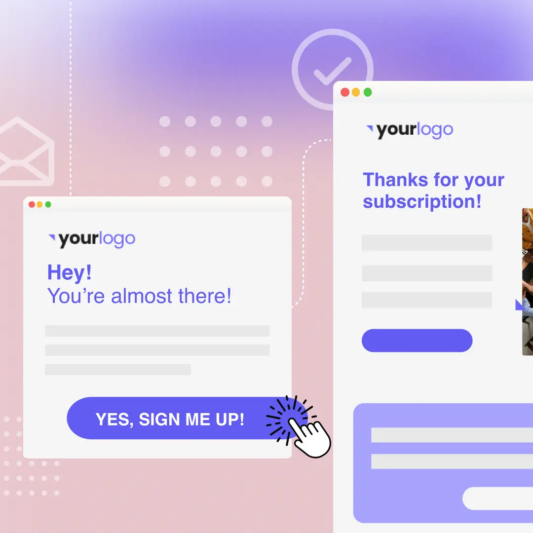
A subscription confirmation email is an automated email your reader receives immediately after they subscribe to your mailing list. These emails can take a few different forms. For example, a single opt-in confirmation email that tells the person they have subscribed. While a double opt-in confirmation email requires the person to take additional action. Either way, these emails are part of crossing your Ts and dotting your Is for a stronger email program.
Why are Subscription Confirmation Emails Important?
Whether you choose a single opt-in or double opt-in confirmation email, there are several benefits to the practice:
- Improving deliverability - When a recipient marks your email as spam, this makes your emails more likely to be auto-labeled as spam for other recipients too. A way to avoid this is to ensure that your emails only go to people who want them.
- Maintaining GDPR compliance - Part of GDPR compliance is receiving confirmation from people that they are consenting to receive your emails, and confirmation emails give you a record of that consent.
- Making email data more reliable - In your email program, tracking data like open rates, click-through rates, and so on will give you a gauge of how successful each email is and why. Confirmation emails are an additional way to ensure that people actually want to receive your emails.
Single vs. Double Opt-In
As we’ve briefly touched on, there are two types of subscription confirmation emails: single opt-in or double opt-in. Let’s take a closer look at each of these and when they might be the best choice.
What Is a Single Opt-In?
A single opt-in subscription confirmation email is the simplest route to go. After a person fills out the form, they receive an automated email to notify them that their subscription was added. There are pros and cons to this method:
- Pro: Fewer blockers to new subscribers. Email subscriptions are like any other type of conversion: the more steps it involves, the fewer people will follow through. A single opt-in process is simple and only requires one step. If someone subscribes by accident, the confirmation email gives them the opportunity to unsubscribe.
- Con: More fake emails. Because no confirmation is required, you may have emails on your mailing list that are fake or incorrect. This lowers your deliverability.
What Is a Double Opt-In?
Most email service providers require new subscribers to go through a two-step process to sign up for a mailing list. A double-opt-in requires a two-step verification process where a subscriber needs to confirm their subscription. Until they complete the second step, they aren’t subscribed.As with a single opt-in, there are advantages and disadvantages of a double opt-in system too:
- Pro: Cleaner mailing list - Asking readers to confirm their subscription makes for a cleaner, more engaged subscriber database. Readers who confirm their subscription want to receive your emails; there’s no chance they signed up by accident. It also reduces spam complaints and ensures subscribers' consent and security.
- Con: Losing intended subscribers due to a lack of follow-through - Not all initial subscribers will confirm their subscription and thus won’t make it onto your list. According to Campaign Monitor, up to 20% of initial subscribers will not complete the final confirmation step. The email might get overlooked or accidentally deleted, or readers may not understand the confirmation process. To reduce that problem, send an automated follow-up to remind them again to confirm their subscription.
Subscription Confirmation Email Best Practices (with Examples)
It’s important to remember that subscription confirmation emails are your first opportunity to make an impression on readers and confirm their desire to receive emails from you.
Use a Large, Easily Accessible CTA Button
When there’s something you want people to do (in this case, to confirm their email subscription or perhaps take another action), make it as easy for them as possible. In designing your confirmation email, include a prominent call-to-action button that says “confirm your subscription” or “complete your subscription.” While that CTA will be the focal point of the email, you should also have a brief explanation of what this email is doing and why they need to click through to confirm.Note that we said this button should be “prominent.” What does that mean? It means you should use the design to make it visually stand out: make it somewhat large, use bright or eye-catching colors, and have enough white space around it that it draws the reader’s eye.

Write Brief but Effective Copy
A subscription confirmation email doesn’t have to include a lot of copy, and you want to keep it brief so your readers don’t make the classic decision of “that looks like too much reading so I’m going to skip it entirely.” Be concise but still make sure your copy is warm and welcoming, on-brand, and enthusiastic about having them on board.Here’s a great example of custom, on-brand, welcoming text from the agency Edenspiekermann:

Check for Brand Consistency
Your confirmation email is one more opportunity to make your brand more recognizable to subscribers, so take advantage of that opportunity. The design should reflect your branding elements: use brand colors, use brand fonts, include your logo, and so on. Make it look like a true match with your website so the subscriber recognizes the imagery immediately. This makes subscribers feel more comfortable that the email is coming from you and not a scammer, and it also builds trust and familiarity with your brand.

Use Humor to Make a Statement
Want to grab your readers’ attention and establish a better relationship with them? Relate to them by making them laugh. While subscription confirmation emails don’t seem exciting and they have a very straightforward (albeit a bit dull) purpose, you can make them fun.We got this email from Parabo, the print shop app, and smiled. Instead of the very standard “Please confirm subscription” header text, we were greeted with a funny, whimsical hello that’s totally in their brand voice. “We really want you to want us” is a clever way to break up the usual mundane greeting, and reaffirmed why we thought we wanted to sign up for their emails in the first place. Parabo also includes their logo in the header, and the HTML background color and call-to-action button have been customized to be on-brand pink. The email is simple, it only takes a second to read, but it still makes an impression. Job well done.

Top Subscription Confirmation Email Examples
Need some inspo before you dig in and start designing a subscription confirmation that brings smiles to readers’ faces and gets the job done? Ask and we shall deliver. Check out these subscription confirmation email examples that put best practices to use.
Example #1: Be Design Forward
We’ve written about The Daily GOOD email newsletter before. It’s always well-designed and well thought-out, so it’s no surprise that the subscription confirmation email has a smart design. It’s simple, yes, but GOOD does something we haven’t seen in any other confirmation emails: the header is an animated GIF.

The rest of the email is simple but in a distinctly on-brand way. It uses brand colors, and the design’s minimalistic look and abundant white space make it very clear that you need to click the button to complete your subscription. What a great way to show readers a preview of the beautiful, design-forward thinking from the newsletters to come.

Example #2 - Expectation Manage with Your Audience
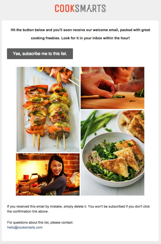
Cook Smarts' subscription confirmation email serves up a delicious welcome. Their beautiful, high-quality images are engaging and enticing, while the copy tells subscribers exactly what to expect next (a welcome email with freebies) and when to expect it (within the hour).The info is useful for readers, encourages them to confirm their subscription, and tells them something about what to expect from Cook Smarts: great, timely communication. It goes to show how a little bit of thought can go a long way when you’re making an effort to make a strong first impression with potential subscribers.

Putting It All Together: Crafting a Successful Subscription Confirmation Email
Your subscription confirmation email is one of the first contacts you may have with your new subscribers. Taking advantage of the best practices for these emails can give you a more engaged, enthusiastic mailing list. In this guide, we’ve laid out some of the key best practices for subscription confirmation emails, including:
- Designing a prominent and clear call-to-action button
- Writing copy that is brief but engaging and on-brand
- Incorporating brand-specific design choices
- Using humor to stand out
We’ll admit that putting all this together into an expertly crafted subscription confirmation email isn’t easy. The good news is you don’t have to start from scratch. Our catalog of 1,500+ email templates is designed to guide you with these best practices in mind. All templates are easy to customize with your own unique brand elements. Try them out for yourself with your free Beefree account.Editor’s Note: This post was updated on June 2023 to ensure accuracy and comprehensiveness.


