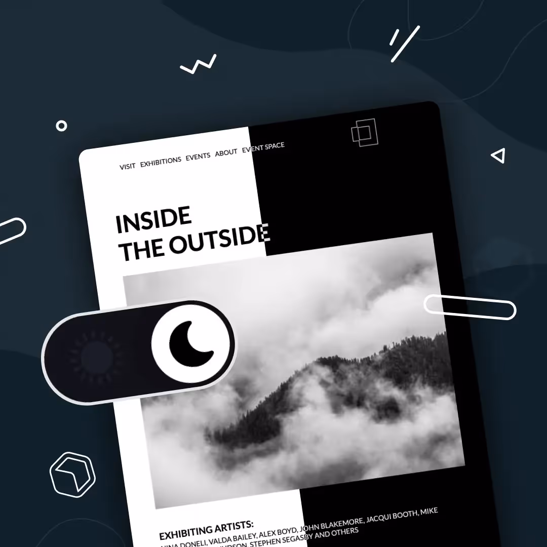
Design

Elevate Your Email Campaigns: Optimal Banner Size & Design Tips

Discover the perfect email banner size for your campaign with our comprehensive guide, including design tips, best practices, and inspiration to enhance your emails.
Beefree team
Beefree team
Apr 17, 2024

Every marketer knows that branding, visually engaging branding, matters. In a recent HubSpot survey, 20% of marketers reported to see a direct correlation between their design choices and an increase in email engagement.

In email marketing specifically, one of the first design elements a recipient views is your banner, making it crucial to grab the attention of the reader at first glance. An email banner should effectively convey your message, resonate with your audience, and be responsive regardless of what device your recipient uses to view your emails.

Let's discuss email banner best practice to follow that will ultimately lead to improve results of your email campaigns.

What is an email banner?

An email banner is a strategic design element element that appears at the top of your emails to catch the immediate attention of your reader. Sometimes called an email header, your banner is where you’ll introduce the main purpose of your email, like that amazing sale you’re advertising or the product launch of the century, and reel in customers’ so they scroll through the rest of the email.

Your email banner is your chance to make a fantastic first impression. Let’s explore the best email banner sizes and best practices to keep in mind.

Ideal email banner sizes

It is an outdated solution to automatically set all email banners to a width of 600px. With screen sized of both mobile and desktop devices varying so widely, it's important to ensure your email banner size is responsive for optimal viewing experience.

  • For desktop users, a banner 650-700 pixels wide and 90-200 pixels tall is ideal
  • For mobile users, the ideal banner is 350 pixels wide and up to 100 pixels tall

These updated dimensions follow responsive design best practices allowing email banners to render properly in a variety of email clients and devices.
Responsive design allows your email design to automatically adjust to the screen size of a customer’s device.

PRO tip: using an email design template that is already built to be responsive makes following this best practice a breeze.  

Impact of email banner size on campaign performance

A banner that’s poorly sized could become distorted when customers open it in their Gmail, Outlook, or whatever email platform they use.

This makes your email look less professional and it can also be harder to read so it doesn’t get your message across as well. A poorly sized email banner can also affect the user experience. If the banner is too wide, for example, it forces customers to scroll horizontally and it doesn’t allow them to see the entire banner in one view.

Not only do these issues affect the overall experience customers have with your email but they can also squander the excellent engagement opportunity that a well-designed email banner can be. According to Opensense's data, email banners can have 5-10% engagement rates,  a significant enhancement compared to the average click-through rate of 1.4% in emails.

Best practices for email banner design

Your banner size is an important part of designing an effective email banner, but it’s one of many. Check out these best practices to make your email banner even more powerful in garnering the engagement of your recipients.

  • File size: Any image in your email, but specifically your email banner, should be of high-quality. The ideal image should be download as a PNG at a resolution of 72dpi at 40kb or below.
  • Inverted pyramid: This "rule" in email design relates to adding the most important information at the top, working your way down to the least important information. When designing your email banner, make sure it clearly communicates the most important message in your email.
  • Brand consistency: As important as it is that your email banner makes a positive impression and communicates the main purpose of your email, it also should align with your brand. Make sure the design uses your brand colors, logo, or other aspects that make it consistent with your brand’s visual identity.
  • Text: Your banner needs to communicate your message, but less is more. Keep your copy sparse so it isn’t visually overwhelming and so the focus stays on your core intention. Ideally, 45-75 characters on a line is the sweet spot.
  • Email-friendly fonts: Make sure you use email-safe fonts that render reliably on major email platforms.
  • Accessibility: You want your banner’s message to reach as many customers as possible, and that includes customers with disabilities. Make sure to include accessibility features like using alt text so viewers with visual impairments can understand your message and using color combinations that viewers with color blindness can see.
  • Interactivity: Your email banner doesn’t have to be just a plain image or text. Consider making it interactive, such as with a GIF or a video that grabs your viewers’ attention.
  • Testing: You can follow all the rules for proper email banner size and design, but it’s still important to test it in action to make sure it shows up the way you want it to. Always send yourself a test email and see how that test email looks on different devices and platforms before you send it to your subscriber list.

For inspiration, check out these excellent email banners. This one from Beefree's template catalog clearly communicate the purpose of the email, remains consistent in branding throughout and plays with visual and text hierarchy to guide the reader's eye.

color of the year beefree email template
Use this template

This other email banner uses a navigation bar to keep the reader in the brand's ecosystem allowing readers to learn more about the marketing agency. This simple, yet effective email header communicates clearly the purpose of the email using imagery and text and has a clear CTA to lead the reader to complete the desired action without needing to scroll.

free beefree webinar email template
Use this template

Common mistakes in email banner design

When creating a strong email banner, it’s just as important to avoid doing the wrong things as it is to do the right things. Watch for these common pitfalls in email banner design:

  • Over-designing: Your email banner is prime real estate in your email, so of course you want to make the best use of that real estate. If you try to cram too much into that banner, though, you may lose your core message entirely because viewers don’t know where to look. 
  • Hard-to-read fonts: Your email banner is a wonderful place to get creative and build visual appeal, so of course you want to use fun design elements and fonts.
    But at the end of the day, the purpose is to send a message, so make sure the ornamental fonts you use are still clear enough that they’re easy to read.
  • Lack of responsive design: We’ve touched on this above but it’s also a common misstep that’s worth mentioning. Considering that 46% of emails are opened on mobile devices, every email and banner you create must be responsive to maintain its visual quality on any email platform.

Leveraging tools for email marketing banner

There’s a lot to consider as you’re designing an email banner, but we have great news: there are tools that can make it easier.

Take Beefree for example. Our extensive email template library has over 1,700 pre-built templates that already use banner design best practices like responsive design, minimal text for maximum impact, and proper sizing. Our HTML email editor makes it easy to customize these designs for your brand and messaging.

Start designing with ease and sign up for a free account today! 

60 Newsletter Ideas Readers Will Love + Free Email Templates

Discover inspiring newsletter ideas and engagement-boosting topics. Learn how to create memorable newsletter content that resonates with your subscribers.
Beefree team
Beefree team
Mar 15, 2024

Newsletters are more than just digital letters; they're a bridge, connecting brands to their audience in the most personal way. In the vast sea of online content, creating a newsletter that stands out and resonates can be a challenge. 

Dive into this blog, and you'll discover 60 captivating newsletter ideas that readers absolutely adore. Whether you're a seasoned newsletter professional or just starting out, we've got the inspiration to help you craft content that not only informs but also engages and inspires your audience. Let's get started!

Why are newsletters important?

Newsletters are like the unsung heroes of email marketing. Not only do they keep your audience informed and engaged, but they also play a pivotal role in building and nurturing relationships. Think of them as a regular touchpoint, a friendly "hello" that reminds your subscribers of your brand's value. 

From sharing company updates to spotlighting new products, newsletters organize key information in a digestible format, ensuring your audience stays connected and in the loop. In essence, they're a bridge between your brand and its community, fostering trust and loyalty.

What to include in a newsletter

Crafting a newsletter? It's not just about filling space; it's about delivering value. The key is to provide content that resonates with your audience's interests and keeps them eagerly awaiting your next update. 

For instance, if you're focusing on business, perhaps share some behind-the-scenes insights or company milestones. Looking for something light-hearted? Fun trivia or seasonal highlights might be your go-to. From monthly recaps to themed specials and educational deep-dives, the possibilities are vast. 

Dive into this article, and you'll discover a treasure trove of newsletter ideas, whether you're in the mood for business insights, seasonal tidbits, or educational gems.

60 newsletter ideas to elevate your campaigns

So, you're on the hunt for newsletter content ideas that not only captivate but convert? You're in the right place! With a wide range of topics and themes at your fingertips, the challenge isn't about finding content—it's choosing which pieces of content to spotlight. 

Whether you're aiming to inform, entertain, or inspire, the right idea can transform your newsletter from a mere email into a must-read. Dive into these 60 ideas, spanning business insights to themed wonders, and watch as your campaigns soar to new heights. Ready to elevate your email game? Let's dive in!

Interactive newsletter ideas 

When it comes to newsletters, who said business can't mix with fun? Fun newsletters are the sprinkle of joy in your subscriber's inbox, offering a delightful break from the usual. They're not just about entertainment; they're about forging a deeper connection with your audience, showing the lighter side of your brand, and making your emails the ones they genuinely look forward to. Let's explore some ideas that'll infuse your campaigns with a dose of fun!

1. Trivia quizzes

There's something inherently engaging about quizzes. They challenge, entertain, and offer a moment of playful competition. Including trivia quizzes in your newsletter can boost engagement rates and encourage interaction. Plus, they're a fantastic way to highlight product features or company milestones in a fun manner.

We recommend initiating these emails with a direct and inquisitive questions about the topic. Not only does this challenges the recipient's knowledge but also establishes a personal connection, making them feel as if they're part of an exclusive inside joke only they know about.

2. Behind-the-scenes

Let your subscribers in on the backstage magic. Whether it's a sneak peek into your office culture, the making of a product, or a day in the life of your CEO, these glimpses humanize your brand and foster a sense of community.

3. Memes and GIFs galore

Who doesn't love a good meme or GIF? Incorporating these into your newsletters not only adds a touch of humor but also makes your content more relatable and shareable. It's a modern way to comment on current events or industry trends with a light-hearted twist.

4. Customer spotlights

Shine a light on your loyal customers. Share their stories, testimonials, or fun ways they use your product. It's a win-win: you get engaging content, and they get a moment in the spotlight.

Customer spotlight free email template
Access free template: https://beefree.io/template/customer-reviews-product-template

5. Interactive polls

Engage your subscribers by seeking their opinions. Whether it's about a new product feature, industry trends, or just a fun "this or that" choice, polls can drive interaction and provide valuable insights.

Dipping into newsletters like the one below, you'll see a masterclass in sparking customer interaction. Interactive polls not only spark email engagement, but it give your audience a voice, making them feel important and valued by your brand. Additionally, these emails are a goldmine for gathering genuine feedback about your offerings. It's a win-win: your subscribers feel heard, and you gain priceless insights. Talk about a conversation starter!

free email template with interactive poll
Access template: https://beefree.io/template/small-business-survey

6. Themed playlists

Music connects people. Share themed playlists related to your industry, season, or just for fun. It's a way to set the mood and offer something extra to your subscribers.

free email template with playlist
Access template: https://beefree.io/template/start-new-year-with-your-favorite-playlist

7. DIY tips and hacks

Everyone loves a good hack. Share DIY tips related to your products or industry. It's not just informative but also showcases the versatility of what you offer.

8. Jokes and puns

A little humor goes a long way. Share industry-specific jokes or puns that resonate with your audience. It's a simple way to bring a smile to your subscribers' faces while building a bond and brand recognition! If you want to go beyond using funny email copy, consider offering a pun-y sale to go along with the joke. Now that's how you serve up a memorable newsletter!

9. Virtual scavenger hunts

Engage your subscribers with a virtual scavenger hunt. Hide clues in your website or social media channels and let them embark on a digital adventure. It's interactive and can be a unique way to highlight features or products.

10. Caption contests

Challenge your subscribers' creativity with a caption contest. Share an intriguing image and ask them to come up with a witty or humorous caption. It's interactive, fun, and can lead to some hilarious results. These types of newsletter ignite a two-way conversation between your brand and customers. By weaving in a playful caption contest, you're not only keeping subscribers engaged, turning passive readers into active participants. 

Business newsletter ideas

Navigating the business world requires a blend of strategy, insight, and communication. Business newsletters serve as a bridge, connecting your brand with clients, stakeholders, and employees. They're not just about sharing updates; they're about showcasing your brand's journey, achievements, and vision. 

Whether you're celebrating milestones, introducing new initiatives, or sharing industry insights, these newsletters position your brand as a thought leader. Let's explore some ideas that'll infuse your campaigns with professionalism and purpose.

11. Company milestones

Celebrating achievements, big or small, fosters a sense of pride and community. Sharing these moments in your newsletter not only keeps your audience informed but also builds trust and showcases growth.

company report email newsletter
Access template: https://beefree.io/template/agency-growth-report

12. Employee spotlights

Your team is the backbone of your business. Highlighting their stories, achievements, or unique skills humanizes your brand and showcases the talent behind the scenes.

This employee spotlight newsletter is a stellar example of how businesses can really humanize their brand. By highlighting new employees and their roles, they are setting the tone for collaboration and building a company culture of acknowledgment. It's not just about showcasing numbers and achievements; it's about celebrating the individual and showing that there's a genuine people behind the impressive work they will go on to do. This not only fosters a sense of community and camaraderie within the company but also strengthens trust and connection across teams.

human resource email templates
Access template: beefree.io/template/see-you-tomorrow

13. Case studies

Showcase real-world applications of your products or services. Case studies provide tangible proof of your brand's impact and can drive conversions.

14. Upcoming events

Whether it's a webinar, product launch, or networking event, keep your audience in the loop. It drives engagement and offers opportunities for face-to-face interactions.

free webinar email template
Access template: https://beefree.io/template/agency-webinar-announcement-email

15. Industry trends

Stay ahead of the curve by sharing the latest industry trends and insights. It positions your brand as a knowledgeable player and provides value to your subscribers. The following template showcases the most recent Color of The Year as it relates to this fashion brand.

Access template: https://beefree.io/template/how-to-wear-the-color-of-the-year

16. Product updates

Keep your subscribers informed about the latest features, improvements, or launches. It's a way to drive excitement and showcase continuous innovation.

Access template: https://beefree.io/template/color-of-the-year-collection

17. Testimonials and reviews

Word of mouth is powerful. Share genuine testimonials or reviews to build trust and showcase the positive impact of your brand.

By spotlighting endorsements from customer who know the ins and outs of your offer, you can brilliantly broadcast the wide-reaching wonders of your product. Pair each testimonial with a candid snapshot to add an additional a personal touch, making the brand feel less like a distant entity and more like a trusted friend sharing success stories.

18. Business tips and advice

Share valuable advice or tips related to your industry. It positions your brand as a helpful resource and can drive engagement.

19. Expert interviews

Bring in industry experts for interviews or guest posts. It provides fresh perspectives and boosts your newsletter's credibility.

20. CSR initiatives

Showcase your brand's commitment to social responsibility. Sharing CSR initiatives resonates with ethically-minded subscribers and highlights your brand's values.

Monthly newsletter ideas 

Consistency is key in communication, and monthly newsletters are the embodiment of that principle. Serving as a regular touchpoint, they offer a curated snapshot of the past month's highlights, ensuring your audience stays informed and engaged. Whether you're recapping events, sharing insights, or previewing what's on the horizon, monthly newsletters are a reliable way to maintain a steady connection with your subscribers. Let's delve into some ideas that'll make your monthly updates eagerly anticipated.

21. Monthly recaps

Think of monthly recaps as your brand's highlight reel, capturing all the noteworthy moments, wins, and stories from the past 30 days. It's like giving your subscribers a VIP pass, ensuring they're always in the loop and never miss a beat. Picture this: a vibrant timeline dotted with key events, achievements, and news, making your subscribers feel like they've been right there with you every step of the way. 

22. Featured blog posts

Highlight the top-performing or most insightful blog posts from the past month. It drives traffic to your website and offers added value to your readers.

23. Customer of the month

Celebrate a loyal customer by sharing their story or experience with your brand. It fosters community and showcases real-world brand interactions.

24. Monthly poll results

If you run regular polls or surveys, share the results. It's a way to show subscribers that their opinions matter and provide insights into popular opinions or trends.

25. Upcoming promotions

Give your subscribers a heads-up about any special deals, discounts, or promotions coming up in the next month. It builds anticipation and can drive sales.

26. Spotlight on success stories

Dive into the transformative journeys of your customers or clients. Each month, highlight a success story that showcases the real-world impact of your product or service. Share challenges faced, solutions provided, and the outcomes achieved.

27. Monthly challenges

Engage your subscribers with a fun challenge or goal for the upcoming month. It can be related to your product, industry trends, or just for fun.

28. Voices from the community

Dive into the conversations happening around your brand. Each month, curate a mix of shout-outs, stories, and feedback from your community, whether it's on social media, forums, or direct messages. It's a way to show you're listening and value every voice.

free email templates to highlight communities
Access template: https://beefree.io/template/black-history-month-support-your-local-artist

29. Sneak peeks

Offer a glimpse into any upcoming product launches, events, or initiatives. It builds excitement and keeps your audience in the loop.

30. A personal note

Add a personal touch by including a note from the CEO or a team leader. It humanizes the brand and fosters a deeper connection with the audience.

Seasonal newsletter ideas 

As the seasons change, so do the interests and needs of your audience. Seasonal newsletters tap into the current mood, offering content that's timely, relevant, and resonates with the spirit of the season. Whether it's the festive cheer of the holidays, the rejuvenation of spring, or the warmth of summer, these newsletters capture the essence of the moment. Let's dive into some ideas that'll make your seasonal newsletters a breath of fresh air in any inbox.

31. Holiday gift guides

During the festive season, everyone's on the lookout for the perfect gift. Curate a list of top products or services that make for great presents, tailored to your audience's preferences.

free email template for seasonal gift guide
Access template: https://beefree.io/template/christmas-gift-guide

32. Seasonal recipes

Share recipes that highlight the flavors of the season. Whether it's a summer smoothie or a winter stew, it's a tasty way to engage your subscribers.

free email templates for recipies
Access template: https://beefree.io/template/celebrate-carbonara-day

33. Seasonal DIY projects

Engage the crafty side of your subscribers with DIY projects that align with the current season. It's a fun and interactive way to celebrate the time of year.

34. Seasonal discounts and promotions

Offer special deals or promotions that celebrate the season. It's a timely incentive that can drive sales and engagement.

35. Event recaps

If your brand hosts or attends seasonal events, share a recap with highlights, photos, and key takeaways.

36. Seasonal trends

Highlight trends or popular items for the upcoming season. It keeps your subscribers in the know and positions your brand as a trendsetter.

37. Fundraising initiatives

During seasons of giving, showcase any charitable initiatives or partnerships your brand is involved in. It resonates with the spirit of the season and highlights your brand's values.

free emails for fundraising
Access template: https://beefree.io/template/donate-today

38. Seasonal challenges

Engage your subscribers with challenges that align with the season, whether it's a winter fitness challenge or a spring cleaning spree.

39. Decor and styling tips

Share tips on how to style clothes, homes, offices, or events in line with the season's theme. It's a creative way to immerse in the seasonal vibe.

Style guide free template
Access template: https://beefree.io/template/add-color-of-the-year-to-style

40. A personal seasonal note

Add a personal touch with a note reflecting on the season, sharing personal stories, or looking forward to upcoming events.

Themed newsletter ideas 

Themes can be the creative spark that ignites interest in your newsletters. They offer a cohesive narrative, making your content more engaging and memorable. Whether it's celebrating a global event, tapping into pop culture, or exploring a specific topic in-depth, themed newsletters stand out in an inbox and offer a fresh perspective. Let's explore some ideas that'll give your newsletters that thematic flair.

41. Cultural celebrations

Celebrate global events or cultural festivals, showcasing diversity and inclusivity. It's a way to educate and engage subscribers about different traditions and customs.

free holiday email templates
Access template: https://beefree.io/template/guide-to-celebrating-chinese-new-year

42. Pop culture moments

Tap into trending pop culture moments, whether it's a hit TV show, a viral meme, or a blockbuster movie. It makes your content timely and relatable.

43. Historical throwbacks

Take a trip down memory lane by highlighting significant historical events or milestones related to your industry or brand.

44. Eco-friendly focus

Dedicate a newsletter to sustainability and eco-friendly practices. It's a way to showcase your brand's commitment to the environment and offer green tips.

earth day email newsletter template
Access template: https://beefree.io/template/promote-sustainability

45. Tech and innovations

Highlight the latest tech trends, innovations, or gadgets related to your industry. It positions your brand as forward-thinking and in-the-know.

46. Book or movie recommendations

Share curated lists of books or movies related to your industry, season, or any theme. It offers added value and positions your brand as a curator of good content.

47. Art and creativity

Celebrate the world of art, design, and creativity. Showcase artists, design trends, or creative projects that inspire.

48. Travel and exploration

Take your subscribers on a virtual journey, exploring destinations, cultures, or travel tips. It's a way to inspire wanderlust and share unique experiences.

travel newsletter template
Access template: https://beefree.io/template/leap-year-adventure

49. Health and wellness

Focus on well-being, sharing health tips, recipes, or fitness challenges. It's a way to promote a balanced lifestyle and offer valuable advice.

50. Hobby and passion projects

Highlight hobbies or passion projects, encouraging subscribers to explore new interests or dive deeper into existing ones.

Educational newsletter ideas 

Knowledge is power, and educational newsletters are the torchbearers of that power. They serve as a platform to enlighten, inform, and provide value to your subscribers. Whether you're breaking down complex topics, sharing industry insights, or offering tutorials, these newsletters position your brand as a trusted educator. Let's explore some ideas that'll make your newsletters a treasure trove of knowledge.

51. Industry deep dives

Offer in-depth analysis or insights into specific industry topics, trends, or challenges. It establishes your brand as an authority and provides valuable content to your subscribers.

52. How-to guides and tutorials

Break down processes or tasks with step-by-step guides. It's a practical way to offer hands-on knowledge and assist subscribers in mastering new skills.

free email template for how-to newsletters
Access template: https://beefree.io/template/get-started

53. FAQ sessions

Address common questions or misconceptions related to your industry or product. It's a way to clarify doubts and offer direct value.

54. Webinar recaps

If you host webinars or online sessions, share key takeaways, highlights, or recordings. It extends the reach of your content and offers a recap for attendees.

55. Research and studies

Share the latest research, studies, or surveys related to your industry. It keeps your subscribers updated and offers data-driven insights.

56. Guest expert columns

Invite industry experts or thought leaders to contribute to your newsletter. It offers fresh perspectives and boosts the credibility of your content.

57. Book summaries or reviews

Offer summaries or reviews of influential books related to your industry. It's a way to promote continuous learning and offer reading recommendations.

email templates for publishers

58. Interactive quizzes

Test your subscribers' knowledge with interactive quizzes related to your industry or recent content. It's engaging and offers a fun learning experience.

59. Resource roundups

Curate a list of valuable resources, tools, or articles that can benefit your subscribers. It's a way to offer added value and save them research time.

60. Learning challenges

Encourage continuous learning by introducing monthly or weekly learning challenges. It can be related to a skill, topic, or habit.

Bring your newsletter ideas to life with Beefree

We've journeyed through a galaxy of ideas for a newsletter, from the fun-filled to the educational, and from the seasonal to the thematic. But, as we all know, even the most captivating content needs a stellar design to truly shine. That's where Beefree steps in. With Beefree’s intuitive email editor, you can effortlessly pair your top-notch content with equally impressive designs, ensuring your newsletters aren't just read, but remembered.

Whether you're crafting a monthly recap or diving deep into industry insights, Beefree ensures your vision translates perfectly into the inbox. With customizable templates, user-friendly tools, and a plethora of design options, you're equipped to create newsletters that resonate, engage, and inspire.

Ready to elevate your newsletter topic game? Dive into Beefree for a world of design possibilities. Get started with a free account and let's make your next newsletter one readers will love! 

Color of the Year 2024: What It Is and How to Harness It in Email Marketing

Elevate your 2024 email marketing initiatives by harnessing the influence of the Color of the Year. Beyond mere aesthetics, incorporating this dynamic hue strategically into your campaigns allows you to infuse contemporary flair into your brand communication.
Beefree team
Beefree team
Feb 21, 2024

This year, Pantone celebrates its 25th year of its unique and inspiring Color of the Year program. While many people find the Color of the Year to be simply an entertaining announcement, for marketers, this color can be a gateway toward better connecting with your customers and audiences.

Let's discuss how email marketing pros can stay ahead of the trends and effortlessly infuse the Color of the Year 2024 in your email campaigns.

What Is the Color of the Year 2024?

Each year, Pantone selects a "Color of The Year" that depicts and illustrates the state of the current culture and recent trends. This year's color is Peach Fuzz, Pantone 13-1023.

Source: https://www.pantone.com/articles/color-of-the-year/what-is-peach-fuzz

According to Pantone's reasoning for selecting the color Peach Fuzz, they state that it serves as an expression of the kindness, tenderness, warmth and togetherness that our culture is seeking and driving for in 2024. As Pantone explains, “Pantone 13-1023 Peach Fuzz captures our desire to nurture ourselves and others. It’s a velvety gentle peach tone whose all-embracing spirit enriches mind, body, and soul.” For many, this color embodies a vintage feel, creating a sense of honoring the past while welcoming the opportunities of the future.

How is the Color of the Year chosen?

For Pantone, choosing the Color of the Year is a long and comprehensive effort. Its team of color experts is continuously at work observing the global culture and the expressions of color across fashion, art and design, lifestyles, travel destinations, imagery on media platforms, and so on.

The Color of the Year is both an expression of our present culture at the dawn of a new year and a result of trend forecasting for colors, attitudes, and social movements that will be pervasive in the year ahead. It’s decided by the emerging popularity of the color itself as well as the emotions and concepts associated with the color.

Why does the Color of the Year matter in email marketing?

The Color of the Year can be an excellent asset to your email marketing (and your other 2024 marketing channels) in multiple ways. First, this color is representative of the present culture, which means it’s likely relatable to your present-day audience. It embodies a mindset that your consumers are likely to share - one of warmth, wellness, and interpersonal kindness - which fosters the connection between your brand and the consumers.

Second, the Color of the Year is in keeping with current color and fashion trends. By incorporating this color into your email marketing, your brand looks to be trendy and up-to-date. Even if consumers don’t know what the Color of the Year is, they notice that your emails have a modern, on-trend look.

Ways to use the Color of the Year 2024 in your email marketing

As we step into the vibrant realm of 2024, the Color of the Year takes center stage as a powerful tool for marketers seeking to infuse their strategies with contemporary flair.It serves as a language of its own, capable of communicating emotions, evoking reactions, and establishing a unique visual identity for brands. By incorporating the Color of the Year into marketing initiatives, businesses can align themselves consumer sensibilities, fostering a connection and positioning themselves as forward-thinking.

Use imagery with the Color of the Year 2024

Peach Fuzz doesn’t have to be the core color of your email design for you to benefit from it. When selecting images to include in your

email campaigns, consider looking for images that have Peach Fuzz or a similar color. For example, this royalty-free images from Unsplash each contain peachy hues that have the same mood and essence as the Color of the Year 2024. You’ll notice that the color isn't too prominent, but still stands out and plays well with the other colors in the image. This is a great depiction how you can incorporate Peach Fuzz to pair well with your brand identity.

Source: https://unsplash.com/photos/low-angle-photo-of-white-and-orange-concrete-building--T0La6F_WrE

Align your messaging with the Color of the Year 2024

As we’ve noted, the Color of the Year isn’t just a color; it’s a concept and an embodiment of our culture. You can use this to inform the messaging in your email marketing. In the case of Peach Fuzz, infuse your messaging with a sense of kindness, compassion, and warmth to speak to our current culture and appeal to your audience’s mindset in the present time.

Add the Color of The Year to your seasonal and trendy campaigns

By infusing the Color of the Year into seasonal and trendy campaigns, you not only stay relevant and timely but also capitalize on the cultural and emotional resonances associated with the chosen color, creating a dynamic and engaging experience for your audience. Here are some ideas:

Align the color with changing seasons

Embrace the changing seasons and incorporate the Color of the Year into your email campaigns that align with specific times of the year.

Source: https://beefree.io/template/feel-the-holiday-cheer

Capitalize on fashion and design trends

Stay attuned to fashion and design trends that feature the Color of the Year. Incorporate the color into email campaigns that showcase how your products or services align with current style preferences. Additionally, highlight new arrivals or product collections that prominently feature the trending color, catering to the fashion-forward interests of your audience, such as the template below:

Source: https://beefree.io/template/color-of-the-year-collection-email

Create a sense of urgency and exclusivity

Create a sense of urgency and exclusivity by tying the Color of the Year to limited-time promotions or exclusive offers. Use the color to highlight special discounts, early access to products, or exclusive content, encouraging your audience to engage promptly with your email campaigns.

Sourcehttps://beefree.io/template/color-of-the-year-collection-announcement

Develop themed content and storytelling

Develop themed content around the Color of the Year, telling a story that resonates with your brand and the significance of the color. The email template below serves as a perfect starting point to share share narratives, testimonials, or behind-the-scenes content that emphasizes the emotional and cultural aspects associated with the color of the year.

Source: https://beefree.io/template/how-to-design-with-pantone-peach-fuzz

Does the 2024 Color of the Year suit your brand?

Evaluating whether the 2024 Color of the Year suits your brand involves a nuanced exploration of the color's characteristics and your brand identity. Begin by examining the psychological and emotional associations of the chosen color. Peach Fuzz has a warm, welcoming, and peaceful air that can align well with many brands’ voices and messaging. Consider the values, personality, and messaging of your brand; does the color align with these elements, or does it pose a potential contrast that could enhance visual appeal and captivate your audience?

If the color resonates with your target demographic and aligns with your brand's narrative, it may offer an opportunity to play around your visual identity. However, remember that a balance between staying on-trend and maintaining a unique brand identity is crucial.

Strengthening your 2024 email marketing with the Color of the Year

Embracing the Color of the Year in your email campaigns is more than just a visual choice; it's an opportunity to remain competitive and provide users with something new. By strategically incorporating the Color of the Year, you can create visually appealing and emotionally resonant emails that stand out in crowded inboxes.

The easiest way to experiment with the color of the year in email campaigns is to start with a pre-designed template. Beefree’s "Color of The Year" template collection is a perfect place to start. Our user-friendly email editor makes it easy to customize all templates with your brand identity and effortlessly make a few simple changes to bring Peach Fuzz into your design.

Get started with Beefree - it's free!

How To Utilize Gamification For Your Next Email Marketing Campaign

Transform your email marketing strategy with the innovative use of gamification. Delve into actionable insights and strategies to captivate your audience, enhance engagement, foster brand loyalty, and elevate the success of your next email campaign.
Beefree team
Beefree team
Feb 20, 2024

Today, digital interactions dominate, and gamification has emerged as a powerful tool to capture and maintain audience attention. More than 70% of businesses included in the Global 2000 have adopted gamification as a key strategy.

In this article, we'll explore the significance of gamification in email marketing, understand its core concepts, delve into the psychology behind it, and provide insights on implementing and overcoming challenges in your gamified campaigns.

The psychology behind gamification in email

At its core, gamification in email marketing revolves around incorporating game-like elements to enhance user engagement.

This strategy involves understanding human behavior and motivation and leverages the psychological aspects that make games inherently appealing, such as competition, achievement, and rewards. Together, these insights help email marketers determine the best use of gamification to help drive engagement and shape consumer responses.

Here are the 3 key psychological drivers in gamification:

Intrinsic motivation

Gamification triggers users' desire to participate by incorporating challenges, rewards, and competitions. As a result, this creates a sense of achievement in users brought on by the idea of "winning" and reinforces positive engagement.

Operant conditioning

By strategically designing gamified elements that reward specific actions, marketers create a positive association between user engagement and valuable incentives. This conditioning strengthens the likelihood of users repeating desired behaviors, establishing a cycle of ongoing engagement.

Cognitive biases

Leveraging cognitive biases like scarcity bias allows marketers to prompt quicker responses by offering exclusive rewards or limited-time promotions.

In short, by appealing to individuals' inherent need for achievement and recognition, gamification becomes a powerful tool for capturing and maintaining their attention.

How to use gamification in email marketing

The concept of rewards and incentives helps amplifies the gamification strategy. Offering tangible benefits like exclusive discounts or access entices users to not only engage with emails but also to seek out additional interactions. Let's delve deeper into how you can use gamification to create a competitive edge and engage users in your next email campaign:

  • Points, Badges, and Leaderboards: Creating a competitive edge by rewarding users with points, badges, or leaderboard positions based on their interactions with your emails. This not only helps promote a feeling of accomplishment in users, but also helps foster a sense of community and competitiveness that leads them to climb leaderboards and stand out.

  • Rewards and Incentives: Offering tangible benefits such as discounts, exclusive access, or special promotions to incentivize user participation. This exclusivity makes users feel valued and special, fostering a stronger connection with your brand.

  • Interactive Elements: Enhancing user experience by introducing interactive features like quizzes, polls, or challenges within email content. These elements not only enhances engagement but also provides valuable insights into customer preferences, helping you tailor future content and offerings.

By tapping into users' motivations, whether it be competition, a desire for recognition, or the pursuit of exclusive benefits, you can create dynamic emails that help build a loyal and active audience for your brand.

Benefits of gamification in email marketing

Gamification transforms the user experience from a passive act of scrolling through emails into an interactive and dynamic journey where each click or purchase brings them closer to a tangible reward.

Increased customer engagement:

By turning the email experience into a game-like, subscribers are encouraged to engage with the content, spending more time exploring and interacting with the messages. This heightened engagement not only improves the chances of users absorbing the information presented but also creates a memorable and enjoyable experience, setting the brand apart in the minds of the recipients.

Enhanced brand loyalty:

One of the significant benefits of gamification is its ability to create deeper connections between a brand and its audience. When users consistently engage with gamified email content, they become active participants in a brand experience, leading to stronger brand-customer relationships and increased loyalty.

Higher conversion rates:

Gamification can be a powerful motivator for users to take desired actions. Whether purchasing, sharing content, or subscribing to newsletters, the gamified elements provide incentives and rewards for these actions. This motivational aspect drives increased participation, as users are more inclined to interact with emails, complete tasks, and actively engage with the brand, contributing to a more dynamic and participatory audience.

Improved data collection and analytics:

Gamification allows valuable user data collection through interactions and participation. Users willingly provide information while engaging with challenges, quizzes, or other gamified elements. This enriches your customer database and provides insights into user preferences and behavior. Improved analytics enable marketers to tailor future campaigns based on a better understanding of their audience.

5 Best practices for using gamification in email marketing

Embarking on a successful gamified email marketing campaign requires meticulous planning and strategic considerations. The following strategies and tactics can transform your email campaigns into immersive and rewarding journeys, making a lasting impression on your audience and optimizing your marketing efforts.

  1. Define campaign objectives: Clearly outline the goals of your gamified campaign to align with your overall marketing strategy. Use data-driven insights to identify the objectives and strategy for your emails. This means regularly tracking key metrics such as open rates and click-through rates. Once your campaigns launch, assess the effectiveness of your gamification elements to refine future campaigns.
  2. Identify target audience: Personalization is key to creating a more engaging experience. Understand your audience's preferences and tailor gamification elements to their interests. By leveraging data and what you know about your unique audiences, you can create better segmented gamified content that tailors to individual preferences. This includes personalizing challenges, rewards, and interactions, making the entire experience more relevant and appealing to different audiences.
  3. Choose appropriate gamification elements: Select elements that resonate with your brand and align with customer preferences. Ensure rewards align with audience interests. Go beyond generic incentives by offering enticing and meaningful rewards such as exclusive discounts, early access, or special promotions. It is crucial to adhere to data protection laws, like GDPR and CCPA, in your gamification practices. Communicate clearly how user data will be used and ensure compliance to build trust with your audience.
  4. Integrate gamification into email design: Ensure a smooth transition to gamified content for an intuitive and enjoyable experience. This means visually appealing emails with a user-friendly interface that offers a seamless transition from the email to the gamified elements.
  5. Develop clear calls-to-action (CTAs): Encourage user participation by crafting compelling CTAs that drive desired actions. Clearly communicate what action you want the user to take and highlight the benefits of doing so. Whether it's clicking a link, participating in a challenge, or making a purchase, the CTA should be persuasive and aligned with the gamification goals.

Overcoming challenges in gamified email marketing

When using gamification in email, it is important to find the right balance between gamification elements and the core message of the email. It's essential to integrate gamified features seamlessly without overwhelming or distracting recipients from the primary content. This lack of harmony brings forth two main challenges:

User fatigue

With the increasing use of gamification in various digital platforms, users risk experiencing fatigue or disinterest in engaging with gamified content. If not managed carefully, this fatigue can decrease overall participation and effectiveness.

Mitigation Strategy: To counter this, marketers should introduce variety and novelty in gamified content, keeping users engaged with fresh challenges and incentives. A/B testing is a great way to experiment with different gamification elements to identify what resonates best with your specific audience.

Lack of brand recognition

Maintaining consistency and alignment with your brand image while implementing gamification can be challenging. If gamified elements feel disconnected or misaligned with your brand identity, it may create confusion or a lack of authenticity among your audience.

Mitigation Strategy: Regularly analyze performance metrics and gather user insight to continuously improve your gamification strategy. Actively seeking insights from your audience about their preferences and perceptions allows you to adapt and iterate on your gamified content.

Unleashing the power of email gamification with Beefree

In an era where consumer attention is a prized commodity, the integration of gamification has emerged as a dynamic strategy to captivate and engage audiences within the realm of email marketing. It's important to remember that the essence of success in this area is rooted in persistent experimentation and creative thinking. Embrace the opportunity to try fresh gamification techniques in your email campaigns to maintain a competitive edge.

No-code solutions like Beefree simplify this process by providing an intuitive and user-friendly solution that empower marketers to seamlessly incorporate interactive and gamified elements into their email designs.

So, create a free account and start infusing some fun and interactivity into your email marketing efforts. Here's to the exciting gamification journey – may it bring you great results and enjoyment!

Innovative Leap Day Email Marketing Ideas for 2024

Step into the extra day of the year with innovative Leap Day email marketing ideas that defy the ordinary and captivate your audience. Explore our innovative Leap Day email marketing ideas to take a leap toward exceptional customer engagement and brand recognition.
Beefree team
Beefree team
Feb 13, 2024

We have a unique holiday on the horizon that doesn’t come around often: Leap Day. This special occasion only comes up every four years, and it’s simply a fun and quirky holiday that your customers enjoy celebrating. Getting in on the fun with them is an excellent way to connect with your customers through a shared experience.
But how? Explore these creative ideas for Leap Day email marketing campaigns.

Why Leap Day is a special occasion for Email Marketers

The origins of Leap Day are purely practical. We align our yearly calendar with the sun’s orbit around the sun, but it actually takes 365.25 days for that orbit, not 365 days. Adding a day every four years puts us back on track. Leap Day started showing up on calendars as early as 45 BC with the calendar Julius Caesar introduced.

The beauty of Leap Day is that it’s a holiday everyone can agree on. It’s not related to or excluding any religions or cultures, it doesn’t have painful or negative historical origins - it’s just lighthearted and fun. Sharing this experience with your customers through festive email marketing can help you grow your emotional connection with customers. These customers spend twice as much on brands they’re emotionally connected to, so Leap Day can be a lucrative opportunity.

Creative Leap Day campaign concepts for B2B marketers

Targeting businesses with your Leap Day email marketing campaigns? Try these ideas for campaigns that can build your relationship with customers and appeal to their bottom line.

Run the Numbers

Use enticing statistics in your emails about how businesses will benefit if they sign on with your services, using Leap Day as a vehicle. For example, perhaps you have data that your customers save an average of $100,000 per year when they use your services. Use messaging such as: “By the next Leap Day, you could have saved $400,000 if you sign up today.”

On the flip side, you could also use this as an opportunity to express gratitude for their support over the past four years. Highlight how much your revenue has grown since the last Leap Day and thank them for being part of this growth.

Help Them Appeal to Their Customers

Your customers are businesses and they want to take advantage of Leap Day as a revenue opportunity too. Depending on the product or service you offer, launch a campaign that tells them how you can help them reach their own customers for Leap Day. For example, if your business is a print shop, encourage them to print flyers or signage for a special Leap Day sale.

Feature Testimonials

Trust is paramount in B2B sales, with 92% of B2B buyers saying they’re more likely to buy from a brand after reading a trusted review. For Leap Day, grow your customers’ trust by highlighting the most compelling reviews and testimonials you’ve received in the past four years.

Engaging B2C Leap Day campaigns that stand out

While there are plenty of ways to appeal to B2B customers on Leap Day, it’s a rich opportunity for B2C sales too. Engage your audience with these fun Leap Day email campaign ideas.

Appeal to Tradition

There aren’t a lot of traditions that are specific to Leap Day, but there is one that’s well-known: women proposing to their boyfriends. This unique flip on the convention of men proposing to women can be a vehicle to have some fun with your audience. You could center your campaign on the concept of women taking charge or on the ideas of proposals and commitments.

Offer a Themed Sale

Leap Day gives your consumer an extra day in their year, so help them take advantage of it by offering a one-day-only sale. You could offer them a free gift with their purchases or a free trial for their “free” day. Or, you could offer promotions based on the number 4 or the number 29.

Play with Words and Images

It might seem simple, but simply having fun with the holiday in your messaging and imagery can be endearing to customers. Make a play on the word “leap,” like leaping puns or images and gifs of dancers leaping through the air. Frogs are associated with Leap Day too because they leap and jump, so have fun with cute frog imagery too. As simple as this might be, it shows you have a sense of humor, and 49% of consumers say funny content is the most memorable and interesting content.

Innovative Strategies for Leap Day

Technology has come a long way since the last Leap Day or two, so use it to your advantage! Check out these advanced strategies for your Leap Day email marketing.

Go interactive

Interactive content garners 52.6% more engagement than non-interactive content like text and images. There are plenty of ways you can harness the power of interactivity in your Leap Day emails.

For example, you could include a poll asking how people are spending their Leap Day (try offering an incentive for them to engage too, like a discount for those who complete the poll). If recipients are familiar with your staff, you could even take a poll of who they think can leap the farthest and then reveal the winner at the end of the day.

Use personalized nostalgia

Leap Day is a great opportunity to appeal to customers’ nostalgia because it’s been four years since the last Leap Day…and a lot can happen in four years! Try including snapshots of some of the products the customer was buying four years ago as a fun way to connect. You could also do a non-personalized version of this by highlighting the products that were your best sellers four years ago.

Offer a discount for a quiz

Invite consumers to win a discount on Leap Day by scoring points on a themed quiz. Make sure it’s information they can’t just Google, like how many new customers your company has brought on in the last four years, how many 5-star reviews you’ve gotten in these four years, or what your top-selling product was four years ago.

Designing captivating Leap Day emails

The ideas above can get you started with your Leap Day campaigns, but how do you pull them off in the most impactful way? Check out these design tips.

Start with a professionally designed template

There’s no need to reinvent the wheel for your next email campaign. Beefree’s template library is packed with over 1,600 templates that span a wide range of styles and structures. Each one is designed by a professional and is easy to customize with your messaging and branding. You can expect a more efficient email design with a professional look every time.

Connect your marketing channels

Email marketing is a strong marketing tool in its own right but you can take it a step further by integrating it with your other marketing channels. For example, include links to your social media profiles or call-outs of your Leap Day social media posts. Or, embed a video you’ve posted on your YouTube channel. Any of these will invite customers to engage further with your brand.

Make sure it’s not a Leap for customers to convert

Whatever your Leap Day campaign’s goal is (making a purchase, filling out a contact form, signing up for a trial, etc.), make it as easy for consumers as possible. Have a clear and simple call-to-action button that leads to a matching landing page on your site where they can make that conversion quickly and easily. Pro tip: Beefree has matching templates for emails and landing pages so you can do this quickly.

Measuring your Leap Day campaign’s impact

How do you know if your marketing campaign hit the mark? It all comes down to metrics. To gauge how successful your Leap Day campaign is, look for these metrics:

  • Open rate - shows whether your subject line was enticing people to open the email
  • Clickthrough rate (CTR) - shows how many of your recipients were compelled to engage with your content
  • Conversion rate - shows how many recipients made a purchase, requested a consultation call, or whatever your conversion is
  • Sharing/forwarding rate - shows how many recipients sent the email along to someone else
  • Return on investment (ROI) - compares the revenue you brought in from campaign recipients vs how much you spent

Kicking Off Your Leap Day Email Marketing Campaign

Ready to turn this Leap Day into a revenue-making opportunity? Now that you have all the ideas you need, get the tools you need from Beefree. Sign up for free to experience this advanced email design tool.

10 Engaging Birthday Email Examples + Strategies

When it comes to making your customers feel special, nothing says "We're glad you're here" like a personalized birthday email. Not only that, but they are gr...
Emily Santos
Emily Santos
Nov 17, 2023

When it comes to making your customers feel special, nothing says "We're glad you're here" like a personalized birthday email. Not only that, but they are great sources for driving up engagement and strengthening brand loyalty.After all, who doesn't love a freebie or a discount to spoil themselves with?Whether you're currently sending birthday emails or want to start, below you'll find some of our best strategies for crafting and optimizing birthday messages that delight your recipients.

What is a Birthday Email?

Birthday emails are powerful automated email campaigns brands use to provide a more personalized customer experience. While on the surface, they might seem like a simple gesture to brighten your customer's day. These emails are strategically crafted and inserted into every big e-commerce brand’s email marketing efforts.

What is the Purpose of a Birthday Email?

Birthday emails have multi-purposes. While they are created to help celebrate a subscriber's special day, they also drive up email engagement and brand loyalty. Here’s how:

  • Deepen Subscriber Connection: A personalized birthday wish can strengthen the bond between a brand and its subscribers. A simple message can make your subscribers feel important, keeping you at the top of their minds the next time they purchase. 
  • Drive Sales: Exclusive birthday discounts or offers can incentivize subscribers to purchase. 
  • Boost Engagement: Birthday emails often see higher open and click-through rates than regular promotional emails.

Do Birthday Emails Work?

Absolutely! When it comes to engagement metrics, birthday emails are the party animals of the email marketing world. In fact, according to Experian, birthday emails generate “179% more clicks, 481% more transactions, and 342% more revenue per email.”Our educated hypothesis is that everyone loves a little extra attention on their birthday, and when brands deliver that in the form of tailored offers and heartfelt messages, subscribers are more likely to engage (and buy)!

10 Happy Birthday Email Examples (and  their strategies)

Birthday emails are a unique blend of celebration and strategy; finding the right balance is important. We've scoured the email universe and handpicked 12 of the best birthday emails. Each example showcases a different approach, from heartwarming messages to irresistible offers.As we unwrap each one, you'll discover what makes them stand out and drive results. By the end of this list, you'll be brimming with ideas and ready to craft birthday emails that resonate and convert.

Make your offer stand out 

This birthday email example from Chipotle showcases a brilliant marketing strategy. The "Gift of Guac" is not only quirky and engaging but also entices the receiver with a tempting offer on one of Chipotle's delicacies. Not only that, but the offer is applicable anytime during their birthday month, which promotes return visits.In addition, the call-to-action button attracts the reader's eye and offers clear instructions for the next steps.

chipotle birthday email example

Keep it Simple and Stay on Brand 

When it comes to birthday emails, Outdoor Voices nails it by embracing the beauty of simplicity.A common mistake with birthday emails is that it is really easy to go overboard. Outdoor Voices does a great job of embracing the “less is more” approach to design and copywriting, which aligns with their overall brand identity.Another differentiating factor, when compared to Chipotle’s approach above, is that the offer is not the star of the email. Instead, the customer is. This strategy is great for strengthening connections with readers as they often feel less “sales-y. ”Regardless, they do a great job of ensuring the offer is still noticed by adding an on-brand CTA that stands out.

Outfoor voice birthday email

Nike's birthday email also beautifully embodies its athletic and dynamic brand essence. Featuring an athlete surrounded by playful hand-drawn elements, the email captures attention and reinforces Nike's iconic image. The straightforward offer of a 10% discount on a $100 purchase, combined with the exclusive feel of 'Member Access,' effectively incentivizes the recipient to shop.

nike birthday email example

Use a Humorous Approach

The following birthday email from Markiplier incorporates humor to create a memorable and light-hearted message. The message feels personable as it makes a joke about aging that a friend would make, yet emphasizes genuine appreciation.The offer for a discount on Markiplier store items adds an incentive to the comedic touch. If there's a lesson here, it's this: a good laugh can reel 'em in, but pairing it with a genuine offer? That's the cherry on top!

Markiplier humorous birthday email example

Exclusivity For The Win

If you're an avid Sephora shopper, you'll know their birthday mini sets are (unfortunately) not curated for the individual; however, this email makes you feel like it is.While using your reader's name is a great example of personalization, in this case, it isn't the star of the show.Sephora's unique layout, design, and use of high-quality images exude the feeling of "these were hand-picked just for you." The use of supersized imageslaid out was intentional to make these "minis" feel larger (and, in turn, more exclusive) than they are, which likely makes "Mary" feel special.They also subtly hint with a subtitle that "Mary" is receiving this exclusive offer because they are part of their "beauty insider" program, further promoting the feeling of exclusivity and encouraging customer loyalty.

sephora beauty insider exclusive birthday email

Time Is Of The Essence? or Not? 

The following two emails offer a different approach to birthday offer expiration dates.PixelBoosts offers a 30% discount to be redeemed within three days. Crafted for those looking to renew their subscriptions, this birthday email does a good job of blending the personal touch of a birthday email with a gentle nudge toward "stick around with us!"

PixelBoost birthday email example

On the other hand, the email below extends the festivities and gives the reader the entirety of their month to redeem their discount. The phrase "pick your own present" offers a sense of autonomy and personalization.

birthday email campaign

There are pros and cons for both strategies.While offering limited-time offers such as PixelBoost can be a great way to encourage urgency and conversion, finding the right time to send this email is important. According to Campaign Monitor, 55% of birthday emails are sent on the recipient's birth date. For limited offers such as 3 days, the challenge comes with not knowing whether the recipient will open the email in time as they might be taking some much-needed R&R.For birthday emails with a much longer deadline, while they offer recipients ample time to open and purchase, you risk them forgetting about your offer. In this case, reminder emails will be essential, turning birthday emails into birthday campaigns.As always, we recommend testing and monitoring what works best for you and your organization.

Personalized Product Recommendations

According to Epsilon, "80% of consumers say they're more willing to purchase when provided with a personalized experience." While, a birthday email alone is a strong example of this, Rachel Jackson's birthday email takes it one (or ten) steps further. 

While we usually see product recommendations being personalized with the power of dynamic content and consumer behavior, Rachael Jackson takes a unique, maybe simpler, but still impactful approach using the recipient's birthstones. 

The use of high-quality images and meaningful descriptions engages the recipient to learn more about their birthstone, which only further helps promote the feeling that "this was made for me." 

rachel jackson jewelry birthday emails

Use Interactive Elements 

When done right, videos, gifs, and polls are great ways to catch your readers' attention and guide them toward the desired action.While the email below is simple, the animated birthday cake and candle GIF catches the reader's eye and embodies the essence of celebration, warmth, and festivity. Again, while simple, the GIF enhancesthe user experience, making the offer more enticing and the email more interactive.

animated birthday cake and candle GIF

Loyalty Points Boost

Simons' birthday email effectively leverages a loyalty program by offering double points on the largest purchase made during the birthday month. The CTA "treat yourself" is strategically used to encourage a larger-than-usual purchase, possibly enticing the reader to buy something they might have been eyeing for a while. The double points incentivize the consumer as they are more willing to buy, knowing they will receive something in return.

Simon isn't just sending out birthday wishes but making it a win-win for everyone.

simon birthday email

Best Practices for Engaging Birthday Email Campaigns

The best birthday emails are more than just a celebratory message; they're an opportunity to deepen your connection with your subscribers. To make sure that your birthday wishes stand out in a crowded inbox, it's important to follow some tried-and-true best practices.From creating an automatic birthday campaign to the art of the perfect call-to-action, here are our top secrets to crafting unforgettable birthday emails.

Automation is Your Birthday Campaign BFF

No one is to be left behind. Setting up an automated birthday campaign ensures subscribers feel acknowledged on their special day. It's not just about convenience; it's about consistency.Automation permits timely and personalized gestures that say, "We remember, and we care."

Send More Than One Birthday Email 

One email is great, but why stop there? Celebrating a subscriber's birthday isn't just about the day itself; it's about the anticipation and the afterglow.Start with a warm pre-birthday greeting, followed by the main birthday wish, and perhaps a gentle reminder or a thank-you note a day or two later. It's a prolonged celebration that keeps the connection alive and makes your brand memorable.

Ensure a Smooth Redemption Process 

If you're gifting your subscribers a birthday treat (and we highly recommend you do!), make the redemption process a breeze. The last thing you want is for them to jump through hoops on their special day. Whether it's a discount code, a freebie, or exclusive access, ensure they can claim it effortlessly.Part of this is ensuring a clear and compelling CTA. Whether you're nudging them to shop a birthday sale, read a special message, or claim a gift, your CTA should stand out.

Design Unforgettable Birthday Emails with Beefree

Whether it's a heartfelt message, a special discount, or an exclusive offer, it is proven that birthday emails strengthen brand-consumer relationships. And with only 31% of retail email marketers sending birthday greetings, there's a huge opportunity for you to stand out.As shown above, playing with color, layouts, images, and interactive elements is the name of the game. And while it might seem challenging and time-consuming at first, it doesn't have to be.With an intuitive drag-and-drop interface and a catalog of over 1,600 templates, Beefree makes designing birthday emails a piece of cake ;).Not sure where to start? Try this free birthday email template.

12 Exceptional Email Newsletters to Inspire You

Email newsletters stand as a beacon between your brand and your audience. In one cohesive and on-brand email, you can share everything from news to announcem...
Emily Santos
Emily Santos
Nov 2, 2023

Email newsletters stand as a beacon between your brand and your audience. In one cohesive and on-brand email, you can share everything from news to announcements to updates and inspire action, building stronger connections with your subscribers.The artistry behind crafting a newsletter that not only informs but captivates is a journey of balancing aesthetic appeal with potent content, ensuring each word and image is a step towards enriching subscriber engagement. As connoisseurs of well-crafted email newsletters, within the confines of this blog, we'll share 16 email newsletter examples, each uniquely highlighting the impact of successful communication in its own special way.

Behind the Best Email Newsletter Examples

Understanding the mechanics of email design means recognizing and appreciating the subtle nuances that elevate a newsletter from good to exceptional. Below, you'll find a collection of designs that brilliantly mix visuals and content, each one shining a light on the exciting opportunities that your own newsletters can explore.

E-Commerce Newsletter Examples

Serumize 

The presented newsletter comes from "Serumize," a brand dedicated to skincare. This specific edition from their "Skintuation" blog emphasizes the importance of correct skin cleansing to achieve clear, healthy skin.

Serumize email newsletter example showcasing their latest blog on healthy skin

Stand-out elements:

  1. Engaging Content and Visuals:
  2. One of the standout features of this newsletter is its use of engaging content complemented by visually appealing imagery. The headline "Are You Cleansing Right?" is not only attention-grabbing but also prompts the reader to delve deeper into the content. When accompanied by high-quality images of the products and a model showcasing the cleansing process, it gives the viewer a comprehensive idea of what the brand offers.
  3.  Clear Call to Action:
  4. The "LEARN MORE" button is prominently placed and effectively serves as a call to action. Its distinct color and positioning ensure it catches the reader's attention, leading them towards more detailed information or potentially to a purchase.
  5. Transparency and Trustworthiness:
  6. Serumize has incorporated icons at the bottom of the newsletter, highlighting the qualities of their products, such as "Cruelty-Free" and "Paraben Free." This not only informs the consumer about the product's attributes but also builds trust by showcasing their dedication to safe and ethical formulations. Additionally, the personal touch in their thank you note at the end adds a feeling of community and appreciation, making the reader feel valued and connected to the brand.

Business Newsletter Examples

Moz

This newsletter is from Moz, a reputable name in the domain of search engine optimization (SEO) and digital marketing. Through its "Moz Top 10," the brand aims to provide its subscribers with valuable insights, updates, and resources in the ever-evolving realm of SEO and online marketing.

Moz email newsletter example

Stand-out elements:

  1. Curated Quality Content:
  2. Moz's strategy of listing the top 10 articles or resources is an excellent way to keep readers informed about the latest and most pertinent topics in the industry. Each entry is concise yet descriptive, allowing subscribers to gauge the relevance and importance of the content quickly. This curation reflects Moz's expertise, providing readers with confidence that they're getting a distilled version of the most significant industry happenings.
  3. Variety and Interactivity:
  4. Including diverse resources, from video sessions like "TechSEO Boost 2019" to interactive games like "The Search," showcases Moz's commitment to catering to various learning styles and preferences. By mixing traditional resources with more engaging, interactive content, they ensure that readers remain engaged and are more likely to explore the provided content further.
  5. Clear Value Proposition and Incentives:
  6. The newsletter not only updates readers but also offers tools and resources that can be directly implemented, like the "Google Search Console – Quick Insights (Google Sheet)." Additionally, the promotional segment at the bottom about an "Early Bird" discount serves as an incentive for readers to act and get involved with Moz's offerings, effectively driving potential conversions

The Hustle

The newsletter presented is from "The Hustle," a daily business and technology news platform that condenses vital information into bite-sized, digestible pieces. This edition, dated May 7, 2021, delves into the intricacies and value proposition of airline loyalty programs while also offering readers a mix of interesting tidbits and thought-provoking snippets.

The Hustle email newsletter example describing airline's loyalty program

Stand-out elements: 

  1. Engaging Big Idea Segment:
  2. The newsletter opens with a "Big Idea" section, focusing on airline loyalty programs. By leading with a captivating visual and a headline that poses a question, the Hustle immediately piques the reader's curiosity. The section provides key insights, like the surprising financial value of loyalty programs compared to actual airline operations. Such an approach not only educates but also offers a fresh perspective on a topic many might assume they're familiar with.
  3. Diverse Range of Content:
  4. One of the strengths of this newsletter is the diversity in content. Beyond the main story, there are "Snippets," which cover various topics from finance to sports and media, catering to a broad audience spectrum. This strategy ensures that even if a reader isn't particularly interested in the main topic, other sections might catch their attention, increasing overall engagement.
  5. Shower Thoughts for Engagement:
  6. Adding a touch of whimsy, the "Shower Thoughts" section offers quirky and contemplative statements likely to resonate with many readers, potentially becoming a talking point or even being shared on social platforms. This inclusion, while seemingly light-hearted, enhances user engagement and offers a delightful conclusion to the reading experience.

Product Newsletter Examples

Fridababy

The showcased newsletter is from "Fridababy," a company specializing in innovative baby and toddler products designed to simplify parental challenges. This edition is dedicated to introducing their new product, the "DermFrida Bath Mitt," aiming to transform bath times into a fuss-free experience for parents and their little ones.

Fridababy product newsletter example showcasing products

Stand-out Elements: 

  1. Eye-Catching Visuals and Cohesive Design:
  2. Fridababy has effectively used vibrant, playful visuals that immediately draw attention to the new product. Using a child's illustrated hand juxtaposed with the actual product not only adds a fun element but also emphasizes the product's utility. The cohesive color palette, centered around the product's color, further accentuates the product and creates a visually appealing design that's consistent throughout.
  3. Clear Information and Benefits:
  4. The newsletter does a commendable job of highlighting the product's features, from being a "quick-dry" mitt to its "bacteria-resistant" nature. The segment "A Tub Without Tantrums" cleverly emphasizes the primary benefit for parents—making bath time a breeze. The succinct points give a quick overview, allowing potential customers to grasp the product's advantages at a glance.
  5. Comprehensive Product Range Showcase:
  6. Towards the end, the newsletter smartly showcases a range of their other products, reminding subscribers of their holistic approach to baby care. This not only reinforces brand recall but also encourages cross-selling. The invitation to "Join the Fridababy Babble" further promotes community engagement and brand loyalty.

The Body Shop

The featured newsletter comes from "The Body Shop," a globally recognized brand known for its ethically produced beauty and skincare products. This edition emphasizes their new avocado-themed body care range, showcasing the benefits of this natural ingredient while highlighting promotions and the essence of the brand's ethos.

The Body Shop product newsletter example showcasing their new avocado themed body care line

Stand-out Elements: 

  1. Cohesive Thematic Presentation:
  2. "The Body Shop" has brilliantly leaned into the avocado theme, creating a visual treat for the eyes. From the prominent avocados to the green-hued product packaging, everything in the newsletter ties together seamlessly. This cohesive presentation not only emphasizes the natural ingredients of their products but also creates a memorable and distinct visual identity for this specific range.
  3. Clear Call-to-Action and Offers:
  4. Throughout the newsletter, there are clear and enticing CTAs. Whether it's the playful "Smash that buy button" for the avocado range or the "Buy now" for the 20% off promotion, each segment clearly guides the reader on what to do next. Coupled with attractive offers and promotions, it nudges potential customers towards purchasing.
  5. Emphasis on Brand Values:
  6. The "Spread Love" section at the bottom, featuring diverse models, is a subtle yet powerful nod to the brand's commitment to inclusivity and positive body image. By incorporating this imagery and message, "The Body Shop" reinforces its brand values, creating a deeper connection with its audience beyond just the products it sells.

Professional Newsletter Examples

Your City

From interactive scavenger hunts to melodious live music sessions and delightful tasting events, the city is bustling with activities for locals and tourists to indulge in and enjoy.

Your City professional newsletter examples

Stand-out Elements: 

  1. Clear Visual Cues and Structured Layout:
  2. The newsletter employs a clear and straightforward layout, a boon for easy readability. The dominant imagery of the city's iconic building sets the geographical context instantly. Dates are boldly highlighted, ensuring readers can swiftly pick out the timings for each event. The accompanying images for each event serve as visual cues, giving readers an instant feel of what to expect.
  3. Concise and Informative Descriptions:
  4. Each event's description is concise yet comprehensive enough to give readers a clear idea of the activity. The "Let's Roam Scavenger Hunt," for example, is not just presented as a fun outdoor activity but is specifically pitched towards tourists, locals, and newcomers alike, broadening its appeal. The "Velour Live Music" description mentions the owner's name and the venue's unique selling points, such as a smoke and alcohol-free environment.
  5. Call to Action and Accessibility:
  6. Strategically placed at the bottom, the contact information ensures that interested parties have a direct line to the organizers. An email address allows for easy communication, while the placeholders for address and phone number suggest that the newsletter would provide multiple ways for readers to reach out, enhancing user accessibility and interaction.

Webinar Newsletter Examples

Fluent

This newsletter is from Fluent, a marketing company, announcing a collaborative webinar with ActiveProspect. This webinar aims to provide insights and strategies for building a superior call marketing plan for 2022, appealing to businesses and marketers looking to enhance their communication strategies for the upcoming year.

Fleunt webinar announcement email newsletter sample

Stand-out Elements: 

  1. Visual Clarity and Conciseness:
  2. One of the standout features of this newsletter is its clear, concise, and visually appealing design. The bold, catchy header "How to Build a Better Call Strategy for 2022" immediately captures the reader's attention. Including headshots of the speakers adds a personal touch, giving a face to the experts who will be presenting. The highlighted date and time ensure readers can quickly jot down the event in their calendars.
  3. Detailed Content with a Direct CTA:
  4. The newsletter does an exceptional job of detailing the webinar's objectives in a bullet-point format, which allows potential attendees to gauge the content at a glance. By touching on crucial points like transparency, consumer journeys, and compliance best practices, Fluent emphasizes the comprehensive nature of the webinar. The clear "Register" button is a straightforward call-to-action (CTA), prompting immediate registration. Additionally, the assurance that a recording link will be sent even if someone cannot attend the live session helps capture a broader audience.
  5.  Transparent Communication:
  6. The footer section, which includes Fluent's address and an unsubscribe option, ensures transparency and adheres to best email marketing practices. It establishes trust with the recipients, showing that Fluent respects their privacy and their right to opt out of such communications.

2C2P

By providing solutions that facilitate payments across diverse markets, 2C2P positions itself as a critical bridge in the digital payments ecosystem. This specific newsletter emphasizes their upcoming participation in the IDC DX Summit and a webinar centered around the buying and payment trends in Southeast Asia.

2c2p banking email newsletter

Stand-out Elements: 

  1. Clarity and Segmentation:
  2. One of the standout aspects of this newsletter is the clarity it offers. Each section is distinctly separated, allowing for easy navigation. Whether it's the invitation to the IDC DX Summit or the details about the webinar, readers can quickly glean the primary focus points, enhancing user experience.
  3. Engaging Content and Value Proposition:
  4. The description of the digital economy's growth and the potential it holds for businesses is compelling. By highlighting numbers like the "US$280 billion mark by 2025," the newsletter taps into a sense of urgency and opportunity. Moreover, by showcasing their CEO, Aung Kyaw Moe, as the speaker for the webinar, 2C2P is subtly underscoring their expertise in the domain. The emphasis on the complexities of the payments ecosystem in Southeast Asia positions the webinar as a must-attend for businesses keen on tapping into the region's potential.
  5. Direct Calls to Action (CTA) and Accessibility:
  6. The newsletter doesn't merely provide information; it guides the reader towards specific actions. The "Register for our webinar here," "Sign up for the FREE webinar!" and "Get in touch" buttons are direct CTAs that foster engagement. Additionally, providing a direct link to download the complete agenda for the IDC DX Summit ensures readers have immediate access to detailed information.

Blog Newsletter Examples

Julie Blanner

The newsletter in focus is from Julie Blanner, a lifestyle influencer known for her approach to easy recipes, effortless entertaining, and minimalist style. Through this newsletter, she introduces her readers to her favorite coffee table books and extends an invitation to her free masterclass on starting and growing a blog.

Julie Baker blog newsletter

Stand-out Elements: 

  1. Personal Touch and Relevance:
  2. One of the standout elements of this newsletter is its personal touch. Addressing the recipient by name ("Hi Marilia") creates an instant connection, making the reader feel individually acknowledged. Furthermore, by offering content on coffee table books, Julie provides value that aligns with her brand's aesthetic and resonates with her target audience's interests. This tailored content is crucial in capturing and maintaining the reader's attention.
  3. Visual Consistency and CTA:
  4. Julie's newsletter excels in visual consistency. The soft, muted color palette and the curated images reflect her brand's essence and the promise of "minimalist style." The images not only provide visual appeal but also offer a sneak peek into what readers can expect by clicking on the "Read More" or "Learn More" CTAs. Clear and concise CTAs encourage user interaction and lead the reader down a predetermined path, increasing the chances of conversion.
  5. Offering Value and Engagement:
  6. Julie's invitation to her free masterclass on blogging is a strategic move to engage with her readership further. By offering something of value, like a masterclass, she not only establishes her expertise but also fosters a deeper relationship with her community. Additionally, including her profile at the bottom, complete with social media links, ensures that readers have multiple avenues to connect with her and explore her content further.

Restaurant Newsletter Examples

Allset

This newsletter is from "Allset," a platform facilitating a seamless dining experience by allowing users to order meals ahead for dine-in or pickup. This particular communication promotes their "Takeout August" campaign, aiming to incentivize users with a daily $2 off on their pickups.

allset takeout promo email newsletter example

Stand-out Elements: 

  1. Eye-catching Design and Clear Messaging:
  2. One of the primary strengths of this newsletter lies in its visually appealing design. The bright red background immediately captures attention, and the contrasting yellow emphasizes the promotional offer. The headline "Takeout August" followed by "extra $2 off" succinctly conveys the essence of the promotion. Furthermore, the image of a delicious meal not only tantalizes the taste buds but also gives a visual cue about the brand's service – offering delightful meals at a discount.
  3. Direct Call to Action and User Convenience:
  4. The newsletter uses multiple "Order now" buttons, strategically placed after introducing the offer and towards the end. This ensures that at any point if the user is convinced, they have an immediate way to act. Additionally, the mention of "No-Contact Pickup" and "Curbside Pickup" addresses current health and safety concerns, showcasing the brand's commitment to user safety. Such features can significantly enhance user trust and increase the likelihood of conversions.
  5. Integration of Mobile and Encouragement for Recurring Use:
  6. By displaying App Store and Google Play buttons, the newsletter encourages users to download the allset app, pushing for a more extended engagement. Coupled with the statement, "Not sure what to get? We’ve got plenty of options that can easily become your everyday fix," the brand subtly promotes recurring use, aiming to make their service a part of the user's daily routine.

Sweetgreen

The displayed newsletter is from "Sweetgreen," a brand known for its dedication to fresh, wholesome food offerings. Catering to the health-conscious and those who appreciate vibrant flavors, this particular communication emphasizes their summer-themed salads, reminding customers that summer is far from over.

sweetgreen restaurant catering email newsletter example

Stand-out Elements: 

  1. Vibrant Visuals and Seasonal Relevance:
  2. The use of fresh, bright imagery in this newsletter not only emphasizes the freshness of the ingredients but also evokes a sense of the summer season. By stating, "Summer is going strong," Sweetgreen captures what many love about the season – the warmth, vibrancy, and extended daylight. This strategic play on the sentiment resonates with the audience, making them more inclined to indulge in the salads and extend their summer feelings.
  3. Detailed Descriptions and CTA:
  4. Each salad is accompanied by a brief, flavorful description that tantalizes the reader's palate. Phrases like "watermelon + spicy cashew" or "peach + goat cheese" are not just ingredients; they narrate a flavor story, hinting at the delightful contrasts one can expect. The repeated call to action – "Taste the summer" – is a compelling nudge, inviting readers to experience these flavor combinations for themselves.
  5. Brand Mission and Accessibility:
  6. Closing off with "connecting people to real food" not only reinforces Sweetgreen's brand mission but also subtly communicates their dedication to quality and authenticity. The inclusion of social media icons and their physical address enhances accessibility, giving readers multiple avenues to engage with the brand, whether it's for feedback, queries, or simply to follow their journey.

Company Newsletter Examples

Star Capital Bank

A renowned financial institution, Star Capital Bank, seems to be expanding its portfolio with a product that aims to benefit the globetrotters by offering them rewards, discounts, and perks for their travels.

star capital bank new travel credit card company newsletter example

Stand-out Elements: 

  1. Clear Highlight of the New Product:
  2. At the outset, the newsletter grabs attention with a vibrant visual of the travel credit card. Accompanied by the phrase "Introducing our new travel credit card," the positioning makes it instantly clear what the main focus of the communication is. This direct approach ensures that readers immediately understand the core message without distractions.
  3. Emphasis on Benefits:
  4. Rather than just listing features, the newsletter smartly emphasizes the benefits of using the travel credit card. The section "Make Every Dollar Count" details the rewards and perks cardholders can avail of, like 3x points on various categories and significant discounts. By outlining these tangible benefits, the bank effectively communicates the card's value proposition, making it more enticing for potential customers.
  5. Personal Stories and Destination Highlight:
  6. The spotlight sections, featuring Lucia's story and highlighting Brazil as a top destination, add a personal touch to the newsletter. Lucia's story offers a testimonial of sorts, detailing how the card benefited a real customer, which can resonate with readers and build trust. The Brazil feature, conversely, not only taps into wanderlust but also showcases how the card can be used for diverse travel experiences.

Create Email Newsletters That Stand Out With Beefree

In today's digital age, capturing your audience's attention is more challenging than ever. It is paramount to craft email newsletters that truly resonate and stand apart from the myriad of messages flooding inboxes daily. It is just as important to have the right tool to create email designs effortlessly.

That's where Beefree comes in.

Beefree offers 1,500+ customizable newsletter templates to fit your individual company needs. Our drag-and-drop editor makes it easy for anyone on your team to simply swap out content, add your branding, and export using your favorite sending platform. The best part? It's free. Happy designing!

9 Engaging Email Newsletter Design Tips and Ideas

When it comes to digital marketing, the tried-and-true email newsletter has proven to be a reliable communications tool for businesses of all sizes. Today, 4...
Emily Santos
Emily Santos
Sep 28, 2023

When it comes to digital marketing, the tried-and-true email newsletter has proven to be a reliable communications tool for businesses of all sizes. Today, 41.5% of companies use email as a critical component within their marketing plans, and 81% of B2B marketers send email newsletters as part of their content strategy. Email is a proven marketing standard, and a newsletter is an easy way to communicate with customers, prospects, partners, or subscribers.

Despite the growing preference among consumers for receiving information via SMS and social media, email still reigns supreme, with 55% of consumers choosing to stay up-to-date with their favorite businesses via this channel. Email newsletters are one way to deliver engaging content through attractive designs while sharing valuable information with customers.

In this guide to engaging email newsletter design, we offer ten expert tips for designing engaging, creative, and thoughtful email newsletters to optimize engagement and elevate your brand.

How to Craft an Engaging Email Newsletter Design

Constructing an engaging email newsletter design requires a thoughtful blend of creativity, strategic know-how, and a basic understanding of best practices. Let's explore the world of email newsletter design and the elements that can make your campaigns stand out in a crowded inbox.

1. Newsletter layout and format: The Foundation

An email newsletter's layout and format serve as the foundational elements of your digital design. A clutter-free, well-structured format for newsletters helps improve readability and engagement with the content. The most crucial information in the newsletter should be at the top, with the lower body text neatly divided into sections using bullet points, headers, and sub-headers. We recommend a good amount of whitespace to improve readability and lend your newsletter a modern, minimalist feel. 

Use this template in Beefree!

Use this template in Beefree!

The template newsletter uses a structured, clean format to highlight its content effectively, while eye-catching headings, colorful buttons, and well-spaced sections ensure a seamless reader experience. 

2. Go Mobile or Go Home

Smartphones are everywhere and almost certainly in the hands of your email subscribers. Nearly half of all emails are opened each day on a mobile device, so ensuring compatibility is a must. Be sure your email newsletter is optimized for mobile with designed content, fonts, and CTA buttons that work effectively on a smaller screen for the best user experience.

To improve the reading experience on a mobile device, consider these design tips:

  • Use a single-column layout to avoid the awkward side-scroll
  • Keep the copy simple because no one likes to read a book on their tiny mobile screen
  • Use standard fonts that are easily read on a hand-held device
  • Keep colors limited and on-brand to avoid unnecessary eye strain

3. Typography Appeals to Readers

Fonts are essential in enhancing your email newsletter's visual appeal and readability. It’s best to stick to two or three fonts maximum – one for headlines, one for subheadings, and another for the body text. This approach ensures legibility and creates a sense of visual harmony.

When choosing fonts that readers will view online, experts recommend using a sans serif font like Arial, Helvetica, or Verdana. These fonts are the easiest to read and are most compatible with digital programs.

When designing an email newsletter for a desktop, it’s best to keep header text in the 22-24pt range and body copy between 14-16pt. Design your email using a responsive program, so the font size will adjust for a comfortable reading experience on mobile as well. We’d also recommend limiting the amount of text in your newsletter as much as possible so as not to overwhelm the reader. When you have a longer article to share, consider linking a teaser on your newsletter to the full article on your website.

Read more: How to Choose the Best Font for Email

4. What Your Colors Convey

Color psychology is a unique way to understand how colors can impact how someone feels. Did you know that your brand colors may have a certain emotional appeal to people? For example, research shows that black symbolizes power and status, green conveys wealth and relaxation, and yellow can make you feel optimistic or youthful.

It's essential to choose a color scheme for your email newsletter that resonates with your target audience psychologically. It’s also important to understand how your color choices could impact accessibility for those with vision impairments. However, you want the color scheme you choose for your emails to be consistent with your brand identity. This is important to ensure brand recognition and consistency.

Use this template in Beefree!

Use this template in Beefree!

The email template above is for a gaming audience. Notice how the use of color evokes a playful feeling and, alongside the layout, helps guide and engage the reader throughout. You can also see how the use of typography catches the reader’s interest.

Read more: 10 Creative Ways to Use Color in Email

5. Visual Perception is Everything

"A picture is worth a thousand words," even in email newsletters. Including relevant, high-quality images can enhance engagement levels and draw readers in. Make sure the images you choose thoughtfully reflect your brand identity and the message you are sharing. It’s also important that your email design is accessible and inclusive, staying consistent with your branding and themes. For example, the higher education template below uses images and icons to provide further context for the message and provides useful information about what the email is about with just a glance.

Use this template in Beefree!

Use this template in Beefree!

6. Capture Your Brand Through Tone and Copy

Beyond the look and feel of your newsletter, engaging copywriting is at the heart of your newsletter. Marketers should always strive for content that is not only valuable to the reader but interesting and personable. Use a tone that echoes your brand’s personality and write as though you’re speaking directly to the reader, making your content more relatable and human.

Read more: The Non-Marketer’s Guide to Writing Emails Like a Copywriter

7. Call Readers to Action 

Well-crafted call-to-action (CTA) buttons guide your readers toward taking a specific action and engaging them deeper. Be sure your CTAs stand out, are compelling, straightforward, and meet accessibility standards. This includes making clickable areas large enough to be easily tapped and providing labels for links that screen readers can read. The email template below is an excellent example of how a prominent, clear CTA button can capture attention and invite action.

Use this template in Beefree!

Use this template in Beefree!

8. Consistency is Key

Consistency is the key to growing ongoing readership, from colors and fonts to imagery and sending schedules. The best times and days of the week to send your email are determined by when your audience is most active. Try testing a variety of times and days to see if one is better than another. Being consistent helps your readers to recognize your newsletters, fostering trust and brand loyalty.

9. A Newsletter Can Be Personal

It might surprise you that we suggest personalizing email newsletters, but the results speak volumes about why. Personalization can substantially improve engagement rates, with open rates improved by as much as 50%. Leverage your subscriber data to tailor content, subject lines, or images to individual readers, making your newsletters more relevant and engaging.

BONUS: Use Email Newsletter Design Templates to Get Started

If you're overwhelmed by the idea of starting an email design from scratch, Beefree's email newsletter design templates are a quick and efficient solution. These templates provide a great starting point for designing engaging newsletters with proven structures and designs you can customize to suit your brand, or they can be used for newsletter design inspiration or newsletter format ideas.

An engaging email newsletter design blends style, content, and user experience. With Beefree, you can customize email newsletter designs to your heart's content, mixing your creativity with the best practices discussed in this article.

Why wait? Start designing today with Beefree, and let your newsletters do the talking.

8 Highly Effective Email Header Design Tips and Ideas

Eye-catching email headers set the tone for your email. Whether it’s bold or subtle, the header is where you announce yourself to the reader and immediately introduce a visual identity.
Beefree team
Beefree team
Sep 19, 2023

Eye-catching email headers set the tone for your email. Whether it’s bold or subtle, the header is where you announce yourself to the reader and immediately introduce a visual identity. If you don’t normally give your email header design much thought, now’s the time to reconsider.

What is an email header

An email header encompasses the subject line, recipient, and sender, as well as the HTML header in the body of the email.

Email headers include the company’s name or logo. They often add a product menu that links to the brand’s website. Sometimes, brands will also add a line about a perk they’re offering—such as free shipping or a discount.

Your header might seem unimportant, but it’s actually a great place to use some key marketing strategies. Think of it as a free space to insert essential marketing or branding information. You could also make the email easier to navigate by adding an anchor link menu in the header.

Email header design best practices

Well-designed email headers have a few key qualities in common. We suggest the following best practices:

  • Make sure the header is brand-identifying. The header reinforces the “from” field so the reader won’t doubt who sent the email.
  • Make sure the header is versatile. A good header works with all email campaign types, playing nicely with each email template.
  • Remain consistent over time. A consistent email header creates familiarity, which reduces the cognitive drain on your readers.

Create an elegant and simple header. There should be no clutter in the header, like crammed information or hard-to-read print. Case in point: the Sweaty Betty header, seen here, that uses a basic font and includes only the essential information.

Email header design mistakes to avoid

As you design your email header, avoid the following pitfalls:

  • Don’t overdo the navigation. A concise and clear navigation menu is helpful. A dozen choices are overwhelming. It’s an email, not your website.
  • Don’t make it too big. Size is important—strive for your email headers to be less than 70px high if they don’t have a menu, or less than 200px if they do.
  • Don’t go off-script. The header should be strongly branded, including your logo and key colors. Your email header is not the place to experiment with new, off-the-wall ideas.
  • Don’t keep changing. If the design of your email header changes frequently, your emails will be less recognizable, causing some readers to wonder if it’s really you.

Now that you know what makes up the best email header design, let’s take a look at some email header ideas backed up with real-life examples from brands you know.

Email header ideas

#1: Just use your logo

Plenty of brands use a version of their logo in their header. There’s nothing wrong with that! Using your logo easily checks all three items on our to-do list: Your logo is branded, simple, and versatile.

If you include a navigation menu in your header — many brands, especially e-commerce companies, find these menus important — reduce clutter and streamline your header by using your brand name or logo at the top. Brands from Target to Crate & Barrel to West Elm all do this. Here’s the approach Hootsuite uses in its emails, inserting its logo and name before an introductory line of text:

When your logo is well-recognized, it gets easier and easier to use on its own. Here’s another example from Lululemon, with the logo on the left and a super-simple navigation menu on the other side.

Instacart is another brand that keeps its emails uncluttered by just using its logo and name at the top. The logo provides a little pop of color and immediately brands the email.

#2: Get colorful

Another simple, versatile way to create a great email header is to use a band of color across the top of your message. The header doesn’t have to be fancy. Just use your primary brand color and brand font, and voilà!

Here’s an example from Ghirardelli Chocolate. Ghirardelli chose a muted navy blue that matches its branding and isn’t overwhelming. Gold accents, the brand’s logo, and its motto set up the rest of the email. This email header design example is visually appealing but not overwhelming.

Mashable takes a similar approach with a bold blue header that helps reinforce visual identity while looking clean and sharp.

Here are three different email headers from The Tie Bar; you can see how the design is versatile and easy to insert into multiple separate emails.

A bold color header like this can easily be accomplished with an HTML background color—either alongside an image (like a logo) or beneath live text.

#3: Grab the eye with photography

Including an image at the beginning of your email is always a great way to catch readers’ eyes. A photographic header is no exception. My Subscription Addition’s Sizzle newsletter, for example, always begins with this fun, playful header that’s emblematic of its brand.

The Munchery food service also uses a beautiful, crisp photo header:

When you choose a photo for your header, it’s important to think about the photo’s versatility. If your email typically includes a lot of imagery, consider if your photo header will work well alongside all future content you’ll send. The Sizzle always employs a “DEALS” section header as a buffer between the main header and the rest of the email, which is a smart way to ensure email flow and organization.

#4: Make sure to customize

Keeping a header consistent doesn’t mean that it always has to be exactly the same. For different emails, you’ll want to make slight changes to the header to keep it visually interesting and add customization. But if you’re going to make adjustments in one place, keep other things the same, like the position of your text or logo.

Take this email header design example created by graphic design school Shillington. The circle logo and dog-eared corner effect are always present, even though the brand often changes colors. Because the header is so simple, it’s also versatile. Here are some examples:

Unstyled by Refinery29 takes a similar approach. The text in the email header never changes size or placement, but each email has a different color scheme, creating a beautiful rainbow effect. Here are three great examples of this email newsletter header design:

#5: Have a few versions on hand

If you choose to customize your header, it doesn’t hurt to have a few templatized versions to cycle through emails (see the section at the bottom for instructions on how to save and reuse different email headers). While the Unstyled newsletter always has a custom header for each email, clothing company Chubbies rotates between at least three different headers:

#1 — pineapples

#2 — full-width logo

#3 — special “weekender” edition

Having a few different email header styles keeps your emails dynamic and interesting. But Chubbies never strays from using its logo and brand color in every header, and it’s this consistency that makes the emails easily recognizable and well-branded.

#6: Include an offer

While your header isn’t a place where you normally want to put much informative content, you can make an exception for a special offer. If you’re having a major sale and you want to immediately draw readers’ attention to the sale, you can include a reference to that sale in your header. This makes the offer more noticeable and draws in readers to take a closer look and, hopefully, make a purchase.

For instance, take a look at this header in an email from New York and Company:

#7: Include an animation

As eye-catching and enticing as images are, animation can be even more effective. In your email header, a well-placed and on-brand or on-topic animation is an excellent way to engage readers and make them take notice.

As an example, take a look at this email from Love Crafts:

The animation in the “free delivery” offer in the header is attractive and attention-grabbing. It makes the reader pause and take notice so they’re more likely to see (and take advantage of) the sale.

#8: Include a company mascot

One fun way to build brand awareness and make your brand more relatable to people is to use a brand mascot. A mascot gives your brand more of a personality and incorporating that mascot into an email header will make the email more relatable to readers from the moment the email opens.

Check out how Big Peach Running Co. does this:

The cute running peach is the beloved mascot of this running company, featured on many of their merchandise and even as a full-size mascot who cheers on runners at the company’s events, so it’s immediately recognizable in this email header.

How to design an email header

There are several options for how to make an email header.

Some opt to create their headers in design programs, like Canva, as images and insert them into their emails; however, when you do this, you lose functions like animations and clickable menu options. You also run the risk that your image may not render properly in the email clients some readers are using.

The more versatile and reliable option is to create your header using HTML within an HTML email. For those with minimal HTML or coding knowledge, n HTML email editor, such as Beefree, provides an easy-to-use interface that lets you drag and drop different elements and customize the email as you wish.

With an HTML email editor, you can rest assured that your design are translated properly into HTML and are optimized for all screen sizes and email clients.

Ensuring brand consistency of your email header design

If you like the idea of being able easily add your email header to all emails and ensure that they always on-brand, you’ll need an email design system.

An email design system is a set of guidelines that outline the components and elements that make up your brand. This system helps ensure that you and your team can reduce time spent on repetitive design elements, such as an email header, and ensure brand consistency across all emails.

These types of programs generally have a library or another place where you can store individual templates and content blocks.

Your email header is a vital part of your design, capturing readers’ attention and showing them why they should read on. With the tips above and the help of our user-friendly free email editor, you can develop appealing and brand-forward headers in a snap.

Welcome Email Examples to Engage Your Subscribers

First impressions are powerful, and that’s just as true when you’re marketing your brand as it is when you’re getting dressed for a job interview or getting ...
Beefree team
Beefree team
Sep 19, 2023

First impressions are powerful, and that’s just as true when you’re marketing your brand as it is when you’re getting dressed for a job interview or getting ready for a first date. When you send a welcome email to new subscribers, that email is a first impression and a first step in creating a strong customer relationship, so it’s imperative that you get things off on the right foot. A welcome email campaign can start to build credibility and loyalty, showing benefits long past that initial message.Want to create lasting customer relationships? A strong welcome email should put your branding front and center, let subscribers know they’re valued, and give readers an idea of what they’ll receive as subscribers. To guide your welcome email design, here are a few welcome email examples and tips from our email marketing pros.

What is a welcome email?

A welcome email is simply the email you send to people when they first subscribe to your email list. These emails are usually brief and straightforward but they serve several purposes:

  • Confirming for subscribers that their sign-up was successful
  • Giving a warm welcome to new subscribers
  • Building on subscribers’ excitement about your business by telling them what they can look forward to from your emails so that they stay engaged with your brand

In these ways, your welcome email will set the tone for your future relationship with this new subscriber, so make it count!

15 Examples of great welcome emails 

Where do you start when crafting an effective welcome email that sends the right message and nurtures lasting customer loyalty? While every welcome email will be unique because it should be true to your brand, there are plenty of ideas and techniques you can use. We’ve curated 15 stellar examples of welcome emails to inspire your design process.

1. Sprouts

Type of welcome email: Brand introduction

One approach you can take to your welcome email is to use it to introduce the subscriber to your business. Give them an overview of who you are, why you’re a fantastic partner for them to have, and why they’ll love being a subscriber and customer. Check out how the grocery chain Sprouts tells new subscribers what makes them special in their welcome email.Subject line: Hey Hailey, welcome to Sprouts!This welcome email from Sprouts makes it as easy as possible for you to go shopping. The message gives you a peek inside the store complete with photos and an explanation of symbols used on their signage. For customers who have never shopped at Sprouts before, this welcome email example makes it simple to get started.Why it works:

  • Introduces the brand’s shopping experience and what it has to offer
  • Invites readers to engage further with text alerts
  • Tells subscribers what to expect from future emails
  • Makes the branding prominent by featuring the brand colors
welcome email design example

2. Le Prunier

Type of welcome email: Discount code

A discount code is a great component to add to your welcome email design. They give subscribers an incentive to shop while also making them feel appreciated as subscribers. Welcome emails with offers can boost revenue by 30% per email compared to welcome emails without offers. Try sending a simple 10% off discount code, like Le Prunier does here.

Subject line: Welcome to Le Prunier!Le Prunier uses the 10% discount to thank the reader for subscribing and to prompt them to shop the site, but its welcome email goes beyond this too. It puts its welcome message front and center so subscribers feel like they’ve been warmly embraced and it gives a brief elevator pitch too, introducing subscribers to the brand’s core product.Why it works:

  • Features a simple design that’s easy to understand and doesn’t overload the reader with information
  • Gives the subscriber the high points of the core product and its benefits
  • Offers enough of a discount to encourage subscribers to shop
welcome email example

3. KIND Snacks

Type of welcome email: Product features

We’ve already talked about using welcome emails to introduce a subscriber to your business, but you can also take a more detailed approach by offering an overview of your core products. This serves the purpose of not only introducing the subscriber to what you have to offer but also attracting their attention and enticing them to click through and shop. KIND Snacks does this by showing off some of its most mouthwatering snack bars.Subject line: Welcome to the KIND familyThis welcome email example provides a nice overview of KIND’s products. In a simple single-column layout, KIND lists four of its most popular products, providing a photo, simple description and CTA button for each. At the end of the email, readers also have the option to “Shop All Snacks” via a separate CTA button that leads to the entire store.Why it works:

  • Uses clever puns and relatable messaging to build familiarity with subscribers
  • Features high-quality images that are appetizing and appealing
  • Offers a discount to give subscribers more of a reason to click on their appetizing featured products
welcome email to customer

4. Yard House

Type of welcome email: Free gift

Customers can unsubscribe from your mailing list just as quickly as they subscribed, so it’s important to keep them engaged from the start. One way to do this is to reassure them that they have made the right choice by welcoming them with a free gift. Check out how restaurant chain Yard House has used this technique to generate enthusiasm from their subscribers immediately.Subject line: You’re officially a House Insider!After giving subscribers a warm welcome, Yard House lays out the perks for subscribers,like inside peaks at new menu items and an updated list of the latest beers on tap, but the main draw is a free appetizer for their next visit.It’s also important to note that Yard House sends this welcome email as soon as somebody signs up for the company’s newsletter. It’s best not to wait too long to send a welcome email to a customer. When they opt in to your emails, your brand is on their mind — they’re expecting to receive a message. So your welcome email is more likely to be opened and read if you send it right away.Why it works:

  • Features an appealing and on-brand design
  • Clearly articulates why the subscriber should be glad they signed up and should continue to subscribe
  • Encourages subscribers to visit the restaurant with the special offer of a free appetizer
welcome email design

5. Sephora

Type of welcome email: GIF

Many of your subscribers get dozens or even hundreds of emails every day. You want your welcome email to stand out so it delivers the message that you have carefully crafted. One clever and fun way to do this is with an eye-catching GIF. The movement of the GIF grabs readers’ attention and draws them in so they’re more engaged in the introduction to your brand.Subject line: Welcome to Sephora! 🎉Sephora uses the cute GIF at the top of the welcome email to snag the subscriber’s attention and then it uses other techniques to welcome the subscriber and tell them what the brand has to offer. It highlights a few of its exclusive products and its free rewards program. And we absolutely love the checklist at the bottom of the message: The “Your Sephora Welcome Series” lets readers see what’s coming to their inboxes next.Why it works:

  • Uses a GIF that’s attractive and engaging but isn’t so complex that it makes the email download slowly
  • Gives subscribers an incentive to take a step further and join the brand’s rewards program
  • Recommends products to encourage readers to shop
best welcome email example
welcome email gif

6. Monday.com

Type of welcome email: Social confirmation

Showcasing that other people are using a product is a great way to encourage new customers to sign up because they think, “if that many people use this, they must be enjoying it!” That’s an excellent strategy for a variety of different marketing projects including your welcome email. Let subscribers know that they’ve now joined a popular club (or could join it by taking the next step and becoming a customer). One brand that does this well in its welcome email is Monday.com.Subject line: Welcome to monday.comIn this welcome email example from Monday.com, the company includes a user statistic, tapping into the bandwagon effect to get more people to jump on board. To add even more reasons to enjoy the brand’s product, it provides a bulleted list of features, shining a light on the benefits of Monday.com’s services and letting you know how the platform works.Why it works:

  • Speaks to users’ desire to find out why the product is so popular
  • Keeps the email short and to the point, serving as a true introduction without overwhelming readers with information
  • Encourages ongoing engagement with a clear call-to-action to take subscribers to their accounts and explore the platform’s features
simple welcome email design

7. Purina

Type of welcome email: Getting to know you

Your welcome email doesn’t just tell subscribers about your brand - it can tell your brand about subscribers too. When you strategically use your welcome email to ask for more information, you can better serve your new customers. You’ll be able to use that information to segment your emails, sending each subscriber relevant, personalized content they want to read.You can create segments based on geographic location, purchase history, or other information about your customer. It’s all a matter of what you’re able to learn about your subscribers, and your welcome email is an excellent place to start. Take a look at Purina’s welcome email and how they use this strategy.Subject line: Bee, welcome to the Purina familyIn this welcome email, Purina asks new customers for more information about their pets. The “tell us about your pet” CTA button takes you to a page where you can check off whether you have a dog or cat and input their name, birthday, and size. All of these questions provide Purina with more opportunities to specifically market to individual customers.Why it works:

  • Uses a clear CTA to direct subscribers toward the customer profile
  • Maintains a simple design so the CTA doesn’t get lost in the clutter of too much information
  • Builds familiarity with the brand by highlighting the brand’s values with the three icons and statements at the bottom
welcome email example

8. Warby Parker

Type of welcome email: Keeping it simple

A welcome email doesn’t have to be overly detailed and complex. In fact, a simple, straightforward design with plenty of white space will allow your subscribers to take in your core message without being distracted by other information. One brand that does an excellent job of using strategic white space is Warby Parker:Header: "You're all signed up"

Warby parker welcome email examples

The brand also grabs their subscribers’ attention with a clever GIF:

warby parker gif

Warby Parker‘s mission is to make shopping for glasses simple, easy, and fun. The company’s welcome email reflects that brand mission with a simple message that’s easy on the eyes—clean and modern-looking with lots of white space—but still exudes a fun energy with the animated graphic right at the top. There is good support for GIFs in email clients (see this Litmus report on the subject), and they are a great way to put some fun in your messages.

Why it works:

  • Uses a simple design to keep the core message from becoming choked by clutter
  • Creates a positive association with the brand through happy and lighthearted messaging
  • Provides a CTA that invites subscribers to start shopping
  • Uses a GIF to engage readers and stand out

9. Rolling Stone

Type of welcome email: Social media engagement

Your welcome email is an introduction to your brand, so it’s an excellent place to let subscribers know where they can learn more about you. When you feature your social media pages in your welcome email and link to them for an easy user experience, you encourage the subscriber to become more invested in your brand and be part of your community. Check out how Rolling Stone does this:Header: "Thank you for signing up for the Rolling Stone Newsletter!"Rolling Stone doesn’t inundate subscribers with content right away. Instead, the magazine’s message is simple: “Thank you.” It confirms for subscribers that the newsletter will be on its way, and in the meantime lets them know where to connect with Rolling Stone on social media.Why it works:

  • Simplistic design keeps the focus on welcoming subscribers and highlighting the brand’s social media pages
  • Social media icons are recognizable but still within the brand’s color scheme, keeping them consistent with the brand’s image
  • Let subscribers know what they can look forward to in the newsletter
rolling stone newsletter welcome email

10. Everlane

Type of welcome email: Strategic imagery

Some new subscribers are learning about your brand for the first time while others might have been familiar with your brand for years before subscribing. In either case, using the right photography or imagery can immediately build more familiarity between the subscriber and your brand. As the saying goes, a picture is worth a thousand words, so featuring one powerful image in your welcome email can set the tone for the way new subscribers see your brand.Everlane knows the power of one fantastic photo and they put this to work in their welcome email.Header: "Hello"Everlane has one of the simplest top navigations we’ve seen, allowing the eye to go straight to the brand’s beautiful black-and-white photography. The photo is right at the top, with barely any overlaid text. Subscribers who want to shop or read more can click through to the website, but for those who can only spend a few seconds, photography sends an immediate message about the style of the brand and what to expect.Why it works:

  • The featured photo takes up most of the email and clearly communicates the chic yet simplistic nature of the brand and its products
  • The introductory offer in the header navigation stands out because of the design’s simplicity
  • Email is straightforward and to the point without trying to push subscribers in too many different directions
Everlane welcome newsletter

11. Lord & Taylor

Type of welcome email: Value proposition

When a customer subscribes to your mailing list, you get a more engaged customer who will see your brand routinely and will be more likely to buy frequently and become a loyal long-term customer. But what does the subscriber get? You can answer that question in your welcome email by listing out the perks and the value the subscriber is getting. This encourages them to not only stay subscribed but to open your emails when they come in. Check out how Lord & Taylor does this:

Lord & Taylor welcomes subscribers with a list of the three things you can expect from their emails: trends, brands, and deals. It’s the value proposition behind their campaigns, the “why” you made a good move by signing up. The message is coupled with great photography, a pop of brilliant yellow, and one takeaway: shop now. There’s no need to scroll on and on; in fact, there’s barely any reading to do. The shortlist says it all quickly and beautifully.

Why it works:

  • Articulates subscriber perks clearly and cleanly
  • Features on-brand styling and imagery
  • Grabs attention with a banner announcing free shipping
Lord & Taylor newsletter

12. Bumble and bumble

Type of welcome email: Exclusivity

Everyone wants to feel special and feel like they’re part of something unique. You can give subscribers that validation in your welcome email by making them feel like they’ve joined an exclusive club. Whether or not your subscriber list or your rewards club actually is exclusive or limited, you can use messaging and imagery that makes subscribers feel like elite insiders. Take Bumble and Bumble’s welcome email for example:

Header: "You Made The List"

The “you made the list” headline immediately makes subscribers feel wanted and included. Bumble and Bumble continue in that vein by showcasing the perks of being part of the club, like exclusive offers and backstage access. Subscribers feel more like a part of the community and more invested as a result.

Why it works:

  • Positions mailing list as elite and desirable so subscribers want to stay on the list
  • Uses imagery from the backstage of a fashion show to enhance the idea that the subscriber is now an insider
  • Guides subscribers toward the next step of shopping or visiting a salon with an online discount code and an easy way to find the nearest salon
Bumble and Bumble exclusive welcome email

13. Moo

Type of welcome email: Inviting entertainment

When a customer subscribes to your mailing list, it’s (hopefully) the start of a more engaged, active relationship with that customer. While many brands aim to encourage that added engagement in their welcome email by incentivizing the subscriber to go shop, you can also do it by enticing the customer to come to your site for entertainment. Intrigue them with the content you have to offer and beckon them to your site for an enjoyable read.

To see this in action, take a look at Moo’s welcome email:

Header: "Thanks for singing up to the MOOsLETTER!"

Moo does a great job of covering a lot of ground without overwhelming readers. They intrigue the reader with the promise of inspiring stories and helpful tips right off the bat. By using a large, easy-to-read font, keeping messages brief, including great images, and allowing for white space and breathability between sections, Moo also squeezes in multiple calls-to-action (go to the website, get 10% off, connect on social) without it feeling like too much.

Why it works:

  • Appeals to subscriber’s desire for entertainment and enjoyment rather than just pushing them to make a purchase
  • Uses a clean and simple design so the CTA and the promise of great content aren’t lost
  • Includes an appealing discount but doesn’t push a purchase as the only goal of the email
moo sign up email

14. Mario Batali

Type of welcome email: Exclusive content

When someone signs up for a mailing list, there’s always still a question in their mind about whether the emails will actually pay off and be the right choice. Even if your mailing list is free, customers have to ask, “Is the content I’ll get worth the burden of having more emails crowding my inbox?” You can show them immediately in your welcome email that they made the right choice by giving them exclusive and exciting new content right away. Chef Mario Batali, for example, does this in a seamless way:Header: "Thanks for signing up for Mario Mail!"Mario Batali doesn’t mess around with his welcome email. Open it up and readers find their first Mario recipe, front and center. By diving into quality content right away, Batali makes an instant connection with readers and provides them with exactly what they are looking for. Plus, the photography is gorgeous, the text is easy to read, and there’s no clutter.Why it works:

  • Presents valuable content without delays or making subscribers jump through hoops
  • Gives subscribers a preview of what they can expect to see in future emails and why they’ll be glad they signed up
  • Uses a navigation bar in the header to subtly invite subscribers to check out other types of content from the brand
Mario Batali email

15. West Elm

Type of welcome email: Urgency

So much of marketing can be described as capitalizing on opportunities when they arise, and your welcome email is an excellent opportunity. The subscriber is already engaged enough to sign up so you know they’re interested in your brand, making this the perfect time to offer a discount to encourage them to shop. But you can take advantage of this opportunity even more by creating a sense of urgency for that discount.A limited-time discount makes customers want to shop and save right away because, if it slips their minds later, they might miss out on the savings altogether. Check out how West Elm uses this strategy in their welcome email:West Elm truly motivates readers to jump over to their site and get shopping: they offer a coupon right at the top and a noticeable alert that the discount is only valid for one week. They also make it easy to take advantage of the deal by including a simple, clickable menu reflecting the offerings of their site (furniture, bedding, etc.). By using gorgeous photography and keeping the email simple and full of links, readers almost can’t help but wander right over to its website.Why it works:

  • The combination of a discount code and a very obvious time limit on that code prompts subscribers to shop now
  • Beautiful and inviting photography is visually appealing and makes subscribers envision how the brand’s products could give their homes a similar look
  • The email design is simple and straightforward, with enough detail to catch subscribers’ eyes but not so much to lose sight of the message and CTA
welcome to west elm email

Welcome Email Examples Key Takeaways and Tips

The examples above are all effective welcome emails but they each use their own strategies and designs to make subscribers feel included, encourage sales and conversions, and nurture long-term subscriber relationships. Any of these designs can inspire your welcome email development, but your design isn’t the only factor in your emails’ success. Use these tips and takeaways to make your welcome emails even more effective:

Put thought into your subject line:

Your subject line should be appealing and eye-catching but it should also make the intention of the email clear. Try customizing subject lines like these:

  • Welcome to ! Here’s a little treat.
  • You’re in! Welcome to the club.
  • Thanks for subscribing! Here’s 10% off to show our appreciation.

Be quick:

You want your welcome email to go out as soon as possible after a customer subscribes - ideally, you should set up automation that triggers the welcome email immediately when a new customer subscribes. This will capitalize on the subscriber’s engagement with and interest in your brand at that moment.

Consider a welcome email series instead of a single welcome email:

You could start with an immediate email that confirms the customer’s subscription and gives them a discount code to shop. A day or two later, you could follow it with a more thorough introduction to your brand or the features of your site, and another follow-up email could encourage further interaction by highlighting your social media pages and other ways to engage with your brand.

Quality counts:

Even if a customer already knows your brand well by the time they subscribe, your welcome email is an introduction to the value your mailing list brings. Use only high-quality images and valuable, interesting content to show subscribers that you’re worth the sign-up.

Personalize your welcome emails:

For example, you might have one design for the core of your welcome email but you can add personalized product recommendations or content recommendations at the bottom based on what the subscriber has viewed on your site. This both prompts the subscriber to shop and also makes the email feel more relevant to them.These tips and best practices can help you take your welcome email from a simple subscription confirmation to an excellent tool for strengthening your customer base.

Create welcome emails easily with a template

Now that you have all the secrets to creating an effective welcome email, let’s get to work! When you use the right tools, it’s simpler than you think. With the Beefree email editor, welcome email design is made easy. Our HTML email editor allows you to either create your own welcome email from scratch (with no HTML knowledge needed) or to start with one of our skillfully crafted templates. Find one of our welcome email templates that works for you, like this “Thanks for signing up!” template by Martin Nikolchev.

Use this template in Beefree!

Use this template in Beefree!

…or the “Hiring Simplified” email by designer Navid Nosrati.

Use this template in Beefree!

Use this template in Beefree!

Editor’s Note: This post was updated on September 2023 to ensure accuracy and comprehensiveness. 

Share this post with your friends! Pin it on Pinterest?

three email about welcome series

What To Include in Your Email Footer Design: Examples and Best Practices

Email footer design is often an afterthought, but it's a critical piece of your overall email design. Footers contain important information and get plenty of action. It's often where readers go when they're looking for details about you.
Beefree team
Beefree team
Aug 8, 2023

Email footer design is often an afterthought for brands, as it's often boring and filled us legal-must haves. What many may not know is that footers are often where where subscribers look for key details about your brand.

An email footer is comprehensive place where folks can contact, learn more, and engage with your brand and external links, so let's work on optimizing it! 

What is an email footer?

An email footer is the section at the end of each email you send out. The footer serves a few purposes from sharing housekeeping information, legal statements and disclaimers to encouraging further brand engagement and conversion.

Legally required elements to include in your email footer

In the interest of securing consumers’ rights and protecting consumers from scams and harassment, there are legal regulations that require all marketing emails to include certain pieces of information. We’ll start by going through everything you must include in your footer, and then we’ll discuss the additional items you can include in your footer to improve your reader engagement.

An easy way to unsubscribe or manage preferences

While no one wants to lose subscribers, it’s paramount to include a clear, easy-to-find link to opt-out. If you’ve ever decided to unsubscribe from a brand’s emails but couldn’t find the link to do it, you understand the frustration. It’s good business and prevents spam complaints, but more importantly, it’s legally necessary.

In the US, the CAN-SPAM Act of 2003 includes this requirement as a way to ensure that consumers have a way to stop receiving emails from any organization. The same is true for similar laws like Canada’s Anti-Spam Legislation (CASL) and the UK’s Privacy and Electronic Communications Regulations of 2003.

Build transparency and trust with readers by giving them a simple way to opt-out if they choose to. You can do this through either an “unsubscribe” link or a “manage preferences” or “email preferences” link.

An “unsubscribe” link directly takes readers to a page where they can unsubscribe from all your emails or just select ones, while a “manage preferences” button typically gives customers more options, like reducing the frequency of emails. Either way, these make it convenient for customers to unsubscribe and show them that you aren’t trying to trap them in your mailing list.

Take Michael’s, for example. This is what the unsubscribe link looks like at the bottom of its marketing emails:

Michael's email footer example

When customers click that link, it brings them to a page to manage their preferences:

Michael's "manage your inbox"

Identifying information and contact information

To help prevent scams and give customers recourse against improper emailing behaviors, various anti-spam laws require that organizations include certain pieces of identifying information and contact information in every email. Legally, you must include:

  • Your business or organization’s name
  • Your full address. Include your street address, city, and state/province

Those legal requirements are the bare minimum, but you can improve your engagement and your consumer trust if you include a few additional pieces of contact information too:

  • A link back to your site. Try adding a linked logo or including specific pages (your blog, services page, etc.). This gives readers a way to get more information in a single tap.
  • Contact email address. This information is a way for readers to reply to the message or get in touch with questions or concerns.

    As an example, check out how For Days has included all of those contact details and links in its email footer:
FOR DAYS email footer example

Privacy policy and legal disclaimers

Privacy policies and legal disclaimers aren’t the most exciting elements of your email footer design, but they're among the most important. A privacy policy is legally required, not by anti-spam legislation but by privacy-focused legislation like General Data Privacy Regulation (GDPR) in the European Union and the California Consumer Privacy Act (CCPA) in California.

If your emails may reach consumers in any of these locations (which is the case for most email marketers), you must include a privacy policy.

There are certain other pieces of information which, while they aren’t legally required, can help you establish trust with your readers and improve transparency so consumers know who you are and why you’re emailing them. They can also help you in the case of certain civil lawsuits, like copyright-related lawsuits. These additions can include:

  • Why you’re receiving this email. Many readers are subscribed to dozens and dozens of mailing lists. A permission reminder is a nice way to tell them exactly why they’re receiving this message. It’s also an email deliverability best practice because it further reduces spam complaints and helps you maintain a high sender reputation.

    Here, Health-Ade Kombucha explains that you’re receiving this email because you opted in via their website or an event.
Health-Ade Kombucha email footer design
  • Copyright. This doesn’t have to stand out boldly, but it’s a good email footer best practice to include the copyright mark (©), the year and the copyright owner (your business name).
  • Details or restrictions on an offer. Retailers often need to include fine print about the discounts or deals presented in an email, and the footer ends up being the place where these details are added.

Optional email footer elements to boost engagement

As we’ve discussed, most email service providers require you to include certain information in your footer, such as a physical address, a link to unsubscribe to comply with anti-spam laws, and a link to your privacy policy. Beyond these basic components, however, there’s much more information you can include to create more impact and engagement with your email footer. Here are some common footer elements to consider.

Social media buttons

As secondary calls to action, social media buttons often find a home in the footer, where they aren’t a distraction from the body of your message and your main CTA. These conveniently linked icons guide readers toward an additional way to engage with your brand and keep up with the latest sales and news, so they’re a win-win.

Check out how Thrive Causemetics included its social media links in its email footer using its brand color:

Thrive Causemetics on brand email footer

Website links

Your website is your digital “home” and for most brands, it’s the best place for customers to land because it’s where they learn about your organization, build brand familiarity, and perhaps even make purchases.

Something as simple as adding your website link to your footer can prompt consumers to visit your website (along with adding further transparency about who is sending them this email).

Take a look at how Dancing Goats Coffee does this, for example:

Dancing Goats Coffee footer

It’s simple and subtle but it’s clear and provides an easy path to added engagement.

Additional engagement links

You may want to include some other relevant links in your email footer design to boost engagement, too. This could include:

  • Forward to a friend: Sometimes your beautifully designed email doesn’t render correctly when forwarded, so many brands include a “Forward” link at the email’s close. On the marketing end, this can encourage readers to forward and help you track how many of them do.
  • Sign up: If your message does get forwarded, it’s useful to provide a direct way for those new recipients to subscribe.
  • Update your profile: If your email service provider offers a preference center where subscribers can update their profile and change things like messaging frequency, the footer is the perfect place to add a link to it.
  • App download: If you have an app, your email marketing is an excellent place to make customers aware and prompt them to download it and try it out.

    Check out the app download button in this ModCloth footer. Along with other engagement-centered buttons, this button helps to spread the word about ModCloth’s app and offers customers a more convenient way to shop.
ModCloth email Footer

Branding elements

Your email marketing is an excellent opportunity for branding. Something as simple as adding a few branding elements, like your logo and your brand colors or branded icons, into your footer can help to reinforce your brand image. The more familiar your brand feels to customers, the more likely they are to think of you for their future purchases, and every little bit helps.

Consider this footer of an email from TOMS, for instance. TOMS incorporates an image of its slogan, “Wear TOMS. Wear Good.” in the footer along with its brand color scheme. This not only strengthens the TOMS brand but it reinforces the brand’s core value of philanthropy.

TOMS footer

How to design a great email footer

Once you’ve decided what to include in your footer, it’s time to start designing. These email footer examples and tips can help.

Make it simple

Footers can quickly become overly crowded with buttons, icons, links and fine print. Before stuffing your footer with information, evaluate what makes the most sense to include and then try to stick to the bare minimum. Overwhelming readers with too much information can lead them to skip over the footer altogether, not knowing where to begin. An email design best practice is to keep your message focused. Likewise, the simpler the footer, the more useful it will be to readers.

Here’s an example from BANGS Shoes. The clutter-free design makes the footer easy to scan. Readers can zero in on what they’re looking for quickly since the footer doesn’t include too many elements or an overload of information. And since most of the footer is plain text, it will always render correctly.

email footer example

Create a hierarchy

After you’ve established a basic list of what needs to be included in your footer, organize the information in a hierarchy based on the actions you most want readers to take and the information they’re most likely to be seeking.

Here’s an email footer example from WeTransfer that provides subscribers with direction and clarity.

First, the company clearly explains what they do for any new subscribers (or old ones who could use a refresh). Next you’re directed to social media, and finally WeTransfer gets down to the fine print, keeping this part to a minimum.

The simple black-and-white email footer includes what they really want readers to know at the top and then adds less essential information at the bottom.

WeTransfer email footer example

Get organized

Formatting your footer into sections, with headers and labels to clearly organize content, is a great approach to improving readability.

In this example from Seletti, the color scheme is slick and easy to read, with a couple of emojis that grab your attention. This is a great example of how smart email footer design can make a lot of content easier to scan.

Tthe footer content is separated into groups with website links first, social media next and then other contact information (such as the company’s address and phone number). The unsubscribe link is found at the very bottom.

Seletti Email Design Footer

Use HTML background colors

Footers are often distinguished from the body of an email with a substantially different HTML background color. Using a background color is one of the quickest and most effective ways to let readers know where one email section ends and the next begins.

Here’s an email footer example from Craftsy’s email newsletter. The light blue background pops, signaling to readers that these details are separate, in addition to incorporating part of the brand’s color scheme. Because footer information is typically small, it’s important to think about color and contrast between text and background to enhance legibility. Using colors with high contrast makes reading the smaller text a breeze.

Craftsy email newsletter footer

Take up space

There’s no rule of thumb for how big or small your footer should be. As you design your email, you’ll want to be cognizant of the content size and length to avoid having your message get clipped. But if there’s room for it, your footer can expand to be a bigger part of your email.

Here’s an example from AirBNB that uses the email footer to reinforce branding. The significant padding between each section of the footer allows readers to take in each section of information one at a time — no crowding or clutter here. It’s a cute, clever way to conclude an email without being overbearing.Keeping the footer light on text and big on blank space also helps create a sense of levity and scannability.

AirBNB Footer

Compare AirBNB’s email with this footer from TIME. The below examples compresses information to the point of making it uninviting and hard to read. When it comes to email footer best practices, keeping yours easy to scan is essential.

email footer

Include a sign off

Your email footer is a place to have fun, too! Some brands include a sign-off that inspires readers or adds a sense of playfulness to the message.

General Assembly closes their emails with a quote. With its monochromatic color scheme, two social buttons and high-contrasting HTML background, the footer is elegant and to-the-point.

email footer General Assembly

The clothing brand Huckberry also includes an inspirational quote in their oversized footer, combining the design elements we saw in the the General Assembly and AirBNB footers.

It’s a smart relationship-building technique to include a non-marketing-related sign-off that reinforces your company values. Not only does this help to improve your brand awareness but it also gives your brand more of a relatable personality.All the techniques and elements listed above will allow you to truly take advantage of your footer’s space in every email.

You’re not just checking boxes and including legally necessary information, you’re also making the footer engaging and productive for your bottom line. You don’t need to incorporate every technique in your footers, but even working in a few of them can boost your engagement in a meaningful and lucrative way.

creative email footer

Key takeaways: Designing effective email footer design

  1. Collect the information you’re required to include in your email footer, then carefully evaluate optional elements.
  2. Think about what actions you want readers to take to help create a short list of which elements you’ll include.
  3. Err on the side of too little information rather than too much.
  4. Arrange your footer information in a hierarchy, starting with the most important information or call-to-action.
  5. Organize your email footer design. Use headers and colors to create sections,  incorporate CTA buttons and allow plenty of space around each cluster of information.
  6. Separate the footer from the body of your email with a background color. Use contrasting colors to improve legibility.
  7. If you can afford it, take up space. Allow the information to breathe and increase padding.
  8. Include a thoughtful sign-off. Make a statement about your brand or your company values and strengthen your relationship with readers.Put These Tips In Action With Beefree 

Thanksgiving Email Marketing Ideas to Be Grateful For

On Thanksgiving Day 2022, Americans spent $5.29 billion online shopping. That’s a lot of money flying around. Did your business rake in your share?Email mark...
Beefree team
Beefree team
Aug 8, 2023

On Thanksgiving Day 2022, Americans spent $5.29 billion online shopping. That’s a lot of money flying around. Did your business rake in your share?Email marketing is a powerful way to capitalize on holidays like Thanksgiving and make them profitable days for your business or your client, and that’s true for e-commerce and other industries alike. It all comes down to technique. How do you construct a masterful Thanksgiving email newsletter that grows your relationship with customers while also making use of this kick-off day for the holiday shopping season? We have the tips and tricks you need to know.

Does email marketing top your gratitude list this year? Take a look at these Thanksgiving email marketing ideas that every email marketer will be grateful for.

Thanksgiving Email Newsletter Ideas

What type of Thanksgiving email content could you include in your email newsletter? On holiday like Thanksgiving, you want to strike a balance between advertising to prompt sales and relating to your customers in a genuine way. Consider these possible paths you can take in your Thanksgiving emails.

Express Gratitude for Your Subscribers

Your email subscribers are an important part of your organization. They’re typically loyal customers who continue to trust and patronize your business time and time again, and they have contributed to the community you have built. Thanksgiving is a perfect time to let them know how much you appreciate them with a heartfelt thank you, potentially with a peek at your business family too.Take this example from Outerknown for instance. We love how Outerknown introduced its employees with a photo (including what seems to be the office dog). It’s always a good idea to put faces with a brand. And there’s no better time than Thanksgiving to welcome your customers into the family.Subject line: "A Thanksgiving Message from OK."

thanksgiving email marketing idea

Create a Festive Design

One of the trickiest parts of marketing is anticipating your customers’ mindsets and creating content that relates to them. Holidays make that easy - on Thanksgiving, you know your readers will have Thanksgiving on the brain. An email with a Thanksgiving-themed design will catch their eyes and feel familiar and relatable to them. Thanksgiving imagery and color schemes can go a long way in your email design.Leesa does a great job of connecting its products with the holiday in this Thanksgiving email marketing campaign. The copy is minimal but effective, and the CTA buttons are descriptive and well-placed, enticing you to click. Finally, Leesa tops it off with adorable fall leaves dancing across the screen. This Thanksgiving email is a hit!Subject line: "A Thanksgiving Treat for Kelly."

thanksgiving email marketing campaign

Include Relevant Products or Services

What might your customers want or need to buy on Thanksgiving? Which of your products or services may align with their mindset on Thanksgiving? Selecting and highlighting those products in your Thanksgiving email is an excellent way to both benefit from the holiday financially and offer convenience to your customers.Terrain knows how to do Thanksgiving email marketing. This email starts with a simple message wishing customers a happy Thanksgiving. Then it seamlessly transitions into sales mode, showcasing product photos with simple frames for readers to explore. Terrain does an excellent job of combining a Thanksgiving newsletter with a promotional push.Subject line: "Happy Thanksgiving from Terrain."

thanksgiving email marketing examples

Promote a Thanksgiving Sale

After the turkey and mashed potatoes have been eaten, and the family has enjoyed quality time together, Thanksgiving is an excellent time for customers to relax on the couch and enjoy some online shopping. You can take part in this tradition with your own Thanksgiving sale, and your Thanksgiving email newsletter is an excellent place to prompt customers to check it out.This colorful Thanksgiving email from Paper Source tells readers to hurry — the discounts will be gone soon! Colors and patterns catch your eye: The email is busy without being overwhelming.Subject line: "Hurry! Set the Thanksgiving Table at 20% OFF."

thanksgiving email

Share Impact and Highlights From the Year

Thanksgiving is a sentimental holiday and one that leads many people (including your customers) to reflect on the positives in their lives and embrace gratitude. Customers love to see organizations reflecting in this way too. Your Thanksgiving email is an excellent place to share some of the highlights from the year that you’re most grateful for and to talk about the impact your organization has had. For instance, you could share some statistics about your charitable initiatives and the effects they have had.

Be Empathetic and Inclusive

Thanksgiving is a time for not only shopping and commercialism but genuine human-to-human connection. Make sure your Thanksgiving emails don’t focus purely on sales but also have an empathetic and authentic touch that makes your customers feel seen and appreciated, and be sure that this is inclusive of all customers.This Thanksgiving email marketing message from Ethan Allen looks like a handmade paper card, with one main image and a few lines of text wishing the reader a happy Thanksgiving. Ethan Allen acknowledges that everybody has different family structures, and everybody celebrates this holiday in a different way.Subject line: "A Thanksgiving Wish."

empathy marketing thanksgiving email

Showcase Black Friday Promotions

The run-up to Thanksgiving isn’t too early to start advertising for Black Friday. In fact, many shoppers start buying before the turkey is served. Many retailers start advertising their Black Friday deals as early as Wednesday, and consumers are getting used to the deals being a multi-day event. So it’s not inappropriate to advertise your Black Friday discounts in a Thanksgiving email. Tarte sent this colorful email on Thanksgiving Day around noon, hoping to catch customers before they sat down at the table.Subject line: "Before Thanksgiving Dinner Starts." 

black friday discount email

Thanksgiving Email Marketing Design Tips

The ideas above can help you develop your Thanksgiving email marketing strategy, but then it’s time to do the boots-on-the-ground work of designing and creating your emails. We’re here to help you dream up an impactful, memorable Thanksgiving email design that is both relatable and lucrative, thanks to these design tips.

Keep your Thanksgiving message simple

Sometimes simplicity is your best friend. The more concise and straightforward your message is, the more clearly it will be received, and the more likely customers are to actually read it rather than skip it.Check out this email from Publix, for example. It’s short and to the point, but the simple design makes it easily digestible and visually appealing.

Publix Thanksgiving email campaigns

Create Personalized Thanksgiving Emails

You know you’re not the only email list your customers are subscribed to. They’re likely seeing dozens of Thanksgiving emails, so how do you make yours stand out? An excellent way is by making the email personalized and relatable to them specifically. Not only does this help customers feel seen and understood, but it makes your email more relevant to them in a practical way, so it’s more likely to grab their attention and their time.Check out this email from Hayneedle. While it leads with a sweet Thanksgiving sentiment, it goes into a specially curated section that sends personalized product recommendations based on the customer’s previous searches and purchases. Customers are more likely to see something they like, and that will make them stop scrolling and take notes.

Hayneedle thanksgiving email

Thanksgiving email templates

The easiest way to create beautiful Happy Thanksgiving newsletters is to use a Thanksgiving email template. Check out some of our favorite professionally designed Thanksgiving email templates to get started:

Use this template in Beefree!

Use this template in Beefree!

Or give thanks with this colorful Thanksgiving Day email template.

Use this template in Beefree!

Use this template in Beefree!

Standing Out with Thanksgiving Email Marketing Made Simple

Thanksgiving is an excellent opportunity to grow your relationship with your customers and subscribers, along with capitalizing on a popular shopping day. It’s not easy to both encourage purchases and offer genuine relatability in the same email, but the strategies and tips above will help you do just that and make the most of this opportunity.Want to do this as simply and efficiently as possible? Our Thanksgiving email templates give you an easy and quick way to customize the perfect Thanksgiving email newsletter. Check out Beefree and our email design tools that will help you make an impression on customers on Thanksgiving and beyond.

Share this post with your friends! Pin it on Pinterest ?

two emails from thanksgiving day

Editor’s Note: This post was updated on August 2023 to ensure accuracy and comprehensiveness. 

Stay informed on all email trends

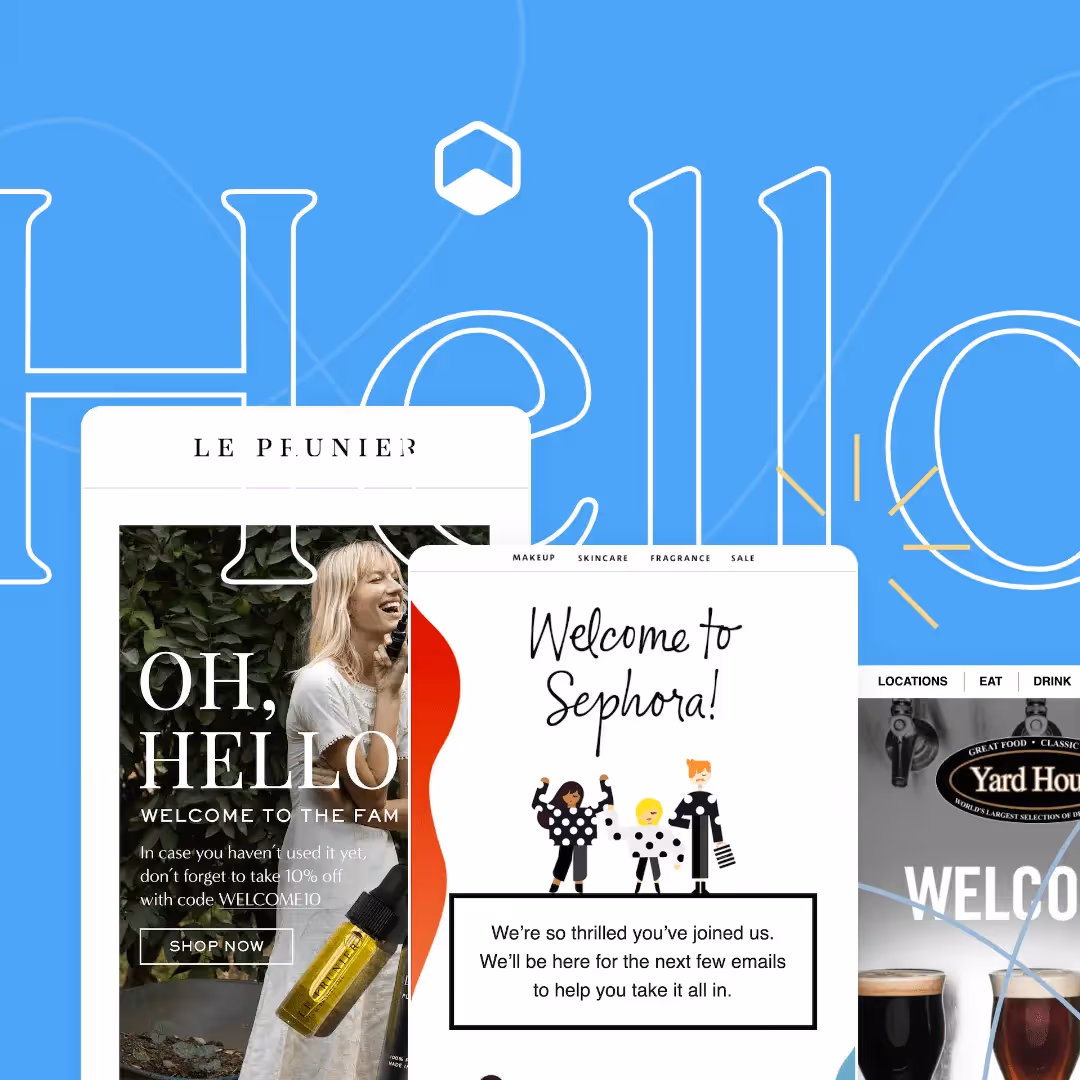
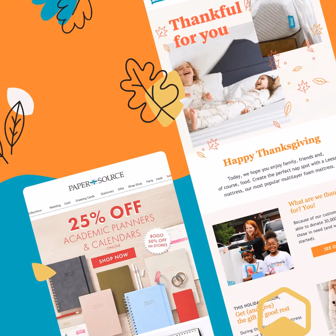
From the latest creative design strategies that inspire your next campaign to industry best practices and tech advancements, our newsletter is the go-to for all things creation.

By clicking Subscribe you're agreeing with our Privacy Policy