Beefree blog

Design Tips for Using Background Colors in Email

Beefree team
Beefree team
Jul 5, 2023
Design Tips for Using Background Colors in Email

How do you add visual interest to your emails? If you’re like most brands, you probably rely heavily on product images and graphics. There’s nothing wrong with that. But you might be overlooking an easy way to create more engaging marketing emails: Email background colors!Background colors can organize content and establish hierarchy. When they’re used behind images, they can even reinforce your design when image-viewing is turned off. In fact, color can improve audience comprehension by 73% and, according to the same study, marketing with color is read 42% more often than marketing in black and white. Plus, HTML background colors render across all inboxes and are easy to create.

Email background colors can organize content and reinforce your design. Plus, they're easy to create!

Many emails will maintain a white background and reserve color blocking for headers and footers. This visually separates intro and outro content from the body of the email. Here’s an example from Crate & Barrel that uses a white and gray background in the body of the message, but includes a pop of red in the header.

email CSS background color

Using a simple color palette and incorporating plenty of white space are best practices in email design. But there are also emails that pull off background colors in a fresh and inspiring way — and not just in headers or footers.

Tips for selecting email background colors

Here are a few key tips for using email background colors creatively in email, with inspiration from brands that aren’t afraid to go bold with color.

#1 Select a color scheme 

You want your email to look visually appealing and professional, so instead of simply choosing one background color, you want to choose a full color scheme of 3-5 coordinating and contrasting colors. There are a few things to keep in mind for your color scheme:

  • Keeping your email’s image inline with your branding
  • Creating the feel you want for your email (e.g., an exciting feel vs. a formal, corporate feel)
  • Matching colors to your content (e.g., bright colors for a summer sale or colors that align with the holiday or event your email is highlighting)

Consider how put-together this email looks because of its color scheme:
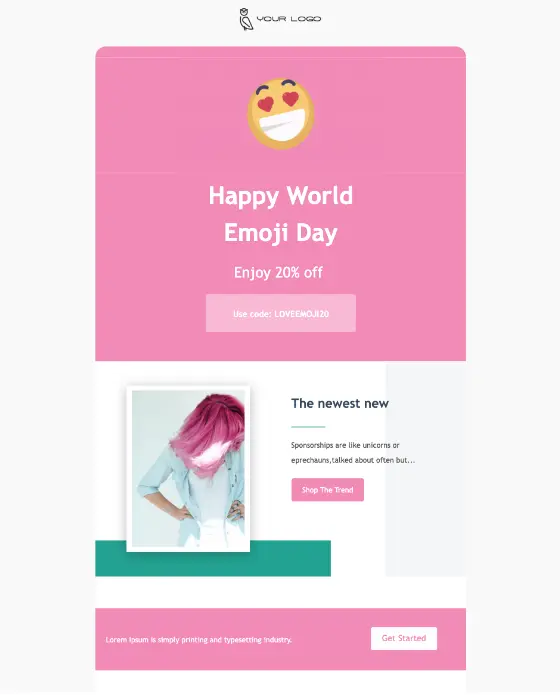
happy world emoji day email template example

#1. Combine images and background colors

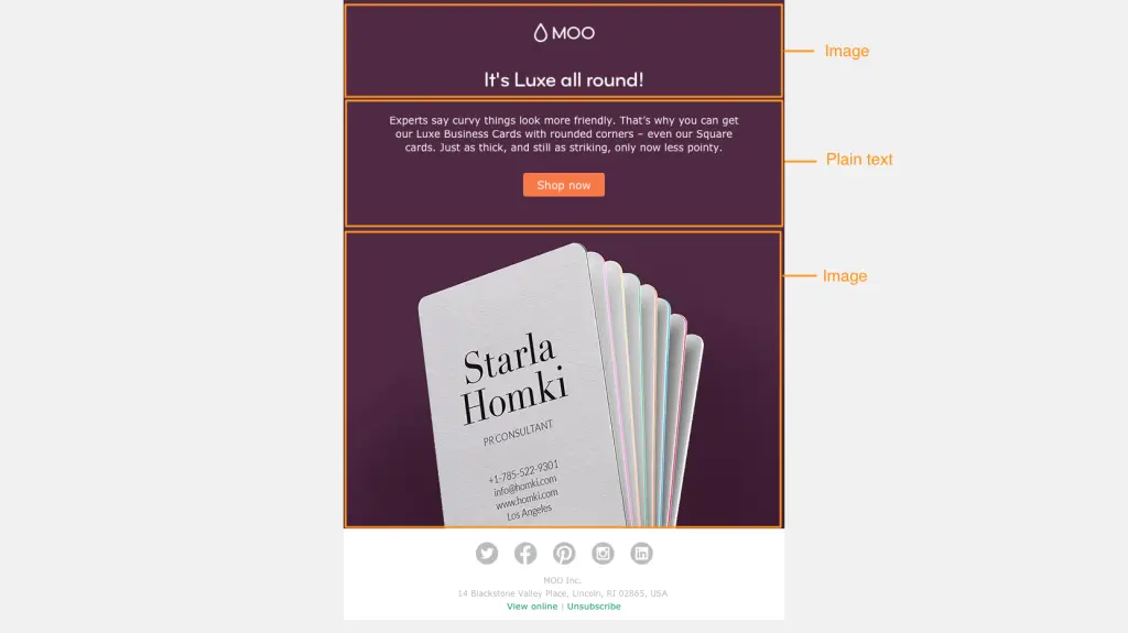
Emails that are made up entirely of images (with little to no plain text) are problematic. Some people won’t be able to see an image-only email at all because of their email client settings. Image-only emails often end up in spam folders or don’t get fully downloaded. And they aren’t mobile-optimized, either. That’s why we always insist that effective emails have a balance of images and plain text (at least 500 characters of text).Check out this email from Moo, a website that helps you design and print business cards, first with image-viewing turned off:
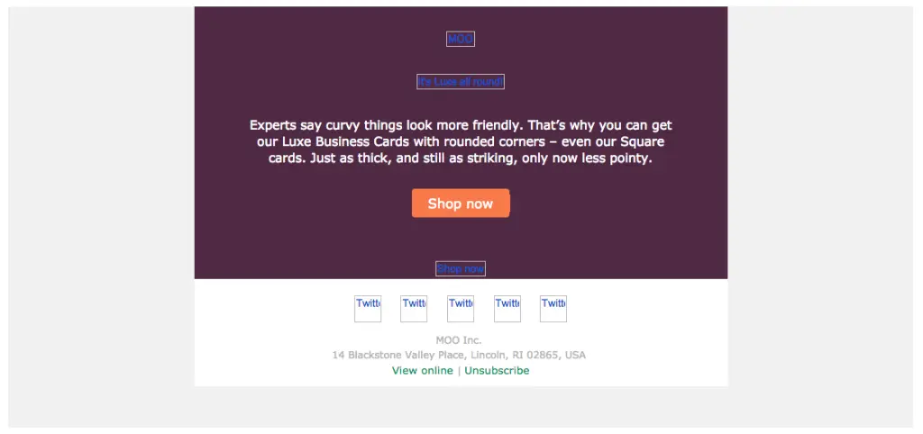
Screen Shot 2016-02-16 at 4.17.23 PM

And then with images turned on:

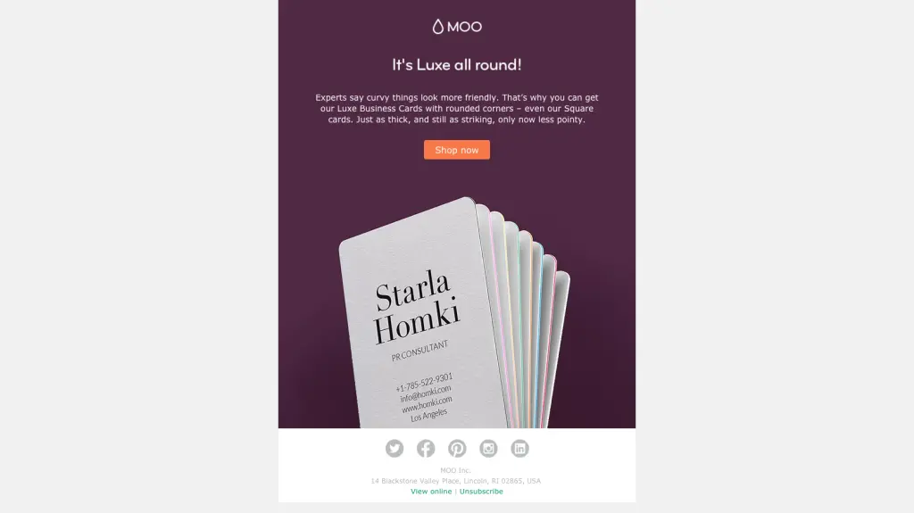
Moo

Once the images are viewable, we can see that most of the top portion of the email is plain text, while the second half is an image of a stack of business cards. But put together, it looks like the email is a single, solid image. The two modules of the email seamlessly flow into each other through the use of the deep purple email CSS background color.
Moo markup

This design tactic is clever. It allows Moo to use color in a simple, striking way to build an email that has a single visual focus (and looks like one cohesive image or module). But it simultaneously allows Moo to avoid sending an image-only email.To pull off this kind of message, three elements of the email need to match:

  1. The background color of the photos
  2. The HTML background color of the plain text section
  3. The background color of the ALT text when images don’t appear.

If you don’t know the HTML color code of an image or graphic, a web tool like HTML color codes will let you upload a photo to determine the colors used.Moo’s email is also optimized with email-safe text and bulletproof buttons that will always render. And the styled ALT text background upholds the structure of the design, even when images aren’t viewable. It’s a great way to make background colors work with your product photos to create a bright, bold email that’s eye-catching and a change of pace from a sterile white background.

#2. Use a single background color for the entire email

It can be tough to break away from the typical white background, and using a background color throughout your email can significantly change the impact it has on readers. So when you’re using color in a way that can potentially be pretty overpowering, like top-to-bottom in an email, it’s wise to think about the feeling you want to evoke first. Brands that do this well often choose a branded color that’s a light shade.Here’s an email from Chobani that uses its pale tan brand color as the background:

email with css background color

A uniform non-white background color works well here (and looks great) because contrasting font and link colors are used so all text is easy to read. Plus, the pale shades act similarly to a white background: They help the email feel light and airy.

#3. Separate content sections with background colors

One of our favorite ways to use vibrant email CSS background colors in email is section by section. It’s one of the most effective organizational uses of color, making clear where one section ends and another begins. We recently received an email from Draper James that’s a great example of this. The blue, white and pale peach sections clearly stand out. The colors are on-brand and complement each other, and it’s easy to navigate the message to find what you need.Similarly, Otherwild uses bold background colors to separate different modules of its email. The blue, green and orange match the products shown in the photos, helping the merchandise stand out. Incorporating email CSS background colors in sections is a great way to visually break up long emails and keep the reader scrolling.

color blocking in email

The blue, white and pale peach sections clearly stand out. The colors are on-brand and complement each other. And it’s easy to navigate the message to find what you need.Similarly, Otherwild uses bold background colors to separate different modules of this email:

color blocking in email

#5. Design an inclusive and accessible-friendly color scheme

Your color scheme can make or break the accessibility of your email in ways you may not realize. For example, people with visual impairments will have a hard time reading your email if there isn’t enough contrast between the background color and the text color. Another important consideration is how your color scheme will look to people who are colorblind. While there are different types of colorblindness that will impact readers in different ways, some general rules to follow include:

  • Avoid a color scheme of reds and greens - especially placing green text on red backgrounds and vice versa.
  • Blue and red hues contrast well for most people with colorblindness, so this is an excellent starting point for your color palette. The same is true for yellow and orange.
  • Include a combination of light and dark colors - while people with colorblindness may not see the same hue, they will see the same darkness as others, so this can help them understand your email.

Remember that chances are that you have people on your email list who have either color blindness or visual impairment - color blindness affects an estimated 300 million people worldwide and 2.2 billion people globally have visual impairment. Always design your colors with inclusivity in mind.

#6. Use an email editor to add HTML background colors without coding 

Using HTML to create background colors in your email is an industry-wide best practice. Each email program your recipients may be using (Gmail, Outlook, etc.) interprets email data differently, but HTML background colors will translate properly in all mainstream email providers so more readers see what you want them to see. Don’t know how to code HTML? No problem! An email editor gives you a user-friendly design interface and translates your design into HTML so you get the benefit of HTML background colors without the coding work.

FAQ: Email background colors 

Have some questions about how to implement background colors into your emails and inboxes? We’ve got answers! Check out these commonly asked questions.

How do you change the email background color in Outlook?

Outlook is designed for sending individual emails rather than mass emails such as email marketing. Still, you can customize your Outlook emails by changing the background color. With the draft message open, click on “Options” at the top of the window and click “Page Color.” This will let you customize the background color.

How do I change my Gmail email background color?

Gmail doesn’t allow you to set a background color in an email you are sending. You can, however, change the background color of your Gmail interface. Click on the gear icon in the top right corner and click “See All Settings.” In this menu, click “Theme” and choose a background image or background color.PRO tip: Beefree is compatible with both Gmail and outlook. That means you can easily design email assets in Beefree and effortlessly export them to Gmail or Outlook. 

Get started with free HTML email templates

Using strategic background colors is one of many best practices you can use to make your emails more effective. You can implement this and other email design practices with ease using Beefree’s HTML email templates. Explore our variety of templates designed for different purposes and audiences and start building more buzz for your business today.

Share this post with your friends! Pin it on Pinterest ?

email layout with background colors

Editor’s Note: This post was updated on July 2023 to ensure accuracy and comprehensiveness.
Related posts

The Importance of Mobile Analytics in Improving Email Experience

Leveraging mobile analytics helps you create better mobile email experiences that drive sales, revenue, and loyalty. Discover how in this guide.
Beefree team
Dec 20, 2024

We live in a mobile-first world. We shop, socialize, work, and create on our phones, expecting seamless, intuitive, and frictionless experiences. As email marketers, we often rely on educated guesses and hard-to-win feedback to improve campaigns. But mobile analytics can revolutionize this process.

Mobile analytics unlock valuable real-time insights into user behavior, preferences, and engagement,  accelerating how fast we can make improvements to our email marketing campaigns.

Let’s discuss the role of mobile analytics in UX and how you can use it to boost satisfaction, sales, and loyalty.

What is mobile analytics?

Mobile analytics is gathering and analyzing user data and behaviors specifically on mobile websites, apps, and devices. This insight comprises of qualitative and quantitative data, such as:  

  • How long readers interact with your email or landing pages
  • Which elements (like CTA buttons) get the most clicks or which don't get interacted with at all
  • The navigational path that users take through your email.
  • The path users take after clicking an email link.
  • Points of friction such as poorly optimized layouts or broken links.
  • Performance issues like slow-loading images or inaccessible designs.

Key differences between mobile analytics and traditional analytics

While traditional analytics might measure desktop-based metrics, mobile analytics reveals how factors like responsive design, mobile-friendly layouts, and load times impact engagement.

From interactions like swipes, clicks, to even orientation changes (landscape vs. portrait). For email marketers, this means deeper insights into how users engage with your content on mobile.

Key email metrics in mobile analytics

These are commonly measured because each gives you important information about user engagement and your email's performance. Collectively, they give you an overarching view of what’s working well and what isn’t so you can improve your campaigns.

  • Open rate: Helps you assess whether your email captures interest at first glance. Low open rates on mobile may signal that your subject lines or send time isn’t aligned with user preferences. For mobile users, shorter, punchier subject lines often perform better, as they’re fully visible on smaller screens.
  • Device-specific click rates: Analyzing clicks segmented by device type (e.g., smartphones vs. tablets) can help you understand how different mobile experiences affect engagement. . For example, smartphone users may prefer more streamlined layouts, while tablet users may enjoy more detailed content.
  • Scroll depth: Tracks how far users scroll through your email on mobile devices. If users don't scroll past the top of your email on mobile, this may guide you to add the most important content above the fold.
  • Bounce rate: Measures how often users exit or leave your linked pages immediately after clicking through from an email. On mobile, high bounce rates might stem from slow-loading pages, confusing navigation, or unresponsive design.
  • Conversion rate: This is the percentage of users who complete a desired action, such as making a purchase or clicking on a landing page. It offers insight into how effectively your emails are in achieing the intended goals whether it is a traditional campaign or experiential.

Whatever metrics you prioritize, make sure to integrate a robust, accurate data processing pipeline. This guarantees real-time insights, so you’re always making decisions based on the latest figures. 

How mobile analytics can help you improve user experience

1. Identify gaps and friction early on

Delivering a smooth user experience is crucial for high engagement. If users encounter barriers that prevent them from taking action, it's best to know the root cause sooner rather than later. 

Mobile analytics uncover navigational and performance issues like confusing layouts, unresponsive buttons, or poor readability.

For example, if a significant portion of users drop off after opening your email, analytics might reveal slow-loading images or unclear CTAs as culprits. You can also pair your website's mobile analytics to inform your email campaigns.

For example, let’s say that a high volume of users is churning during your in-app checkout process, which according to the Baymard Institute study might happen for varying reasons.

Image sourced from baymardinstitute.com 

On your website you may integrate a solution like Vonage Cloud PBX to enable users to contact your customer support team directly from the checkout page. Or proactively offer support via live chat (just make sure to follow TCPA compliance). But then you can go one step further and set up abandoned cart campaigns to re-engage users. 

In short, mobile analytics can provide helpful insight into your users' actual experience, allowing you to explore new and creative solutions. You can use tools like a Kanban board to plan your approach, create visualizations of the user journey, pinpoint priority areas for improvement, and assign tasks to relevant teams.

2. Analyze user flows

Mobile analytics shares valuable insight on your user journey-- from opening and to become a customer. For example, if users abandon your landing page after clicking an email, it could signal that the page design or content isn’t aligned with their expectations. This could mean your page needs to be simplified or your emails need to be a lot more clear.

Again, you can pair your website's or apps mobile analytics to then guide your email campaigns. A recent survey by Newstore found that 60% of shoppers prefer mobile apps over mobile websites. Mobile apps are easier to use, leading to better UX, increased sales, and higher retention.

Image sourced from newstore.com

If you're noticing that users are not as active on mobile app, this could mean your app interface needs to be simplified or that folks may need more guidance. You could send a series of onboarding emails to help customers use your product effectively.

Along with understanding where the friction lies, mobile analytics tells you what motivates consistent engagement. Analytics opens and conversion rates on mobile vs. desktop can uncover the drivers behind engagement and retention for mobile users. It might be that certain types of notification emails encourage repeat interactions.

Overall, understanding what drives loyalty can help you optimize user journeys at scale to drive repeat engagement and long-term retention, making sure you get a good return on your email marketing efforts and app development cost.

3. Create personalize experiences

Mobile analytics offers a deeper understanding of user behavior and preferences. This can be used to segment users and create personalized experiences. You can feed mobile analytics into your CDP and CRM to help you accurately segment customers according to their preferences, user behavior, demographics, and stage in the customer journey. One way to personalize the experience is to tailor the timing of email notifications to when they are most active or recommending solutions to users based on their preferences.

From there, you can then A/B test multiple versions of a personalized email to asses what actually turns leads into customers. For example, you might test two different layouts or calls-to-action.

Design seamless mobile experiences with Beefree

Whether you're crafting emails for E-commerce, SaaS, or B2b, creating convenient, seamless experiences for mobile users is crucial. Mobile analytics keeps your business attuned to the unique needs of your mobile customers. From streamlining journeys to personalizing experiences, the valuable insights gleaned from mobile analytics help you drive sales and retain customers.

Beefree’s Mobile Design Mode eliminates guesswork, allowing you to design with confidence for the fastest-growing segment of email users: those on mobile devices. Our Mobile Design Mode feature allows you to preview and edit emails specifically for mobile devices, ensuring that your design elements—such as images, text, and buttons—adapt perfectly to smaller screens.

Start designing with ease now.

Celebrating the 2024 Really Good Emails Award

Discover the standout email campaigns that defined 2024 in the first-ever Really Good Emails Awards. Dive into the insights and inspiration that can elevate your email marketing to award-winning heights.
Beefree team
Dec 18, 2024

Ten years, thousands of emails, countless "ooohs" and "ahhhs." Since their inception, our friends at Really Good Email have been curating the most mind-blowing emails to save you from “meh” campaigns. Meanwhile, we at Beefree have been busy helping you turn that inspiration into inbox gold.

Now, we’re taking it up a notch with awards for the best of the best with the first-ever 2024 Really Good Emails Awards. Think of it as email’s version of the Oscars—minus the long speeches.

These emails didn’t just meet expectations—they redefined them. Selected from thousands of entries in the RGE collection, the winners embody:

  • Community favorites: Campaigns you searched for, saved, and clicked on the most.
  • Innovation and trends: Designs that pushed boundaries and set new benchmarks.
  • Strategic brilliance: Perfectly balancing email marketing fundamentals with bold creative risks.
Download the awards

Why these awards matter

Email marketing continues to be one of the most effective ways to engage audiences and drive results. The RGE Awards serve as a benchmark for what’s possible, setting new standards for creativity, strategy, and impact. By studying these campaigns, you can:

  • Stay ahead of trends: Understand the latest innovations shaping the industry.
  • Refine your strategy: Learn how to balance creativity with proven marketing principles.
  • Elevate your designs: Incorporate bold, eye-catching elements into your emails.

Not another boring resource: Here's what's inside

The Awards PDF is the ultimate cheat sheet full of strategies, free templates, and inspiration for designing award-winning emails. From standout visuals to innovative CTAs, every element of these campaigns offers a lesson in excellence.

  • Winner highlights (duh): Why they stole the show and actionable insights you can steal to create your own magic.
  • Easy access to all winning emails and categories: All of the best of the best in one place.
  • The ultimate cheat sheet: We're done the heavy lifting for you and linked templates in Beefree similar to the winning emails 👀
  • Exclusive Beefree deal: Black Friday came a little late, but we delivered.
  • and so much more! 

A closer look at the winning categories

We've rolled out the red carpet for the crème de la crème of email design and strategy, competing across 11 categories. Handpicked from 17,000+ emails in our vault, they’re here to spark some serious 2025 inspiration.

  • Welcome emails
  • Product launch
  • Re-engagement emails
  • Pet emails
  • Outdoor/travel emails
  • Drinks emails
  • Subject line
  • Best CTA
  • Quiz
  • Seasonal email
  • Most creative email

The competition also highlighted runner-ups like Lifesum, Google, and Ollie, whose campaigns showcased exceptional creativity and innovation. While these didn’t take the top spots, they serve as shining examples of effective email marketing that connects and converts.

Download the full Awards resource to access all the winners, runner-ups, and actionable insights.

A sneak peak

From sleek designs to impactful messaging, each winner showcased the pinnacle of what’s possible in email marketing. Highlights include:

🥇Best welcome email: Miro

First impressions matter, and Miro’s welcome email excelled with its clear onboarding steps, bold visuals, and action-oriented CTAs. 

Runner-ups like Lifesum’s starter kit email also showcased how to combine simplicity with effectiveness, turning new users into engaged participants right from the start. Welcome emails are more than a handshake—they’re the start of a journey that can shape long-term customer relationships.

Download the full award deck

🥇Best product launch: Volkswagen

Volkswagen’s email captivated audiences with interactive features and vibrant visuals. Its playful yet professional tone made the T-Cross launch feel both aspirational and accessible. 

Other brands like Freaks of Nature and Google stood out with innovative product announcements that paired sleek designs with compelling messaging. Product launch emails have the power to turn curiosity into action, driving immediate engagement.

Download the full award deck

🥇Best re-engagement email: Sometimes Always

Sometimes Always redefined personalization and urgency with a campaign that felt tailored and compelling. Their email leveraged customer data to create a sense of exclusivity and importance. 

Honorable mentions include Tillamook and Nonny, which excelled at rekindling audience interest with humor, warmth, and timely offers. Re-engagement campaigns remind customers why they loved your brand in the first place.

Download the full award deck

🥇Best seasonal email: Touchland

Seasonal emails are an opportunity to tap into the zeitgeist while staying true to your brand identity, and Touchland does just that. Their Prime Day email turned a traditional sale announcement into a celebration of their brand. By combining playful design with clear value propositions, they created an email that felt festive and functional. 

Download the full award deck

These campaigns demonstrate that success in email marketing often lies in the details—from the strategic placement of a button to the tone of the subject line. By focusing on these elements, brands can create emails that not only look great, but also drive meaningful results.

Download the deck for the rest of the winners

What next? Turn inspiration into action

The 2024 Really Good Emails Awards celebrate more than just great campaigns—they’re about inspiring your next big idea. With tools like Beefree, you can bring these award-winning elements to life. Here’s how:

Join the celebration

The email marketing community thrives on sharing and collaboration. Join us in celebrating the creativity and innovation that make email marketing such a dynamic field. Share your favorite campaigns with Really Good Emails and be part of the conversation shaping the future of email design.

Here’s to a future filled with creativity, connection, and campaigns that inspire.

How to Make Privacy Policy Emails Worth Reading

Privacy emails don’t have to be boring or overlooked. Learn how to craft legal emails into engaging messages that don't hurt your sender reputation.
Emily Santos
Dec 13, 2024

From time to time, our favorite brands send us a privacy policy change email. And let’s be honest, most of the time, we just skip them and pay them no attention. 

As an email marketer, though, you might be required to send these emails. Luckily, you only have to send privacy policy notices when you update your privacy policy—which is usually only once per year (the CCPA requires this, in fact). 

So how do we make these less than exciting, but important emails at least worth reading? Let’s get into it.

Can privacy policy emails hurt your email reputation?

While sending privacy policy emails provides users with transparency, they can hurt your email sender reputation. To many sending platforms, privacy policy emails and terms of service emails often look like spam (the irony). This is likely due to fact that these emails are usually all text and send to the masses. Luckily, there are ways to lower the risk of being exiled to the spam folder.

Best practices for sending privacy policy emails

1. Send in small batches

As tempting as it might be to just press “send” once and be done with it, we recommend sending these emails in batches for 1,000-5,000 recipients depending on your list size. Gmail and Outlook specifically look at large sends as spam-like behaviour, which may lead to higher bounce rates, blocks, or the likeliness of landing in the spam folder. Some ways to organize your batches include:

  • Segmenting your audience by levels of engagement or user activity. For example, send first to folks who recently engaged with an email and less likely to mark you message as spam.
  • Adjust timing based on optimal hours when subscribers are more likely to engage based on time zones.

As you send each batch, be sure to monitor the performance to address any issues before scaling up.

2. Set the right intentions

We know you want people to open your email and that not everyone will say, “Oh cool, a new privacy policy! I can’t wait to read,” but honesty is the best policy. Make your subject line transparent about what it contains but also note it’s an important email to open.

Don’t get too wordy, but you can get a little cheeky and fun with it if this suits your brand. For example: “Our Annual Privacy Policy Update (We Know You’ve Been Waiting for It).”

Or take note out of the Really Good Email playbook and poke fun at the not-so-fun email with something like "Our lawyers made us send this boring update."

3. Write like a human

Privacy policies, like any other legal documentation, are usually full of complex legalese that’s dull at best and confusing at worst. Nobody wants to wade through a sea of legal mumbo jumbo, and let’s be real—if it feels robotic, it’s getting ignored. A human, conversation approach makes potentially sticky updates easier to digest.

We saw this first-hand from our friends at Really Good Emails. They connected with readers by being relatable, making the new updates easy to grasp, and dare we say entertaining. The result? 50% more opens and 40% more positive replies.

4. Don't waste people's time

As much personality as we can infuse to these type of emails, it doesn't change the fact that they're kind of boring. Keep things short and concise. Reel them by sharing the why behind the changes --what's the benefit they will get from these changes? This could be anything from "to better serve you" to "staying up to date with new regulations."

Then, highlighting the key changes in bullet points or bolded text. Avoid using legal terms. Finally, offer the ability for folks to learn more somewhere else if they're into that kind of thing.

This example by Skillshare does a great job at being concise.

(Source: Skillshare via Really Good Emails)

The email is clear and straightforward but the most effective thing they do is break out what the updates are, just as importantly, why they’ve made them. They also include several links to the privacy policy and terms of service so they’re easy to find, and they offer a way for recipients to contact them with any questions or concerns.

5. Consider a different sender IP address

Using a different sending IP address for legal and transactional emails can help protect your primary domain's sender reputation in the case that your privacy email batch does get red flagged. Even if you take all the precautions, privacy policy updates can elicit less engagement from recipients which can negatively impact future campaign performance-- for that reason alone, we recommend using a different IP address for varying types of communications.

6. Stay recognizable

A simple way to stay out of the spam folder is to not look like a spam email. Infusing your branding is a simple, yet effective way of assuring your audience you are a trusted source, not some random bot trying to steal their data.

Plus, it’s a subtle reminder that you care about keeping things polished and interesting, even when the topic is not. The email below from Assemble is a perfect example of how even a privacy policy email can be a tool to reinforce trust, strengthen customer connection, and establish brand recognition.

(Source: Assemble via Really Good Emails)

Privacy policy templates and examples you can steal

Now you're ready to start crafting your own privacy email. Here are some templates you can steal to kick things off.

#1: Comedic relief

If you want to show a sense of humor and relate to your customers, try this template:

Subject: Our Eagerly-Awaited Privacy Policy Update

"Some pieces of news you just can’t wait to find out: the conclusion to that mystery novel you’re reading, why your boss scheduled a last-minute meeting, who will win Too Hot To Handle, and the changes we made to our privacy policy:

Okay, we know you’re not exactly on the edge of your seat, but the lawyers say we have to send this every year so here you go. Here’s what’s new:

[summarize the changes]

Look at you, breezing right through that and being ready to take another year by storm! You can contact us with any questions at [email address], but otherwise, keep rocking and we’ll see you around."

Portland-based bank Simple uses a similar strategy in their privacy emails: 

(Source: Simple via Really Good Emails)

This email is relatable and honest, not to mention funny and engaging. They relay the message in the way you’d probably relay it to a friend: they’re conversational, they’re human, and they’re understandable. They break down the update and translate it piece by piece for the reader to understand. According to a blog they posted about it, they had nearly 200 people reply with positive comments. 

#2: Short and sweet

Keep your time and your recipients’ time to a minimum with this concise yet clear privacy policy email template:

Subject: Important Updates to Our Privacy Policy

"In an effort to maintain transparency about your data and how we use it, we’ve updated our privacy policy, effective on [date]. Here’s what has changed:

[summarize updates]

Click the button below to read the full privacy policy. If you have any questions or concerns, reach out at [email address]. Thank you for being a valued member of the [brand] community."

Hims is a telehealth company specializing in medications for men, and they’ve mastered the art of keeping it short and sweet:

(Source: Hims via Really Good Emails)

They’re as concise as can be—just a few paragraphs stating what they’re emailing about and informing customers of their implied consent, along with a link to see the full text. This lets the recipients immediately know what the email’s about and decide if they want to dig into the full policy text.

What’s also done well here, though, is the branding. As simple as this email is, it follows the brand’s aesthetic so it’s easy for customers to recognize and trust.

Start crafting privacy emails worth reading with Beefree

A well-crafted, branded privacy policy email does more than just inform—it builds trust and strengthens your relationship with your audience. Beefree can make it easier to nail your next privacy policy email.

With our intuitive drag-and-drop editor, you can effortlessly design emails that incorporate your branding, ensuring that even legal updates stay aligned with your company’s tone and identity. The best part? It's free.

The Importance of Mobile Analytics in Improving Email Experience

Leveraging mobile analytics helps you create better mobile email experiences that drive sales, revenue, and loyalty. Discover how in this guide.
Beefree team
Beefree team
20 Dec
2024

We live in a mobile-first world. We shop, socialize, work, and create on our phones, expecting seamless, intuitive, and frictionless experiences. As email marketers, we often rely on educated guesses and hard-to-win feedback to improve campaigns. But mobile analytics can revolutionize this process.

Mobile analytics unlock valuable real-time insights into user behavior, preferences, and engagement,  accelerating how fast we can make improvements to our email marketing campaigns.

Let’s discuss the role of mobile analytics in UX and how you can use it to boost satisfaction, sales, and loyalty.

What is mobile analytics?

Mobile analytics is gathering and analyzing user data and behaviors specifically on mobile websites, apps, and devices. This insight comprises of qualitative and quantitative data, such as:  

  • How long readers interact with your email or landing pages
  • Which elements (like CTA buttons) get the most clicks or which don't get interacted with at all
  • The navigational path that users take through your email.
  • The path users take after clicking an email link.
  • Points of friction such as poorly optimized layouts or broken links.
  • Performance issues like slow-loading images or inaccessible designs.

Key differences between mobile analytics and traditional analytics

While traditional analytics might measure desktop-based metrics, mobile analytics reveals how factors like responsive design, mobile-friendly layouts, and load times impact engagement.

From interactions like swipes, clicks, to even orientation changes (landscape vs. portrait). For email marketers, this means deeper insights into how users engage with your content on mobile.

Key email metrics in mobile analytics

These are commonly measured because each gives you important information about user engagement and your email's performance. Collectively, they give you an overarching view of what’s working well and what isn’t so you can improve your campaigns.

  • Open rate: Helps you assess whether your email captures interest at first glance. Low open rates on mobile may signal that your subject lines or send time isn’t aligned with user preferences. For mobile users, shorter, punchier subject lines often perform better, as they’re fully visible on smaller screens.
  • Device-specific click rates: Analyzing clicks segmented by device type (e.g., smartphones vs. tablets) can help you understand how different mobile experiences affect engagement. . For example, smartphone users may prefer more streamlined layouts, while tablet users may enjoy more detailed content.
  • Scroll depth: Tracks how far users scroll through your email on mobile devices. If users don't scroll past the top of your email on mobile, this may guide you to add the most important content above the fold.
  • Bounce rate: Measures how often users exit or leave your linked pages immediately after clicking through from an email. On mobile, high bounce rates might stem from slow-loading pages, confusing navigation, or unresponsive design.
  • Conversion rate: This is the percentage of users who complete a desired action, such as making a purchase or clicking on a landing page. It offers insight into how effectively your emails are in achieing the intended goals whether it is a traditional campaign or experiential.

Whatever metrics you prioritize, make sure to integrate a robust, accurate data processing pipeline. This guarantees real-time insights, so you’re always making decisions based on the latest figures. 

How mobile analytics can help you improve user experience

1. Identify gaps and friction early on

Delivering a smooth user experience is crucial for high engagement. If users encounter barriers that prevent them from taking action, it's best to know the root cause sooner rather than later. 

Mobile analytics uncover navigational and performance issues like confusing layouts, unresponsive buttons, or poor readability.

For example, if a significant portion of users drop off after opening your email, analytics might reveal slow-loading images or unclear CTAs as culprits. You can also pair your website's mobile analytics to inform your email campaigns.

For example, let’s say that a high volume of users is churning during your in-app checkout process, which according to the Baymard Institute study might happen for varying reasons.

Image sourced from baymardinstitute.com 

On your website you may integrate a solution like Vonage Cloud PBX to enable users to contact your customer support team directly from the checkout page. Or proactively offer support via live chat (just make sure to follow TCPA compliance). But then you can go one step further and set up abandoned cart campaigns to re-engage users. 

In short, mobile analytics can provide helpful insight into your users' actual experience, allowing you to explore new and creative solutions. You can use tools like a Kanban board to plan your approach, create visualizations of the user journey, pinpoint priority areas for improvement, and assign tasks to relevant teams.

2. Analyze user flows

Mobile analytics shares valuable insight on your user journey-- from opening and to become a customer. For example, if users abandon your landing page after clicking an email, it could signal that the page design or content isn’t aligned with their expectations. This could mean your page needs to be simplified or your emails need to be a lot more clear.

Again, you can pair your website's or apps mobile analytics to then guide your email campaigns. A recent survey by Newstore found that 60% of shoppers prefer mobile apps over mobile websites. Mobile apps are easier to use, leading to better UX, increased sales, and higher retention.

Image sourced from newstore.com

If you're noticing that users are not as active on mobile app, this could mean your app interface needs to be simplified or that folks may need more guidance. You could send a series of onboarding emails to help customers use your product effectively.

Along with understanding where the friction lies, mobile analytics tells you what motivates consistent engagement. Analytics opens and conversion rates on mobile vs. desktop can uncover the drivers behind engagement and retention for mobile users. It might be that certain types of notification emails encourage repeat interactions.

Overall, understanding what drives loyalty can help you optimize user journeys at scale to drive repeat engagement and long-term retention, making sure you get a good return on your email marketing efforts and app development cost.

3. Create personalize experiences

Mobile analytics offers a deeper understanding of user behavior and preferences. This can be used to segment users and create personalized experiences. You can feed mobile analytics into your CDP and CRM to help you accurately segment customers according to their preferences, user behavior, demographics, and stage in the customer journey. One way to personalize the experience is to tailor the timing of email notifications to when they are most active or recommending solutions to users based on their preferences.

From there, you can then A/B test multiple versions of a personalized email to asses what actually turns leads into customers. For example, you might test two different layouts or calls-to-action.

Design seamless mobile experiences with Beefree

Whether you're crafting emails for E-commerce, SaaS, or B2b, creating convenient, seamless experiences for mobile users is crucial. Mobile analytics keeps your business attuned to the unique needs of your mobile customers. From streamlining journeys to personalizing experiences, the valuable insights gleaned from mobile analytics help you drive sales and retain customers.

Beefree’s Mobile Design Mode eliminates guesswork, allowing you to design with confidence for the fastest-growing segment of email users: those on mobile devices. Our Mobile Design Mode feature allows you to preview and edit emails specifically for mobile devices, ensuring that your design elements—such as images, text, and buttons—adapt perfectly to smaller screens.

Start designing with ease now.

Celebrating the 2024 Really Good Emails Award

Discover the standout email campaigns that defined 2024 in the first-ever Really Good Emails Awards. Dive into the insights and inspiration that can elevate your email marketing to award-winning heights.
Beefree team
Beefree team
18 Dec
2024

Ten years, thousands of emails, countless "ooohs" and "ahhhs." Since their inception, our friends at Really Good Email have been curating the most mind-blowing emails to save you from “meh” campaigns. Meanwhile, we at Beefree have been busy helping you turn that inspiration into inbox gold.

Now, we’re taking it up a notch with awards for the best of the best with the first-ever 2024 Really Good Emails Awards. Think of it as email’s version of the Oscars—minus the long speeches.

These emails didn’t just meet expectations—they redefined them. Selected from thousands of entries in the RGE collection, the winners embody:

  • Community favorites: Campaigns you searched for, saved, and clicked on the most.
  • Innovation and trends: Designs that pushed boundaries and set new benchmarks.
  • Strategic brilliance: Perfectly balancing email marketing fundamentals with bold creative risks.
Download the awards

Why these awards matter

Email marketing continues to be one of the most effective ways to engage audiences and drive results. The RGE Awards serve as a benchmark for what’s possible, setting new standards for creativity, strategy, and impact. By studying these campaigns, you can:

  • Stay ahead of trends: Understand the latest innovations shaping the industry.
  • Refine your strategy: Learn how to balance creativity with proven marketing principles.
  • Elevate your designs: Incorporate bold, eye-catching elements into your emails.

Not another boring resource: Here's what's inside

The Awards PDF is the ultimate cheat sheet full of strategies, free templates, and inspiration for designing award-winning emails. From standout visuals to innovative CTAs, every element of these campaigns offers a lesson in excellence.

  • Winner highlights (duh): Why they stole the show and actionable insights you can steal to create your own magic.
  • Easy access to all winning emails and categories: All of the best of the best in one place.
  • The ultimate cheat sheet: We're done the heavy lifting for you and linked templates in Beefree similar to the winning emails 👀
  • Exclusive Beefree deal: Black Friday came a little late, but we delivered.
  • and so much more! 

A closer look at the winning categories

We've rolled out the red carpet for the crème de la crème of email design and strategy, competing across 11 categories. Handpicked from 17,000+ emails in our vault, they’re here to spark some serious 2025 inspiration.

  • Welcome emails
  • Product launch
  • Re-engagement emails
  • Pet emails
  • Outdoor/travel emails
  • Drinks emails
  • Subject line
  • Best CTA
  • Quiz
  • Seasonal email
  • Most creative email

The competition also highlighted runner-ups like Lifesum, Google, and Ollie, whose campaigns showcased exceptional creativity and innovation. While these didn’t take the top spots, they serve as shining examples of effective email marketing that connects and converts.

Download the full Awards resource to access all the winners, runner-ups, and actionable insights.

A sneak peak

From sleek designs to impactful messaging, each winner showcased the pinnacle of what’s possible in email marketing. Highlights include:

🥇Best welcome email: Miro

First impressions matter, and Miro’s welcome email excelled with its clear onboarding steps, bold visuals, and action-oriented CTAs. 

Runner-ups like Lifesum’s starter kit email also showcased how to combine simplicity with effectiveness, turning new users into engaged participants right from the start. Welcome emails are more than a handshake—they’re the start of a journey that can shape long-term customer relationships.

Download the full award deck

🥇Best product launch: Volkswagen

Volkswagen’s email captivated audiences with interactive features and vibrant visuals. Its playful yet professional tone made the T-Cross launch feel both aspirational and accessible. 

Other brands like Freaks of Nature and Google stood out with innovative product announcements that paired sleek designs with compelling messaging. Product launch emails have the power to turn curiosity into action, driving immediate engagement.

Download the full award deck

🥇Best re-engagement email: Sometimes Always

Sometimes Always redefined personalization and urgency with a campaign that felt tailored and compelling. Their email leveraged customer data to create a sense of exclusivity and importance. 

Honorable mentions include Tillamook and Nonny, which excelled at rekindling audience interest with humor, warmth, and timely offers. Re-engagement campaigns remind customers why they loved your brand in the first place.

Download the full award deck

🥇Best seasonal email: Touchland

Seasonal emails are an opportunity to tap into the zeitgeist while staying true to your brand identity, and Touchland does just that. Their Prime Day email turned a traditional sale announcement into a celebration of their brand. By combining playful design with clear value propositions, they created an email that felt festive and functional. 

Download the full award deck

These campaigns demonstrate that success in email marketing often lies in the details—from the strategic placement of a button to the tone of the subject line. By focusing on these elements, brands can create emails that not only look great, but also drive meaningful results.

Download the deck for the rest of the winners

What next? Turn inspiration into action

The 2024 Really Good Emails Awards celebrate more than just great campaigns—they’re about inspiring your next big idea. With tools like Beefree, you can bring these award-winning elements to life. Here’s how:

Join the celebration

The email marketing community thrives on sharing and collaboration. Join us in celebrating the creativity and innovation that make email marketing such a dynamic field. Share your favorite campaigns with Really Good Emails and be part of the conversation shaping the future of email design.

Here’s to a future filled with creativity, connection, and campaigns that inspire.

Stay informed on all email trends

From the latest creative design strategies that inspire your next campaign to industry best practices and tech advancements, our newsletter is the go-to for all things creation.

By clicking Subscribe you're agreeing with our Privacy Policy