

Earlier in this week's Design Inspiration post, we looked at how different brands use social media buttons in email: where they put them, how the color/shape/size is customized, and what purpose they serve (to share or follow).
Today's workshop
Today, we'll show you how to customize social media buttons in Beefreeso next time you're designing anemail campaign, you can give a little extra thought to those very important little buttons.Follow along as we show you:
- How and where to place social media buttons in your email
- How to add or remove different buttons
- How to customize the look of the buttons
- How to fine-tune with alignment, spacing, and padding
1. Position your social media icons
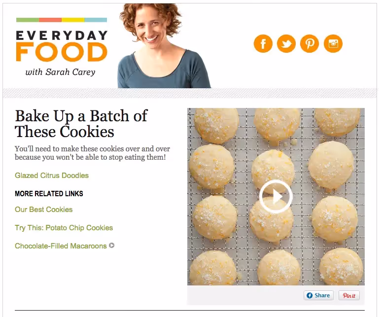
Most brands place social media follow icons at the header or footer of anemailwhere readersinstinctively lookforstandard info found in menus, like contacts and social media links. Design-wise, and from a message-comprehension point of view,it makes sense to placesocial media buttons at the opening or close of your email where they aren't interrupting the flow of your central message. An email's primary call-to-action is generally not about getting readers over to social sites; it's about getting them to make a purchase, sign up for an event, or take some kind of action. So it makes sense that social media buttons are positioned in a way to not steal the show.Let's review how toadd social media buttons to your email's header, similar to this email from Martha Stewart Everyday Food.
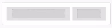
We'll need a two-column structure that accommodates a header image on the left and social buttons on the right, so we'll set up our header structure with this block:
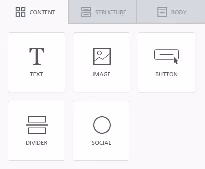
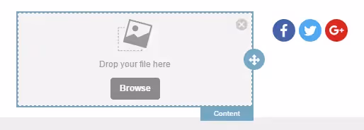
Then, from the Content menu, we'll pull in an image placeholder in the left side of the structure,and social media icons on the right.To add social media buttons to any email in Beefree, simply go to the Content menu and drag and drop theSocial content block into your email's structure, as we see below:
Here's our email header, ready to be customized:
We'll pull in our header image (in this case, we took a screen shot from the Everyday Food email).

And now we can focus on customizingourbuttons!
2. Add and remove social media icons
Now that the social media buttons are positioned in our email, we can click on them to activate our Content Properties menu to make changes.
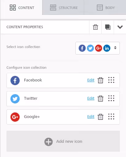
To mimic the Everyday Food email, we'll need four icons: Facebook, Twitter, Pinterest, and Instagram. From our Content Properties menu, we can configure our icon collection. Click the trashcan icon on the Google+ icon bar to delete it. Then, select"Add new icon" tobrowse for the ones we need.
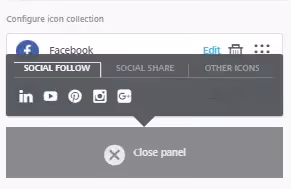
From the Social Follow menu, we select the Pinterest and Instagram icons. Beefree also provides built-in buttons for LinkedIn and YouTube, and, from the "Other icons" menu, an option to link or email content. To rearrange the order of the buttons, just drag them into your preferred position in the same menu on the right.Here's our new header with the social media buttons we need.

Remember to link each one to the appropriate account. Simply click "Edit" for each icon and add the appropriate URL.
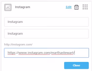
Each social button also has two editable fields--with default "Instagram" text, for example, in the image above. These are thetitle text HTML tag andthe ALT text HTML tag, respectively. Unlike BEE's bulletproof HTML buttons, social media buttons are images, so it's wise to fill out these fields.
3. Customizing your social media icons is easy!
Now that we have the buttons we need, we can format them in one easy step. Beefree offers four built-in icon collections to choose from. The Select icon collection option is the first formatting choice in the Content Properties menu. From it, we can choose betweentwo monochrome collections (all gray or all blue) and two multicolor collections, one with square icons and one with circular.
To keep the look of our header clean, we'll choose the gray scale.
If your brand has custom social media buttons, like these brand-colored orange ones for Everyday Food, you could bypass using the built-in social media icons from Beefree and drag in your own icons as images, linking the once they are in place.
4. Fine-tuning: how to apply alignment, spacing, and padding
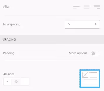
Now we can fine-tune the exact position of our buttons--and the space around and between them--so we're happy with the layout and balance of our header. To match Everyday Food's header, the icons need to come down and to the left, so they're centered within their structure.Back in the Content Properties menu, beneath the collection customization options, we have three more properties to configure: Align, Iconspacing, and Padding.
First, we'll change the alignment so the icons are center-adjusted (selecting the middleoption). This moves our icons over, so we go from this....

...to this:

Next, we can increase the spacing between the icons themselves with the Icon spacing option.It's set to a default of 5px between each, which looks good, but if we wanted to, we could increase to 10, 15, or 20:


Lastly, we can adjust the padding around the buttons. By turning on the More options switch, wecan increase padding specifically on the top, bringing the buttons downward.They're going in the right direction, but I'd still like them to come down a bit, even after adjusting the top padding to its 30px max:

To get more white space over top, we can further adjust the padding, not just on the buttons, but on the content container holding our buttons. Here's how: Select the row of content containing our entire header. The menu will change to view Row properties and Column properties.
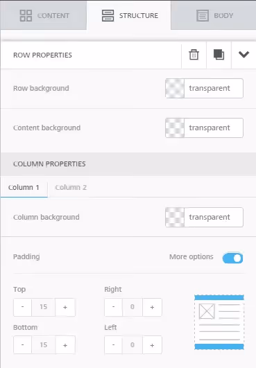
Since our social media buttons sit in the second column of our two-column header (remember that 2-column row structure we selected at the very beginning?), we can select Column 2 under Column Properties and continue to increase the top padding! Now it's just right. What do you think?

Adding and editing social media icons takes just seconds in the Beefree. Once you format the look of your buttons, you can also drag and drop them to the header or footer and test which position works best for your company and audience. Give it a try! And let us know how you do in the comments.


