Beefree blog

Design Tips for Holiday Shopping Emails

Beefree team
Beefree team
Dec 1, 2015
Design Tips for Holiday Shopping Emails

With shopping season in full swing, our overflowing inboxes serve upa great opportunity to check out design trends in holiday shopping emails. In today's Design Inspiration post, we'll review threetypes of effective holiday emailsto sendand how to design them, taking cues from top brands' emails.

Tip #1: Build a shopping guide

Shopping guides are a popularway to showcase products and inspireshoppers. Guides can provide ideas for specific people on shoppers'lists (an uncle, daughter, neighbor), suggestbestselling items, temptshoppers to treat themselves, or provide gift groupingideas. Whatever the approach, an effective gift guide shouldbe highly visual and easy to navigate.No need for lots of text here;viewers want to be able to check out the products quickly. Here are four effective design approaches for presenting your shopping guide in email.

Display top rated products in a grid layout

Here's a shopping guide from MAC cosmetics, showing top-rated products in a three-column grid layout.

Mac use

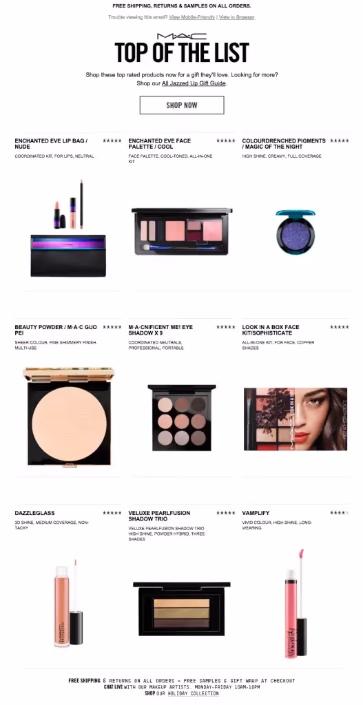
Notice there's ample padding between each item and very little descriptive text, making it easy forreaders to focus onthe products themselves. The streamlined photoshave no background, a style that lends itself to quick viewing, allowing multiple images to be displayed without a sense of clutter ordistraction. Overall, it'sa clean, efficient strategy to showcasea lot in a single email. Agrid layout like thiscanalso easily convert to a single-column design on mobile, so we were disappointed to see that the email was not responsive. Here's how it appeared on an iPhone:

MAC mobile

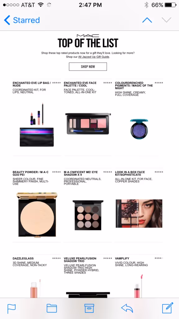
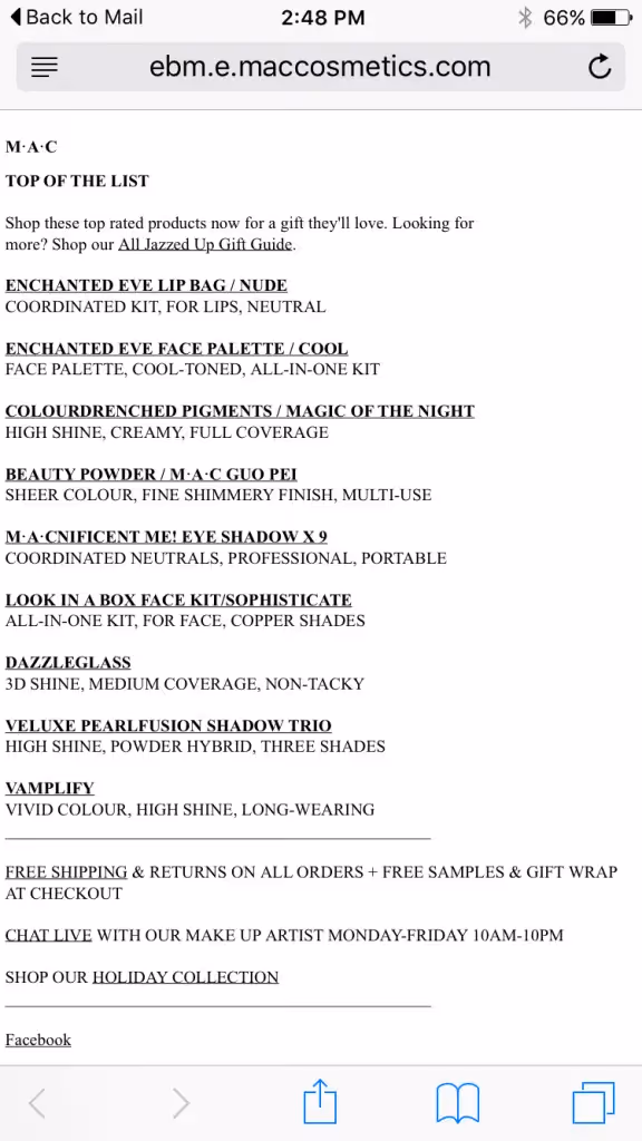
A "View Mobile-Friendly" link is available at the email's header, but it leads toa text-only version. It's easy to scan and gets the job done, but it's much less appealing than the photographic version.

mac view on mobile

Design Takeaway: Use a grid layout with high-quality no-background images, ample white space, and short descriptive text to display a lot of products in a single email—but make sure your design is responsive for optimal viewing on mobile.

List select picks with modular design

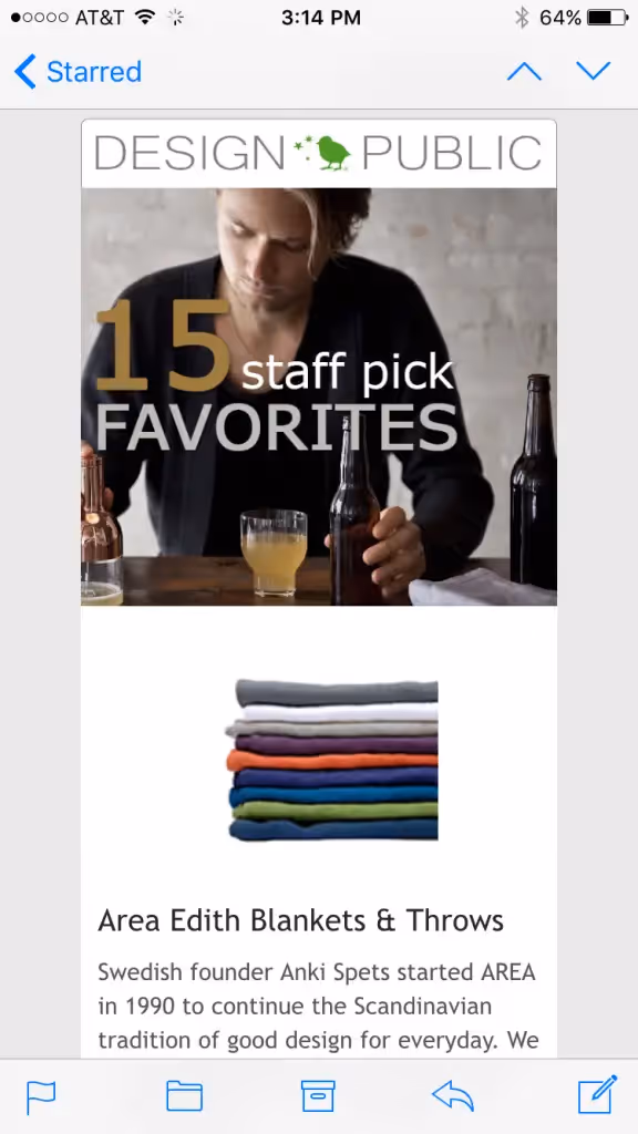
What better way to show a list than in list format? That's exactly what Design Public—a company that features products from emerging designers—did. Here's an email of 15 favorite gifts from their staff, using a single-column modular design:

Design Public

The format allows Design Public to add a bit more description, so this is a good option if you'd like to include a paragraph of text for each item on display. The horizontal green lines provide nice markers between sections, and the design is responsive, too:

Design public mobile 1

This layout requires lots of scrolling on mobile, but we know that mobile readers do scroll.Design Takeaway: Responsive, single-column, modular design is perfect for a gift list, but be cognizant of how much you'll be asking readers to scroll, especially on mobile (i.e., consider capping your list at 5 to 10 items).

Create an all-in-one-photo

Topo Designs, a seller of made-in-the-US backpacks, bags, and apparel, gives subscribers a peek at nine gift ideas in this well-designed photo collage:

Topo new

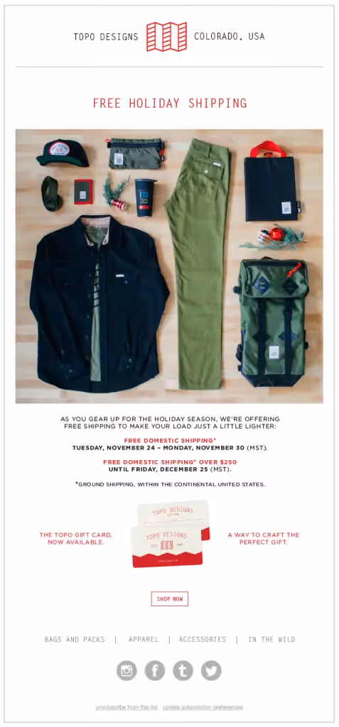
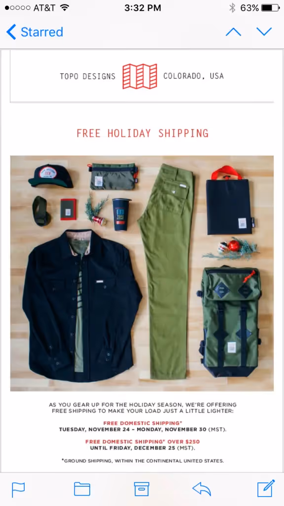
Though the email consists primarily of a single image, it avoids the pitfalls of an image-only emailwith a plain text message and ALT text for the image. The photo succeeds because the items are arranged neatly; it's simple and elegant.While there's no way to make a single image responsive, the email still looks good on mobile because the header—"FREE HOLIDAY SHIPPING"—is in a large font size, and the items in the photo are all pretty easy to make out. The concluding text is small and would have benefited from responsive design to bump up the font size, though.

topo mobile

Design Takeaway: Plan ahead to show your complete gift guide in one (or a few) neatly-organized photo that will resonate with your audience, but be cautious of how it will render on smaller screens, and be sure to have a good image-to-text ratio.

Show your shortlist with an animated GIF

Suit Supply, online retailer of men's suits and apparel, sent their "greedy" gift guide in email, rotating through a collection of five photos in an animated GIF. Here's the email:
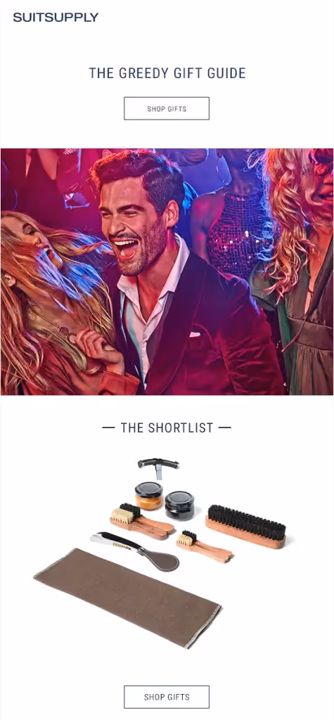
suitsupply use

And here's the GIF:

Suit supply

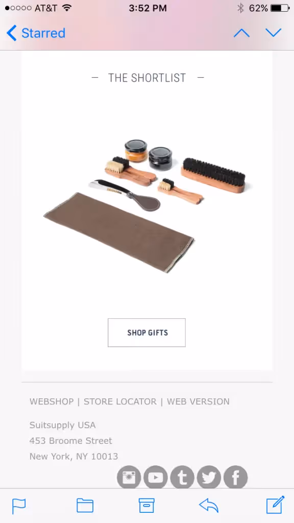
GIFs arean effective way to not only catch readers' eyes and appeal to design-savvy subscribers, but also to show multiple productswithout taking up too much real estate inan email. This message is short and snappy, with no product description whatsoever. The products themselves rotate really quickly, too. The point isn't to describeeverything in email; the point is to get readers inspired, and clicking. It looks sharp on mobile, too:

suit supply mobile

Design Takeaway: Create an animated GIF to inspire readers, cycle through multiple products without requiring scrolling, and communicate quickly and visually.

Tip #2: Tell a story that's true to your brand

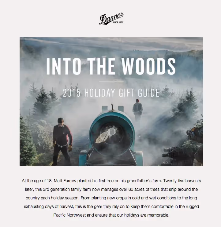
Another way to design an effective holiday shopping email is to engage readers through a simple narrative. When you peelback the curtain on thespecial products, people, or process behind your business through storytelling, you open up an opportunity to connect with readers on a deeper level. Like the gift guides, storytelling campaigns are equally as visual. Look at how Danner, an outdoor gear retailer, tells a story in threesentences:

danner zoom

And here's the full email, complete with more stunning photography:

danner

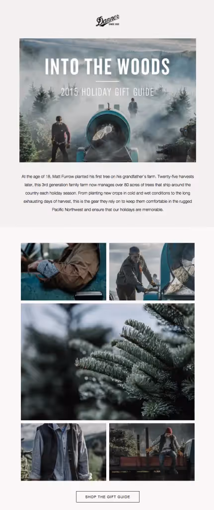
Telling the story of an individual tree farmer, Danner hopes to make a case for how effective and useful their gear is for actual people, inspiring readers to make a purchase. The text portion of the story is quick (just a few sentences), while the photos show readers the rest of the story. Neither the text nor the images are overly product-focused.Patagonia takes a similar approach in a recent email about "The New Localism," which they say, "engages our community to protect threatened places that are home to the sports that inspire our adventures and the products our company makes."

patagonia zoom

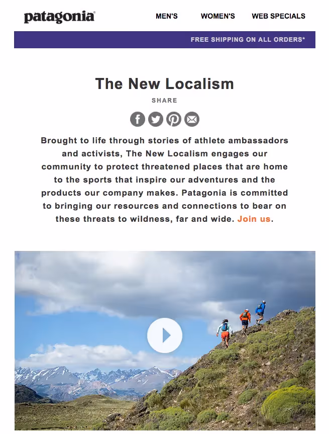
Similar to the Danner email, this message doesn't put Patagonia products front and center (in fact, there's no blatant product advertising at all), but it seeks to inspire readers by revealing something authentic and inspiring about the brand itself.Design Takeaway: Appeal to readers with a story that connects them to your brand identity without making your email overtly product-focused. Any story you tell should be well thought-out in advance, including original multimedia componentslike photos or videos.In a different form of storytelling, Bumble & Bumble takes an infographic-like approach to guide readers through suggested products:

bumble and bumble

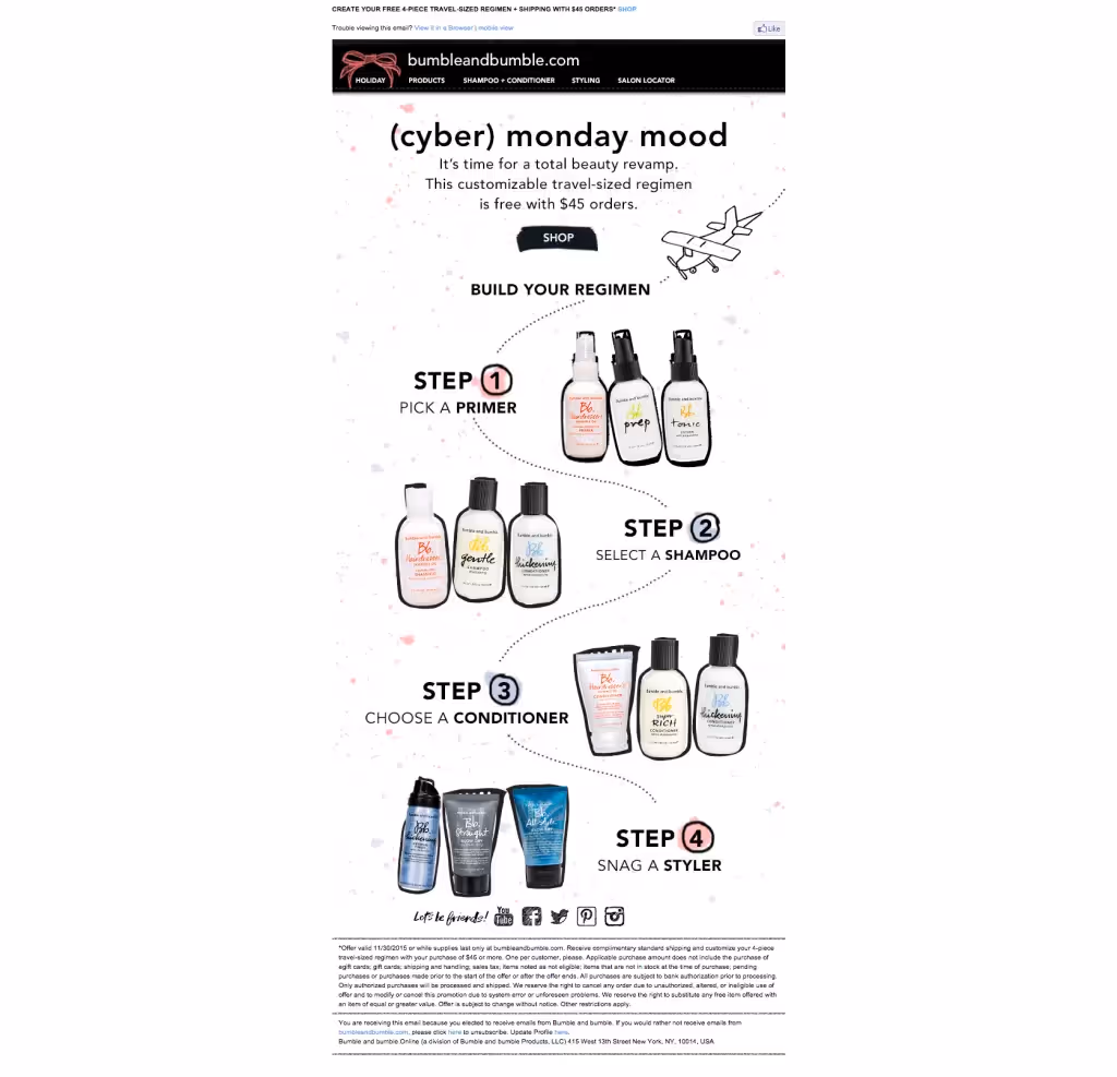
It's kind of like one of those choose-your-own-adventure stories that invites readers to participate. It's cute and fun and a good tactic for engaging your audience—plus, it's more interesting than simply laying outthe products in a grid or list.Design Takeaway: Get creative with how you interpret "storytelling" and come up with a design that engages readers, inviting them to follow along and ultimately make a purchase.

Tip #3: Highlight deals and savings

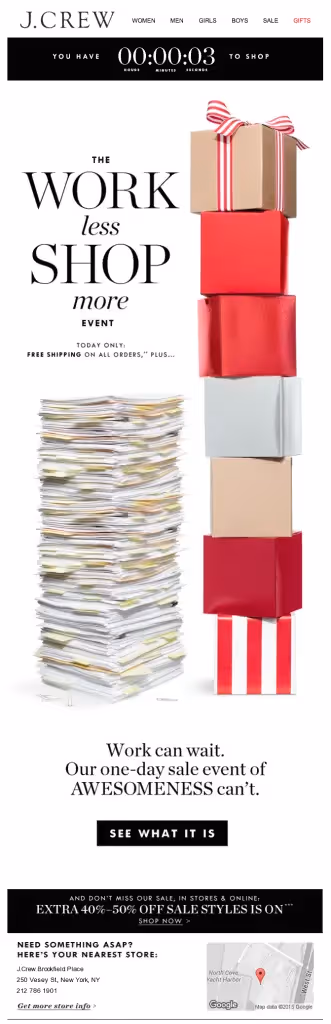
One of the most common and popular holiday shopping emails is one promoting a special sale or deal. These emails are straightforward, focused, and should have a very clear call to action. By and large, these emails fall into the category of "image-only" emails, which is not an email design best practice. Image-only emails are problematic for a number of reasons: some people won’t be able to see an image-only email at all because of their email client settings; image-only emailsend up in spam folders; they aren’t mobile-optimized; and they may notgetfully downloaded. (Read our full post onhow to avoid the pitfalls of image only-email).Nonetheless, many major brands opt to take these risks in favor of designing a highly visual,image-heavy email announcing the seasons's sales and discounts. Here's an example from J. Crew, complete with an animated GIF countdown clock at the top and a tall image that makes up the full body of the email:

jcrew use

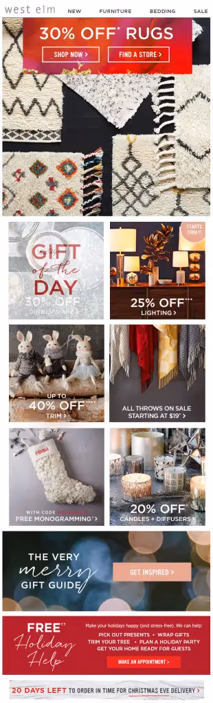
Many retailers like J. Crew commonly send image-only emails. West Elm is another brand to often take this approach:

west elm

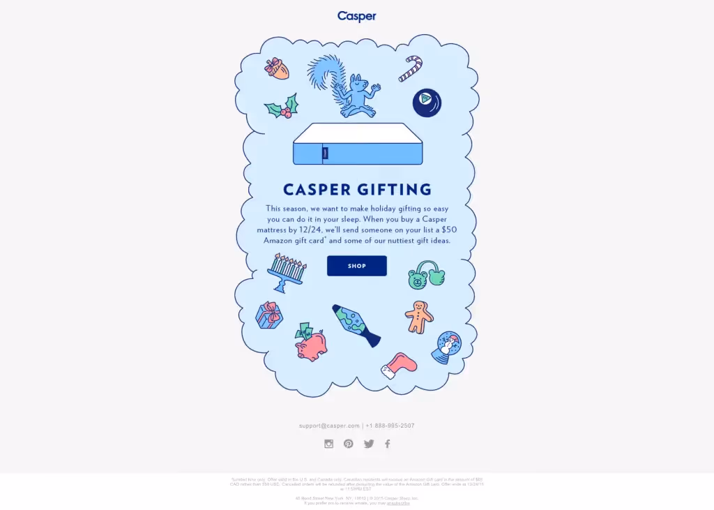
Similarly, Casper, the mattress retailer, sent a fully illustrated email:

Casper deal

This one from Bloomingdale's is an image-only email, but it could have easily been designed with HTML background colors and bulletproof buttons in the BEE editor, as we've shown with previous examples:

bloom

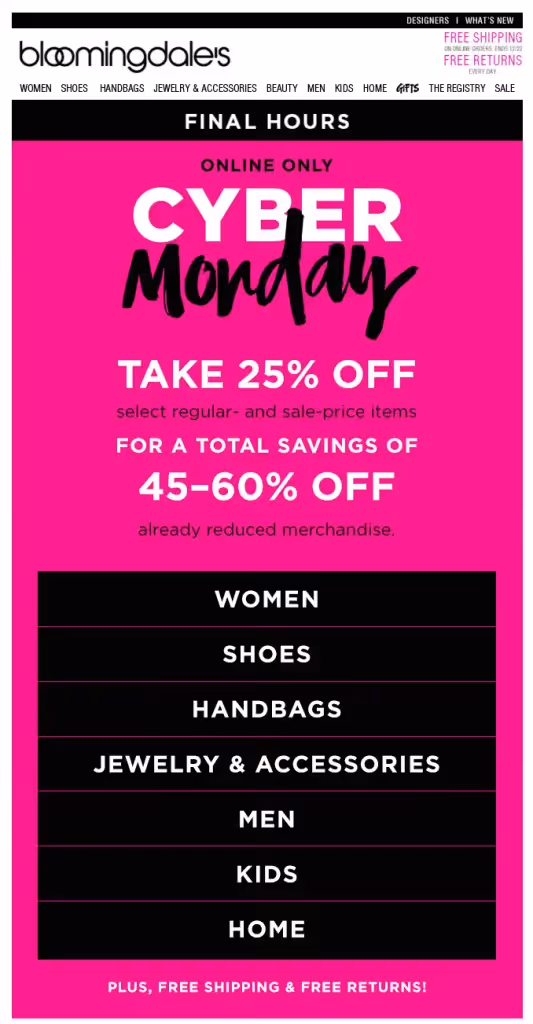
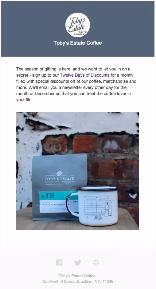
Design Takeaway: It's true the image-only approach allows your design team maximum flexibility in customizing the look of your email, and the results can pay off. If you decide to go this route, make sure you have good reason: know your subscriber list and have a sense of the risk of how many readers may miss your message entirely. Test how the email appears across email clients. Be sure to have at least 500 characters of plain text, and use descriptive ALT text for all images.While many, many sale announcement emails are fully comprised of images, we found a few brands breaking up their emails with a better image-to-text ratio, while stillkeeping a creative spin to their messaging, like this one from Toby's Estate Coffee:

tobys

This is a great list-building tactic and a unique way to build excitement and anticipation.Similarly, the Museum of Modern Art sent this beautiful email that is part plain text message...

Moma email use

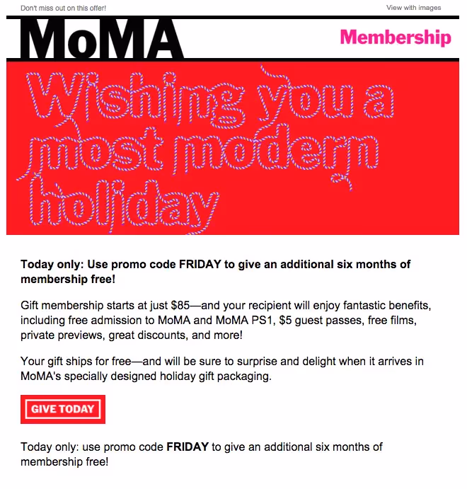
...and part animated GIF:

Moma gif

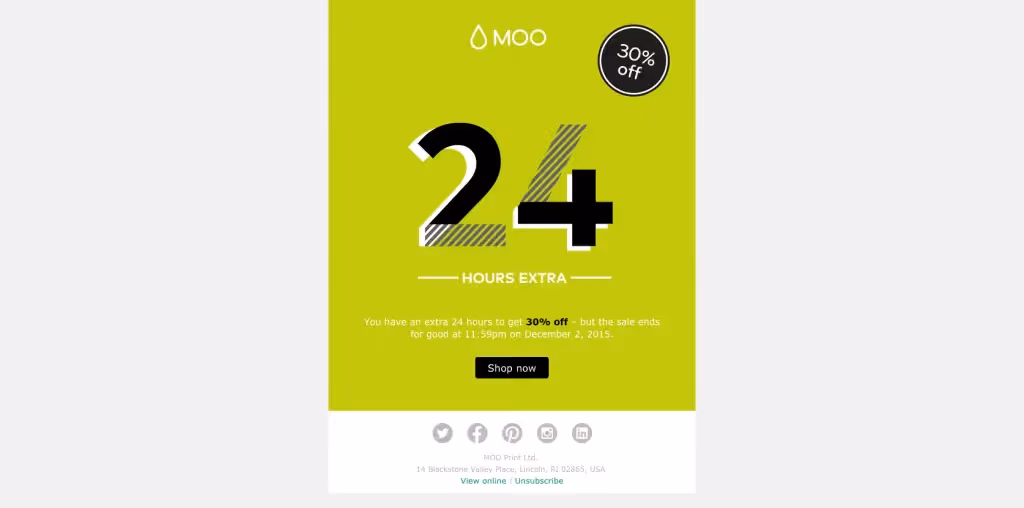
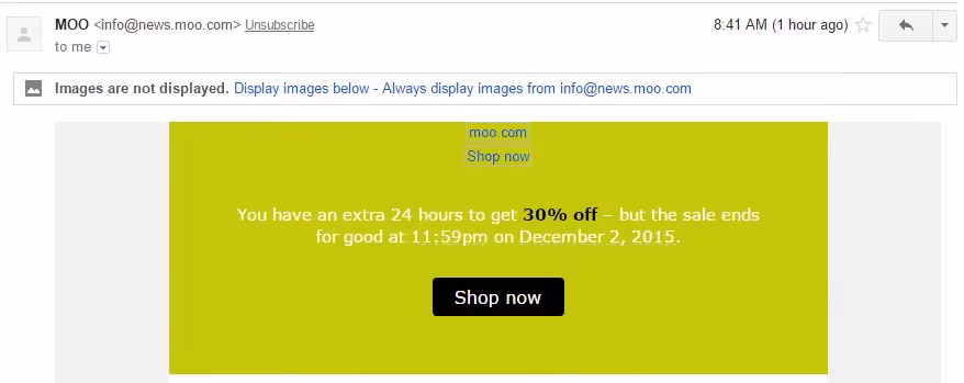
Likewise, this email from MOO has a GIF header, but the text below, including the CTA button, are outside of the image and appear with image-viewing turned off.

MOO email

Here it is without images:

MOO email

Design Takeaway: Keep sale promotion emails short and sweet,avoiding the pitfalls of image-only emails by striking a balance between text and great design, whether it be an image or GIF. (And make sure CTA buttons are bulletproof).It's not too late to implement these design tactics in your own holiday shopping email.Use the BEE editor to create a fully responsive, beautiful HTML-colored email. The drag-and-drop platform is easy to use, and it's free!

Related posts

Why Pardot Users Choose Beefree for Better Email Design

Pardot’s email builder slowing you down? Learn why teams across industries turn to Beefree to create stunning, compliant emails—then export to Pardot with one click.
Beefree team
Apr 23, 2025

Send Error-Free Emails with Confidence Using Beefree

Learn about the Beefree features that can help you and your team catch mistakes, streamline collaboration, and send with confidence every time.
Beefree team
Apr 15, 2025

Using Beefree with Marketo Engage 101

Learn how integrating Beefree with Marketo Engage can help you build high-converting, on-brand email campaigns— faster.
Luca Penati
Apr 4, 2025

Why Pardot Users Choose Beefree for Better Email Design

Pardot’s email builder slowing you down? Learn why teams across industries turn to Beefree to create stunning, compliant emails—then export to Pardot with one click.
Beefree team
Beefree team
23 Apr
2025

If you’re using Salesforce Account Engagement (formerly Pardot), you’ve likely hit a wall with its native email editor. Whether you’re a nonprofit, a growing SaaS company, or an enterprise with multiple brands, the common complaint is the same:

"Pardot is just way too restrictive for our needs."

"The collaboration part just isn’t happening smoothly. It is too hard to involve writers and designers effectively."

 "It isn’t like we were doing anything overly creative—it just doesn’t give us the flexibility we needed."

Let’s face it: as powerful as Pardot is on the automation side, its design capabilities often fall short. And Salesforce doesn’t seem in a rush to improve them. If you’ve been trying to get more from your marketing emails—faster, better, more on-brand—it’s time to consider a better way.

Beefree isn’t a replacement. It’s the perfect addition to your workflow

The good news is that you don’t have to abandon Pardot. It is excellent at what it’s built for—automation, CRM integration, lead scoring, and financial compliance. 

But when it comes to design and collaboration, the limitations start to pile up. Whether it’s because of its clunky editor, lack of customization, or the time spent fixing buttons and web fonts (insert eye roll). 

Pairing Beefree with Pardot doesn’t just improve how your emails look, it transforms how your team works. This pair is especially perfect for: 

  • Healthcare & Financial Services: where compliance and approvals are non-negotiable.
  • SaaS, Consumer Brands, and Professional Services: where keeping brand consistency across touchpoints is critical.
  • Higher Ed, Manufacturing, Real Estate: where teams juggle multiple departments, audiences, and localizations.
  • Nonprofits: where lean teams need to move fast 

Teams from all walks of life all come to Beefree looking for the same thing: a fast and flexible email design solution that seamlessly integrates with their tech stack (without slowing their team down).

(source)

From chaos to control: Why teams choose Beefree

Now that you know what Beefree is, it’s time to talk about how it can help. 

When email production feels scattered (we’re talking files everywhere, last-minute edits, branding inconsistencies), it’s not just frustrating, it’s risky. It opens the door to real mistakes: off-brand messaging, broken layouts, missed approvals, or worse, emails that get flagged for non-compliance.   

1. Keeps your team organized with Workspaces

Instead of one cluttered space where everyone shares the same templates and folders, Workspaces allows you to manage email assets across brands, departments, and regions in unique environments. 

  • Create separation without silos: Marketing ops can manage everything in one platform, while individual teams work independently within their own workspace. It’s the best of both worlds.
  • Prevent cross-team mixups: With workspace-specific templates and permissions, there’s no risk of someone accidentally launching a healthcare email from the real estate workspace.

2. Allows you to move faster without sacrificing brand integrity

Beefree empowers teams to scale production while keeping every email perfectly on-brand.

  • Style Kits: Automatically apply your brand’s fonts, colors, and design settings to every email in a workspace
  • Saved Rows: Save your most-used content blocks (like hero sections, testimonials, or product features) and reuse them across campaigns.
  • Synced Rows: Make a global update, like changing your holiday promo footer or legal disclaimer, and Beefree automatically applies it to every email using that row. 

3. Helps you catch mistakes before they go live

Beefree helps your team build error-resistant emails with features designed to catch issues before they go live. 

  • Smart check: Beefree’s Smart Check automatically checks your designs and alerts you of any red flags, such as missing links, heavy images, and large HTML files, so you can fix them before they cost you. 
  • Built-in approval flows: Ensure the right eyes are on every email. No more chasing approvals in Slack or email threads.

Learn more about sending error-free emails with Beefree: https://beefree.io/blog/error-free-emails-beefree

4. One click export from Beefree to Pardot

With Beefree’s native Pardot integration, your team can export emails with confidence. What you see in Beefree is exactly what your audience gets in Pardot. No weird spacing. No layout issues. No surprises.

Real results: How USC Marshall scaled campaign production with Beefree

In 2020, Dwayne Rice, Senior Associate Director of CRM Management at USC Marshall, was juggling comms for 11 graduate programs. Each had its own drip campaigns, deadlines, and unique audiences.

“I needed an efficient process to crank out emails,” he said.“But Pardot’s editor was slowing us down.”

By switching to Beefree, Dwayne’s team was able to build reusable templates and modular elements—cutting production time and removing the need for third-party vendors.

“Beefree has enabled us to create content efficiently enough to bring multiple processes in-house and discontinue relationships with several vendors, saving time and money.”— Dwayne Rice, USC Marshall

Read the full case study

Stop letting Pardot’s email builder hold you back

From higher ed to healthcare, SaaS to nonprofits—teams across industries are making the switch to Beefree not to replace Pardot, but to complete it. With Beefree you can:

  • Design polished, responsive emails in minutes
  • Collaborate seamlessly with writers, designers, and stakeholders
  • Export to Pardot with full confidence

Start building better emails for Pardot today — Try Beefree for free

Or if you're a non-profit, apply for a $1,000 annual credit!

(source)

Frequently asked questions about using Beefree with Pardot

1. How does Beefree integrate with Pardot?

Beefree serves as an external email design tool that integrates seamlessly with Pardot. Users can design emails in Beefree and export them directly to Pardot as new templates or update existing ones. This integration streamlines the email creation process by allowing for more flexible and visually appealing designs than Pardot's native editor.

2. Does Beefree provide analytics for email performance?

Beefree focuses primarily on email design and does not offer built-in analytics. However, once emails are exported to Pardot, users can leverage Pardot's robust analytics and reporting tools to track performance metrics such as open rates, click-through rates, and conversion rates.

3. How does Beefree enhance email design capabilities for Pardot users?

Beefree offers a no-code, drag-and-drop email builder that allows users to create visually appealing emails without HTML knowledge. It integrates seamlessly with Pardot, enabling users to export their designs directly into the platform, thereby overcoming Pardot's design limitations .​

4. What collaboration features does Beefree offer compared to Pardot?

Beefree offers robust collaboration features that surpass those in Pardot, including:

  • real-time design-specific comments
  • role-based permissions
  • approval workflows

all available directly within the email design environment. These tools make it easier for teams to co-create and review content without switching platforms. In contrast, Pardot’s collaboration tools are more limited and typically rely on Salesforce’s broader ecosystem for team coordination.

5. Does Beefree support features like AI copywriting or mobile optimization?

​Yes, Beefree supports both AI-driven copywriting and mobile optimization features. Its AI Writing Assistant enables users to:

  • generate email and landing page content or revise existing copy
  • create alt text for images
  • translate content to different languages

Additionally, Beefree's Mobile Design Mode allows for editing of mobile-specific styles, such as:

  • text alignment
  • padding
  • font size
  • and more

to ensure responsive and user-friendly designs across devices.

6. Can Beefree help maintain brand consistency better than Pardot?

Yes, Beefree helps maintain brand consistency more effectively than Pardot through its Brand Style Guidelines feature, which lets teams lock in brand colors, fonts, and content blocks across all email designs.

Users can also create reusable templates and design systems that ensure uniformity, even across multiple teams or clients. While Pardot offers some branding controls, it lacks the same level of built-in visual governance and flexibility found in Beefree’s design-focused environment.

Send Error-Free Emails with Confidence Using Beefree

Learn about the Beefree features that can help you and your team catch mistakes, streamline collaboration, and send with confidence every time.
Beefree team
Beefree team
15 Apr
2025

We’ve all been there: You craft the perfect email, hit “send”, and just as you settle into the satisfaction of a job well done, someone slacks you: “Hey, something doesn’t look right with that campaign.” 

If this sounds familiar, you should know that you’re not alone: According to the 2025 Really Good Email Survey “90% of email marketers say they have a history of noticing mistakes in their emails after they’ve hit the send button.

This becomes especially common when your team constantly juggles multiple campaigns or makes edits until the last minute. Sadly, even the smallest mistakes don’t just slip through the cracks; they cost you.

Luckily for us all, mistakes can be avoided. And no, not by lighting a Pre-Send Protection Candles™ and hoping for the best. But rather by equipping your team with the right tools that work with your team – not slow them down. Let’s talk about it!

Building your team’s safety net for mistake-free emails with Beefree 

When everyone involved in the email creation process is aligned and supported by smart systems, executing mistake-free emails becomes second nature. Instead of scrambling to do damage control, you’ll want to set up the tools and processes that help your team focus on what they do best: creating emails that connect, convert, and confidently represent the brand.

In this article, we’ll discuss how you can use Beefree to: 

  • Reduce human errors 
  • Implement systems of checks and balances 
  • Establish guardrails & frameworks for on-brand email design

1. Catch mistakes before they happen with Smart Check

Missing links that lead nowhere? Forgotten subject lines? HTML emails that get clipped in Gmail? It’s easy to make little mistakes that derail your campaign’s performance. 

Learn more about Smart Check → 

Beefree’s Smart Check automatically checks your designs and alerts you of any red flags so you can fix them before they cost you opens, clicks, or conversions. Think of Smart Check as your built-in QA partner who will catch:

  • Missing links
  • Heavy images that could slow down email load times
  • Missing subjects & preheaders that impact engagement
  • Missing alt text on images that hurt your email’s accessibility
  • Large HTML files that might affect deliverability (or get clipped in Gmail)

2. Keep every email on-brand with built-in guardrails 

Most of us don’t nail the perfect campaign on the first try. Great emails are a team effort. However, when multiple teams are involved in the email creation process, branding can quickly go off the rails. 

A misused font, clashing colors, or buttons that are too small to click don’t just make emails look disjointed—they can damage your brand’s credibility.

With Beefree’s Advanced Style Kit, you can set clear, predefined guidelines for fonts, colors, spacing, and more—so every design starts on the right foot. Once configured, all new emails automatically inherit your brand styles, reducing the need for constant oversight and minimizing errors.

Advanced user permissions let you lock down specific design elements, giving you full control over what can (and can’t) be edited. That means anyone on your team—regardless of design expertise—can confidently create emails that look and feel like your brand.

3. Empower your team to create with confidence with reusable content

When your team isn’t bogged down by the cumbersome process of creating content from scratch (or fear of going off-brand), they can move faster—and with far more confidence.

With Saved and Synced Rows, you can provide your team with pre-approved content blocks—like headers, footers, and other commonly used design elements—that they can use in their designs without creating them from scratch. That ensures design consistency, eliminates redundant work, and makes email creation a lot faster.

Learn more about Saved Rows → 

4. Ensure your team is aligned with centralized reviews and approvals:

Creating the perfect email often takes a team of designers, copywriters, marketers, and other team members working together. But when multiple people are involved, endless back-and-forth and feedback scattered across multiple conversations and channels can slow things down, lead to miscommunication, and ultimately cause mistakes. 

With Beefree’s built-in commenting, your team can collaborate and share feedback where the work is actually happening—right inside the builder. And if you’d like to involve external reviewers into the review process, you can do that as well. 

Learn more about commenting → 

Plus, with Beefree’s built-in Approval flow, you can ensure your designs are reviewed and approved by the right stakeholders. Stay aligned with real-time notifications on design changes, lock edits on approved content, and get a clear view of project status for smoother team collaboration and high-quality results.

Learn more about Approvals →

5. Need an additional pair of eyes? Use the power of AI to support your team

Take some weight off your team's shoulders and use AI to support them in the final stretch. Whether it’s catching typos, flagging inconsistencies, or suggesting optimization, AI can be a saving grace when deadlines are creeping in.

For those times when you can’t remember the difference between “there, their, and they’re,  Beefree’s  AI Writing Assistant is there to help. This eager-to-learn helper can  review your copy for grammatical errors, tone of voice, and even share suggestions for making it just a bit more compelling. Our AI Writing Assistant can also seamlessly translate content or automatically generate ALT text for images to enhance the accessibility of your emails. 

Learn more about AI-powered content creation in Beefree →

The tangible cost of email mistakes

Mistakes don’t just impact performance; they slowly erode credibility. What starts as a small oversight can be a massive inconvenience for your readers, sending them straight to the unsubscribe button. As for your team, mistakes chip away at their confidence. Instead of brainstorming for the next campaign, they’re scrambling trying to figure out how to do damage control.   

When done right, email is a powerful tool for connecting with your audience. But a single mistake can unravel that connection and undermine trust.

  • A missing or broken links can interrupt your subscribers’ journey to conversion, negatively impacting campaign performance.
  • A missing subject lines means your emails won't stand out in the inbox, hurting your open rate
  • An awkward typo might signal a lack of attention to detail
  • An off-brand design can make your brand look disorganized
  • An email that gets clipped in Gmail because it’s too big means some subscribers might never see the full email content.

Design error-free emails and send with confidence with Beefree 

Beefree helps teams of all sizes create polished, on-brand emails—without the risk of costly errors. With built-in safeguards, streamlined approval flows, and collaboration tools that keep everyone aligned, Beefree acts as your team’s system of checks and balances. From first draft to final sign-off, you’ll have everything you need to send with confidence, build trust, and get results.

Try Beefree's Business for free for 15 days and get access to all of Beefree’s tools that help you catch mistakes, streamline collaboration, and send with confidence every time. Or schedule a call with one of our experts to discover everything Beefree can support your team.

Stay informed on all email trends

From the latest creative design strategies that inspire your next campaign to industry best practices and tech advancements, our newsletter is the go-to for all things creation.

Thank you! Your submission has been received!
Oops! Something went wrong while submitting the form.
By clicking Subscribe you're agreeing with our Privacy Policy