We're always on the lookout for responsive email design tips to share with youin our collective effort tomake email design better. This week, we stopped by aDesigning Responsive Email seminar led by Noble Desktop, one of New York's top digital design training institutes, to connect with email marketers and get the lowdown on the latest design tips.

The seminar was a good reiteration of many of the basics we've covered here in our Email Design Workshop blog:how design impacts an email campaign’s success rates and how to turn responsive designlimitations into strengths. Thank you, Noble Desktop, for the important reminders and great inspiration, which shouldbe used for all types of emails, responsive or not (though, of course, by using our intuitive, drag-n-drop BEE email editor, all of your emails are automatically responsive!).Here are the top 10 responsive email design tips we took away from the seminar:
1. Make your responsive email a teaser.
We know there's a lot you want to communicate to readers on your mailing listabout your upcoming event, newest product, biggest sale, or company announcement. But your email is not the place to get into detail. Think of your email as a teaser for the main content of your message—which can be found on your website after readers tapyour call-to-action button. Here's a great example from Best Buy: themessage isshort, focused, and to-the-point, leading readers directly to the CTA.

2. Create a hierarchy within your responsive email.
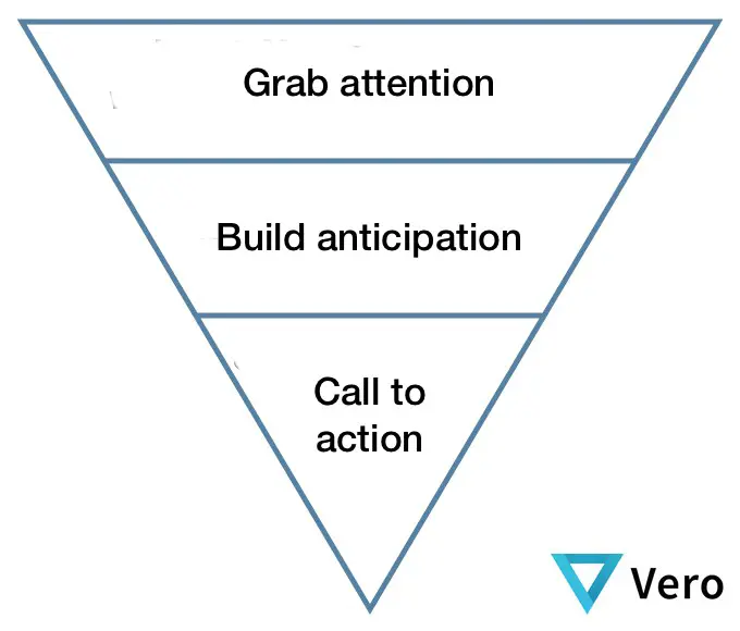
Create focus and organization in your email bytelling yourstory in a hierarchical fashion. Envision how your message could be structuredusing the inverted pyramid model.
Campaign Monitor shows us a great example of this method in action in an email from InVision:
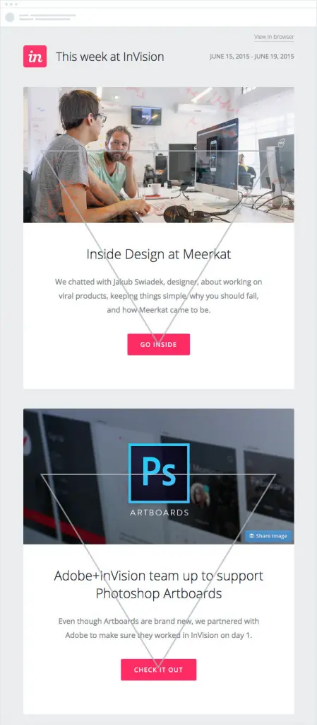
Each section begins with a compelling visual element, followed by a short, bold headline with supportive text that leads directly to a call-to-action buttonmakingit clear what to do next. It's an excellent way to communicate quickly and get click-throughs from readers with short attention spans (i.e., all of your readers).
3. Your CTA should never say "Click here."
Don't waste space by telling readers where to click, especially because on mobile devices, readers are tapping, not clicking. "Click here" isn't really a call to action. Skip it and tell readers directly what they should do.Use a clear, direct action verb—and be concise. Try using personal pronouns like “my” and “your” that make your message friendly and engaging. You could try: “Reserve my spot now” or “Get my free ticket.”Read more about how to optimize CTA buttons in our post How to Design Bulletproof CTA Buttons in Email. Here's a great action-oriented CTA button from Skillcrush:

4. Never use a single large image in a responsive email.
In other words, avoid the pitfalls of the image-only email.Using just one large image in your email will increase your spam score, so the email may not make it into readers' inboxes at all. It also means your email won't be fully responsive. And if your imagedoesn't load, readers will only see ALT text. The solution? Always use a balance of text and images in your email.
5. Design on a grid.
Grid-based designs are easier to make responsive. That's because HTML emails are built with tables comprised of rows and columns.Email editors that capitalize onmodular template design—like our BEE email editor—automatically help you arrange content in a grid while providing plenty offlexibility in arranging content. In a previous post, we checked out this infographic from an Aveda emailanddrew up lines to show how the content fell into four quadrants:
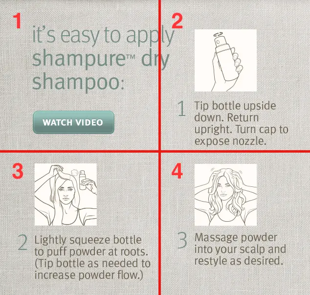
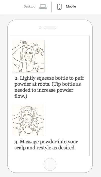
The original contentwas all one image, but by breaking it up into 4 separate images on a grid, we made it mobile responsive (see the full tutorial here).

6. Remember ALT text.
Be prepared for your images not to load. Some email clients don't automatically load images, and some subscribers don't enable auto-loading for security purposes. Here's how that original Aveda email above looks with images disabled:
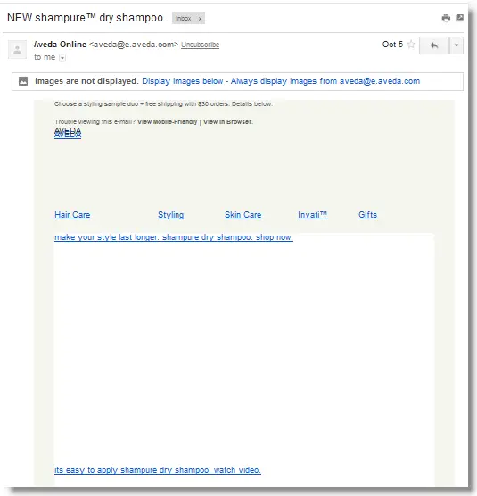
ALT text allows these readers to understand your message, even without images. When writing your ALT text, remember to keep the text short. If it breaks onto 2 lines, some email clients will not display it. If you can, style your ALT text by adding styling to the image (your image won't look any different, but when your ALT text appears, it will be the font, color, and size you specified).
7. Your email is not a website.
If you follow Tips #1 and #2, then you're probably in good shape. A focused, succinct email should be designed for clarity and shouldcommunicate a single call to action. So there's no need to crowd the email, or the header, for example, with extraneous links, menus, and messages, like in this example from Target:

Go with simplicity. And, remember to use the data you have to make customizations.When someone comes to your company's website, you don't know much about that visitor. Your mailing list, on the other hand, is another story. You have data about your subscribers. Use it to tailorversions of your campaign for segmented, targeted portions of your audience to improve conversion rates.
8. Be selective with custom fonts.
Most email clientswill not support your brand's custom font. Use them sparingly to make a statement, like in the main header of your email, then incorporate email-safe fonts for the body of your message. Here's a great example from Mashable:the blue "Mashable / Alerts" header is in their brand font (and is displayed as an image) but the sub-header is plain text with a great HTML background color (and the following header under the images is plain text, too).

Your selection of email-safe fonts is somewhat limited, but when in doubt, go with a serif. Many brands use Arial, Helvetica, and Verdana.
9. Don't forget preheader text.
An email's preheader is a small amount of text that follows the subjectline in the inbox. Here's how to customize the preheader text from the MailUp blog.
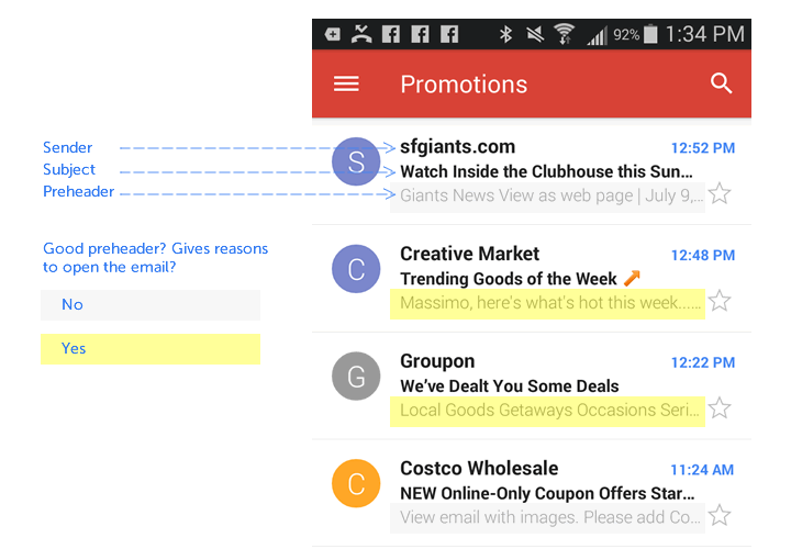
Subscribers use preheader textas a screening tool, deciding whether or not the email is worth reading based on just a few words, so using compellingpreheader text can increase open rates. The first plain text that appears in your email will show up as preheader text.
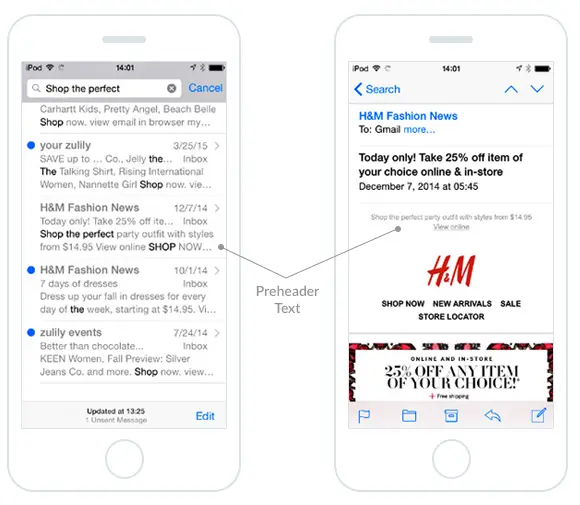
But it needs to be short; Campaign Monitor adviseskeeping your preheader text to between 40-50 characters. Once the email is open, preheaders can be visible or hidden.
10. Use animated GIFs wisely.
Animated GIFs are powerful visualstorytelling tool that work seamlessly across most email clients. Outlook is the big exception—Outlook 2007 and newer will only display the first frame of your GIF (it won't animate), so plan for that when you're designing.Banana Republic uses a question mark as its first frame in the animated GIF below so that even without animation, the message makes sense:
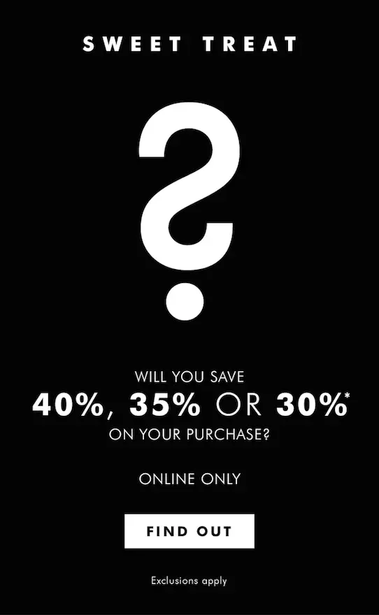
And here's the GIF in motion:

Depending on the number of frames and their resolution, GIFs can turn into large files. Oversized GIFs can be slow to animate and eat up data plans onmobile. Minimize the size of your animated GIF by animating only what needs to be animated; as the frames rotate, the fewer pixels change, the smaller your file size will be. Read our Top 4 Tips for Using Animated GIFs in Emailpostfor more info.
Questions? Comments?
And now it's time to start designing some clear, compellingresponsive emails! Let us know if you have any tips or questions in the comments, and give the BEE email editor a try for your next campaign. It's free, requires no registration, and all emails designed with BEE are 100% mobile responsive (and you won't need to code a single line).Save
