Solutions
7 New Beefree Features That Will Change Email Design
Extra! Extra! Read all about it! We've rounded up the latest and greatest BEE features right here. Our goal is to be the Best Email Editor around, and we are constantly striving to make email design better and easier for you. Check out the seven latest features in the editor below.
Roles and Permissions
BEE Pro users can now assign an access level for each collaborator. This means you can control what a team member can or cannot do in BEE.
Here's a summary of the roles that can be assigned:
- Owner. A special Admin user that can manage the BEE Pro subscription. This is the only user who can purchase items (upgrade plan, add users, activate a connector, etc.).
- Admin. Has access to all the features and can create and manage brands in an Agency plan. Usually, this person is in charge of overall team management.
- Manager. Has all the capabilities to manage the message creation workflow inside a brand, including template management and content locking. Cannot create a brand or decide who has access to it.
- Editor. Has the capability to create, edit, and export messages.
- Contributor. Has the ability to contribute sporadically to content editing (e.g., text optimization).
Read more about Roles and Permissions here.
Video Content Block
Video content blocks in email typically consist of astatic image from the videowith aplay button/icon overlay. An image like this is usually created separately, then dropped into an email template. But BEE has made the process even easier. The new video content block featureautomatically generates a static image of your video and allows you to customize the play button that appears. All you need to do is drop in a video link. It's like magic! Get the scoop in our tutorial.
Save messages as templates
Did you just design a beautiful email that you want to reuse again in the future? This new BEE feature lets you quickly turn a message into a template. Simply drag your email into the "My Templates" folder and you'll be able to access it again later.
Change your account email
If you signed up for a BEE account with one email address but want to change it to another one, now you can. We had a lot of support tickets asking for this capability! We're happy to say you can now go ahead and change away!
Content Dialog
As you design an email in the BEE editor, there are probably many times when you insert amerge tag, add a link to an image, or apply aconditional statement. That all works fine, unless...
- What if you have 400 merge tags? You can feed an array of merge tags to the editor, but that’s not going to cut it.
- What if it’s a 6,000 product database? How will they locate the right one? Special Links is not the right fit.
- And what if a display condition needs to be built on-the-fly?
A new feature called Content Dialog offers a flexible solution.If you want to insert a merge tag or a display condition, you can now control exactly how that will happen. Read about the new feature here.
Multi-file upload
You can now quickly and efficiently upload multiple files in the file manager! Your email will be beautifully finished in no time. Shazaam!
Height adjustments for dividers
Want better control of how much padding and white space you create between content blocks in your email? Now you can adjust the height fordividers to better control those empty spaces in your message design.
What do you think of these new features? Which ones are you excited about? And which features are on your wish list?
Tutorial: How to Add a Video Content Block in Email
We're thrilled to introduce a brand new email design feature in BEE: a video content block! Now you can share video content in email more easily. Just drag-and-drop a BEE video block into your email design, then paste in your video's YouTube or Vimeo URL. BEE automatically does the rest! The editor will: (1) grab a cover image for the video; (2) overlay a play icon on top of it; and (3) link it to the video content. Your email will be ready to send in no time. In today's tutorial, we'll walk you through how to use the new BEE video block feature. Keep reading and watch our short tutorial video!First, a little inspiration: Video content blocks in emailFull videos themselves are still challenging to implement in an email. That's because video files aren't well-supported by email clients or mobile inboxes. As a result, the vast majority of "videos" that pop up in emails are actually static images or GIFs providing a preview. When readers click or tap on the "video," they're actually redirected to watch the full video on a landing page or website. We're sure you see these video previews in email campaigns all the time. Let's take a little scroll through some recent examples from our inbox.
Estée Lauder
Food52
Tasting Table
Litmus
Disney
PureWow
As you can see, video content blocks usually include a few standard features:
- A static image from the video that links to the video itself
- A play button/icon that visually signals to readers that the image is from a video
- Supporting surrounding content like a header describing the video, short description text, and CTA button
Sounds pretty easy, right? It really is! And the BEE video content block has made it even easier by automatically generating a static image of your video and allowing you to customize the play button that appears. All you need to do is drop in your link. Let's walk through it.
Create your video email in BEE
The BEE video content block doesn't embed your actual video in email—video emails still aren't a design best practice due to limited support—but it links to your video in a beautiful, smart way.
https://youtu.be/FP1JQ8jQr6c
Step 1: Drag-and-drop the video content tile into your email
Use the BEE editor to design your custom or templatized email just as younormally would. When you're ready to add your video content block, navigate to the Content menu in the right margin. You'll see there's a new Video tile available. Drag it into your design to get started.
Once dropped in the body of your email, the empty video block will look like this:
Step 2: Link to your video
Select your video content block by tapping on it. In the Content properties menu in the right margin, paste the URL to your video. Your URL should be from either YouTube or Vimeo, the popular video hosting services that we currently support.
Once you paste in a valid URL, the content block in your email will display a cover image for your video. Voilá!
Note: The editor can't provide a cover image for password-protected videos.
Step 3: Customize the play icon
You can edit the style of the play icon that appears on your cover image. Just use the drop-down menus in the Content properties menu on the right to customize.Select the icon type:
Choose a light or dark color that shows up best against your cover image:
Then, choose a size.
Yes, the process really is this easy, and your BEE video block will now look great and be clickworthy! Also, make sure to learn more about the power of BEE by checking out our other BEE tutorials.
Tutorial: How to Use the Beefree Gmail Connector
Not so long ago, we made an exciting announcement: Thanks to a new connector feature in BEE, any email designed in the BEE editor can be exported seamlessly to Mailchimp. Now, you can export your beautiful, custom email designs into Gmail.The new Gmail connector lets you design any email in BEE, then move the fully-designed email over to Gmail drafts in a matter of clicks. It’s easy, and we know this is going to be a super useful tool for many of our users.Here’s a quick tutorial on how to do it.
First: Why use BEE Pro with Gmail?
We want to give users just as much control and flexibility over sending and tracking emails as they have with designing them in the BEE editor. Our users know that BEE is one of the most dynamic email editors around. The drag-and-drop editor makes email assembly easy, and granular control on padding, spacing, buttons, and borders allows you to make extremely precise design adjustments. In other words: in BEE, it’s fast and easy to build an email that looks exactly how you want it. Now that we have connectors with Gmail and Mailchimp, two of the most popular and powerful email service providers around, you can designany email in our editor!
Step-by-Step Guide: Exporting your email to Gmail
Step 1: Connect to Gmail in BEE
First, log into your BEE Pro account and go to the Settings menu.
Scroll down to the Connectors section, and click to install the Gmail connection. (Note: You can easily connect to MailChimp at the same time, too—here's our quick tutorial on how to do it.)
As soon as you select Install, the connector is available for use! Next, you'll choose which Google account to connect to. Click View Settings.
In the following window, select Connect my Google Account.
Choose the account you'd like BEE to connect to by clicking on it.
Last, make sure you allow BEE to connect with the account you chose.
Et voilá! You're now connected. Any email design you create in BEE Pro can be exported and sent via Gmail.You’ll also receive an email from Google confirming the connection has been made.
Step 2: Export your email to Gmail
Now that BEE Pro can communicate with your Google account, start exporting any designs. Here’s how.First, go to the design you want to export. Navigate toProjects, view the list of messages within any project, and select the email you’d like to push to Gmail. On the Message details page, click on the Export to ESP drop-down menu and select Gmail.
Press Continue to push your BEE-designed email to Gmail.
In a few seconds, your message will arrive in your Gmail drafts folder.
Step 3: Access your email in Gmail and send!
Open your Gmail inbox. Go to your drafts folder. Your BEE email will be the most recent one.
Simply customize the subject line and update the To field, and send as you normally would. Yes, it’s that easy.
Go Pro and send any BEE email with Gmail!
If you’re not already using BEE, sign-up for a BEE Pro free trial to check it out and enjoy the new Gmail connector. We'll be releasing more connectors soon, so if you have any questions, let us know!
Tutorial: How to Use Beefree Mailchimp Connector
With more than 15 million users, Mailchimp is one of the most popular email marketing platforms in the world. Known for its high-quality email marketing and automation services, Mailchimp offers a variety of tools for you to get the most out of your marketing efforts. Some of the features include a Content Optimizer and Customer Journey builder, and an effective and easy-to-use email editor. So, why are Mailchimp users adopting Beefree to design their emails instead of using the built-in editor?
Beefree and Mailchimp Are a Perfect Pair
Currently, 20% of all Beefree users use Mailchimp to send their emails. We were curious about what made us the perfect pair, so we asked a few of you to share your experience.The main key factor was the additional design flexibility they found when using the Beefree editor. Beefree is a drag-and-drop email and landing page editor that allows you to quickly design emails from scratch or choose from 1,600+ professionally designed templates. Beefree allows users to create customizable, responsive HTML emails and export them to Mailchimp to send to email subscribers.The design flexibility of the Beefree builder paired with Mailchimp’s automation services makes the perfect pair to help you grow and nurture your email list.
Step-By-Step Guide: Exporting Your Email to Mailchimp
Any email designed in Beefree can be exported to Mailchimp, including ones you build from scratch and ones created from our customizable templates. Watch our video below for the simplest way to get your email from Beefree to Mailchimp; then, follow our clear written guide.https://www.youtube.com/watch?v=2jH2Aw1k1z8
Step 1: Connect Mailchimp to Beefree
Log into your Beefreeaccount and go to the Settings menu.
Click the Connectors section and install the Mailchimp connection.
Once you select Connect, a window will appear where you can enable the connector by entering your Mailchimp account credentials. Make sure to “Allow” Beefree to connect.
And that's it! You're connected.
Step 2: Export Your Email to Mailchimp.
Now that your Beefree and Mailchimp account are connected you can navigate all of your projects, collaborate with team members, and export emails all within a few minutes.When your email is ready to be sent, click on the Export button on the Email Details page.
Select “Push to your sending system."
A new window will be displayed with the connector list. Select Mailchimp and “create” a template.
After that, your email will be exported to your Mailchimp account under your Campaign Lists.
Step 3: Access Your Email in Mailchimp Templates.
Once your Beefree email is in your Templates Folder in Mailchimp, you can send it directly to your audience or continue editing using the Mailchimp Design and Code Editor. In the Mailchimp Design Editor, you can make minor edits to the text, buttons, and URLs. If you would like to make any other changes, such as images or messaging structure, we recommend you use the Beefree builder to make use of the drag-and-drop feature.
Go Pro and Send Any Beefree Email With Mailchimp!
And there you have it! With just a few clicks, it is easier than ever to design emails with Beefree and then export them to MailChimp for sending and tracking.Beefree is built to give marketers total control when it comes to bringing their email design to life. This is what makes Beefree such a great design tool and why it pairs so well with Mailchimp.If you’re not already using Beefree, sign-up for a Beefree account. Read more about the Connector feature here.
Thanksgiving Email Design Trend: Quirky Content Blocks (Plus, a Mini Tutorial)
It's almost Turkey Day! If your inbox is as festive as ours is, you've probably received recipes, promotions, GIFs, and autumn-themed content galore. As the holiday draws near, brands are flexing their marketing muscles in preparation for the year's biggest spending season. It's fun to watch. And, we caught an interesting Thanksgiving email design trend emerging: quirky content blocks.Brands are getting playful with module design, layering images, colors, and type in innovative ways. The result: emails that look collaged and almost handmade. The good news is, many of these techniques are easy to implement. We'll point out how, so let's dive in!
A Closer Look: Creative Module Design in Thanksgiving Emails
#1. Anthropologie: Differently sized modules with repeat patterns, fonts, & colors
Anthropologie's aesthetic is colorful yet sophisticated, in a boho-chic sort of way. In email, Anthro often features intricate product displays with distinct brand fonts and features. This Thanksgiving, their email design is no exception.While none of these modules look the same as the others, design treatments repeat to create cohesion. Each module includes encircled numbers, uneven tracking between words, orange or yellow color blocks, and the same alternating typefaces. And, modules are one of two sizes. The repetition—and clean white breaks between sections—is what makes this email work, even when there's a lot going on.
#2. Of a Kind: Mini module collages with a paper-cut look
Of a Kind's Thanksgiving outfit inspiration email is a numbered list, like Anthropologie's. Modules alternate between orange or white backgrounds, plus some product photos extend beyond borders.The result? The email stands out amidst other multi-product display messages. Just arranging images unevenly, in different sizes, with variable background colors makes the email look unique, thoughtful, and crafty.
#3. Paperless Post: Misaligned text and background
Have you noticed a pattern with these emails? Nothing is lined up perfectly or laid out in an even grid. Design elements flow from one content structure to the next. In this Paperless Post Thanksgiving email, the header text actually begins above the hero image and flows into it.
#4. Sur La Table: Cascading image overlap
In this email from Sur la Table, images overlap again from one content block to the next, creating a cascading effect that keeps the reader's eyes moving down.
#5. Williams Sonoma: Z-pattern checkerboard
Not every email follows a quirky, uneven aesthetic. Instead, Williams Sonoma adheres to a clean checkerboard pattern. Text and images form a grid that flows from hero image downward. The look is more polished, and it makes room for more text.
#6. Food52: Translucent textbox overlay
In contrast to the even pattern above, Food52 switches things up. Image alignment alternates from one module to the next, in a Z-like pattern, but overlapping text gives the email a look that's a bit more askew. Instead of overlapping, white padding also buffers one content block from the following one.
#7. Ethan Allen: A combination of image styles and sizes
Ethan Allen's Thanksgiving email design uses a little bit of everything. It includes overlapping images, different image styles and sizes, and variable module layouts within the email. Still, ample white space and consistent number styling offercohesion.
Design Tips: Create Quirky Content Blocks in Your Drag-and-Drop Editor
Whether you're in the midst of finalizing your own Thanksgiving email design or if you're looking to jazz up your next campaign, you can try these design techniques right away. Most are easy to implement! There's a lot you can accomplish within a drag-and-drop editor, including our BEE editor, which allows for plenty of fine-tuning. Here are our quick tips.
#1. Switch up your email structure.
We often favor single-column email design, but it's clear from the emails above that having multiple columns often looks great. If you want to add some pizazz to your email, try an unusual layout. You can start by lining up content structures that are different from one another. Then, drop in your content. In the BEE editor, the Structure menu is where you can find your layout options. Check out our tutorial on how to optimize multi-column email design.
#2. Play with borders and padding.
In the Anthropologie email, borders and padding around images are applied unevenly around images, like the yellow border in module #3.
Achieve a similar look by fine-tuning the borders around your own content so that some sides have thicker borders than others.In BEE, use the Column Properties menu to adjust the padding around a content block.
When you select More Options, you can adjust the padding so that it's thicker on some sides than others. Voila!
#3. Add alternating HTML background colors behind images and modules.
Try using different background colors from one module to the next. Alternate between a bold color and white. You can also use one color as your module background color, plus a second color behind and around your images, like Of a Kind's email.In the BEE editor, you can select any structure in your email, then adjust the Row background color and Content background color.
This also means you can create the same effect as the Paperless Post email by assigning the "Thanksgiving" module one color (white), followed by a background image (or HTML background color) with live text.
#4. Place some text over background images and some alongside them.
Using the Ethan Allen email as inspiration, alternate your text placement within an email. Some content sits next to an image, while some content is on top of it. If you haven't started using live text over background images, now's the time to start!
#5. Alternate between landscape and vertical images.
Even if you're designing a single-column email, this doesn't mean your content has to be edge-to-edge. Use differently sized images like many of these emails do to create a quirky effect. And for tips on lining up photos in interesting ways, catch our tutorial on how to adjust image padding and borders.
#6. Make a numbered list.
This tip speaks for itself! But make sure you have fun with number styling and placement. Try adding numbers as live text atop images, or inflate the numbers' font size and let it take up all the space in its own content block. Left-adjust numbers in some modules, and right-adjust in others.
#7. Check your design on mobile.
Going gangbusters with quirky, creative module design is fun, but make sure your design looks good on mobile when you're finished! In BEE, use the Actions menu to preview any design you build.
Ready to improve your Thankgiving email design?
Go Pro!If you’re not already using BEE, sign-up for aBEE Pro free trialand get access to additional templates and design features. Happy Thanksgiving, and happy designing!
Tutorial: How to Create A Personalized Image in Email
Today's personalized emails are filled with dynamic content. Just take a look at how many emails in your inbox include personalized content that's tailored to you. This can be as simple as seeing your first name to the more advanced product recommendations, ads, and even full images!Thanks to a number of online tools, adding dynamic content to our email campaigns is becoming easier and more accessible, as we'll see in this email design workshop. You can actually take any image from your email campaigns and turn it into a personalized, dynamic image. Your subscribers will see their own name shown up, as shown below with this happy birthday image from NiftyImages:
Image courtesy of NiftyImages
Practical example: A happy birthday email
Let's take this happy birthday email from Stitch Fix, an online styling brand, which was featured in our blog post on happy birthday email design tips and examples.Birthdays are a great opportunity to connect on a personal level with your subscribers. They'll love to know you’re thinking of them and happy to see a personal offer on their special day. If you're not already sending a personalized birthday email, now's the time to start, since tailored birthday emails achieve a 179% higher click-through rate compared to regular promotional emails.
We'll be taking the static birthday cake image from the Stitch Fix email and transforming it into a dynamic, personalized image that will show your subscriber's first name. Here's what the finished email looks like from my inbox with my name, Kelly:
Tools you’ll need to get started
We’ll be using these two online tools to build our dynamic, personalized happy birthday email:
- Our intuitive, drag-n- drop Beefree editor to design the email message. If you’re not already using Beefree, sign up for our free plan.
- NiftyImages to build the personalized image. NiftyImages is a platform that provides easy-to-use tools for creating personal images and countdown timers. You can sign-up for free on https://niftyimages.com/
Step #1: Design your email in Beefree
Let's recreate the layout of the Stitch Fix happy birthday email in the Beefree editor. Begin with a single column layout and add the header, image block, and text blocks below.
Next, add the text and customize the CTA button. Let's also add a turquoise HTML color padding to the image, as in the original email. For now, though, let's leave the image placeholder blank.Our layout is pretty much complete. We now need to create the personalized, dynamic image from NiftyImages and then upload it into our image block in BEE:
Step #2: Create and customize your personalized image with NiftyImages
If you haven't already, create a NiftyImages free account to get started immediately!
Step #2.1: Design your personalized image
On the welcome screen, select New Personalized Image.
You can either:
- Upload your own image
- Choose a template from the NiftyImages library
Here's a peekat the great birthday image templates that are available:
Since we already have our birthday image from the Stitch Fix example, let's upload into NiftyImages. Click the [Upload Image] button in the upper right corner to import the Stitch Fix image. The default personalization text "Great deals for our customers" will show up for us to edit next.
Using the menu on the left, we can indeed customize the font size and style, and the text itself. Let'supdate the message to reflect the birthday theme:
For now, we'll use FIRSTNAME as a placeholder for our dynamic text; you'll see how to customize it for your email service provider (ESP) in the next step.Next,provide backup text, so that any recipient whose name isn't in your mailing list database will still receive a complete message.
Let's now preview how our birthday image looks, by clicking on the button in the upper right corner:
Step 2.2: Create your dynamic image URL
Let's get a bit technical. The personalized happy birthday image that we designed has a special dynamic URL. Notice that the image URL has the recipient first name field as a parameter at the end, which is specific to the emailing platform that you'll be using to send this email. You therefore need to choose your email service provider (ESP) from the drop down. Here's an example for MailUp, our email marketing platform.
This step is very important: if the first name merge tag syntax is wrong, then the image won't work. Each ESP has a different syntax for merge tags (some use curly brackets, for instance). The drop-down in NiftyImages generates the URL for your email service provider (ESP). So once you choose your ESP, copy the image URL and let's get back to Beefree. We're almost done!Here a quick video tutorial from NiftyImages on how to generate the dynamic image URL:
Step #3: Add the personalized image to your email
In Beefree, click on the image placeholder to view the menu on the right. Turn on the Dynamic image button from the Content Properties. To learn more about the dynamic image feature of Beefree, please view our help article on How to use dynamic images for countdown timers and personalized content.
Paste the image URL from NiftyImages and the personalized happy birthday image will now appear in the Beefree editor.
Finally, let's preview how the recreated Stitch Fix happy birthday email looks with the personalized, dynamic image that we created. Looks great, don't you think? :)
Design your next personalized email with Beefree!
Voilá! We've created an awesome personalized happy birthday email with just two design tools and in three simple steps. So, there's no excuse not to try more personalization in your email campaigns! If you’re not already using Beefree, sign-up for our free plan!
Tutorial: How to Adjust Email Borders and Padding
Email designers know that email borders and padding can make for greatdesign—it's about what you include as much as it is about what you leave out. Being sparing and selective about your design is particularly important in emails, where space is limited. This is why we often talk about the significanceof simplicity, white space, hierarchy, and organization.In this workshop, we'll review the ways in which the Beefree editor allows you to adjust email borders and padding. When you know how to fine-tune these elements, you canimprove your design quickly and efficiently, and without having to touch the HTML code!We will cover how to:
- Add borders around any email structure (e.g., between rows or columns)
- Add a border around an entire email
- Change the color, width, and style of borders
- Use and customize the divider feature
- Adjust padding around any content element or structure (e.g., text blocks, images, buttons, etc.)
Email inspiration: Nike's Mother's Day gift promotion
This email from Nike (subject line:Gifts She'll Love on Mother's Day) uses light gray borders and plenty of white space (padding). As a result, the message is light, bright, and well-organized. Here's a snapshot of the first module:
Let's get started!
To show you how to achieve the same effect, we recreated the email in the Beefree editor using a simple single column template—first, without borders or spacing adjustments.
How to customize borders in Beefree
1. Add and adjust a border around any email structure.
In the Beefree editor, borders can be added to any email structure. That means any structure in the structure menu can have a borderadded along the top, bottom, right, and/or left sides.
Our Nike email is made up of two single-column structures (the first structure element in the menu picturedabove). One contains the header (Nike logo and navigation menu) and one contains the body of the email (header text, text, and images). To add a border around either of these structures, we simply need to select it, then make adjustments in the border menu on the right.
2. Fine-tune the width, color, and style of any border
The border menu will allow you to fine-tune the color, width, and style of a border. We selected the first structure in our email—the one with the logo and navigation menu—then set the border color to gray and began increasing the width...
...Now, a border appears around the header, just like in the original email.
Select the body structure and do the same thing, and now there is a border around each section.
3. Add a border that goes around an entire email
What if we want just a border around the whole email? In the border menu, turn on more options using the slider in the upper right corner. Now, instead of adding a border justaround an entire structure, we can dictate which sides will be bordered: either the top, bottom, right, and/or left sides.
To remove the divider between the first (header) structure and the second (body) structure, adjust the top and bottom borders of each one.First, select the header structure and, in the border menu, decrease the bottom border to 0px.
Second, select the body structure and decrease the top border to 0px.
With the horizontal borders between each structure removed, the email has a border around its entirety.
4. Add a border (or divider) between rows
Instead of a border around the email, what if we simply want a horizontal line between the header structure and body? We can achieve this look in one of two ways. First, we can do the inverse of what we just did. We remove the top, right, and left borders from the first structure, but we keep the bottom border only. Then, we remove the borders fromthe second structure. Here's how it looks:
A second way of achieving this look is to removeall borders and simply drag in adivider from the content menu.
Once the divider is added to the email...
...it too can be customized. You can change a divider's width, thickness, color, and style using the content menu to the right.
How to customize padding in Beefree
Padding can be adjusted around any email structure or content element in the Beefree editor.This means you can increase or decreasethe padding along the top, bottom, right, and/or left sides of any text block, image, or button, or even an entire row or column.
1. Adjust the padding around a structure (like a row or column of content)
In the original Nike email, the images in the body of the email crowd against the right and left borders without any space between them.
To achieve the same look in our email, adjust the padding of the body structure. Simply select it, then make adjustments in the padding menu on the right.
As you can see, there is default padding around the structure. To eliminate padding along the right and left sides, turn on more options...
...then decrease the right and left padding to 0px.
Now, the images touch the borders along the sides, without padding in-between them.
2. Adjust the padding around a specific piece of content (like a button, image, or text block)
Padding can be adjusted at the content level, too. This means we can select almost anything in the email—like the Nike logo, navigation text, header text, images, or button—and increase or decrease the padding around any of its sides. Designers have incredible control over the spacing of elements in any Beefree email.Simply select the item you want to adjust. Let's start with the Nike logo.
Once it's highlighted, the same padding menu appears at the right. Turning on more options will allow you to add more padding to specific sides. In this case, increase padding to the top and bottom.
Here's how the header looks now:
As you have seen, adjusting the padding in Beefree is that simple. Try it on any element to create more space and breathability in your email.
Try it out and go Pro!
We hope you found this tutorial on borders and padding useful! If you're not already using Beefree, sign-up for a free account and have access to thousands templates and unbound design features.SaveSave
How to Design A Full-Bleed Vs Limited-Width Email Layout Design
How do you achieve a full-bleed email layout design? How about if I want to instead limit the width of my layout for a more boxed appearance? These are two questions we get asked a ton from users of Beefree.
In today's workshop, we'll be showing you how easy it is to change the layout of your email design with a simple adjustment to the background and content color settings, but first let's take a look at a few examples. Our inbox is full of emails with both types of designs!
Full-bleed versus Limited-width layout explained
A full-bleed layout of your email has an edge-to-edge appearance and it extends to the full width of your screen, typically more noticeable on desktop and tablets. A full-bleed layout is sometimes also referred as full-width or edge-to-edge.On the other hand, a limited-width layout has your content boxed in within your email message. Intuitively, we sometimes call this a boxed layout, since the width of your email remains fixed in and doesn't stretch out.Here are a few examples of these two different layout designs from our templates available on Beefree. Notice that the American Pie and Fantastic Journey templates have a full-bleed layout design whilethe others, such as Pure Morning have a limited-width layout design.
Our inbox is full of emails with both the full-bleed layout as well as the limited-width one! Here are a few more examples of real email campaigns from brands.
Full-bleed email layout examples
Check out these three recent examples of full-width email designs from Aperture, Holstee, and LitHub. Feel free to click on each image to zoom into the full email.
Aperture
Holstee
LitHub
Limited-width email layout examples
By comparison, boxed emails usetwo contrasting colors, one color behind the content and one around the content. As we'll see, light gray is a popular choice for background color. The boxed look narrows readers' eyes on the column of content, potentially improving focus and legibility.Here are three examples with emails from Crate & Barrel, Maple, and Moo. Again, feel free to click on the images to zoom in to see the full email.
Crate & Barrel
Maple
MOO
Which email layout is better?
So, which layoutis better? That's a trick question. Both can be effective, and the best way to find out if your audience responds more or less to a particular style is to run A/B tests on your email design. Whichever method you choose, your design should always be mobile responsive. And, if you're already using Beefree, all emails you create will automatically be responsive to mobile devices.Keep reading to learn how to quickly and easily change your email design layout!
Today's workshop
In today's workshop, we're going to recreate a recent email from Litmus, shown below. This email currently has an edge-to-edge full-bleed design. Let's walk through how to create this look with the Beefree editor by using HTML background colors.If you're not already using Beefree, get started with our free plan!
How to create a full-bleed email design
In the Beefree editor, we started with a simple single-column design. The header and body are comprised of live text, and we also added the logo, hero image, and the bulletproof button.Here's how the email looks before we include any background colors:
To create the full-bleed header from Litmus's original email, we simply need to edit the row and content background color settings.First, we'll simply click on the rowwe want to edit so that it's highlighted with a blue border as such:
Now, in the Structure menu to the right, we can edit the row background color and content background color.
The row background color is the color of the content structure from edge to edge, while the content background color is the background colorbehind the center column of email content. For the full-bleed look, we need only to select the row background color of our choice and leave the content background set to transparent.
After updating the header font color to white, here's how our email looks with the new row background color:
In BEE, whenever you wantto create a full-bleed design, choose the row background color(s) of your choice, then set the content background color to transparent.The row background color can also be changed from one part of your emailto the next. In this email, for instance, we could select the second rowof content and choose a new color, like pale gray:
In BEE, you have a lot of flexibility when it comes to customizing color.Bonus tip:In theBody menu on the right, you can also adjust your content area width as well as the background color for the entire email at any point as you design.
How to create a boxed email design
Changing our email from a full-bleed layout to a boxed one is simple. First, select the header row once again. Go back to the Structure menu on the right, and this time, change the content background from transparent to white.Here's our updated email, before we make any other adjustments:
To complete the boxed look, we need to update the header font color...
...then update the background color in the second row to match the first:
One last trick: if we want to position the white Litmus logo against the dark gray background, we can create a new content row for just the logo, making the row background dark.Just drag in a new row acrossthe top:
Then add the logo as an image and update the background. The new lookadds to the box-effect on the body of the content.
Design your next email design layout with Beefree!
So, what do you think? Do you prefer one layout to the other? The good news is that switching one layout to the other couldn't be easier with Beefree!
Tutorial: How to Add Christmas Countdown Timers to Emails
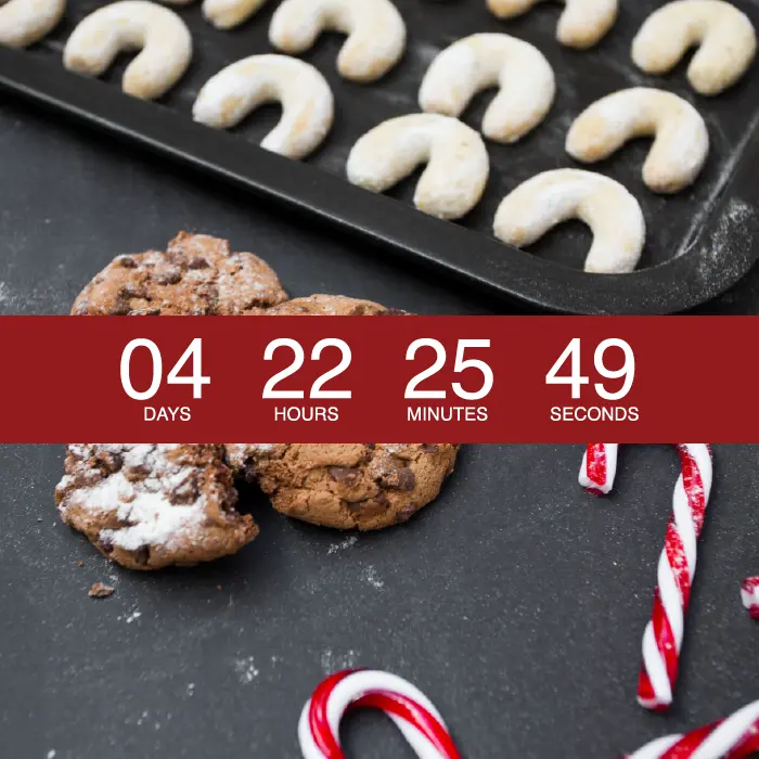
Have you received any emails with Christmas countdown timers and thought, I wonder how they did that? You’re in luck—today, we’ll show you how. Countdown timers in emails are a fun tool for adding dynamic, attention-grabbing motion – see our video tutorial at the above link! Here’s how to create a festive timer for all of your Christmas email marketing needs:
WHY ADD A CHRISTMAS COUNTDOWN TIMER?
Honestly, we’re surprised we haven’t seen more December timers in emails this season. More brands should consider using them! Here’s why:
- Adding Christmas countdown tickers is easy! Seriously. It’s just a matter of copying-and-pasting a few lines of code.
- Timers captivate readers’ attention better than static images.
- A countdown creates urgency. Seeing a ticking clock gives readers an incentive to act now—resulting in a conversion rate that increases by as much as 400 percent for some brands.
- Including a timer demonstrates that your brand is visually sophisticated, innovative, and thoughtful.
Plus, the festive holiday season is the perfect time to use a timer. With time-sensitive promotions and shipping deadlines—not to mention a flood of competing emails—seasonal timers are a smart way to send a clear message, add visual interest, and help your message stand out. And you don’t have to save these timers just for Christmas—they’re an awesome way to jazz up your emails when New Year’s rolls around, too. Before we jump into the how-to, let’s take a look at a few emails that do a great job incorporating Christmas countdown timers.
CHRISTMAS COUNTDOWN DESIGN INSPIRATION
Society6
You don’t have to set your countdown timer for December 25 — you can also use it to count down to when a sale will end, or notify a customer when their free trial is almost over. Here, Society6 used a timer with a countdown to the shipping deadline day to receive orders by December 24.
Function of Beauty
This hair care company used a mid-December email with a countdown timer to notify readers that it’s time to get moving: Order by this Sunday, the email said, and we’ll get your gift under the tree in plenty of time.
Timberland
Timberland got creative—instead of creating a ticker with the numbers running, the company added a calendar strip at the top of the email with an X on the day the message was sent.
The sky’s the limit with countdown timers, and remember, they’re easy to create and insert into a message. Plus, 99 percent of email providers display countdown timers correctly, meaning almost all of your email list can enjoy. So, let’s get started on the tutorial!
TOOLS YOU’LL NEED
Here are some tools to help you build an email with a merry countdown:
- Use the BEE editor to build and design our email message.
- Use a free email countdown timer generator. We like Sendtric because it’s simple to use (and, yes, free!) Plus, the timer it creates is an animated GIF, so it will render well in email. A number of online platforms (listed below) also offer easy-to-use countdown timers to add to any email campaign:
- FreshRelevance
- PowerInbox
- MotionMail
- Promofeatures
You can also use looped GIFs as your countdown timer by choosing a timer GIF from Tumblr or Giphy and inserting it into the email. HTML timers load more quickly, though; they also look professional, and aren’t that difficult to make.
YOUR HOW-TO GUIDE
To show how easy it is to add Christmas countdown timers to emails, let’s recreate this email from Paper Culture, the online card shop.
This email actually doesn't have a timer in its original design. Instead, the message (a static image) simply says there are Xhours left in the sale. But wouldn't the email be more compelling if it showedhow many hours are left in a countdown timer?
Video overview: How to build a Christmas countdown email
How easy is it to add one in your email message? As easy as watching our two-minute video tutorial! Be sure to check out our steps below for all the details.
STEP 1: DESIGN THE EMAIL IN BEE
Open up the BEE editor and start with a basic single-column template. Trim Paper Culture’s image and add it to the template. You don’t need the “HOURS LEFT” text at the top because that’s where the timer will be placed, and plain text (the fine print) will also be added to the bottom of the email. Doing this will balance the text-image ratio better, which is an email design best practice.
Here's our message with the remaining text and header:
To create a placeholder for the countdown timer, add an HTML block. This is where the timer code will be dropped once it's created.Here's how the HTML block looks in the Content menu. Just grab and drag it into the template.
Place it above the 50% off image, as seen below.
Now, the message is ready for the timer.
STEP 2: MAKE THE COUNTDOWN TIMER WITH SENDTRIC
Creating a free email countdown timer withSendtric is a pretty straightforward process.
After entering an email address, add the campaign end date. You can set a date that’s up to a month out. Paper Culture’s sale already ended, so let’s choose a future date just to illustrate how the timer works. (Remember to keep time zones in mind as you choose your end date and time; Sendtric can help you with this step.)Next, update the background and numbercolors. Use an online HTML match tool to find the exact colors (with hex codes) that you want. Click Generateand you have the HTML code for the timer:Then, copy the code from the text box and paste it into the HTML content block.
And...voilá! Here is the result:
To give some context, drag in a text box either above or below it. Finally, add a short line of copy. And for an extra personal touch this holiday season, you could even consider using a similar approach to create a Christmas countdown email signature.
USING A COUNTDOWN TIMER IN EMAIL? GO PRO!
There’s no excuse not to try countdown timers in your next holiday email campaign! If you’re not already using BEE, sign up for a BEE Pro free trial to enjoy access to additional templates and design features—including templates specifically made for Christmas email design. Now, how many days until Christmas?
Tutorial: How to Add Background Images in Email
For today's exciting workshop, we have a new feature introduced in the BEE editor: you can now add background images to your emails. We promise this is going to be your new favorite email design trick, so let's dive in!
Background images in action
Start looking for them, and you'll find images with text overlay in most emails in your inbox. Here's an example from Skillshare:
Anotherfrom Huckberry:
And one from Brit + Co.:
One from Everlane:
And on andon. Adding text to images is a great way to:
- Customize stock photos to make them your own
- Encourage readers to click on an image
- Bring text "above the fold" in your email (instead of positioning text beneath an image)
However, these "email background images" aren't really background images at all. That's because the text and the image are part of a single JPG, PNG, or other image file. The text isn't plain text; it's part of the image, added in Photoshop or with another tool. As a result, if the image doesn't show up because of image-blocking, the text doesn't appear either. And changing the text requires editing the image.Today, we're going to show you how to create true email background images with plain text on top.This means that even if your images don't load, your text will be preserved, and changing the text does not require editing the image.We'll also show you how you can repeat an image across an entire row to create pattern or texture.This new capability in the BEE email editor is one thatdesigners have been asking for.It doesn't require any coding and is much easier to implement than in other design tools, or even in an ESP like Outlook. Let's take a look athow it works!
Using email background images
Let's use this module from a Litmus email as today's inspiration.We'll recreate it in BEE.
Video tutorial
Want to see how to add a background image in your email quickly? Watch our video tutorial and follow along step-by-step below:
Choose an email template
Open the BEE editor at beefree.io.Choose a template to get started. We typically choose the basic one-column template. (Tip: If you need a ready-to-goprofessional email template for business, BEE has those, too!)
Enable the row background image
Simply click on any row of content, and you'll see there's now a Row background image option in the Structure menu in the right panel.Enable it, then click "Change image" to browse for a photo.
Browse for an image
You can find free, high-resolution stock photos in BEE, so let's look forone. (You could also upload your own image or paste in animage URL).On the next screen, tap the "myfiles" folder or open one of your folders from the file manager.
Then, press "Search free photos" CTA at the top.
Drawing inspiration from the Litmus email, let's search "stars" or "night sky" to see what turns up.
Choose an image to import, then insert it in the email. Here is the result:
Drag-and-drop content
Using the image placeholder that's already in the template, add the calendar image by dragging it in. Continue adding content placeholders for the Litmus logo, text, and CTA button. After dragging and dropping each module, take a look at how the email is shaping up:
Notice how the text, images, and even the CTA button sit on top of the background image. This allows for plain text and a bulletproof CTA—email design best practices—to build the entire email all within BEE.To finish up, add other necessary images and text, then format the styles, colors, and padding. Here's howthe finished product looks:
Pretty awesome, right? Email background images are simple and straightforward to use in BEE. With background images, youremails won't just look beautiful—they'll be more functional and effective than ever before.
Background image settings
Once you selectyour background image, you can also adjust how it appears in your email. There are three key settings: Full width, Repeat, and Center.
Use them to findthe best fit for your background image. Select "repeat," for example, to create a pattern. This is especially useful if your image doesn't span the entire width of the email but you want it to.As with any image in BEE, you can also edit it using the built-in photo editor. You can alwayscrop, filter, add in specialeffects,etc.
Email client compatibility & setting up a fallback background color
Just like with any advanced email design, you need to keep an eye if any mobile and email clients support background images. According to our recent tests, the only email clients that did not show email background images were:
- Outlook 2016 on MAC OS X 10.10
- Lotus Notes 7
- Xfinity / Comcast email client
For those email clients (and for best results when images are blocked) make sure that you set a background color in the necessary row as a fallback background color in those cases when your background image doesn't render.To set a background color, simply select the row, then use your Structure menu to choose a Row background color or Content background color.
Tip: Add background images to Gmail emails with BEE Pro Connector
Did you knowany email designed in the BEE editor can be exported to Gmail?The BEE Gmail connector lets you design any email in BEE, then move the fully-designed email over to your Gmail drafts folder—ready to be sent—in a matter of clicks. Check out our quick tutorial to learn how.
Using background images in your emails? Go Pro!
We hope you enjoy this new email background images feature, as we're striving to build the Best Email Editor or BEE in short! If you're not already usingBEE, sign-up for a BEE Pro free trial and have access to additional templates and design features.SaveSave
Tutorial: Tips for Using Stock Photos in Email
Stock photos sometimesgeta bad wrap for being cheesy, outdated, and irrelevant. Luckily,many new stock photo resources offer beautiful, high-quality images that email marketerscan actually get excited about using in email.But it's still important to use these images properly.There's an art tofinding, editing, and incorporating photos in email.Make the process of choosing stock images even easierby searching for free photos directly in our visual email builder.Today, we'll give you our top tips for using stock photos in email, along with a tutorial on how to use the photo search tool directly from the BEE editor.
1. Find stock photos that fit your brand.
Formany readers, thevisual elements of your email get more attention than the written components. Eyes naturally gravitate toward images, buttons, and colors first, and we digest that information more quickly. So, when choosing stock photos, it's important to be mindful that those imagesare on-brand. Your brand or style guide should have a section that explains the kinds of photos to be used and details for how they should look—like the kinds of people and scenes that should be depicted, the emotions they should evoke, if they get treated with filters, or if they should be cropped a certain way. If you don't have something for your brand, thencreate one by following these visual style guide tips! Some of the most effective style guides are simple and straightforward.In a recentpost,21 Email Design Tools to Transform Your Emails, we listed some of our favorite stock photo libraries and tools, likeUnsplash andPexels. Since then, we've partnered with three popular stock photo services—Unsplash, Pexels, and Pixabay—to giveBEE users the ability to search through a hugerepository ofhigh-quality images that are free to use under the Creative Commons Zero (CC0) license.
How to add a stock image in BEE
When you are editing an email or a landing page with BEE's drag-and-drop builder, simply pull up the file manager by clicking on Change imagewhen an existing image is selected, or by adding a new image block and clicking on Browse. Navigate to the folder where you want to update your image, and the select Search free photos button in the top bar.
In the search menu, simply add a keyword and browse the search results for an image that works for you. When searching for "summer," you'll notice that each image preview shows you which of the services photos came from, the link to the original photo, and a blue Import CTA button. Once youimport one of the photosfrom thesearch results, it gets added to yourfile manager. Simplyclick on the Insert button (a plus sign) to add the image tothemessage.
2. Edit stock photos to make them your own.
Email images often include text overlays to make a branded statement. We previously discussedhow effective this SkillCrush header image was at connecting with its target audience and communicating a strong value proposition:
Scanning our inbox today, we can find hundreds of emails with text-and-image pairings from different brands, like these from Jimmy Choo, Restoration Hardware, and Express. As you can see, adding text to images doesn't have to be complicated. You can save time and design resources by skipping Photoshop and editingphotosdirectly in the BEE editor.
How to edit images in BEE
Choosean image andnavigate to the menu on the right. Select Apply effects & more.
Use the built-in image editor to make edits to your image, without leaving the email builder. You can make almost any adjustment to the image, like setting a filter, cropping or rotating, adjusting the saturation and contrast, and more.
To add text, select the Text option from the image editor's toolbar. In the text editor, adjust the font type and color from the top menu. You can also adjust the size of your text by dragging the corner of the text box.
Make sure your font color contrasts with the background, so the text is easy to read. Treat text in images like headers: short phrases work best, and keep the total amount of text to a minimum. Your image should communicate a single key message. When you're done editing the image, click on Apply and then Save.
3. Remember image design best practices.
Whether you're using stock ororiginal photos, and whether you edit them or not, keep in mind design best practices for all your email images.
Be cognizant of your image-to-text ratio.
An all-image email is likely to get filtered as spam or it may take too long to download. A best practice is to make sure you have at least 500 characters of text to pass spam filters. Once you design a beautiful header image, complete your email withsupporting text.
Add a link to your image.
Treat your image like a call to action and link it to the landing page where you're driving readers. All images in your email should be linked.
Use ALT text.
Even when your images don't appear because of a reader's settings, the ALT text you set for each photo will still show up. This means you can still communicate your message in text form,which is critical when that's all readers are seeing!
Lead readers to a call-to-action.
Not only should your image be linked, but it should lead readers to your CTA button. Since images arewhere readers’ eyes are likely to land, the CTA shouldn’t be far away. Plus, if your image doesn't load or show up in a reader's inbox, your bulletproof CTA will still appear. So even if your image is linked, it's valuable to have a button, too.
Check out the free stock photo gallery!
Test this feature yourself within minutes. Load our email templates catalog, which features over 1,000 professionally designed, responsive email templates. Select the template that you wish to start with, or start from scratch. Click on Get started to load the drag-and-drop editor, and off you go!
Tutorial: How to Begin A/B Testing Email Designs
Want to know which email campaigns catch your readers' eyes? Try this easy solution: A/B testing.A/B testing compares two versions of the same thing (subject headlines, email design layouts, CTA buttons, etc.) until you narrow down results for comparison. Not surprisingly, the data that results from the A/B testing is powerful, from open rates to click-through rates to conversions, and reveals howyour audience responds to changing variables. It's a great testing and optimization method to understand your audience's reaction to changes in calls-to-action, layout, and background color.Today, we'll be using Beefree to walk you through how to conduct A/B testing on your email design. If you're not already using Beefree, sign-up for our free plan!
How to decide what to test
Before designing your A/B campaign, determine what you want to test. To start, choose just one variable so your results are clear. Here are some examples of commonly tested variables:Design
- CTA size and style. Full-width button or smaller? Green or red? Tall or short?
- Layout. Single column or multiple?
- Color scheme. White or gray background? Blue or green header text?
- Image size or variety. Two product images or four? Still image or animated GIF?
- Information amount. Include secondary content or not? Social media buttons or not? Nav menu or not?
- Information placement. Social buttons at the top or bottom? CTA button mid-way through or at the end?
Content and Time
- From line. Your business name or the name of an individual?
- Subject line. Shorter or longer? Emoji or no emoji? Include "" language or not?
- CTA language. "Claim your ebook now" or "Claim your free ebook"?
- Body text. "Pushy" language or more subtle? Six sentences or three?
- Send time. Will there be more opens at 8:00 AM or at 4:00 PM?
Best practices for A/B testing
As you prepare your campaign, do your research and be sure to follow some best practices, including:
- Determine your success metric first. Open rates will make sense if you're testing subject lines; click-through or conversion rates for design changes. Know what you're evaluating in advance.
- Test only one thing at a time. If you change more than one variable, you won't be able to tell what caused the change in response.
- Test a big sample size. Understand how many responses you need to show statistical significance.
- Send A and B versions at the same time. Time is a variable, so be consistent by having both campaigns be sent at the same time (to different groups)—unless send time IS your variable.
Today's Workshop: How to A/B test email design changes
Let's walk through how to A/B testing related to design by using this email example fromVerywell, a site that provides health advice and resources.
A/B Design Test 1: CTA button
Verywell'scurrent version of the email has no call-to-action button. What if we added one in the first module to see how it changed the click-through rate?For the "A" version: Let's first recreate the Verywell email as-is in the Beefree editor. Using the drag-and-drop functionality, the basic email outline from the Structure menu can be pulled, followed by the appropriate content blocks and content. Here's the first half of the email, i.e. our part "A" of the test:
For the"B" version,simply drag a CTA from the Content menu and format it.We chose a button that matches the header color, is nearly the width of the email, and uses some urgency in the text, "Check out the recipe now." So will this CTA increase clicks? Well, we'll just need to send our A/B test emails to find out!
Just a note: In Beefree, it's easy to save your email and edit it later. Look for the blue "Save Message" button in the upper right corner. This way, you can create one version—like your "A" version—and save it to edit later.
But the important thing to know about A/B testing is: you can also copy an entire email in Beefree to make modifications to your "B" version and save it. Look for the "Create a copy" command in the "Edit Message" drop-down menu. Creating a copy means you won't have to start from scratch to create a second version.
A/B Design Test 2: Layout
Without multiple columns, but how would Verywell's email perform if a version included the first module as a single column?Instead of arranging the header text and image side-by-side, let's update the layoutso the image appears above the text.Using Beefree's drag-and-drop functionality, changing the layout is super simple. Starting with the "A" version, we'll drag in a single-column structure as a destination for our content:
Then, grab the existing header text, and drag it down:
Finally,grab the image and drag that underneath the text:
That's it! The text re-flows and image resizes, so our email is automatically formatted nicely. Now, we can delete the empty two-column structure, and the new email is ready to go:
A/B Design Test 3: Background color
Even thoughVerywell's email has a nice, clean look with an all-white background, how would readers react if the first module has a bight background color that matches the brand's teal color?To change the background color, let'sselect the top row, then navigate to the Structure menu and update Content background.
After that, let's update the text from black to white to make it readable, and our new module is ready to be tested:
Running any A/B tests? Go Pro!
It's easy to create different versions of an email and test which one performs best. Just remember to stick to one variable at a time in order to understand what your subscribers are reacting to at specific moments. Feel free to try our tips out and sign-up for our free plan!
Stay informed on all email trends
From the latest creative design strategies that inspire your next campaign to industry best practices and tech advancements, our newsletter is the go-to for all things creation.