It's almost Turkey Day! If your inbox is as festive as ours is, you've probably received recipes, promotions, GIFs, and autumn-themed content galore. As the holiday draws near, brands are flexing their marketing muscles in preparation for the year's biggest spending season. It's fun to watch. And, we caught an interesting Thanksgiving email design trend emerging: quirky content blocks.Brands are getting playful with module design, layering images, colors, and type in innovative ways. The result: emails that look collaged and almost handmade. The good news is, many of these techniques are easy to implement. We'll point out how, so let's dive in!
A Closer Look: Creative Module Design in Thanksgiving Emails
#1. Anthropologie: Differently sized modules with repeat patterns, fonts, & colors
Anthropologie's aesthetic is colorful yet sophisticated, in a boho-chic sort of way. In email, Anthro often features intricate product displays with distinct brand fonts and features. This Thanksgiving, their email design is no exception.While none of these modules look the same as the others, design treatments repeat to create cohesion. Each module includes encircled numbers, uneven tracking between words, orange or yellow color blocks, and the same alternating typefaces. And, modules are one of two sizes. The repetition—and clean white breaks between sections—is what makes this email work, even when there's a lot going on.

#2. Of a Kind: Mini module collages with a paper-cut look
Of a Kind's Thanksgiving outfit inspiration email is a numbered list, like Anthropologie's. Modules alternate between orange or white backgrounds, plus some product photos extend beyond borders.The result? The email stands out amidst other multi-product display messages. Just arranging images unevenly, in different sizes, with variable background colors makes the email look unique, thoughtful, and crafty.

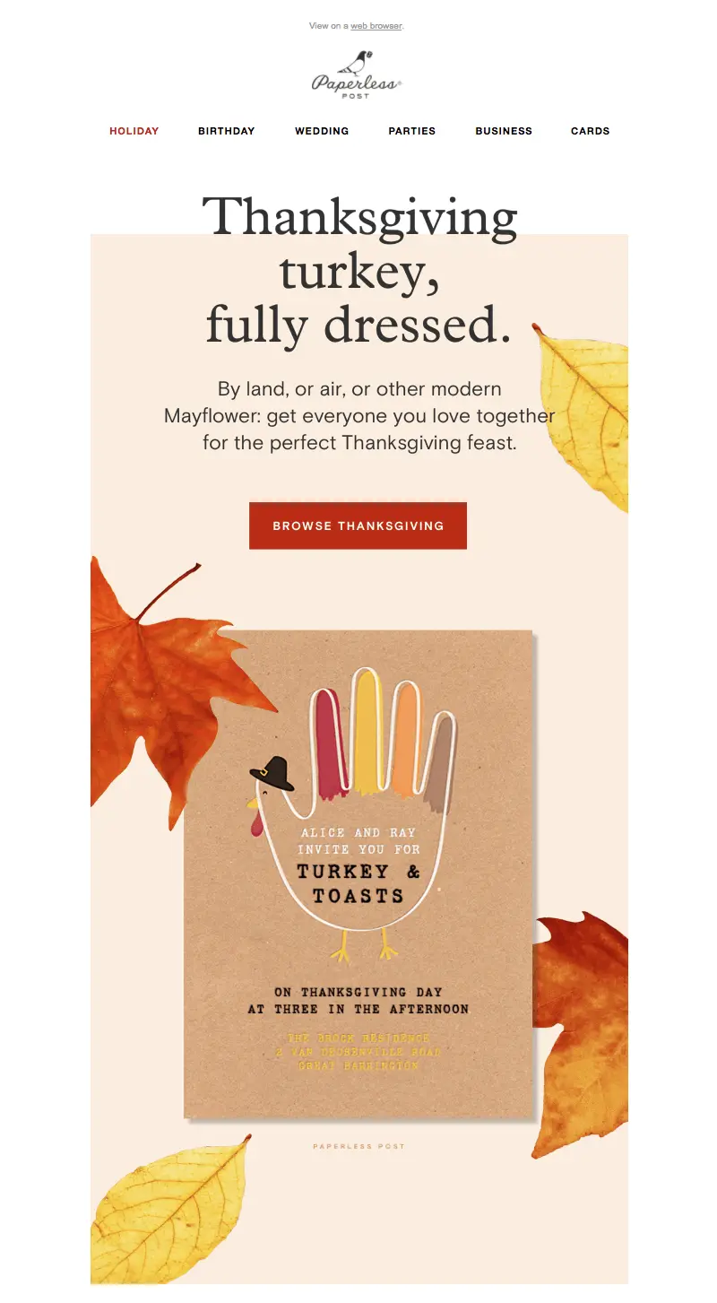
#3. Paperless Post: Misaligned text and background
Have you noticed a pattern with these emails? Nothing is lined up perfectly or laid out in an even grid. Design elements flow from one content structure to the next. In this Paperless Post Thanksgiving email, the header text actually begins above the hero image and flows into it.
#4. Sur La Table: Cascading image overlap
In this email from Sur la Table, images overlap again from one content block to the next, creating a cascading effect that keeps the reader's eyes moving down.

#5. Williams Sonoma: Z-pattern checkerboard
Not every email follows a quirky, uneven aesthetic. Instead, Williams Sonoma adheres to a clean checkerboard pattern. Text and images form a grid that flows from hero image downward. The look is more polished, and it makes room for more text.

#6. Food52: Translucent textbox overlay
In contrast to the even pattern above, Food52 switches things up. Image alignment alternates from one module to the next, in a Z-like pattern, but overlapping text gives the email a look that's a bit more askew. Instead of overlapping, white padding also buffers one content block from the following one.

#7. Ethan Allen: A combination of image styles and sizes
Ethan Allen's Thanksgiving email design uses a little bit of everything. It includes overlapping images, different image styles and sizes, and variable module layouts within the email. Still, ample white space and consistent number styling offercohesion.

Design Tips: Create Quirky Content Blocks in Your Drag-and-Drop Editor
Whether you're in the midst of finalizing your own Thanksgiving email design or if you're looking to jazz up your next campaign, you can try these design techniques right away. Most are easy to implement! There's a lot you can accomplish within a drag-and-drop editor, including our BEE editor, which allows for plenty of fine-tuning. Here are our quick tips.
#1. Switch up your email structure.
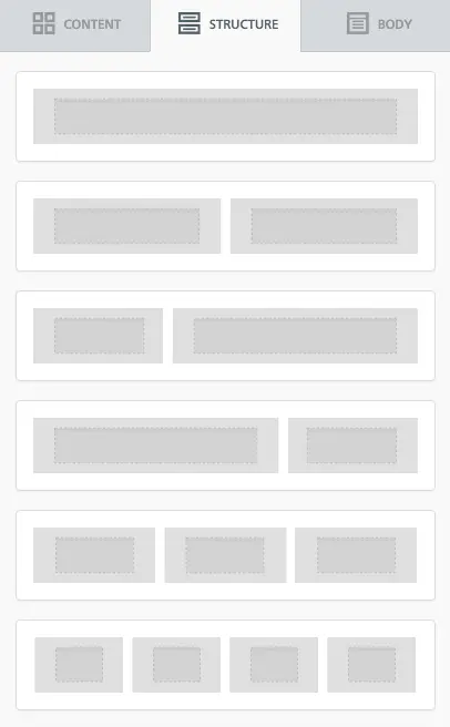
We often favor single-column email design, but it's clear from the emails above that having multiple columns often looks great. If you want to add some pizazz to your email, try an unusual layout. You can start by lining up content structures that are different from one another. Then, drop in your content. In the BEE editor, the Structure menu is where you can find your layout options. Check out our tutorial on how to optimize multi-column email design.
#2. Play with borders and padding.
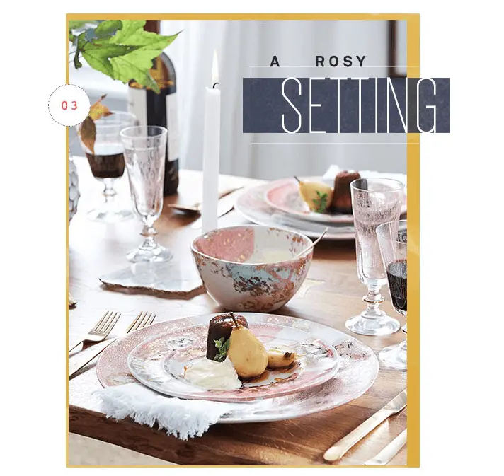
In the Anthropologie email, borders and padding around images are applied unevenly around images, like the yellow border in module #3.
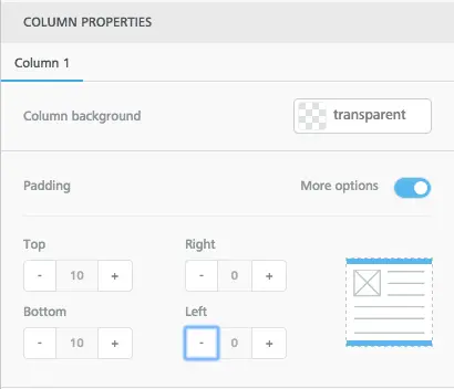
Achieve a similar look by fine-tuning the borders around your own content so that some sides have thicker borders than others.In BEE, use the Column Properties menu to adjust the padding around a content block.
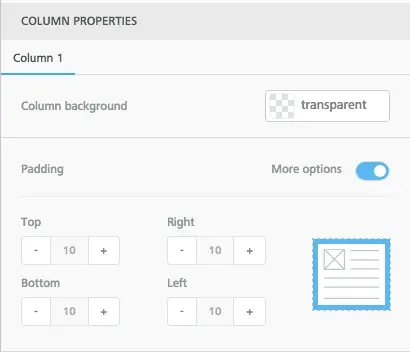
When you select More Options, you can adjust the padding so that it's thicker on some sides than others. Voila!
#3. Add alternating HTML background colors behind images and modules.
Try using different background colors from one module to the next. Alternate between a bold color and white. You can also use one color as your module background color, plus a second color behind and around your images, like Of a Kind's email.In the BEE editor, you can select any structure in your email, then adjust the Row background color and Content background color.
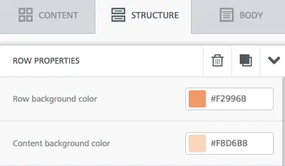
This also means you can create the same effect as the Paperless Post email by assigning the "Thanksgiving" module one color (white), followed by a background image (or HTML background color) with live text.
#4. Place some text over background images and some alongside them.
Using the Ethan Allen email as inspiration, alternate your text placement within an email. Some content sits next to an image, while some content is on top of it. If you haven't started using live text over background images, now's the time to start!
#5. Alternate between landscape and vertical images.
Even if you're designing a single-column email, this doesn't mean your content has to be edge-to-edge. Use differently sized images like many of these emails do to create a quirky effect. And for tips on lining up photos in interesting ways, catch our tutorial on how to adjust image padding and borders.
#6. Make a numbered list.
This tip speaks for itself! But make sure you have fun with number styling and placement. Try adding numbers as live text atop images, or inflate the numbers' font size and let it take up all the space in its own content block. Left-adjust numbers in some modules, and right-adjust in others.
#7. Check your design on mobile.
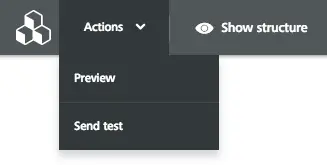
Going gangbusters with quirky, creative module design is fun, but make sure your design looks good on mobile when you're finished! In BEE, use the Actions menu to preview any design you build.
Ready to improve your Thankgiving email design?
Go Pro!If you’re not already using BEE, sign-up for aBEE Pro free trialand get access to additional templates and design features. Happy Thanksgiving, and happy designing!
