Solutions

Exciting Beefree Updates: Export Emails to PDF, Undo/Redo, & More

Good news, email designers! We recently launched new and exciting BEE Pro updates that will help make your email design process smoother, faster, and easier....
Beefree team
Beefree team
Sep 27, 2018

Good news, email designers! We recently launched new and exciting BEE Pro updates that will help make your email design process smoother, faster, and easier. Today we'll show you how to:

  • Undo and redo changes as you design
  • View the design history of an email—and rewind and fast-forward to any point in your recent edit history
  • Export your email to PDF for improved share and review processes

Undo, redo, and view change history

Made a mistake while assembling your email? It happens to all of us. Now, you can easily undo (and redo) as you design in BEE Free and BEE Pro.

BEE Pro updates

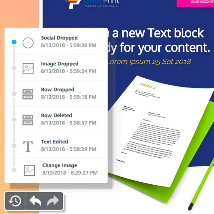
Here's how it works: As soon as you make any updates or changes to an email, an Undo-Redo widget will appear at the bottom left corner of your design screen.

BEE Pro updates

The widget includes Undo and Redo arrows to move easily between changes. TheUndowidget currently remembers the 15 most recent changes in the current browser session (it does not remember changes that happened during a different session).The clock icon, when clicked, expands to reveal a full timeline of all the latest changes:

BEE Pro updates

For each event in the timeline, you'll see:

  • An icon to identify the type of content that was changed (an image, text box, and so on)
  • A description of what changed (including the new value assigned to the element, if any—e.g., 5px)
  • The time the change was made

When the timeline is open, you can click on any event to return to a previous version.

BEE Pro updates

When you select a previous step in the timeline, the content or row that was edited becomes highlighted. This way, you can easily spot the change within the email itself.Note: When you go back in time, the timeline for more recent changes remains available, allowing you to move forward again, without losing any of the edits.

BEE Pro updates

Now it's easier than ever to fine-tune your emails and toggle between drafts. We hope you get a lot of use out of this new feature, and that it makes your design process better and easier!

Export emails to PDF

If you ever want to quickly send a work-in-progress email design with colleagues, this new feature should streamline your process. You can now turn any email into a PDF in both the BEE Free and BEE Pro platforms. This means you can now share your PDF email in Slack, print it out, email it, etc.

BEE Pro updates

Downloading any message to PDF is easy. From theProjects screen, use the Edit drop-down menu to choose Export.

BEE Pro updates

On the pop-up screen, simply tap Download a PDF file.

BEE Pro updates

Then, you can choose which size you want your PDF to be.

BEE Pro updates

Finally, click Download Your File, and there you have it!

Will you be trying these new BEE Pro updates? Let us know if you have any questions or ideas in the comments! Happy designing!

How to quickly create wonderful emails directly in your Gmail account

Emily Santos
Emily Santos
Sep 16, 2018

It's time to level up your email messages with professional ready-to-use Gmail templates including event promotions, invitations, greeting cards, thank you notes, startup presentations, blog updates, job alerts, product announcements. BEE Templates for Gmail is FREE: http://goo.gl/QnUCBYNo registration is required to use the BEE email templates within your Gmail™ account: just install the add-on and start creating cool emails!Use "BEE Templates for Gmail" whenever style matters, including:- Surprise your friends with fun get-together invites.- Send "Happy Holidays" greeting cards your family will love.- Motivate your employees or teammates with visually rich messages.- Say "Happy Birthday" like you really mean it.- Introduce yourself with style when applying for your dream job.- Impress potential investors with your new startup project.- Send a message that will melt her heart.- Create event invitations that can't be turned down.Take a look to our tutorial about how to use BEE Templates for Gmail™ to create wonderful personal email messages:http://live-emaildesign.pantheonsite.io/2018/10/tutorial-how-to-use-bee-templates-for-gmail/

Tutorial: 5 Responsive Email Templates You Can Create

Beefree team
Beefree team
Aug 29, 2018

We've written before about the essential templates email marketer should have on-hand:a letter or text-based template, an invitation template, an announcement or reminder template, a content roundup template, and a product feature template. And the templates are even better when they're automatically responsive on mobile devices. Designers use responsive email templates as a consistent brand foundation, which saves time and improves workflow efficiency. (Can you imagine starting from scratch all the time?!) In this tutorial, we'll first show you some solid examples from big brands, and then we'll walk you through how to mimic and build these essential templates (all mobile responsive) in the BEE editor.

1. Text-based templates

Letter or text-based templates are commonly used to send a personal or serious message to subscribers,like an update to the Privacy Policy or Terms of Service. Check out this email from Airbnb:

Airbnb responsive email templates

A letter or text-based email template is useful for:

  1. Welcome emails
  2. Apology messages
  3. Company or product change announcements
  4. Privacy policy or terms of service change announcements
  5. Weekly or routinely sent messages

For letter or text-based email templates, important components to consider including are:

  1. A standard, branded header/logo
  2. An easy-to-read email-safe font for the body text
  3. A call-to-action button
  4. An e-signature
  5. A footer

Building a text-based template in BEE

Open up a simple one-column template and begin customizing the template in the Settings menu on the right. This menu will let you make changes for the entire email in one go. Let's change the font to Helvetica, make sure the background colors are white/transparent, and update the links to show up as Airbnb's coral brand color.

BEE Pro responsive email templates

Next, recreate the basic structure of the email, which has three basic parts: the logo header, the body text, and the footer separated by a divider.Drag in an image block, followed by two text blocks separated by a divider:

BEE Pro responsive email templates

Once you drop in the logo, position it by turning off the auto-width function and making sure it's left-adjusted.

BEE Pro responsive email templates

After updating the footer text, the template is ready to go! Now, this letter-style template can be updated by just dropping in the appropriate body text.

BEE Pro responsive email templates

2. Invitation-to-join templates

Invitation emails require companies to introduce an offer's value proposition quickly, whether it's joining a webinar or downloading a free e-book. Having a strong invitation template means you'll always have aconsistent way to alert readers to the "what, when, where, and how" of anoffer,so that readers can get the basics in one scan and take action. This email fromSkillshareinvitessubscribers to sign up for new workshops:

Skillshare responsive email templates

An invitation email template is useful for:

  1. Webinars, conferences, or other reservation-required events
  2. Lead gen offerings like giveaways or downloads
  3. New product introductions

For invitation email templates, important components to consider including are:

  1. A logo/header
  2. A strong visual image or two (especially of the product)
  3. A fairly short section providing promotion highlights
  4. Clear and strong call-to-action language
  5. A footer

Building a text-based template in BEE

First, in the Settings menu, make sure the email body has a white/transparent background, teal link text, and Helvetica for the font.

BEE Pro responsive email templates

Then, pull in the rows that correspond to the layout, from single-column to triple to double, along with content blocks. Here's how the template is shaping up:

BEE Pro responsive email templates

Next, update the font color and stylethroughout the email, along withthe CTA buttons (extra button formatting tips can be found here!) so that this template will be easy to update later with copy and images.

BEE Pro responsive email templates

3. Announcement/reminder emails

Every marketer needs a template that's ideal for sending out an email, with a single, clear message to readers.While the template might get updated from time to time, it's valuable to have a structured template with a standard width and flow in place. Everlane, for example, always usesthe same header, content dividers, "Radical Transparency" section, and footer for announcement emails.

Everlane responsive email templates

An announcement email template is useful for:

  1. Big promotion alerts or reminders
  2. Product teasers, reveals, or updates
  3. Event reminders

For announcement email templates, important components to consider including are:

  1. A standard, branded header/logo
  2. A placeholder for artwork
  3. A consistently-formatted section for body text
  4. A clear call-to-action button
  5. A footer

Building an announcement email template in BEE

Start by modifying elements in the Settings menu, like an all-white background and aserif font.

BEE Pro responsive email templates

Then, use the simple one-column template and bring in three main components: an image placeholder for the logo, an image placeholder for artwork, a CTA button, an image and text bucket for the"Radical Transparency" section, and text for the footer. Let's also add horizontal dividers like Everlane. The skeleton looks like this:

BEE Pro responsive email templates

Now, bring in the Everlane logo and the Radical Transparency image; then, format and update the text and CTA button. Here's the template, ready to be updated with the next product announcement:

BEE Pro responsive email templates

4. Content roundup emails

A single column, modular design is perfect for content roundups—something any brand should have in their template library. Core77 lists their most popular free classes in a well-organized and well-formatted email,which can be easily repurposed from week to week with new content:

Core77 responsive email templates

A roundup email template is useful for:

  1. Product/service lists
  2. Blog/article digests

For content roundup email templates, important components to consider including are:

  1. A standard, branded header/logo
  2. Consistently-formatted modules containing images, text, and CTAs
  3. A footer

Building a content roundup email template in BEE

This email is especially easy to create in BEE with a sweet little shortcut. To begin, build the header and first module of the email, like so:

BEE Pro responsive email templates

Then, copy the first module as many times as needed without having to reformat each time. Simply use the duplicate button in the upper right.

BEE Pro responsive email templates

Now, the template is ready to rock-n-roll!

BEE Pro responsive email templates

5. Multiple products templates

A product feature email template is a baseline for aregularly-scheduled product offering message that features multiple items.Danner uses a simple template to introduce and remind subscribers about featured boot collections:

Danner responsive email templates

A multiple-product email template is useful for:

  1. Featuring products/services in a photo collage or grid
  2. Blog/articles organized in a grid

For multiple-product email templates, important components to consider including are:

  1. A standard, branded header/logo
  2. A consistently-formatted module highlighting a single product
  3. A mobile-responsive grid of images featuring additional products
  4. A call-to-action button

Building a multiple-product roundup email template in BEE

Over in the BEE editor, begin with a basic one-column template. Then, pull in content blocks so the structure is similar starting with a logo image, header text, a header image, text, a CTA button, and on and on.

BEE Pro responsive email templates

Once the text and CTA buttons are formatted, the template is ready to go!

BEE Pro responsive email templates

Build your own responsive email templates today with a free trial of BEE Pro! The editor is intuitive and easy to use, and all your beautiful templates can be saved and repurposed for every newsletter need!

Creating Email Marketing Campaigns with Beefree Email Templates

Having ready-to-go email templates makes life easier for your marketing team and ensures your beautiful emails are always on brand. Templates allow your emai...
Beefree team
Beefree team
Aug 14, 2018

Having ready-to-go email templates makes life easier for your marketing team and ensures your beautiful emails are always on brand. Templates allow your emailsto start offwith a foundation for your brand’s visual style, so you don’t have to reinvent the wheel each time. Today, we're going to walk through how to create BEE Pro email templates. Sending email is about to get easier. Let's go!

Step 1: The best way to create a new message or new email marketing campaign in BEE Pro

Any new email built in BEE Pro can become a template. To get started, log in and create a new message.When you log in, you'll see this navigation menu:Projects | Templates | SettingsProjects are folders to organize messages. Templates are where default and created templates are stored.Stay in Projects view to begin. Click theCreate a new projectbutton to start a new project (or open an existing project folder).

BEE Pro Email Templates

Name your new folder and choose a color to sort it or help it stand out.

BEE Pro Email Templates

Once your folder is created, click on it to open. Then, click theCreate a new messagebutton on the upper right.

BEE Pro Email Templates

Once you create a new message, you'll see Default templates, where you can choose from a library of ready-made templates or start from scratch.

BEE Pro Email Templates

Select a template and then go ahead with modifying/designing your email. When you're finished, click Save and add a Nameto reference your email later.Click Save again, and your message will be saved with its custom name and description.

BEE Pro Email Templates

Now, you'll now be able to export your email for use. Just click on the Export message button and choose how you want to export the message (HTML, to an email service platform, .zip, .pdf).

BEE Pro Email Templates

You just made a beautiful email that's ready to send! And, it can also be turned into a template...

Step 2: Turn your message into a template

After you've created a message for email campaign, it's easy to save the message as a template!From the same page that you exported the message, click on Create a template.

BEE Pro Email Templates

Next, navigate to Templates and the template you just created will now be visible. Voilá!

BEE Pro Email Templates

We recommend renaming the template to avoid confusion with your original message. Do this by toggling to the drop-down menu on the right and choosing View details.

BEE Pro Email Templates

ChoossEdit and type in aNamefor your template (to set it apart from the previously created Message).

BEE Pro Email Templates

Your new template is now saved and stored! So, what happens when you want to use that template to make your next email campaign? Keep reading...

Step 3: Use your template to create a new email

Navigate back to Projects in the main menu and open the project folder you'd like to work in. From there, click the Create a new message button in the upper right.

BEE Pro Email Templates

Now, navigate to My Templateswhere all of your customized templates are stored.

BEE Pro Email Templates

You'll now be able to find and choose your own customized templates.

BEE Pro Email Templates

Then, you can update your email however you like, save, and export again!

Ready to make and save your own BEE Pro email templates?

Sign-up for aBEE Pro free trialand get access to a full template library, plus tons of free stock images and easy-to-use tools to make your email look perfect! Let us know if you have any questions about this tutorial, and happy email designing!

Tutorial: How to Build a One-Question Survey Email

A one-question survey emailallows readers to take immediate action intheir inboxes. When just one question in the body of an email, it's easy for subscribers...

Beefree team
Beefree team
Aug 3, 2018

A one-question survey emailallows readers to take immediate action intheir inboxes. When just one question in the body of an email, it's easy for subscribers to respond and easy for you to collect valuable data!

A few examples

Let's take a look at some examples of fun and simple one-question surveys that use a mix of images and text.Check out this no-fuss feedback survey from Expedia. It asks one question. And just by tapping on the happy or sad face, readers can let Expedia know about their travel experience.

Expedia one-question survey email

Similarly, the survey creation siteTypeform uses the one-question survey email as an engaging promotion tool that asks a light-hearted question about summer fruit:

Typeform one-question survey email

And Instapage, a landing page platform, employs a "One Second Survey" with linked text, inviting readers to provide feedback quickly and easily:

Instapage one-question survey email

Benefits of a one-question survey email

  • Subscriber convenience. Readers can simply tap to respond right in their inboxes. Plus, with only one question, it's incredibly easy for readers to participate.
  • Better engagement. Since there's just one question and it's easy to enter an answer, it's likely the response rate will be higher than if readers responded to a survey on a separate landing page.
  • Easy to assemble. Creating a single-question survey email is fast and easy. You can quickly design one and start collecting valuable data immediately.

How it works

Here's the truth behind the one-question survey email: You don't need a special tool to create and embed a survey. All you need to do is link the text or images to your survey.Take the Expedia email, for example. The happy and sad smiley faces are simply linked images placed side by side. Clicking on either image takes subscribers to a landing page where their answer is pre-recorded. They are also invited to share more feedback and answer two more questions.

Expedia follow-up one-question survey email

Even if a reader does not continue with the survey, the initial response is still tracked. In a true single-question survey, the link readers tap might take them to a page that simply says, "Thank you for your feedback!". Or, for users who chose the sad face, they may see another page that says, "We're sorry to hear that. Let us know what went wrong," with an option to submit feedback.In summary: the one-question survey email is designed by asking readers a question and inviting them to directly tap the linked text or images within the email.You can also get more tips about sending successful survey invitation emails and check out our list of 21 email design tools to transform your emails.

Today's Workshop: How to build a one-question survey email

As many of you know, it's not possible to embed a survey in the form of an iframe because email clients don't support JavaScript. This means that we have to be creative with how to build a survey email. As we've seen from the examples above, a one-question survey email is very clever and really easy to build.Today we're going to show two ways of creating a one-question survey: (1)link survey URLs to images, text, and buttons in an email, or (2) embed a question via a survey tool (Typeform) into an email.We're going to use the BEE editor to demonstrate how easy it is to build a one-question survey email. BEE is free, online, and requires no registration. For a wider variety of beautiful templates and additional features, upgrade to the BEE Pro account (start with a 15-day free trial; afterward, the tool is available for $15/month). All emails designed on the platform are mobile responsive.

Option 1: Link your own survey URL to images, text, or buttons in our email

Link images

Let's start by building the Expedia email. Because it has asimple, single-column format, we'll start building from scratch in a one-column template to begin.The content structure of the email is an image for the header, followed by a line of question text, followed by two linked images for the response. This is what the structure looks like:

Next, pull in the appropriate content blocks:

BEE tool one-question survey email

Now, update the text and drag-and-drop the chosen images.

BEE tool Expedia one-question survey email

Yes, it's that easy! Once the images are in place, simply click one and add your URL link from your survey tool in the image link field under Content properties > Action in BEE:

If you're using images, be sure to include ALT text, too, so users with image-viewing turned off can still respond. ALT text can be edited in the same menu as the URL.

Link text

Instead of linking the happy and sad images, Expedia could also have linked text. To create a survey email with linked text, like the Instapage example, replace the image files with text. So the new email looks like this:

BEE tool Expedia one-question survey email

Onebenefit of using text instead of images is that the email has a better text-to-image ratio. This means it's less likely to fall into a spam folder or lose responses from users who have image-viewing turned off.

Use bulletproof buttons

All buttons in the BEE editor are bulletproof and responsive, so they'll appear more reliably in inboxes than images. And,buttons are more attention-grabbing than text!Instead of choosing and draggingimages, we can drag two buttons:

BEE tool Expedia one-question survey email

Then,the buttons can be formatted as desired:

BEE tool Expedia one-question survey email

As with images, don't forget tolink the buttons by adding the link URLs from your survey tool in the right-hand menu in BEE.

Option 2: Embed a question from a survey tool like Typeform

Perhaps the easiest way to add a built-in question to your email is to design it in a free survey tool likeTypeform, then embed the question in anemail. This way, Typeform will record and collect data so you won't have to build that yourself on the backend. Here's how!

Build your survey in Typeform

You can sign up for a free Typeform account and begin right away!From the home page, click the upper right button to create a new Typeform. Then, choose the Opinion Scale block. (Note: this question type is the only option for embedding in anemail via Typeform right now).

Once you are satisfied with your customized question, clickShare from the menu at the top, then navigate to the Email tab.

Click the Get the code button and copy to your clipboard.

Tip: Typeform also provides a great how-to for embedding questions in email.

Embed your question into BEE

Open the BEE editor and build your email as usual. When you're ready to embed your survey question, drag in an HTML content block.

Paste your code from Typeform into the window on the right, and voilá! Your question will then appear in the editor.

Now, you can finish designing and send the email as usual. Yes, it's this easy!

Free survey tools

Check out more free online tools you can use to embed questions in email or set up a survey for follow-up questions.

Typeform

Typeform allows users to build online forms, surveys, quizzes, landing pages, and much more.

Typeform one-question survey email

GetFeedback

GetFeedback allows anyone to create surveys that display on smartphones, tablets, and browsers.

Get Feedback one-question survey email

Google Forms

Google Formsallows peopleto collect votes from friends, survey co-workers, or gather poll data into a sheet.

Google Forms one-question survey email

Whichever tool you use,you'll likely need to create acorresponding survey email for each response to your initial question. For example, if a reader chose "happy" in the Expedia email, their corresponding survey might ask different questions than someone who respondedwith "unhappy."Have you ever created a one-question survey email? Let us know the design approach you took and the response you received from subscribers.

Beefree's Email Collaboration Tools for Your Review Process

Email production can be a whirlwind. At any given time, your team might have a dozen emails in production, all at varying phases: conception, design, coding,...
Beefree team
Beefree team
Jul 17, 2018

Email production can be a whirlwind. At any given time, your team might have a dozen emails in production, all at varying phases: conception, design, coding, testing. And since no one wants to make a costly or embarrassing mistake (though occasionally it happens), review and approval processes are critical steps along the way. However, they can be time-consuming and logistically challenging to execute. That's why BEE's email collaboration tool has a built-in, easy-to-use review and approval process that your internal and external teammates can all use. Keep reading as we show you and your team howto save time—and sanity!

Email design review and approval is time-consuming

According to research by Litmus, companies spend the most time on email design. Fine-tuning an email's design is often a collaborative process full of multiple review checkpoints and iterations. You know the drill. A designer might email the first draft to a team of reviewers, who then send feedback—trying to describe the changes they want to see "at the top of module 2" or "in the subheader of the first section." Maybe they even open the email in another program, like Skitch or InVision, to mark it up before sending it back. The designer responds and makes updates. The reviewers have more comments. And on and on. Things can get messy.And, if you're an agency, you might be at an even greater disadvantage. Agencies have bigger teams, Litmus reports: 30.8% of agencies have email marketing teams of 7 or more people, twice the rate of brand marketers (15.4%). Plus, agencies spend more time than brand marketers on email production, as seen in the infographic below. And, agencies are twice as likely as brand marketers to use an extensive pre-send checklist (34.0% vs. 17.4%).

litmus agency email infographic

Source: Litmus, 2016 State of Email Agencies

Why is the review and approval process a culprit in slowing down teams?

You probably recognize these common snafus:

  • No central location for all project communication
  • No clear approval process
  • No ability to track feedback and revision history
  • No ability to mark up an email in a shareable team environment

Introducing Collaboration: An easy way to review and approve email

Thankfully, there is a solution for your team's email workflow:Collaboration,a teamwork tool that allows you to share, comment, and approve email campaigns and templates in one place.Collaboration is available for BEE Pro users and their colleagues and clients. The tool streamlines the email review and approval process, so you can work more efficiently.

BEE's email collaboration tool

Collaboration Tool Features that Simplify the Approval Process

With Collaboration in BEE, you can share an email design draft with colleagues or clients, let them comment on specific parts of a message, resolve individual threads, and give final approval. Here are some key features:

  • Share your work-in-progress email using its unique URL (drop it right into Slack, Skype, an email, etc.)
  • No authentication required to access a design (i.e. anyone with a link can access it)
  • Individual comments in multi-thread discussions can be marked as resolved
  • Collaborators can easily turn on/off the visibility of resolved threads
  • Members are notified of new comments/feedback with automated email notifications
  • An approval person can be assigned to mark the email from In Progress to Approved 
  • Everything is responsive on mobile!

Tutorial: How to improve your review process with BEE's Email Collaboration tool

When your email is ready for review, simply open the Share menu and add email addresses of colleagues or clients. Enter a personal note before sending the invitation to collaborate. (Or, simply toggle "on" the shareable link option to send the link via Slack, Skype, email, etc.)The sender and/or designated final approver would need a BEE Pro account to see the process through from start to finish. However, colleagues or clients who only need to review/comment do not require accounts.Those invited to collaborate on the project will receive an email invitation to add their comments.When recipients click on the link in the email, they are taken to a page where they can easily view the message and comment on it. (Again, recipients who don't have BEE Pro accounts yet can still add comments and send messages, making the workflow more effortless.)Viewers can Comment on an existing thread, or drop a pin on a specific area of the message (e.g., the logo at the top) to start a new thread. Individual collaborators can also click on the Send notifications option to select people who will be notified about specific (or all) comments.Each comment thread can be marked Resolved or Reopened simply by checking a box at the top. Unread Comments and Resolved Threads can both be viewed in list format in the left panel; just click the Menu option.

BEE's email collaboration tool

Once you're finished, the approval point person can toggle the email from In Progress to Approved, so it's clear when an email is ready for the next phase of production. (Reminder that the designated approver needs a BEE Pro account in order to access and make this final change.)

BEE's email collaboration tool

So to recap, with email Collaboration in BEE, you get:

  • One place to track all communication
  • The ability to mark up an email to improve the review and approval process
  • An organized way to track comments from everybody
  • A clear approval process that's funneled through one person

Improve your review & approval process and start collaborating now

Ready to collaborate more efficiently on all your email campaigns? Start a BEE Pro free trial today and try it out our speedy review and approval system! You'll get access to an extensive template library and fully customizable designs, all editable with an easy drag-and-drop editor. No coding. All responsive. Make your workflow smoother than ever, and let us know how you and your team like BEE Collaboration!

Tutorial: How to Add a Bulletproof CTA Button Over a Background Image

In email design, calls to action come in all shapes and sizes: clickable buttons, text, images, icons, and so on. If it can be linked, it is! But perhaps the best way to show readers you want them to tap is a button—it's the only item whose sole purpose is to be clicked. So, even emails with beautiful linked images still include CTA buttons that invite readers to click.
Beefree team
Beefree team
Jun 25, 2018

In email design, calls to action come in all shapes and sizes: clickable buttons, text, images, icons, and so on. If it can be linked, it is! But perhaps the best way to show readers you want them to tap is a button—it's the only item whose sole purpose is to be clicked. So, even emails with beautiful linked images still include CTA buttons that invite readers to click.

This means many emails get opened in one of two ways: a hero image with a CTA button sitting below it (inverse pyramid design) or hero image with a faux CTA "button" designed into the image to inspire clicks. But what if you want to position a bulletproof CTA button over a background image? In the BEE editor, it can be done and it only takes a few seconds, so you can maximize email design best practices, too!

Today's Email Inspiration

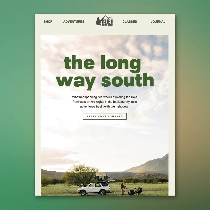
Check out this beauty of an email from REI. We recently included it on our list of dreamy summer vacation emails and were excited to see live text atop the hero image!

What a beautiful email opening. But that CTA button is an image (and a little blurry)!

Today we'll show you how to build an email like this, but with a bulletproof CTA button atop a background image. Here we go!

Tutorial: Add a Bulletproof CTA Button Over an Image

Choose an email template

Log into the BEE editor at beefree.io. Choose any template to get started. We usually go with a basic one-column structure to start with. Here's how our empty email layout looks:

Enable the row background image

If you want to add live text and a CTA button over your image, make it a "background image" in BEE. To create a background image, first select your content row (like above), and check out the Row background image menu option in the right panel. Enable it, then click Change image to browse for a photo.

Browse for an image

As always, you can find free, high-resolution stock photos in BEE from Unsplash, Pexels, and Pixabay. You can also upload your own image or paste an image URL.

Let's draw inspiration from REI and search in BEE's stock photo library for "camping."

Click through the pages until you find one you like, then import!

Adjust background image settings

Once you select your background image, you can also adjust how it appears in the email. In this case, the image we pulled was too large for the email, so let's resize. To do this, we can click Edit Image, then use the built-in photo editor to resize. (You can also crop, filter, add in special effects, etc.)

Once the image is resized, we can also adjust how it looks with three key settings: Full width, Repeat, and Center. Use them to find the best fit for your background image. Select Repeat, for example, to create a pattern. This is especially useful if you want the image to span the entire width of the email.

To mimic REI's email today, we'll just select Center.

Pull in your button (and any other content!)

From the Content menu on the right, pull in a button. Pull in text boxes, too, to mimic REI.

Here's our email before formatting:

We've got a bulletproof CTA button and live text atop our gorgeous background image! Now, all we have to do is format! In the Content Properties menu, update the button's color, text formatting, width, alignment, and more.

After some tinkering, here's how our email looks....

Ta da! Wasn't that easy?

If you're looking for more formatting guidance today, check out our posts on how to choose the best CTA button color for your email and how to create bulletproof CTA buttons. And for text formatting tips, check out our post on fonts in email.

Don't forget to set up a default background color

Background images are stunning and easy to implement, but like other advanced email design techniques, not all email clients support background images. According to our recent tests, only a few email clients don't show email background images, including:

  • Outlook 2016 on MAC OS X 10.10
  • Lotus Notes 7
  • Xfinity / Comcast email client

For those email clients (and for best results when images are blocked), make sure to choose a color in the necessary row as a default background color, in those cases when the background image doesn’t render.

To set a background color, simply select the row, then use the Structure menu to choose a Row background color or Content background color.

Ready for background images in emails? Go Pro!

Sign-up for a BEE Pro free trial and get access to this exciting background image feature, along with tons of free stock images and easy-to-use tools to make your email look perfect! Let us know if you have any questions about this tutorial, and happy email designing!

The Beefree SendGrid Connector

Hey email designers, marketers, and geeks! We want you to be able to design the emails of your dreams with the Beefree editor —and be able to send them with ease...
Beefree team
Beefree team
Jun 4, 2018

Hey email designers, marketers, and geeks! We want you to be able to design the emails of your dreams with the BEE editor —and be able to send them with ease. That's why we recently rolled out our MailChimpandGmailconnectors.Next in our lineup is the BEE SendGrid connector. Let's check it out!

Why use SendGrid and BEE Pro together?

Like MailChimp and Gmail, SendGrid is a solid option and popular choice when it comes to sending email. And, many SendGrid users also use the BEE editor in the BEE Pro platform. Why?Folks who use BEE Pro recognize it as a dynamic, powerful design tool.The BEE drag-and-drop editor makes for easy email layouts, and granular control on padding, spacing, buttons, and borders allows you to make design adjustments with more precision. You can also design and save templates, tap into multiple free stock photo libraries, and have each email be mobile responsive. BEE makes it fast to build an email that looksjust the way you want it to.So, SendGrid users, welcome to the fam. Here's how to activate the SendGrid connector in your BEE Pro account.

Step-by-Step Guide: Exporting your emails to SendGrid

Step 1: Get an API key from SendGrid

To get started, head on over to SendGrid.com and log in to your account.On the lefthand side, click the Settings menu. Tap "API Keys." 

BEE SendGrid connector

In the window that appears, tap the blue Create API Key button in the upper right corner.

BEE SendGrid connector

Enter a name for thekey in the type form at the top.Be sure to select the Full Access API option. Then click Create & View.

BEE SendGrid connector

On the following screen, you'll see your API key. Copy it. Then tap Done.

BEE SendGrid connector

Your API key will now appear in the API Key menu.

BEE SendGrid connector

Step 2: Activate the SendGrid connector in BEE Pro

Login to your BEE Pro account. From the menu under your account name in the upper right corner, choose Manage connectors.

BEE SendGrid connector

To connect SendGrid, go ahead and click on it. SendGrid is a paid connector for $50 per month.

BEE SendGrid connector

Confirm the connection on the pop-up window and you're all set!

BEE SendGrid connector

Finally, add your API key. On your Projects homepage, navigate to your Settings menu.

Note for BEE Pro Agency users

If you have a BEE Pro Agency account, you can connect different SendGrid accounts to different Brands (i.e. you have different clients with different SendGrid accounts). You need to select a Brand in which to install and connect SendGrid— i.e., you will not see theSettings tab if you haveAll brands selected in the left-side drop-down menu.

BEE SendGrid connector

Under Settings, scroll down to the Connectors section. Tap "Install" for SendGrid.

BEE SendGrid connector

Check off one or bothtransactional and marketing campaign types. Click Connect my SendGrid account.

BEE SendGrid connector

Paste in that API Key from SendGrid and click Connect Account.

BEE SendGrid connector

You're now connected!

BEE SendGrid connector

Step 3: Export your email

Now that BEE Pro can communicate with your SendGrid account, you can export any email design. Here’s how.Navigate to yourProjects menu,view the list of messages within any project, and click the email you’d like to push to SendGrid. Use the drop-down menu to choose Export.

BEE SendGrid connector

Click Export to ESP.

BEE SendGrid connector

Select to export to your Transactional or Marketing campaigns:

BEE SendGrid connector

Then, confirm the push by clicking Continue.

BEE SendGrid connector

Step 4: Access your email in SendGrid and send!

Looking for your email?

  • If you selected SendGrid Transactional, the message will appear under Templates > Transactional.
  • If you selected SendGrid Marketing, the message will appear under Marketing > Campaigns.

If you want to make any adjustments, just use the drop-down menu to edit and review your message.

BEE SendGrid connector

Then, do what you gotta do, and send!

BEE SendGrid connector

Go Pro and send any BEE email with SendGrid!

If you’re not using BEE, sign-up for aBEE Pro free trialto check it out and enjoy the new SendGrid connector.

Tutorial: How to Create a Color Blocking Email

We recently celebrated all things color in email. One style we totally love (and see a lot) is color blocking, where about half an email has a bold backgroun...
Beefree team
Beefree team
May 22, 2018

We recently celebrated all things color in email. One style we totally love (and see a lot) is color blocking, where about half an email has a bold background color and the other half is white. This is a simple technique that goes a long way in inboxes. In this tutorial, we’ll show you how to build a color blocking email of your own in a few easy steps. We’ll also explore how to:

  • Add multiple HTML background colors within an email
  • Establish multiple columns
  • Format text (color, size, line height, links etc.)
  • Polish an email by fine-tuning spacing and padding

Inspiration: Offscreen Dispatch

Offscreen is a print magazine and a weekly newsletter “with a thoughtful, human-centred take on technology and the web.” Its newsletter is called Offscreen Dispatch, and we’ve long admired its simple, distinct design. Offscreen uses the same color blocking technique in every email, and the really pretty effect makes the email look like it’s a page in a magazine. The top portion—where web designer Kai Brach writes a note to subscribers—is always pink. The rest of the email is always white. Check it out:

Offscreen dispatch color blocking email

There’s nothing particularly fancy here—no art or photography—but the dynamic layout, well-formatted text, and color blocked design brings this email together.The design is easy to pull off, too, and requires no coding in the BEE editor. Let’s dive in! Open the BEE editor and follow the steps below.

Step 1: Build the structure

Open up the BEE editor on our website (https://beefree.io/) or from your BEE Pro account and start with a basic blank one-column template.Before we start dragging in structure elements, let’s take a minute to examine the Offscreen Dispatch email and identify the layout components. Here’s a marked-up version:

Offscreen Dispatch color blocking email

The email alternates between one-column and two-column structures, which is easy to assemble in BEE.Drag over the corresponding row formations from the Row menu on the right. We’ll need the top two options for this email:

color blocking email

Here’s how our email looks with the row structures in place:

color blocking email

Step 2: Arrange content blocks with text/images

Now that we’ve got the bones of our email assembled, drag over content blocks that correspond with the content type—text and/or image—we want in each section. Then, paste the text and drag in the images.Here’s a 1-2-3 on how to get your content situated. Starting with the first row—the header—here’s how:(1) Pull in a two-column structure:

color blocking email

(2) Add text blocks on the left; an image content block on the right:

color blocking email

(3) Drop in your text and image:

color blocking email

Let’s go through each row to arrange the content.Here’s our email with the remaining content blocks in place:

color blocking email

Now, we’ll finish adding text:

color blocking email

Voilà! Next, let’s format.

Step 3: Format the background colors

Now for the fun part. Watch how easy it is to create the color blocking effect.First, to match the exact shade of pale pink from Offscreen Dispatch’s email, we used HTML-Color-Codes.info to ID the color from the image in the header.

color blocking email

HTML Color Codes identifies the hex code as #F5BBA2. To make the first row the right color, we will:

  1. Select the row
  2. Navigate to Row Background Color in the menu on the right
  3. Paste in the color code (or select manually)
color blocking email

Seamless edge-to-edge color! Now let’s complete the pink color block. We’ll simply select the following row and do the same thing again.

color blocking email

Now, our email is color blocked. Yes, it’s that easy.

Step 4: Format the text

Let’s finalize this email design with some formatting touches. We’ll begin with text.

Choose a default font for the email

Instead of going through each individual content block to choose your email’s font, navigate to the Settings menu on the right and select the font you’d like to use for the entire email.

color blocking email

After that, you can change the header font or select the sections you’d like.

Adjust font sizes

Tap any text block and use the drop-down menu to fine-tune the font size.

color blocking email

Customize text colors

Use that same menu to choose the colors you prefer. Again, use the same matched color code to get the precise shade that’s needed.

color blocking email

Format the link style

Don’t forget links! In the same Settings menu where you chose the default body font, you can also format the link style. In this case, we’ll choose black.

color blocking email

As you add links to your email, make sure the “Underline Link” box is checked. (It’s even an email accessibility best practice!)

color blocking email

Line height

Make sure your body text has room to breathe. For any content blockthat you edit, adjust the text's line height.

color blocking email

Tip: duplicate row

If you spent a lot of time formatting text in a particular row, you can simply duplicate it, instead of manually making the same adjustments in another row.Tap the row you want to copy. Then, click the double-box image all the way on the right.

color blocking email

Your row will be copied! Then, simply drag it and grab the directional icon on the left, to place the new row in the email.

color blocking email

Step 5: Adjust the padding

Last step! And it’s an important one. Before you finish the email, take a close look at the spacing between your content blocks. If there are still too many gaps—or not enough breathing room anywhere else—it’s very easy to make adjustments.For example, there’s still a gap between “Offscreen” and “Dispatch” in the header of our email draft. To tighten it up, tap on either content block, scroll down to Block Options in the menu on the right, and make sure “More options” is turned on under Padding. Then, you can decrease (or increase) the padding on any side in any piece of content.

color blocking email

Pretty neat right? Make sure to check out our tutorial on all things padding and spacing.

Step 6: Preview the finished color blocking email!

Ok—one last,last step. As you design any email, preview it along the way to make sure you like how it appears on both desktop and mobile. Here’s a peek at how ours is shaping up:

color blocking email

Have you used these techniques in the BEE editor? Let us know!

Tutorial: How to Setup Your Beefree's Agency Account

You probably already know that Beefree comes in 3 versions .We're going to explore the exciting capabilities.
Beefree team
Beefree team
May 15, 2018

You probably already know that BEE Pro comes in 3 versions: Freelance, Team, and Agency  (view BEE Pro plans).We're going to explore the exciting capabilities included in BEE Pro Agency. This powerful edition of BEE Pro gives you all the tools to manage the email designs of your clients, brands, or channels. Let's check 'em out in this quick video tutorial below and in the detailed sections below.

Introducing Brands

If you work with many clients, you know each one has its own visual standards and email needs. So we createdBrands to offer a new level of anorganized hierarchy to meet your agency or team needs.Brands are independent environments in which you can manage multiple email messages. Each brand can be customized with its own settings and user access permissions.You can create a Brand for each of your clients and/or company departments or team, then customize it to:

  • Determine which team members have access to a brand
  • Customize a brand's merge tags and special links
  • Set default custom templates
  • Connect Gmail and MailChimp accounts
  • Customize brand fonts
BEE Pro Agency

How to Create a Brand

Create a Brand to manage yourspecific client, business unit, or special project with specific requirements.After logging into your BEE Pro Agency account, create a Brand by choosing Add a new brand from the All brands drop-down menu.

BEE Pro Agency

Type out the brand name, then hit enter. Your brand name will now appear in the menu!

How to Customize Your Brand

Once your brand is created, use the main navigation menu to get started. A good place to begin is withSettings.Settings are not shared between brands, so within a specific brand, you can customize:

You can also use the Settings menu to:

  • Rename the brand
  • Manage connectors (like to MailChimp and Gmail)
  • Delete the brand and all its projects
BEE Pro Agency

Navigate to the Brand styles tab, still in the Settings menu, and you'll also be able to choose the fonts accessible within this specific brand.In the future, brand styles will be expanded to include colors and more.

BEE Pro Agency

How to Create a New Template

Navigate to the Templates tab in the main navigation to create or copy new or existing templates that will be specific to the brand.To add a new one, click Create a new template.

BEE Pro Agency

Choose from our template catalog or create your own with a blank template.

BEE Pro Agency

After you create your template, it can be found under the My templates tab.

How to Copy Templates Within or Across Brands

If you create a template in one brand and want to duplicate it to another brand, or duplicate it within the same brand, simply use the template's drop-down menu and choose Create a copy.

BEE Pro Agency

In the subsequent menu, you can choose where you'd like to copy your template.

BEE Pro Agency

How to Organize Your Projects

Both BEE Pro Team and Agency editions allow users to create unlimited projects. Projects are like folders to organize your messages. Access your projects through the main navigation.

BEE Pro Agency

Each folder displays a thumbnail of the message that was last edited in that project, plus when and by whom.

BEE Pro Agency

Click on a Project to open the folder. Once you're in a folder, create a new message, manipulate existing messages, or filter messages by tags. Any message you create can be shared internally or with external team members or clients using the Collaborate feature.

BEE Pro Agency

Any message in a Project folder can also be copied or exported. You can also send a test or delete a message. Access these tools in the Edit message dropdown on any message.The Collaboration tool allows everyone on a project to share, comment, and approve email campaigns or templates easily and quickly (read more).

BEE Pro Agency

And that's our quick tutorial on how to customize your BEE Pro Agency account.How are you using BEE Pro Agency with Brands? We’d love to hear your feedback in the comments section below!

Tutorial: How to Get the Most Out of Beefree's Roles and Permissions

Teams of email designers, art directors, marketers, and other collaborators all work together to make beautiful emails in the Beefree editor. We're all about tea...
Beefree team
Beefree team
Apr 12, 2018

Teams of email designers, art directors, marketers, and other collaborators all work together to make beautiful emails in the BEE editor. We're all about teamwork! In an effort to make collaboration even more seamless and efficient for everyone, we created BEE Pro roles and permissions.The new user roles and permissions help you control how each additional user can access your BEE Pro Team or Agency account (view BEE Pro plans), from the billing details to the editing of email messages and much more! In BEE Pro Agency, user roles and permissions can be applied to each of your Brands for even more capabilities.Read on for tips on how to access, manage, and optimize how you use BEE Pro roles and permissions.

Introducing Roles and Permissions

BEE Pro users can now assign an access level for each collaborator. This means you can control what a team member can or cannot do in BEE, offering your team the confidence and flexibility to collaborate seamlessly.

User roles

Here are the roles and their descriptions for collaborators:

  • Owner. Has a special Admin status that allows management of the BEE Pro subscription. This is the only user who can purchase items (upgrade plan, add users, activate a connector, etc.).
  • Admin. Has access to all the features and can create and manage brands in BEE Pro Agency. Usually, this person is in charge of overall team management.
  • Manager. Has all the capabilities to manage the message creation workflow inside a brand, including template management and content locking. Cannot create a brand or decide who has access to it.
  • Editor. Has the capability to create, edit, move, and export messages.
  • Contributor. Has the ability to only edit unlocked content and message settings.

Permissions

Here are the capabilities that each role has:

Email editing in different user roles

For the purpose of content consistency, users in the Owner, Admin, or Manager roles are able to limit the email editing access of Editors and Contributors. This is done by locking content so it becomes uneditable.In the BEE editor, anOwner, Admin, or Manager can simply tap any item of content, like an image or button, or any structure, like the header and navigation row of an email, and lock it in the Content Properties menu.

Locked content cannot be moved or changed. This is a great option for maintaining consistent headers and footers that shouldn't change from one email to the next.

How to assign roles for new users

Any time you add a new team member to your BEE Pro account, you can assign them a role. Here's how:1. Open the drop-down menu under your account name in the upper right corner and select Manage users.

2. In the new window that opens, select Add new user.

3. Confirm your plan to add the new user.

4. Enter the user's name, email address, role, and the default brand that can be accessed (these can be changed later in Settings).

As soon as an invitation is accepted, the user can log in and begin designing under the permissions of the assigned role!5. To change a new or existing user's role at any time, go back to the Manage users menu and use the drop-down menus to make adjustments.

BEE Pro Agency only: Roles within Brands

Going one step further, you can assign users to access and manage your Brands in BEE Pro Agency.You can think of a Brand as a completely independent BEE Pro account with its own users, email messages, and settings. Each of your users has a given role (Admin, Manager, Editor, or Contributor) and permissions as well as access to Brand settings, such as custom fonts and ESP connectors.Brands are useful for managing your client's email design if you're working as a traditional email marketing agency, or for your company's email campaigns if you're a team or department at a big company.Here are 3 simple steps on how to setup user roles and permissions in Brands:1. Choose your Brand from the All brands drop-down menu on your BEE Pro home screen.

2. Once a Brand is open, navigate to the Settings menu.

3. In the Settings window, assign permission/access for specific users under the User Permissions menu. You'll also be able to:

  • Rename the brand
  • Add and edit merge tags
  • Add and edit special links
  • Manage connectors
  • Delete the brand and all its projects

Have you setup user roles and permissions in BEE Pro? If you have, we'd love to hear your feedback in the comments section below!

Tutorial: How to Build an Image Grid Email for Desktop and Mobile

Do you want to design a simple, beautiful, mobile responsive email with a ton of photos? We got you. Today's post is a step-by-step guide to building a stunn...
Beefree team
Beefree team
Apr 10, 2018

Do you want to design a simple, beautiful, mobile responsive email with a ton of photos? We got you. Today's post is a step-by-step guide to building a stunning image grid email. You can use this dynamic layout to introduce a new product, offer a promotion, run a sale, or tell almost any kind of visual story. Using an email from fashion brand & Other Stories, we'll walk you through how to organize and optimize a photo grid in an email, including how to:

  • Make creative image grid configurations
  • Set an auto width for select images
  • Hide specific images in the mobile version
  • Stack images in the mobile version (or leave them in a grid formation)

Inspiration: & Other Stories

E-commerce brand& Other Stories consistently sends thoughtfully designed emails. Even though they're full of product photos, the emails remain simple, fresh, and free of clutter. Plus, the brand does a great job of using well-formatted live text and making sure its photo grids look great on mobile, too. Check out what we're talking about—here are a few recent emails from & Other Stories:

Each email is a little different, but most include a photo grid with different-sized images. This one has two hero images, followed by a grid:

We love the use of different-sized images that all fit together perfectly. Knowing how to make smart image configurations can really level-up the design of your emails. Let's get started on how to do it in today's tutorial.

The Inspiration for Our Photo Grid

For today's tutorial, we'll show you how to create an email like this one:Subject: Spring's color pairing

Pretty, right? And it's not difficult to create. Let's go!

Step 1: Build the structure

Open up the BEE editor on our website https://beefree.io/ or from your BEE Pro account and start designing in abasic one-column template.We can think of the email as having six structures or modules.

From ourStructuremenu on the right, we’ll create an email layout that mimics our example by dragging in modules. The first half is a single column, while the second half has a series of multi-column structures.

Using a series of asymmetric multi-column structures like this sets us up to design a dynamic photo grid. When a layout alternates from row to row, it's easy to create a photo grid with images of different sizes. Keep reading to see how.

Step 2: Arrange content blocks

Going row by row, we'll drag in content blocks that correspond to the content contained in each structure. For instance, the first structure (or row) will need a text block to read "STOCKHOLM ATELIER," a divider line, and then an image block for the & Other Stories logo. We'll pull in each of these content blocks into Structure 1.

The following structure will only need an image content block to contain the hero image, and the one after that will require text only.To build the first image grid structure, in row 4, we'll drag in image content placeholders, so the row looks like this:

Then, we drop in the images.

Because of the structure, or layout, chosen for this row, the photo on the right has space to be as large as the two images stacked on the left.Beneath it, the following four-column structure will contain four evenly sized images.(1) Here's the bare structure:

(2) Here's the structure with image content blocks:

(3) Here's the final structure after we drag in images:

Simply go through each row, adding the images and content blocks as desired to complete your email! Here is how ours is coming together:

3. Format images: tips and tricks

Now that you have the hang of how to arrange images, here are some tips on making them look the way you want.

Fine-tune padding

Remember that you can line up each image next to another one—without space between—by setting an image padding to zero. Simply click an image, then use the Content Properties menu on the right to make adjustments.

Conversely, if you want to create space between images, bump up the padding a bit. Here's our four-column row with a little padding—5 px—added between images:

Set an auto width for select images

When you drag and drop an image into your email, it will automatically fill the width of the container. But you can also use the Content Properties menu to adjust an image's width. For instance, in our current email, when we drop in the & Other Stories header image, it's automatically the width of the email.

To decrease the width of the image, unselect auto width on the right...

...then drag the percentage bar down, closer to 20%, to shrink the appearance of the logo.

Note: You can also check the "Full width on mobile" box to make sure the logo is easy to see on a smaller screen.

Hide specific images in the mobile version

If you have an image-heavy email, consider hiding some of those images on mobile. Doing this can help make the email quicker to download on mobile devices and improve readability—with fewer images, a reader won't have to scroll and scroll. You might also have a large hero image, as in this email from & Other Stories, that shouldn't take up so much screen space on smaller devices. For these reasons, BEE now has a Hide on mobile feature that can be selected for an image.The Hide on mobile option is located at the bottom of the Content Properties menu for any image you select. If you select the hero image, for instance, then you can scroll down and choose to hide it.

The email preview allows you to see how theemail looks with the hidden hero image:

Stack images on the mobile version (or leave them in a grid formation)

All emails designed in the BEE editor are mobile responsive. This means, when you have an image grid like the one in an email, the mobile version will automatically "stack" images on top of each other for easy viewing on small screens. So our image grid usually looks like this on mobile, with each image shown "full screen" one at a time:

However, now you have the option to ask BEE not to stack images, if you prefer the grid to remain intact even on mobile screens.Simply select your image grid structure, then use the Content Properties menu to turn on theDo not stack on mobile feature.

Now, our mobile preview looks like this:

Plus! All these features are meant to give you more control over exactly how your email looks. We hope you enjoy the design flexibility while building (and mastering) stunning image grid emails in the BEE editor!

Stay informed on all email trends

From the latest creative design strategies that inspire your next campaign to industry best practices and tech advancements, our newsletter is the go-to for all things creation.

By clicking Subscribe you're agreeing with our Privacy Policy