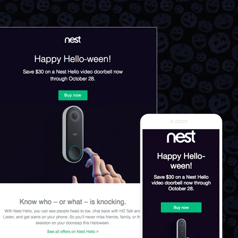
Trick or treat! Halloween is just around the corner, and we're celebrating with a workshop that will walk through how to build a stunning responsive Halloween email of your own. We chose a mobile-responsive email that follows many of our design best practices. Use these tips to build a Halloween email—or another upcoming campaign. These best practices are on fire no matter what kind of email you're building. Let's dig in!
Email Inspiration from Nest
Subject:Say Hello to monster savings from Nest
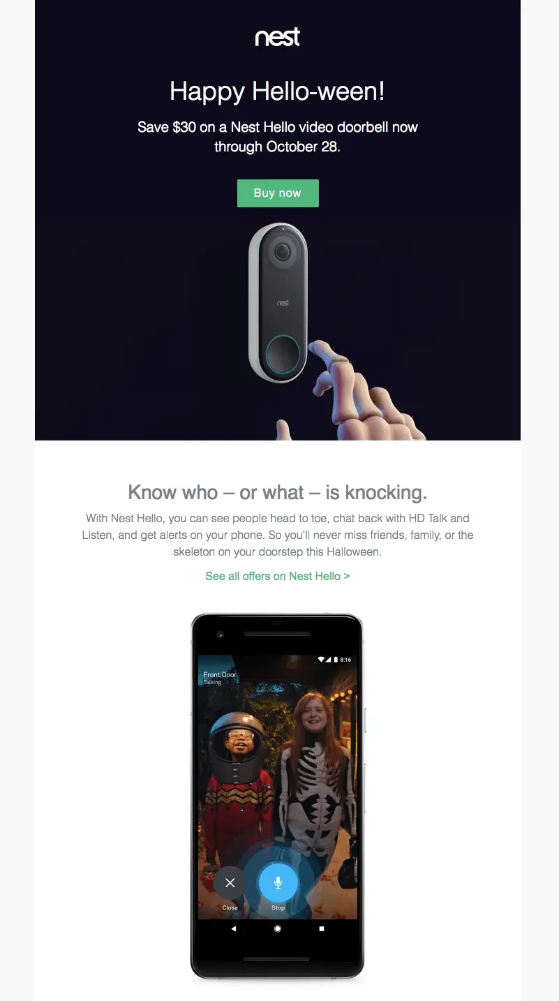
Here's what we love about this email:
- Clean, single-column, modular design
- Easy-to-read live text with large, skimmable headers
- Bulletproof CTA button with A+ green color that pops
- HTML background that seamlessly matches the image alongside it
- Boxed limited width body with light gray background
Today's Tutorial: Build a Responsive Halloween Email
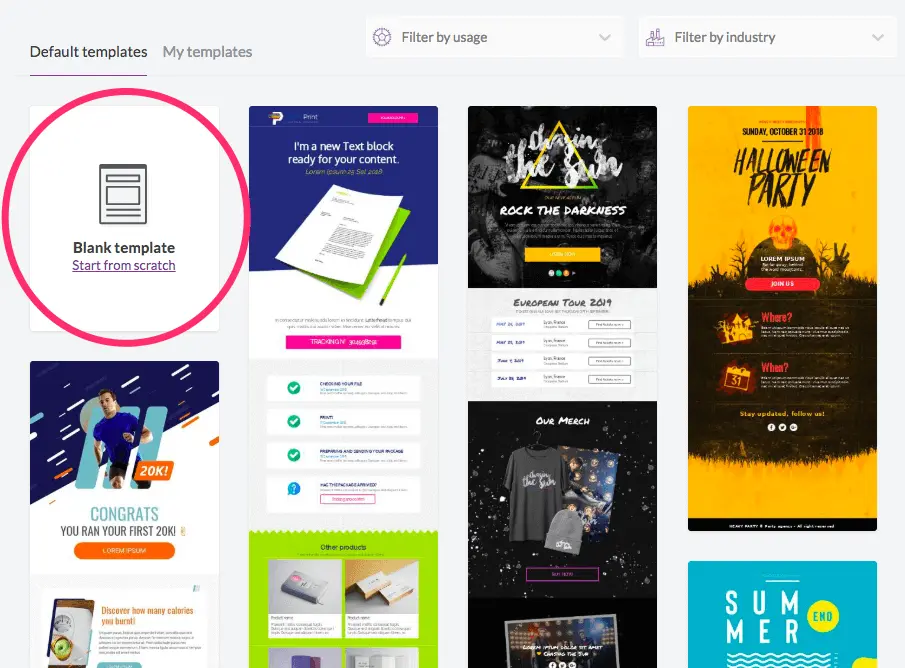
To get started, let's log into BEE Pro (try it for free!).We'll begin with a blank template so we can create this simple one-column structure from scratch.
Trick #1: Build by module
We can think of this email as being made up of two modules.
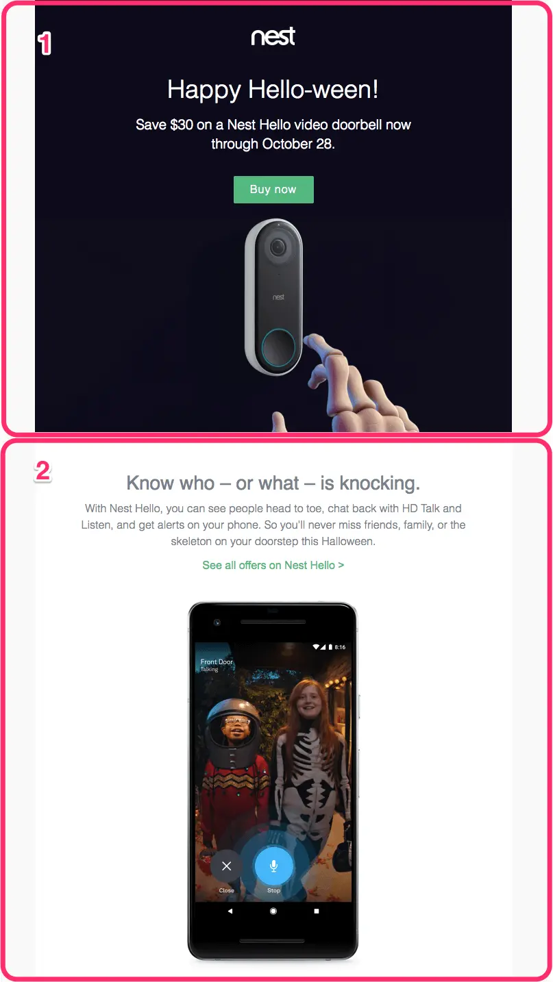
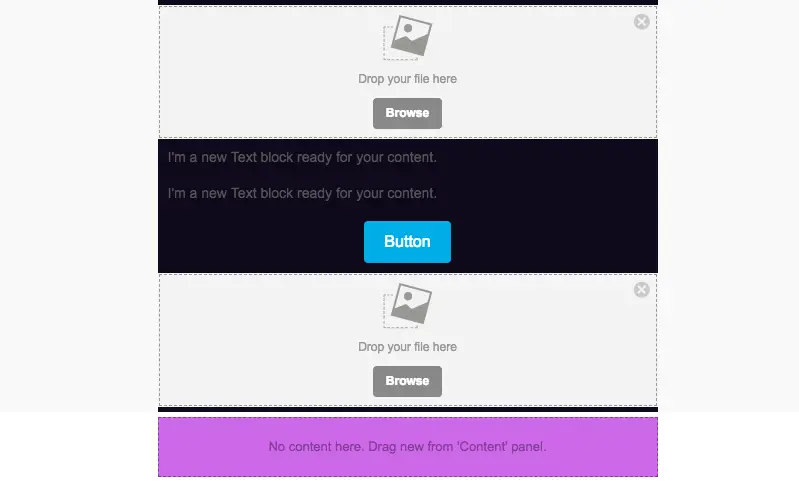
We'll recreate that same structure in BEE by dragging in two empty rows.

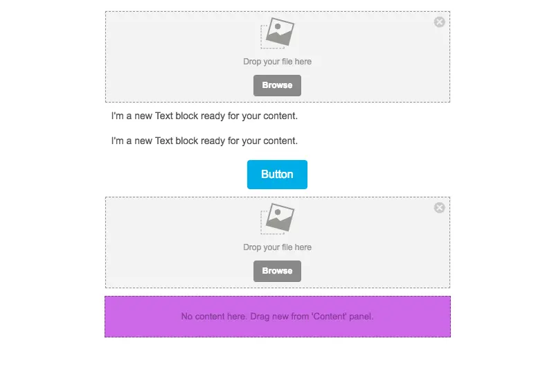
Now we'll drag in the content placeholders that belong in each module. The first module needs to hold an image of the nest logo, then a text box with the opening lines, a CTA button, and then an image container for the GIF. Here's how it looks:
Trick #2: Make an exact match of the colors in your image
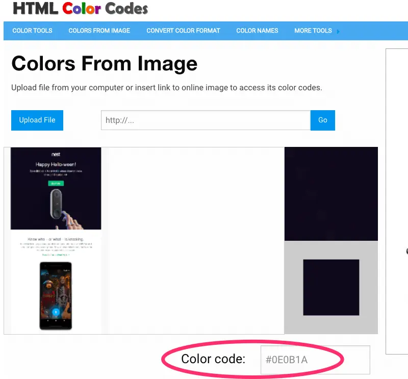
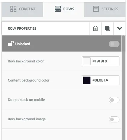
Before we drag in the content, let's set up our background colors. Since the nest logo and header text is white, it will be easier to format once the background color is in place.We use HTML Color Codes to upload images and find out the colors they contain. When we upload the Nest email, we can click on the color of the first module and get its code.
Back in BEE, let's input the code. We'll click to select the first module row, then make our update in the Row Properties menu on the righthand side. We'll want to update the Content Background color.
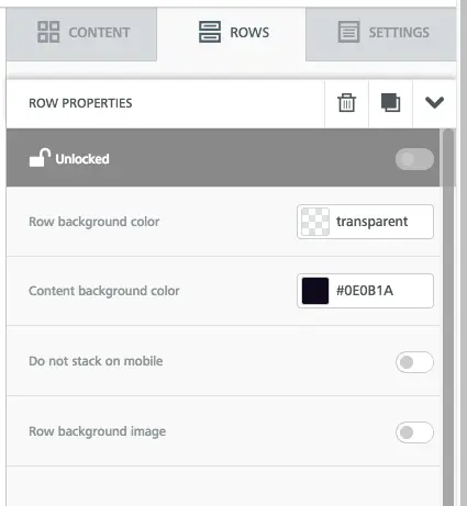
To give the email a "boxed" effect, we'll then update the Row Background color to gray, as Nest has done.
Now, here's how our structure looks:
And once we've added images, here's how module #1 looks:
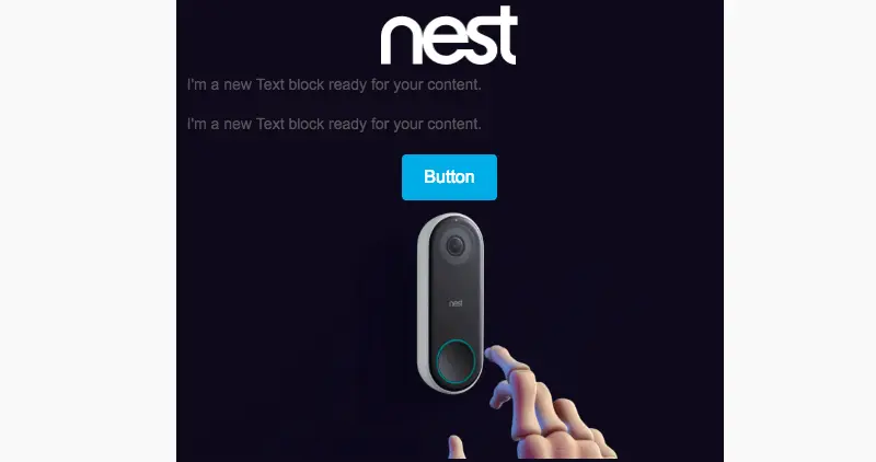
It's coming along!
Trick #3: Use shortcuts for formatting text
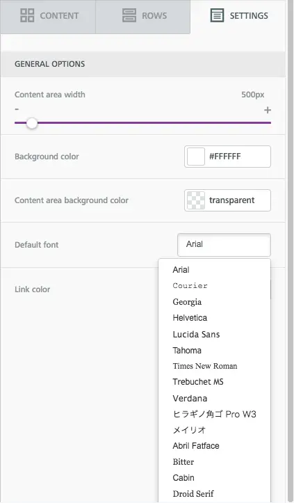
There are a few ways to make formatting text easy. First of all, we can navigate to the Settings menu and select a font that we want to use throughout the whole email (so we don't need to make updates one by one in each module).
Next, we can update one text box, then copy it so all subsequent boxes maintain the same formatting. For example, after we change the color, size, and center adjustment of the header, we can duplicate the content box by clicking the shortcut box in the lower right:

Voilá!
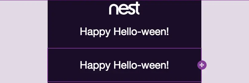
Now it's a little faster to update the second box (we don't have to update the color and center adjustment, only the size).
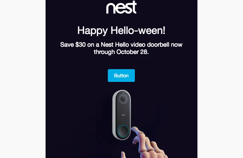
Almost there!
Trick #4: Perfect your CTA button
In BEE, updating your bulletproof CTA button is easy. Just give it a click and start updating! First, we can click right on the button to update the text. Then, using the left side panel, we're going to make a few updates:
- Change the background color
- Sharpen the border radius so the edges are more square
- Add a bit of padding on the right and left to "stretch out" the button

Lastly, we'll link the CTA button to the appropriate landing page. And now module #1 is complete!

Trick #5: Don't forget finishing touches: image sizing, padding, and mobile preview
To make module two, we'll use the same shortcut from trick #3: we'll copy text boxes for quick and easy formatting. That way we'll know our header sizes and body text sizes are the same throughout the email. We simply need to update the language and colors.
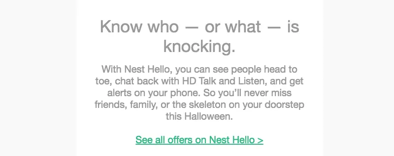
When we drag in our last image, it auto displays too large.
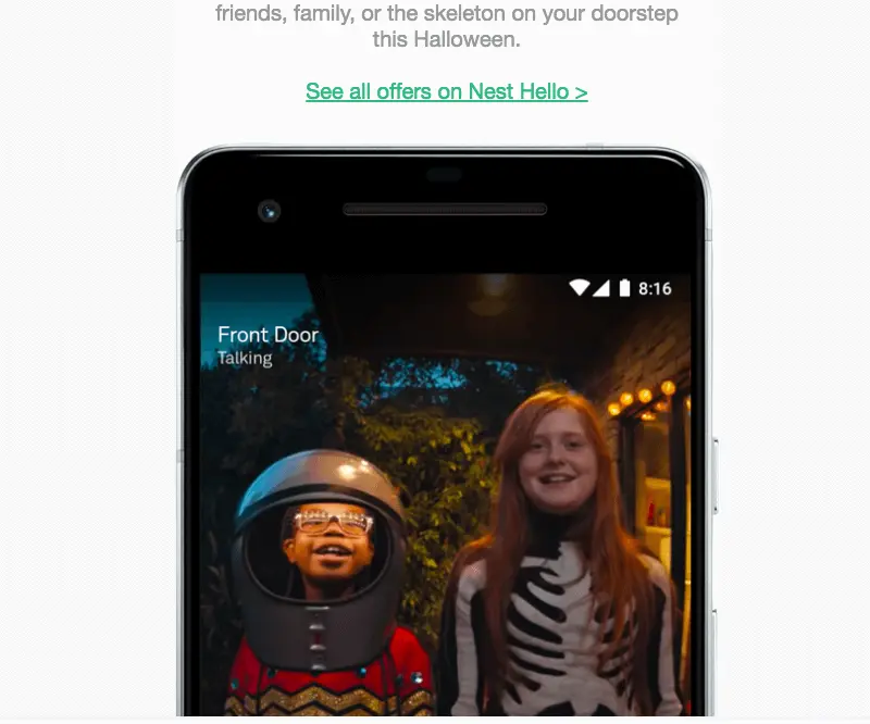
Here's how to fix it. Click the image. Deselect "Autowidth" in the right side menu. Then drag the width percentage down until the photo size appears as desired.
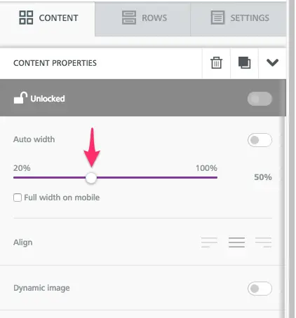
That's more like it:

What else? Be sure to link it! Check that other buttons, text, and images are linked. Fine tune spacing andpadding throughout the email. Do one last spell check.And—last but not least—be sure to preview the message on mobile via the Actions menu in the upper left. Here's our preview:
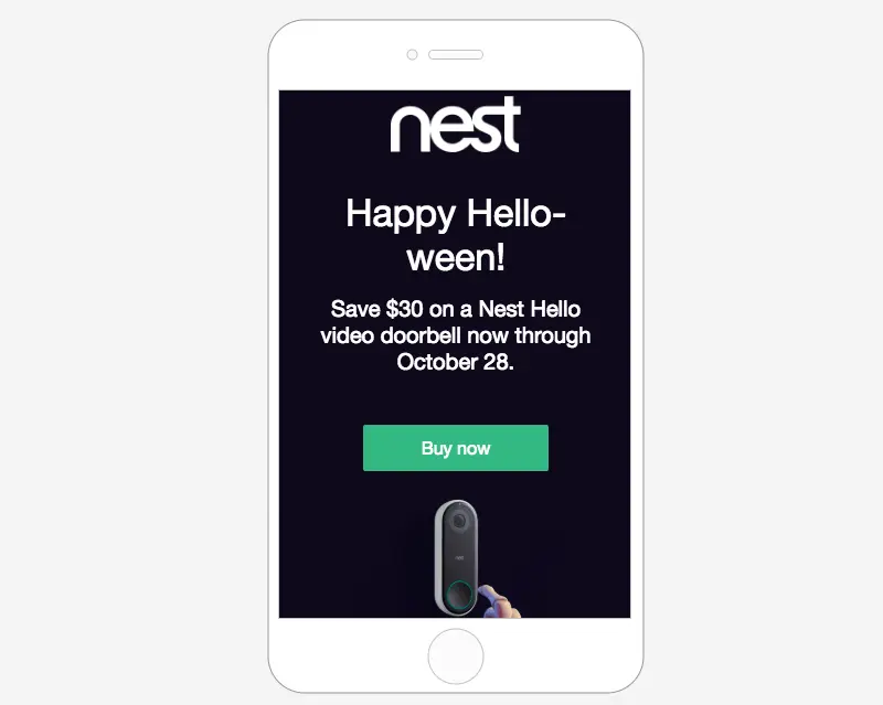
Looks pretty good, doesn't it? We love this fun and playful email from Nest. It follows design best practices and is easy to build in BEE.Are you ready to build your own? Sign-up for aBEE Pro free trialand get access to all of these features, along with tons of free stock images and easy-to-use tools to make your email look perfect! Let us know if you have any questions about this tutorial, and happy Halloween!
