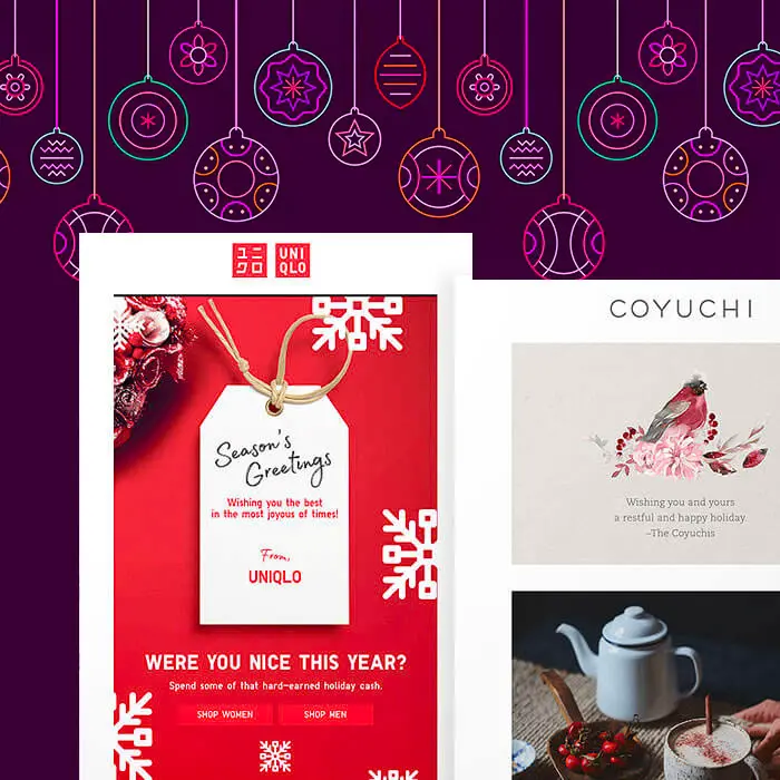
Wise email geeks know the holiday season isn't just about promotions and deals. It's a time to show gratitude and appreciation. That's where holiday ecards come in. Whether the message is a "thank you," a simple season's greetings, an invitation, or something else, holiday ecards are a great opportunity to share a little merriment and cheer. Today we'll show you how to build one in just a few minutes, whether you start from scratch or use a template. Speaking of templates, be sure to scroll down for our gift to you :) Let's get started!
Tips for planning the best holiday ecard
In a previous post,Holiday e-Cards for Your Clients, we established four important things to consider before sending an ecard. Here's a quick refresher.Before you begin designing your holiday ecards this year, take into account:
- Your recipients. Will all your clients, vendors, and customers receive the same message? Consider customizing your email for different segments, or creating different holiday ecards for business sectors.
- Your reason for sending it. Some holiday emails have a call-to-action; others don’t. Some have a note from the CEO; others offer a last-minute promotion. Before you assemble your email, consider why you’re sending it and what your objective is. Your reason will determine the message and the design.
- Your brand identity. A holiday e-card can be one of the easiest emails you’ll send all year. But in order for the message to be effective, readers should feel that it's sincere and reflective of your brand. Use the holiday email as an opportunity to build trust and loyalty.
- Your timing. In the past, many customer-facing holiday ecards have landed in our inbox on December 24th or 25th. Because these emails don’t usually include a CTA, many brands focus on sending a timely message (assuming most recipients celebrate Christmas) vs. being strategic about when most readers would be online and shopping. According to GoDaddy, Christmas Day might have one of the lowest email open rates of the season (but this doesn’t mean your message won’t get read later—which, in this case, is perfectly fine). Once you determine the reason for sending the email, you can choose the right date to send it.
Inspiring holiday ecard designs
Check out a sampling of holiday ecards and their respective approaches to messaging and design—
Uniqlo
Subject: To you + yours
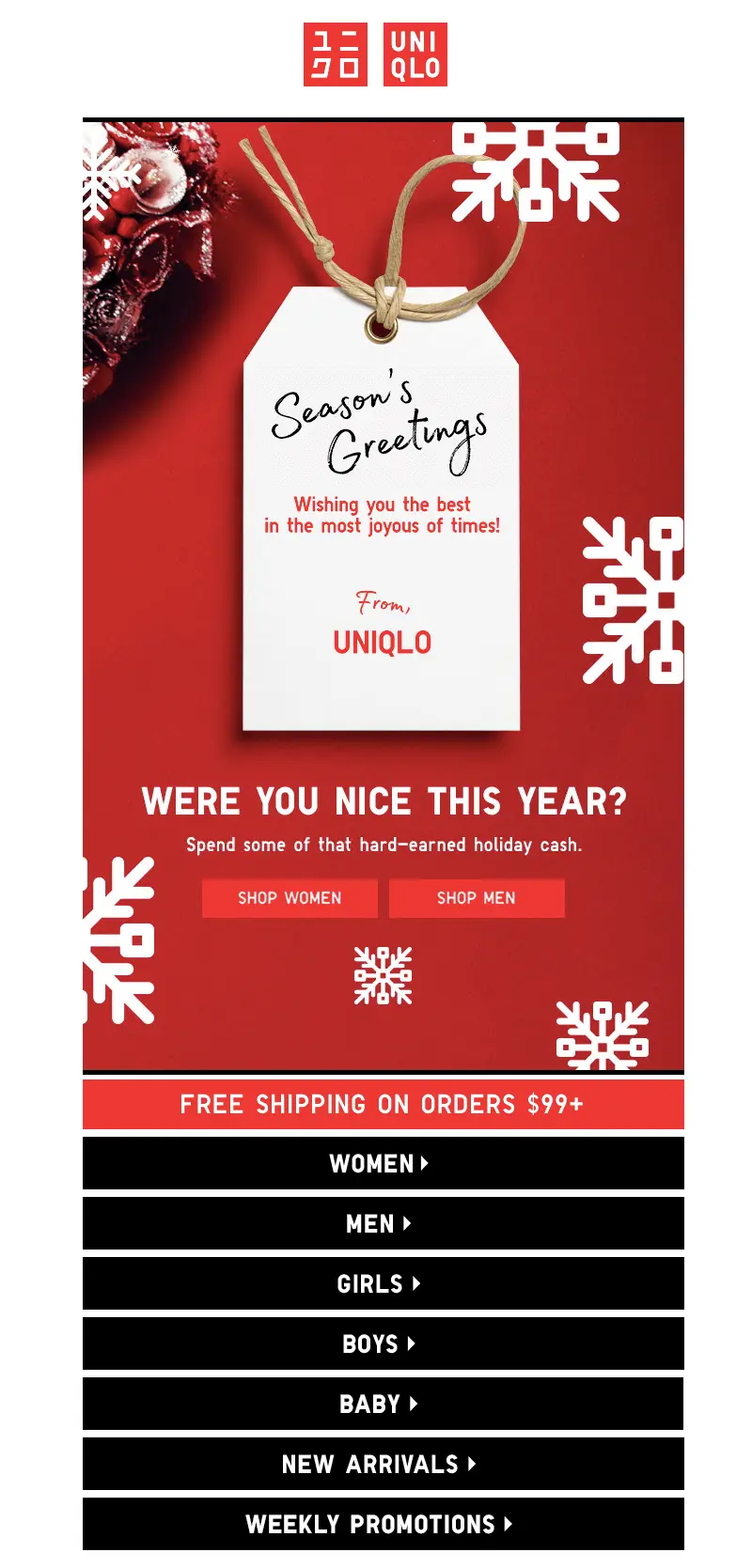
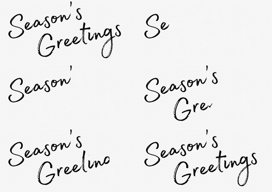
This email came in on Christmas day 2017 and includes a secondary call to action. Here's the animation from the image above:
Coyuchi
Subject: Happy holidays from the Coyuchis

Like Uniqlo's email, this one from Coyuchi begins with a simple holiday message and continues with a few CTAs and offers.
Patagonia
Subject: Happy Holidays

No CTA in this holiday ecard from Patagonia – just footer content if you do choose to shop.
Tutorial: Design your own holiday ecard
Ready to design your own email? Here's how to do it in just a few minutes!
Step 1: Set up your email structure
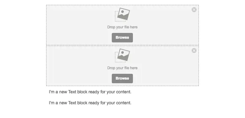
In BEE Pro (access a free trial), we'll start with a blank template. Drawing inspiration from Patagonia, let's set the email up to include the following:
- A simple logo header (image)
- A holiday stock photo (image)
- Header copy (text)
- Body copy (text)
One we drag in the corresponding content blocks, our email structure looks like this:
Step 2: Add your content
We'll drag in our logo to the first content block and type out our content in the following text blocks. For our hero image, we'll use BEE's stock image library to choose something fitting.How to access free stock photos:
- Click Browse
- Click Search free photos
- Type in your search term (e.g., "holiday") and browse
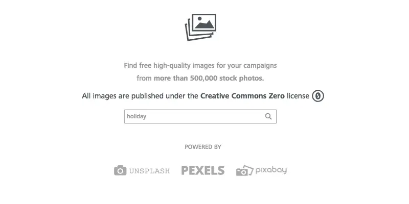
- Click Import when you've found an image you like
- Click Insert to add the photo to your email
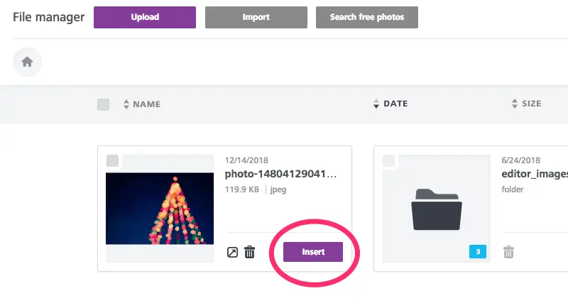
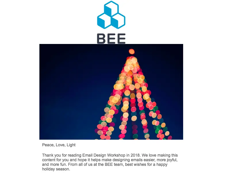
Here's how our email is shaping up, before we format the images and text—
Step 3: Format images
First, let's adjust our images. The logo looks like it could use some padding. Let's tap it, then use the content properties menu to add padding to the bottom edge, so there's a buffer between the logo and hero image.
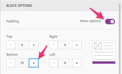
We'll also link the image to the BEE website.
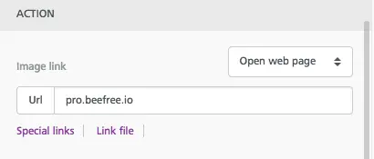
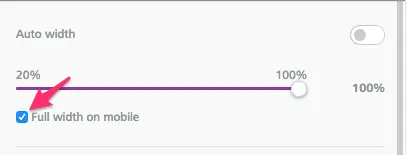
For the tree image, we don't need to add padding, but we can also link it and determine how it will show up on mobile. For instance, we can opt for it to be full width on mobile:
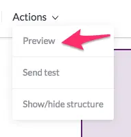
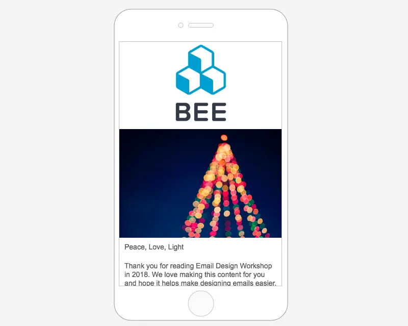
From the Actions menu in the upper left, we can preview how our email will look on desktop and mobile to make sure our design decisions are coming along okay.
So far, so good!
Step 4: Format text
Simply select your text box, then use the pop-up menu to change the font, size, color, treatment, and so on. For our header, we're going with a large 38px font and choosing a serif, Courier New.
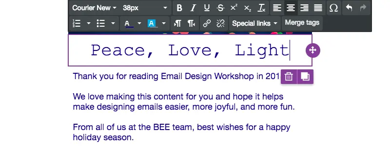
Our body text will be Helvetica, a sans serif, and size 18px. We selected a dark blue color for both, which is easy to read against a white background (remember contrast!).
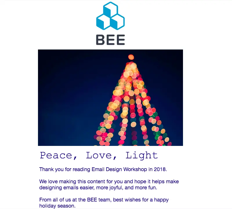
In just a few minutes, we have a beautiful holiday ecard.


