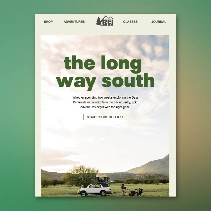
In email design, calls to action come in all shapes and sizes: clickable buttons, text, images, icons, and so on. If it can be linked, it is! But perhaps the best way to show readers you want them to tap is a button—it's the only item whose sole purpose is to be clicked. So, even emails with beautiful linked images still include CTA buttons that invite readers to click.
This means many emails get opened in one of two ways: a hero image with a CTA button sitting below it (inverse pyramid design) or hero image with a faux CTA "button" designed into the image to inspire clicks. But what if you want to position a bulletproof CTA button over a background image? In the BEE editor, it can be done and it only takes a few seconds, so you can maximize email design best practices, too!
Today's Email Inspiration
Check out this beauty of an email from REI. We recently included it on our list of dreamy summer vacation emails and were excited to see live text atop the hero image!
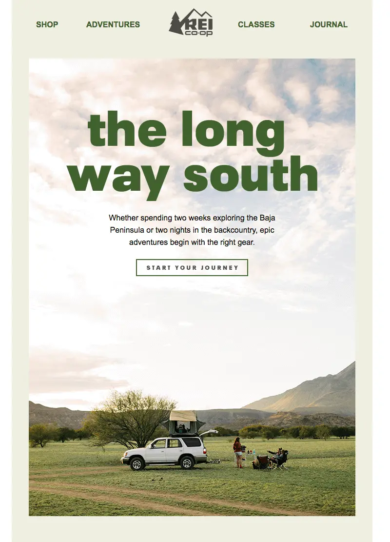
What a beautiful email opening. But that CTA button is an image (and a little blurry)!
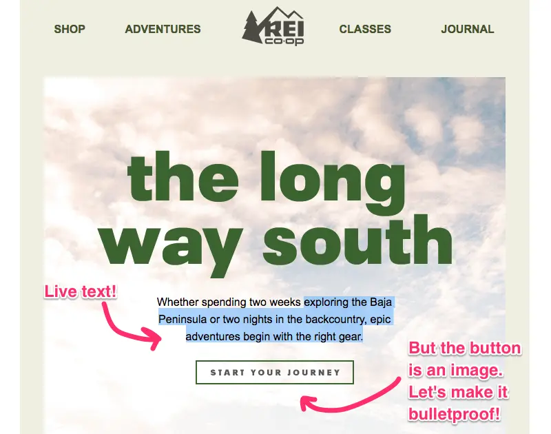
Today we'll show you how to build an email like this, but with a bulletproof CTA button atop a background image. Here we go!
Tutorial: Add a Bulletproof CTA Button Over an Image
Choose an email template
Log into the BEE editor at beefree.io. Choose any template to get started. We usually go with a basic one-column structure to start with. Here's how our empty email layout looks:

Enable the row background image
If you want to add live text and a CTA button over your image, make it a "background image" in BEE. To create a background image, first select your content row (like above), and check out the Row background image menu option in the right panel. Enable it, then click Change image to browse for a photo.

Browse for an image
As always, you can find free, high-resolution stock photos in BEE from Unsplash, Pexels, and Pixabay. You can also upload your own image or paste an image URL.
Let's draw inspiration from REI and search in BEE's stock photo library for "camping."

Click through the pages until you find one you like, then import!

Adjust background image settings
Once you select your background image, you can also adjust how it appears in the email. In this case, the image we pulled was too large for the email, so let's resize. To do this, we can click Edit Image, then use the built-in photo editor to resize. (You can also crop, filter, add in special effects, etc.)
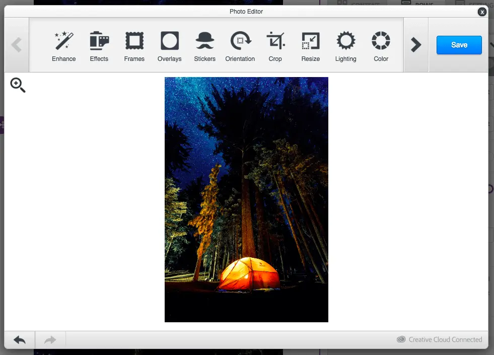
Once the image is resized, we can also adjust how it looks with three key settings: Full width, Repeat, and Center. Use them to find the best fit for your background image. Select Repeat, for example, to create a pattern. This is especially useful if you want the image to span the entire width of the email.
To mimic REI's email today, we'll just select Center.

Pull in your button (and any other content!)
From the Content menu on the right, pull in a button. Pull in text boxes, too, to mimic REI.

Here's our email before formatting:

We've got a bulletproof CTA button and live text atop our gorgeous background image! Now, all we have to do is format! In the Content Properties menu, update the button's color, text formatting, width, alignment, and more.

After some tinkering, here's how our email looks....

Ta da! Wasn't that easy?
If you're looking for more formatting guidance today, check out our posts on how to choose the best CTA button color for your email and how to create bulletproof CTA buttons. And for text formatting tips, check out our post on fonts in email.
Don't forget to set up a default background color
Background images are stunning and easy to implement, but like other advanced email design techniques, not all email clients support background images. According to our recent tests, only a few email clients don't show email background images, including:
- Outlook 2016 on MAC OS X 10.10
- Lotus Notes 7
- Xfinity / Comcast email client
For those email clients (and for best results when images are blocked), make sure to choose a color in the necessary row as a default background color, in those cases when the background image doesn’t render.
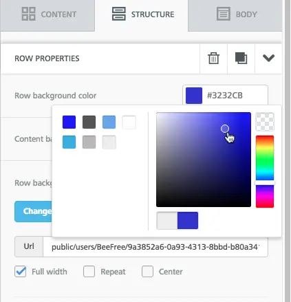
To set a background color, simply select the row, then use the Structure menu to choose a Row background color or Content background color.
Ready for background images in emails? Go Pro!
Sign-up for a BEE Pro free trial and get access to this exciting background image feature, along with tons of free stock images and easy-to-use tools to make your email look perfect! Let us know if you have any questions about this tutorial, and happy email designing!
