Solutions

Tutorial: How to add a countdown timer in email

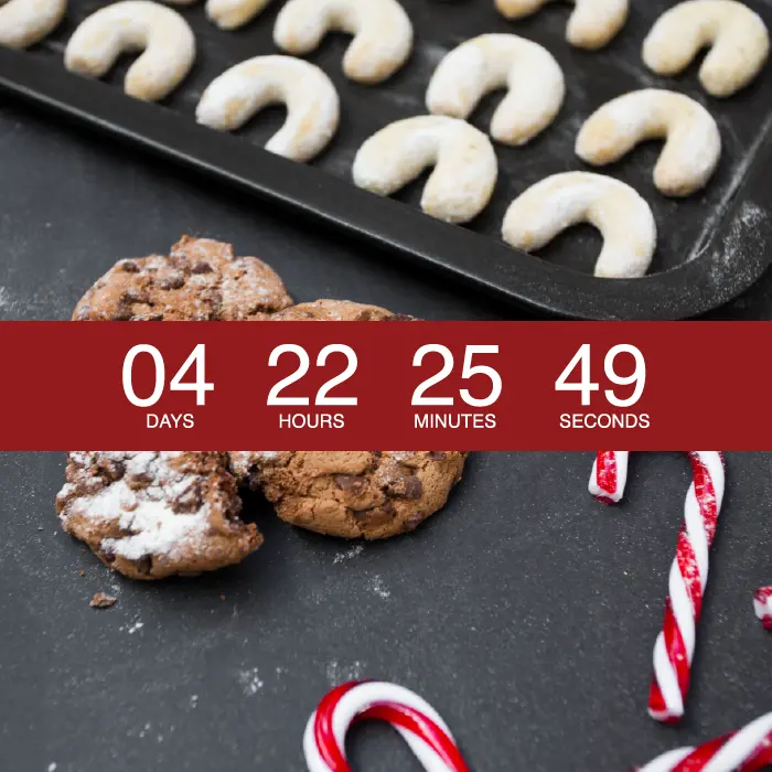
In this workshop we'll be showing you how easy it is to add a countdown timer in your email messages. Our tools for this workshop will be the new custom HTML block in the Beefree editor, along with a simple, free-to-use online tool that will generate the HTML for our countdown email timer.
Beefree team
Beefree team
Mar 26, 2016

More and more brands are using countdown timers in their email design. Countdown timers are dynamic, attention-grabbing, and fun to use. Brands are integrating these timers to encourage subscribers to snag a last-minute deal, register for a workshop, watch an event, and more.In today’s workshop, we’ll be showing you how easy it is to add a countdown timer in your email messages. Our tools for this workshop will be the BEE editor, along with a simple, free-to-use online tool that will generate the HTML for our countdown email timer.Here’s our video recap:

Tools You’ll Need

Today, we’re going to use two tools to build our email with a dynamic countdown timer:

  • We’ll be using the BEE email editor. If you’re not already using BEE, sign up for a free two-week trial of BEE Pro to gain access to additional templates and design features.
  • Second, we’re going to use a tool called Sendtric that can create and generate the HTML for a countdown timer. Sendtric creates the countdown as an animated GIF so it will render in email. 

Let's get started making our countdown email!

Step 1: Design the email in BEE

We’re going to recreate a countdown timer email that The Company Store recently sent its subscribers to announce the last chance for holiday shipping:

email countdown timer

In BEE, we opened up a basic template andnow it’s time to start customizing the email design.To add content, we’ll:

  • Drop in The Company Store logo
  • Add text to the navigation menu

We’re also going to create an additional image block underneath to add the first part of the email. We’re in good shape so far! This is our progress:

email countdown timer

Let’s make the timer and see how it looks in our header.

Step 2: Make the countdown timer with Sendtric

Over at Sendtric.com, creating our timer is pretty straightforward.First, we’ll enter our end date. Sendtric allows you to set the date up to a month out.Then, we’ll update the colors — here, all we need is a beige background and black numbers, and we're going to plug in the HTML color code from the background of the email (#f3f3f3) for an exact match.

sendtric homepage

After we press the Generate button, Sendtric gives us the HTML code and the timer is ready to use!

Step 3: Add the timer to your email

In Sendtric, copy only the link that's in the middle of the code.Back in the BEE editor, we added a new image block in the email and we're going to paste the code for our timer in the URL box for the image. Just like that, our timer is active in the email.

email countdown timer

In Preview Mode, we can see how the width of the timer adjusts to fit a smaller screen. It looks great!

email countdown timer

Additional tools for creating countdown timers

Anumber of online platforms offer easy-to-use countdown timers you can add to your email campaigns. Here's a quick list of additional options:

Using a countdown timer in email? Go Pro!

We hope you enjoy using BEE to jazz up your emails with some countdown timers. If you’re not already using BEE, sign up for a BEE Pro free trial to have access to even more email templates and design features!

Tutorial: Create an email signature in Beefree

In today's workshop, we'll show you how to create awesome email signatures in the Beefree editor. An email signature isn't just for person-to-person business messages; creative signoffs are used in marketing emails to add a personal touch.
Beefree team
Beefree team
Mar 11, 2016

In a recentDesign Inspiration post, we looked at how brands use email signatures to make a statement about their brand identity, build a connection with readers, and leave a lasting impression. An email signature isn'tjust for person-to-person business messages; creative signoffs areused in marketing emails to add a personal touch. In today's workshop, we'll show you how to create awesomeemail signatures in the BEE editor. Keep reading to learnhow!

Recap: Qualities of a great email signature

Check out our video recap:

These are the design best practices we'llkeep in mind as we create our email signature:

  • Short. Just a few lines of text.
  • Simple. A single font and a single accent color.
  • Visual. With a headshot, signature, or logo.
  • Organized. Hierarchy and structure matter.
  • Linked. One or two calls-to-action.
  • Personal. In our brand voice.
  • Mobile-friendly. Responsive and simple; not a single image.

Version 1: Basic signature with plain text

Including an email signature is a statement in and of itself. Plenty of messages don't have them. But including a signature tells readers the email was sent by a real person and not by a robot. It makes the message a little more personal, and it says something about your brand (you're personal, friendly, thoughtful).So you can keep your email signature simple. Just having one already has a lot. Some examples of simple email signatures we spotted look like this:

Screen Shot 2016-03-08 at 3.14.14 PM
Screen Shot 2016-03-08 at 3.16.43 PM

Making a simple signature like this is easy in BEE. Let's open the editor and choose any templatewe'd like to get started.For either of these signatures, we can select a single-column container from our Structure menu...

Screen Shot 2016-03-11 at 10.41.30 AM

...then drag in a Text box from the Content menu:

Screen Shot 2016-03-11 at 10.42.55 AM

Now let's type in a nice signoff in our brand voice. We saw that Dropbox signs their emails "Happy Dropboxing!" and Mailcharts says, "Happy emailing." Above, Invoca signs off with a "Cheers." Instead of closing with “Thank you” or “Sincerely” or “Best,”we can use this opportunity to create a tailored signoff. Today, I'm going to go with this:

Screen Shot 2016-03-11 at 10.49.02 AM

I like the font Georgia, so I'm going to choose it from our list of email-safe fonts, and increased the font size to 18px so it's easy to read.

Screen Shot 2016-03-11 at 10.51.43 AM

Now, let's add some basic, linked details. Sticking to our "keep it simple" best practice, we'lladd two links: one to our Twitter account and one to the blog. A great opportunity to have fun with color and further brand the signature is to use a brand color for links. To change the color of links in our email, we'll go to the Body menu.

Screen Shot 2016-03-11 at 10.57.24 AM

I'm selecting apale blue accent color we use onthe blog. When you add links, you can select if you want your linked text to be underlined or not in the pop-up menu.

Screen Shot 2016-03-11 at 11.00.02 AM

Here's my signature:

Screen Shot 2016-03-11 at 11.02.03 AM

On the blog, we talk a lot about the importance of calls-to-action in email. Your email needs to drive readers to a CTA button, and that CTA should be well-worded and well-designed. Anytime you link content, that's a CTA, too. One way to make linked content in a signature more compelling is by making it an active statement, and keeping it to just one link. Here's something to try:

Screen Shot 2016-03-11 at 11.09.40 AM

It's more compelling than just adding a simple link, isn't it? Try it out and test the results with your subscribers.

Version 2: Add social buttons

We can keep our stellar simple design from Version 1, but instead of links, we can switch to icons, especially if we want to drive people to social media. I'll delete oursignoff one-liner and add a two-column structure beneath my name:

Screen Shot 2016-03-11 at 11.19.47 AM

In the smaller column on the left, I'll add social media buttons from the Content menu. On the right, I'll have plain text.

Screen Shot 2016-03-11 at 11.20.41 AM

Now, I'll edit my social media buttons. In this case, Iwant to includePinterest, since the Email Design Workshop recently started curating some awesome design boards on the site, and I want to drive readers there.

Screen Shot 2016-03-11 at 11.22.21 AM

Then I'll add a line of text on the right.

Screen Shot 2016-03-11 at 11.35.41 AM

To balance out the signature and create a stronger sense of organization and hierarchy, I'm going to drag in a divider line between the signoff and the Pinterest CTA. And voila!

Screen Shot 2016-03-11 at 11.36.49 AM

To read more about customizing your social media buttons, check out our post on icon design here.

Verion 3: Include a headshot

It’s refreshing to see the person who’s sending an email—the personal touch might make readersmore likely to engage—so we really like these photographic signoffs from Hubspot and Apartment Therapy:

Screen Shot 2016-03-07 at 4.21.29 PM
Screen Shot 2016-03-07 at 4.18.52 PM

To create something similar in the BEE editor, we'll again start withthat two-column structure, but this time, we'll add an image placeholder on the left instead of one for social buttons.

Screen Shot 2016-03-11 at 11.41.17 AM

Now it's as easy as dropping in my photo and updating the text, and we have a simple, personal signoff.

Screen Shot 2016-03-11 at 11.55.12 AM

The BEE editor also has a built-in image editor from Aviary. You can crop, color-correct, add filters to an image, and more. Just select your image and press "Edit image" in the menu on the right. I'm going to use it to quickly update the photo to B&W.

Screen Shot 2016-03-11 at 11.58.30 AM

To go with the new black and white theme, I can also add two social media buttons in the gray color scheme to round out the signature.

Screen Shot 2016-03-11 at 12.00.32 PM

Or I can add a pop of color with a simple CTA:

Screen Shot 2016-03-11 at 12.02.28 PM

There are plenty of possibilities! Have fun with your options and tools on BEE.

Version 4: Add a digital signature

Adding a hand-written signature to email is a greatway to add a personal touch to your email signature. To do it, scan your signature or create one in a program like Photoshop, then add it to your email as an image.To recreate Janel Laban's signature from Apartment Therapy, we'd start with this structure in BEE:

Screen Shot 2016-03-11 at 12.07.12 PM

Then we can add in a headshot and signature image, and customize the text underneath for a title.

Screen Shot 2016-03-11 at 12.12.41 PM

And thanks to BEE's built-in responsive design, the signature is optimized for mobile devices, too.

Screen Shot 2016-03-11 at 12.15.06 PM

Creating an email signature is fun! Test out colors, CTAs, and images with yours, and let us know how they turn out!

Quick Video: How to design an email ...and not a website!

Email design is different from website design. Don't confuse the two! Check out this quick video on how to design a proper email marketing message.
Emily Santos
Emily Santos
Mar 2, 2016

Email design is different from website design. Don't confuse the two! Check out our email design tips from our recent workshopHow to avoid making your email look like a website....and try it out in the BEE email editor: http://beefree.io/

Tutorial: How to avoid making your email look like a website

Emails are not websites. Emails are "teaser content." If you make that content interesting enough, readers will tap to learn more. That's why email messages need to be brief, focused, and easy to understand in a matter of seconds.
Beefree team
Beefree team
Feb 27, 2016

Wehave short attention spans. We multitask. We read our emailsin line at the store,while the TV playsin the background, and in the middle of meetings. That's why email messages need to be brief, focused, and easy to understand in a matter of seconds. Emails are not websites. Emails are "teaser content." If you make that content interesting enough, readers will tap to learn more.But we often see emails that are not optimized for readers'mobile, distraction-filled lifestyles. Old design habits die hard. When we recently looked at email design trends in the movie promotions industry, we weren't surprised to see a few emails that were out of sync with the mobile-optimized design techniques we continually recommend. This email, for example, from the movie ticket seller Fandango, could benefit fromsome email serious design updates.

Fandango

The header is complex and takes up a lot of space; the “Buy Tickets” buttons are images (not bulletproof CTA buttons); and the dual-column layout doesn’t create any hierarchy or flow to Fandango'smessage. It also isn’t mobile-responsive, makingthose buttons especially tiny and tough to tap on mobile.

IMG_3871

We recommend Fandangosimplifies, focuses, and prioritizes mobile viewing for on-the-go reading. In today's workshop, we'll show you how. Let's fix this email with BEE.Here's our video recap:

Switch to a single column

We're going to optimize Fandango's email for mobile viewing first by switching from a two-column email to a single-column one. As is evident with this email, multiple columns do not render well on smaller screens. Single column emails are easier to read and are betterfocused on a call-to-action (single columns areoptimal for storytelling, taking readers through each component of the message until there is a clear, obvious call-to-action).In the BEE editor, we'll begin redesigning the Fandango email with a one-column template.

Screen Shot 2016-02-26 at 2.35.36 PM

Simplify the header

Emailheaders shouldn't be overcrowded. Remember, you're not designing a website. There's no need to include extraneous links(social media, special sales, etc), menus, and text at the top. The idea is to get into the important content quickly, guiding readers to your CTA and getting them to tap. Asimple, branded header is enough. Fandango's header hasthree tiers of information: the logo, a site navigationmenu, and a banner message about Memorial Day weekend.

Screen Shot 2016-02-26 at 2.29.18 PM

We'd advise removing those links at the top and sticking with a simple, clean logo for the header. If there's something you really want your readers to click—your awesome teaser content—put it in section one and not in the header.

Screen Shot 2016-02-26 at 3.38.16 PM

Here's our new email-in-progress with the Fandango image at the top:

Screen Shot 2016-02-26 at 2.44.15 PM

To separate it visually from the body content below, we'll also pull in a divider line from the Content menu on the right.

Screen Shot 2016-02-26 at 2.57.57 PM

Simple, elegant, branded!

Screen Shot 2016-02-26 at 2.48.41 PM

Establish hierarchy

When we open the original two-column Fandango email, it's not clear what we should focus on. What's the most importantmessage? What is Fandango telling us, and what do they want us to do? Eachcontent modulecompetes with the others, and there isn't a clear hierarchy to determine what the primary CTA is. Compare that with this single-column email from Film Society of Lincoln Center.The first module has the largest image, and, well, it comes first. We see and read it first; even if we don't scroll down, our eyes probably landed at least on the information in the first section. That's where the most important information is.

film society top

So, what's the most important information in Fandango's email? It's not easy to say, but it appears to be the X-Men tickets. The X-Men module is situatedin the upper left—arguably the most visible part of the email—and the pre-header text reads "Get 'X-Men: Days of Future Past' Tickets + More." It seems, then, that we need toput this section first. From there, we'll make some guesses to line up the itemsthat should follow it.

Streamline modules and switch to bulletproof CTA buttons

With our assumption thatthe X-Men module is themost important piece of content, we're going to make it our first module. Because we want to give readers a single call-to-action, we're going to cut out the mini-menu underneath the X-Men image in the original email. We'll also shorten the description text and delete the duplicative "Buy your tickets now" language that exists already in the CTA button.

Screen Shot 2016-02-26 at 2.51.14 PM

Here's how the new module looks in our redesign in BEE:

Screen Shot 2016-02-26 at 2.53.29 PM

The whole email already has an entirely different feel: our attention is drawn right away to the X-Men announcement and we're led to our first call to action. In addition to simplifying the descriptive text, we also optimized our bulletproofCTA button to read "Get my tickets now"—a more compelling, personalized statement than "Buy tickets." Read all about how to make your CTA buttons irresistibly clickable in our post Top Tips for Call-to-Action Button Design.To improve the balance in the module, we'll also increase the width of the CTA button to line up with the image above it.

Screen Shot 2016-02-26 at 3.26.34 PM

Adjust any CTA button in the Width section of your Content Properties menu.

Screen Shot 2016-02-26 at 3.25.48 PM

From here, we can continue simplifying each module, creatingthem one after the other in our single-column design. We'll also continue using the BEE content dividers to separate oursections.Next up, we'll redesign this Your Theaters module.

Screen Shot 2016-02-26 at 3.27.57 PM

But we don't want this bright orange header to compete visually with the bright orange CTA button that comes before it. Instead, we'll let this module have a white background color, like the one above it, and let the CTA button provide the color—and get the most attention. (You can use an HTML background color to separate amodule—check out our post Design tips for using background color in email). Here's the new design:

Screen Shot 2016-02-26 at 3.34.54 PM

We again updated the CTA button text to include the personal pronoun "my" and to be in the same all-caps format as the first CTA. We were also careful to adjust the width so that it's the same as the previous button.

Preview the design on mobile

As always in the BEE editor, we can preview how our email is coming along by navigating to the Preview option in the Actions menu in the upper left. The new hierarchy and single-column design really shines on a smaller screen!

Screen Shot 2016-02-26 at 4.12.23 PM

Continue with design simplicity

In the Fandango email, and in all emails, as we design each module, we'll continue to consider:

  • What's the key message we need to communicate?
  • How can we eliminate extraneous text?
  • How can we emphasize a single focus by including only the most important call to action?
  • How can we optimize the call to action, both in our language and in our visual style?
  • How can we create simple section breaks to improve readability?

Note we are also only using one font while depending on size and styling (bold) to add emphasis. The email will continue using just blue and orange as the branded accent colors.When we come back to design simplicity again and again, we reinforce the focus and elegance of our email. The email doesn't need to include every last detail—it's not a website! Give these design tactics a try withyour own email in BEE, or recreate your own version of the Fandango email and tell us about it in the comments!

Quick Video: How to use HTML colors alongside images in email

Don't only use images in your email design! Watch this quick video on how using HTML colors alongside images can solve many of the image rendering issues in your email marketing.
Emily Santos
Emily Santos
Feb 24, 2016

Don't only use images in your email design! Chances are some of your subscribers will have image rendering related issues in their inbox. Watch this quick video on how using HTML colors alongside images can solve many of these image rendering issues in your email marketing. To learn more, check out workshop tutorial: How to use HTML colors along images in email…and try this out in the BEE email editor: http://beefree.io/

Tutorial: How to use HTML colors along images in email

Earlier this week, we looked at clever ways brands are using HTML background colors in email. Today's workshop is about applying what we learned and showing you how to use HTML colors with images and improve your email design.
Beefree team
Beefree team
Feb 20, 2016

Email marketers and designers know sending an email composedonly of imagesis a gamble. Tailoring your image-only design to be just-so in Photoshop, then dropping it into an email template is tempting, but it can also increase your spam score, and it means your message won't be viewable to subscribers with image-viewing turned off. The best way to get around this is to break up imageswith plain text and HTML design that will render no matter what. And you can do this without sacrificing the look of your email.We recently looked at three clever ways brands are using HTML background colors in email. In one example,Moo, the website that helps you design and print business cards, incorporatesthe purple color from aproduct image intothe background of a plain-text module in their email. This color blocking technique unifies the email's composition, reinforcing a single visual focus.Itlooks likeit's asingle image even though it isn't.

Moo
Moo markup

Tutorial: How to use HTML colors with images in email

Today, we'll recreate this email in the BEE editor to show you how usingHTML colors with images canimprove your email designwithout sacrificing looks.Here's our video recap:

Step 1: Set up the single-column structure

In BEE, we'll start designing in abasic one-column template.

bee single column

The email has four modules: one at the top for the header, one for the plain text and CTA button, one for the main body image, and one for the footer. From our Structure menu on the right, we'll create this structure by dragging in four single-column modules.

Screen Shot 2016-02-19 at 11.17.41 AM

Step 2: Arrange content blocks

Section 1: The first module will contain two images: the Moo header andthe sub-header in the Moo brand font ("It's Luxe all around!"). So we'll drag in two image containers from the Content menu.

Screen Shot 2016-02-19 at 11.22.20 AM

Section 2: The following module contains text and the "Shop now" button. Text and button containers are pulled in.

Screen Shot 2016-02-19 at 11.23.32 AM

Section 3: This middle section will contain the central business card image.

Screen Shot 2016-02-19 at 11.25.26 AM

Section 4: The footer includes social media buttons, followed by text. We're all set!

Screen Shot 2016-02-19 at 11.26.22 AM

Step 3: Add content and customize

Add images: With our image placeholders are set, we can drag and drop images from the original Moo file into the email.

Screen Shot 2016-02-19 at 11.32.19 AM

Customize text: We'll update the content in the body of the email and in the footer.

Screen Shot 2016-02-19 at 11.35.08 AM

Then, we can format the text. To match Moo, we'll choose Verdana size 16.

Screen Shot 2016-02-19 at 11.37.35 AM

The footer font is smaller; we'll choose 12px. To make the link color greenforUnsubscribe and View Online, we'll navigate to the Body menu and choose green for all links in our email.

Screen Shot 2016-02-19 at 11.41.20 AM

Then, when we link those lines of text, they become green!

Screen Shot 2016-02-19 at 11.42.36 AM

Format buttons: Lastly, we'll update the CTA button and social media buttons.The CTA button needs just two simple changes: we'll make it orange in the Background color menu, and then we can also condense the height a bit by selecting a tighter option in the Line height menu. Read more about all the ways you can customize buttons in BEE in our post How to design bulletproof CTA buttons in email.

Screen Shot 2016-02-19 at 11.46.37 AM

We'll also choose the same social buttons as Moo, and drag-and-drop them in the icon collection menu to reorder. Read more about how to customize your social media buttons in our post How to customize social media buttons in email with BEE.

Screen Shot 2016-02-19 at 11.52.16 AM

The message is shaping up!

Screen Shot 2016-02-19 at 11.50.22 AM

Adjust padding:The header images are clearly a bit condensed, so we need to create space between them. We can do this by selecting one or both images and increasing the padding above or below each one. Just made sure to move the More options slider to the right to make adjustments on particular sides of any type of content.

Screen Shot 2016-02-19 at 11.53.45 AM

Our spacing now looks closer to Moo's.

Screen Shot 2016-02-19 at 11.56.16 AM

Step 4: Select HTML background colors

Now it's time for the fun part! We need to update the background color behind the header and the plain text module to match seamlessly with the product photo beneath. To get the HTML code for the color we need, we went tohtml-color-codes.info, uploaded our image, and got the proper code.

Screen Shot 2016-02-19 at 10.01.20 AM

Then, we can copy #502944 and drop it right into BEE. The easiest way to do this in one fell swoop is to go to the Body menu and paste the code into the Content area background color field.

Screen Shot 2016-02-19 at 12.02.25 PM

We can also select a light gray for the background color, same as the original email.Just like that, our email background matches the central image exactly. Pretty cool, isn't it?

Screen Shot 2016-02-19 at 12.03.34 PM

Just a few final updates: we'll change the text color to white, and update the footer background color to white, too.Here we are!

Screen Shot 2016-02-19 at 12.06.27 PM

Put together, the matched modules makethe email appear to bea single, solid image. It's a simple way toimprove ourimage-to-text ratio with abold and bright email thatwon’t get caught in spam filters. Check out other ways to use HTML colors in email in our design inspiration post, and, if you're really feeling creative, see how to combine HTML colors with images to build unique content dividers. In the BEE editor, it's a cinch!

Fix It with Beefree: Appointment Reminder Email

We're excited to introduce a new series to the Email Design Workshop: Fix It with Beefree. In Fix It with Beefree posts, we'll take a look at a real email we've rece...
Beefree team
Beefree team
Jan 29, 2016

We're excited to introduce a new series to the Email Design Workshop: Fix It with BEE. In Fix It with BEE posts, we'll take a look at a real email we've received, identify how the email's design can be improved to increase engagement, and show you how to redesign it with the BEE editor.These days, almost company, organization, or professional individualhas a mailing list and sends emails, from the corner coffee shop to your doctor's office to local artists.Email is a critical component of any business, big or small, but learning how to design for email is a learning process—one that we're studying all the time. We'll useFix It with BEE toshow you how to spot and avoid common design mistakes and make a beautiful, responsive email with our free editor.Ready for the first transformation?We're starting with this newsletterfrom a dermatology office in New York City:

aglow

What can be improved

There are a few significantemail design issues with this email. The Comic Sans font and busy snowflake background make the email look amateur and unprofessional, which is not the kind of branding a medical doctor (especially one focused on skin and aesthetics!) should want. Additionally, right away, we notice that this email is not mobile responsive. The small text is hard to read on an iPhone, and the blue background is taking up more space than the actual message.

IMG_3550

The "Aglow Dermatology" header appearstwice. This is a common mistake and one that's easy to make; when you write and design an email outside of your template, you can overlook how the message will look once its nestled within the structure of your template. In this case, there's a duplicate header, so one should be removed.

Screen Shot 2016-01-27 at 4.22.43 PM

The main body of the email is broken into two lopsided columns, a structure that looks awkward and makes the message hard to follow. There isno clear hierarchy or call to action. The first column is missing a call to action altogether, and the link in the second column doesn't work. It's also hard to spot because it's the same color as the body text. A bulletproof CTA button would be muchmore eye-catching and effective!

Screen Shot 2016-01-27 at 4.24.06 PM

Lastly—another common mistake—there's pre-written instruction text from the email service provider at the close of the email that the business forgot to customize or remove. This email needs a footer that's effective and well-designed.

Screen Shot 2016-01-27 at 4.29.35 PM

Themistakes in this email are easyfor email design beginners to make, but fortunately they're also easy to correct. Let's fix it with BEE.

Fix it with BEE

1. Build the structural layout of your email first

Think of your email as comprised of sections. The basic structure of the Aglow email is: Header image. Header text. Body text. Closing text. Footer.

aglow structure

Let's mimic the structure in BEE by dragging in the structures we need from the Structure menu on the right. Our layout looks like this:

Screen Shot 2016-01-27 at 5.23.55 PM

We'll keep the two-column layout in the center of the email for now and check out how it looks with some design adjustments. If we don't like it, we can switch to a completely single column layout later.

2. Add placeholders for content

From the Content menu, we can populate the structure placeholders with content placeholders, further developing the layout of our email. The first section will just have an image placeholder for the logo.

Screen Shot 2016-01-27 at 5.29.17 PM

The second section will have atwo text placeholders: one for a header ("Act before December 31st!") and one for the first paragraph of text.

Screen Shot 2016-01-27 at 5.30.45 PM

The third section has two text boxes per section (header and body text, respectively). Let's also try adding CTA buttons in each section.

Screen Shot 2016-01-27 at 5.32.20 PM

The final two sections will just need text. But let's also add social media icons for our footer! Here's our email, fully laid out, ready for content, customization, and fine-tuning:

Screen Shot 2016-01-27 at 5.33.43 PM

3. Populate the email with content

We'll copy-and-paste the content from Aglow's original email, and drag in that header image, then reassess how it looks. Here's how the email is shaping up, before formatting:

Screen Shot 2016-01-27 at 5.44.43 PM

4. Format the text to create clarity

We recommendArial, BEE's default and email-safe font, over the Comic Sans from the original Aglow email. We'll go in and adjust the font size and style so that headers and important text stand out. We'll also make some small copyedits, like removing the words "email" and "voice" from the contact info at the bottom—those words are not needed. Here's our email after some simple text formatting:

Screen Shot 2016-01-27 at 5.52.47 PM

It looks pretty good! We also added a divider from the Content menu above the footer, and centered the footer content. By toggling over to the Preview menu in the upper left corner, we can take a peek at how the email will render on mobile, too:

Screen Shot 2016-01-27 at 5.55.41 PM
Screen Shot 2016-01-27 at 5.56.08 PM

5. Improved design approaches

Those side-by-side CTA buttons seem to be competing with each other, and they both essentially communicate the same thing: book an appointment. Let's see how the email wouldlook with a single, full-width CTA button instead. Also note how we're using personal pronouns and an active voice, best practices for highly clickable CTA buttons.

Screen Shot 2016-01-27 at 6.01.19 PM

The focus of the entire email seems clearer now, doesn't it? Having a single call to action removes any confusion and better compels readers to act.Let's try removing the two-column part of the email to see how the message looks in a single column.

Screen Shot 2016-01-27 at 6.05.44 PM

The single column feels better, don't you think? We also bolded the headers and added numbering to improve readability. If Aglow needs to further segment and target different patient populations with their calls to action, they could also go back to two CTA buttons, in a layout like this:

Screen Shot 2016-01-27 at 6.10.12 PM

We feel good about parting ways with that snowflake background and going with an all-white email that feelseasy on the eye and business-like. But if a contrasting background color is preferred, we can choose a color in the Body menu. We'd recommend a lighter color, like gray...

Screen Shot 2016-01-27 at 6.13.39 PM

Or pale blue:

Screen Shot 2016-01-27 at 6.14.26 PM

Wrap Up

It was easy to improve this email with BEE! Withsome small adjustments, the email is much easier to read, and will hopefully get more conversions. Here are the best practices to keep in mind:

  • Take a simple approach to design: don't add busy background patterns or multiple font styles unless they serve a purpose.
  • Use CTA buttons to get readers' attention and call them to act. Links are easy to miss.
  • Beware of how your email looks in its template before you send it out (look out for an accidental double header).
  • Optimize for mobile with a single-column design, full-width CTA buttons that are easy to tap, and a responsive template (all BEE emails are automatically responsive!)
  • Go with a subtle background color to make the central body of your message stand out. Otherwise, an all-white background provides for a simple, clean look.

Tutorial: How to design an email footer

Readers naturally scroll to the bottom of an email—to the footer—when they're in search of more information. Maximize this space by building a footer that's informative, well organized, clutter-free, and mobile optimized. In today's workshop, we'll show you how.
Beefree team
Beefree team
Jan 29, 2016

Readersnaturally scroll to the bottom of an email—to the footer—when they're in search of more information, like where to find your brand on social media, how to update email preferences,how to contact your company, and more. Emails that follow design best practices and are like a teaser (clear and brief) will be lowon text and focused on a single call to action, makingthe footer the best location for fine print and additional details. Maximize this space by building a footer that's informative, well organized, clutter-free, andmobile optimized. In today's workshop, we'll show you how.

Inspiration for our email footer design

In our Best Practices for Email Footer Design post, we reviewed all the informationyou can and should (and sometimes must) include in your footer, along with best practices for formatting. One of the footerswe highlighted, from DC Shoes, is a great example of strong organization and a dynamic layout.

Screen Shot 2016-01-21 at 5.40.18 PM

Usingheaders, HTML background colors, and a clean back-and-white color scheme is a great approach to optimizing space while improving readbility. The three-column layout is also mobile responsive, so text iseasy to read and buttons and links are easy to tap on a small screen.

IMG_3491

In this post, we'll show you step by step how to create a footer like this using the BEE editor. Let's get started!

Tutorial: How to design your email footer

Here's our video recap:

Step 1: Set up the 3-column structure

To recreate the structure of the footer in BEE, we'll usea 3-column layout, followed by a one-column structure for the fine print (*Place an order of $29... etc.). As always, we'll navigate to the Structure menu and drag-and-drop our selections into the body of the emailto get started.

Screen Shot 2016-01-31 at 7.22.10 PM

After dropping in our two structures, the layout of our email looks like this:

Screen Shot 2016-01-31 at 7.23.52 PM

Step 2: Arrange content blocks

Each of the columns has the same basic structure: text, divider, text, then button/icons.

dc shoes markup

From the Content menu, we'll pull in each of these items to recreate the layout.First, text:

Screen Shot 2016-01-31 at 7.34.58 PM

Then a divider:

Screen Shot 2016-01-31 at 7.35.35 PM

Then text:

Screen Shot 2016-01-31 at 7.36.12 PM

And then the button:

Screen Shot 2016-01-31 at 7.37.04 PM

Here's our first section populated with content placeholders:

Screen Shot 2016-01-31 at 7.37.32 PM

After we pull in the remaining items, the footer is prepped to customize and looks like this:

Screen Shot 2016-01-31 at 7.40.50 PM

Note the center section has social sharing icons instead of a button. Check out our post on how to customize social media icons for a quick walk-through of how to select and format the look of these buttons in BEE.

Step 3: Customize and format text and CTA buttons

In each section, we'll customize the text. Before formatting, the footer looks like this:

Screen Shot 2016-01-31 at 8.02.01 PM

First, we'll bold and center each header, and update the font color to black. The font typeand size looks good as-is.

Screen Shot 2016-01-31 at 8.04.37 PM

Then we'll center the second lines of text and decrease the font size.

Screen Shot 2016-01-31 at 8.06.36 PM

The CTA buttons also need to be customized.For each one, we'll...

  • Change the color to black
  • Extend to the right width (we chose 85%)
  • Decrease border radius to 0 (for squared off corners)

Each of these changes is easily made in the Content Properties menu on the right:

Screen Shot 2016-01-31 at 8.12.28 PM

For an in-depth tutorial on CTA button formatting, check out our post How to design bulletproof buttons in email. Our customized buttons now look like this:

Screen Shot 2016-01-31 at 8.15.45 PM

Step 4: Update the background color

To start creating the clear division of content from the DC footer, we need to update the row background color to gray, while the content background remains white. We can simply activate the row by clicking to the right or left of our content and updating the Row background in the Structure menu.

Screen Shot 2016-01-31 at 8.20.21 PM

In the second row of content, where the fine print is listed, we will also make the Content background the same color as the row background.

Screen Shot 2016-01-31 at 8.22.25 PM

We're getting close! If you're wondering how we can create divisions between each section, the answer is by adjusting the borders.Keep reading to see how.

Step 5: Adjust borders and padding

To create space between each section of content, we need to activate the row and check out the Structure menu on the right.Under Column Properties, there's a menu for each column tobe customized.

Screen Shot 2016-01-31 at 8.28.48 PM

Select Column 2. Turn on More options in the Border menu. Now we can adjust the border around the center column on the top, bottom, left, and right. To create a gray border on either side, we can add one on the left and right.

Screen Shot 2016-01-31 at 8.35.23 PM

Voilá!

Screen Shot 2016-01-31 at 8.36.38 PM

The final step we'll take is to adjust the padding of the content within each section. For instance, each header should be closer to the divider beneath it to more closely mimic DC Shoes's format. We can select a header one by one and decrease the padding beneath it in the Spacing menu.

Screen Shot 2016-01-31 at 8.38.39 PM

Then we can format the dividers themselves. Once its selected, the Content Properties menu allows us to adjust the thickness, color, and width of each one. In this case, we'll make each one thicker and the same width as the CTA buttons (85%) so they're aligned. We'll also change the color to match the background.

Screen Shot 2016-01-31 at 8.42.18 PM

Here's our footer!

Screen Shot 2016-01-31 at 8.43.13 PM

It's pretty amazing how closely it matches the original. To preview how it will look on a phone, we can select Preview from the Actions menu in the upper left corner.

Screen Shot 2016-01-31 at 8.49.54 PM

Design a great footer and go Pro!

The DC Shoes footer isa great example of how smart design canmake a lot of content easyto scan, especially on a smaller screen. Witheffective use ofborders and a basic color scheme, the footer is elegant and well organized. If you're not already using BEE, sign-up for a BEE Pro free trial and have access to additional templates and design features.

Quick Video: How to create a mobile-ready image gallery

In the BEE email editor it's very easy to put together a photo collage that changes layout depending on the device that the email is opened with. It's a great way to spruce up all kinds of email campaigns. For more details, see the full workshop on How to create a responsive photo collage for your emails.
Massimo Arrigoni
Massimo Arrigoni
Jan 20, 2016

In the BEE email editor it's very easy to put together a photo collage that changes layout depending on the device that the email is opened with. It's a great way to spruce up all kinds of email campaigns. For more details, see the full workshop on How to create a responsive photo collage for your emails.

Tutorial: How to make a responsive photo collage in email

A photo collage in email is the perfect way to display stunning images and tell a compelling visual story while avoiding the pitfalls of a single-image email. With great stock photos now easier to get than ever, even free of charge (we particularly like Pexels), you're in the driver's seat.
Beefree team
Beefree team
Jan 15, 2016

Photo collages (also called photo galleries) are a great way to add visual muscle to your email campaigns.Readers increasingly scanemails on mobile devices while they're on the go. Withonly a few seconds to capture subscribers' attention, photography is a great way to make an impact (especially if you're in thefood or fashion industries, where product pictures can make or break a campaign).A photo collage in email is the perfect way to display stunning images and tell a compelling visual story while avoiding the pitfalls of a single-image email. With great stock photos now easier to get than ever, even free of charge (we particularly likePexels), you're in the driver's seat.

Pexels free stock photography

Today we'll show you how to build a beautiful, responsive photo collage in email so you can design a message that looks awesome and converts.

Inspiration for our photo collage in email

Many subscription confirmation emails look the same, but recently we took a look at how some brands are breaking the mold by giving subscribers a warm welcome and standing out from the crowd (on that, seeDesign a standout subscription confirmation email).One of them came fromCook Smarts, a company that emailscooking lessonsand recipes. After signing up for their mailing list, we received this confirmation email. The original, high-quality images made our mouths water. Thephoto collageserves as a delicious preview for the meal plans to come. Whata great way to get readers to tap"Yes, subscribe me to this list"!

Screen Shot 2016-01-10 at 6.06.44 PM

But when we checked out the email on iPhone, we noticed it wasn't responsive.

cooksmarts mobile

The text doesn't get any larger (it's actually a bit hard to read), and the photo collage is all one image, so it scales down significantly to fit the screen's width. Sometimes, not having a responsive collage isokay—you might want the images in your collage to remain in place, even on a small device. It depends onthe amount of detail you want to maintain and if losing that detail due to scaling is okay for the purposes of your message. If you make a collage that's a single image, you'll have to do it in Photoshop or a similar program, but you can make a totally responsive photo collage entirely in our drag-and-drop BEE email editor, without needing to pre-format. Here's our quick video recap of today's workshop:

Tutorial: How to build a responsive photo collage

We recreated the basic structure of the Cook Smart email in the BEE editor to get started. Starting with a basic single-column layout, we brought in the logo as an image for the header, formatted the email background color to gray and the content background to white, and copy-and-pasted the text into the email. We also formatted our bulletproof CTA button. (For tips on how to make these formatting changes, check out our post on modular design and HTML colors in email).

Screen Shot 2016-01-15 at 4.40.56 PM

Setting up the photo collage structure

What we need to do next is set up the structure of the photo collage. While so far our email is a single-column layout, we'll need to add a two-column structure to arrange our photos. From the Structure menu, we'll drag one in.

Screen Shot 2016-01-15 at 4.50.12 PM

Now we have a placeholder for our content.

Screen Shot 2016-01-15 at 4.49.43 PM

From the Content menu, we can drag and drop in four image placeholders, two in each column.One...

Screen Shot 2016-01-15 at 4.53.47 PM

Two...

Screen Shot 2016-01-15 at 4.54.27 PM

Three...

Screen Shot 2016-01-15 at 4.55.36 PM

Four...

Screen Shot 2016-01-15 at 4.59.44 PM

Ready to rock and roll!

Screen Shot 2016-01-15 at 5.00.18 PM

Adding photos to the collage

We took Cook Smarts' single image collage and saved each portion individually so we have four separate images to work with. Now we'll drag them in one at a time into our placeholders.

Screen Shot 2016-01-15 at 5.06.16 PM

The content placeholders automatically adjust in size to fit the heightof each image, making it super easy to maintain the look and feel of the Cook Smart collage.

Screen Shot 2016-01-15 at 5.08.26 PM

We can continue to add the images on at a time, dropping each one into place, until all four are in place.

Screen Shot 2016-01-15 at 5.11.05 PM

Fine-tuning with padding adjustments

The photo collage looks great, but we can more closely mirror the layout of Cook Smart's collage by adjusting the white space between the images andalong the outside borders on the right and left. We can adjust padding on any piece on content in BEE by clicking on it and navigating to the Content menu that appears on the right.To add white space on either side of our collage, we'll click the content row (the blank space to the right or left of our collage), so we can adjust both sides at once. Here's how:Turn on the "More options" slider under Padding.

Screen Shot 2016-01-15 at 5.18.05 PM

In Column 1, we'll want to adjust the padding on the left only. By increasing the padding to 30px, we create a nice strip of white space on the left of our collage, similar to the original Cook Smart one.

Screen Shot 2016-01-15 at 5.19.44 PM

In Column 2, we will bump up the Right padding to 30px as well. Now there's white space on either side of our collage.

Screen Shot 2016-01-15 at 5.21.28 PM

Looking good! Finally, we can make a similar adjustment for each image, so that there is a thin white border around the photos. Click on each photo, turn on "More options" for Padding, and fine-tune away! Here's our collage after we finished:

Screen Shot 2016-01-15 at 5.29.00 PM

Ta da! The photos from Cook Smart are stunning and already look great, but the BEE editor also has a built-in image editor, from Aviary, that you can access to crop, orient, resize, and edit your images in countless ways. To access Aviary, just select an image, navigate to the menu on the right, and click "Edit image."

Screen Shot 2016-01-15 at 5.30.31 PM

Aviary will load, and you can edit away!

Screen Shot 2016-01-15 at 5.24.40 PM

Previewing our new email

To get a glimpse of how our new responsive photo collage will look on mobile devices, we can preview it in BEE. Select "Preview" from the Actions menu in the upper left corner.

Screen Shot 2016-01-15 at 5.32.09 PM

And here's our mobile preview:

Screen Shot 2016-01-15 at 5.33.36 PM
Screen Shot 2016-01-15 at 5.34.04 PM

I love how we can see these beautiful images at full-resolution and takeadvantage of the full width of the smaller screen. The text is much easier to read, too. The email looks great, is fully responsive, and was easy to build! Give the BEE editor a try and tell us aboutyour creative collages in the comments.

Quick Video: How to customize social media icons in email

Did you know you can customize social media icons in your email message? Yes! Watch how to customize them in this quick video tutorial. For more info, check ...
Emily Santos
Emily Santos
Jan 9, 2016

Did you know you can customize social media icons in your email message? Yes! Watch how to customize them in this quick video tutorial. For more info, check out our workshop tutorial: How to customize your social media icons in email...and try it out in the BEE email editor! http://beefree.io/

Tutorial: How to customize your social media icons in email with Beefree

Earlier in this week’s Design Inspiration post, we looked at how different brands use social media buttons in email: where they put them, how the color/shape/size is customized, and what purpose they serve (to share or follow).
Beefree team
Beefree team
Jan 8, 2016

Earlier in this week's Design Inspiration post, we looked at how different brands use social media buttons in email: where they put them, how the color/shape/size is customized, and what purpose they serve (to share or follow).

Today's workshop

Today, we'll show you how to customize social media buttons in Beefreeso next time you're designing anemail campaign, you can give a little extra thought to those very important little buttons.Follow along as we show you:

  • How and where to place social media buttons in your email
  • How to add or remove different buttons
  • How to customize the look of the buttons
  • How to fine-tune with alignment, spacing, and padding

1. Position your social media icons

Most brands place social media follow icons at the header or footer of anemailwhere readersinstinctively lookforstandard info found in menus, like contacts and social media links. Design-wise, and from a message-comprehension point of view,it makes sense to placesocial media buttons at the opening or close of your email where they aren't interrupting the flow of your central message. An email's primary call-to-action is generally not about getting readers over to social sites; it's about getting them to make a purchase, sign up for an event, or take some kind of action. So it makes sense that social media buttons are positioned in a way to not steal the show.Let's review how toadd social media buttons to your email's header, similar to this email from Martha Stewart Everyday Food.

Screen Shot 2016-01-04 at 10.16.51 PM

We'll need a two-column structure that accommodates a header image on the left and social buttons on the right, so we'll set up our header structure with this block:

header

Then, from the Content menu, we'll pull in an image placeholder in the left side of the structure,and social media icons on the right.To add social media buttons to any email in Beefree, simply go to the Content menu and drag and drop theSocial content block into your email's structure, as we see below:

social

Here's our email header, ready to be customized:

strucutre 1

We'll pull in our header image (in this case, we took a screen shot from the Everyday Food email).

header customize

And now we can focus on customizingourbuttons!

2. Add and remove social media icons

Now that the social media buttons are positioned in our email, we can click on them to activate our Content Properties menu to make changes.

content prop

To mimic the Everyday Food email, we'll need four icons: Facebook, Twitter, Pinterest, and Instagram. From our Content Properties menu, we can configure our icon collection. Click the trashcan icon on the Google+ icon bar to delete it. Then, select"Add new icon" tobrowse for the ones we need.

social snip

From the Social Follow menu, we select the Pinterest and Instagram icons. Beefree also provides built-in buttons for LinkedIn and YouTube, and, from the "Other icons" menu, an option to link or email content. To rearrange the order of the buttons, just drag them into your preferred position in the same menu on the right.Here's our new header with the social media buttons we need.

new header

Remember to link each one to the appropriate account. Simply click "Edit" for each icon and add the appropriate URL.

instagram

Each social button also has two editable fields--with default "Instagram" text, for example, in the image above. These are thetitle text HTML tag andthe ALT text HTML tag, respectively. Unlike BEE's bulletproof HTML buttons, social media buttons are images, so it's wise to fill out these fields.

3. Customizing your social media icons is easy!

Now that we have the buttons we need, we can format them in one easy step. Beefree offers four built-in icon collections to choose from. The Select icon collection option is the first formatting choice in the Content Properties menu. From it, we can choose betweentwo monochrome collections (all gray or all blue) and two multicolor collections, one with square icons and one with circular.

social media icon collections

To keep the look of our header clean, we'll choose the gray scale.

header with icons

If your brand has custom social media buttons, like these brand-colored orange ones for Everyday Food, you could bypass using the built-in social media icons from Beefree and drag in your own icons as images, linking the once they are in place.

4. Fine-tuning: how to apply alignment, spacing, and padding

Now we can fine-tune the exact position of our buttons--and the space around and between them--so we're happy with the layout and balance of our header. To match Everyday Food's header, the icons need to come down and to the left, so they're centered within their structure.Back in the Content Properties menu, beneath the collection customization options, we have three more properties to configure: Align, Iconspacing, and Padding.

align

First, we'll change the alignment so the icons are center-adjusted (selecting the middleoption). This moves our icons over, so we go from this....

header right

...to this:

header center

Next, we can increase the spacing between the icons themselves with the Icon spacing option.It's set to a default of 5px between each, which looks good, but if we wanted to, we could increase to 10, 15, or 20:

10
15
20

Lastly, we can adjust the padding around the buttons. By turning on the More options switch, wecan increase padding specifically on the top, bringing the buttons downward.They're going in the right direction, but I'd still like them to come down a bit, even after adjusting the top padding to its 30px max:

more padding

To get more white space over top, we can further adjust the padding, not just on the buttons, but on the content container holding our buttons. Here's how: Select the row of content containing our entire header. The menu will change to view Row properties and Column properties.

column properties

Since our social media buttons sit in the second column of our two-column header (remember that 2-column row structure we selected at the very beginning?), we can select Column 2 under Column Properties and continue to increase the top padding! Now it's just right. What do you think?

final

Adding and editing social media icons takes just seconds in the Beefree. Once you format the look of your buttons, you can also drag and drop them to the header or footer and test which position works best for your company and audience. Give it a try! And let us know how you do in the comments.

Stay informed on all email trends

From the latest creative design strategies that inspire your next campaign to industry best practices and tech advancements, our newsletter is the go-to for all things creation.

By clicking Subscribe you're agreeing with our Privacy Policy