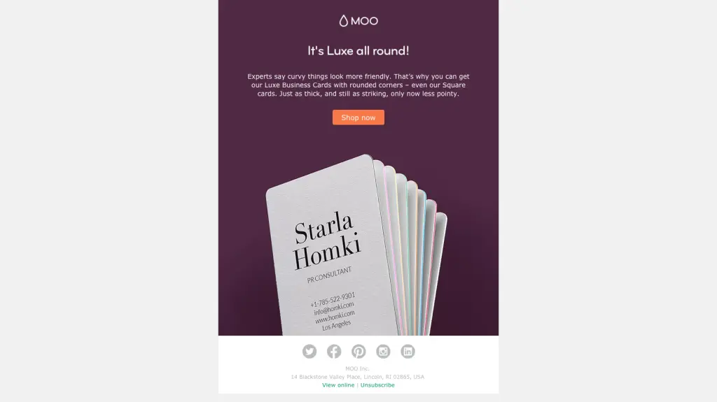
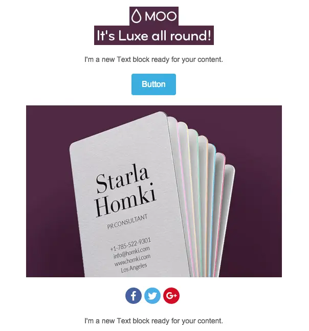
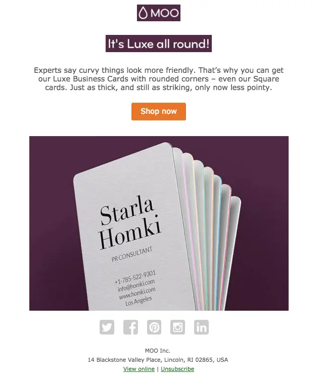
Email marketers and designers know sending an email composedonly of imagesis a gamble. Tailoring your image-only design to be just-so in Photoshop, then dropping it into an email template is tempting, but it can also increase your spam score, and it means your message won't be viewable to subscribers with image-viewing turned off. The best way to get around this is to break up imageswith plain text and HTML design that will render no matter what. And you can do this without sacrificing the look of your email.We recently looked at three clever ways brands are using HTML background colors in email. In one example,Moo, the website that helps you design and print business cards, incorporatesthe purple color from aproduct image intothe background of a plain-text module in their email. This color blocking technique unifies the email's composition, reinforcing a single visual focus.Itlooks likeit's asingle image even though it isn't.
Tutorial: How to use HTML colors with images in email
Today, we'll recreate this email in the BEE editor to show you how usingHTML colors with images canimprove your email designwithout sacrificing looks.Here's our video recap:
Step 1: Set up the single-column structure
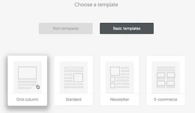
In BEE, we'll start designing in abasic one-column template.
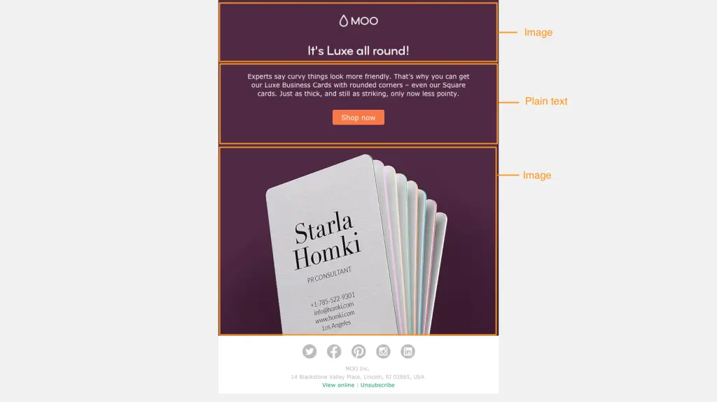
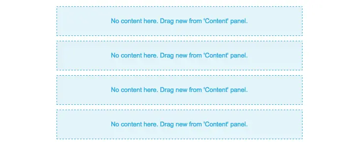
The email has four modules: one at the top for the header, one for the plain text and CTA button, one for the main body image, and one for the footer. From our Structure menu on the right, we'll create this structure by dragging in four single-column modules.
Step 2: Arrange content blocks
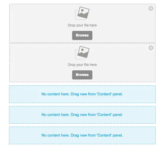
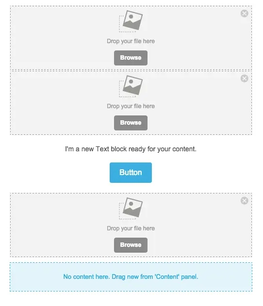
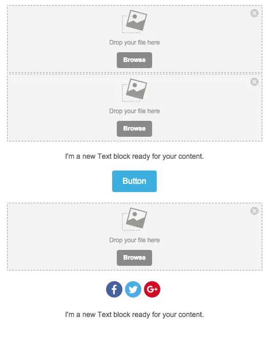
Section 1: The first module will contain two images: the Moo header andthe sub-header in the Moo brand font ("It's Luxe all around!"). So we'll drag in two image containers from the Content menu.
Section 2: The following module contains text and the "Shop now" button. Text and button containers are pulled in.

Section 3: This middle section will contain the central business card image.
Section 4: The footer includes social media buttons, followed by text. We're all set!
Step 3: Add content and customize
Add images: With our image placeholders are set, we can drag and drop images from the original Moo file into the email.
Customize text: We'll update the content in the body of the email and in the footer.

Then, we can format the text. To match Moo, we'll choose Verdana size 16.

The footer font is smaller; we'll choose 12px. To make the link color greenforUnsubscribe and View Online, we'll navigate to the Body menu and choose green for all links in our email.
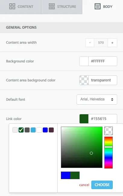
Then, when we link those lines of text, they become green!

Format buttons: Lastly, we'll update the CTA button and social media buttons.The CTA button needs just two simple changes: we'll make it orange in the Background color menu, and then we can also condense the height a bit by selecting a tighter option in the Line height menu. Read more about all the ways you can customize buttons in BEE in our post How to design bulletproof CTA buttons in email.

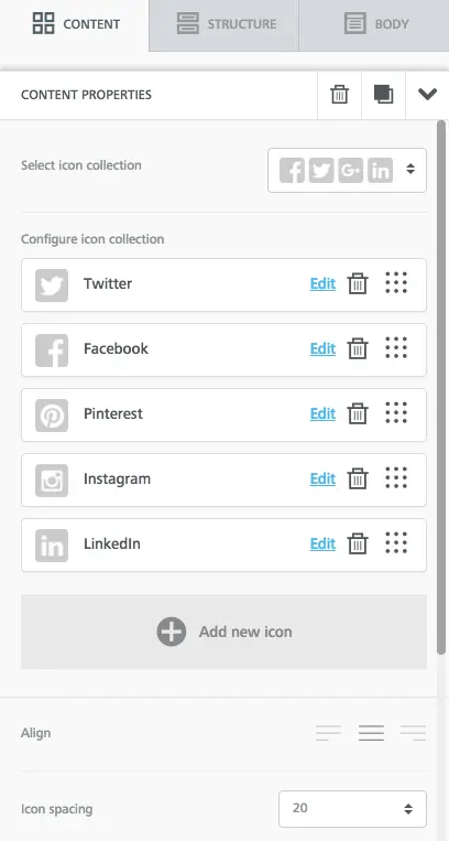
We'll also choose the same social buttons as Moo, and drag-and-drop them in the icon collection menu to reorder. Read more about how to customize your social media buttons in our post How to customize social media buttons in email with BEE.
The message is shaping up!

Adjust padding:The header images are clearly a bit condensed, so we need to create space between them. We can do this by selecting one or both images and increasing the padding above or below each one. Just made sure to move the More options slider to the right to make adjustments on particular sides of any type of content.
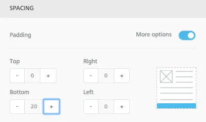
Our spacing now looks closer to Moo's.
Step 4: Select HTML background colors
Now it's time for the fun part! We need to update the background color behind the header and the plain text module to match seamlessly with the product photo beneath. To get the HTML code for the color we need, we went tohtml-color-codes.info, uploaded our image, and got the proper code.
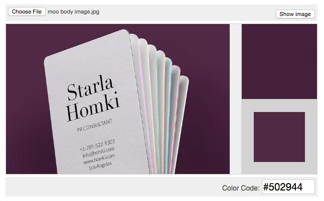
Then, we can copy #502944 and drop it right into BEE. The easiest way to do this in one fell swoop is to go to the Body menu and paste the code into the Content area background color field.
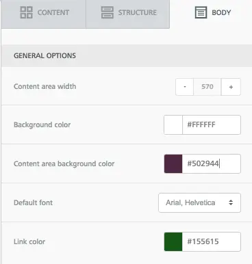
We can also select a light gray for the background color, same as the original email.Just like that, our email background matches the central image exactly. Pretty cool, isn't it?

Just a few final updates: we'll change the text color to white, and update the footer background color to white, too.Here we are!
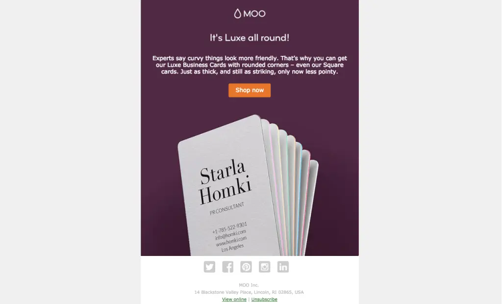
Put together, the matched modules makethe email appear to bea single, solid image. It's a simple way toimprove ourimage-to-text ratio with abold and bright email thatwon’t get caught in spam filters. Check out other ways to use HTML colors in email in our design inspiration post, and, if you're really feeling creative, see how to combine HTML colors with images to build unique content dividers. In the BEE editor, it's a cinch!
