
In a recentDesign Inspiration post, we looked at how brands use email signatures to make a statement about their brand identity, build a connection with readers, and leave a lasting impression. An email signature isn'tjust for person-to-person business messages; creative signoffs areused in marketing emails to add a personal touch. In today's workshop, we'll show you how to create awesomeemail signatures in the BEE editor. Keep reading to learnhow!
Recap: Qualities of a great email signature
Check out our video recap:
These are the design best practices we'llkeep in mind as we create our email signature:
- Short. Just a few lines of text.
- Simple. A single font and a single accent color.
- Visual. With a headshot, signature, or logo.
- Organized. Hierarchy and structure matter.
- Linked. One or two calls-to-action.
- Personal. In our brand voice.
- Mobile-friendly. Responsive and simple; not a single image.
Version 1: Basic signature with plain text
Including an email signature is a statement in and of itself. Plenty of messages don't have them. But including a signature tells readers the email was sent by a real person and not by a robot. It makes the message a little more personal, and it says something about your brand (you're personal, friendly, thoughtful).So you can keep your email signature simple. Just having one already has a lot. Some examples of simple email signatures we spotted look like this:


Making a simple signature like this is easy in BEE. Let's open the editor and choose any templatewe'd like to get started.For either of these signatures, we can select a single-column container from our Structure menu...
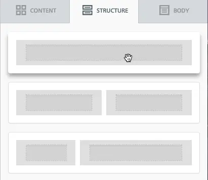
...then drag in a Text box from the Content menu:

Now let's type in a nice signoff in our brand voice. We saw that Dropbox signs their emails "Happy Dropboxing!" and Mailcharts says, "Happy emailing." Above, Invoca signs off with a "Cheers." Instead of closing with “Thank you” or “Sincerely” or “Best,”we can use this opportunity to create a tailored signoff. Today, I'm going to go with this:

I like the font Georgia, so I'm going to choose it from our list of email-safe fonts, and increased the font size to 18px so it's easy to read.

Now, let's add some basic, linked details. Sticking to our "keep it simple" best practice, we'lladd two links: one to our Twitter account and one to the blog. A great opportunity to have fun with color and further brand the signature is to use a brand color for links. To change the color of links in our email, we'll go to the Body menu.
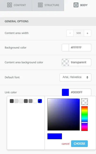
I'm selecting apale blue accent color we use onthe blog. When you add links, you can select if you want your linked text to be underlined or not in the pop-up menu.
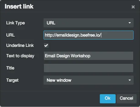
Here's my signature:

On the blog, we talk a lot about the importance of calls-to-action in email. Your email needs to drive readers to a CTA button, and that CTA should be well-worded and well-designed. Anytime you link content, that's a CTA, too. One way to make linked content in a signature more compelling is by making it an active statement, and keeping it to just one link. Here's something to try:

It's more compelling than just adding a simple link, isn't it? Try it out and test the results with your subscribers.
Version 2: Add social buttons
We can keep our stellar simple design from Version 1, but instead of links, we can switch to icons, especially if we want to drive people to social media. I'll delete oursignoff one-liner and add a two-column structure beneath my name:

In the smaller column on the left, I'll add social media buttons from the Content menu. On the right, I'll have plain text.

Now, I'll edit my social media buttons. In this case, Iwant to includePinterest, since the Email Design Workshop recently started curating some awesome design boards on the site, and I want to drive readers there.

Then I'll add a line of text on the right.

To balance out the signature and create a stronger sense of organization and hierarchy, I'm going to drag in a divider line between the signoff and the Pinterest CTA. And voila!

To read more about customizing your social media buttons, check out our post on icon design here.
Verion 3: Include a headshot
It’s refreshing to see the person who’s sending an email—the personal touch might make readersmore likely to engage—so we really like these photographic signoffs from Hubspot and Apartment Therapy:
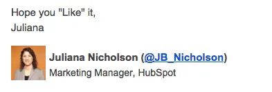

To create something similar in the BEE editor, we'll again start withthat two-column structure, but this time, we'll add an image placeholder on the left instead of one for social buttons.

Now it's as easy as dropping in my photo and updating the text, and we have a simple, personal signoff.
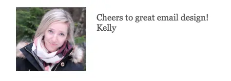
The BEE editor also has a built-in image editor from Aviary. You can crop, color-correct, add filters to an image, and more. Just select your image and press "Edit image" in the menu on the right. I'm going to use it to quickly update the photo to B&W.

To go with the new black and white theme, I can also add two social media buttons in the gray color scheme to round out the signature.
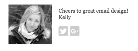
Or I can add a pop of color with a simple CTA:
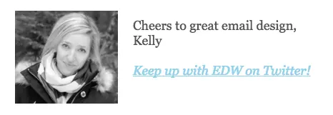
There are plenty of possibilities! Have fun with your options and tools on BEE.
Version 4: Add a digital signature
Adding a hand-written signature to email is a greatway to add a personal touch to your email signature. To do it, scan your signature or create one in a program like Photoshop, then add it to your email as an image.To recreate Janel Laban's signature from Apartment Therapy, we'd start with this structure in BEE:
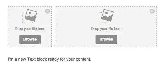
Then we can add in a headshot and signature image, and customize the text underneath for a title.

And thanks to BEE's built-in responsive design, the signature is optimized for mobile devices, too.

Creating an email signature is fun! Test out colors, CTAs, and images with yours, and let us know how they turn out!


