Beefree blog

Fix It with Beefree: Appointment Reminder Email

Beefree team
Beefree team
Jan 29, 2016
Fix It with Beefree: Appointment Reminder Email

We're excited to introduce a new series to the Email Design Workshop: Fix It with BEE. In Fix It with BEE posts, we'll take a look at a real email we've received, identify how the email's design can be improved to increase engagement, and show you how to redesign it with the BEE editor.These days, almost company, organization, or professional individualhas a mailing list and sends emails, from the corner coffee shop to your doctor's office to local artists.Email is a critical component of any business, big or small, but learning how to design for email is a learning process—one that we're studying all the time. We'll useFix It with BEE toshow you how to spot and avoid common design mistakes and make a beautiful, responsive email with our free editor.Ready for the first transformation?We're starting with this newsletterfrom a dermatology office in New York City:

aglow

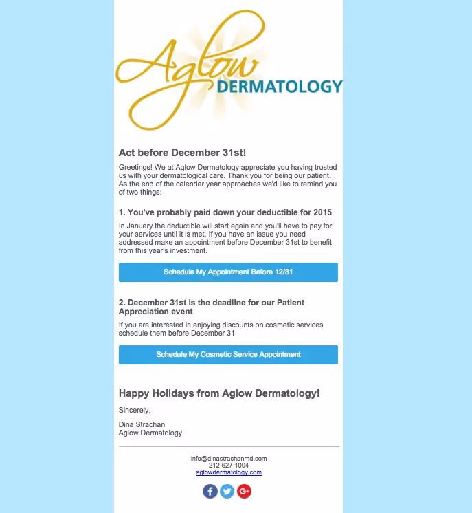
What can be improved

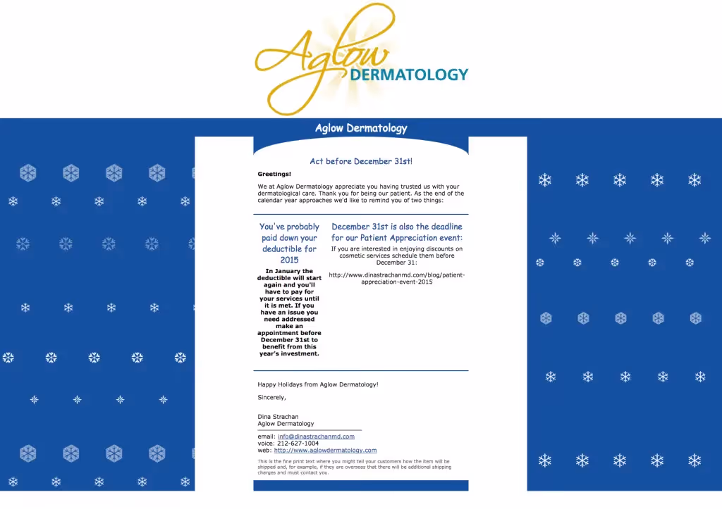
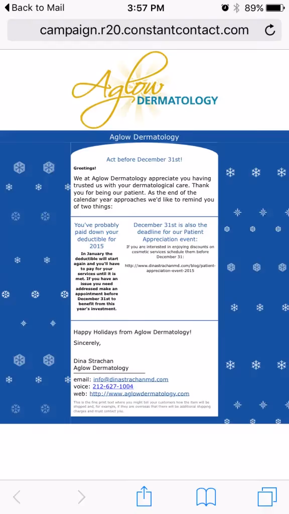
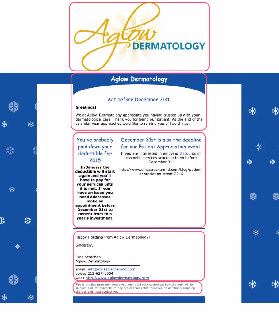
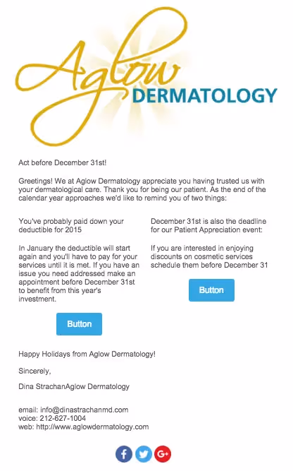
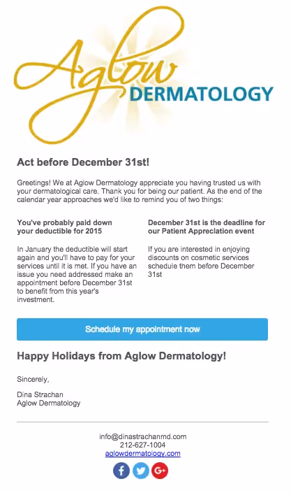
There are a few significantemail design issues with this email. The Comic Sans font and busy snowflake background make the email look amateur and unprofessional, which is not the kind of branding a medical doctor (especially one focused on skin and aesthetics!) should want. Additionally, right away, we notice that this email is not mobile responsive. The small text is hard to read on an iPhone, and the blue background is taking up more space than the actual message.

IMG_3550

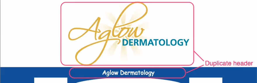
The "Aglow Dermatology" header appearstwice. This is a common mistake and one that's easy to make; when you write and design an email outside of your template, you can overlook how the message will look once its nestled within the structure of your template. In this case, there's a duplicate header, so one should be removed.

Screen Shot 2016-01-27 at 4.22.43 PM

The main body of the email is broken into two lopsided columns, a structure that looks awkward and makes the message hard to follow. There isno clear hierarchy or call to action. The first column is missing a call to action altogether, and the link in the second column doesn't work. It's also hard to spot because it's the same color as the body text. A bulletproof CTA button would be muchmore eye-catching and effective!

Screen Shot 2016-01-27 at 4.24.06 PM

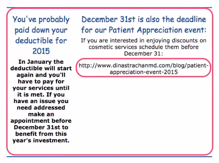
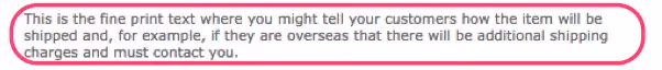
Lastly—another common mistake—there's pre-written instruction text from the email service provider at the close of the email that the business forgot to customize or remove. This email needs a footer that's effective and well-designed.

Screen Shot 2016-01-27 at 4.29.35 PM

Themistakes in this email are easyfor email design beginners to make, but fortunately they're also easy to correct. Let's fix it with BEE.

Fix it with BEE

1. Build the structural layout of your email first

Think of your email as comprised of sections. The basic structure of the Aglow email is: Header image. Header text. Body text. Closing text. Footer.

aglow structure

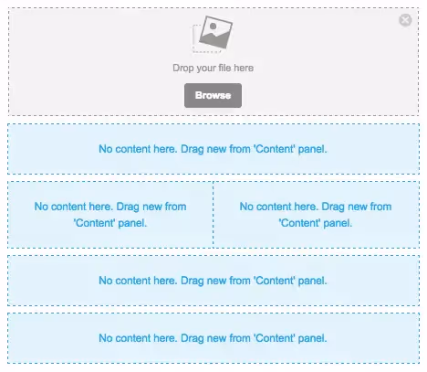
Let's mimic the structure in BEE by dragging in the structures we need from the Structure menu on the right. Our layout looks like this:

Screen Shot 2016-01-27 at 5.23.55 PM

We'll keep the two-column layout in the center of the email for now and check out how it looks with some design adjustments. If we don't like it, we can switch to a completely single column layout later.

2. Add placeholders for content

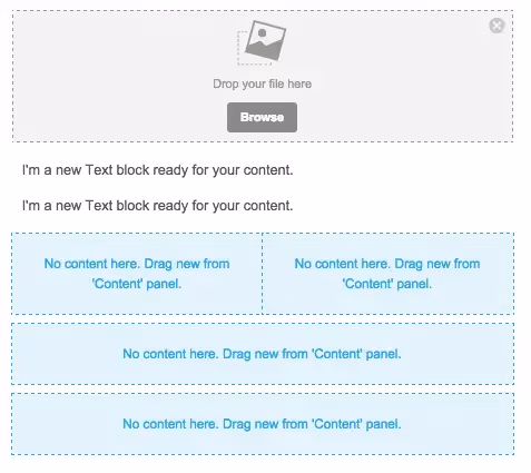
From the Content menu, we can populate the structure placeholders with content placeholders, further developing the layout of our email. The first section will just have an image placeholder for the logo.

Screen Shot 2016-01-27 at 5.29.17 PM

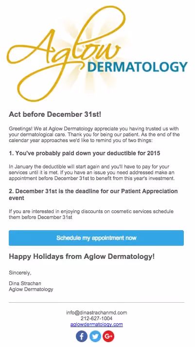
The second section will have atwo text placeholders: one for a header ("Act before December 31st!") and one for the first paragraph of text.

Screen Shot 2016-01-27 at 5.30.45 PM

The third section has two text boxes per section (header and body text, respectively). Let's also try adding CTA buttons in each section.

Screen Shot 2016-01-27 at 5.32.20 PM

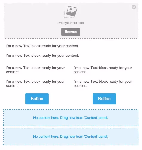
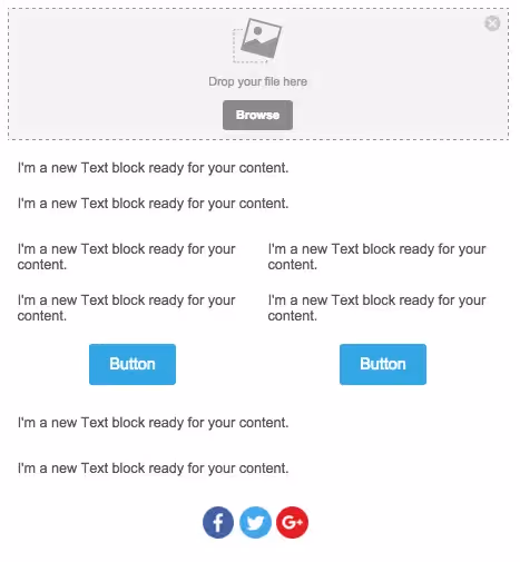
The final two sections will just need text. But let's also add social media icons for our footer! Here's our email, fully laid out, ready for content, customization, and fine-tuning:

Screen Shot 2016-01-27 at 5.33.43 PM

3. Populate the email with content

We'll copy-and-paste the content from Aglow's original email, and drag in that header image, then reassess how it looks. Here's how the email is shaping up, before formatting:

Screen Shot 2016-01-27 at 5.44.43 PM

4. Format the text to create clarity

We recommendArial, BEE's default and email-safe font, over the Comic Sans from the original Aglow email. We'll go in and adjust the font size and style so that headers and important text stand out. We'll also make some small copyedits, like removing the words "email" and "voice" from the contact info at the bottom—those words are not needed. Here's our email after some simple text formatting:

Screen Shot 2016-01-27 at 5.52.47 PM

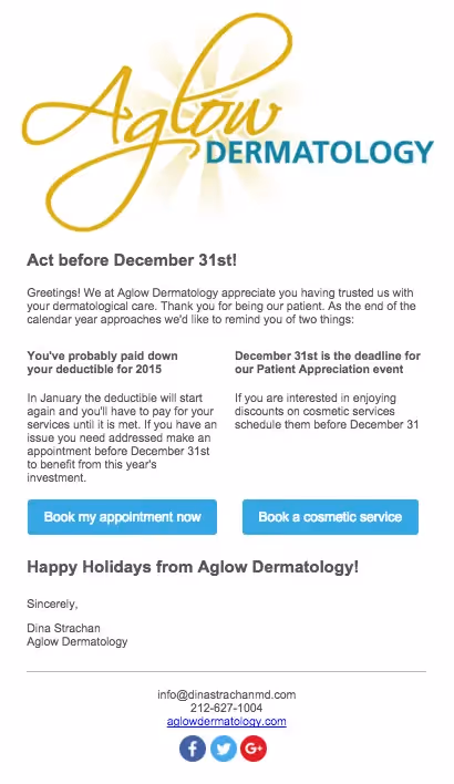
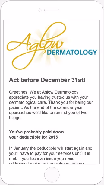
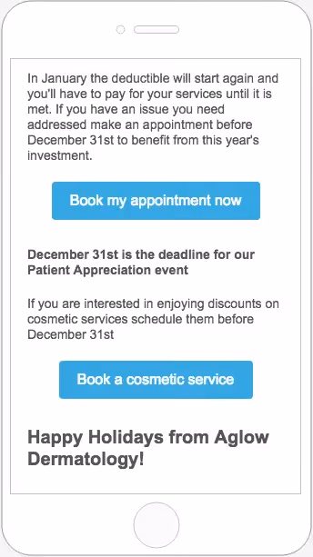
It looks pretty good! We also added a divider from the Content menu above the footer, and centered the footer content. By toggling over to the Preview menu in the upper left corner, we can take a peek at how the email will render on mobile, too:

Screen Shot 2016-01-27 at 5.55.41 PM
Screen Shot 2016-01-27 at 5.56.08 PM

5. Improved design approaches

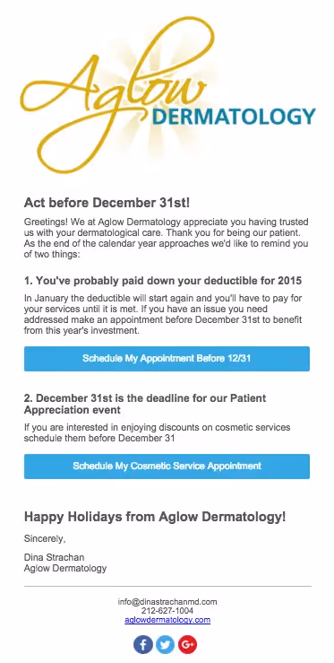
Those side-by-side CTA buttons seem to be competing with each other, and they both essentially communicate the same thing: book an appointment. Let's see how the email wouldlook with a single, full-width CTA button instead. Also note how we're using personal pronouns and an active voice, best practices for highly clickable CTA buttons.

Screen Shot 2016-01-27 at 6.01.19 PM

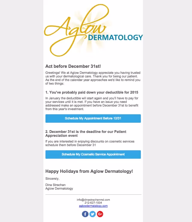
The focus of the entire email seems clearer now, doesn't it? Having a single call to action removes any confusion and better compels readers to act.Let's try removing the two-column part of the email to see how the message looks in a single column.

Screen Shot 2016-01-27 at 6.05.44 PM

The single column feels better, don't you think? We also bolded the headers and added numbering to improve readability. If Aglow needs to further segment and target different patient populations with their calls to action, they could also go back to two CTA buttons, in a layout like this:

Screen Shot 2016-01-27 at 6.10.12 PM

We feel good about parting ways with that snowflake background and going with an all-white email that feelseasy on the eye and business-like. But if a contrasting background color is preferred, we can choose a color in the Body menu. We'd recommend a lighter color, like gray...

Screen Shot 2016-01-27 at 6.13.39 PM

Or pale blue:

Screen Shot 2016-01-27 at 6.14.26 PM

Wrap Up

It was easy to improve this email with BEE! Withsome small adjustments, the email is much easier to read, and will hopefully get more conversions. Here are the best practices to keep in mind:

  • Take a simple approach to design: don't add busy background patterns or multiple font styles unless they serve a purpose.
  • Use CTA buttons to get readers' attention and call them to act. Links are easy to miss.
  • Beware of how your email looks in its template before you send it out (look out for an accidental double header).
  • Optimize for mobile with a single-column design, full-width CTA buttons that are easy to tap, and a responsive template (all BEE emails are automatically responsive!)
  • Go with a subtle background color to make the central body of your message stand out. Otherwise, an all-white background provides for a simple, clean look.

How Beefree is Helping Email Makers Scale Their Production

2024 was a banner year for email markers everywhere. From sleek newsletters to interactive promos, you flexed your creative muscle to new heights and did it with a level of speed and efficiency that made crafting award-worthy emails look easy. Let’s dive into the numbers, trends, and stories that made this year unforgettable for email makers like you. 
Beefree team
Jan 6, 2025

Design Award-Winning Emails with Beefree

A few weeks back, we kicked off the first-ever 2024 Really Good Email Awards (cue the confetti). Today, we’re taking it one step further and sharing how you can build award-winning emails in Beefree.
Emily Santos
Dec 26, 2024

Simplifying Email Creation for Universities with Beefree

In a recent conversation with Rice University’s Owl Business Analyst, Sonja Fulbright, we revealed all the challenges that led the university to lean on Beefree—not only to bring their decentralized teams together in one platform but also to increase the speed and quality of the university’s emails. 
Stephanie Benoit
Jan 2, 2025

How Beefree is Helping Email Makers Scale Their Production

2024 was a banner year for email markers everywhere. From sleek newsletters to interactive promos, you flexed your creative muscle to new heights and did it with a level of speed and efficiency that made crafting award-worthy emails look easy. Let’s dive into the numbers, trends, and stories that made this year unforgettable for email makers like you. 
Beefree team
Beefree team
6 Jan
2025

2024 was a banner year for email markers everywhere. From sleek newsletters to interactive promos, you flexed your creative muscle to new heights and did it with a level of speed and efficiency that made crafting award-worthy emails look easy. 

At Beefree, we’ve had a front-row seat to all the incredible ways you scaled your email production. With templates that sped up creation and workflows that brought your team closer, you’ve redefined what it means to create emails that inspire and deliver.

Let’s dive into the numbers, trends, and stories that made this year unforgettable for email makers like you. 

Total number of emails created: 1,648,180

That’s right—over 1.6 million emails were crafted using Beefree this year, each one a testament to your creativity and efficiency. Everyone from small startups to large enterprises, and teams across the globe harnessed the power of Beefree.

The templates that powered your success

Out of the 1.6 million emails created this year, 178,199 started with a little help from our template catalog.

Our most loved categories included:

  • Templates for Gmail & Mailchimp: Whether you were crafting a campaign or a one-off blast, these platform agnostic templates made it easy to integrate design and delivery effortlessly.
  • Password-reset emails: You proved that even the most utilitarian messages deserve to be noticed.
  • Notification email templates: From order confirmations to system alerts, these templates kept your communications clear, concise, and on-brand.

These favorites highlight a vital truth: even the simplest communications can leave a lasting impression. Templates have become your secret weapon, allowing you to hit the ground running, save time, and focus on the creative flair that makes your emails stand out.

(source)

Total time saved per week: 2 hours

Time is money, and in 2024, Beefree users saved big. On average, 59% of users shaved off at least 2 hours per week on email creation, giving them more time to focus on strategy, creativity, and all the other things that make their emails shine. But that’s just the tip of the iceberg.

An impressive 81% of users reported being able to design emails at least 3x faster since implementing Beefree. What used to take hours now takes mere minutes with pre-designed templates and built-in collaboration tools. 

(source)

More time saved = more time to design

By cutting down on the nitty-gritty of email production, like formatting, coding, and repetitive edits, Beefree gave you the freedom to focus on what truly matters: design. 

With more time on your hands, you experimented with bold new layouts, fine-tuned your visual storytelling, and perfected those interactive elements that kept your audience engaged.

(source)

84% of Beefree users saw an increase in design quality after implementing our tool and 84% have increased on-brand email creation by 50% or more. 

Think about it: The less time on production meant more time to think creatively and innovate.

New height reached 

With more time on your hands and even more accessible design solutions, 2024 became the year you pushed boundaries and achieved more than ever before. And as your email production scaled, so did your ambitions. 

This surge in productivity and creativity signaled that you were ready for the next step—a plan that could grow alongside you and offer even more tailored support for your evolving needs. Recognizing this, we launched our Business Plan in May, designed specifically to meet you where you’re at. 

This plan was crafted to offer the advanced features and scalability that busy teams need, like enhanced collaboration tools and more customization options. 

Is the Beefree HTML Email Builder Right for You? >

After upgrading to a paid plan, 41% of Beefree users saw an ROI in just under a month! 58% report that Beefree has been a KEY part of scaling their email programs. 

(source)

Beautiful design matters 

A well-crafted email design does more than look good; it communicates your brand’s personality, values, and message in a way that’s instantly recognizable and engaging. It draws the reader in, guides their eyes through the content seamlessly, and encourages action, whether it’s clicking through to a website, signing up for an event, or making a purchase.

In 2024, you embraced the power of beautiful design like never before, and you were rewarded for it. Beefree users increased their CTR by an average of 25%.

The marketing ROI on the one email alone was immeasurable. Open rates increased by over 20%, engagement rates by 31%, and best of all, the subscribers fell under a healthy .1%. All are driven by the creative firepower of Beefree. 

Aimee Meester
, Founder and CEO, Madison Taylor Marketing 
Read the case study

In a digital landscape where first impressions are everything, beautiful design isn’t just nice to have—it’s a necessity. And with Beefree, creating visually appealing emails has never been easier, empowering you to continue delivering designs that captivate and convert.

We can’t wait to see what you create next.

Design Award-Winning Emails with Beefree

A few weeks back, we kicked off the first-ever 2024 Really Good Email Awards (cue the confetti). Today, we’re taking it one step further and sharing how you can build award-winning emails in Beefree.
Emily Santos
Emily Santos
26 Dec
2024

A few weeks back, we kicked off the first-ever 2024 Really Good Email Awards (cue the confetti). The “award show” was paired with downloadable resources sharing the ins and outs of what made these emails winners. Today, we’re taking it one step further and sharing how you can build award-winning emails in Beefree.  

But first, what is an award-winning email? 

Winning emails like Miro’s welcome series and the AllTrails x Calm collab didn’t just meet expectations—they redefined them. Besides being the most loved by the RGE community, the winning emails beautifully balanced creativity, trends, and best practices. They gave us insight into the future of email design and how to break the rules intentionally. 

While each email was different in its own unique way, we noticed a consistent pattern in them all: On-brand, but never boring. Let’s take the emails by Sundays as a really good example of staying on brand. Everything from their Black Friday emails to their order confirmation emails follows the same brand guidelines, ensuring a cohesive experience at every touchpoint. 

Resource from our Award Ceremony

This realization was validating! As marketers, we know how important presenting a cohesive experience is for brand recognition, awareness, and loyalty. But as passionate designers, we're always looking at the next cool design trend. This pattern of "on-brand, yet never boring" pushes us to explore new and creative ways to showcase our branding and spread our message.

Designing on-brand, never-boring emails with Beefree

Beefree makes balancing creativity with your brand guidelines seamless. Its combination of brand management, productivity solutions, and a no-code drag-and-drop editor enables everyone to create beautiful designs that inspire people to action and drive results. 

uevi.co/4075ZNTX

Step 1: Set your brand guidelines

Your brand, your rules. Lock in colors, fonts, and logos so your emails look like you —even if Greg from accounting gets a little too creative with the copy. 

There are several ways to set your brand guidelines in Beefree, but our favorite is to use our “Get Brand Styles” feature, which can be accessed in your workspace’s style settings.


Once you’re in your settings, click on “Get brand styles” and input your website’s URL. From there, Beefree will retrieve your brand’s colors, fonts, and social links. You can learn more about this feature here

Once you import your brand’s essentials, you can continue to add brand elements. You can get as granular as you’d like. From a predefined width for emails and pages, to the appearance of your CTAs. 

With our Advanced Style Kit, you can even set predefined background colors, set the appearance of lists, and tables. 

Once you add your style settings, every email your team creates with Beefree will have the same brand colors, icons, links, fonts, and whatever else you decide to assign. Now, let’s say you want to take things one step further. 

Step 2: Create re-usable content blocks 

Beverage brand and winner of our Endless Cheer Award, “Athletic Brewing,” is a great example that following a template doesn’t have to be restrictive. 

All of their holiday templates follow a similar layout: A hero section with a standout image, a large title, body text, and a CTA followed by a similar content block below. 

Resource from our Award Ceremony


Beefree’s Saved and Synced Rows are an easy way to build out templated layouts for your emails. Most users turn frequently used content blocks, such as headers or footers, into Saved Rows so they can easily use them in other designs. You can also save rows as “Synced” when you want to apply any changes made to a row to all of your other email templates. 

You can find all of your Saved and Synced Rows in the builder's Rows tab by selecting “My Saved Rows.”

Templates and re-usable content blocks aren’t just made to help you speed up creation time; they’re about allowing you and your team more time to be creative. The less time you spend worrying about what layout to create, the more time you can spend coming up with clever messaging or taking high-quality product shots. 

uevi.co/1491YKUH

Let’s get to the fun stuff.

Step 3: Bring your visions to life 

In our downloadable resource, we shared the characteristics of each email that made it stand out. We highlighted key elements such as persuasive copy, value-driven content, actionable CTA’s, interesting layouts, and so much more. 

We could spend hours sharing tips and tricks to emulate the award-winning characteristics of an email, but for now, we’ll share some of Beefree’s features that can help take your emails from “meh” to “Why didn’t I think of that?” 

Display conditions

Why settle for one-size-fits-all when you can design emails that feel like a direct DM to each recipient? Beefree’s Display Conditions feature allows you to pick a condition (or write one from scratch if you are technically savvy), apply it to a row, and thus show different content based on the recipient. 

We can see a great example of how Display Conditions could be used in Rael’s award-winning email below: 

Really Good Email Awards Deck

The “Hook, Line, and Sinker” Awards goes to Rael for its charming abandoned cart email that feels like a warm reminder rather than a hard sell.  Instead of just pushing one product, the thoughtfully curated product suggestions make it easy to explore complementary items. 

uevi.co/7663GXCO

Interactivity

Throughout all winning emails, we saw brands bring their message to life with movement. Whether they used videos, gifs, icons, or crafted visually interesting layouts – making their emails interactive was crucial in getting our attention. 

Resource from our Award Ceremony

With Beefree, you can turn your designs into playgrounds. Easily add videos, GIFs, countdown timers, surveys, hover effects, and more. To see what’s possible, we recommend browsing through our template catalog! 

Mobile design mode 

Part of crafting a truly on-brand experience is ensuring that your brand looks good anywhere. Beefree takes responsiveness and dynamic design to the next level by allowing you to create custom mobile experiences. With Mode Design Mode you can re-arrange, re-size, and remove elements for smaller screens. 

uevi.co/2498UJQM 

Step 4: Let AI take care of the little things 

Creating award-winning emails takes vision, creativity, and time. But let’s be honest—sometimes, the little tasks, like tweaking ALT text or sourcing the perfect image, can slow you down.

With Beefree’s AI-powered solutions, you can let your eager intern handle the busy work while you focus on making your emails unforgettable.

AI Image Generator

Struggling to find the perfect image? Beefree’s AI Image Generator lets you create custom visuals that enhance your email’s message. Just add an image block to your email and in the Content Properties panel on the right, click “Create with AI,” then fill out the details. For additional prompt suggestions visit this support page

Alt Text Generator

For us, alt text isn’t just a best practice—it’s essential for creating accessible emails. But crafting the perfect descriptions for every image can feel like a chore.

 Beefree’s AI ALT Text Generator takes care of it for you, automatically generating accurate and descriptive ALT text for your images, gifs, icons, and stickers. 

AI Copy Assistant 

When Greg from accounting gets a bit of writer’s block or when you need a little help writing a catchy CTA, AI is here to help generate bold and fresh ideas. 

Ready to start designing? 

A really good email involves a balance of best practices and bold moves. The winning emails didn’t just make an impact; they set the standard for what’s possible in email marketing. Now, it’s your turn to take the lessons, insights, and inspiration from these campaigns and channel them into your next great idea. Start designing with Beefree for free!

If you’re looking for even more inspiration or tactical takeaways, don’t forget to download the deck or watch the Award ceremony replay! 

Stay informed on all email trends

From the latest creative design strategies that inspire your next campaign to industry best practices and tech advancements, our newsletter is the go-to for all things creation.

By clicking Subscribe you're agreeing with our Privacy Policy