
Do you want to design a simple, beautiful, mobile responsive email with a ton of photos? We got you. Today's post is a step-by-step guide to building a stunning image grid email. You can use this dynamic layout to introduce a new product, offer a promotion, run a sale, or tell almost any kind of visual story. Using an email from fashion brand & Other Stories, we'll walk you through how to organize and optimize a photo grid in an email, including how to:
- Make creative image grid configurations
- Set an auto width for select images
- Hide specific images in the mobile version
- Stack images in the mobile version (or leave them in a grid formation)
Inspiration: & Other Stories
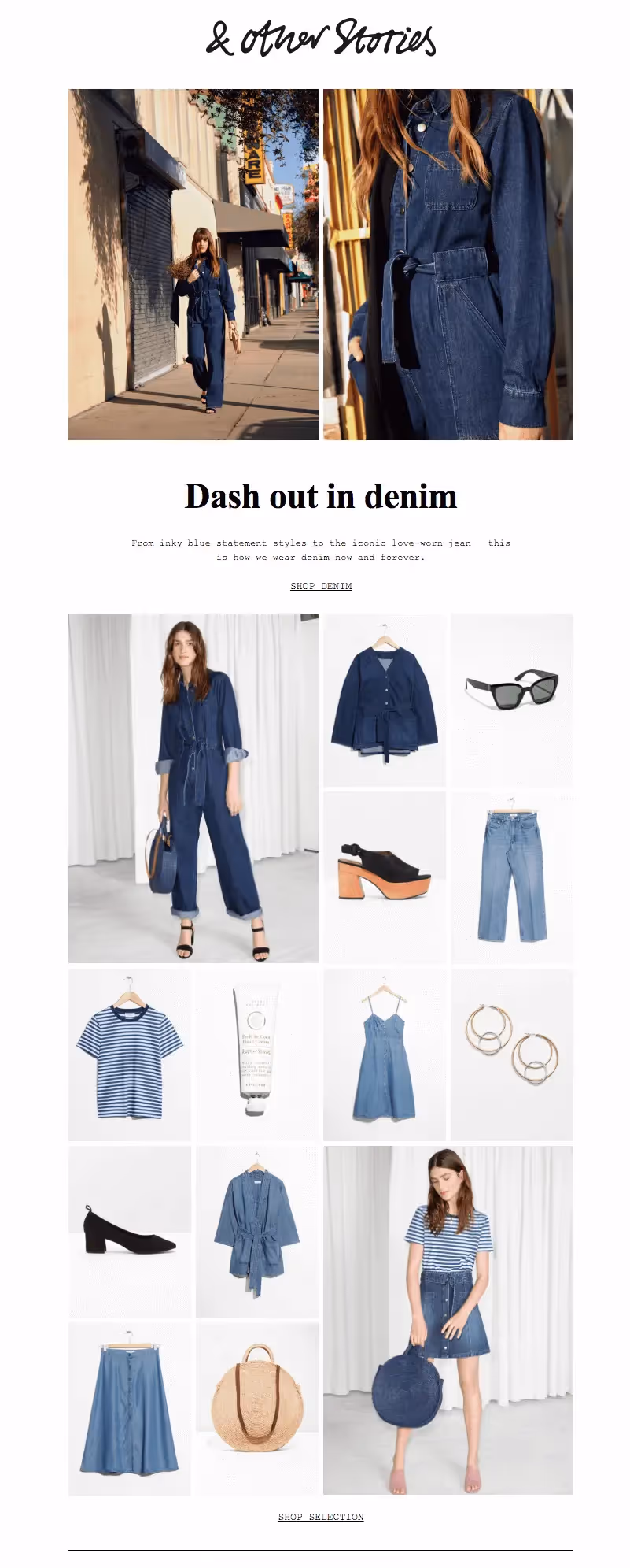
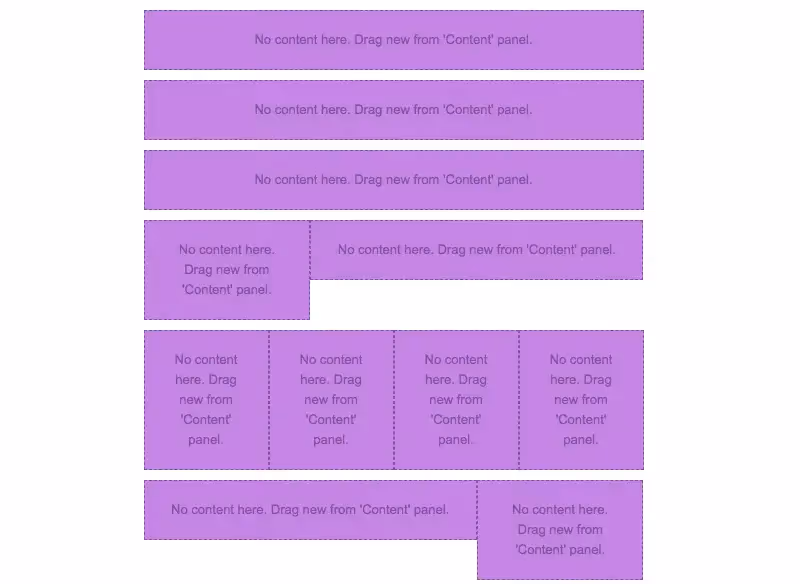
E-commerce brand & Other Stories consistently sends thoughtfully designed emails. Even though they're full of product photos, the emails remain simple, fresh, and free of clutter. Plus, the brand does a great job of using well-formatted live text and making sure its photo grids look great on mobile, too. Check out what we're talking about—here are a few recent emails from & Other Stories:
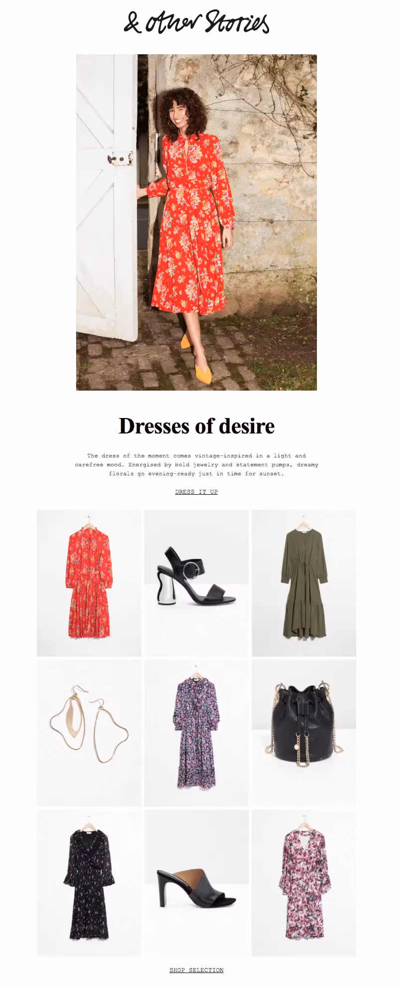
Each email is a little different, but most include a photo grid with different-sized images. This one has two hero images, followed by a grid:
We love the use of different-sized images that all fit together perfectly. Knowing how to make smart image configurations can really level-up the design of your emails. Let's get started on how to do it in today's tutorial.
The Inspiration for Our Photo Grid
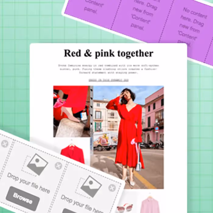
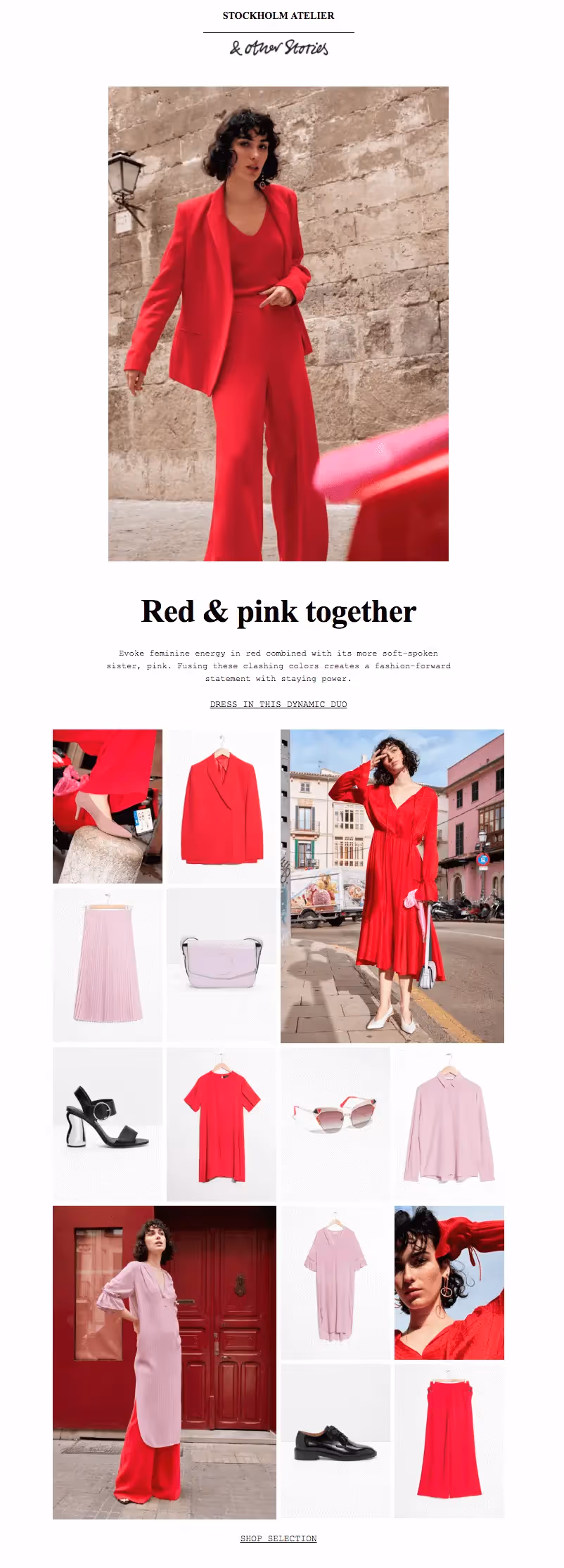
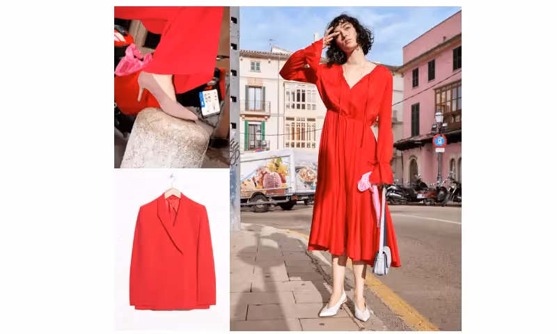
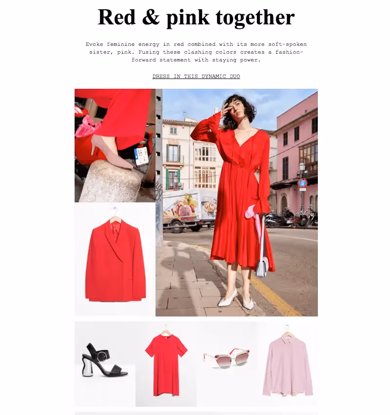
For today's tutorial, we'll show you how to create an email like this one:Subject: Spring's color pairing
Pretty, right? And it's not difficult to create. Let's go!
Step 1: Build the structure
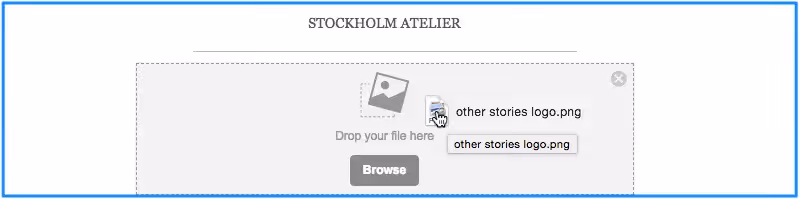
Open up the BEE editor on our website https://beefree.io/ or from your BEE Pro account and start designing in abasic one-column template.We can think of the email as having six structures or modules.
From our Structure menu on the right, we’ll create an email layout that mimics our example by dragging in modules. The first half is a single column, while the second half has a series of multi-column structures.
Using a series of asymmetric multi-column structures like this sets us up to design a dynamic photo grid. When a layout alternates from row to row, it's easy to create a photo grid with images of different sizes. Keep reading to see how.
Step 2: Arrange content blocks
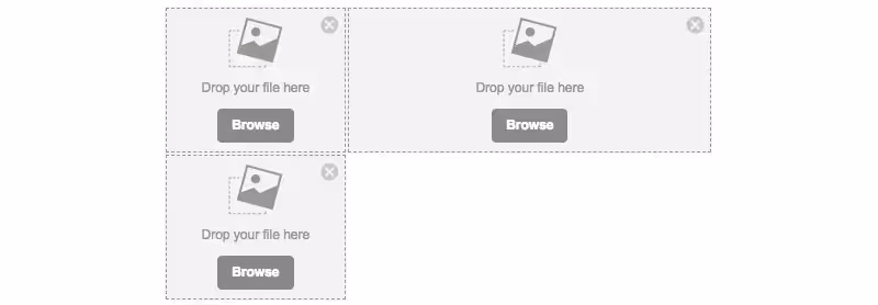
Going row by row, we'll drag in content blocks that correspond to the content contained in each structure. For instance, the first structure (or row) will need a text block to read "STOCKHOLM ATELIER," a divider line, and then an image block for the & Other Stories logo. We'll pull in each of these content blocks into Structure 1.
The following structure will only need an image content block to contain the hero image, and the one after that will require text only.To build the first image grid structure, in row 4, we'll drag in image content placeholders, so the row looks like this:
Then, we drop in the images.
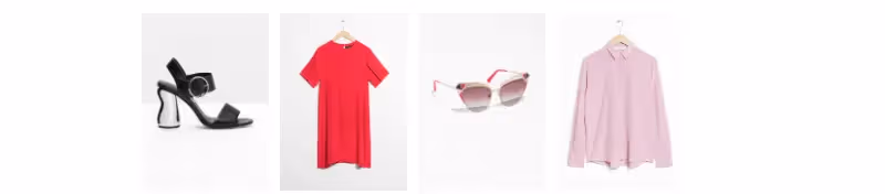
Because of the structure, or layout, chosen for this row, the photo on the right has space to be as large as the two images stacked on the left.Beneath it, the following four-column structure will contain four evenly sized images.(1) Here's the bare structure:
(2) Here's the structure with image content blocks:

(3) Here's the final structure after we drag in images:
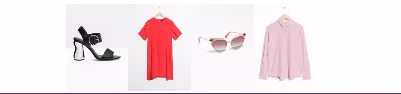
Simply go through each row, adding the images and content blocks as desired to complete your email! Here is how ours is coming together:
3. Format images: tips and tricks
Now that you have the hang of how to arrange images, here are some tips on making them look the way you want.
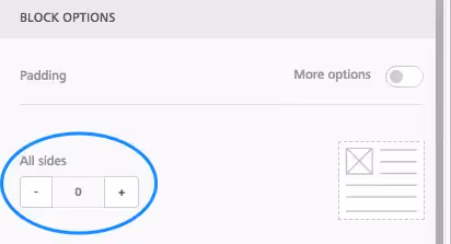
Fine-tune padding
Remember that you can line up each image next to another one—without space between—by setting an image padding to zero. Simply click an image, then use the Content Properties menu on the right to make adjustments.
Conversely, if you want to create space between images, bump up the padding a bit. Here's our four-column row with a little padding—5 px—added between images:
Set an auto width for select images
When you drag and drop an image into your email, it will automatically fill the width of the container. But you can also use the Content Properties menu to adjust an image's width. For instance, in our current email, when we drop in the & Other Stories header image, it's automatically the width of the email.
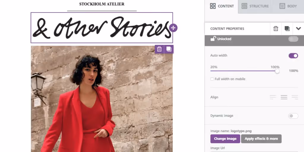
To decrease the width of the image, unselect auto width on the right...
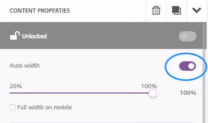
...then drag the percentage bar down, closer to 20%, to shrink the appearance of the logo.
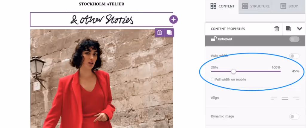
Note: You can also check the "Full width on mobile" box to make sure the logo is easy to see on a smaller screen.
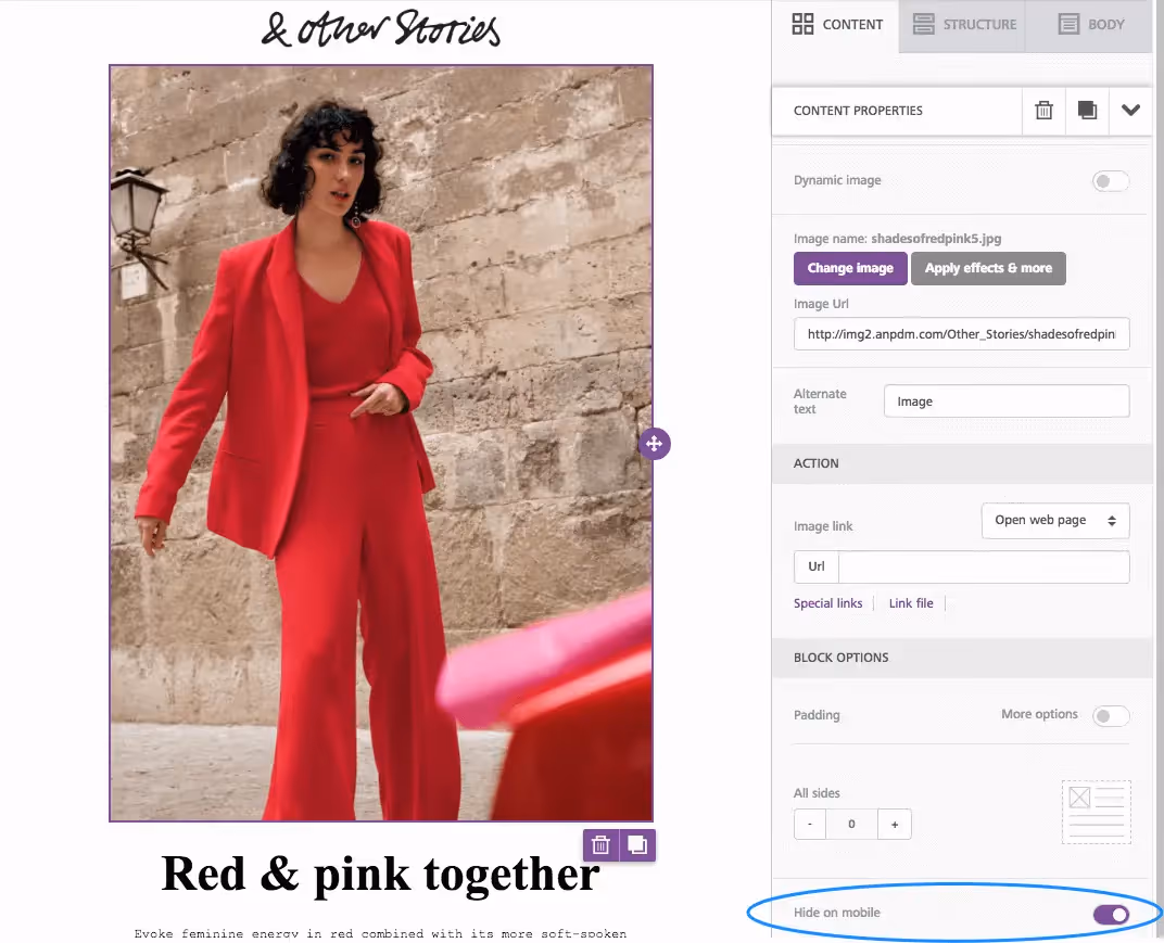
Hide specific images in the mobile version
If you have an image-heavy email, consider hiding some of those images on mobile. Doing this can help make the email quicker to download on mobile devices and improve readability—with fewer images, a reader won't have to scroll and scroll. You might also have a large hero image, as in this email from & Other Stories, that shouldn't take up so much screen space on smaller devices. For these reasons, BEE now has a Hide on mobile feature that can be selected for an image.The Hide on mobile option is located at the bottom of the Content Properties menu for any image you select. If you select the hero image, for instance, then you can scroll down and choose to hide it.
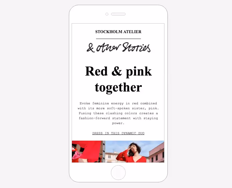
The email preview allows you to see how theemail looks with the hidden hero image:
Stack images on the mobile version (or leave them in a grid formation)
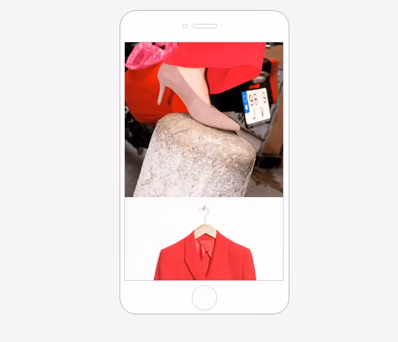
All emails designed in the BEE editor are mobile responsive. This means, when you have an image grid like the one in an email, the mobile version will automatically "stack" images on top of each other for easy viewing on small screens. So our image grid usually looks like this on mobile, with each image shown "full screen" one at a time:
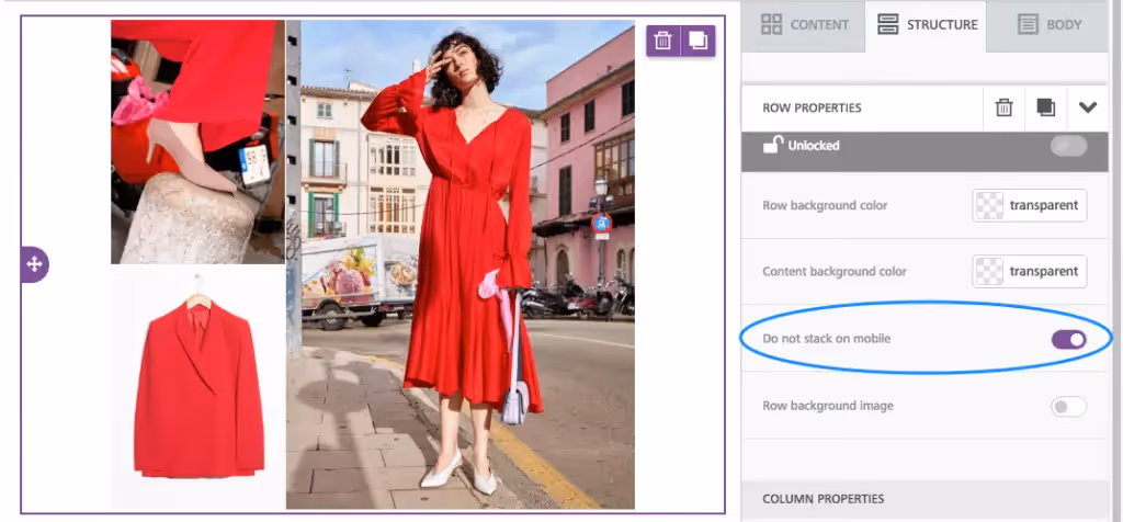
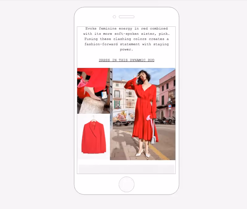
However, now you have the option to ask BEE not to stack images, if you prefer the grid to remain intact even on mobile screens.Simply select your image grid structure, then use the Content Properties menu to turn on theDo not stack on mobile feature.
Now, our mobile preview looks like this:
Plus! All these features are meant to give you more control over exactly how your email looks. We hope you enjoy the design flexibility while building (and mastering) stunning image grid emails in the BEE editor!

