
Email newsletter examples to kickstart your email marketing (+ free templates)
Not sure how to start your email marketing program? Here are 12 email newsletter examples with templates to get you going!
Email newsletters are a valuable link between your brand and your audience. In one cohesive and on-brand email, you can share everything from announcements to educational resources, building stronger connections with your subscribers.
The artistry behind crafting a newsletter that not only informs but captivates is a journey of balancing aesthetic appeal with valuable content. In a newsletter, each word and image is a step towards enriching subscriber engagement.
As connoisseurs of well-crafted email newsletters, we’ve compiled 15 examples, each highlighting the impact of successful communication in its own unique way.
What is an email newsletter?
An email newsletter is a recurring email, often sent once a week or once a month. Think of it as a way to catch up with your customers about the latest updates for your brand.
Email newsletters often have a fairly consistent format from one issue to the next and contain several content blocks with different types of content. For example, if your business is a gym, your email newsletter could include:
- Updates about new equipment or upgrades
- The latest special offer on memberships or merchandise
- A workout tip of the week
- Announcements welcoming new staff members
- A member spotlight highlighting one of your members’ fitness journeys
- Upcoming events
The contents of your newsletter will vary depending on your brand and industry, but they should all be curated with the intent to build lasting connections with your readers.
How to layout your email newsletters and elements to add
Understanding the mechanics of a strong email newsletter is recognizing and appreciating the subtle nuances that elevate a newsletter from good to exceptional. However, they’re are a few best practices to follow to ensure that your email newsletters are effective and meet the long-term goal of strong brand recognition:
- Your logo at the top
- A strong hero section that immediately catches the reader’s attention placed above the fold.
- The action that you want readers to take the most on top, followed by lesser priority content
- A footer with links on how users can continue to interact with your brand, alongside legal and platform requirements such as an unsubscribe link
- Visual hierarchy to ensure that readers can easily find what they’re looking for
- Effective use of white space and dividers to clearly separate different types of resources.
- Clear CTAs relevant to each content throughout the newsletters
Overall, avoid getting overly promotional. An email newsletter should focus more on keeping your customers in the loop and strengthening their relationship with your brand rather than selling them something.
Below, you'll find a collection of strong email newsletter examples from well-known brands. Each example is paired with what works well and a template to help you kick off your next newsletter.
Email newsletter examples to inspire you
Example #1: Novo
Novo is an online bank for businesses, so its newsletter centers on finances for business owners.
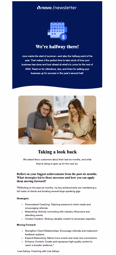
What works well:
- Relevant content: Novo understands that at this time of year, businesses are reflecting on the first half of the year and making plans for a stronger Q3 & Q4. The newsletter features practical tips and strategies for optimizing the rest of the year, giving readers actionable and relevant advice.
- Scannability: Novo’s Q&A format allows readers to find exactly what they’re looking for without having to read through content that is irrelevant to them.
Example #2: REI
REI is best known as a superstore for all things outdoors. This REI newsletter focuses on their upcoming events and classes:

What works well:
- Content hierarchy: The primary action they want readers to take is displayed above the fold.
- CTAs: CTA’s are placed after every content block giving the reader clear instructions on “what’s next.”
- Variety: Each resource linked in this newsletter offers something different to the users. A newsletter, unlike other forms of email marketing, contains less personalization, so offering a variety helps ensure that you can appeal to the majority.
Example #3: Squarespace
Squarespace is a web design platform. Its newsletter, topically titled “Release Notes,” keeps customers up to date on the latest happenings with the platform and its community.

What works well:
- Variety: Squarespace appeals to different readers’ levels of engagement and needs by offering community resources, events, product updates, and more.
- Simplicity: This newsletter's use of simple design and white space makes it easy for readers to engage and allows for a large amount of content to be easily digested. By breaking up the different resources by “category” and highlighting key elements of each, readers can quickly get what they need to know.
Example #4: Serumize
The newsletter below comes from "Serumize," a brand dedicated to skincare. This specific edition from their "Skintuation" blog emphasizes the importance of correct skin cleansing to achieve clear, healthy skin.
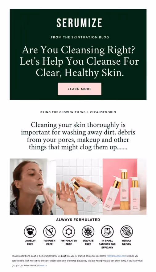
What works well:
- Clear intent: The headline "Are You Cleansing Right?" above the fold communicates at first glance what the user will get from this newsletter.
- Personalization: As mentioned earlier, personalization in newsletters is often kept to a minimum considering they are typically sent to the masses. The headline "Are You Cleansing Right?" feels like a direct call out to the reader making it feel more personal than it is. Additionally, the personal touch in their thank you note at the end adds a feeling of community and appreciation, making the reader feel valued and connected to the brand.
- Visual imagery: Serumize uses high-quality images and icons to showcase the key elements of its products. This not only informs the consumer about the product's attributes but also builds trust by showcasing their dedication to safe and ethical formulations.
- Standout CTA: The "LEARN MORE" button is prominently placed and effectively serves as a call to action. Its distinct color and positioning ensure it catches the reader's attention, leading them towards more detailed information or potentially to a purchase.
Example #5: Brené Brown
Brené Brown is a researcher and author who has become a revered emotional health and relationship guru. Her email newsletter, “From Brené,” serves as a way for her to keep in touch with her fans and followers.

What works well:
- On brand: “From Brené” feels like an extension of Brené Brown’s website, encouraging immediate brand recognition.
- Imagery: In this newsletter, imagery is used to break up each content block. Each image further promotes engagement as it relates to the content in the block.
- Standout CTAs: Each content block concludes with a CTA button that encourages readers to take action. The CTA button stands out due to the high color contrast between it and the background color.
Example #6: The Hustle
This newsletter is from “The Hustle,” a daily business and technology news platform that pulls together top stories to note. This particular issue features stories about restaurant dining, a new urban lumber industry, and a unique type of technology that went defunct before resurfacing as today’s QR codes.

What works well:
- Clear purpose: The newsletter starts with an enticing preview of what’s to come above the fold. With a few bullets, it gives just enough information about its top stories to make readers curious enough to scroll down for more.
- Variety: One of the strengths of this newsletter is the diversity in content. Beyond the main story, there are "Snippets," which cover various topics from finance to sports and media, catering to a broad audience spectrum. This strategy ensures that even if a reader isn't particularly interested in the main topic, other sections might catch their attention, increasing overall engagement.
Example #7: Your City
From interactive scavenger hunts to melodious live music sessions and delightful tasting events, the city is bustling with activities for locals and tourists to indulge in and enjoy.
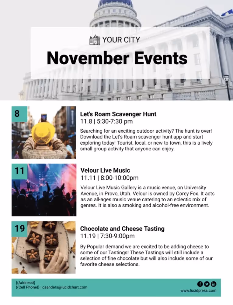
What works well:
- Structured layout: The newsletter employs a clear and straightforward layout, making it easy to skim and read. Events are boldly highlighted, ensuring readers can swiftly pick out which one they’d like to attend.
- Informative descriptions: Each event's description is comprehensive enough to give readers a clear idea of the activity without overwhelming them.
- Short and to the point: This newsletter provides users with what they’re looking for, nothing more or less. This short and to-the-point approach ensures that every time a reader opens the newsletter, they know exactly what they’re going to get.
Example #8: Salesforce
Salesforce is a leader in sales technology. Their IT Highlights newsletter is a way for them to further their brand as technology experts.

What works well:
- White space: With abundant white space around each content block, Salesforce makes each resource easy to skim and see which stories interest them.
- Content layout variety: This Salesforce newsletter formats its content using different layouts to differentiate each resource. The layout for events is similar to that of a calendar invite, and for resources, it uses a typical image, title, description, and CTA layout.
Example #9: Longreads
Longreads is a daily newsletter for readers who love great stories. Every day, they send out their favorite articles and stories from around the web.

What works well:
- Simplicity: Longreads keeps its design simple and straightforward while emphasizing the headlines to engage the reader. It appeals to humor, curiosity, and current hot topics to grab readers’ attention and make them want to read the full stories.
- Intentional design: Longreads emails feel almost like newspapers, further promoting the brand's purpose of serving “daily recommendations.” With every newsletter, readers develop more and more familiarity with the brand, almost like instinctually picking up the newspaper with their morning coffee.
Example #10: Sweetgreen
The displayed newsletter is from Sweetgreen, a brand known for its dedication to fresh, wholesome food offerings. Catering to the health-conscious and those who appreciate vibrant flavors, their summer newsletter emphasizes their summer-themed salads, reminding customers that summer is far from over.
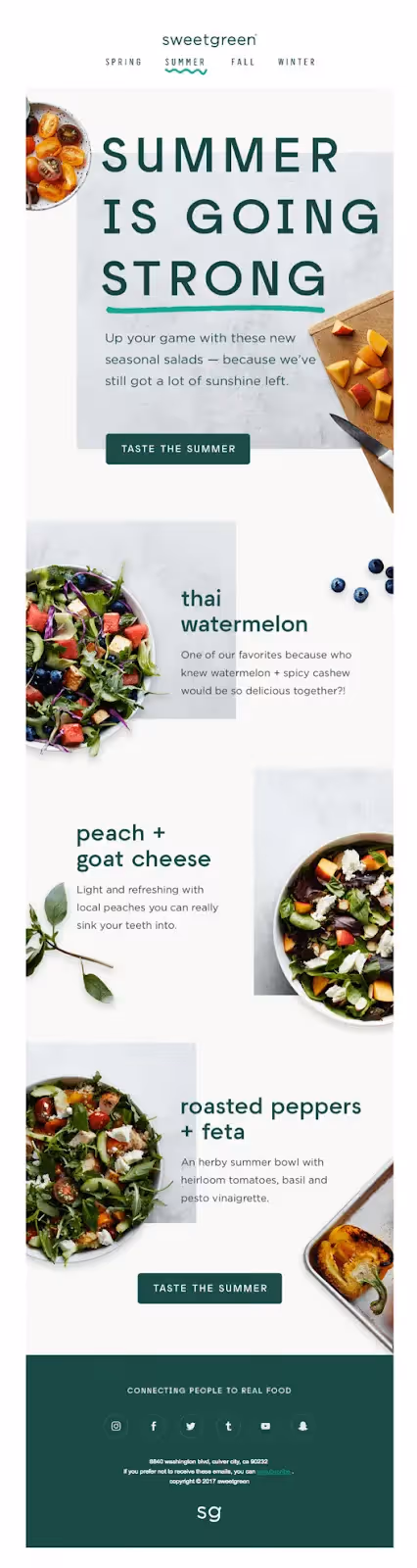
What works well:
- Seasonal relevance: The “Summer is going strong” headline ties in Sweetgreen with the season making the newsletter relevant to their reader’s summer cravings.
- Product visuals: This newsletter's use of fresh, bright imagery emphasizes the freshness of the ingredients and evokes a sense of the summer season, further tying into its purpose.
- Visual Hierarchy: Each image is accompanied by the name of the product in bold and large letters reinforcing recognition of the brand and product names.
- Engaging CTA: The repeated call to action – "Taste the summer" – is a compelling nudge, inviting readers to experience these flavor combinations for themselves.
- Value proposition: Closing off with "connecting people to real food" not only reinforces Sweetgreen's brand mission but also subtly communicates their dedication to quality and authenticity.
Example #11: Alltrails
Alltrails is an application for outdoor enthusiasts who love hiking and other on-trail adventures. Their summer update newsletter introduces an exciting new concept for their app “Collections.”

What works well:
- Valuable resources: While this can work as a product update or product promotion newsletter, the content serves as more of an educational resource than a sales pitch. Through videos and graphics, the newsletter shows how users can get the most out of the application.
- Simplicity: In this newsletter, Alltrails keeps the text to a minimum. They take the “show, don’t tell” approach by focusing more on the visuals that showcase top features.
- Clear action: The newsletter has one clear goal in mind, and that is to educate. The prominent CTAs inviting readers to “Watch video” guide them toward a more interactive and engaging way to learn more.
Example #12: Julie Blanner
The newsletter in focus is from Julie Blanner, a lifestyle influencer known for her approach to easy recipes, effortless entertaining, and minimalist style. Through this newsletter, she introduces her readers to her favorite coffee table books and extends an invitation to her free masterclass on starting and growing a blog.
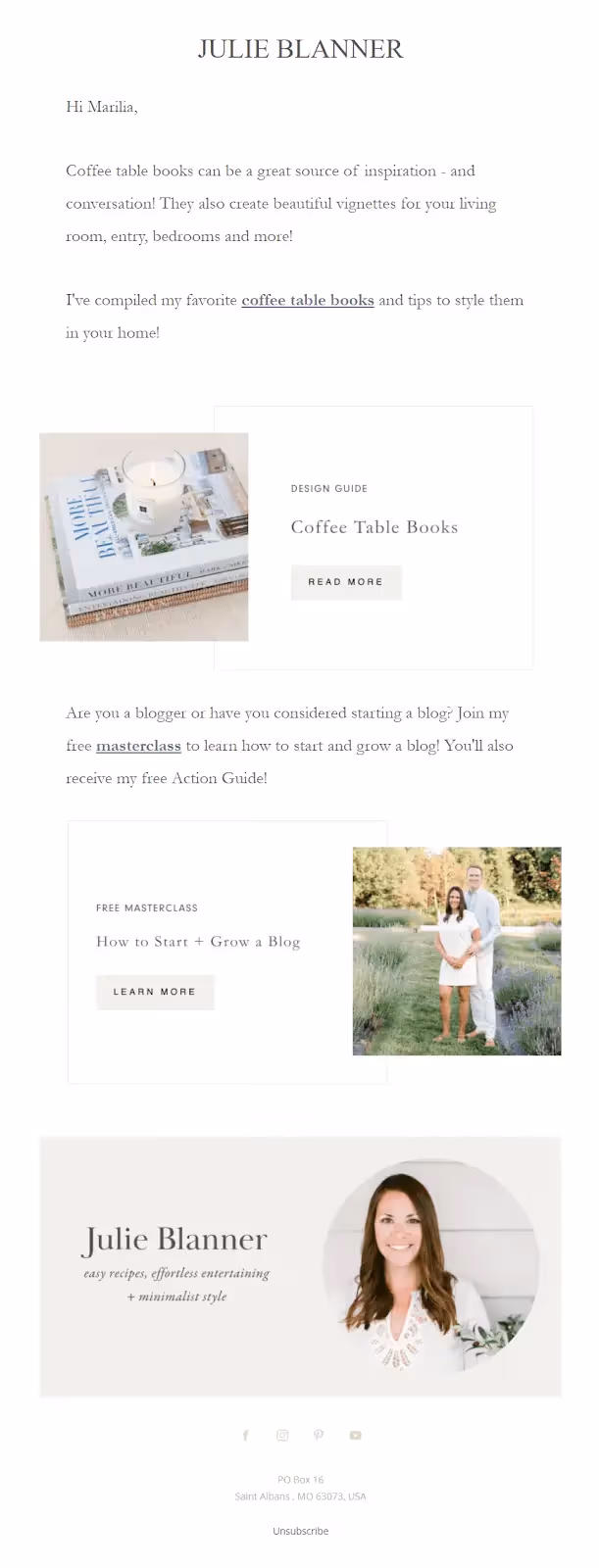
What works well:
- Personal touch: Addressing the recipient by name ("Hi Marilia") creates an instant connection, making the reader feel individually acknowledged. Including her profile at the bottom, complete with social media links also ensures that readers have multiple avenues to connect with her and explore her content further.
- On-brand: The soft, muted color palette and the curated images reflect her brand's essence and the promise of "minimalist style."
- Engagement: Julie's invitation to her free masterclass on blogging is a strategic move to further engage with her readership.
