Mobile friendly email design best practices
Increase your subscriber's mobile experience and increase engagement with our mobile-friendly design best practices.
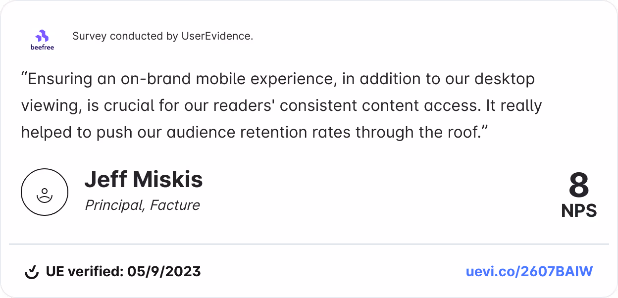
To understand the importance of designing mobile responsive emails, it's important to understand how web and email design has evolved over time.
Previously, desktop computers were the most commonly used device to view websites and emails, however; things have changed a bit today. A Bluecore report shows that "59% of Millennials and 67% of Generation Z use their smartphones as their primary email source."
Mobile phones are ubiquitous and part of our lives. We use mobile phones for most of our everyday tasks. From waking up to listening to our favorite podcasts, managing our project, chatting on Slack with our colleagues, and, yes, checking emails.
The shift in how users view content forces marketers and designers to approach email creation with a slightly different mindset – prioritizing responsiveness over everything.
Mobile-first design vs. responsive email design
Both mobile-first and responsive email design aim to improve the user experience on mobile devices, but they approach this goal differently. Mobile-first email design is designing considering the smallest device first. This approach ensures that your email experience is optimized for mobile, without necessarily adapting the same experience it to various screen sizes.
Responsive email design involves creating emails that adapt dynamically to various screen sizes and email clients to ensure a smooth experience regardless of where they're being viewed.
For us, a blend of the two is the sweet spot. In fact, MailChimp states that "launching a mobile responsive email design can increase unique mobile clicks by 15%." The following best practices although optimized for mobile, will help ensure a smooth experience for users, enhancing usability and readability across all devices.
6 Best practices for mobile friendly emails
1. Optimize your email subject lines for mobile
The best email subject lines are the ones that intrigue you, offer you a deal, or require you to take action. While desktop allows up to 60 characters to reel your reader in, mobile-only has the capacity for 30-35 characters.
The stats on subject lines:
- "Subject lines influence 33% of email recipients to open the email." (OptinMonster)
- "Subject lines can cause 69% of people to mark the email as spam." (OptinMonster)
- "Using an emoji in a subject line can increase open rates by 56%." (Experian)
- "Subject lines that use personalization increase open rates by 50%." (Marketing Dive)
- "Including a sense of urgency can increase open rates by 22%." (OptinMonster)
When you have so much riding on such a small amount of real estate, you may feel pressured to deliver brilliance each time. An effective subject line is one of the most important and it might seem like a difficult and daunting task. Lucky for you, we're here to help.
- Personalize it
- Avoid salesy-phrases like "apply now," "cash bonus," and "earn money"
- Add some emojis for an extra dose of personality
- Make it timely and specific
- Add a sense of urgency
- Keep it relevant to your copy

2. Mobile email design
In a mobile-first email design world, design starts with the mobile user's needs and then the desktop user's needs. Approaching design with this mindset will ensure you're delivering the best experiences to most of your audience who choose to use mobile for email.A good mobile-first email design will include:
- A single-column layout
- Simple copy
- Standard fonts
- Limited, on-brand color
Single-column layouts
A single-column layout is by far the most accessible format to navigate from a smartphone. The single-column email makes it easier to focus on the messaging, presenting information in a precise order using a hierarchy. The content will scale and fit nicely regardless of the device used to view it.
Copy
Keep copy simple. It can be challenging for someone to read a large amount of text on a small screen, like that of a mobile device. Keep the experience enjoyable by landing your message quickly before users scroll past it. Here are some tips for how to write short, goal-oriented sales copy:
- Have one goal in mind, and try not to do too much more than that with one email message.
- Keep a consistent brand voice throughout the email.
- Use subject line and preheader text to add to the email's content.
- Use active words that engage.
- Get specific – don't use too many fluff words that take up space.
- Have someone else read it to make sure your message is clear.
Font size
Have you ever tried to read a tiny font on a smartphone? Be sure to choose readable fonts – at least 22-point headlines and 14-point body text. We recommend choosing a standard font and using no more than two fonts within an email. This will keep your email legible and looking professional and on-brand.
Colors
We love color and think it can add a lot of fun to design. However, mobile email is not necessarily the right place for a crazy amount of color. Too much design in an email can be distracting from the message, so try to choose one primary color and one or two secondary colors for each email. It would be best if you also considered accessibility concerns when choosing the color for the email. For many mobile users, dark mode is a default setting. Not only does it enhance accessibility and reduces eye strain on those with light sensitivity, but also:
- Preserves batter life on devices by reducing screen brightness and using less energy.
- Offers a slick and cook dark interface that many prefer.

3. Optimize images for mobile use
Images are a great way to create visual interest and engage your audience in the content of your email. However, images could also hurt your email's performance if not done correctly.Some common mistakes made when it comes to images include:
- Images too large to load
- Images not formatted for accessibility
- Poor image quality
- The image is not responsive
- The image is in the wrong format
To give your readers the best user experience, it's best to use responsive email images in your email design. Using responsive images is one way to keep your design mobile-first and provide a positive experience for mobile users.
High-quality images
It is best to export high-quality mobile and web images with a resolution of 72 DPI (dots per inch). While this might sound small, this is not one of those instances where more is better.
A 72 DPI guarantees a high-quality image on web and mobile and prevents blurriness. It's also important to consider the image's color values. CMYK (cyan, magenta, yellow and black) color values are meant for print and won't display well on a digital screen. Instead, we recommend images in RGB (red, green, blue) because they work well for high-quality digital images.
Image size
File sizes impact the total time it will take for email content to render once it's opened fully. In addition, on a mobile device, internet connections could contribute to long load times. Avoid these concerns by optimizing your image sizes for mobile-first email design.
For the highest quality image, we recommend adjusting your content area width to around 600px. Images will adapt according to the device used to open the email, so this is the safest route to ensure a high-quality display.
Be sure to compress your images for faster loading times.
4. Tips for mobile optimized CTA design
A call-to-action (CTA) can be a link or a button. When designing your mobile responsive email, it is best to use large, colorful buttons for the CTAs as buttons are 25% more likely to be clicked than a link alone. On the other hand, a link can be challenging to find and click on a smartphone.
The suggested size for a CTA button is a minimum of 44px x 44px.
CTA placement is still extremely important on mobile. Don't bury your CTA at the bottom of the email – there's a high probability they won't even get there to see it. Keep it "above the fold." This may mean including a button in your header image or immediately below it. If your email is on the longer side, include a few throughout the email to give folks ample opportunity to take action.
Lastly, ensure accessibility of your CTAs by using HTML code to define your button instead of inserting an image. Within the code, you can include alt tags to identify the CTA text for a screen reader.
5. Use of space
It can be challenging to interact with elements on a mobile device if they are too close together. Ensure a good balance of text, graphics, and white space. Utilizing white space allows a reader to focus more intentionally on the action that you want them to take.
6. Minimize the scroll
According to Campaign Monitor, the average person receives 100-120 emails daily, not including spam. That's a lot of emails!
If you take time to read and scroll through every email, that will consume a large portion of your day. That is why many people scan their emails for essential details and only typically give an email 10-15 seconds of their time.
For this reason alone, it is important that your email's key message is immediately seen with only a short glance. Don't beat around the bush, or you'll miss out on a potential conversion opportunity.
Most readers do not follow a typical left-to-right reading pattern when scanning emails. Instead, their eyes will fly over the copy and images, typically in an "F" pattern. If you have subscribers, they may only be looking at headlines and CTAs. Here are some content tips by Campaign Monitor to keep your email skimmable:
- Subject lines: For mobile audiences, the best subject lines will be 28 to 39 characters.
- Pre-headers: Most email platforms allow 40 to 100 characters.
- Email copy: Ideal length is 50 to 125 words.
- CTAs: Keep it short and sweet at two to five words.
The impact of mobile friendly emails
Reports by Litmus show that "roughly half of all email opens occur on mobile devices;" however, a study from SuperOffice found that "nearly one in five email campaigns are not optimized for mobile viewing." By ignoring mobile design, even your best emails could be providing your reader with a poor email experience, and you could be missing out on the benefits it can provide, such as greater conversion rates, higher engagement, and better email delivery rates.
Not yet convinced? Here are some stats that may change your mind:
- Almost every report on email open rates concludes that mobile is responsible for at least 50% of all opens (Campaign Monitor)
- 70% of users will delete poorly formatted emails in under three seconds. (Campaign Monitor)
- Mobile transactions accounted for 71% of sales on Black Friday and Cyber Monday in 2021. (Shopify)
- Smartphone users spend five to six hours daily on their phones, not including work-related use. (Statista)
- 42.3% of email users will delete an email that isn’t optimized for (SalesCycle)