
What to include in your email footer design
Email footer design is often an afterthought, but it's a critical piece of your overall email design. Learn how to optimize your email footer for maximum engagement.
Email footer design is often an afterthought for brands, as it's often boring and filled us legal-must haves. What many may not know is that footers are often where where subscribers look for key details about your brand.
An email footer is comprehensive place where folks can contact, learn more, and engage with your brand and external links, so let's work on optimizing it!
What is an email footer?
An email footer is the section at the end of each email you send out. The footer serves a few purposes from sharing housekeeping information, legal statements and disclaimers to encouraging further brand engagement and conversion.
Legally required elements to include in your email footer
In the interest of securing consumers’ rights and protecting consumers from scams and harassment, there are legal regulations that require all marketing emails to include certain pieces of information. We’ll start by going through everything you must include in your footer, and then we’ll discuss the additional items you can include in your footer to improve your reader engagement.
An easy way to unsubscribe or manage preferences
While no one wants to lose subscribers, it’s paramount to include a clear, easy-to-find link to opt-out. If you’ve ever decided to unsubscribe from a brand’s emails but couldn’t find the link to do it, you understand the frustration. It’s good business and prevents spam complaints, but more importantly, it’s legally necessary.
In the US, the CAN-SPAM Act of 2003 includes this requirement as a way to ensure that consumers have a way to stop receiving emails from any organization. The same is true for similar laws like Canada’s Anti-Spam Legislation (CASL) and the UK’s Privacy and Electronic Communications Regulations of 2003.
Build transparency and trust with readers by giving them a simple way to opt-out if they choose to. You can do this through either an “unsubscribe” link or a “manage preferences” or “email preferences” link.
An “unsubscribe” link directly takes readers to a page where they can unsubscribe from all your emails or just select ones, while a “manage preferences” button typically gives customers more options, like reducing the frequency of emails. Either way, these make it convenient for customers to unsubscribe and show them that you aren’t trying to trap them in your mailing list.
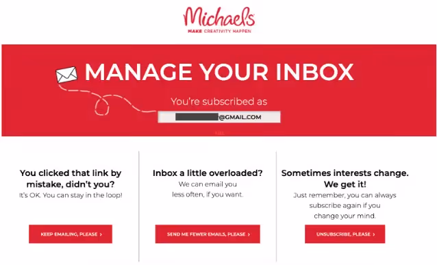
Take Michael’s, for example. This is what the unsubscribe link looks like at the bottom of its marketing emails:
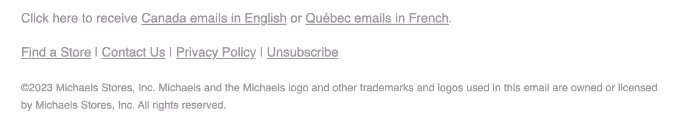
When customers click that link, it brings them to a page to manage their preferences:
Identifying information and contact information
To help prevent scams and give customers recourse against improper emailing behaviors, various anti-spam laws require that organizations include certain pieces of identifying information and contact information in every email. Legally, you must include:
- Your business or organization’s name
- Your full address. Include your street address, city, and state/province
Those legal requirements are the bare minimum, but you can improve your engagement and your consumer trust if you include a few additional pieces of contact information too:
- A link back to your site. Try adding a linked logo or including specific pages (your blog, services page, etc.). This gives readers a way to get more information in a single tap.
- Contact email address. This information is a way for readers to reply to the message or get in touch with questions or concerns.
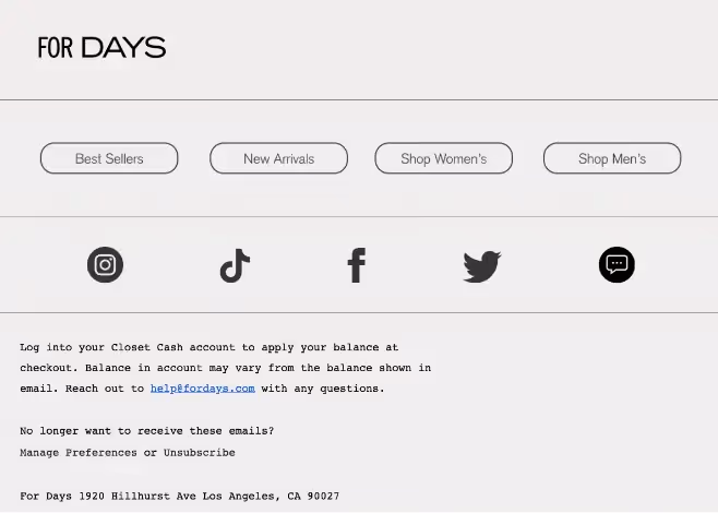
As an example, check out how For Days has included all of those contact details and links in its email footer:
Privacy policy and legal disclaimers
Privacy policies and legal disclaimers aren’t the most exciting elements of your email footer design, but they're among the most important. A privacy policy is legally required, not by anti-spam legislation but by privacy-focused legislation like General Data Privacy Regulation (GDPR) in the European Union and the California Consumer Privacy Act (CCPA) in California.
If your emails may reach consumers in any of these locations (which is the case for most email marketers), you must include a privacy policy.
There are certain other pieces of information which, while they aren’t legally required, can help you establish trust with your readers and improve transparency so consumers know who you are and why you’re emailing them. They can also help you in the case of certain civil lawsuits, like copyright-related lawsuits. These additions can include:
- Why you’re receiving this email. Many readers are subscribed to dozens and dozens of mailing lists. A permission reminder is a nice way to tell them exactly why they’re receiving this message. It’s also an email deliverability best practice because it further reduces spam complaints and helps you maintain a high sender reputation.
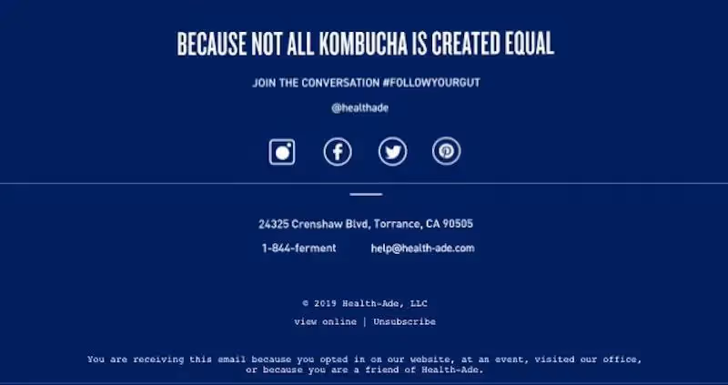
Here, Health-Ade Kombucha explains that you’re receiving this email because you opted in via their website or an event.
- Copyright. This doesn’t have to stand out boldly, but it’s a good email footer best practice to include the copyright mark (©), the year and the copyright owner (your business name).
- Details or restrictions on an offer. Retailers often need to include fine print about the discounts or deals presented in an email, and the footer ends up being the place where these details are added.
Optional email footer elements to boost engagement
As we’ve discussed, most email service providers require you to include certain information in your footer, such as a physical address, a link to unsubscribe to comply with anti-spam laws, and a link to your privacy policy. Beyond these basic components, however, there’s much more information you can include to create more impact and engagement with your email footer. Here are some common footer elements to consider.
Social media buttons
As secondary calls to action, social media buttons often find a home in the footer, where they aren’t a distraction from the body of your message and your main CTA. These conveniently linked icons guide readers toward an additional way to engage with your brand and keep up with the latest sales and news, so they’re a win-win.
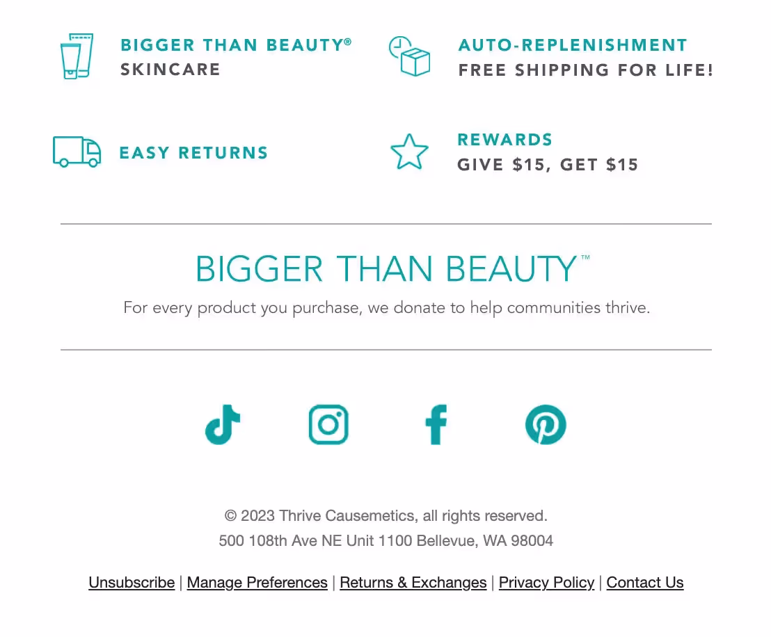
Check out how Thrive Causemetics included its social media links in its email footer using its brand color:
Website links
Your website is your digital “home” and for most brands, it’s the best place for customers to land because it’s where they learn about your organization, build brand familiarity, and perhaps even make purchases.
Something as simple as adding your website link to your footer can prompt consumers to visit your website (along with adding further transparency about who is sending them this email).
Take a look at how Dancing Goats Coffee does this, for example:
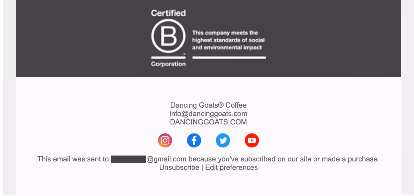
It’s simple and subtle but it’s clear and provides an easy path to added engagement.
Additional engagement links
You may want to include some other relevant links in your email footer design to boost engagement, too. This could include:
- Forward to a friend: Sometimes your beautifully designed email doesn’t render correctly when forwarded, so many brands include a “Forward” link at the email’s close. On the marketing end, this can encourage readers to forward and help you track how many of them do.
- Sign up: If your message does get forwarded, it’s useful to provide a direct way for those new recipients to subscribe.
- Update your profile: If your email service provider offers a preference center where subscribers can update their profile and change things like messaging frequency, the footer is the perfect place to add a link to it.
- App download: If you have an app, your email marketing is an excellent place to make customers aware and prompt them to download it and try it out.
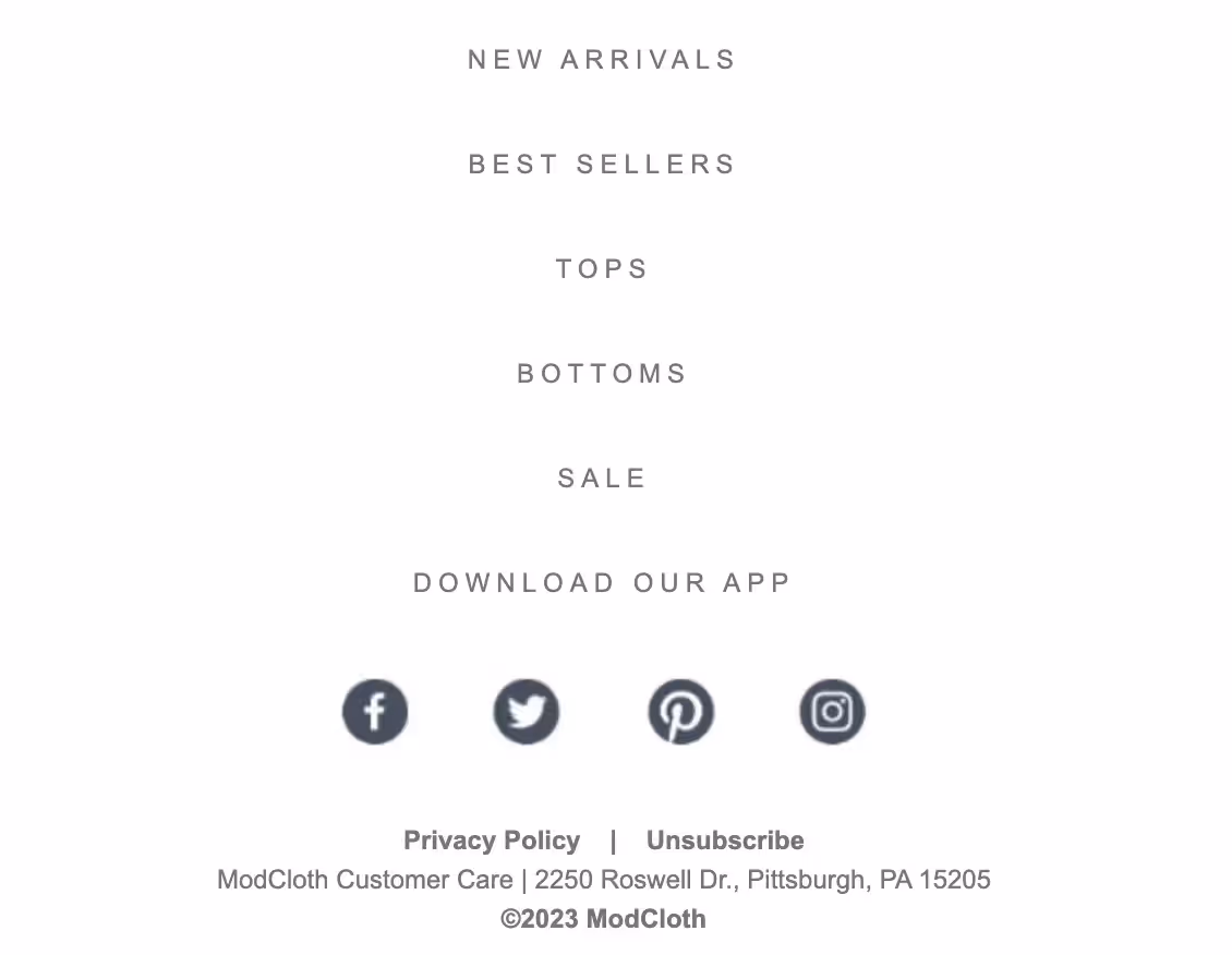
Check out the app download button in this ModCloth footer. Along with other engagement-centered buttons, this button helps to spread the word about ModCloth’s app and offers customers a more convenient way to shop.
Branding elements
Your email marketing is an excellent opportunity for branding. Something as simple as adding a few branding elements, like your logo and your brand colors or branded icons, into your footer can help to reinforce your brand image. The more familiar your brand feels to customers, the more likely they are to think of you for their future purchases, and every little bit helps.
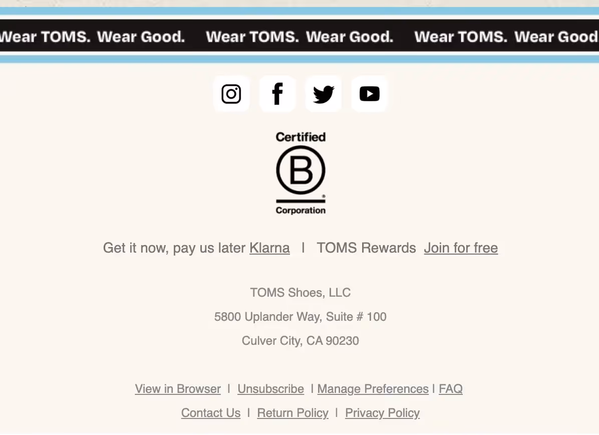
Consider this footer of an email from TOMS, for instance. TOMS incorporates an image of its slogan, “Wear TOMS. Wear Good.” in the footer along with its brand color scheme. This not only strengthens the TOMS brand but it reinforces the brand’s core value of philanthropy.
How to design a great email footer
Once you’ve decided what to include in your footer, it’s time to start designing. These email footer examples and tips can help.
Keep it simple
Footers can quickly become overly crowded with buttons, icons, links and fine print. Before stuffing your footer with information, evaluate what makes the most sense to include and then try to stick to the bare minimum. Overwhelming readers with too much information can lead them to skip over the footer altogether, not knowing where to begin. An email design best practice is to keep your message focused. Likewise, the simpler the footer, the more useful it will be to readers.
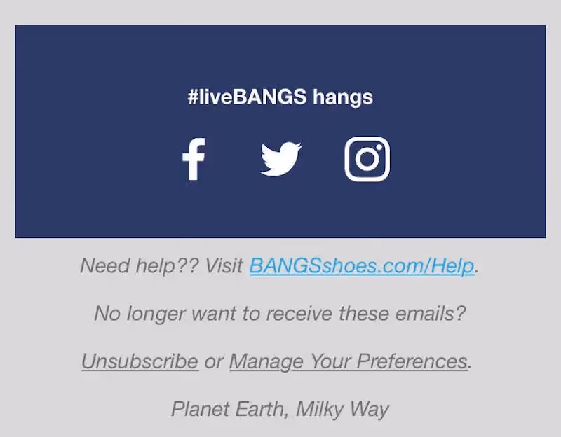
Here’s an example from BANGS Shoes. The clutter-free design makes the footer easy to scan. Readers can zero in on what they’re looking for quickly since the footer doesn’t include too many elements or an overload of information. And since most of the footer is plain text, it will always render correctly.
Ensure visual hierarchy
After you’ve established a basic list of what needs to be included in your footer, organize the information in a hierarchy based on the actions you most want readers to take and the information they’re most likely to be seeking.
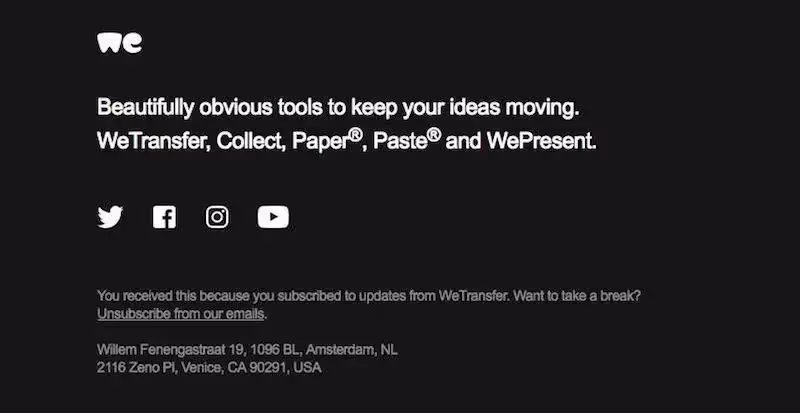
Here’s an email footer example from WeTransfer that provides subscribers with direction and clarity.
First, the company clearly explains what they do for any new subscribers (or old ones who could use a refresh). Next you’re directed to social media, and finally WeTransfer gets down to the fine print, keeping this part to a minimum.
The simple black-and-white email footer includes what they really want readers to know at the top and then adds less essential information at the bottom.
Stay organized
Formatting your footer into sections, with headers and labels to clearly organize content, is a great approach to improving readability.
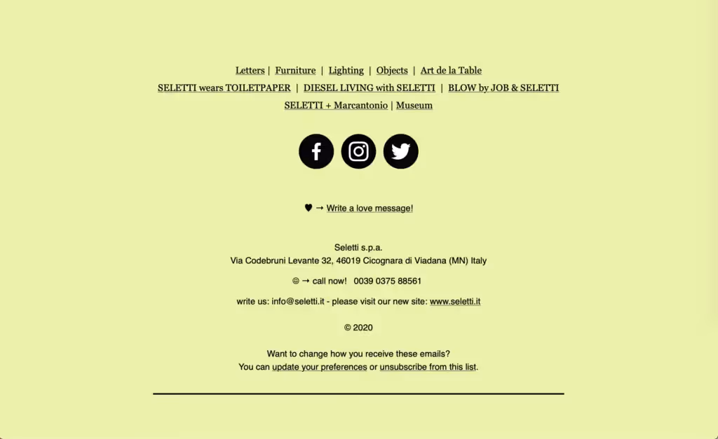
In this example from Seletti, the color scheme is slick and easy to read, with a couple of emojis that grab your attention. This is a great example of how smart email footer design can make a lot of content easier to scan.
The footer content is separated into groups with website links first, social media next and then other contact information (such as the company’s address and phone number). The unsubscribe link is found at the very bottom.
Choose color wisely
Footers are often distinguished from the body of an email with a substantially different HTML background color. Using a background color is one of the quickest and most effective ways to let readers know where one email section ends and the next begins.
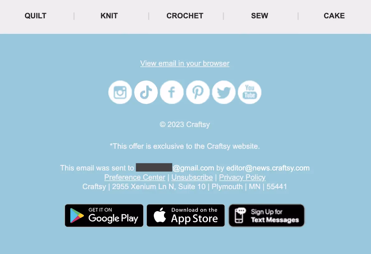
Here’s an email footer example from Craftsy’s email newsletter. The light blue background pops, signaling to readers that these details are separate, in addition to incorporating part of the brand’s color scheme. Because footer information is typically small, it’s important to think about color and contrast between text and background to enhance legibility. Using colors with high contrast makes reading the smaller text a breeze.
Take up space
There’s no rule of thumb for how big or small your footer should be. As you design your email, you’ll want to be cognizant of the content size and length to avoid having your message get clipped. But if there’s room for it, your footer can expand to be a bigger part of your email.
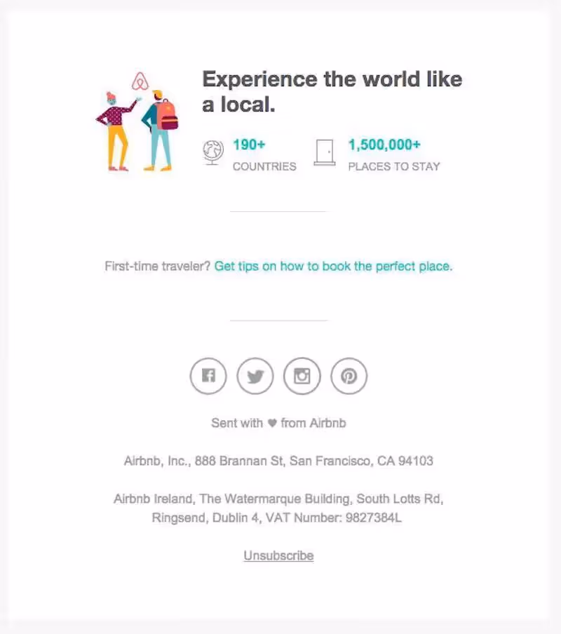
Here’s an example from AirBNB that uses the email footer to reinforce branding. The significant padding between each section of the footer allows readers to take in each section of information one at a time — no crowding or clutter here. It’s a cute, clever way to conclude an email without being overbearing.Keeping the footer light on text and big on blank space also helps create a sense of levity and scannability.
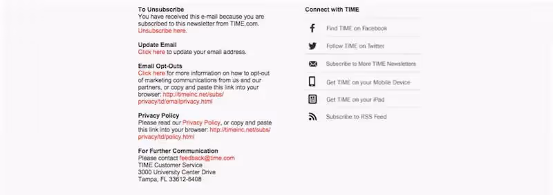
Compare AirBNB’s email with this footer from TIME. The below examples compresses information to the point of making it uninviting and hard to read. When it comes to email footer best practices, keeping yours easy to scan is essential.
Include a sign off
Your email footer is a place to have fun, too! Some brands include a sign-off that inspires readers or adds a sense of playfulness to the message.
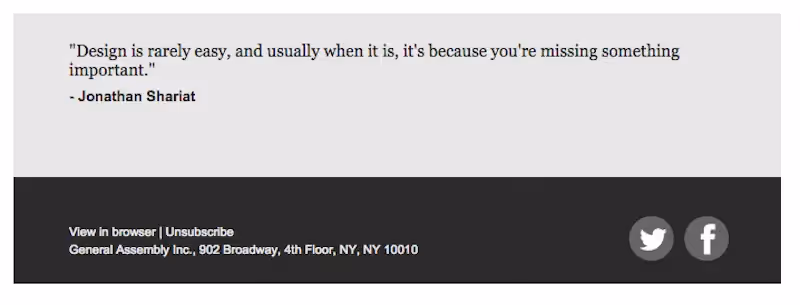
General Assembly closes their emails with a quote. With its monochromatic color scheme, two social buttons and high-contrasting HTML background, the footer is elegant and to-the-point.
The clothing brand Huckberry also includes an inspirational quote in their oversized footer, combining the design elements we saw in the the General Assembly and AirBNB footers.
It’s a smart relationship-building technique to include a non-marketing-related sign-off that reinforces your company values. Not only does this help to improve your brand awareness but it also gives your brand more of a relatable personality.All the techniques and elements listed above will allow you to truly take advantage of your footer’s space in every email.
You’re not just checking boxes and including legally necessary information, you’re also making the footer engaging and productive for your bottom line. You don’t need to incorporate every technique in your footers, but even working in a few of them can boost your engagement in a meaningful and lucrative way.
Key takeaways: Designing effective email footer design
- Collect the information you’re required to include in your email footer, then carefully evaluate optional elements.
- Think about what actions you want readers to take to help create a short list of which elements you’ll include.
- Err on the side of too little information rather than too much.
- Arrange your footer information in a hierarchy, starting with the most important information or call-to-action.
- Organize your email footer design. Use headers and colors to create sections, incorporate CTA buttons and allow plenty of space around each cluster of information.
- Separate the footer from the body of your email with a background color. Use contrasting colors to improve legibility.
- If you can afford it, take up space. Allow the information to breathe and increase padding.
- Include a thoughtful sign-off. Make a statement about your brand or your company values and strengthen your relationship with readers.Put These Tips In Action With Beefree
