Beefree blog

How to Use Social Media Buttons in Email

Beefree team
Beefree team
Jan 5, 2016
How to Use Social Media Buttons in Email

It may have been a while sinceyou last gave some thought to thesocial media buttons in your email campaigns. That's because they're pretty ubiquitous—always there, just hanging out in the header or footer—and they're notmeant to be the main attraction of anemail. Butif the new year has you antsyto reinvigorate your marketing techniques and make someemail design improvements, don't overlook social media buttons! According to a study by GetResponse,just adding social sharing buttons can boost emailclick-through rate by 158%. They're worth a closer look.Here's what to consider when making design decisions for social media buttons in email.

The purpose of social media buttons in email

In email, social media buttons provide a secondary call to action. YourprimaryCTA is probablyabout registering for an event, making a purchase, reading more—basically, getting readers to your website to makeatransaction. But in the background are those glimmering little buttons that make one of two requests: share or follow.

  • Follow icons take readers straight to your social media pages—to like your Facebook page or follow your Instagram account, for example—to get connected to your content in whichever way they prefer.
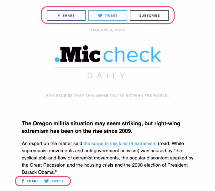
  • Share icons ask readers to share a specific piece of content—Tweet the story or Pin the picture, etc. Here's an email from Mic with both examples present: follow icons in the header, and share icons after the first story:
miccheck social media buttons

Where to place social media buttons

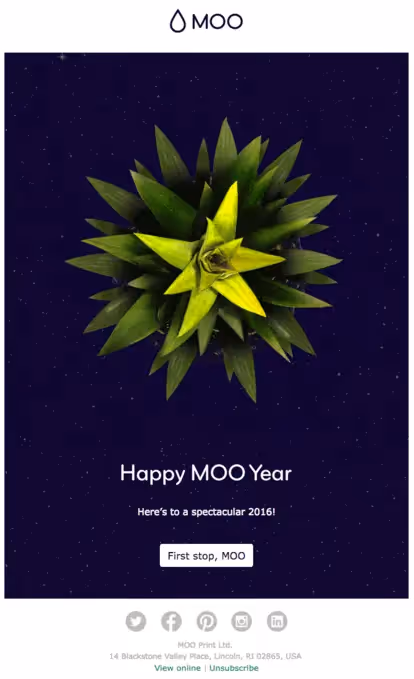
A best practice is to place your social media follow icons at the header or footer of your email. Savvy readers instinctively scroll to the top or bottom of an email (or a website) to find standard info found in menus, like contacts and social media links. Keeping your follow icons at the opening or close of your email makes it intuitive for readers to locate. From a design perspective, it makes sense that the icons are consistently placed where they won't interrupt the flow of content in your body message. Think about it: the main focus of your email is to get readers to take action on your primary CTA, like signing up for your upcoming webinar. The key focusisn't for a reader to follow you on Facebook, so don't get in the way of your primary CTA with extra CTAs. Keep social follow icons from being a distraction. And if you're sending more of a personal email—one that includes an e-signature—includingsocial media icons in your email signature is another great spot. (Check out BEE's personal note email template).Here's an example email from MOO, the business card design company. Their social media icons are placed at the bottom of the email in the footer, after the main CTA button. This choice—very commonly seen in email design—also keeps the email totally clutter-free.

moo social media buttons in footer

Alternatively, this email from Martha Stewart Everyday Food givessocial follow icons more of a spotlight in the upper right corner of the header.

everyday food social media icons in header

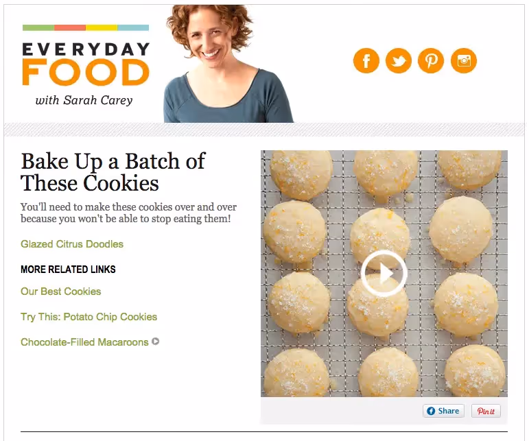
Overall, the header is very well-balanced; it's not cluttered with information and there's plenty of white space, while the orange color unifies the social media icons with the main logo. The buttons are well positioned to attract the right amount of attention—they're very easy to spot but don't stick out like a sore thumb.Peoplegenerally read information in an "F" shape, starting in the upper left-hand corner then moving horizontallybefore scanningdownward. That first horizontal movement means information in the top right is usually read. So if social media follows are a priority for you right now, top-of-email icon placement may be the way to go.Compare the Everyday Food approachwith a slightly busier header, like this one from Rolling Stone:

rollingstone follow buttons in header

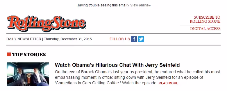
These social icons are smaller and placed in the center, where they don't quite demand the same amount of attention. Here, "Subscribe to Rolling Stone" is likelier to be read, and probably for good reason: Rolling Stone wants to make subscribing for their magazine a prominently featured, easy-to-click option for readers.There's no single correct place to put your social media follow icons. When making a decision, first evaluate your current priorities, and give social icons slightly more prominence if increasing followers is a goal. But don't let them clutter up your main message. Know your audience: Mix up your icon positioning and test to see what garners more clicks.

Customizing social media buttons

In the four emails we've looked at so far (Mic, Moo, Everyday Food, Rolling Stone),each brand's social media buttons look different from the others.

buttons mic
buttons moo
buttons ms
buttons RS

Different sizes, shapes, and colors are pretty common because it's become easier and easier to customize buttons in email. So how do you know what's right for your brand? On one hand, it goes back toyour current goals and strategies. If increasing your social media following has been determined as a priority—because that's where you get the most engagement or that's where you see your emails getting clicks or that's where you need to improve or that's where your audience is most active, etc.—then it makes sense to integrate social media buttonsin a more prominent way. Maybe, then, the icons are larger and they appear at the top and bottom of all of your emails.From a design perspective, the look of your social media icons depends heavily on your brand's visual identity. Here are some customizations to consider.

Shape

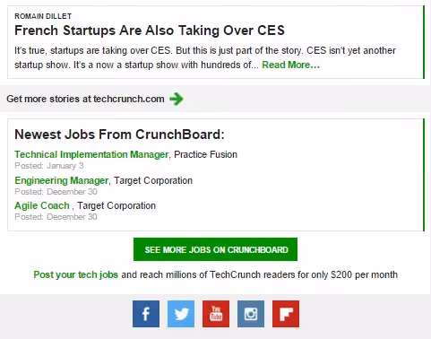
If your visual brand incorporates angles, edges, and corners (e.g., in your lettering or in the cropping of images, etc.), then you will probably follow suit with your social media buttons. Here's an example of that from TechCrunch. Their email includes stories in rectangular boxes that sit within rectangular sections, so their social icons are, you guessed it, rectangular as well.

tech crunch social media icons square

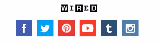
WIRED makes a similar choice, and it's easy to see how the boxy, angular aesthetic fits perfectly with their visual brand.

wired social media icons youtube

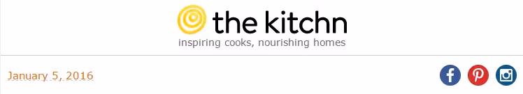
A button with a rectangular shapegenerally connotes a senseof traditionalism, practicality, and balance, while circular elements can be perceived as softer, calming, and more modern.Here are circular buttons used by the Kitchn. You can see how the choice is in sync with the circular nature of their logo and the curvy natureof their brand font.

the kitchn round social share buttons

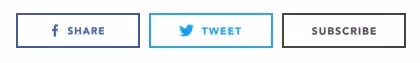
For a sleek, more minimalist feel, many brands omit the circle or square shape altogether and present readers with only the icons themselves. That's the approach the daily newsletter The Skimm takes...

skimm share and follow social media icons

...as does Fusion:

fusion follow us icons

Against a bold background color, the simple white icons are easy to spot, so there's no need to have the extra bulk of a circular or rectangular container.

Color

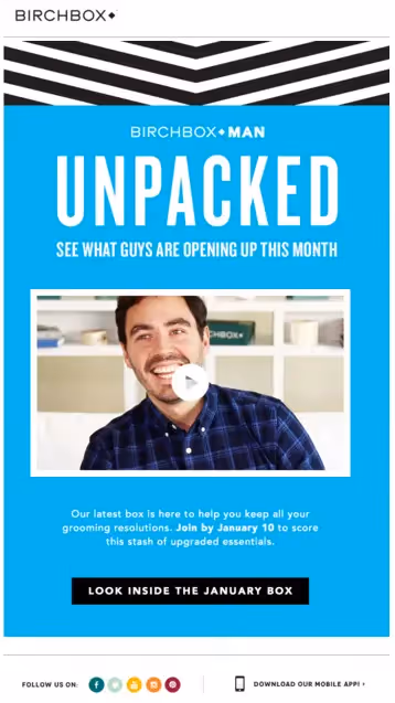
The color ofsocial media buttons typically falls into one of three categories: traditional colors (like blue for Facebook, red for Pinterest, etc.); neutral monochromatic colors (all black, white, gray, orblue); or brand colors (customized to suit your particular brand color palette). In email, your social media button color choice will depend heavily on the colors used in the email itself, and to what degree you'd like the buttons to stand out.Here's a playful take on button color from Birchbox:

birchbox button style

The Birchbox visual identityiswhimsical and fun-filled, and their emails are full of fresh,bold colors against clean, bright backgrounds. These social media buttons are a departure from the blue-white-black color scheme of the email, andset against a white background with plenty of surrounding padding, they provide the right amount of whimsy without competing with the central CTA.

birchbox social media icons in footer

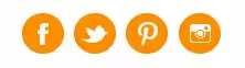
Some brands customize in a more subtle way, but making all social media buttons a brand color. ALOHA does this in their emails, making the icons their characteristic ALOHA red:

buttons aloha

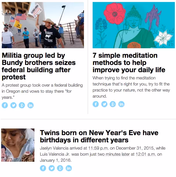
Because the symbols of each platform are so iconic, they're still easily recognized, even in monochrome.Mashable does a nice job of choosing an icon brand color throughout their emails that's not intrusive. The cool blue used here is noticeable but never detracts from the stories they're paired with:

mashable social share icons

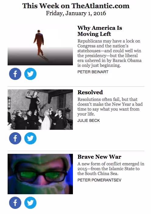
A light, monochromatic color scheme is a nice choice whensocial sharing buttons will be included many times throughout an email. (Email design platforms should include options for choosing the shape and color scheme of your social icons—for instance, check out BEE's basic coupon email template). However, the choice stilldepends on your brand's goals and to what degree you want to encourage readers to use the buttons. The Atlantic, for example, takes a very different approach from Mashable, using traditional colors and much larger icons. But because the icons are so much more prominent, they only include two: Facebook and Twitter.

the atlantic social media buttons for sharing

Special customizations

A few brands take special care to fully immerse every piece of email content in their brand identity, so that every piece is distinctive. We sawthis in a few recent emails, like in this one from Anthropologie. Each social media button has a pretty, playful hand-sketched look, in keeping with the light-and-bright vibe of their visual identity:

anthropologie custom social media buttons

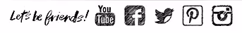
Bumble and Bumble takes a similar approach, adding "Let's be friends!" in whimsical handwritten lettering:

bumble and bumble illustrated buttons

Both approaches are a nice touch for large brands with the resources to fully customize every aspect of their brand.

Which buttons to include

The most popular social media buttons are Facebook and Twitter. After that, it depends on your brandcontentand your audience. If you're content is super visual, and you release weekly videos or daily Instagrams, then you bet YouTube and Instagram should be a priority on your list. If you're trying to grow your audience on a particular platform or have recently invested resources in building up, say, your Pinterest content, then try increasing that particular button's prominence in your emails and measure what happens.It will be different for everyone. With social sharing buttons that are included throughout your email, brands tend to be more minimalistic, which is smart. To encourage sharing an article, you don't need to list Facebook, Twitter, Instagram, YouTube, Pinterest, Google+, LinkedIn, Vine, AND Tumblr. Choose the top two or three your audience most uses, or that best suits the content, and use those, formatting appropriately.

Wrap Up

Have fun with your social media buttons in email. Try something new, and track subscribers' engagement. Here are a few design tipsto keep in mind:

  • Social media buttons in email are usually secondary calls to action. Wherever you place them, social media buttons shouldn't compete with your main content. Try the header or footer.
  • Choose a shape, size, color, and customization that suits your brand and fits with the look of your email. Maintain balance—and make sure the buttons are easily tapped on mobile—by including ample white space around buttons.
  • Decide which buttons to include based on the nature of your content and audience. Don't overload readers with too many options.

Want a little help getting started? Check out BEE's email templates—they're fully customizable, easy to use, and beautifully designed!

Related posts

Why Pardot Users Choose Beefree for Better Email Design

Pardot’s email builder slowing you down? Learn why teams across industries turn to Beefree to create stunning, compliant emails—then export to Pardot with one click.
Beefree team
Apr 23, 2025

Send Error-Free Emails with Confidence Using Beefree

Learn about the Beefree features that can help you and your team catch mistakes, streamline collaboration, and send with confidence every time.
Beefree team
Apr 15, 2025

Using Beefree with Marketo Engage 101

Learn how integrating Beefree with Marketo Engage can help you build high-converting, on-brand email campaigns— faster.
Luca Penati
Apr 4, 2025

Why Pardot Users Choose Beefree for Better Email Design

Pardot’s email builder slowing you down? Learn why teams across industries turn to Beefree to create stunning, compliant emails—then export to Pardot with one click.
Beefree team
Beefree team
23 Apr
2025

If you’re using Salesforce Account Engagement (formerly Pardot), you’ve likely hit a wall with its native email editor. Whether you’re a nonprofit, a growing SaaS company, or an enterprise with multiple brands, the common complaint is the same:

"Pardot is just way too restrictive for our needs."

"The collaboration part just isn’t happening smoothly. It is too hard to involve writers and designers effectively."

 "It isn’t like we were doing anything overly creative—it just doesn’t give us the flexibility we needed."

Let’s face it: as powerful as Pardot is on the automation side, its design capabilities often fall short. And Salesforce doesn’t seem in a rush to improve them. If you’ve been trying to get more from your marketing emails—faster, better, more on-brand—it’s time to consider a better way.

Beefree isn’t a replacement. It’s the perfect addition to your workflow

The good news is that you don’t have to abandon Pardot. It is excellent at what it’s built for—automation, CRM integration, lead scoring, and financial compliance. 

But when it comes to design and collaboration, the limitations start to pile up. Whether it’s because of its clunky editor, lack of customization, or the time spent fixing buttons and web fonts (insert eye roll). 

Pairing Beefree with Pardot doesn’t just improve how your emails look, it transforms how your team works. This pair is especially perfect for: 

  • Healthcare & Financial Services: where compliance and approvals are non-negotiable.
  • SaaS, Consumer Brands, and Professional Services: where keeping brand consistency across touchpoints is critical.
  • Higher Ed, Manufacturing, Real Estate: where teams juggle multiple departments, audiences, and localizations.
  • Nonprofits: where lean teams need to move fast 

Teams from all walks of life all come to Beefree looking for the same thing: a fast and flexible email design solution that seamlessly integrates with their tech stack (without slowing their team down).

(source)

From chaos to control: Why teams choose Beefree

Now that you know what Beefree is, it’s time to talk about how it can help. 

When email production feels scattered (we’re talking files everywhere, last-minute edits, branding inconsistencies), it’s not just frustrating, it’s risky. It opens the door to real mistakes: off-brand messaging, broken layouts, missed approvals, or worse, emails that get flagged for non-compliance.   

1. Keeps your team organized with Workspaces

Instead of one cluttered space where everyone shares the same templates and folders, Workspaces allows you to manage email assets across brands, departments, and regions in unique environments. 

  • Create separation without silos: Marketing ops can manage everything in one platform, while individual teams work independently within their own workspace. It’s the best of both worlds.
  • Prevent cross-team mixups: With workspace-specific templates and permissions, there’s no risk of someone accidentally launching a healthcare email from the real estate workspace.

2. Allows you to move faster without sacrificing brand integrity

Beefree empowers teams to scale production while keeping every email perfectly on-brand.

  • Style Kits: Automatically apply your brand’s fonts, colors, and design settings to every email in a workspace
  • Saved Rows: Save your most-used content blocks (like hero sections, testimonials, or product features) and reuse them across campaigns.
  • Synced Rows: Make a global update, like changing your holiday promo footer or legal disclaimer, and Beefree automatically applies it to every email using that row. 

3. Helps you catch mistakes before they go live

Beefree helps your team build error-resistant emails with features designed to catch issues before they go live. 

  • Smart check: Beefree’s Smart Check automatically checks your designs and alerts you of any red flags, such as missing links, heavy images, and large HTML files, so you can fix them before they cost you. 
  • Built-in approval flows: Ensure the right eyes are on every email. No more chasing approvals in Slack or email threads.

Learn more about sending error-free emails with Beefree: https://beefree.io/blog/error-free-emails-beefree

4. One click export from Beefree to Pardot

With Beefree’s native Pardot integration, your team can export emails with confidence. What you see in Beefree is exactly what your audience gets in Pardot. No weird spacing. No layout issues. No surprises.

Real results: How USC Marshall scaled campaign production with Beefree

In 2020, Dwayne Rice, Senior Associate Director of CRM Management at USC Marshall, was juggling comms for 11 graduate programs. Each had its own drip campaigns, deadlines, and unique audiences.

“I needed an efficient process to crank out emails,” he said.“But Pardot’s editor was slowing us down.”

By switching to Beefree, Dwayne’s team was able to build reusable templates and modular elements—cutting production time and removing the need for third-party vendors.

“Beefree has enabled us to create content efficiently enough to bring multiple processes in-house and discontinue relationships with several vendors, saving time and money.”— Dwayne Rice, USC Marshall

Read the full case study

Stop letting Pardot’s email builder hold you back

From higher ed to healthcare, SaaS to nonprofits—teams across industries are making the switch to Beefree not to replace Pardot, but to complete it. With Beefree you can:

  • Design polished, responsive emails in minutes
  • Collaborate seamlessly with writers, designers, and stakeholders
  • Export to Pardot with full confidence

Start building better emails for Pardot today — Try Beefree for free

Or if you're a non-profit, apply for a $1,000 annual credit!

(source)

Frequently asked questions about using Beefree with Pardot

1. How does Beefree integrate with Pardot?

Beefree serves as an external email design tool that integrates seamlessly with Pardot. Users can design emails in Beefree and export them directly to Pardot as new templates or update existing ones. This integration streamlines the email creation process by allowing for more flexible and visually appealing designs than Pardot's native editor.

2. Does Beefree provide analytics for email performance?

Beefree focuses primarily on email design and does not offer built-in analytics. However, once emails are exported to Pardot, users can leverage Pardot's robust analytics and reporting tools to track performance metrics such as open rates, click-through rates, and conversion rates.

3. How does Beefree enhance email design capabilities for Pardot users?

Beefree offers a no-code, drag-and-drop email builder that allows users to create visually appealing emails without HTML knowledge. It integrates seamlessly with Pardot, enabling users to export their designs directly into the platform, thereby overcoming Pardot's design limitations .​

4. What collaboration features does Beefree offer compared to Pardot?

Beefree offers robust collaboration features that surpass those in Pardot, including:

  • real-time design-specific comments
  • role-based permissions
  • approval workflows

all available directly within the email design environment. These tools make it easier for teams to co-create and review content without switching platforms. In contrast, Pardot’s collaboration tools are more limited and typically rely on Salesforce’s broader ecosystem for team coordination.

5. Does Beefree support features like AI copywriting or mobile optimization?

​Yes, Beefree supports both AI-driven copywriting and mobile optimization features. Its AI Writing Assistant enables users to:

  • generate email and landing page content or revise existing copy
  • create alt text for images
  • translate content to different languages

Additionally, Beefree's Mobile Design Mode allows for editing of mobile-specific styles, such as:

  • text alignment
  • padding
  • font size
  • and more

to ensure responsive and user-friendly designs across devices.

6. Can Beefree help maintain brand consistency better than Pardot?

Yes, Beefree helps maintain brand consistency more effectively than Pardot through its Brand Style Guidelines feature, which lets teams lock in brand colors, fonts, and content blocks across all email designs.

Users can also create reusable templates and design systems that ensure uniformity, even across multiple teams or clients. While Pardot offers some branding controls, it lacks the same level of built-in visual governance and flexibility found in Beefree’s design-focused environment.

Send Error-Free Emails with Confidence Using Beefree

Learn about the Beefree features that can help you and your team catch mistakes, streamline collaboration, and send with confidence every time.
Beefree team
Beefree team
15 Apr
2025

We’ve all been there: You craft the perfect email, hit “send”, and just as you settle into the satisfaction of a job well done, someone slacks you: “Hey, something doesn’t look right with that campaign.” 

If this sounds familiar, you should know that you’re not alone: According to the 2025 Really Good Email Survey “90% of email marketers say they have a history of noticing mistakes in their emails after they’ve hit the send button.

This becomes especially common when your team constantly juggles multiple campaigns or makes edits until the last minute. Sadly, even the smallest mistakes don’t just slip through the cracks; they cost you.

Luckily for us all, mistakes can be avoided. And no, not by lighting a Pre-Send Protection Candles™ and hoping for the best. But rather by equipping your team with the right tools that work with your team – not slow them down. Let’s talk about it!

Building your team’s safety net for mistake-free emails with Beefree 

When everyone involved in the email creation process is aligned and supported by smart systems, executing mistake-free emails becomes second nature. Instead of scrambling to do damage control, you’ll want to set up the tools and processes that help your team focus on what they do best: creating emails that connect, convert, and confidently represent the brand.

In this article, we’ll discuss how you can use Beefree to: 

  • Reduce human errors 
  • Implement systems of checks and balances 
  • Establish guardrails & frameworks for on-brand email design

1. Catch mistakes before they happen with Smart Check

Missing links that lead nowhere? Forgotten subject lines? HTML emails that get clipped in Gmail? It’s easy to make little mistakes that derail your campaign’s performance. 

Learn more about Smart Check → 

Beefree’s Smart Check automatically checks your designs and alerts you of any red flags so you can fix them before they cost you opens, clicks, or conversions. Think of Smart Check as your built-in QA partner who will catch:

  • Missing links
  • Heavy images that could slow down email load times
  • Missing subjects & preheaders that impact engagement
  • Missing alt text on images that hurt your email’s accessibility
  • Large HTML files that might affect deliverability (or get clipped in Gmail)

2. Keep every email on-brand with built-in guardrails 

Most of us don’t nail the perfect campaign on the first try. Great emails are a team effort. However, when multiple teams are involved in the email creation process, branding can quickly go off the rails. 

A misused font, clashing colors, or buttons that are too small to click don’t just make emails look disjointed—they can damage your brand’s credibility.

With Beefree’s Advanced Style Kit, you can set clear, predefined guidelines for fonts, colors, spacing, and more—so every design starts on the right foot. Once configured, all new emails automatically inherit your brand styles, reducing the need for constant oversight and minimizing errors.

Advanced user permissions let you lock down specific design elements, giving you full control over what can (and can’t) be edited. That means anyone on your team—regardless of design expertise—can confidently create emails that look and feel like your brand.

3. Empower your team to create with confidence with reusable content

When your team isn’t bogged down by the cumbersome process of creating content from scratch (or fear of going off-brand), they can move faster—and with far more confidence.

With Saved and Synced Rows, you can provide your team with pre-approved content blocks—like headers, footers, and other commonly used design elements—that they can use in their designs without creating them from scratch. That ensures design consistency, eliminates redundant work, and makes email creation a lot faster.

Learn more about Saved Rows → 

4. Ensure your team is aligned with centralized reviews and approvals:

Creating the perfect email often takes a team of designers, copywriters, marketers, and other team members working together. But when multiple people are involved, endless back-and-forth and feedback scattered across multiple conversations and channels can slow things down, lead to miscommunication, and ultimately cause mistakes. 

With Beefree’s built-in commenting, your team can collaborate and share feedback where the work is actually happening—right inside the builder. And if you’d like to involve external reviewers into the review process, you can do that as well. 

Learn more about commenting → 

Plus, with Beefree’s built-in Approval flow, you can ensure your designs are reviewed and approved by the right stakeholders. Stay aligned with real-time notifications on design changes, lock edits on approved content, and get a clear view of project status for smoother team collaboration and high-quality results.

Learn more about Approvals →

5. Need an additional pair of eyes? Use the power of AI to support your team

Take some weight off your team's shoulders and use AI to support them in the final stretch. Whether it’s catching typos, flagging inconsistencies, or suggesting optimization, AI can be a saving grace when deadlines are creeping in.

For those times when you can’t remember the difference between “there, their, and they’re,  Beefree’s  AI Writing Assistant is there to help. This eager-to-learn helper can  review your copy for grammatical errors, tone of voice, and even share suggestions for making it just a bit more compelling. Our AI Writing Assistant can also seamlessly translate content or automatically generate ALT text for images to enhance the accessibility of your emails. 

Learn more about AI-powered content creation in Beefree →

The tangible cost of email mistakes

Mistakes don’t just impact performance; they slowly erode credibility. What starts as a small oversight can be a massive inconvenience for your readers, sending them straight to the unsubscribe button. As for your team, mistakes chip away at their confidence. Instead of brainstorming for the next campaign, they’re scrambling trying to figure out how to do damage control.   

When done right, email is a powerful tool for connecting with your audience. But a single mistake can unravel that connection and undermine trust.

  • A missing or broken links can interrupt your subscribers’ journey to conversion, negatively impacting campaign performance.
  • A missing subject lines means your emails won't stand out in the inbox, hurting your open rate
  • An awkward typo might signal a lack of attention to detail
  • An off-brand design can make your brand look disorganized
  • An email that gets clipped in Gmail because it’s too big means some subscribers might never see the full email content.

Design error-free emails and send with confidence with Beefree 

Beefree helps teams of all sizes create polished, on-brand emails—without the risk of costly errors. With built-in safeguards, streamlined approval flows, and collaboration tools that keep everyone aligned, Beefree acts as your team’s system of checks and balances. From first draft to final sign-off, you’ll have everything you need to send with confidence, build trust, and get results.

Try Beefree's Business for free for 15 days and get access to all of Beefree’s tools that help you catch mistakes, streamline collaboration, and send with confidence every time. Or schedule a call with one of our experts to discover everything Beefree can support your team.

Stay informed on all email trends

From the latest creative design strategies that inspire your next campaign to industry best practices and tech advancements, our newsletter is the go-to for all things creation.

Thank you! Your submission has been received!
Oops! Something went wrong while submitting the form.
By clicking Subscribe you're agreeing with our Privacy Policy