

Consistently and creatively using color in email is one of the most important things you can do as an email designer or marketer. Our brains can process visual information 60,000 times faster than text, and color is a major factor in how we evaluate what we’re seeing. Up to 90% of product assessment is based solely on color. In one case study, a company saw a 20% increase in conversions just by switching a call-to-action button from green to red!
It’s clear that color has power. But how can we harness that power in email? Read on for 10 creative ways to use color in email, with design inspiration from brands doing it right.
1. COLOR YOUR ALT TEXTALT
text is the text that shows up when your email’s images don’t appear. This happens because your subscriber has image-viewing turned off or because the images are too large, making them slow to load. It’s an email design best practice to always use ALT text so that readers who don’t see images still get your message. Here’s how ALT text typically looks (on the left) and how the same email appears with images (on the right):
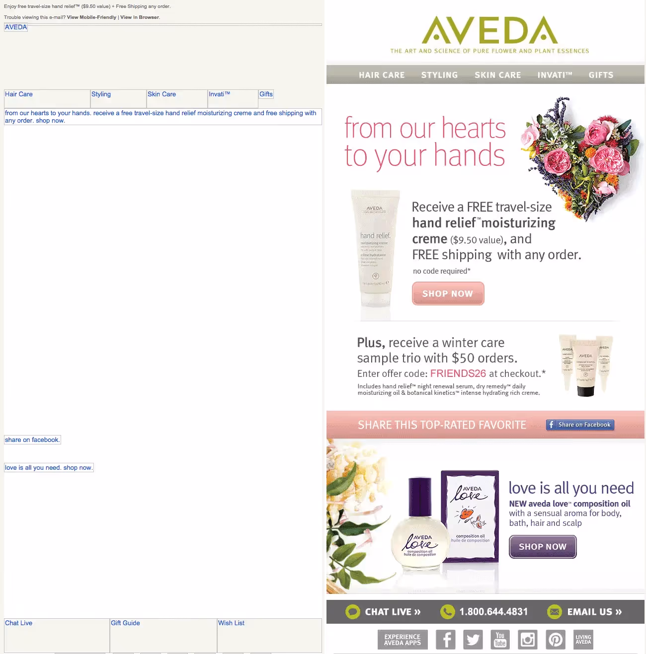
It’s clear to see why it’s not wise to send an email that’s entirely made up of images — it really won’t look good if the images aren’t there. But if you’re sending image-heavy email campaigns, you can style ALT text, too. Check out how much better the ALT text looks in this email (on the left) with background colors added (email with images loaded appears on the right).
Color your ALT text to improve your email’s design, even without images.
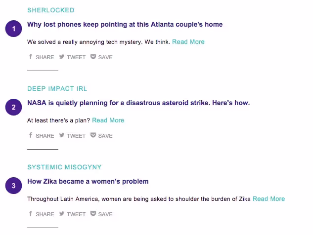
2. ORGANIZE CONTENT WITH COLOR TABS
Small color tabs or labels can improve content organization, helping readers skim your email. We’ve seen quite a few brands consistently use this technique to add order to both text and image content. One of the great things about these small splashes of color in email is that they’re not images. Using an HTML background color means they’ll always show up.
In this email newsletter, Robinhood Snacks uses small green tabs of text to categorize each story. “Tappy” and “Aww” denote must-read and adorable content:

These colorful tabs are small and unobtrusive. But they still do a good job of segmenting the stories and giving readers a bit of extra information.
3. GO ALL IN ON A COLOR SCHEME
Complement the photos in your email by reflecting their colors in your headers and CTA buttons. This is a great technique for product emails. The approach unifies the aesthetic of the email and offers a cohesive, contemporary look. You can even match the exact HTML color from an image or graphic by using a quick web tool like HTML color codes. Here’s an example from Draper James:
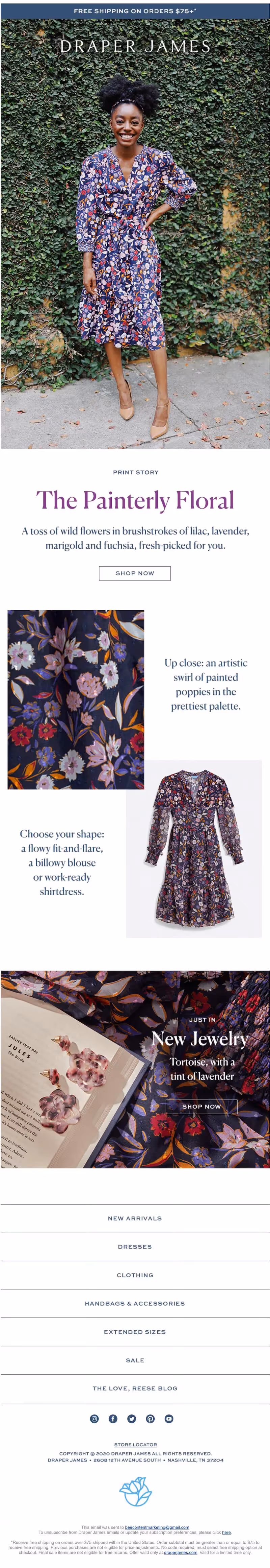
The product that’s being showcased is a dress in vibrant tones of lilac, lavender, marigold and fuschia. The text below the image is written in the same colors as the dress, helping tie the email together.
4. ADD COLOR BLOCKS TO YOUR PHOTO COLLAGE
Mix up your email’s photo gallery by adding text blocks with flat HTML background colors. The approach breaks up images and adds a sense of cohesion to photos, like in this example from Michael’s.
Make sure the color blocks are plain text with background colors (not images) to improve your text-to-image ratio. And don’t forget to make it responsive!

5. DIVIDE CONTENT WITH COLOR
A lot of emails have a white background. Often, this makes the content feel a little lighter, cleaner and less cluttered. It also makes high-contrasting black text easier to read.
But all that white space leaves plenty of room to get playful with color in email when it comes to separating and organizing your content. We often see this approach when modules of an email have different background colors to visually separate them, like in this email from Melissa & Doug.
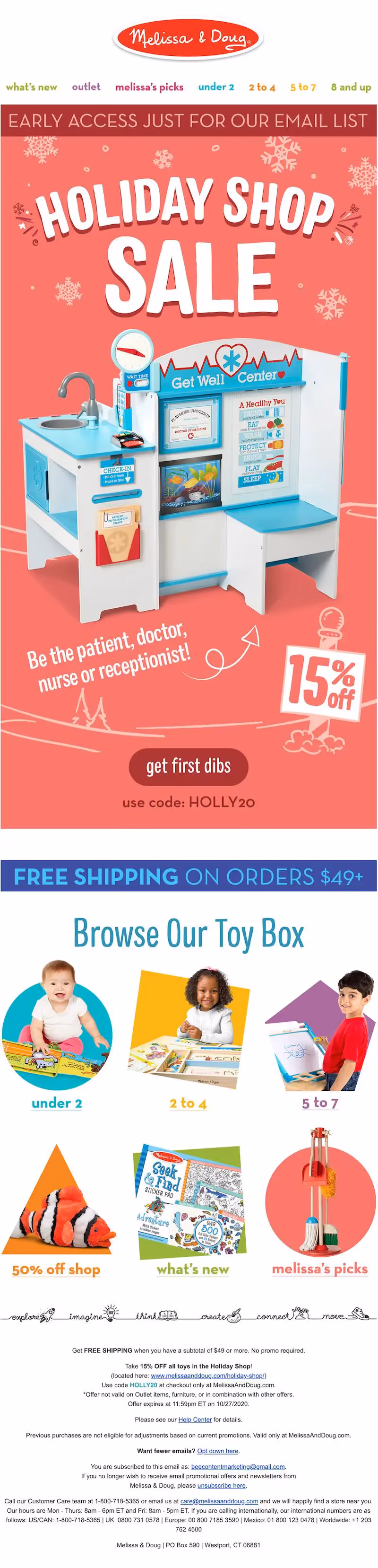
It’s clear where the first section of this email ends and the second one starts. The visual separation can help your readers navigate the content.
6. GET CLEVER WITH COLOR IN TEXT
There’s no rule that says the plain text in your email needs to be black. As long as it contrasts enough against your background color, it’s okay to leave the black font behind and play with color. Fusion uses an on-brand aqua-and-purple color scheme to liven up their listicle emails. It’s a nice break from the black font we often see, and it also serves to organize the email. The consistent use of aqua for headers and purple for sub-headers allows the reader to skim this email more easily.
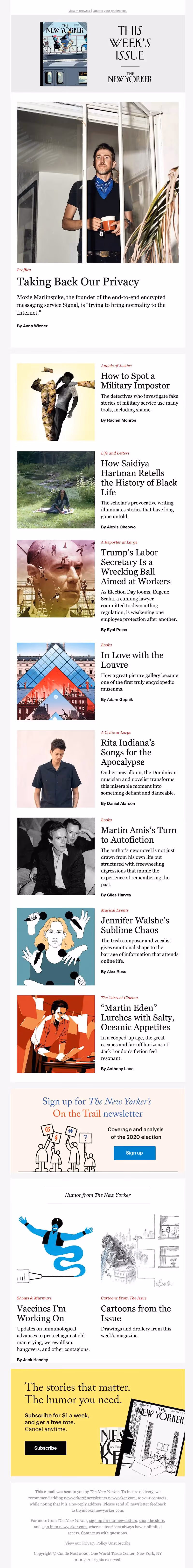
The New Yorker takes a more subtle approach when it comes to color in email by adding red text above each headline. The text categorizes each article and pops just enough to catch the eye.
7. CREATE CONTRASTING COLOR CTA BUTTONS
One of the most powerful ways to use color in email is in your call-to-action buttons. CTA buttons should visually pop out from the rest of your email — a reader scanning your message should be able to instantly identify where the CTA is. And color is a great way to do that! But it’s all about balance. Your button should also be on brand and simply styled.
Most brands choose a color that’s within their brand color palette and matches the aesthetic of the particular email. Often, the button echoes the header design in color. Here’s how Cratejoy uses the same blue color of its logo for many of its CTA buttons:
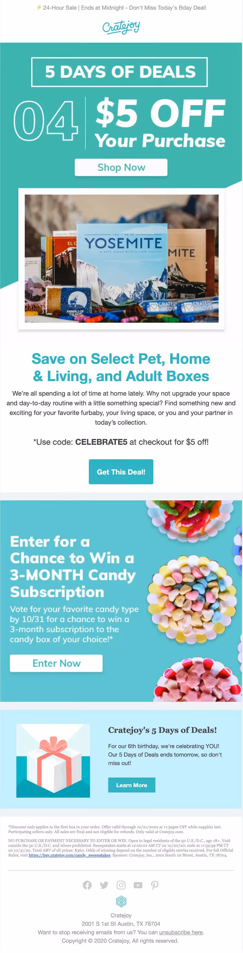
It’s so easy to spot, and it’s bulletproof — a must!
Another way to use color to make a CTA button stand out is to make the module that contains it a distinct color, like in this example from Can’t Clutch This.
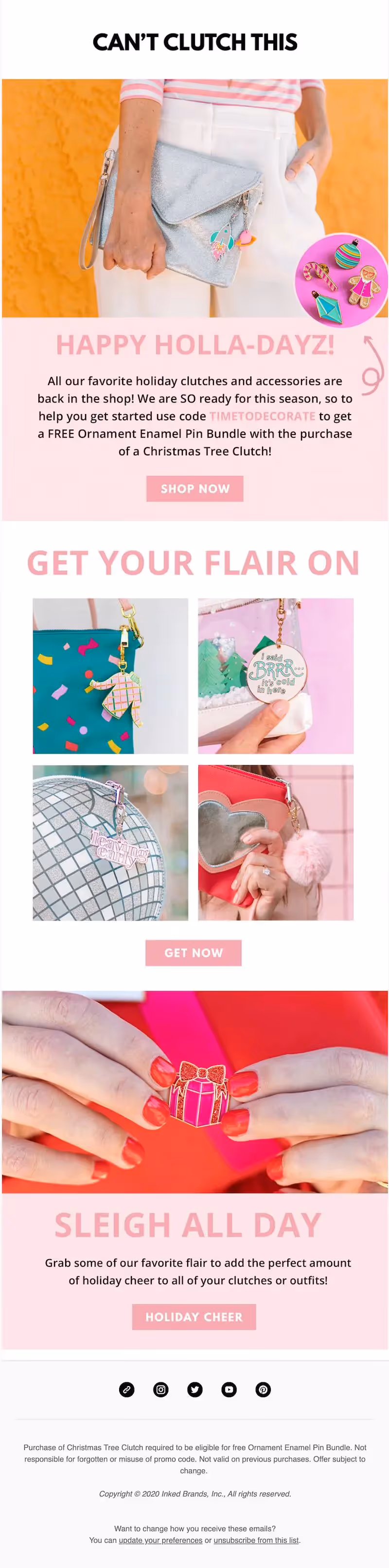
If you’re scrolling through this email, two of the CTA sections immediately stand out because of the pale pink background color compared to the mostly white email.
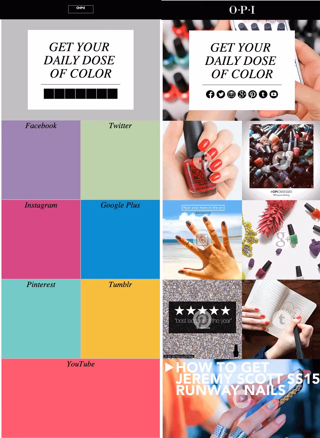
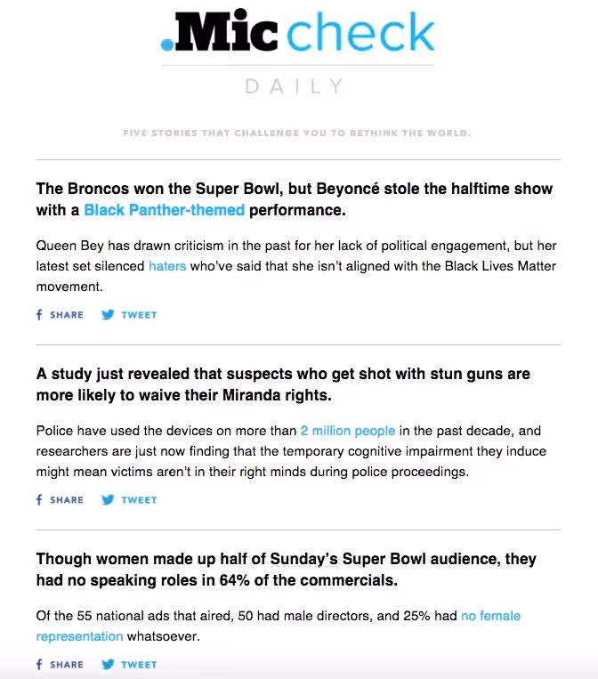
8. USE A COLOR OTHER THAN BLUE FOR LINKS
Readers don’t need the classic bright blue text to know text is linked. Get playful with color in email. Capitalize on branding your email by using an on-brand color for links. Here’s another Robinhood Snacks email that adds a few green keywords here and there to easily call out links to readers.

Similarly, the Mic Check newsletter uses their brand turquoise color in both headers and for links. Against the otherwise all black-and-white email, the links easily stand out.
In this newsletter, Tech Crunch does the same thing. Against the otherwise all black-and-white email, the links easily stand out.

9. USE BACKGROUND COLOR FOR HEADERS, FOOTERS, AND ADS
HTML colors are a great tool for content organization in email: They render across all inboxes (unlike images), they take up less than one line of code and they’re easy to implement. By assigning different background colors to different modules of your email, you organize content and provide a seamless reading experience for subscribers. Using an HTML background color as your header is an excellent alternative to using an image (which may not render). Here, the New Yorker uses a tan background color to distinguish a paid post from the rest of the email.

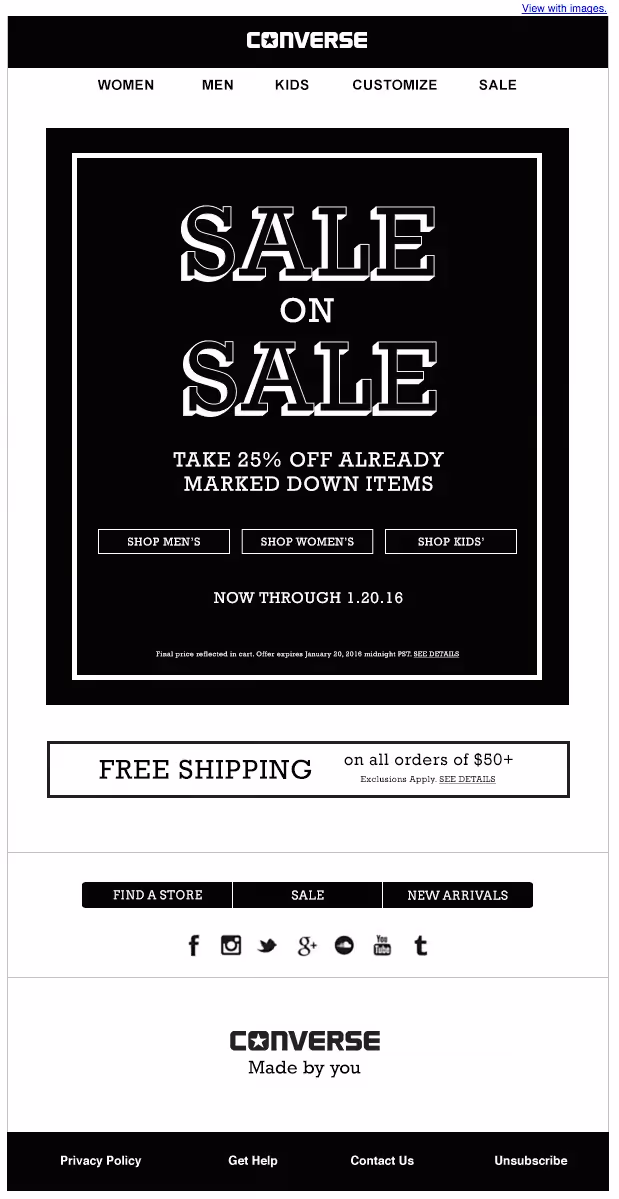
10. GO COLORLESS
One final tip on how to use color? Don’t use it, especially if it’s a regular part of your email design aesthetic. Instead, try an all black-and-white email. Without color to help you call attention to links and CTAs and to help you organize content, you might be forced to simplify, streamline and improve your design in ways you wouldn’t otherwise think. Here’s a B&W email from Converse that we love:
WRAP-UP: GET CREATIVE WITH COLOR
Get creative with color in email by using the BEE email editor. Our drag-and-drop editor is the perfect way to play with background colors, headers, CTA buttons and more, cycling through a rainbow of options before you hit send. Use the BEE editor for free today to create beautiful emails for your subscribers!


