
How to choose the best font for email
Selecting a font for your emails is a small but crucial decision that can make or break the effectiveness of your communication.
Why choosing the best font for email matters
Selecting a font for your emails can greatly affect how your message is read and displayed across different email clients and devices. For instance:
Readability: A font can make your messaging easier (or more difficult) to read. You want it to be comfortable and inviting for readers, including people with visual impairments.
Branding: Some fonts have a modern aesthetic, some look traditional, some look more feminine or more masculine, and so on. The aesthetic theme of your font contributes to the overall brand your email cultivates.
Emotion: Fonts can contribute to the feel or tone of your email. Whether you’re trying to create a fun or corporate vibe your font will impact this. How strange would it be to see a marketing email that was addressing a serious, somber topic using a comic sans font?
Attention: Using fonts strategically can, along with your overall email design, guide readers’ eyes to where you want them to go. This can improve your conversions as you’re guiding readers toward making a purchase, booking a call, or whatever your call-to-action may be.
Technical Rendering: One of the challenges with email marketing is that people in your mailing list are receiving your emails on a wide variety of platforms and apps: Gmail, the iOS Mail app, Outlook, and more. Not all fonts will render properly on all these platforms, so if you choose the wrong font, it could look completely different for some readers.
Each of these things on its own might seem minor. But together, they mean that your font is an important factor in how successful your email marketing is, and every conversion matters.
Best fonts for email
Thinking about all the ways your font can affect your email, it’s easy to get bogged down trying to analyze every font you can find online, searching for the perfect one or the perfect combination.
Don’t worry; we’ve done the overthinking for you already.
While your font choice for each email will ultimately depend on your brand and your message, there are certain fonts that work particularly well for emails.
- Courier
- Georgia
- Lucida Sans
- Tahoma
- Times New Roman
- Trebuchet MS
- Verdana
- Arial
- Helvetica
What is a web-safe email font
A web-safe font is a font that nearly all email platforms and web browsers are able to display properly. Every email app and web browsers can display HTML emails differently, and this is something you don’t have control over on your audience’s end. Using web-safe fonts ensures that your emails are readable and attractive in almost any app or browser your recipients use to view the emails.
All of the nine fonts we listed above are web-safe fonts, but each one also has its own characteristics that make it excellent for email marketing. Let’s break them down.
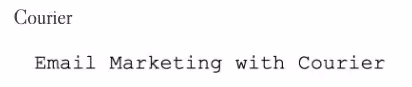
Courier
Courier is a font people often associate with typewriters. It has a somewhat whimsical, old-timey look that can be perfect if you’re going for a vintage feel.
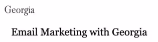
Georgia
Georgia is a font you’ve probably seen often in books and literature. It’s a popular choice for publishing houses and conveys a professional yet creative look in email marketing.
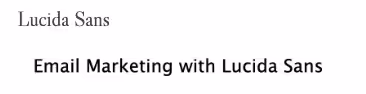
Lucida Sans
Lucida Sans is a font that is common in marketing emails and sometimes websites, but you don’t see it in many other places. Still, it’s a simple and easily readable font that could be perfect for your next campaign.
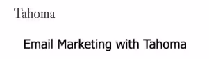
Tahoma
You’ve probably seen Tahoma font more often than you realize. It has a very simple but slightly modern look to it, which makes it ideal for some contemporary brands.
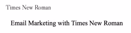
Times New Roman
Times New Roman is about as classic as it gets. It spent many years as Microsoft Word’s default font so chances are that you think of it as the font you used for all your school papers in your youth. It’s a font we all easily read and recognize which is perfect for email marketing.
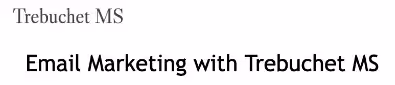
Trebuchet MS
Trebuchet MS font might look familiar because it’s similar to Calibri, a default font in many word processors. It’s standard and clear, without making a strong impression toward any particular style, but it’s straightforward and easy to read.
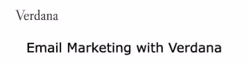
Verdana
If you’re on the hunt for a font that is clear and readable but has a bit of a fun flair to it, check out Verdana. This popular email marketing font has a youthful but still professional look.
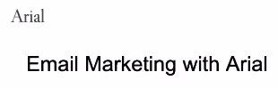
Arial
Arial font is about as simple and standard as it gets. It’s abundantly easy to read and uses fairly minimalistic characters, making it appropriate for a wide range of styles and brands.
Helvetica
As far as web-safe fonts go, Helvetica is the peak of modern chic. This font’s rounded characters and thin line give it a 21st-century look that’s ideal for brands who want the latest in style.
Author's note: Drawbacks of Helvetica and Arial
While all of the fonts above are excellent for email marketing, there’s a specific issue that Helvetica and Arial face: excessive uniformity.
In these fonts, some letters like p, b, q, and d, or i and l, are actually too similar to each other. That can make them tough for readers’ minds to quickly distinguish, leading to misinterpretations. Be mindful of how and when you use them. Avoid these fonts if your company name contains several of these uniform characters, like abode, abide, illicit, or dabble, as it can make your name hard to read and recognize.
Types of fonts
In the world of typography, there are four basic types of fonts: serif, sans serif, decorative, and script. These each have different properties that affect how readable they are and how and when they should be used.
Serif Fonts
Take a look at some text in Times New Roman for a moment. Consider the capital T. You’ll see that it has little lines that come off the bottom of the T, and off the right and left sides of the top line in the T. These little lines are called serifs. You’ll find them on nearly all letters in Times New Roman.
Fonts that contain those serifs are known as serif fonts. Not only do these serifs add a bit of an elegant flair but they can make fonts more readable because you don’t have the problem of excessive uniformity.
Of the ideal email marketing fonts we listed above, the serif fonts are Courier, Georgia, and Times New Roman.
Sans Serif
While serif fonts are those that contain serifs, sans serif fonts are those without serifs. As far as email marketing fonts go, Lucida Sans, Tahoma, Trebuchet MS, Verdana, Arial, and Helvetica are all sans serif fonts.
Decorative
Decorative fonts are fonts that are, well, decorative. They’re highly unique and are usually designed with a niche look that portrays a specific theme. These fonts are designed not necessarily for readability but to catch someone’s eye. For example, you’ll often see these in titles on posters or other design projects, as well as social media graphics and so on.
Script
A script font is a font that looks like cursive handwriting, generally. These fonts, like decorative fonts, are best reserved for titles and other areas in which you want your text to catch a reader’s eye but where there isn’t much text to read, because they aren’t easy to skim at a glance. Script fonts typically have a decidedly elegant, classy look.
Best email fonts for different email use cases
Best fonts for email body text
Your email’s body text and header text have different goals and needs. When it comes to body text, the key is for the text to be easy to read smoothly and quickly. You want readers to be able to read it comfortably rather than struggling to interpret each word. That comes from fonts that don’t just use simple and straightforward lines but that have an appropriate amount of space between each letter and word.
In general, choose a serif font for body text in emails with longer blocks of text - these fonts are perfect for quick reading. Our recommendations are:
- Georgia
- Verdana
- Times New Roman
We tend to scan through emails, and fonts like these have wide enough spacing that we can catch everything even as we skim.
Best fonts for email header text
In your marketing emails, headers are all about snatching a reader’s attention and pulling them in. The fonts need to be readable, sure, but because your headers are brief, they don’t need to be as easy to skim as body text does. You also want to make sure there’s some contrast between your header font and your body font. This allows your headers to stand out and pull in the reader’s eye.
As we noted, serif fonts are ideal for body text. An excellent way to contrast them, then, is to use a sans serif font for your headers. You don’t want two fonts that have so much personality that they clash with each other - you want them to have a natural flow. Any of the sans serif fonts we named above can be excellent for headers, such as:
- Helvetica
- Tahoma
- Verdana
Note that you also want to distinguish between your header text and body text in other ways. Make your headers a larger font size than your body text, for example, and make them bold. This makes it clear to readers that these headers are telling them what they’ll learn from each section of your email.
Best fonts for newsletters
Email newsletters tend to have more text than, say, promotional emails and transactional emails. For that reason, use fonts that are easy to read quickly. We recommend:
- Arial
- Tahoma
- Oswald
- Raleway
Best fonts for business emails
Every email you create for your email marketing should be designed to appeal to your specific audience. When you’re sending a business email or a marketing email to a business, you want to convey a professional and polished image. Avoid fonts that are casual or potentially silly, like Comic Sans or most decorative fonts. Instead, we recommend fonts with a more buttoned-up look such as:
- Helvetica
- Arial
- Georgia
- Poppins
- Ubuntu
Best fonts for email signatures
Your email signature will be on all of the emails you send to all audiences. That means you want the font to be universally appropriate: just as suitable for business readers as consumer readers. Some top options include:
- Open Sans
- Lato
- Tahoma
- Arial
- Poppins
- Oswald
- Helvetica
- Georgia
- Roboto
Best practices for using fonts in emails
Choosing a font is just one aspect of optimizing your emails for readability. Some elements such as font size and color are also important to keep top of mind.
Size
When it comes to email text, size matters. If your text is too big, you’ll have big blocks of text that turn off readers. If it’s too small, it’s hard for readers to read it comfortably. So what’s the middle ground?
- Body text: A 14-point font is considered the gold standard, though anything from 10-16 can work depending on the font.
- For headers: The rule of thumb is to go no larger than 36-point font. Even adding just 3-4 points to your body text can create large enough headers that stand out, assuming it’s a different font and bold.
Color
The colors you choose for your marketing emails are just as important as the colors you use in any other piece of branded marketing. Ideally, use your custom brand colors and, within your assortment of brand colors, choose colors that embody the feel you want for your email.
Remember that body text is all about easy readability, and headers are all about grabbing attention. In general, it’s best to use color in your headers but not in your body text. The color you use should depend, though, on your email’s background color. There are certain rules for readable color combinations, like using black text on a high-contrast color background or using white text on rich, dark colors.
Bold
Bold font can be an excellent tool in directing the reader’s eye in a marketing email. It’s great for headers, helping these high points stand out.
Within the body of your email, though, you can also use brief bold text to call attention to certain phrases. This can be a smart choice for particularly impactful phrases, like “Our latest webinar is your go-to guide for doubling your sales in the next three months.”
Remember, though, that the more text you bold, the less impact it has because it no longer stands out. Less is more.
Link formatting
Adding links to your email text can be an excellent way to further engage readers and prompt conversions. You don’t need to stick with the standard blue, underlined text for links. You can get creative by bolding links and/or putting them in one of your brand colors. This makes them better flow with the design of your email while calling attention to them. But make sure they’re just as readable (both before and after they’re clicked) as the rest of your body text.
Text alignment
For US-based audiences, their eyes immediately start on the left side of their screen because they read from left to right. It might sound like a small detail, but aligning your text to the left makes it easier to read because it coordinates better with your audience’s natural flow.
How to integrate custom fonts in emails
There are cases when you might want to use custom fonts rather than standardized web-safe fonts in marketing emails. For example, when you make the design for your headline message“Flash sale today!” or “Tickets now on sale!” more engaging.
What’s the best way to do this?
Because custom fonts often won’t render properly on many email platforms, one option is to embed the text as an image. Use a design software like Canva to create an image that contains your message in the custom font and place this in your email body. Then, you can use a web-safe font for the rest of the email.
With this optio; however, there are a few caveats to keep in mind.
First, some of your readers might have images disabled in their email platforms, and in that case, they won’t be able to see that snazzy image with your custom font.
Second, remember that some of your readers may have visual impairments, so they might be using text-to-speech features. Those features won’t be able to read the text in your images, so it’s vital to include alt text for the image that tells these readers what the image says and shows.
An alternative is to use an HTML email builder like Beefree. Beefree gives you the option to add custom fonts, like your own brand’s font, for your convenient use.
