Design
Holiday Emails: A Look Back at How Thinx Dominated Design
Happy New Year, beloved email buddies! And congratulations on surviving the busiest season of the year. You did it! Now that the new year is upon us, we thought we'd take a moment to reflect on 2018's holiday email campaigns. In fact, we're going to take a deep dive into how one brand, Thinx, approached holiday emails, all the way from Thanksgiving to New Year's. We'll see how Thinx communicated with customers, offered promotions, and generated clicks throughout the chaotic shopping season. There are great design insights here, and even a little holiday email design inspiration to get you ready for any 2019 campaign on your list. Let's go!
First: What's to love about Thinx email design?
Of all the holiday email examples, we chose Thinx because the brand's approach to email is simple, beautiful, and effective.
Each holiday email we received from Thinx was:
- Focused: Each has a single objective and call to action.
- Clutter-free: There are no navigation menus or header clutter.
- To the point: The copy is succinct and easy to skim.
- Balanced: Live headers and body text accompany images (never any image-only emails).
- Bulletproof: Buttons are bulletproof, high-contrast, and have custom copy.
- Designed for mobile: Each email follows an inverted pyramid layout with large text, plenty of padding between elements, and all of the above mentioned mobile-friendly design approaches.
Let's go! Here's a look at Thinx's 2018 holiday emails...
#1. Thanksgiving Week
Each year, the holiday (shopping) season seems to creep up earlier and last longer. The action really heats up right around Thanksgiving, leading into Black Friday, Small Business Saturday, Cyber Monday, and Giving Tuesday—and, for many brands, expanding right on through in a full Cyber Week(and beyond).For Thinx, Thanksgiving week didn't equate with huge sales or eye-catching promotions. Instead, the brand started out with an awareness and loyalty-building email encouraging readers to watch a video about its ethical and sustainable practices.Subject: We craft our undies carefully and consciously — see how.Sent November 18 (the Sunday before Thanksgiving)
An email like this is a signal to readers about who Thinx is as a brand and what their values are. This kind of messaging can build customer trust and loyalty. It's reminiscent of other brands like Patagonia or Everlane whochoose to opt out of the Thanksgiving-Black Friday madness and instead show readers their real values go deeper. And when it comes to design, this email is strong. The big, bold header—ethical, sustainable manufacturing—tells readers what the email is about immediately. Even if they skip the body content and go straight down to the CTA, they'll get it. Making an email skimmable is important when inboxes are congested. The idea is to convey the most important takeaway and intrigue readers enough to click for more. (Emails are not websites!)
#2. Cyber Week
For Cyber Week, Thinx kept it simple and celebrated the "holiday" that best connected to its brand identity and values: Giving Tuesday.Subject: It’s Giving Tuesday: $5 from every pair of undies goes to Girls Inc. Sent November 27 (Giving Tuesday)
We absolutely love the simple design of this email, from the asymmetrical image layout to the simple lines of text to the custom CTA button. Like the email before it, if you cut the body text and just read the header and CTA button, you still have an understanding of what the email is about and what the action to take is.
#3. Christmas Lead-Up
In the month of December, between the 4th and 22nd, Thinx sent a total of 7 emails. Some promoted a gift set for the holidays and a limited edition style, as well as free shipping, like the ones below—Subject: Hello better period, goodbye shipping fees. Sent December 11
Bold, oversized header statement, eye-catching art, simple live-text messaging, and another great CTA — what's not to love?Subject: Don’t forget about our free shipping! Sent December 17
This follow-up is great and to the point. The only addition we might recommend? A dynamic in-email countdown timer. Many are free to use and easy to implement—and they're effective at creating urgency when you really mean it!
#4. Post-Christmas
Subject: A post-holiday treat from us to you ⛄️Sent December 26
Leading up to Christmas Eve and Christmas Day, Thinx was quiet, then popped back into inboxes after Christmas with a post-holiday sale. Straightforward like the rest of its holiday email marketing, this message is simply and powerfully designed.Subject: 2018 is almost over (and so is this sweet deal!)Sent December 30
Here's the follow-up email, a few days after the first. The hero image is different but still similar, signaling its connection to the first email in the two-message campaign.
#5. New Year's Eve
Year-in-review emails come in all shapes and sizes. Some brands send them in mid-December, and some wait until mid-January. Some enclose detailed information within the email itself, while others link out to a report, like Thinx does, below. For end-of-year email wrap-up inspiration, be sure to check out our post, The 7 Best Year in Review Emails of 2017.Subject: The year in review
As you can tell right away, this illustration is a big change of pace from the photos in the rest of Thinx's holiday emails. Switching up your hero image (or making it a GIF) is like telling readers, Hey, this is different—pay attention! In this case, it's a perfect choice for a year-in-review email.
#6. New Year's Day
Subject: *This* is the year to period better
In this one, there's no promotion and no sale—just a beautiful email celebrating the brand's flagship product. It's a bold way to start the new year, and a great strategy. With a strong, simple sans serif as its header font, an email like this could be optimized in BEE by using live text atop a background image.
Wrap-Up: Takeaways from Thinx's Holiday Email Marketing Strategy
Here are some takeaways we gleaned from Thinx's fantastic holiday email design:
- Instead of saturating readers with emails throughout the season, choose the holidays that best align with your brand and email then (i.e., Giving Tuesday)
- It's okay if your emails all have a similar layout! In fact, using templates is a great way to establish design consistency.
- Change up your hero image to signal a special message (e.g., switching from photography to illustration or a GIF)
- Always customize your CTA text so that readers know why they're clicking
- Follow design best-practices like using ample live text and bulletproof buttons and avoiding clutter and multiple CTAs that vie for attention
Tutorial: How to Make Festive Holiday Ecards for Anyone on Your List
Wise email geeks know the holiday season isn't just about promotions and deals. It's a time to show gratitude and appreciation. That's where holiday ecards come in. Whether the message is a "thank you," a simple season's greetings, an invitation, or something else, holiday ecards are a great opportunity to share a little merriment and cheer. Today we'll show you how to build one in just a few minutes, whether you start from scratch or use a template. Speaking of templates, be sure to scroll down for our gift to you :) Let's get started!
Tips for planning the best holiday ecard
In a previous post,Holiday e-Cards for Your Clients, we established four important things to consider before sending an ecard. Here's a quick refresher.Before you begin designing your holiday ecards this year, take into account:
- Your recipients. Will all your clients, vendors, and customers receive the same message? Consider customizing your email for different segments, or creating different holiday ecards for business sectors.
- Your reason for sending it. Some holiday emails have a call-to-action; others don’t. Some have a note from the CEO; others offer a last-minute promotion. Before you assemble your email, consider why you’re sending it and what your objective is. Your reason will determine the message and the design.
- Your brand identity. A holiday e-card can be one of the easiest emails you’ll send all year. But in order for the message to be effective, readers should feel that it's sincere and reflective of your brand. Use the holiday email as an opportunity to build trust and loyalty.
- Your timing. In the past, many customer-facing holiday ecards have landed in our inbox on December 24th or 25th. Because these emails don’t usually include a CTA, many brands focus on sending a timely message (assuming most recipients celebrate Christmas) vs. being strategic about when most readers would be online and shopping. According to GoDaddy, Christmas Day might have one of the lowest email open rates of the season (but this doesn’t mean your message won’t get read later—which, in this case, is perfectly fine). Once you determine the reason for sending the email, you can choose the right date to send it.
Inspiring holiday ecard designs
Check out a sampling of holiday ecards and their respective approaches to messaging and design—
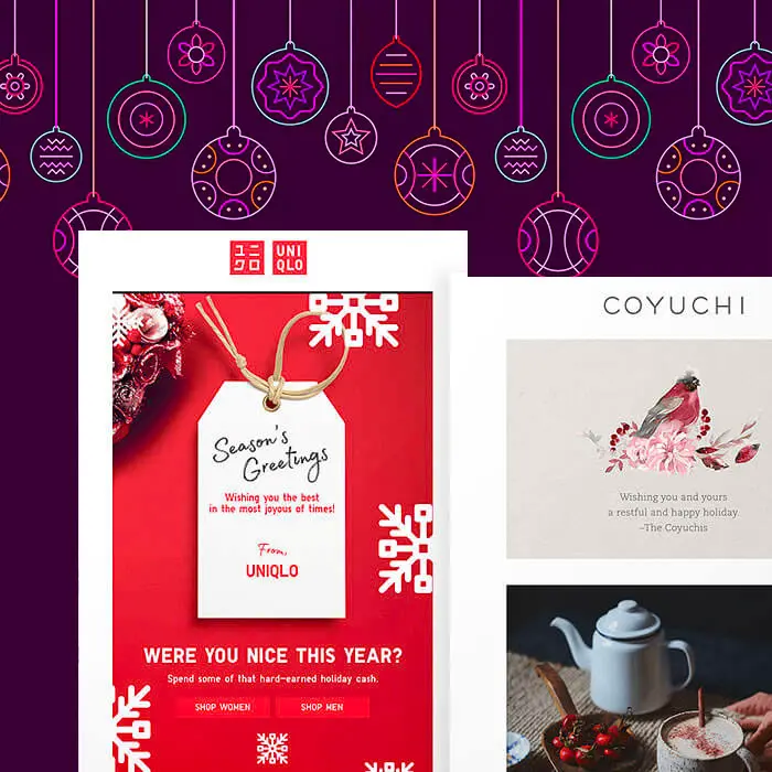
Uniqlo
Subject: To you + yours
This email came in on Christmas day 2017 and includes a secondary call to action. Here's the animation from the image above:
Coyuchi
Subject: Happy holidays from the Coyuchis
Like Uniqlo's email, this one from Coyuchi begins with a simple holiday message and continues with a few CTAs and offers.
Patagonia
Subject: Happy Holidays
No CTA in this holiday ecard from Patagonia – just footer content if you do choose to shop.
Tutorial: Design your own holiday ecard
Ready to design your own email? Here's how to do it in just a few minutes!
Step 1: Set up your email structure
In BEE Pro (access a free trial), we'll start with a blank template. Drawing inspiration from Patagonia, let's set the email up to include the following:
- A simple logo header (image)
- A holiday stock photo (image)
- Header copy (text)
- Body copy (text)
One we drag in the corresponding content blocks, our email structure looks like this:
Step 2: Add your content
We'll drag in our logo to the first content block and type out our content in the following text blocks. For our hero image, we'll use BEE's stock image library to choose something fitting.How to access free stock photos:
- Click Browse
- Click Search free photos
- Type in your search term (e.g., "holiday") and browse
- Click Import when you've found an image you like
- Click Insert to add the photo to your email
Here's how our email is shaping up, before we format the images and text—
Step 3: Format images
First, let's adjust our images. The logo looks like it could use some padding. Let's tap it, then use the content properties menu to add padding to the bottom edge, so there's a buffer between the logo and hero image.
We'll also link the image to the BEE website.
For the tree image, we don't need to add padding, but we can also link it and determine how it will show up on mobile. For instance, we can opt for it to be full width on mobile:
From the Actions menu in the upper left, we can preview how our email will look on desktop and mobile to make sure our design decisions are coming along okay.
So far, so good!
Step 4: Format text
Simply select your text box, then use the pop-up menu to change the font, size, color, treatment, and so on. For our header, we're going with a large 38px font and choosing a serif, Courier New.
Our body text will be Helvetica, a sans serif, and size 18px. We selected a dark blue color for both, which is easy to read against a white background (remember contrast!).
In just a few minutes, we have a beautiful holiday ecard.
12 Sensational Holiday Emails for Business
'Tis the season for inboxes stuffed with cheer! With the last few weeks of the year before us, we love watching the Christmas and holiday emails roll in – especially those with fantastic design. Today we've rounded up some of our favorite Christmas email ideas and other holiday stunners, with tips for recreating these clever campaigns. It's not too late to build (or improve) your own!
#1. Quip
Subject:Better brushing > Holiday rushing. Save 20%, cross your list off early.
Electric toothbrushes may not top your gift list, but this email from Quip makes it tempting, doesn't it? Having a beautifully designed (and discounted!) product doesn't hurt. And neither does this elegant email, with its large, easy-to-read header, animated image, plain text copy, and custom bulletproof button. The shades-of-green color scheme and decked-out logo are sweet touches, too. And here's the GIF:
#2. Everyday Needs
Subject: Gifts For The Chef
Ah, we're suckers for things arranged neatly. It's soothing for the mind, isn't it? This email is beautiful (and reminds us a lot of another photo collage we recreated in a tutorial). The monochromatic color scheme achieved with the all-green image backgrounds—plus the total absence of descriptive text—gives the design a sleek, chic vibe. We'd make that CTA button pop a little more if it were us (with the perfect contrasting color), but otherwise, this email is a stunner.
#3. Suiteness
Subject: Two-bedroom suites for the holidays
Suiteness does a great job of engaging customers with frequent one-question, in-email surveys like this one—and we think it's great. Posing a question to readers is a fun way to get them thinking, and hopefully clicking. Messages like this are not difficult to design, either. Check out our tutorial on how to build a simple survey email with ease.
#4. Dollar Shave Club
Subject: This gift is a crowd-pleaser.
Nothing like a little intrigue in the subject line, right? We like that move by Dollar Shave Club. And inside, this email has a lot of fun stuff going on, too. There's user-generated content, well-formatted text in a modular layout, and CTA buttons that pop. Plus, check out this festive GIF—
#5. Hipmunk
Subject: Traveling This Holiday Season?
Hipmunk has a way of designing short, right-to-the-point emails that are endearing and effective. (Probably in large thanks to its adorable chipmunk mascot). This email is a perfect example of an inverted pyramid layout—image, text, button—one that's easy to design and a great standard to use for a simple email with a single message. We like emails like this! They're clear. After all, emails are not websites.
#6. Shillington
Subject:???? 22 Holiday Gift Ideas, 39 Shillington AGDA Awards Finalists, Industry Guest Lecture and More
We trimmed this longer email from Shillington to give you a taste of its design and flow. It's a great example of how you might format a message that contains a lot of content. Its primary module follows, again, that standard inverted pyramid layout, directing readers to a CTA button that pops. We also appreciate that all the text is left-aligned, which makes it easy to read, and that the header text is so large. It looks sharp. The subsequent secondary content follows a simple two-column grid pattern. Buttons are skipped here, as they'd add to the length of the email, take up space, and look repetitive. Instead you can tap on the images or linked text to read more.
#7. Kosas
Subject: Give Greater This Holiday
The white space in this email gives it a sleek look and makes the black text and buttons pop that much more. Contrast it to Shillington's email, above, which uses a gray background to create a boxed effect. Each email is well designed, and comparing them side by side gives you an idea of how background colors change the vibe of a message.
#8. Malin + Goetz
Subject: Bring the party.
More things arranged neatly, beautiful photography, and CTA buttons that pop. We like how Malin+Goetz formats plain text in a specific way so it feels very on-brand (bold, blue, lower-case). It's a great design move to make when you want to include live text that doesn't look the same as everyone else's. Brava.
#9. Koio
Subject: WIN THE HOLIDAYS
It's an all-image email, but the GIF is so eye-catching, we had to include it in our list! If you have a big GIF in email, do some testing to make sure it's not getting filtered out of inboxes. You might also break the animation into smaller GIFs that line up. And always use ALT text and background colors, so readers who aren't seeing images still get the message!
#10. Harry's
Subject: Don't miss your chance
We love the HTML background colors used in this mystery sale email from Harry's. It's a beautiful color blocked email (easy to design, too!) The copy gets your attention, and it's live text. Here's the GIF at the top—
#11. Alma
Subject: Happy Hanukkah, pals!
This text-heavy email uses a narrow body width to make it easy to read, along with simple content dividers. The CTA button is fun, too, and here's the awesome GIF at the top of the message—
#12. The New York Times
Subject: Givea gift that brings you closer. Starting at $25.
We don't often see an all pale-pink email from the Times, and that's part of what makes this email eye-catching. Switching up your HTML background color is a great way to signal to readers, This promotion is special and different. It goes beautifully with the blue header text, too. And, of course, there's motion in this email, too. Here's the sweet GIF:
We hope you're feeling inspired! This year's holiday emails have been a beauty to behold, and new ones are coming in each day. Use these tips and inspiring messages to update or create your own Christmas email design. Remember you can try BEE Pro for free, and it's immediately a breeze to use. Good luck, and have fun!
11 Mystery Sale Emails With Magnificent Design
We love emails that make us want to tap or click—like on aone-question survey,hamburger menu, or another fun interactive element. Lately, we've spotted a lot of mystery sale emails that invite us to unveil a mystery code, item, or promotion. Have you ever tried designing an email like this? They're a fun spin on the usual promotional message, creating a bit of intrigue and a sense of playfulness. And with the holiday season upon us, mystery emails might be just the creative tactic you need to cut through the noise. Check out these 11 mystery sale emails for inspiration.
Harry's
Subject: New Mystery Item. That’s all we can say.
Step one of a successful mystery email? Mention the mystery in the subject line to get readers curious. And then don't give away too much in the email itself. This email from Harry's is super fun and mysterious. Readers will have little idea what the surprise is; the only hint is that it's a product worth at least $5. Want to know what it is? Us, too! Design-wise, Harry's does a great job of using an HTML background color alongside images, so the email is seamlessly deep teal. There's live text, plus a custom bulletproof button, plus a bit of animation with this sweet little GIF:
Moo
Subject: Areyou feeling lucky?
This email from MOO kind of takes mystery to a whole other level, doesn't it? We aren't sure what revealing our "score" will mean—but there's only one way to find out! We're inspired by how curious this email makes us feel, and how elegantly it's designed. Like Harry's, the message leverages great HTML background colors, plain text, and a compelling CTA (notably placed above the image). Plus, check out the GIF:
Loft
Subject: This may come back to haunt you...
This Halloween email from Loft succeeds with great copy and a simple animation. (By the way, have you seen our tutorial on how to create stunning all-text emails?) It's all one image, though, so if you build an email like this, we definitely recommend a fallback, alt text, and moving that CTA button into a new module so it can stand on its own as a bulletproof element.
General Assembly
Subject: It’s here: Our Black Friday mystery sale
Are you noticing a trend? Mystery emails go hand in hand with animated GIFs, apparently! But we're not complaining. Animation emphasizes the playfulness of these intriguing messages and adds a little delight to our inbox. This one from General Assembly is perfectly designed to fit the season, though we'd recommend the same CTA-related edits for them as we did for Loft.
Grammarly
Subject: LAST CHANCE: This Mystery Sale Ends in 2 Days
Here's a beauty of a mystery email from Grammarly. This time, it's part mystery, part reminder email—one in a series of a drip campaign. The message follows a classic inverted pyramid layout, starting with an image (GIF!), then by a few lines of copy, followed by a CTA. It also employs a fixed-width, which just means the background color of the body of the email is white, while the border is light gray. This makes the central part of the email look "boxed."
Teavana
Subject: Everyone Loves a Mystery Deal!
It's a mystery email without animation! And it's still just as stunning. This email's high quality photography, ample white space, large type, and easy-to-spot CTA buttons make it pleasant to look at. We wonder, though, how having a second module of non-mystery content impacts interaction with the mystery CTA. (A/B test it!)
Tarte
Subject: SURPRISE DEAL INSIDE
For this next set of emails, be sure to hold onto your keyboard! There's a lot of spin action. Tarte's mystery sale email—and the two that follow—all include roulette-inspired GIFs. If your mystery promotion varies for recipients—i.e., some folks will get one discount, like 30% off, while others will get another, like 20% or 10%—using a roulette animation is a fun way to make it feel like a game. Of course, the wheel is just symbolic; readers can't actually interact with it. But the effect is still interesting and—hopefully—engaging! And, you can always build an actual interactive roulette wheel on your landing page.
Logitech
Subject: Your Mystery Coupon Expires TODAY – Up to 25% Off
Here's another wheel from Logitech! There are great contrasting colors used here, so each part of this email-in-motion is easy to read and fun to look at.
Sperry
Subject: FINAL HOURS: Up to 30% off - Mystery Sale
And for good measure, here's one last wheel from Sperry—
Dizzy yet?
Lucky Brand
Subject: Our Mystery sale is back for ONE MORE DAY!
We love this GIF from Lucky Brand, though it is essentially a single-image email (not a design best practice). But the copy before and after the animation—along with the CTA—could easily be designed in-email instead of baked into an image (especially easy using BEE!)
MAC
Subject: LAST CHANCE to Get a Haute Mystery Haul for Only $49 ($95.50+ value)
One last email to round us out! Here's a black-and-white mystery message from MAC, with this animation:
There are tons of ways to design your mystery sale email, and we hope these examples leave you feeling inspired! Don't forget to check out afree trial of BEE Proto design magnificent emails with our easy-to-use, drag-and-drop editor. We even have a template for a mystery email right here. You'll also get access to holiday templates, stock photography from Unsplash, and cutting-edge features like background images—No coding required! So get designing, and have fun!
Tutorial: Create a Simple, Beautiful Typographic Email Design
Ever spot a simple, stunning photo-less email in your inbox? For many brands—especially those that focus heavily on product images or illustrations—a no-image email is a nice change of pace. Readers can tell right away it's different, and that novelty can catch eyes (and earn clicks!) So if you don't have any photos or art in your email, what is in it? Text, of course! We're talking beautiful, typographic email design. With live text. Give your plain text a little formatting love, and your email will stand out from the rest. It's easy!
Inspiration: Beautiful, font-forward emails
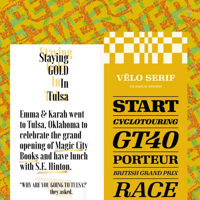
Check out the inspiration for today's typographic email design tutorial. Each of these emails relies almost entirely on creative copy and text formatting to shine.House Industries
Belletrist
Stumptown
Glossier
Youth to the People
Today's tutorial: build a beautiful typographic email
To create an eye-catching, text-based email, here's our secret: All you need is live text + HTML background colors. No Photoshop, no design assets, no images. Just great copy, styled smartly.Let's get started with a single-column blank template in BEE Pro.
#1: Narrow your width
Since we're building an email comprised only of text, narrowing the width of the message body is an important step to making it easier to read. (Picture the way narrow newspaper columns make the content more legible.) A narrow width also helps the text stretch from edge to edge in the body of the email (like in a fixed-width message).To adjust your content area width in the BEE editor, navigate to the Settings menu on the right side. Drag the slider down to 500px (or as low as 480px).
#2: Choose a great serif or san serif—or both!
In the examples above, most emails stick with a single, large typeface. Glossier and Youth to the People stick with sans serifs, while Stumptown and Belletrist use serifs.Here’s a reminder of the difference between serifs and sans serifs—the red image shows where the little "serifs" are:
Image from w3schools.com
Quick font refresher: Email safe fonts vs. web fonts. vs. custom fontsEmail safe fonts (AKA "live text" or web safe fonts) like Arial, Helvetica, Georgia, Times New Roman, Courier, and similar default fonts render on any computer or device. Choosing these fonts for emails is a design best practice because they’re so reliable.Web fonts are designed specifically for the web and are somewhat less reliable than live text options, but they’re still found on many – if not most – devices. These are fonts like Open Sans, Roboto, Lato and others. Many popular web fonts are Google Fonts.Of course, there are fonts out there other than these web safe or web font categories. And many brands have custom fonts—typefaces that have been modified or designed specifically for a brand. More often than not they’re simply added as an image in email.Pro tip: You can customize the fonts you have access to in the BEE editor, adding additional web fonts and even custom ones (but be sure to have fall-backs!). Here's how.
Let's begin by drawing inspiration from Stumptown and choosing a serif font, like Georgia. In the Settings menu, you can set your default email font.
And not every text block we drag and drop into our email will be set to Georgia.
#3: Go BIG
One thing all these great font-forward emails have in common? The text is LARGE. That's an intentional design move. Here's how to recreate it. Simply use your drop down menu to choose an ultra-big size. Test out a few to see which feels right. (You can preview your email on mobile, too.)
#4: Think contrast
Now, let's have fun with color. Not only do our inspiration emails use a large typeface, but they also use great bold colors. That's part of the appeal—and the fun!The trick is to choose a great font color that contrasts against the background so it's easy to read. For Stumptown, both blue and red contrast well against the white background. We'll use the Custom color option in the type menu to get the right shade.
Note we're also centering our text. Since it's just one word in a column, centering is okay (for other long blocks of text that need to be read, stick with left-alignment).Now let's duplicate our row, making the next one blue.
We can duplicate each row multiple times, then drag them so they're arranged by alternating colors. It's coming together!
#5: Minimize padding
To achieve tighter spacing between each row, we need to decrease the padding on each row and content block.Use the Row Properties menu to reduce padding on the row....
...then Content Properties > Block Options to decrease padding on the content block itself, making sure all padding is set to zero.
Now our message is much more condensed.
Important bonus tip: Have fun!
These emails are super fun to make, because you can essentially try different font and color combinations until you land on something you love. So play around a bit! You can mix-and-match fonts, like in House Industries' email, along with colors, like in Youth to the People's email. Just keep in mind your brand guidelines so that your email looks like it came from you. (Don't go too wild!)Watch our quick video for tips on how to have fun with colors and fonts. And happy designing!
5 Pro Tips for Black Friday Cyber Monday Email Design
Each year the holiday shopping frenzy seems to start earlier that ever before. It's "Christmas creep," but it doesn't have to be a bad thing. The exaggerated timeline gives companies an opportunity to invent their own approach to holiday email marketing, getting creative with how and when they offer promotions. From Black Friday in July to Cyber Week to extended Cyber Week, we feel like we've seen it all. And with Thanksgiving just a few days away, it's time to check out how companies are approaching 2018's Black Friday and Cyber Monday email design. How are you going to grab readers' attention? Let's take a tour of this year's trends to get inspired:
#1. Give shoppers a heads-up
Whether you're starting your sale earlier or sticking to a more traditional timeline, you can give readers a heads-up about what's coming. It's a way to drum up excitement and maybe get a better turnout for your promotion. We spotted a few brands doing just that.
Frank & Oak
Subject: Mark your calendar for Black Friday ????
Frank and Oak actually gives readers the option toschedule their savings with calendar shortcuts. It's an unusual idea, and a clever one. Plus, this email is beautifully designed with well-formatted text (super legible, large, left-adjusted, with great contrast!) and a stunningly simpleblack-and-white design. And check out the animation, too—
Sonos
Subject: Get ready for Black Friday.
Like Frank and Oak, Sonos is letting readers know that deals are coming. Instead of an add-to-calendar CTA, Sonos asks readers to make a list and explore its gift guide. A tap on the CTA button takes readers to a gift guide landing page where they can check out items and possibly buy early.
#2. Count it down
All these holiday events are a great opportunity to add a countdown timer to your email design. It only takes a few steps, we promise! Here's what we do:
- Open the BEE editor to build and design our email message.
- Add a countdown timer via a generator! A number of online platforms (listed below) also offer easy-to-use countdown timers to add to any email campaign:
- Sendtric
- Nifty Images
- FreshRevelance
- PowerInbox
- MotionMail
And speaking of Nifty Images, they used their own timer 2x in this countdown email—
Nifty Images
Subject: Black Friday is almost here, are you ready?
Here are the GIFs in motion. Black Friday:
And Cyber Monday:
Staples
Subject: FIRST LOOK: Check out your Black Friday sneak peek!
It's not the most beautifully designed email, but Staples makes good use of its own timer-in-action in this Black Friday sneak peek email:
Timers add a sense of urgency, and we're always in favor of a little in-email motion to show the value you place on good design—and in delighting your readers!
#3. Start early
We know you've seen them: pre-Thanksgiving, early Black Friday, early-early Cyber Monday promotion emails. The sales before the sales are rolling in by the dozens! Some extend through the holidays, while others are their own singular, pre-holiday events. Let's see how brands are getting the party started early.
Food52
Subject: Sneak peek! Get 60% off this Staub cocotte—you've got 24 hours.
And here's the hero GIF:
Pretty, right? In this Black Friday "preview," Food52 chooses a single product to feature and discounts it steeply for 24 hours. It will be interesting to see how this sale performs vs. ones later in the week. Design-wise, this email does a great job of using motion to snag readers' attention, and it breaks into a two-column layout to display a numbered list of benefits (sort of like a photo collage with text). We love it!
Article
Subject: Article’s Black Friday Sale has begun ????.
Four days before Black Friday and furniture company Article is announcing the sale starts now. And what a beautiful way to do it. This animated email is simple, sleek, and stylish, just like the brand's furniture. Of course, if we were designing the email in BEE, we'd suggest positioning live text and a bulletproof CTA button on top of the image instead of baking them all into one.
Huckberry
Subject: We're stuffffffed
This email from Huckberry was so chock full of deals, we had to trim it. You get the idea from the first few modules. What follows is a continuation of the z-pattern single column modular design that you can see here—a good option for long, product feature emails. We like the hero image here and the color scheme. It stands out from other Huckberry emails and therefore seems special—exactly what you want to communicate if you're a brand vying for attention this holiday season. The black copy is live text, too (but show us some bulletproof buttons, Huckberry!) All in all, this "early access" email does the trick.
#4. Opt out?
For the past few years, REI has closed on Black Friday. While many brands are able to resist the pressure to open on Thanksgiving, REI seems to be one of the only ones to remain closed on Friday as well. And evidently, the move has been good for the brand.We're including REI's #OptOutside campaign in our roundup for inspiration on breaking the mold. And we found another email that takes a different approach to Black Friday, too. Check 'em out...
REI
Subject: This Black Friday: Rethink Your Routine #OptOutside
We love this combo of a beautiful, illustrative hero image with photography to follow. The opener really grabs your attention, while the single column modular design makes the rest of the content easy to browse.
Pact
Subject: 10 Tips for a Green Black Friday
While this is a promotional email from Pact, it certainly has a different vibe from most of the others we've spotted. And chances are, its readers—who are likely environmentally-conscious folks—appreciate that. Both REI and Pact provide great examples of the importance of knowing your audience, then tailoring the content and design to resonate with them.
#5. Extend throughout the week
Cyber Week is a thing now. And it starts on November 26th. That means if you want to cash in on consumers' shopping behavior beyond the weekend, you've got to be ready with a great campaign. One message isn't enough! For inspiration on how to extend your own cyber week emails, check out these handy guides:
- Email drip campaigns: inspiring design tips
- How Fitbit dominates email stream design
- 6 brands tackle product demos in email
- How to get the most out of your email templates
Feeling inspired to get those opens and clicks? Check out afree trial of BEE Proto design stunning emails in our easy to use drag-and-drop editor. Create the perfect CTA buttons, arrange live text over images, build custom photo collages, and much more. Happy Turkey Day, and happy designing!
Election Day Emails: Which Brands Are Getting Out the Vote?
In these politically charged times, many brands are asking themselves how to use their voice. For the 2018 midterm election, we were curious to see who would choose to send Election Day emails. And we were surprised to find some unexpected answers in our inbox. All kinds of companies and organizations spoke up about Election Day, encouraging readers to vote in their own unique, on-brand way. Scroll down for some serious inspiration.
Beauty brands make it count.
These skincare and makeup brands show their brand values go deeper than a smooth complexion.
Youth to the People
Subject: WEEKLY BOOST: It's time.
We love this modern, edgy look from YTTP. The asymmetrical layout, bright HTML background color, and large text make this message bold and eye-catching.
Milk Makeup
Subject: Make it count.
In this Election Day email, Milk Makeup tells its readers exactly what the brand stands for: self-expression in beauty and action. It's a strong, effective statement that connects its mission directly to the call to action to vote. Plus, check out this sweet GIF:
Coffee culture calls for action.
All fueled up from your morning cup-o-joe? Good—now these coffee companies want you to use that energy to get to the polls.
Stumptown
Subject: Brew up some democracy - Stumptown is getting out the vote????????
Like all the brands on this list, Stumptown isn't telling you how to vote; it just wants you to do it. And this beautiful design is a great example of how well-formatted text can go a long way. No pictures? No problem.
La Colombe
Subject: Your voice. Your vote.
La Colombe isn't just inviting you to vote. The brand also wants you to know it supports its employees in voting, too, which certainly makes a statement about its brand values.
The fashion and apparel industry speaks up.
Some fashion brands offered promotions for customers showing up with I VOTED stickers, while others encouraged readers to show up.
Madewell
Subject: One word: Vote
Like many apparel companies, Madewell sends a promotional email daily featuring new products, sales, consumer-generated content, and the like. Needless to say, this one stood out. What's notable about it is that it shows a real commitment to the message. There's no tie-in promotion. Even the CTA button is about finding your polling place, NOT about shopping. We think it's great. Plus, who can resist a good countdown timer?
Athleta
Subject: Today, run outdoors. Tuesday, run to the polls
Athleta provides a little prod to vote in its subject line, followed by this last module. It's a more subtle approach than Madewell; each brand has to determine what works best for its voice and audience.
J. Crew
Subject: It’s go time: Take 40% off wear-now styles
You almost wouldn't know this is a "go vote" email (no subject line mention), but the election day promo from J. Crew includes a discount at the very bottom. The bold background color makes it stand out.
Mission-driven brands
For brands on a mission to protect the environment, election day emails show a commitment to the cause.
Patagonia
Subject: Get to the polls.
Patagonia's email is one in a series of election day messages the brand sent these past few weeks. While the brand is known for producing outdoor apparel and gear, it also has a long history of commitment to honoring and protecting nature. The design simplicity here is powerful. Patagonia is literally making a statement, and it's hard to miss.
Parks Project
Subject: You Ready to Vote for Parks?
For a brand that's dedicated to national parkst-shirts, hats, and accessories made with purpose, this email is right in line with what customers would expect. It's a long one, but we appreciate the single column modular design and great use of live text.
Seventh Generation
Subject:Commit to Clean on Election Day
Seventh Generation sent a climate-themed email chock full of information for readers, along with encouragement to vote. The modular design is easy to follow and the CTA buttons, while not overly compelling, are easy to find.
Plus a few more:
Lyft
Subject: Election Day is tomorrow. Need a Lyft ride?
This email from Lyft is a beauty. Simple, crisp, clear. Live text. Huge legible headers. A clear CTA button you can't miss. Bravo!
Tattly
Subject: Useful (Voting) Things To Click On + a Special Giveaway
We love this hero image art from Tattly. And the email altogether is easy to read and a pleasure to look at. A bulletproof button here or there would be nice, but we'll take it!Did you see any Election Day emails you admired? Let us know! And we hope these examples provided some inspiring examples of how to navigate politics in a way that suits your brand. Happy email designing!
9 Breast Cancer Awareness Month Emails That Show Us How to Connect
October was Breast Cancer Awareness Month, a yearly campaign to raise awareness about the disease. In the U.S., each woman has a 1-in-8 chance of developing breast cancer over the course of her lifetime. Given the disease's far-reaching impact, we see a lot of brands take up the cause – and it's certainly a worthwhile one!Because the disease touches many of us so closely, Breast Cancer Awareness Month emails often speak from the heart.They offer us much to learn about how to tackle sensitive and personal topics in email marketing, and about how email design can support that connection. Let's take a look at some emails that caught more than our eye this year:
UrbanStems
Subject: On a personal note
This is a simply designed email with big impact. Whenever you're addressing readers in a different way—that is, you're breaking from your typical email marketing format—it's so important to establish the shift in tone immediately. (That's how you earn attention!) UrbanStems does just that with (1) the subject line and (2) the upper banner that announces exactly what the email is: a message from the CEO. This is just the right layout for a letter-style announcement email. The content gets right to the point—no modules or CTA buttons needed. And the signature is the perfect way to show how personal this message is. (PS: If you want to create a seamless transition between the background color of an image and the background color of the body of your email, check out this tutorial.)
Hint
Subject: Support Breast Cancer Awareness with Us!
Hint is fruit-infused water. You might not know that from this email, because hint does a pretty good job of shifting the focus from their product to the real humans behind it. (Zero product images!) These testimonial notes are a beautiful use of user-generated content. Since they're the centerpiece of the email, hint uses a nice large size font (easy to read) and sticks to live text (no rendering issues). And while there's no personal sign-off like UrbanStems (because the email is from the brand voice, not a single person like a CEO), hint still adds a touch of warmth to the tone by addressing the email to "our community" and signing it "the hint family." These are simple copy choices that work well here because they match the serious nature of the content.
Lunya
Subject: F*!# BREAST CANCER
Lunya is a luxury sleepwear brand for women. This message, like the ones before, speaks from the heart. And f*** cancer isn't just a sentiment; it's also the name of Lunya'scollaborator: F*** Cancer is a movement and organizationdedicated to prevention, early detection, and emotional support for folks impacted by cancer. When it comes to design, Lunya makes similar choices to hint and UrbanStems: no nav menu or clutter at the top; no frills or buttons. The message is direct, which makes the email feel personal. And the founder includes a signature, too, giving this message the vibe of a hand-written note.
Athleta
Subject: Join us this October
There's more going on in this email than in the previous ones, including this animated GIF at its center:
That's because, unlike the other emails so far, Athleta has a product to introduce in this breast cancer awareness email. The email is beautiful and the message is important, even though Athleta doesn't follow many of the usual email design best practices we espouse to make sure emails render well across devices and ESPs (live text, bulletproof buttons, HTML background colors, and so on). But one thing that caught our eye was how easily the hero image and text could have been optimized by using a background image instead. In BEE, we love having the ability to upload any image, then position and format plain text over the top however we like. (And buttons, too!) If you haven't already, be sure to check out this easy-to-use feature.
Well+Good
Subject: Let's talk about boobs...
If you often send content round-ups or content heavy emails, this email layout from Well+Good is a great model to follow. The modules are all formatted the same (same size image + plain text header) so it's easy to skim and tap on what grabs you. This is a classic, single-column, mobile-friendly design. And check out the awesome animation in the hero image!
The Company Store
Subject: Help Us Fund the Cure
This email design from the Company Store does a great job of leveraging white space, modular design, a z-pattern content layout, easy-to-spot CTA buttons, and sweet spot illustrations. But you already know what we're going to say: a little plain text would make it even better! And bulletproof buttons. We don't want to be a broken record; we just want to make sure your emails stay out of spam folders and render beautifully :)
Crocs
Subject: Introducing our new collaboration with Susan G. Komen
We're glad to see great use of live text in this Crocs email. Some argue that "ghost buttons"—buttons with the same color as their background and only an outline—can be tough for readers to spot, but the ones Crocs uses here stand out. That's because they're sized really well with large text and a good amount of padding. Easy to tap, especially on mobile!
The Laundress
Subject: Things We Love | Think Pink
Unlike some of the more personal emails shown at the beginning of this post, this one from the Laundress is more of a direct, simple call to action. Which is totally fine! Not every brand needs to tug on readers' heartstrings. Every company will be different. Here, we appreciate how succinct this message is and how the CTA is customized and clear.
Estée Lauder
Subject: Support Breast Cancer Research with AERIN
And for good measure, here's one more breast cancer awareness email to close out our collection. It has a fresh, airy, pretty vibe. But aside from what we always suggest (yes: live text), would you make any other updates to this email? One thing that comes to mind is one of our takeaways from #LitmusLive 2018: It's best to left-align body text in email. Centered text, as seen here, can be tough to read. Did you notice?We hope you enjoyed this roundup and gleaned some design inspiration for your upcoming campaigns. If you've spotted other enviable Breast Cancer Awareness Month emails, send them our way!
5 Halloween Email Design Tricks for the Most Spooktacular Campaign
Calling all email geeks, goblins and ghouls: Are you ready for Halloween? The spooky holiday is almost here, and our inbox is full of frighteningly fantastic examples of Halloween email design. There's still plenty of time to assemble a spooktacular Halloween email campaign, so let's take a look and get inspired!
#1. Try a call-to-BOO! button.
This is a simple design move anyone can do—and should do! And that's to customize your call-to-action buttons to align with the holiday. Have fun with it! CTA buttons should be direct and clear, so that readers know exactly why they're clicking. However, that doesn't mean there isn't room to get creative and show your festive spirit.Look how the Noun Project sets up its first module with stunning design simplicity, plus a bit of playfulness via its button:
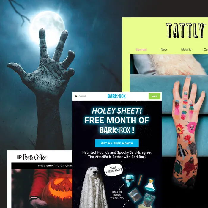
We love how each module includes a big, clear header followed by only a line of supportive text and then a CTA button that pops. No fuss or frills here—just great design. And a bulletproof CTA button that says "BOO!" is an easy way to include a little bit of mobile-friendly flair.This Halloween email from Bark Box has a totally different vibe—it's all image-based—but like Noun Project, the dog-friendly brand has a bit of fun by customized its buttons.
"Get it before it disappears" is a little more explanatory than just "Boo," but it's still festive and playful. Pick a short message that makes sense for your audience and email and have fun getting spooky with your CTA!
#2. Select spooky stock images.
Need to assemble a Halloween email in a hot second? Here's another tip that takes little to no time. Get your content and call to action ready, and then search for a witchy stock image that fits. Then you're ready to roll!Here's a simple example from Peet's Coffee:
Not only does Peet's snag an appropriately creepy stock photo for its Halloween email, but the brand found a way to serve up coffee-relevant content about dark roasts to fit the holiday. It's clever and interesting—and a nice departure from the common approach of simply offering a discount and asking readers to shop.Need a source for free stock images? Remember that the BEE editor has a built-in search tool for finding free photos at your fingertips from Unsplash, Pexels, and Pixaboy. You can even customize them as needed, including layering live text on top! If you haven't checked out this feature yet, now's the time.
#3. Don't be afraid to commit to color.
You might be afraid of ghosts (no judgment), but don't be afraid of color! We spotted a few Halloween emails with gorgeous edge-to-edge color.Check out this one from Postable:
And another from Tattly:
Want to know how to douse your email in beautiful, vibrant HTML color? It's easy:
- Choose the same content background color and row background color, giving your email a "full-bleed" look
- If you want to match the background color of your email to the background color of an image, choose the same HTML code color for a seamless transition (see our tips for how to use HTML background colors alongside images)
That's pretty much it! It's simple, and the effect is a big splash of color in your readers' inboxes. It's a nice trick to try for a special occasion like a holiday, especially if you typically stick to white backgrounds.PS: Check out the GIF from Tattly's email:
#4. It's alive... text.
By now we email geeks all know the magic and importance of live text. Still, all-image emails do abound in our inboxes, even though we know live text helps emails render smoothly across devices and stay out of spam folders. But there are easy solutions that involve no complications or coding.Instead of building your content/text into your image, you can either (1) simply position well-styled plain text above and/or below your image (like a traditional inverse pyramid layout: image, text, button) or (2) position your well-styled plain text ON TOP of your image. Yes, that can be done! Here are the easy steps.If you go the plain text-atop-background-image approach, your emails can be optimized across devices and email providers and look lovely, like this one from King Arthur Flour:
And you can even put an animated GIF behind your live text, achieving a look like this Paperless Post email:
#5. Bewitch readers with GIFs.
Call us easy to please, but we're always delighted by a little inbox animation. Building an animated GIF for your email takes a little more time than these other Halloween email design tricks, but – if you have the resources – we always recommend it! Once your GIF is ready, including it in email couldn't be easier: it's the same as plugging in a still image.Here are some bewitching in-email animations that caught our eye recently:Chobani:
Urban Outfitters:
And one more from Tattly:
Have you spotted spooktacular Halloween email designs in your inbox? Let us know what's inspiring you! And if you're still in the process of putting together your own Halloween campaign, implement these 5 tricks with a free trial of BEE Pro. The drag and drop tool is easy to use and all emails are mobile responsive – no coding needed. So get in the spooky spirit and start designing!
Skin Care Industry Emails With Stunning Designs
The skin care industry is booming. And there are no signs of slowing down, especially as consumers reach for options from an ever-expanding market of natural and organic brands. So what can we learn from how these brands areapproaching email marketing? We collected dozens of skin care industry emails and are excited to share a few of our favorites with you. Scroll for inspiration and design tips, no matter your industry!
#1. Curology
Subject: Welcome to Curology
The first thing that caught our eye about this email was the tiny GIFs included throughout:
Aren't they sweet? Little touches like this really make an email stand out. These GIFs aren't necessarily demonstrating any useful information; instead, they're working to demonstrate a brand identity that's friendly, playful, and charming. Those things go a long way, making emails from Curology a treat to receive. Another notable design choice in this email is its color scheme. The combination of white, gray, and muted blue-green creates a soothing effect. Using a limited width or "boxed" message layout—with a gray border around the body of the email—adds to a warming effect, whereas all white throughout might come across as relatively more sterile.
#2. Panacea Skincare
Subject: Hit Refresh
We love how spare and stunning this welcome email from Panacea is. The beautiful asymmetrical layout of images is a design choice we're seeing more and more of lately. It makes the email feel modern and chic—almost like a print magazine—and the ample white space alongside photos and between content blocks offers a fresh vibe. Don't forget that in the BEE editor, live text and bulletproof call-to-action buttons can be positioned atop images for a mobile optimized design.
#3. Hims
Subject: SkinRx is here. your $20 offer inside.
There's nothing particularly extraordinary about this design, but it certainly stood out in our inbox. Too many emails are over-designed, with navigation menus, multiple typefaces and type treatments, and colors galore. However, this one from hims looks sharp in its simplicity. The color gradient between the photo and photo background color, plus the beige border color, creates a warm, monochromatic style that's super pleasing to the eye. The content is short and sweet, and, importantly, the text is live. CTA buttons are easy to spot, too. All well done.
#4. Supergoop!
Subject: "What is blue light?”Check out the cinemagraph that's the highlight of this email from Supergoop!:
Here it is in the body of the email—it's so quick that getting a still screen grab wasn't possible!
Cinemagraphs are "still photographs in which a minor and repeated movement occurs, forming a video clip." Here, it's published as an animated GIF, which as we know are rather email friendly. We don't often see cinemagraphs in email, but as we combed through skin care industry emails, we definitely noted they were somewhat of a trend in this corner of the email world. And it makes sense: They're a great, quick way to demonstrate how to use a product, as in this cinemagraph from another Supergoop! email:
Or this one from Milk Makeup:
#5. Moon Juice
Subject: What we love
Positive reviews can be incredibly impactful to consumers when evaluating products. And occasionally, we even see reviews from those inside the company itself, as in this message from Moon Juice. What makes it work well here is that each person's name and department is offered, making the reviews feel super personal. They're also only a sentence or two, which is appropriate for email.
#6. Saturday Skincare
Subject: Welcome to Saturday Skin!
This email from Saturday Skin is relatively "traditional," but they made a few sweet design choices that are worth pointing out. First, for a welcome email, that ultra large "hi!" at the header is attention-grabbing and feels warm. In case you forgot what you signed up for, they state what to expect in the opening lines and provide an image that showcases the products. That builds trust (and probably helps diminish quick unsubscribes). The modular design bolsters the modern feel (along with millennial pink, naturally), but we'd definitely recommend upping the live text here. It's so important to break up images with plain text content, especially for mobile devices—and to stay out of spam folders.
#7. Hey Day
Subject: Fall is coming...????????????
And speaking of live text, this email from Hey Day does a beautiful job of incorporating it alongside images. The circular cropped images and z-pattern layout are nice touches, giving this email an airy, pretty feel.
#8. Glossier
Subject: Feels good, smells good
Glossier tends to impress us on the email front, and we've written about the brand's email design style a few times before. Many messages are sleek and simple like this one, with a bold header, image, and CTA button that pops. Like Moon Juice, this one features a review from a Glossier employee. Do you find it compelling? We'd love to hear your thoughts on this email and others!And if you're feeling inspired by these skin care industry emails, we hope you'll check out a free trial of BEE Pro, where you can design stunning emails in our easy to use drag-and-drop editor. Style the perfect CTA buttons, arrange live text over images, create custom photo collages, and much more.
Litmus Live 2018: 10 Must-Read Email Design Insights
Email geeks, did you attendLitmus Live2018 in Boston? Over the two-day gathering, email pros talked all things strategy, process, design, and development. We never want you to miss out on the latest in great design insights, so we rounded up the best email tips from #LitmusLive and gathered them here.Read on to get the scoop and join the conversation!
Tip #1: Undesign your design.
How do you feel about un-designed emails? Is there a valid case to be made for ultra design simplicity? We're intrigued by this conversation!https://twitter.com/litmusapp/status/1042427609047552000The idea of an undesigned email is that it's more personal. It feels like it's from a friend, not a big company. And establishing those close connections with your audience is critical.https://twitter.com/popculturelord/status/1042430061410955264A text-based template is super easy to assemble and definitely something that every brand should have on hand.https://twitter.com/tnrt/status/1042428767048740864
Tip #2: Keep it to 50 words or fewer.
We are always talking about readers' short attention spans—and for good reason! The average reading time for an email is a mere 11 seconds. That's quick. And it means you might want to consider saying what you need to in 50 words or fewer.https://twitter.com/lisackeller/status/1042066212908396545One trick to test if your email is short enough is the "one breath test."https://twitter.com/chadswhite/status/1042142281367605248Another recommendation is using a three-sentence formula. Simplicity is a beautiful thing!https://twitter.com/meladorri/status/1042066615360266243
Tip #3: Design for aging eyes.
At #LitmusLive, designer, illustrator, and director Mike Hill talked about the importance of designing email for an aging population.https://twitter.com/litmusapp/status/1042066160651517952The stats are seriously powerful.https://twitter.com/logansandrock/status/1042065947912286208But remember, we're all aging, folks. And we all want to be treated with dignity. Mike makes an important point:https://twitter.com/brittles_86/status/1042071112732102657What can you do? Get familiar with how vision changes with age. Make sure you're paying attention to sizes (text, images, buttons), color, contrast, and – of course – amount of text.https://twitter.com/pompeii79/status/1042065868237275136
Tip #4: Stick to one CTA.
We couldn't have said it better ourselves...https://twitter.com/litmusapp/status/1042145459630956545We love all arguments for simplification, and this one is a favorite! As we all know by now, emails are not websites. So keep your message direct, succinct and on-point with a single call-to-action.
Tip #5: Get personal, but not too personal.
Emails that personalize can be super powerful, especially when executed creatively.https://twitter.com/lovevalgeisler/status/1042426420654424065That means not simply plugging in first names. This slide has great ideas for email personalization:https://twitter.com/chadswhite/status/1042427758431883264But, don't overdo it! Do all your emails address your audience members by name? Multiple times throughout the text? While incorporating your knowledge of their recent shopping history or location? Then there's a chance you might want to dial it back...https://twitter.com/litmusapp/status/1042429119823273984One way to gauge if you're personalizing your campaigns too much or not enough? Check out the next tip...
Tip #6: A/B testing is your friend.
The best way to know for certain if your design moves are working is to test!https://twitter.com/Stef_Read/status/1042476418167451648Why? Because email geeks aren't mind readers. No one is! At Indeed, product manager Lindsay Brotherswisely encourages everyone to test their hypotheses. They've found 70% of theirs aren't quite on the mark. That's something we can all learn from.https://twitter.com/chadswhite/status/1042476823559528448
Tip 7: In 2018, your emails must be accessible.
Email accessibility is critical. Last year, we talked to Email on Acid CEO John Thies about why it matters and how to do it. And this year at Litmus, the accessibility conversation took center stage.https://twitter.com/dylanatsmith/status/1042071497718878209The real driver of email accessibility is empathy. As email designers and marketers, we must empathize with our audience.https://twitter.com/litmusapp/status/1042404752280182786That means understanding all readers' experiences. This slide is a great visualization.https://twitter.com/TaxiforEmail/status/1042408053566595072
Tip #8: Don't overlook the importance of well formatted text.
If you're only going to have 50 words in your email, those 50 words better read smoothly and look great. There was a lot of conversation about best practices for type formatting with some great takeaways, like...https://twitter.com/pompeii79/status/1042435919293366272And these slides from Libby Herskovitz are golden!https://twitter.com/TaxiforEmail/status/1042440766541508608Please keep your text left-aligned!https://twitter.com/jillydidit/status/1042410810528681984And don't forget alt text!https://twitter.com/lpdesignsvt/status/1042438453902934021
Tip #9: It's worth having an email style guide and playbook.
Your brand likely has a set of visual brand guidelines, but do they have one specifically for email?https://twitter.com/logansandrock/status/1042420801327321088Your emails are an extension of your brand, and knowing exactly the visual parameters within which you're working is critical in creating consistency and an elevated aesthetic. Plus...You can create an email playbook, too. We love this definition of a hub for best practices, inspiration, case studies, and resources. Your email style guide can live within your email playbook!https://twitter.com/fidgetcoder/status/1042141816244654082
Tip #10: If you haven't tried background images yet, it's time!
We couldn't have said it better ourselves:https://twitter.com/litmusapp/status/1042463936925323265Background images are so easy to include with the BEE editor. No coding necessary! Check out our tutorial and have some background-image-fun in email.
Remember: No email is ever 100% perfect.
A perfect final reminder:https://twitter.com/jainamistry/status/1042070073001816065We want you to feel good about the next message you send. Try out these design tips with a free BEE Pro trial and get designing right away.
7 Design Moves for Your Fall Email Campaign
Is your fall email campaign ready to go? Even though temps across the country have been uncomfortably high—90s and humid, whew!—brands are in full fall mode. This means inboxes are cooling down with the latest back-to-school offerings, autumn launch announcements, and new seasonal promotions. If you haven't joined in on the fun yet, our list will get you inspired. Whether you're building your fall email campaign or something else, these design moves are ones to try! Read on and check 'em out.
#1. Try an itty bitty animation
Animated GIFs don't have to be the central component of your email. Lately, we've seen emails that offer just a little bit of movement to catch the eye. Check out this one from Harry's introducing a new line of body wash and soap.Subject: Introducing: Body Wash and Bar Soap
Can you guess which part is animated? The scents illustration—in the mid-right section—rotates, showing all three options in a clever way:
Subtle GIFs like this can be super simple, but they also level-up your email, showing readers some real thought and high-quality design went into it. Here's another example of a little more movement from Article:Subject:Our Labor Day Sale waits for no man ⏰.
And another example of an animated header/logo from Serpentine Gallery:
GIFs are a great invitation to get creative!
#2. Ask a question
What better way to engage readers than to ask a question! We love a good in-email one-question survey. But look how this recent email from Suiteness turns that concept on its head, asking readers a question that helps them book a room—info that may or may not be for Suiteness's own data collection.Subject: To cook or not to cook
If you choose Yes, you're taken to a landing page that lists hotel suites with kitchens. If you click No, Suiteness provides hotel options with 24-hour room service "for a no-chore vacation." How suite—er, sweet—is that?
#3. Get creative with your photo collage
Photo grids: almost all emails have 'em. But all photo grids don't have to look alike! Did you know that in the BEE editoryou can adjust the padding on an image differently along each side? This means you can create interesting shapes with white space, just like Need Supply Co. does in this stunning email.Subject: FREE 2-DAY SHIPPING / Swedish Connection
Such an unexpected, creative look for an email! It's a simple design move that creates a lot of visual interest. But if asymmetrical design isn't your thing, you can still make your photo grid interesting by varying image size and adding text atop an image in an out-of-the-ordinary way, like in this email fromHelmut Lang.Subject: Autumn/Winter 18-19 Womenswear
There's no rule that you need white space between images. These photos jut up against one another, and it creates a nice effect. Plus, that large, yellow type is beautiful on the white background. And remember you can add live, mobile-friendly text on top of background images in the BEE editor.
#4. Spotlight community content
A little bit of user-generated content can go such a long way. Showing readers how other folks are using your product helps them imagine how they might use/wear/enjoy it, too, and it's a chance for you to build brand trust. It's like saying: all these people love our stuff; you might too! There are a ton of variations of UCG out in the email world, and this one from Nisolo is a beautiful recent example:Subject: As seen on Instagram.
Here are some design tips: Make sure you give image credit! (And, consider asking in advance for a user's permission to share). Use an HTML background color beneath and around your image or GIF, and make sure your CTA is bulletproof!
#5. Simplify. Then simplify some more.
We can't write a list around here without including a bit of our very favorite advice: keep it simple! Emails are not websites. Next time you're building a campaign, try stripping away a few sentences. A few images. A navigation menu. An extra CTA button or two. Just try, and see where you end up. You might love your streamlined look! For inspiration, check out the chic vibe Kotn creates in this ultra simple stunning message.Subject: Fall is in session.
Here's the full copy of this email: "Layer up. Fall is in season. And two layers are better than one. Shop the lookbook." Boom. Your copywriter will love you when you give them this direction! But seriously, a few lines is all this email needs. The photography here is gorgeous, and the call-to-action only needs to be stated once. Attention spans are short. Give readers a break with a straightforward, beautiful email.
#6. Make it a list
Is there anything better than a good listicle? We gotta be honest: we love this organization technique. Turning content into a list always seems to make it more fun—and maybe even easier—to read and view. This recent email from Hugo Boss is a dynamic example of list fun.Subject: Transition from Summer to Fall with Ease
And check out this pretty example from Equinox, too.Subject: Bang out this 12-minute routine
We love the zigzag layout and gray background! You can see the text is a bit blurred because it's an image, though. Avoid that by using plain text in your photo collages!
#7. Start with a template
Feeling uninspired? Stuck? Short on time? Get started with a built-in template that you can customize to make your own. Most design platforms have this option. BEE has templates aplenty, ready for you to use on the go! Here's a little preview of a few:
We hope you're feeling inspired by these autumnal email tricks! You can build your own fall email campaign today with a free trial of BEE Pro. The editor is intuitive and easy to use, and all your messages will be mobile responsive!
Stay informed on all email trends
From the latest creative design strategies that inspire your next campaign to industry best practices and tech advancements, our newsletter is the go-to for all things creation.