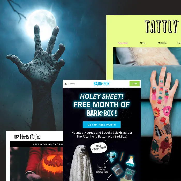
Calling all email geeks, goblins and ghouls: Are you ready for Halloween? The spooky holiday is almost here, and our inbox is full of frighteningly fantastic examples of Halloween email design. There's still plenty of time to assemble a spooktacular Halloween email campaign, so let's take a look and get inspired!
#1. Try a call-to-BOO! button.
This is a simple design move anyone can do—and should do! And that's to customize your call-to-action buttons to align with the holiday. Have fun with it! CTA buttons should be direct and clear, so that readers know exactly why they're clicking. However, that doesn't mean there isn't room to get creative and show your festive spirit.Look how the Noun Project sets up its first module with stunning design simplicity, plus a bit of playfulness via its button:

We love how each module includes a big, clear header followed by only a line of supportive text and then a CTA button that pops. No fuss or frills here—just great design. And a bulletproof CTA button that says "BOO!" is an easy way to include a little bit of mobile-friendly flair.This Halloween email from Bark Box has a totally different vibe—it's all image-based—but like Noun Project, the dog-friendly brand has a bit of fun by customized its buttons.

"Get it before it disappears" is a little more explanatory than just "Boo," but it's still festive and playful. Pick a short message that makes sense for your audience and email and have fun getting spooky with your CTA!
#2. Select spooky stock images.
Need to assemble a Halloween email in a hot second? Here's another tip that takes little to no time. Get your content and call to action ready, and then search for a witchy stock image that fits. Then you're ready to roll!Here's a simple example from Peet's Coffee:
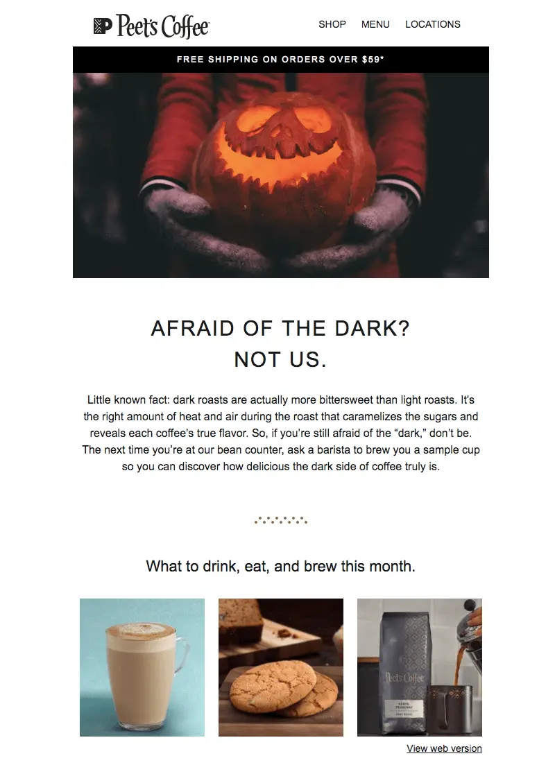
Not only does Peet's snag an appropriately creepy stock photo for its Halloween email, but the brand found a way to serve up coffee-relevant content about dark roasts to fit the holiday. It's clever and interesting—and a nice departure from the common approach of simply offering a discount and asking readers to shop.Need a source for free stock images? Remember that the BEE editor has a built-in search tool for finding free photos at your fingertips from Unsplash, Pexels, and Pixaboy. You can even customize them as needed, including layering live text on top! If you haven't checked out this feature yet, now's the time.
#3. Don't be afraid to commit to color.
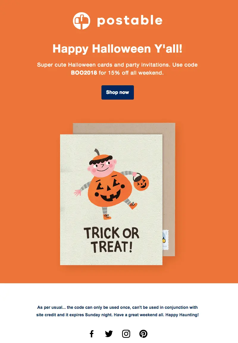
You might be afraid of ghosts (no judgment), but don't be afraid of color! We spotted a few Halloween emails with gorgeous edge-to-edge color.Check out this one from Postable:
And another from Tattly:

Want to know how to douse your email in beautiful, vibrant HTML color? It's easy:
- Choose the same content background color and row background color, giving your email a "full-bleed" look
- If you want to match the background color of your email to the background color of an image, choose the same HTML code color for a seamless transition (see our tips for how to use HTML background colors alongside images)
That's pretty much it! It's simple, and the effect is a big splash of color in your readers' inboxes. It's a nice trick to try for a special occasion like a holiday, especially if you typically stick to white backgrounds.PS: Check out the GIF from Tattly's email:

#4. It's alive... text.
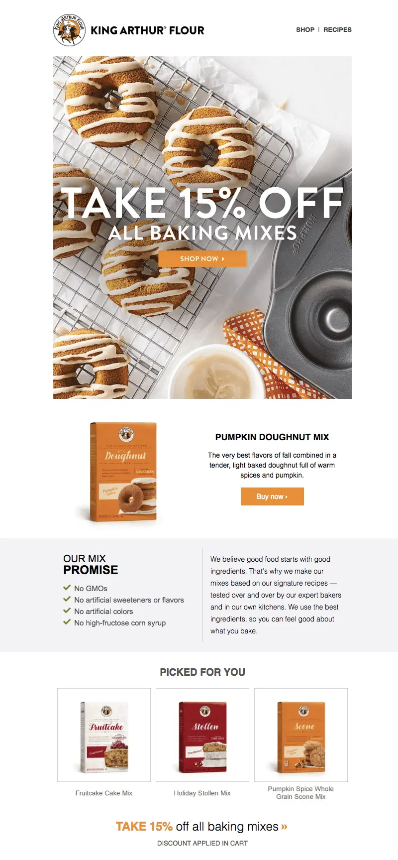
By now we email geeks all know the magic and importance of live text. Still, all-image emails do abound in our inboxes, even though we know live text helps emails render smoothly across devices and stay out of spam folders. But there are easy solutions that involve no complications or coding.Instead of building your content/text into your image, you can either (1) simply position well-styled plain text above and/or below your image (like a traditional inverse pyramid layout: image, text, button) or (2) position your well-styled plain text ON TOP of your image. Yes, that can be done! Here are the easy steps.If you go the plain text-atop-background-image approach, your emails can be optimized across devices and email providers and look lovely, like this one from King Arthur Flour:
And you can even put an animated GIF behind your live text, achieving a look like this Paperless Post email:

#5. Bewitch readers with GIFs.
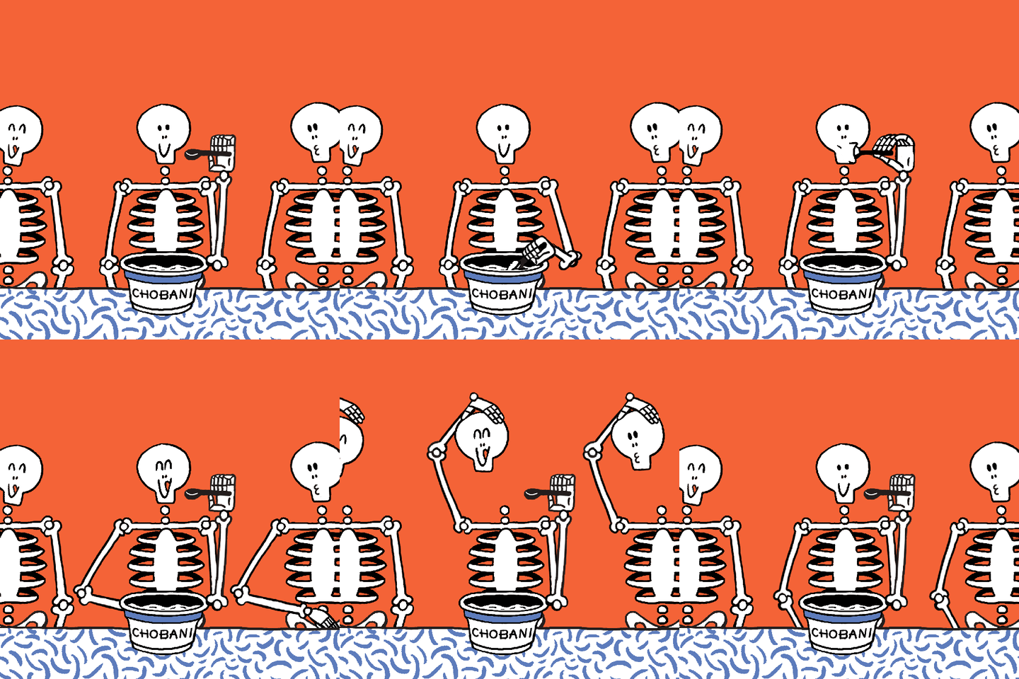
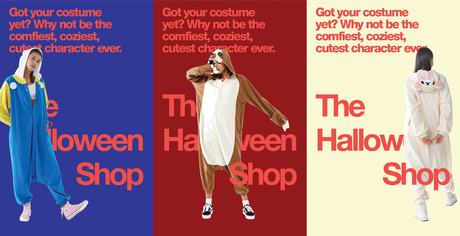
Call us easy to please, but we're always delighted by a little inbox animation. Building an animated GIF for your email takes a little more time than these other Halloween email design tricks, but – if you have the resources – we always recommend it! Once your GIF is ready, including it in email couldn't be easier: it's the same as plugging in a still image.Here are some bewitching in-email animations that caught our eye recently:Chobani:
Urban Outfitters:
And one more from Tattly:

Have you spotted spooktacular Halloween email designs in your inbox? Let us know what's inspiring you! And if you're still in the process of putting together your own Halloween campaign, implement these 5 tricks with a free trial of BEE Pro. The drag and drop tool is easy to use and all emails are mobile responsive – no coding needed. So get in the spooky spirit and start designing!
