Design

5 Ideas for the Best Email Newsletter Design

Email newsletters are typically a bit longer than your average promo campaign. They might contain a company update, round-up list, digest, or a story. In sho...
Beefree team
Beefree team
Sep 7, 2018

Email newsletters are typically a bit longer than your average promo campaign. They might contain a company update, round-up list, digest, or a story. In short: there's a lot of content. So how do you get people to actually read and scroll? Great design, of course! Read on for our essential email newsletter design ideas.

#1. Think of your newsletter as a series of micro-content.

If you're familiar with modular design, this will be intuitive for you. The idea is to separate your content into bite-sized pieces. Each module contains, say, three sentences and an image. The idea is not to get too long-winded, but if you do need to say a lot, break down what you want to say into segments for easier reading and skimming. Use the newsletter design layout to signal transitions, like:

Check out how this daily newsletter from Finimize leverages spacing and headers to present bite-sized pieces of content. (Note: The message is trimmed since the whole email is pretty long!)

Finimize email newsletter design

Each section gets progressively more detailed for those who want to keep reading. Otherwise, you still get the lede in the first section—"What's going on here?" This means the email is easy to scan, and with headers breaking up the information, no section contains more than a few sentences. This makes the whole thing much easier to read!

TIP: For emails with a lot of text, be sure to increase your margins to maintain readability. You'll probably want a max width of about 500px.

On the flip side, you can also take an approach like Kickstarter's Drip, which uses lines, borders, and colors to separate one piece of newsletter content from the next.

Drip dispatch email newsletter design

Both approaches are effective. The key is to measure out your content in small pieces. Aim for 3 sentences max in each section or paragraph.

ALSO: Note how dynamic this email is while also following design best practices, like plenty of live text and HTML background colors. Your email doesn't need to be an image to look good! Live text is a must. And when you format wisely, your email looks great and is easy to read.

#2. Include visuals that provide value.

Images serve multiple purposes in an email. They convey information visually, break up the flow of text and create structure, and add a way for readers to click through. But if you're just adding images to your newsletter without much thought, they probably aren't engaging to your readers. So choose and design art that adds value to your newsletter. Stock images can be great, but make sure you're taking the time to personalize them, like adding text.Check out the images in this excerpt from the Washington Post's weekly newsletter,Lily Lines:

Lily Lines email newsletter design

These infographic-like images are almost like bonus content. They're providing real information—streamlined, well-designed, sharp-looking—instead of just taking up space. When you're designing a long email newsletter chock-full of content, you have to make it interesting to keep readers scrolling.

3. Cut your intro.

Got a lot to say? Then cut right to the chase. If your newsletter is a daily or weekly digest, chances are, your readers know what to expect. So you don't include a long-winded introduction to set up each email. Instead, dive right into the content you know readers want. Your subject line, preheader, or main header are usually more than enough to set expectations. Check out how CityLab Daily does it:

City Lab Daily email newsletter design

Likewise, The New York Times' weekly movies digest dives right in, too, after a little greeting:

The New York Times Movie Update email newsletter design

4. Make it a list.

A great "trick" for email newsletter design is to put your content in a list. Just organizing information in a numbered list is soothing on the brain, isn't it? Suddenly, what you have to say seems more ordered. So many newsletters are formatted this way, especially round-up lists. Bullets are great, too—as seen above from Drip and NYT. Each week, the WW Club starts its newsletter with a numbered list:

The WW Club email newsletter design

What's also great about this email is that each module offers different content, or at least organizes the content in a different way: a numbered list, then a center-aligned list, then a photo grid. The variety makes for a more visually interesting newsletter—and one we want to keep reading.

5. Get personal.

If you've collected any amount of data on your subscriber list, you probably have folks' first names. If that's the case, use 'em! Drawing readers in by addressing them by name is a perfect opportunity to level-up your email newsletter and get readers invested in your content right off the bat. Even a little personalization goes a long way. Many newsletter design examples, like the email above from Finimize,do this well.But, if you don't have names, you can still create a personal tone in your email with your greeting and sign-off. This is particularly important for brands where there's a single figurehead at the helm. Take, for instance, Austin Kleon's weekly newsletter:

Austin Kleon email newsletter design

There's a lot here we like. First, even though it's not "personalized," the tone is still personal. You have a "Hey y'all" greeting and a "xoxo" sign-off. This cheeky tone won't work for everyone, but for Kleon, it's very on-brand. Plus, there's no time wasted on an intro and the email is formatted as a list. This is all simple and effective, and very readable!Are you feeling the newsletter design inspiration? Ready to design your own irresistible email newsletter and try out these email newsletter design best practices? Try a BEE Pro trial for free, where you'll get access to free newsletter templates, like this fashion-lifestyle template, this inspirational quote newsletter template, and lots more. The tool is easy to use, and in addition to getting access to the best email newsletter design templates, everything you make will be mobile-responsive. Give it a try, and happy designing!

10 Back-to-School Sales Emails at the Top of Their Class

It's that time of year again! As Labor Day approaches, we've all got that back-to-school spirit—even if we're not all returning to the classroom. Brands are ...
Beefree team
Beefree team
Aug 28, 2018

It's that time of year again! As Labor Day approaches, we've all got that back-to-school spirit—even if we're not all returning to the classroom. Brands are serving up special promotions to slough off summer inventory and introduce autumn's offerings. Back-to-school sales emails can be playful, nostalgic, and downright dazzling. Let's check out the designs that caught our eye!

Lumosity

Subject: This pop quiz comes with a prize!

Lumosity back-to-school sales emails

This Lumosity email is a great example of a one-question in-email "survey." And the hero image is animated:

Lumosity back-to-school sales emails

When readers answer the quiz by clicking or tapping on an answer button, they go to a landing page with their results—and an offer to take 25% off Lumosity Premium.

Lumosity back-to-school sales emails

This is a cute and simple strategy that gives readers a chance to engage with the content and have a little fun. And, this goes to show that you can even get creative building a "survey."

Chubbies

Subject: i'm leaving you

Chubbies back-to-school sales emails

We've gotta hand it to Chubbies for the clever copy. Their brand voice never fails to disappoint. The design of this email is pretty straightforward, but the tone of voice and text takes it to the next level. One interesting move Chubbies made was a three-tier call-to-action (with each one going to the same landing page). We haven't seen this used before in email, have you? (We're curious about the click rate!)

Cook Smarts

Subject: Back-to-school savings! 20% off everything????????

Cook Smarts back-to-school sales emails

Here's the animation:

Cook Smarts back-to-school sales emails

Cook Smarts has been sending out a series of back-to-school sales emails with eye-catching themes. There's nothing fancy, but excellent design best practices are in play here. We love the GIF, well-formatted live text, and custom CTA button.

Intelligentsia

Subject: Back to School Savings: 20% off????

Intelligentsia back-to-school sales emails

"Back to the grind"... hehe, get it? This email makes great use of color to call our attention to important information. The CTA buttons are nice and specific (no boring "click here" CTAs) and the white space throughout makes this email feel like a breath of fresh air. But a little live text would go a long way here to break up those images and make this email more inbox-friendly.

BarkBox

Subject: Grab your Bark to School supplies!

BarkBox back-to-school sales emails

We must have really needed a good laugh because punny emails are certainly speaking to us. This one from BarkBox made us smile (and it was pretty long — we had to trim it!). BarkBox always does a great job of mixing photography with illustration, which helps readers get an understanding of what they're looking at and creates some levity. Even more live text here—especially over the top of background images—would only make this email better!

Roxy

Subject:This Year, Head Back To School With Class

Roxy back-to-school sales emails

Hello, yellow! Doesn't this Roxy header text pop against the all black-and-white background? It's eye-catching, helping to draw readers in before the email switches to a more traditional product display layout.

Muji

Subject: Thanks for being a fan - Here's 10% OFF for you!

Muji back-to-school sales emails

Muji sent an illustrated back-to-school sales email design that stood out in our inbox amidst a lot of photo-heavy campaigns. Everything about this is simple and sweet!

DC Shoes

Subject: The DC Shoes Back To School Collection

DC Shoes back-to-school sales emails

DC Shoes often sticks to a nearly all black-and-white design aesthetic, which results in emails that always look polished and sleek. The black background with white type and white CTA button isn't something we often see, and the combination looks sharp. The primarily black-and-white color scheme gives the brand identity an edge—one that's underscored perfectly in the expression of the girl in the last photo.

Bodum

Subject: Up 75% OFF: Back to School + Back To Work

Bodum back-to-school sales emails

In addition to paper and pencils, coffee is an important school supply. :) And this email from Bodum, another coffee company, isreally easy on the eyes. All the gray tones offer a soothing effect, and the clean lines in the photo collage provide a sense of organization. This is all intentional, as the message of the email is to help readers "get organized and start the year a little less stressed." Well done, Bodum.

Puma

Subject: Your Kiddo’s New Kicks, Now 25% Off.

Puma back-to-school sales emails

The unique highlighter effect in this email from Puma caught our eye. The hot pink adds an element of surprise and playfulness to a straightforward product grid email. The campaign is clearly well-thought-out and cohesive, from the hero image to the copy to the hand-drawn lines. Little touches like this make a big impact.

Bonus: A Template for Back-to-School Sales Emails

Ready for the back to school season? Get your readers excited by sending a well-designed and stunning email that includes a special promotion, deal, or new product offering! To make things easir for you, try BEE Pro for free—the drag-n-drop design tool is super easy to use, and all emails are mobile-responsive.Plus, you'll get access to free templates, including new back-to-school and end-of-summer templates.Here's a sneak peek...

back-to-school sales emails

Don't delay! Sign up right away and you'll be ready for September!

Summer Sales Emails: 13 Ways to Turn Up the Heat

Beefree team
Beefree team
Aug 1, 2018

This summer has been so hot, it's almost too toasty to even think. So let's take a moment to cool off with these stunning summer sales emails. This season's email campaigns are all about light-hearted GIFs, inspiring photography, and bold color. Scrolling through these inbox beauties is like taking a dip in a cool pool! So kick back, relax, and get inspired for your next campaign...

1. Hem

Subject:the FLORAL SUMMER SALE continues! — Green Chrysanthemum

Hem summer sales emails

Hello, beautiful hero image! The stunner caught our eye—and we love how the rest of theHememail continues the green-tastic vibe. There's always something visually satisfying about going monochromatic and arranging images by color. This is a perfect trick for the doldrums of summer. Just line up an HTML-colored content block alongside the perfect photo, then curate the rest of your art by color. Tada!

2. Equinox

Subject: Your exclusive summer offer.

Equinox summer sales emails

The first thing that caught our eye about this Equinox email was the sweet lil' animation in the logo header:

The GIF is unexpected and playful. A nice touch! Plus, we're a sucker for an ultra-focused message with a sleek design. If you ask us, simplicity is always the way to go.

3. Flywheel

Subject: Here’s 3 months of FREE WordPress hosting!

flywheel summer sales emails

Flywheelkept its email fully responsive, even as it stretches the span of our inbox, which makes an especially big impact on a desktop screen. That hero image totally screams summer, and the spot illustrations help convey a lot of information elegantly.

4. Trade

Subject: Cool for the summer

trade summer sales emails

Tradeopens with a gorgeous photo that grabs our attention as soon as we tap. It's so big that even the header is enveloped by it. That gives the email a real energy—almost as if you're outside with that iced coffee right in front of you. Yum. And if you're going to go big, just situate your live text and bulletproof CTA button over top of your image—it's possible with our tutorial!

5. West Elm

Subject: Goodbye spring, hello summer savings: Pillows starting at $9.99!

west elm summer sales emails

Okay, this is a pretty typical West Elm email (which we had to trim because it kept going, and going, and going), but check out the animation in the hero image:

west elm summer sales emails

No doubt, thisWest Elm email is playful and beautiful. And it's a great example of getting creative with your art. This GIF has nothing to do with theproduct; it's just about glorious summer (in the form a juicy watermelon)—and that connects to the main takeaway: shop the sale before it's too late!

6. Rent the Runway

Subject: Looking for a new summer dress? We found it.

rent the runway summer sales emails

We love this carousel GIF from Rent the Runway. What a fun way to display dresses and have a little fun. Plus, the simplicity of the entire email is admirable. There's one head, one line of text, one image, and one CTA button. Only a few words—but a big, effective message. The only thing we'd recommend is upgrading to live text and minimizing the size of the GIF to be more inbox-friendly!

7. ClassPass

Subject: Inside: Your free trial for summer workouts

classpass summer sales emails

Simple, summery, smart. Looking at this ClassPass email, you can almost feel the fun the designer had making this illustration. And that's the way it should be, right? The double CTA approach is interesting here, too, and we'd be curious to know if they A/B tested it against another email with a single CTA. Overall, we're digging the sleek, playful vibe.

8. Brit + Co

Subject:???? Ready to Create the Most Memorable Summer?????

brit+co summer sales emails

We had to share the opening content block from this Brit+Co email because it's just so darn summery. Talk about vacation envy. One thing we noticed is the subject line and thefirst header contain the same text. We're so curious to know if you've tried this technique and what you think of it! So let us know in the comments.

9. Cook Smarts

Subject: Summer sale! 20% off a season of delicious dinners

cook smarts summer sales emails

Who needs a real pool when you can have an illustrated one?

cook smarts summer sales emails

Like Flywheel, Cook Smarts uses what we'll call "swimming pool blue" in this evocative, sunny email. There's something joyful and refreshing about it. We'd be curious to see how a version of this email would perform without a paragraph of text, too. Like Rent the Runway, sometimes super streamlined simplicity is the way to go.

10. Warby Parker

Subject: Summer + Fridays =

warby parker summer sales emails

Warby Parker sends emails that always look sharp, and this one is no exception. It's also another lovely example of how text can be arranged atop a background image—and in the best case scenario, it's live text with a bulletproof button. What do you think of the side-by-side CTA buttons?

11. Havenly

Subject: Summer surprise! Free Shipping for 1 more day

havenly summer sales emails

Bold color—this time the color of a sunset—carries this Havenly email. While we love the stunning photography we've seen in a lot of summer emails, a design approach like this is still eye-catching and effective.

12. Everlane

Subject: The Popover Shirt

everlane summer sales emails

One of the things we love most about Everlane emails is the way their text and images play together. The copy is always bold and spot-on, and the images do the rest. Line breaks and ample padding between content makes the email easy to read and beautiful to look at. All told, it's just so pretty!

13. Blind Barber

Subject: So Fresh, So Clean

blind barber summer sales emails

We love the classic design Blind Barber used here, with a spin on the hero image: four photos instead of one. The look is evocative of Instagram and feels modern and approachable. The custom text on the main CTA button is fun, too.

Send Your Summer Sales Emails

Feeling inspired? Start creating your own summer sale emails now! Make sure to sign up for a freeBEE Pro trial. We havedozens of tutorialsto help you get started (and inspired!), and the drag-and-drop tool is super easy to use. Give it a try!

3 Tips for Designing the Best Brand Collaboration Emails

Collaboration is a good thing. When two brands come together, they each benefit in plenty of ways. There's the synergy of working together, the fun of creati...
Beefree team
Beefree team
Jul 2, 2018

Collaboration is a good thing. When two brands come together, they each benefit in plenty of ways. There's the synergy of working together, the fun of creating something you couldn't or wouldn't have alone, and the added exposure of accessing each other's audiences. Hopefully, a bump in sales is a benefit, too. Working together = good for everyone. So it's no surprise we see tons of brand collaboration emails in our inbox. Today, we'll look at some stellar examples and offer design tips for how to make your own!

brand collaboration emails

Tip #1: Call out the collaborators immediately

Share the spotlight! List the brands you're featuring at the tippy top of your email—and in your subject line, too.

Vrai & Oro

Subject:Vrai & Oro x Everlane

Vrai & Oro Everlane brand collaboration emails

In this collaboration email from jewelry brand Vrai & Oro, announcing its partnership withEverlane, both brands are named at the very top of the email—and in the subject line itself. This trend was almost ubiquitous in all the collaboration emails we examined. Don't make readers scroll through a series of images before telling them the stars of the show. Many emails—this one included—used images of the brand logos for added recognition and clarity. Our brains processes images more quickly than words, so in the name of speed and efficiency, logos are a great move. We also enjoy the simplicity of this email, which helps readers get the information they need if they want to attend the event. For more tips on designing event invitation emails, be sure to check out a few of our event design posts:

Koio

Subject: Koio x Quincy Davis

Koio Quincy Davis brand collaboration emails

While this Koiocollaboration email with Quincy Davis is all image-based (why no plain text?!), there's inspiration to be drawn from the design choices here. The ultra-narrow body width makes the text easy to read. The generous line height and line breaks offer an airy, spacious vibe. And that hero image? It's so pretty, especially with white text atop it. We'd definitely incorporate live text, though, and make that single CTA button pop!

Tip #2: Structure the email like a product launch

A collaboration is a special event! Treat it like one by designing the email like you would a product launch email. Unveil the collaboration with vibrant images and festive language. Your collab is a big deal.

Nisolo

Subject: Introducing the Nisolo x Huckberry Travel Derby

Nisolo Huckberry brand collaboration emails

Check out this snazzy email from Nisolo. It definitely reads like a product launch email—because that's what it is, in partnership with Huckberry. The images are carefully selected to show off a product, which is a smart move whenever you're introducing something new. Instead of a conventional piece of user-generated content, the email ends with a quote from a product development manager. The brand can even see if the quote is effective by experimenting with an A/B test—it'd be interesting to know! This is a beautiful email, but again, we'd advise breaking up those stacked images and using well-formatted live text and bulletproof CTA buttons. Just follow our tutorial on how to position live text and a CTA button over a background image in BEE!

Topo Designs

Subject: Topo Designs x FRONTEERCollaboration

Topo Designs Fronteer brand collaboration emails

We love the alternating bold colors in the modules of this collaboration email from Topo Designs (on behalf of Fronteer). In this case, the brand logos aren't used at the top of the email, which makes for a perfect opportunity to layer live text in the first module atop the image—or position matching HTML background color alongside an image. Again, lots of images are shown here to unveil the features of the shoe and pack, and by using just one image per module, the reader can focus on one exciting characteristic at a time.

Tip #3: Don't be shy about making emails look "off brand"

One way to catch readers' attention when they open a collaboration email is to departboldly from your usual brand standards. After all, a brand collaboration email isn't all about you—it's about your partner brand, too, and about the new brand image you're creating together.

Blue Apron

Subject: Introducing BLUE APRON x CHRISSY TEIGEN—save $50 ????

Blue Apron Chrissy Teigen brand collaboration emails

If you receive Blue Apron emails, you know that most of the time, they're very blue. This collaboration email with celeb foodie Chrissy Teigen certainly incorporates the usual brand blue, but the red banner and pink background are a bold departure. As soon as readers open this email, they can tell it's something different and special. And that's a good thing! This email definitely got my attention.

Toms

Subject: Introducing the Clare V. x TOMS collection

TOMS Clare V. brand collaboration emails

This collaboration email from TOMS, to showcase its partnership with Clare V., is definitely on the softer, more feminine side compared to the brand's typical look. We noticed the change in vibe right away—the pale millennial pink and "hand-written" illustrations make for a sweet, stand-out message that caught our eye. We love the brand logos at the top, plus the combination of product stills and modeled images. All of it just comes together!

Create Your Own Brand Collaboration Emails

Is a collaboration in your future? Design one-of-a-kind brand collaboration emails in the BEE editor with a free trial of BEE Pro. The editor is super easy to use and also provides a ton of options for fine-tuning and customizing templates. Check out our free email design tutorials and videos for tips, and have fun!

Tutorial: How to Add a Bulletproof CTA Button Over a Background Image

In email design, calls to action come in all shapes and sizes: clickable buttons, text, images, icons, and so on. If it can be linked, it is! But perhaps the best way to show readers you want them to tap is a button—it's the only item whose sole purpose is to be clicked. So, even emails with beautiful linked images still include CTA buttons that invite readers to click.
Beefree team
Beefree team
Jun 25, 2018

In email design, calls to action come in all shapes and sizes: clickable buttons, text, images, icons, and so on. If it can be linked, it is! But perhaps the best way to show readers you want them to tap is a button—it's the only item whose sole purpose is to be clicked. So, even emails with beautiful linked images still include CTA buttons that invite readers to click.

This means many emails get opened in one of two ways: a hero image with a CTA button sitting below it (inverse pyramid design) or hero image with a faux CTA "button" designed into the image to inspire clicks. But what if you want to position a bulletproof CTA button over a background image? In the BEE editor, it can be done and it only takes a few seconds, so you can maximize email design best practices, too!

Today's Email Inspiration

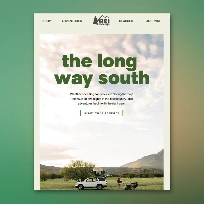
Check out this beauty of an email from REI. We recently included it on our list of dreamy summer vacation emails and were excited to see live text atop the hero image!

What a beautiful email opening. But that CTA button is an image (and a little blurry)!

Today we'll show you how to build an email like this, but with a bulletproof CTA button atop a background image. Here we go!

Tutorial: Add a Bulletproof CTA Button Over an Image

Choose an email template

Log into the BEE editor at beefree.io. Choose any template to get started. We usually go with a basic one-column structure to start with. Here's how our empty email layout looks:

Enable the row background image

If you want to add live text and a CTA button over your image, make it a "background image" in BEE. To create a background image, first select your content row (like above), and check out the Row background image menu option in the right panel. Enable it, then click Change image to browse for a photo.

Browse for an image

As always, you can find free, high-resolution stock photos in BEE from Unsplash, Pexels, and Pixabay. You can also upload your own image or paste an image URL.

Let's draw inspiration from REI and search in BEE's stock photo library for "camping."

Click through the pages until you find one you like, then import!

Adjust background image settings

Once you select your background image, you can also adjust how it appears in the email. In this case, the image we pulled was too large for the email, so let's resize. To do this, we can click Edit Image, then use the built-in photo editor to resize. (You can also crop, filter, add in special effects, etc.)

Once the image is resized, we can also adjust how it looks with three key settings: Full width, Repeat, and Center. Use them to find the best fit for your background image. Select Repeat, for example, to create a pattern. This is especially useful if you want the image to span the entire width of the email.

To mimic REI's email today, we'll just select Center.

Pull in your button (and any other content!)

From the Content menu on the right, pull in a button. Pull in text boxes, too, to mimic REI.

Here's our email before formatting:

We've got a bulletproof CTA button and live text atop our gorgeous background image! Now, all we have to do is format! In the Content Properties menu, update the button's color, text formatting, width, alignment, and more.

After some tinkering, here's how our email looks....

Ta da! Wasn't that easy?

If you're looking for more formatting guidance today, check out our posts on how to choose the best CTA button color for your email and how to create bulletproof CTA buttons. And for text formatting tips, check out our post on fonts in email.

Don't forget to set up a default background color

Background images are stunning and easy to implement, but like other advanced email design techniques, not all email clients support background images. According to our recent tests, only a few email clients don't show email background images, including:

  • Outlook 2016 on MAC OS X 10.10
  • Lotus Notes 7
  • Xfinity / Comcast email client

For those email clients (and for best results when images are blocked), make sure to choose a color in the necessary row as a default background color, in those cases when the background image doesn’t render.

To set a background color, simply select the row, then use the Structure menu to choose a Row background color or Content background color.

Ready for background images in emails? Go Pro!

Sign-up for a BEE Pro free trial and get access to this exciting background image feature, along with tons of free stock images and easy-to-use tools to make your email look perfect! Let us know if you have any questions about this tutorial, and happy email designing!

10 Vacation Emails That Will Inspire Wanderlust

Temperatures are up, and it's time for summer vacation! Whether it's a road trip, weekend getaway, or international adventure, many of us are getting ready f...
Beefree team
Beefree team
Jun 22, 2018

Temperatures are up, and it's time for summer vacation! Whether it's a road trip, weekend getaway, or international adventure, many of us are getting ready for a change in scenery. We rounded up 10 vacation emails to fit the mood. So turn on your out-of-office reply and scroll down for some summery email design inspiration...

Care/Of

Subject: Travel-ready vitamins, on us

care/of vacation emails

Care/Of takes a classic inverted pyramid layout approach in this bright and bold summertime email. It's simple and effective, and that CTA button really pops. This type of image can be easilyuser-generated—a great community-building tool that makes customers feel special and gives your brand a friendly, approachable vibe.

REI

Subject: You're invited to Baja

REI vacation emails

The hero image in this REI email is a real stunner. And, guess what? The copy is actually live text on top of the photo. We love this design best practice, which works especially well for a large image. Learn how to add email background images in our tutorial.

Lumosity

Subject: Meet your new travel companion

Lumosity vacation emails

This time with motion:

Lumosity vacation emails

The header copy and GIF really make this Lumosity email. We love it! There's also a great use of HTML background color behind the GIF to make the email body look seamlessly gray. If we had our way, we'd bump up the body text to a slightly larger font size.

Malin+Goetz

Subject: Packing for your summer getaway.

Malin+Goetz vacation emails

We love a good roundup list email, and this summer checklist from Malin+Goetz fits the bill. The illustration style is a break from typically photo-heavy emails, and it definitely exudes a carefree summer vibe. We also like that there's no extra descriptive text for each item. The email is certainly mobile-friendly and easy on the eyes.

Who What Wear

Subject: This under-$40 vacation dress will sell out fast

Who What Wear vacation emails

Here's the animation:

Who What Wear vacation emails

This Who What Wear email is short and sweet, which we always like. The animated text is a great example of how GIFs don't have to be complicated to be fun and effective. If the email weren't all one image, it would be more inbox-friendly, but otherwise, this sleek summer email works for us.

Need Supply Co.

Subject: Summer Travel / Take Up to 40% off

Need Supply Co. vacation emails

Need Supply Co. has an email with a basic single-column modular design—a great way to lay out multiple blocks of content. The text is well-formatted for easy reading—large size, ample line height, and plenty of padding—and it's delightfully minimal. Ghost buttons can be tricky on top of background images, but these are hard to miss with their generous size and their contrast against the white background.

Everlane

Subject: The Mover Pack

Everlane vacation emails

Here's a GIF from one of the modules:

Everlane vacation emails

ThisEverlaneproduct launch email is longer than most. The modules fitthe occasion, though, helping readers get a full view of the new item. This is beautifully done, and it's a perfect example of how a more complex GIF—with multiple frames displaying the product—can go a long way in helping readers understand how something works and functions. The other lovely thing about this email? Themillennial pink background color, of course!

Madewell

Subject: The anatomy of a beach outfit

Madewell vacation emails

There have been a few diagram-style illustrations atop images in these summer emails, and this one from Madewell stood out to us. The email hits that sweet spot of not being overly complex while still "leveling up" the photo; the email is playful and easily catches a reader's eyes. Everlane used the same technique, even though the diagramming was less cheeky and more intentional, pointing out product features. But both approaches work!

Loft

Subject: Out of office

LOFT vacation emails

The hero images in all of these summer emails from LOFT are so on point! This is a lesson in and of itself: when you can lead with an evocative, stunning image, half your work is done. This sky-sweet image just screams summer. And for those of us craving a vacation right about now, it's more fun to scroll down and see more photos like it than stare at our work.

& Other Stories

Subject: Beach-ready swimsuits

& Other Stories vacation emails

& Other Stories always does a nice job of arranging images in emails. We like how this grid includes a combination of product images and details, along with photos from a styled shoot.Ready to design and send your own easy breezy summer email?Sign up for a free BEE Pro trial. We have dozens of email design tutorials and vacation-themed templates to help you get started (and inspired!). Plus, the drag-and-drop tool is super easy to use. Give it a try!

GDPR Emails You Actually Want to Read

Beefree team
Beefree team
Jun 19, 2018

With GDPR finally(!) upon us, we hope all you fellow email geeks are faring okay! The European Union's privacy law has certainly created a lot of anxiety, excitement, and buzz. And for us here at Email Design Workshop, it also created a unique opportunity: we got to compare a flood of emails that all sought to tackle the same challenge—updating users about changing site policies. We surveyed the many, many GDPR emails in our inbox and plucked some that stood out. The design-savvy privacy policy, terms of service, and opt-in emails we found fall into three design categories:

  • Simply styled and effective
  • A little bit artsy
  • Tongue-in-cheek

As always, we hope to inspire you with this roundup of emails. So, let's have a little GDPR fun!

Wait—what is GDPR again?

GDPR is the General Data Protection Regulation, a privacy law established by the European Union "designed to harmonize data privacy laws across Europe,toprotect and empower all EU citizens data privacy and to reshape the way organizations across the region approach data privacy." In other words, instead of having different privacy laws in each EU country, now there's an EU-wide standard that's enforceable as of May 2018.In the email world, companies with EU-based subscribers need to make sure they're GDPR compliant. This resulted in, as you've noticed, a massive influx of GDPR emails. They fell into two main categories: (1) ones that notified readers of updates toprivacy policies and terms of service, and (2) reconfirmation campaigns asking subscribers to opt-in.If you want to read more about GDPR, we included helpful links at the end of this post. But, for now, let's see how these GDPR emails looked. After all, good design means good communication, and when it comes to these "legalese" emails, this often goes a long way.

GDPR Emails: Simply styled and effective

Hinge

Subject:We’ve updated our Privacy Policy and Terms.

Hinge GDPR emails

Hinge does a really nice job of personalizing this email and making it super easy to read. The ultra-narrow fixed width, generously-sized text, and use of bolded, numbered sub-headers all converge to make this email super sleek and user-friendly.

Coursera

Subject: Notice of Privacy Policy Updates

Coursera GDPR emails

Courseraemploys similar techniques as Hinge to make its email simple, ultra-readable, and well done. The "boxed" effect of the blue background border is a nice touch, too.

Timex

Subject: Your trust is important to us.

Timex GDPR emails

This is the only GDPR email we spotted that used a modular design with background colors to delineate information. It's a great example of how a simple design tactic can improve comprehension, as readers see clearly labeled pieces of information one at a time.

Your Majesty Co.

Subject: Reconfirm your subscription to keep receiving our newsletter

Your Majesty Co. GDPR emails

Here's a great reconfirmation email from Your Majesty Co. that couldn't be simpler. (You can probably guess the thing we love most about it.) Thepurple bulletproof CTA buttonpractically jumps off the page—it's impossible to miss—which, of course, is the whole idea.

GDPR Emails: Just a little artsy

Topo Designs

Subject: Update to the Topo Designs Privacy Policy

Topo Designs GDPR emails

With the brevity of its statements and great formatting, Topo Designs makes it easy to understand the updates that have been implemented. But the PRIVACY POLICY header at the top of the email is also a nice touch. And the hero "art" helps drive home the main point and makes this email easy to understand at a glance.

The Muse

Subject: Important Updates to The Muse’s Terms of Use and Privacy Policy

The Muse GDPR emails

This is a super friendly—if not wordy—email from The Muse that feels almost like it came from a buddy. To match the decidedly not cut-and-dry tone, the brand added an illustration at the top that incorporated the GDPR logo. We're into it.

Edenspiekermann

Subject: You're in Control (Action Required)

Edenspiekermann GDPR emails

Like Topo Designs, the hero image/banner in this Edenspiekermann email says it all. And this is even more important in a reconfirmation campaign that's asking readers to act. Plus, Edenspiekermann incorporated artwork for each supporting article—a welcome invitation for readers to click.

Penguin Books

Subject: We've updated our Privacy Policy

Penguin Books GDPR emails

Leave it to the literary folks at Penguin Books to take their GDPR email to a whole other level. We're into the Harper Lee quote and the opening line, which stands out as being more than a "We respect your privacy" opener!

Uber

Subject: Updates to Uber’s Privacy Policy

Uber GDPR emails

Like most of the emails in this category, Uber added a neat hero image to help convey its message, and we dig it!

Code Academy

Subject: Update to our Privacy Policy

Code Academy GDPR emails

Saved the best for last! The elegant header in this Code Academy email looks great and communicates well—we love how the deadline was included (and themillennial pink, naturally).

GDPR Emails: Tongue-in-cheek

Sidetracked

Subject: No action needed! (Unless you want to unsubscribe)

Sidetracked GDPR emails

Sidetracked Magazine got a little playful here, and while the style isn't for everyone, it is a breath of fresh air.

Reformation

Subject: PRIVACY POLICY UPDATE

Reformation GDPR emails

Here, Reformation kept it short, sweet, and silly.

Bullish

Subject: Yet another Privacy Policy Update, plus a doggo meme

Bullish GDPR emails

Here is the only GDPR email we received (from Bullish) with a meme. You're welcome. :)Hungry for more GDPR info? Here are a few GDPR articles we found useful!

And, visit our GDPR Emails Pinterest Board for more design ideas!

10 Modern Father's Day Email Designs

Forget the ties, golf clubs, and leather wallets. This year, plenty of brands are doing Father's Day email designs differently. We rounded up 10 modern email...
Beefree team
Beefree team
Jun 11, 2018

Forget the ties, golf clubs, and leather wallets. This year, plenty of brands are doing Father's Day email designs differently. We rounded up 10 modern emails that show dads' lives aren't just about sports and office jobs. Get inspired by these campaigns—and our design tips—to build your own Father's Day messages before June 17th!

01. Nest Cam

Subject:Save up to $50 on a Nest Cam. Because Dad loves deals

And check out the animated GIF from that TV-looking screen grab above:

These NestCam clips totally made us LOL. We even went straight to Instagram and searched #CaughtonNestCam for more. Isn't it clever that the GIF was embedded in the email to look like it was on TV in someone's living room? This shows the design team went the extra mile instead of just making the GIF and plopping it in the email. Plus, the set-up text above the GIF is plain text—a great example of how to situate copy against an HTML background alongside an image or GIF, a design best practice!

02. Lord & Taylor

Subject: Dad-approved gifts. Father's Day is June 17!

We're so happy to see Lord & Taylor—a major brand with a long history—showing a dad who's differently abled. We looked at dozens and dozens of Father's Day email designs, and this is the only one we saw like this. We appreciate L&T for acknowledging there aren't cookie-cutter dads. Design-wise, we can see that the quirky content block trend continues, and we're not complaining! This email feels dynamic and playful, allowing readers' eyes to keep moving down the page. And, if you ever want to overlay live text atop a static image or GIF, you can do it in BEE (see our tutorial to see how!)

03. Postable

Subject: Do Your Daddy Duty

In a sea of emails with white and neutral backgrounds, the bold green in this message from Postablereally pops! This is another email that aligns its image block next to a content block that matches in color, complete with plain text and bulletproof CTA button. It looks great and checks off all our design best practice boxes!

04. Malin + Goetz

Subject: Raise the bar for DAD + Free shipping!

Check out the movement in the hero image:

This Father's Day email from Malin+Goetz is vibrant, fresh, and easy to read. The oversized text accompanying the photos is great; sometimes, a few sentences of descriptive copy just doesn't add value when readers are spending only a few seconds looking at your email. And like NestCam, this email includes another great example of user-generated content: a five-star review that couldn't be more flattering.

05. Blue Bottle

Subject: Cold Brew Kits for Cool Dads

Another GIF to show ya:

Mmm, this GIF makes us crave some cold brew! The design of this Blue Bottle email is so simple. Like Malin+Goetz, the only "dad thing" about it is pretty much the subject line. This just goes to show that if you're in a last-minute hurry to put out a Father's Day promo, keep it simple with clever subject line copy and amazing creative assets you already have on hand.

06. Chubbies

Subject: *****kid's swimsuits*****

True to form, the copy in this Chubbies email makes us crack a smile. Chubbies notoriously has a lot of fun with its email campaigns, and this one is no exception. In addition to simply adorable photos and funny easy-to-read text, this email uses a "boxed" design for its layout, which is easy to do and cannarrow readers’ eyes on the column of content, potentially improving focus and legibility.

07. Food52

Subject: Gifts for Dad we're willing to bet he's never unwrapped before.

Oh Food52, you had us at "salami bouquet." It's a lot of fun to see brands branching out in their selection of dad-themed gifts. The first module of this email is built in a standard inverse pyramid layout. However, there's also a CTA button above the first image, and we're curious to see how that performs. We see a good opportunity to A/B test a layout like this—one version with the CTA button at the top, and one without it (so the first CTA button would come after the salami image).

08. Brooklinen

Subject: We Love You Dad!

This email from Brooklinen is simple and sweet! The two-frame GIF is so funny and engaging that Brooklinen makes a smart decision not to add any frills here. No need for a header or additional modules. A single, clear focus is the way to go.

09. The New York Times Store

Subject:Father's Day Gifts for the Intrepid World Traveler

This travel-themed gift guide email from The New York Times looks great and is easy to follow. Each module flows into the next without borders or header text; the only labels are names and prices. By bypassing CTA buttons for each gift item, NYT saves space and creates a sleek look. Readers know intuitively to simply tap an image to get more information. Alt text is particularly important here—without bulletproof CTA buttons—so readers will still have something to click if images don't load.

10. Topo Designs

Subject: This one's for Dad.

The dad categories Topo Designs creates in its Father's Day email are cute and clever, helping readers navigate through the email and shop. (There were quite a few more modules, too, that we had to cut!) Photo clusters like these are easy to design by assembling individual images. In BEE, you can choose whether or not an image grid is responsive for mobile screens or if it stays in place as-is (check out the "do not stack on mobile" feature!)Start creating your own modern Father's Day email designs now! Using the BEE editor is easy. Sign up for a free BEE Pro trial. We have dozens of tutorials to help you get started (and inspired!), and the drag-and-drop tool is super easy to use. Give it a try!

Black and White Emails: 8 Reasons for Simple Email Design

Think a black and white color scheme sounds boring? Think again! Lately, our inbox is full of stunning black and white emails, and we're all for it. Email de...
Beefree team
Beefree team
May 30, 2018

Think a black and white color scheme sounds boring? Think again! Lately, our inbox is full of stunning black and white emails, and we're all for it. Email designers prove over and over again just how timeless and gorgeous a simple palette can be. Restricting colors in a design might even help you come up with something new. So instead of wondering what you can add to make your email stand out, consider this old adage: less is more. Strip a design down to basic black and white, and let your creative juices flow. Here are some black and white email designs to keep you inspired!

Editorial elegance from the Common Muse

Subject: Introducing our Sterling Collection

common muse black and white emails

Jewelry designer Common Muse stopped us in our tracks with this beautiful email. Doesn't it look like a page out of a magazine? The photos are stunning on their own, and Common Muse is wise to let them breathe by not cluttering the design. Also, by arranging the images evenly, with just a fine white border between them, and skipping an overuse of text, this email makes a statement. Readers eyes go straight to the jewelry, and each piece speaks volumes.

Vintage views from The Lily

Subject:How would you answer this question about your mom?

The Lily black and white emails

This darling email from The Lily straddles the line between elegant and approachable. The images and text feel sentimental, while the hand-drawn look of the borders adds some levity. If you're collecting photos with different quality from various sources, giving all the snapshots a simple black and white treatment creates a consistent look within the email itself. Also, the header and sub-header styling here shows that color isn't necessary when it comes to delineating content hierarchy. Size, font, and all-caps styling—along with line-height an spacing—are all used to help readers' eyes move over content with ease.

Artful layering by BCBGeneration

Subject:???????? 40% off select full-price AND sale styles ????????

BCBGeneration black and white emails

Here's the animation:

You might not think that the beautiful azure blue of pool water should be turned, well, gray. But the movement of the animated GIF and the pop of color from the text overlaywork because the emphasis is on the sale. The steep discount—40%— is probably unusual, soBCBG wants that to be what stands out (the number is repeated in the subject line, too). With the black and white treatment, and the quick movement of the GIF, you barely notice what the model is wearing. It doesn't matter. What BCBG really wants you to see is 40% Off!

 Neat arrangements from Sonos

Subject: Get started with speaker sets

Sonos black and white emails

Black and white products certainly lend themselves to a black and white email design, but this email from Sonos still stands out. The elegant, futuristic, and sleek design of its products is the backbone of the visual brand identity and this email. However, Sonos also chooses wisely with a white background, gray borders, (indented) black font, and a boxed effect to play up the drama of the color scheme. The result is spaceship-worthy intrigue and delight.

White-out photo collage by Rag & Bone

Subject: Break the rules

Rag & Bone black and white emails

We love a good photo collage! Even though the portrait styles and backgrounds are slightly different for each image in this grid, uniformity is achieved with the all-white products. The other great thing about this email design? The lack of body text. The richest sources of written material come from the subject line, a single body header "White Out," and the CTA button.

Pleasing patterns by Schuh

Subject: Stand out from the crowd...literally

Schuh black and white emails

These product photos from Schuh are spectacular, and they carry the email. Instead of adding headers or labels along with each image, Schuh customizes the CTA button text throughout the email so that readers know what they're looking at—i.e., "Shop PUMA" goes with the pair of PUMA shoes, instead of labeling the image "PUMA" and using generic button text like "Shop now." This is a simple move that saves space and streamlines the message. "Ghost" buttons—ones that match the background of an email with just a border—can sometimes get lost, but because of the contrast of black and white here, they're easy to spot.

Stunning simplicity by Helmut Lang

Subject: The Leather Slip Dress in white

Helmut Lang black and white emails

Here's another stunning email from Helmut Lang that's minimal on text and big on gorgeous photography. When an image is the star of your email, some brands skip the CTA and just let readers tap the photo for more. Setting up an A/B test where one email has the CTA button and the other doesn't is a great way to gauge what works best for your audience. And remember, with BEE, you can also put a bulletproof CTA button right on top of your image!

Intimate insight from Nisolo

Subject:Our CEO shares hard learned lessons.

Nisolo black and white emails

In this message, Nisolo uses a black and white email design to strike a slightly more serious tone. The classic color scheme is perfect for achieving that. Here, the black and white palette helps communicate the importance of the message. It's simple and well done.Ready to build your own black and white email? Try a free BEE Pro trial. The drag-and-drop tool makes design super easy, and every email is mobile responsive, so whatever creative design you come up with, it will look great on any screen!

5 Creative Ways to Design Roundup List Emails

Roundup list emails are a fun and dynamic way to present content. Your roundup email might list top blog posts or most popular products, walk readers through...
Beefree team
Beefree team
May 23, 2018

Roundup list emails are a fun and dynamic way to present content. Your roundup email might list top blog posts or most popular products, walk readers through a step-by-step process or timeline, show social media shares or comments from brand loyalists, or organize pretty much any kind of list you can imagine. The use of numbers in roundup emails helps keep readers’ eyes moving down the page, and the layout can vary in plenty of dynamic and engaging ways. These emails are fun to build! Let’s get inspired by checking out these creative roundup emails.

01. The Cluster

Editorialist

Subject: Stefania Allen & Kate Davidson Hudson's Top Mother's Day PicksWhoever said lists needed to flow straight down a page? The Editorialist uses a cluster approach to give a sense of movement to its design. The white space and font choice also gives the design a more polished look, like a magazine spread. Keeping each module compact, and minimizing text descriptions, makes this email easy to scan.

editorialist roundup list emails

Splendid Spoon

Subject: Isaac’s Splendid List, Vol. 6Here’s another fun cluster from the Splendid Spoon. We love this asymmetrical, collaged look. This is a bit more playful than the Editorialist’s email, and it also comes with a plain-text legend beneath the image cluster. This is a great way to balance out your design and make it even more mobile-friendly.

splendid spoon roundup list emails

02. The Timeline

Harry’s

Subject: Thank you for 5 fantastic yearsWe haven’t seen an email quite like this one from Harry’s! In celebration of the company’s five-year anniversary, this roundup email chronicles the brand’s milestones through the year. They even—laughably—include a few flubs, like the time they accidentally sent their welcome email to every one of their subscribers in 2015. It’s always great when an organization can laugh at itself! While this email is a series of images, the BEE editor allows you to add plain text atop images in your timeline, or to use a two-column design to arrange images next to text blocks.

harry's roundup list emails

Loft

Subject: Your Mon-Fri outfit ideasIn a different sort of “timeline,” Loft uses a roundup email to showcase products for every day of the week. Once the artwork is prepped (just look at those gorgeous product photos!), this email is easy to assemble in a single-column layout with plenty of white space. Those ghost buttons are a little easy to miss, though. Wouldn’t it be fun if they were a little more playful? Maybe simply “Shop Monday” or “Try out Tuesday” instead of “Shop Now” for every module.

loft roundup list emails

03. The Animated How-To

Homesense

Subject: How-To exclusive! Expert blogger tips inside.Look how much fun Homesense had with this animated how-to email! It’s more of a 1-2-3 process than a roundup, but it was too clever not to include here. We often advocate for simple emails with straightforward calls-to-action—emails that aren’t websites—but sometimes you gotta put some longer, snazzier content right in your email. Whatever you do, test! See how readers respond to both short and long emails.

homesense roundup list emails
homesense gif roundup list emails

04. The Z-Pattern

Topic

Subject: 5 of our favorite storiesTopic’s welcome email is a beauty to behold. The peachy HTML background color and well-styled plain type make us swoon. Plus, we had to show you how the roundup section is so balanced and nicely laid out. Z-patterns—alternating the left or right-alignment of images and text—work really well for lists that include images. Just make sure images are the same size and the amount of text you use in each block is similar.

topic roundup list emails

05. Block by Block

Artifact Uprising

Subject: Need a theme for your next photo book?Check out the airy, ethereal look of this list from Artifact Uprising. We rarely see a three-column layout like this, but because of the design simplicity, it works. While each row here is an image, you could create the same responsive effect by using a three-column structure with plain text on either side of the middle image. Plus, each row is buffered by ample padding, giving this roundup a sleek, bright vibe.

artifact uprising roundup list emails

Blue Mercury

Subject: The April Hotlist is here!Another way to separate content blocks in a list or roundup is by alternating the HTML background colors of each block, as Blue Mercury did here. By positioning images in a different spot in each module, this email feels extra playful and fun.

blue mercury roundup list emails

Want to build your own roundup email? Try a free BEE Pro trial. No HTML knowledge is required to create any dynamic, quirky email, and whatever you build, it will be mobile responsive!

Tutorial: How to Create a Color Blocking Email

We recently celebrated all things color in email. One style we totally love (and see a lot) is color blocking, where about half an email has a bold backgroun...
Beefree team
Beefree team
May 22, 2018

We recently celebrated all things color in email. One style we totally love (and see a lot) is color blocking, where about half an email has a bold background color and the other half is white. This is a simple technique that goes a long way in inboxes. In this tutorial, we’ll show you how to build a color blocking email of your own in a few easy steps. We’ll also explore how to:

  • Add multiple HTML background colors within an email
  • Establish multiple columns
  • Format text (color, size, line height, links etc.)
  • Polish an email by fine-tuning spacing and padding

Inspiration: Offscreen Dispatch

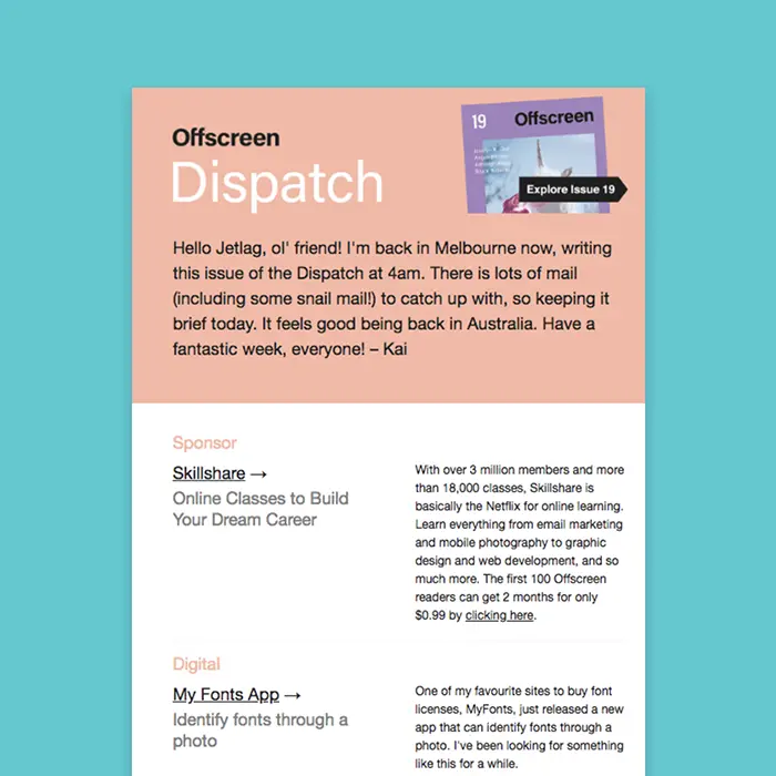
Offscreen is a print magazine and a weekly newsletter “with a thoughtful, human-centred take on technology and the web.” Its newsletter is called Offscreen Dispatch, and we’ve long admired its simple, distinct design. Offscreen uses the same color blocking technique in every email, and the really pretty effect makes the email look like it’s a page in a magazine. The top portion—where web designer Kai Brach writes a note to subscribers—is always pink. The rest of the email is always white. Check it out:

Offscreen dispatch color blocking email

There’s nothing particularly fancy here—no art or photography—but the dynamic layout, well-formatted text, and color blocked design brings this email together.The design is easy to pull off, too, and requires no coding in the BEE editor. Let’s dive in! Open the BEE editor and follow the steps below.

Step 1: Build the structure

Open up the BEE editor on our website (https://beefree.io/) or from your BEE Pro account and start with a basic blank one-column template.Before we start dragging in structure elements, let’s take a minute to examine the Offscreen Dispatch email and identify the layout components. Here’s a marked-up version:

Offscreen Dispatch color blocking email

The email alternates between one-column and two-column structures, which is easy to assemble in BEE.Drag over the corresponding row formations from the Row menu on the right. We’ll need the top two options for this email:

color blocking email

Here’s how our email looks with the row structures in place:

color blocking email

Step 2: Arrange content blocks with text/images

Now that we’ve got the bones of our email assembled, drag over content blocks that correspond with the content type—text and/or image—we want in each section. Then, paste the text and drag in the images.Here’s a 1-2-3 on how to get your content situated. Starting with the first row—the header—here’s how:(1) Pull in a two-column structure:

color blocking email

(2) Add text blocks on the left; an image content block on the right:

color blocking email

(3) Drop in your text and image:

color blocking email

Let’s go through each row to arrange the content.Here’s our email with the remaining content blocks in place:

color blocking email

Now, we’ll finish adding text:

color blocking email

Voilà! Next, let’s format.

Step 3: Format the background colors

Now for the fun part. Watch how easy it is to create the color blocking effect.First, to match the exact shade of pale pink from Offscreen Dispatch’s email, we used HTML-Color-Codes.info to ID the color from the image in the header.

color blocking email

HTML Color Codes identifies the hex code as #F5BBA2. To make the first row the right color, we will:

  1. Select the row
  2. Navigate to Row Background Color in the menu on the right
  3. Paste in the color code (or select manually)
color blocking email

Seamless edge-to-edge color! Now let’s complete the pink color block. We’ll simply select the following row and do the same thing again.

color blocking email

Now, our email is color blocked. Yes, it’s that easy.

Step 4: Format the text

Let’s finalize this email design with some formatting touches. We’ll begin with text.

Choose a default font for the email

Instead of going through each individual content block to choose your email’s font, navigate to the Settings menu on the right and select the font you’d like to use for the entire email.

color blocking email

After that, you can change the header font or select the sections you’d like.

Adjust font sizes

Tap any text block and use the drop-down menu to fine-tune the font size.

color blocking email

Customize text colors

Use that same menu to choose the colors you prefer. Again, use the same matched color code to get the precise shade that’s needed.

color blocking email

Format the link style

Don’t forget links! In the same Settings menu where you chose the default body font, you can also format the link style. In this case, we’ll choose black.

color blocking email

As you add links to your email, make sure the “Underline Link” box is checked. (It’s even an email accessibility best practice!)

color blocking email

Line height

Make sure your body text has room to breathe. For any content blockthat you edit, adjust the text's line height.

color blocking email

Tip: duplicate row

If you spent a lot of time formatting text in a particular row, you can simply duplicate it, instead of manually making the same adjustments in another row.Tap the row you want to copy. Then, click the double-box image all the way on the right.

color blocking email

Your row will be copied! Then, simply drag it and grab the directional icon on the left, to place the new row in the email.

color blocking email

Step 5: Adjust the padding

Last step! And it’s an important one. Before you finish the email, take a close look at the spacing between your content blocks. If there are still too many gaps—or not enough breathing room anywhere else—it’s very easy to make adjustments.For example, there’s still a gap between “Offscreen” and “Dispatch” in the header of our email draft. To tighten it up, tap on either content block, scroll down to Block Options in the menu on the right, and make sure “More options” is turned on under Padding. Then, you can decrease (or increase) the padding on any side in any piece of content.

color blocking email

Pretty neat right? Make sure to check out our tutorial on all things padding and spacing.

Step 6: Preview the finished color blocking email!

Ok—one last,last step. As you design any email, preview it along the way to make sure you like how it appears on both desktop and mobile. Here’s a peek at how ours is shaping up:

color blocking email

Have you used these techniques in the BEE editor? Let us know!

Mother's Day Emails That Will Impress Your Mom

Email buddies: Are you ready for Mother's Day this weekend? It's not too late to put together a heart-warming, funny, simple, and/or beautiful email! To help...
Beefree team
Beefree team
May 8, 2018

Email buddies: Are you ready for Mother's Day this weekend? It's not too late to put together a heart-warming, funny, simple, and/or beautiful email! To help you get inspired, we culled our inbox and curated some impressive Mother's Day emails from all different kinds of brands. They're sweet, bold, and original. As always, we added design tips, too. Check 'em out, then build your own!

peonies Mother's Day emails

Photo by Alisa Anton on Unsplash

Quip

Subject: Get Moma gift that’ll grow on her ????

quip Mother's Day emails

When you think of Mother's Day gifts, you might imagine flowers, books, chocolate, clothing, tickets to an event, or any number of other thoughtful little things. You probably don't think toothbrush. But Quip—an electric toothbrush company—isn't letting that stop them from doing a little Mother's Day marketing. It's clear the brand had some fun coming up with this campaign, and it pays off. The play on words in the headline—"Just add water"—flower-illustrated photo, and clever body copy (plain text!) makes this email a home run!

Sonos

Subject: Get the ultimate Mother’s Day gift.

sonos Mother's Day emails

Like Quip, Sonos knows its smart speaker might not exactly come to mind when shoppers are looking for Mother's Day gifts. This is where thoughtful copywriting can carry an email. If you're sending a last-minute campaign, you can easily pair existing photography with smart text to make it work. The headline text here is large and bold, and the supportive copy it succinct. It's all super legible, high contrast live text with a bulletproof CTA button to boot.

Lululemon

Subject: It's Her Turn

lululemon Mother's Day emails

We've been grooving on creative photo grids lately, and this one from Lululemon stood out. The millennial pink squares filling the gaps in-between images are a nice touch, and one we don't typically see in photo collages. The different style of the second photo grid—with clean white borders around each image—is equally pleasing to the eye. We also appreciate how there's pretty much zilch body text in this email. When the photos carry the story, you really don't always need to add much else!

Artifact Uprising

Subject: Mother's Day gift ideas, straight from our staff

artifact uprising Mother's Day emails

The Z-pattern in this Mother's Day email from Artifact Uprising caught our eye. If you want to pair photos with corresponding text, using a Z-pattern—which looks like a checkerboard—is a good way to go. This beautiful email is also a good reminder that user-generated content can come from your staff, not just from customers or social media followers. For a personal holiday like Mother's Day, this approach is a bit more intimate and pulls at the heartstrings.

Malin+Goetz

Subject: Best. Mom. Ever.

malin+goetz Mother's Day emails

Fragrance. Perfume oil. Candles. The simple labels in this Malin+Goetz Mother's Day email let you know what you're tappin' on. The deep blue color is easy to read, and the links are underlined, so the brand gets an A+ for accessibility. Skipping CTA buttons was probably a style choice, as cramming 3 buttons next to each other in the same content block might be a bit much. But, we still like the vibe. And, when it comes to that beautiful hero image and header, just a friendly reminder that text overlay is always an option if you design in the BEE editor. This means you can use a background image of your choice, then apply live text on top, so your text will be super primed to show up in any inbox, on any device.

MAC

Subject: Love Your Mom to the M·A·C with a Liptensity Pair for $35 ($42 Value) + Free Shipping!First the GIF:

MAC Cosmetics Mother's Day emails

Then the full email:

MAC Cosmetics Mother's Day emails

A little animation goes a long way. This email from MAC cosmetics is pretty simple: hero image GIF, body copy, CTA button, and secondary content. A good ol' inverted pyramid layout does the trick every time. And keep in mind, you get the entire message in the subject line, too. So when a reader opens the email, they're already primed with the info they need. After that, a click or a tap should be the next step. Tip: While this body copy is MAC's brand font—so it's displayed as an image—choosing a web safe font like Courier would make this email more inbox friendly.

Moleskine

Subject: Since Mother's Day is Coming Soon

Moleskine Mother's Day emails

We're suckers for things arranged neatly. Or by color. This well-crafted custom photography by Moleskine makes us smile. It's cute how lipstick and flowers are included, right? And, that 50-50 split of the background colorsis a nice touch, too. (But use a bulletproof CTA button next time, please!)

Rifle Paper Co.

Subject: Match Your Mom

Rifle Paper Co. Mother's Day emails

Rifle Paper Co. makes the most beautiful emails! We're bummed, though, that the email is composed ofall images. Using HTML background colors alongside images, and live text over images, are two design techniques that we're proud our BEE editor lets designers do. Otherwise, this email is a stunner.

Consider the Wldflwrs

Subject: For Mom: The family tree of diamond necklaces.First, another GIF:

Consider the Wldflwrs Mother's Day emails

Then, the whole email:

consider the wldflwrs Mother's Day emails

We had to include this email from Consider the Wldflwrs for its animation. The GIF is so simple and sweet! It's perfect for this lovely Mother's Day email.

Ready to build your own Mother's Day emails?

Create your own email for mom with a freeBEE Protrial.The drag-and-drop editor is easy to use, comes with built-in templates and stock image libraries, andallemails and design elements are mobile-responsive.

Stay informed on all email trends

From the latest creative design strategies that inspire your next campaign to industry best practices and tech advancements, our newsletter is the go-to for all things creation.

By clicking Subscribe you're agreeing with our Privacy Policy