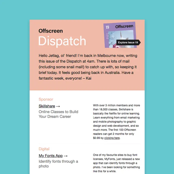
We recently celebrated all things color in email. One style we totally love (and see a lot) is color blocking, where about half an email has a bold background color and the other half is white. This is a simple technique that goes a long way in inboxes. In this tutorial, we’ll show you how to build a color blocking email of your own in a few easy steps. We’ll also explore how to:
- Add multiple HTML background colors within an email
- Establish multiple columns
- Format text (color, size, line height, links etc.)
- Polish an email by fine-tuning spacing and padding
Inspiration: Offscreen Dispatch
Offscreen is a print magazine and a weekly newsletter “with a thoughtful, human-centred take on technology and the web.” Its newsletter is called Offscreen Dispatch, and we’ve long admired its simple, distinct design. Offscreen uses the same color blocking technique in every email, and the really pretty effect makes the email look like it’s a page in a magazine. The top portion—where web designer Kai Brach writes a note to subscribers—is always pink. The rest of the email is always white. Check it out:
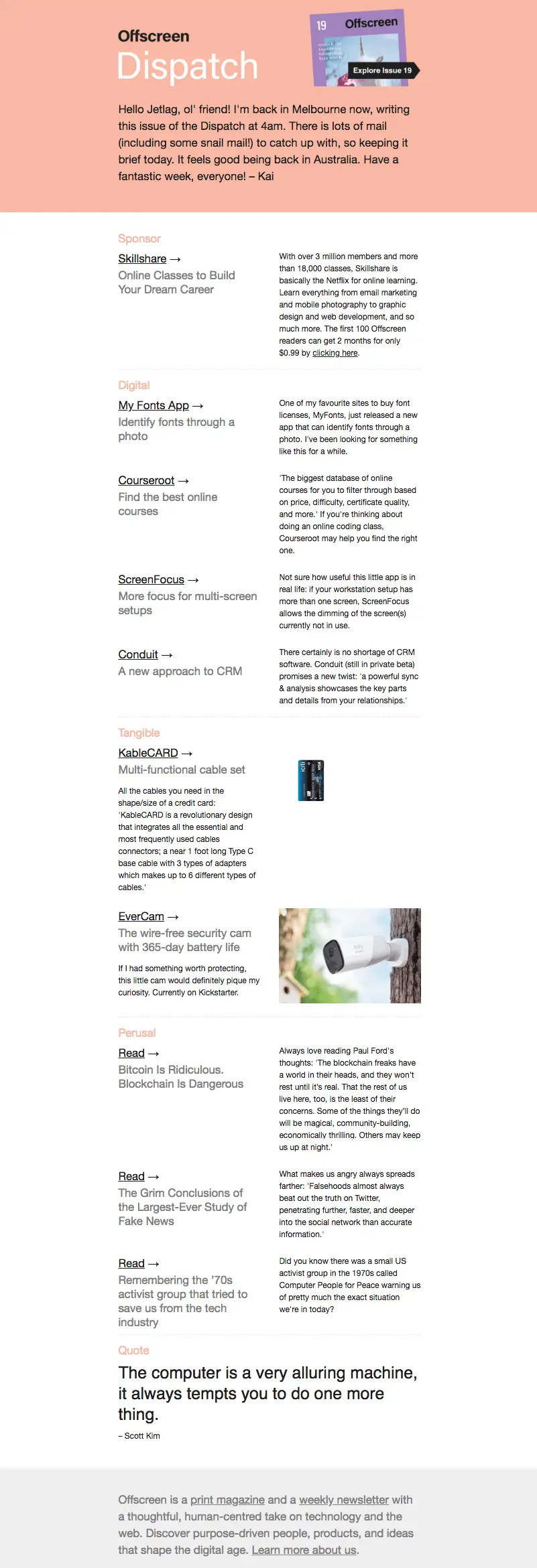
There’s nothing particularly fancy here—no art or photography—but the dynamic layout, well-formatted text, and color blocked design brings this email together.The design is easy to pull off, too, and requires no coding in the BEE editor. Let’s dive in! Open the BEE editor and follow the steps below.
Step 1: Build the structure
Open up the BEE editor on our website (https://beefree.io/) or from your BEE Pro account and start with a basic blank one-column template.Before we start dragging in structure elements, let’s take a minute to examine the Offscreen Dispatch email and identify the layout components. Here’s a marked-up version:
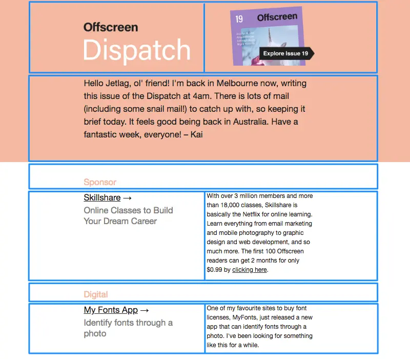
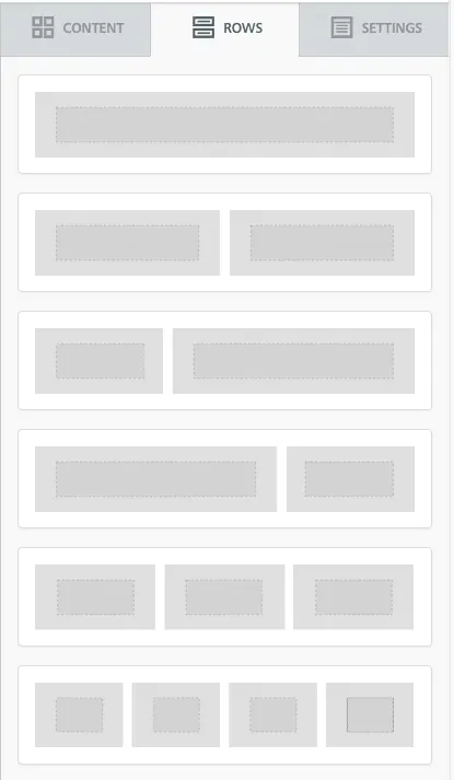
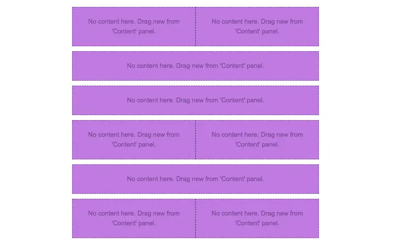
The email alternates between one-column and two-column structures, which is easy to assemble in BEE.Drag over the corresponding row formations from the Row menu on the right. We’ll need the top two options for this email:
Here’s how our email looks with the row structures in place:
Step 2: Arrange content blocks with text/images
Now that we’ve got the bones of our email assembled, drag over content blocks that correspond with the content type—text and/or image—we want in each section. Then, paste the text and drag in the images.Here’s a 1-2-3 on how to get your content situated. Starting with the first row—the header—here’s how:(1) Pull in a two-column structure:

(2) Add text blocks on the left; an image content block on the right:
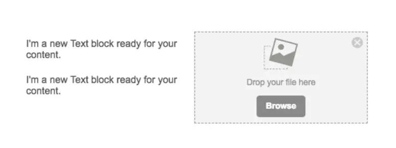
(3) Drop in your text and image:

Let’s go through each row to arrange the content.Here’s our email with the remaining content blocks in place:

Now, we’ll finish adding text:
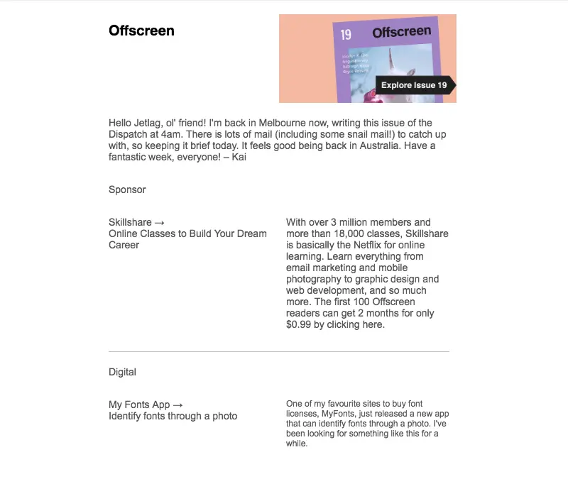
Voilà! Next, let’s format.
Step 3: Format the background colors
Now for the fun part. Watch how easy it is to create the color blocking effect.First, to match the exact shade of pale pink from Offscreen Dispatch’s email, we used HTML-Color-Codes.info to ID the color from the image in the header.
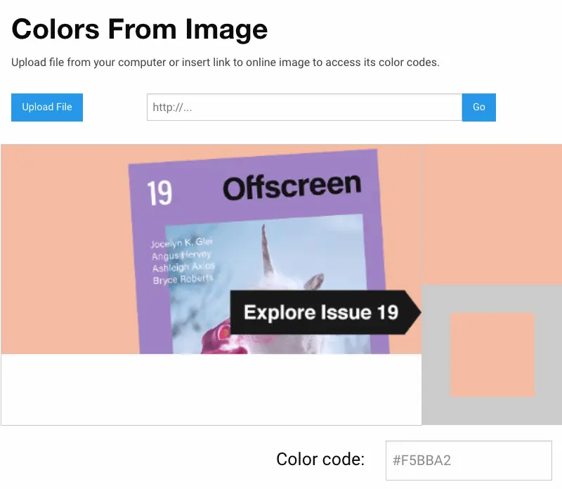
HTML Color Codes identifies the hex code as #F5BBA2. To make the first row the right color, we will:
- Select the row
- Navigate to Row Background Color in the menu on the right
- Paste in the color code (or select manually)
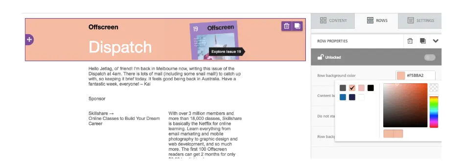
Seamless edge-to-edge color! Now let’s complete the pink color block. We’ll simply select the following row and do the same thing again.

Now, our email is color blocked. Yes, it’s that easy.
Step 4: Format the text
Let’s finalize this email design with some formatting touches. We’ll begin with text.
Choose a default font for the email
Instead of going through each individual content block to choose your email’s font, navigate to the Settings menu on the right and select the font you’d like to use for the entire email.

After that, you can change the header font or select the sections you’d like.
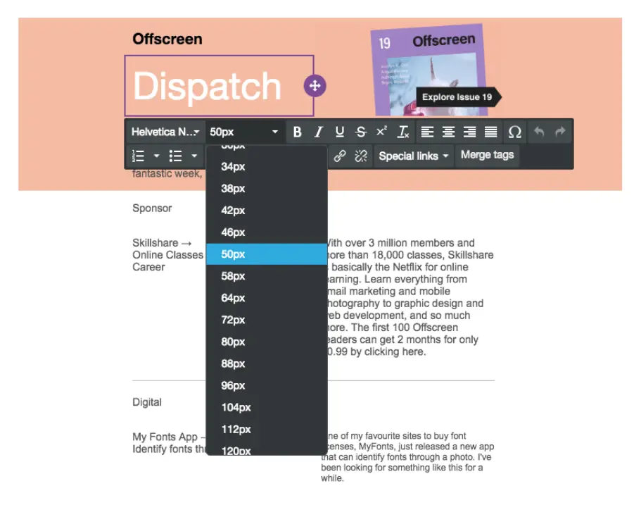
Adjust font sizes
Tap any text block and use the drop-down menu to fine-tune the font size.
Customize text colors
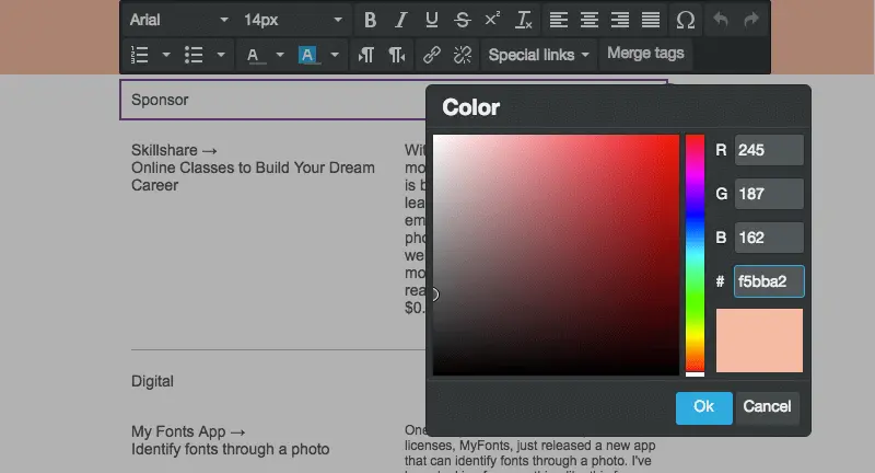
Use that same menu to choose the colors you prefer. Again, use the same matched color code to get the precise shade that’s needed.
Format the link style
Don’t forget links! In the same Settings menu where you chose the default body font, you can also format the link style. In this case, we’ll choose black.
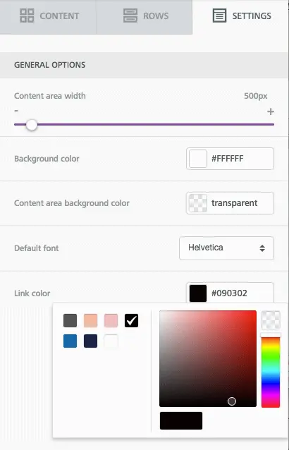
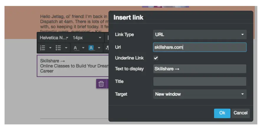
As you add links to your email, make sure the “Underline Link” box is checked. (It’s even an email accessibility best practice!)
Line height
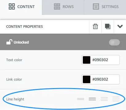
Make sure your body text has room to breathe. For any content blockthat you edit, adjust the text's line height.
Tip: duplicate row
If you spent a lot of time formatting text in a particular row, you can simply duplicate it, instead of manually making the same adjustments in another row.Tap the row you want to copy. Then, click the double-box image all the way on the right.

Your row will be copied! Then, simply drag it and grab the directional icon on the left, to place the new row in the email.

Step 5: Adjust the padding
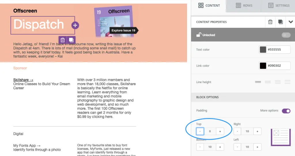
Last step! And it’s an important one. Before you finish the email, take a close look at the spacing between your content blocks. If there are still too many gaps—or not enough breathing room anywhere else—it’s very easy to make adjustments.For example, there’s still a gap between “Offscreen” and “Dispatch” in the header of our email draft. To tighten it up, tap on either content block, scroll down to Block Options in the menu on the right, and make sure “More options” is turned on under Padding. Then, you can decrease (or increase) the padding on any side in any piece of content.
Pretty neat right? Make sure to check out our tutorial on all things padding and spacing.
Step 6: Preview the finished color blocking email!
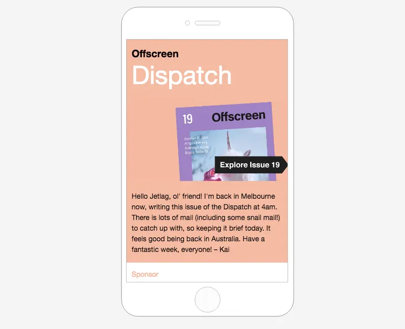
Ok—one last,last step. As you design any email, preview it along the way to make sure you like how it appears on both desktop and mobile. Here’s a peek at how ours is shaping up:
Have you used these techniques in the BEE editor? Let us know!
