B2B buyers are busy, and their decisions are rarely simple. Purchasing often involves multiple decision-makers and constant pressure to justify every tool in terms of ROI, efficiency, and scale.
Their days are spent comparing vendors, aligning internally, managing budgets, and responding to evolving team needs. So when an email hits their inbox, it’s rarely read line by line. It’s scanned.
That's why effective B2B email design catches the reader’s attention, cuts through the noise, and strategically signals to them what matters, what's new, and what's worth acting on now.
In this article, we’ll explore six strategies to help you design emails that support B2B buyers in making more informed decisions, faster.
- Make a strong first impression
- Segment your audience with modular precision
- Address pain points with "before and after" layouts
- Transform complex insights into scannable email blocks
- Share verified customer success stories
- Include clear CTAs for multi-stakeholder decision making
1. Make a strong first impression
By now, you know that your subject line is your first impression. But for busy prospects, this 30-60 character sentence becomes increasingly more important. When evaluating subject lines, ask from your prospect’s perspective: “Why is this email important to me?” If it doesn’t answer that question instantly, it risks being ignored.
Equally important is what your recipients see above the fold, including the preheader text and hero section. These elements must visually fulfill the promise of the subject line. The preheader should reinforce the subject’s value, hint at the content, and encourage the reader to open the email. The hero section—the first visual and textual content in the email—should immediately deliver on that promise.
For example, if your subject line highlights a way to improve productivity, the hero section should clearly show how, using scannable text, key metrics, icons, or imagery. This alignment builds trust and encourages the reader to continue engaging with your message.
A disconnect between the subject line and above-the-fold content creates friction. It can confuse or frustrate your audience, diminishing trust before they even scroll further.
2. Segment your audience with modular precision
Segmentation doesn't start in your CRM. It begins in your email design. In B2B, no two leads are the same. Even when they are in the same lifecycle stage, they differ in priorities, constraints, and what they need to move forward.
The most effective way to support segmented messaging at scale is by building modular email templates. Instead of creating a new email for every audience, modular templates use flexible content blocks that can be swapped, reordered, or personalized for each recipient.
For example, a SaaS company that prices based on usage might design a proposal template with a dynamic pricing module. That module can pull personalized data from a CPQ system, while the rest of the email remains consistent and on-brand. Marketing maintains design control, sales gain speed, and prospects receive information tailored to their needs.
With Beefree, teams can design these modules visually and reuse them across campaigns. A single base template can support multiple segments by:
- Adjusting headline messaging to reflect different pain points
- Swapping proof points based on industry, role, or maturity level
- Showing or hiding CTAs depending on readiness or intent
- Localizing content for regions or departments without rebuilding layouts
3. Address pain points with "before and after" layouts
B2B buyers don’t respond to vague promises. They respond to clarity. A clear problem-solution structure helps turn an outreach email into something immediately actionable. One way to do this is by illustrating the "before and after," a strategy you might be most familiar with in B2C.

Although mainly seen in B2C, this strategy translates exceptionally well to B2B when applied with intent. The “before” state should clearly and concisely frame the problem your buyer recognizes today. This isn’t about dramatizing pain. It’s about naming inefficiencies, risks, or blockers in simple, concrete terms so the reader can instantly say, yes, that’s us.
The “after” state then shows what changes once the problem is addressed. This is where solution-oriented messaging shines. Instead of features, focus on outcomes: faster workflows, fewer handoffs, better visibility, or more consistent execution across teams.
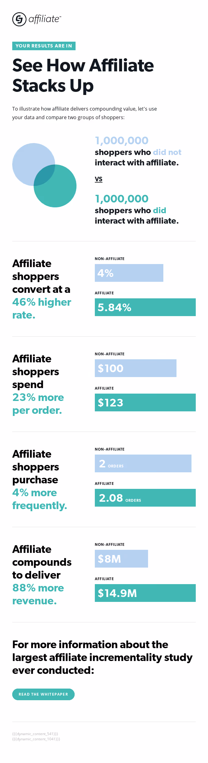
In the example below Commission Junction, consicely communicates the before (non-affiliates) and after (affiliates) of their affiliate program for brands and partners to understand the impact, stay engaged with the program, and potentially act on the insights provided.
There are various ways to illustrate "before vs. after" in emails, but here are some ideas to get you started:
- Split layouts
- contrasting backgrounds
- Progressive flows or step-based layouts
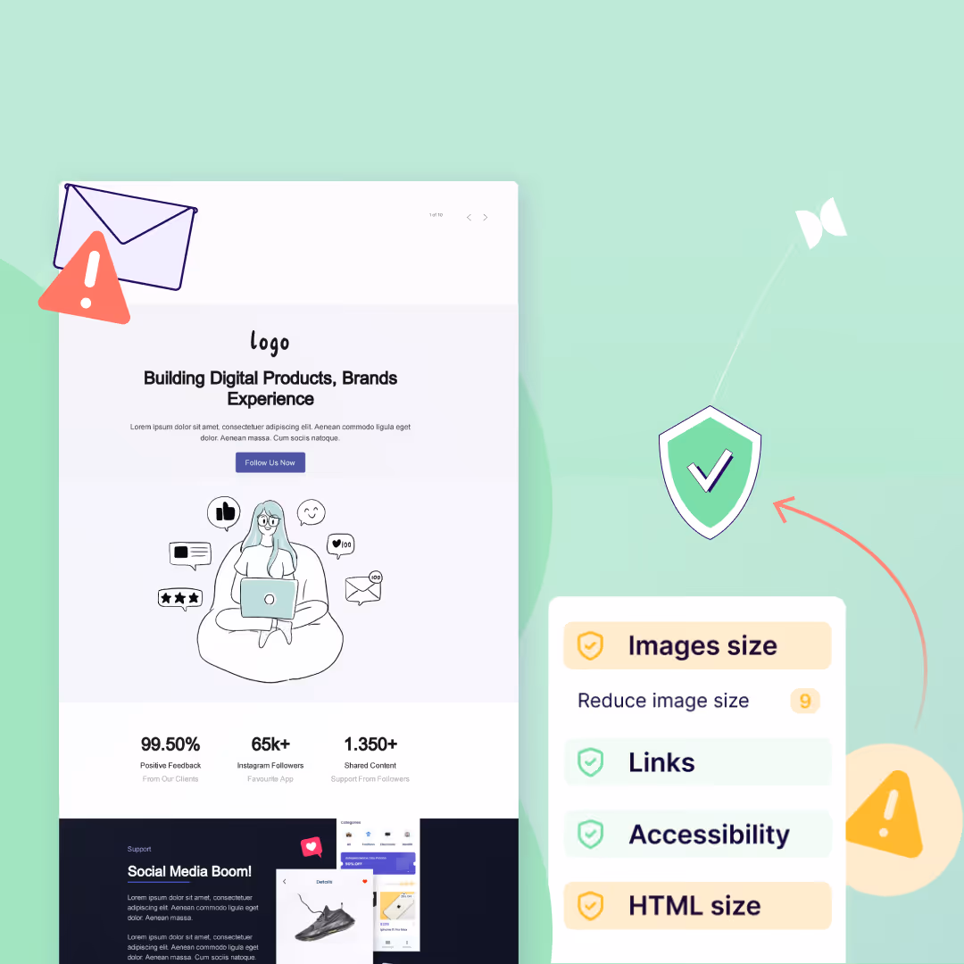
4. Transform complex insights into scannable email blocks
Data builds trust. Similar to the strategy above, tangible numbers help B2B buyers quantify the impact of your solution and make informed decisions. But that value quickly disappears if insights are buried in dense paragraphs or in overly complex explanations.
By replacing text-heavy sections with scannable, infographic-style elements such as bold callouts, simple charts, or highlighted metrics, you can help reduce cognitive effort. Plus, when paired with a short, outcome-focused explanation, the email reinforces to the reader why they should take action.
The following example from Customer.io does a great job at showing us the numbers and why they matter to us. They also do a great job using visual heirarchy to guide us throughout the email.

PRO Tip: Whenever possible, prioritize first-party data. Metrics tied directly to customer outcomes, performance improvements, or efficiency gains carry more weight and feel more credible to B2B buyers.
If you reference third-party research, clearly cite the source. Better yet, link to a relevant article or analysis hosted on your own site. This adds credibility, provides deeper context, and gives readers a natural next step if they want to explore further.
5. Share verified customer success stories
In the spirit of using first-party data, testimonial and case studies are powerful B2B sales accelerators. In fact, around 92% of B2B buyers read online reviews and testimonials to support buying decisions.
These social proofs champion customers who have solved a problem using your products or services. Such stories are relatable to your prospects and are crucial to building trust. Some design elements to add to your testimonials include:
- Customer headshots or brand logos
- Short, outcome-focused quotes
- Supporting data points or star ratings
Additionally, this is where the modular approach from Strategy #2 becomes especially powerful. Instead of using the same social proof for every audience, modular testimonial blocks allow teams to swap in the most relevant customer story for each segment.
6. Include clear CTAs for multi-stakeholder decision making
In B2B, decisions rarely happen in isolation. Multiple stakeholders often influence a single purchase. Your CTAs must cut through that complexity, providing a clear, unambiguous action that aligns all readers on the next step. A well-designed CTA moves everyone closer to the promised value without creating confusion.
1. Make it stand out with contrast:
Use a high-contrast color for your CTA button to ensure it pops against the email background and surrounding elements. This immediately draws the eye, helping multiple stakeholders identify the action they need to take.

2. Use size and whitespace strategically:
Slightly larger buttons, surrounded by whitespace, signal importance and create a visual anchor. In a group decision-making context, this ensures every stakeholder notices the CTA and recognizes it as the priority action.
4. Layer CTAs:
Position a primary CTA above the fold for high-intent readers, then reinforce with a secondary CTA at the bottom for those who need more context. This layered placement ensures all stakeholders, from quick scanners to detail-oriented reviewers, can engage appropriately.
5. Personalize CTAs with dynamic content:
With Beefree’s display conditions, you can tailor CTAs to each lead’s stage in the buying journey. Early-stage prospects might see a CTA to download an educational resource, while mid-stage leads see a CTA to schedule a demo, and late-stage leads are guided directly to a trial or pricing page. Dynamic CTAs keep your messaging relevant, reduce cognitive load, and guide each stakeholder toward the most appropriate next action—without redesigning separate emails for each segment.
Keep leads moving with consistent email design
Ultimately, strong email design is both aesthetic and functional. It helps busy B2B buyers quickly scan, understand your message, and clearly see how your solution fits into their world.
Repeated layouts, familiar color schemes, and consistent typography create visual recognition across follow-ups. That familiarity helps build trust and keeps leads engaged as they move closer to a buying decision.
Standardized templates make this possible at scale. Whether you’re creating sales emails from scratch or starting with Beefree’s library of over 2,000 ready-made templates, consistency becomes a system, not a manual effort. Teams can move faster, collaborate more easily, and maintain quality without slowing down execution.