Design
Coffee Industry Emails With Well-Brewed Designs
Ready for a coffee break? Us, too. We love a good cup of joe, and this appreciation led us to wonder what coffee industry emails (from brands like Starbucks, Illy, Counter Culture, Peet's, Blue Bottle) looked like. Our first discovery was that most coffee brands don't send a massive number of email campaigns! Nothing like, say, fashion and e-commerce brands. But, there are a few gems that we're excited to share, and we want you to send us your favorite coffee emails, so we can add them to the mix, too!
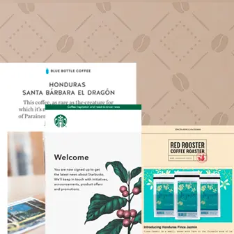
Blue Bottle Coffee
Subject: A Newly Discovered Cultivar with an Unusual Name
This bright, beautiful email from Blue Bottle Coffee made our mouth water. That hero image is stunning! It's also relatively generic and could even be a stock image, which just goes to show that you can build a beautifully designed email without any custom artwork.We like the one-line opener positioned above the hero image, instead of below it, in a traditional inverse pyramid layout. The text is large, minimal, and easy to read. The whole email is also based around a single message, with just one module of secondary content. This is an effective way to communicate with busy, on-the-go (and caffeinated) readers!One thing we'd change: The text must be live! Georgia is a web-safe font and would be a great way to break up the images. And the CTA button, of course, should be bulletproof.
Red Rooster Coffee Roaster
Subject: NEW COFFEE + NEW SCORE!
We've come to expect the background color for most emails to be plain white, so it's a pleasant surprise to find apale peachy color in this Red Rooster Coffee email. It's light enough that the black text has plenty of contrast and is easily read. Plus, the email has a lovely web-safe Courier font, which offers a vintage typewriter vibe that pairs nicely with the sans seriffont used in the logo and headers.Another small but important design detail we appreciate is the underlined links. Underlining links makes your email more accessible to readers who have visual impairments, which is so important! (Read more about accessible email design from Email on Acid's John Thies).
The Coffee Bean & Tea Leaf
Subject:Everyone loves free shipping ☕
We're a sucker for a good pun, and the opener of this Coffee Bean & Tea Leaf email made us smile. The email is a solid image, which isn't a design best practice, but we appreciate the smart art and copy that went into this messaging.Pro Tip:In the BEE editor, you can upload a big background image like this one, then place live text and a bulletproof CTA on top! This will make your email more inbox-friendly, particularly for mobile viewers! Check out our tutorial on adding background images in email.
Stumptown Coffee
Subject: Special delivery: new Indonesian coffees for April
Gorgeous green! That was our first thought upon opening this email from Stumptown Coffee. We love that the green background only exists behind the photo collages. If the entire email were green, it'd have a darker, potentially more claustrophobic vibe. But using a light gray background for the body of the email does wonders to provide balance.While these photo grids are actually single images, they could also be arranged individually in responsive photo grids. Still, this email is well-balanced with plenty of padding between content, a CTA button that passes the squint test, live text, and underlined links!
Starbucks
Subject: Welcome to Starbucks
This Starbucks email isn't the most exciting in the world, but we thought it was beautiful and unexpected. It's not often that an email lands in our inbox without a strong call to action—and we usually don't advocate for that approach—but this simple welcome email was a pleasant surprise. Starbucks is very clear and straightforward in confirming what the reader signed up for, both in the green banner and in the body text, and while this email may not garner clicks, it does help establish transparency and brand loyalty.
La Colombe
Subject: Favorite Mexican Coffee
One of the first things we noticed about this La Colombe email is its color scheme. The brand's blue, red, and yellow colors—along with white in the background and as an accent—all play nicely together and provide a bit of a pop. The brand is also using the quirky content block approach we first talked about last year, which offers a playful, creative vibe. And, the map illustration stands out! Still, like emails from other coffee brands, this one would benefit from more live text, whether between the images or on top of them.
Build your own photo grid email & get creative with HTML background colors!
Not to toot our own horn, but...if you try a free BEE Pro trial, you'll get access to our super intuitive drag-n-drop email design tool, in which every email you make will be mobile responsive. You'll also get access to our huge library of gorgeous stock photos, plus all the tools you need to design a beautiful email—without needing to know any code. We hope you give BEE Pro a try, and cheers to happy designing!
Tutorial: How to Build an Image Grid Email for Desktop and Mobile
Do you want to design a simple, beautiful, mobile responsive email with a ton of photos? We got you. Today's post is a step-by-step guide to building a stunning image grid email. You can use this dynamic layout to introduce a new product, offer a promotion, run a sale, or tell almost any kind of visual story. Using an email from fashion brand & Other Stories, we'll walk you through how to organize and optimize a photo grid in an email, including how to:
- Make creative image grid configurations
- Set an auto width for select images
- Hide specific images in the mobile version
- Stack images in the mobile version (or leave them in a grid formation)
Inspiration: & Other Stories
E-commerce brand& Other Stories consistently sends thoughtfully designed emails. Even though they're full of product photos, the emails remain simple, fresh, and free of clutter. Plus, the brand does a great job of using well-formatted live text and making sure its photo grids look great on mobile, too. Check out what we're talking about—here are a few recent emails from & Other Stories:
Each email is a little different, but most include a photo grid with different-sized images. This one has two hero images, followed by a grid:
We love the use of different-sized images that all fit together perfectly. Knowing how to make smart image configurations can really level-up the design of your emails. Let's get started on how to do it in today's tutorial.
The Inspiration for Our Photo Grid
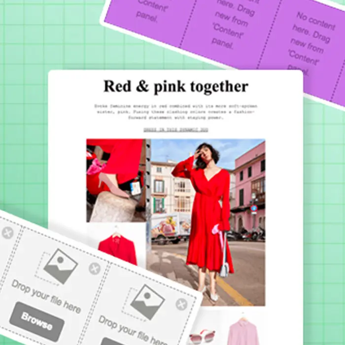
For today's tutorial, we'll show you how to create an email like this one:Subject: Spring's color pairing
Pretty, right? And it's not difficult to create. Let's go!
Step 1: Build the structure
Open up the BEE editor on our website https://beefree.io/ or from your BEE Pro account and start designing in abasic one-column template.We can think of the email as having six structures or modules.
From ourStructuremenu on the right, we’ll create an email layout that mimics our example by dragging in modules. The first half is a single column, while the second half has a series of multi-column structures.
Using a series of asymmetric multi-column structures like this sets us up to design a dynamic photo grid. When a layout alternates from row to row, it's easy to create a photo grid with images of different sizes. Keep reading to see how.
Step 2: Arrange content blocks
Going row by row, we'll drag in content blocks that correspond to the content contained in each structure. For instance, the first structure (or row) will need a text block to read "STOCKHOLM ATELIER," a divider line, and then an image block for the & Other Stories logo. We'll pull in each of these content blocks into Structure 1.
The following structure will only need an image content block to contain the hero image, and the one after that will require text only.To build the first image grid structure, in row 4, we'll drag in image content placeholders, so the row looks like this:
Then, we drop in the images.
Because of the structure, or layout, chosen for this row, the photo on the right has space to be as large as the two images stacked on the left.Beneath it, the following four-column structure will contain four evenly sized images.(1) Here's the bare structure:
(2) Here's the structure with image content blocks:
(3) Here's the final structure after we drag in images:
Simply go through each row, adding the images and content blocks as desired to complete your email! Here is how ours is coming together:
3. Format images: tips and tricks
Now that you have the hang of how to arrange images, here are some tips on making them look the way you want.
Fine-tune padding
Remember that you can line up each image next to another one—without space between—by setting an image padding to zero. Simply click an image, then use the Content Properties menu on the right to make adjustments.
Conversely, if you want to create space between images, bump up the padding a bit. Here's our four-column row with a little padding—5 px—added between images:
Set an auto width for select images
When you drag and drop an image into your email, it will automatically fill the width of the container. But you can also use the Content Properties menu to adjust an image's width. For instance, in our current email, when we drop in the & Other Stories header image, it's automatically the width of the email.
To decrease the width of the image, unselect auto width on the right...
...then drag the percentage bar down, closer to 20%, to shrink the appearance of the logo.
Note: You can also check the "Full width on mobile" box to make sure the logo is easy to see on a smaller screen.
Hide specific images in the mobile version
If you have an image-heavy email, consider hiding some of those images on mobile. Doing this can help make the email quicker to download on mobile devices and improve readability—with fewer images, a reader won't have to scroll and scroll. You might also have a large hero image, as in this email from & Other Stories, that shouldn't take up so much screen space on smaller devices. For these reasons, BEE now has a Hide on mobile feature that can be selected for an image.The Hide on mobile option is located at the bottom of the Content Properties menu for any image you select. If you select the hero image, for instance, then you can scroll down and choose to hide it.
The email preview allows you to see how theemail looks with the hidden hero image:
Stack images on the mobile version (or leave them in a grid formation)
All emails designed in the BEE editor are mobile responsive. This means, when you have an image grid like the one in an email, the mobile version will automatically "stack" images on top of each other for easy viewing on small screens. So our image grid usually looks like this on mobile, with each image shown "full screen" one at a time:
However, now you have the option to ask BEE not to stack images, if you prefer the grid to remain intact even on mobile screens.Simply select your image grid structure, then use the Content Properties menu to turn on theDo not stack on mobile feature.
Now, our mobile preview looks like this:
Plus! All these features are meant to give you more control over exactly how your email looks. We hope you enjoy the design flexibility while building (and mastering) stunning image grid emails in the BEE editor!
Fonts in Email: Remember These Essential Tips From an Email Monks Expert!
Effective emails convey information clearly. No matter how simple or ornate the design is, the core message is—above all else—understandable. After all, emails are about communication! And in the spirit of great communication, we're sharing more best practices for using fonts in email. We even tappedEmail Monks' Head of Marketing, Kevin George, to weigh in, too! Plus, we have exciting news about a font-based feature update in the BEE editor.
What should designers keep in mind when choosing fonts in email?
It may sound obvious, but Kevin George offers a good reminder:The purpose of any font is for itto be read.This means designers need to ask themselves questions like, even if a loopy script looks pretty in the header, is it actually legible? If the kerning or line height is adjusted so much that the letters barely look like letters, will readers still get the message?In other words: keep it simple. "Your emails should look easy to read and understand," Kevin wisely advises. As you build your email and choose your fonts, here are some best practices he recommends:
- Use no more than three fonts in a single email
- Don't use more than two different colors for your text
- Limit the use of "fancy fonts" to headers and titles; use simple fonts for body text1.
1. Understand email safe fonts vs. web fonts. vs. custom fonts
We talk a lot on the blog about "plain text" or "live text," which we generally mean to be the email safe fonts(or web safe fonts) that brands use, like Arial, Helvetica, Georgia, Times New Roman, Courier, and other default fonts that render on any computer or device. Choosing these fonts for emails is a design best practice because they're so reliable. This doesn't mean all your text needs to be "email safe," but the more that is, the better.Web fonts are designed specifically for the web. They're somewhat less reliable than plain text options, but they're still found on many—if not most—devices. These are fonts like Open Sans, Roboto, Lato, and others. Many popular web fonts are Google Fonts. Litmus offers a useful write-up on web font support.Obviously, there are many other fonts in existence beyond these web safe or web font categories. And many brands have custom fonts—typefaces that have been modified or designed specifically for a brand. These fonts can sometimes be coded into an email, but more often than not they're simply added as an image—commonly in the header, like in this email from Schuh.
Pro Tip: Don't forget about fallbacks!
Since web fonts and custom fonts can't be relied upon to appear across all mail clients and devices, fallback fonts should be selected as a backup."Email clients render fonts based on their presence in the system," Kevin explains. "If a system does not have a particular custom font, it proceeds to the first fallback, followed by the next fallback."This series of fallback options is called a font stack. Kevin describes it like three levels of fonts in the code:
- 1st level: The custom font that supports your copy and brand identity
- 2nd level: Web-safe font with the same x-height and kerning as the custom font
- 3rd level: Final fallback which will be present in every system and would render anyhow
For instance, say you use Open Sans in your email. If that doesn't render when a reader opens the message, the code will tell it to default to Helvetica, and if that doesn't render, then Arial.As with all matters of email design, it's critical to test. "No matter how good the fonts look at your end, make sure to set a fallback that displays the font or its matching fallback font properly at the receiving end," Kevin advises.Luckily for us, when designing emails with theBEE editor, you don’t have to worry about building your own font stacks. They're automatically generated when you choose your fonts.
2. Elevate the look of plain text with smart formatting
Any well-formatted text shows aclear hierarchy when used in headers and sub-headers, especially if there is a well-executed combination of fonts and font sizes. Here are some formatting tips to keep in mind:
- Section headers: Use 'em! Headers establish structure—and sometimes, they're all readers will pick up if they're skimming. Use a strong, consistent format—like a sans serif that's at least twice the size of your serif body text.
- Line height: A good rule of thumb: set your line height to be at least 1.3x the height of your letters. It'll help maintain a comfortable distance, between lines, that optimizes readability.
- Section breaks: Empty space is your friend. Offer ample padding between sections to mark a transition from one to another.
- Email width: If you're sending a text-heavy email (think paragraphs of text in a wordy update or newsletter), constrain the width—to about 500px—to improve readability.
- Links: Choose a fun, vibrant brand color that pops on the page, and be sure to keep the underline.
- Bold + italics: Use bold and italicized lettering sparingly and strategically. Ask yourself: is this text treatment serving a purpose?
This email from Heyday is comprised of web safe fonts Arial and Georgia. Yet the strategic implementation of coloring, underlining, bolding, and italicizing font makes the lettering look sophisticated—and easy to read.
Here's another email from Postable that uses nearly all Helvetica text.
Pro Tip: Keep it accessible!
Make sure your email is accessible to everyone—including the vision-impaired—by formatting your text wisely. This means using large, legible fonts (at least 14pt), underlining links, and being mindful of color schemes. Kevin writes more about email accessibility here, and we also covered top accessibility tips in our post, Why Does Email Accessibility Matter? Insights and Advice From Email on Acid’s CEO.
3. Activate web fonts and upload custom fonts in BEE
Now that you're a typeface wizard, here's how to customize the fonts you can access in the BEE editor.
Add web fonts
First, log in and open a new or existing email design project.
Navigate to Settings along the upper menu.
Click Brand Styles.
You'll see a menu of web safe fonts that are already available and loaded into BEE.Scroll down to the next menu, a selection of available web fonts that you can add to BEE for your use. Simply select the ones you want to add!
Add custom fonts
Within the Brand Styles menu under Settings, you'll also see a button to Add Custom Fonts.
Tap it, and a pop-up menu will appear to let you add your own custom brand fonts!
You now have the option to design your font stack of fallback options. Pretty neat, isn't it?Give it a try with a freeBEE Protrial.The drag-and-drop editor is easy to use, comes with built-in templates and stock image libraries, andallemails and design elements are mobile-responsive.Let us know if you have questions or ideas about font use in emails in the Comments area below! And, a special thanks to Kevin George of Email Monks for contributing!
Spring Emails in the Freshest Rainbow of Colors
It's almost spring, and we're so ready for the change in season! Our inbox is flush with spring emails, and there's a lot to love. For one thing: color!The spring emails we're receiving are bright, fresh, and fun. So, to celebrate the warmer weather and the rainbow of color in our inbox, this post will be organized by email color—from pink to yellow to green and more—so scroll on!
Animated hero GIF from a recent Poler email
Think Pretty in Pink
There's nothing exactly new about millennial pink. But its appeal certainly has staying power. And with the change in season, it seems that spring means all things pink. We're seeing pink content, pink backgrounds, pink text, pink pink pink! And we won't complain. There's a specific charm that comes along with this color, and we're happy to see it stay.
Sweaty Betty
Subject: The new spring shades you can't miss
This perfectly pink email from Sweaty Betty isn't particularly revolutionary, but we do love the well-crafted diagram in the second module. The simple labeling, coupled with a swatch of the clothing pattern, is visually delightful. In a sea of e-commerce emails, a simple touch like this stands out.
Rent the Runway
Subject:First Look at Spring Collections
Rent the Runway typically uses a touch of blushy pink in emails, particularly as abackground color. This email is no exception, with red and pink clothing on display. We love the blurry flower image in the bottom left, too. It plays off the airborne flower in the center image and polishes the design. A photo grid like this is easy to make and always looks sharp, especially when it's responsive for smaller screens.
Say Yes to Yellow
Is there any color that says "happy" more than yellow? We think not! This peppy, cheerful color is perfect for spring, so it's no wonder brands are embracing it.
Splendid Spoon
Subject: The Ultimate Spring Soup
Splendid Spoon is a soup delivery and meal-planning service. This recent email introduces their garden minestrone soup—and its nutritional benefits—in a spunky, engaging way. Can't you just imagine these veggies falling straight into a pot of simmering soup? Mmm!
Glamour
Subject: 50 Spring Dresses So Good, You'll Want Them All
There's nothing fancy about this email design, but that bright yellow background is just lovely. It's so chipper, we can't help but want to give it a click!
The Goods by Inside Hook
Subject:Micro wallets, beautiful vans and stellar rain jackets
This yellow rain jacket makes our heart sing! Similar to Glamour's email, a single product takes the stage in the hero image position. Sometimes we want to get fancy with layered text, textures, illustrations, and so on, but these solo images show us that simple works, too. When you choose a single product and let it shine, readers might have a better idea of what they're getting when they click, and there's nothing wrong with that.
Give Some Green
After a long winter, there's nothing like seeing the world erupt in green: green grass and buds and leaves and blossoms. Green is the color of growth. It's refreshing. And, it's very spring.
Consort
Subject:Spring Vibes Are Here... And 10% Off
The horizontal green line/divider in this email from Consort complements the green colors in the photo. So does that discount bar across the bottom. Both are placed carefully in the "dead space" at the top and bottom of the image. Well done! But, that bar could have included live text, so nothing looks blurry or fails to load? One of our favorite BEE editor features is the ability to place live text and CTA buttons on top of background images. Catch the email background tutorial.
Rifle Paper Co.
Subject: New Keds are here!
Check out this springtime color palette from Rifle Paper Co.! This email is a work of art. We love the off-center images, the layered illustrations, and how pops of millennial pink complement all that green.
Be the Best in Blue
Clear blue skies, blue coastal scenes—we're ready for 'em! Bring on the turquoise, teal, azure, and cyan!
Hipmunk
Subject: Time to fly with crazy low fares from $49 one way on Virgin America.
This isn't exactly a blue-blue email, but who can resist this animation? We haven't seen anything quite like it! Here's the full email from travel company Hipmunk:
That little airplane is animated too! It zooms around the button. We're into it, Hipmunk!
Suistudio
Subject: Spring Awakenings
Oh, how this white suit pops against that ethereal blue background!! With a statement image so bold and beautiful, this email doesn't need anything more. Except maybe a bulletproof CTA button, just to be sure.
Suit Supply
Subject: Spring is Postponed
We love the playful copy in this email from Suit Supply. It was sent in early March, just when we were all really yearning for spring but snow was still in the forecast. At least the beautiful blues in this email offers some seasonal soothing.
View Violet Shades
Did you know 2018's Pantone color of the year is ultraviolet?
Since the announcement, we've been seeing pops of purple here and there—though pink is still giving it tough competition...
Reformation
Subject: SPRING-ISH
Reformation knows how to let its images shine. We love how the brand alternates between landscape and horizontal orientations with spare text here and there. The layout offers a fresh, spring-y vibe.We actually found a few more violet emails, but keep an eye out for our Easter roundup to see them all! In the meantime, if you're ready to start designing your own beautiful spring email, try a freeBEE Protrial. No HTML knowledge is required, and your email will even be mobile responsive!
3 Fitness Brands with Stunning Email Campaigns
There's no denying that exercise is part of a healthy lifestyle. We all need it in one form or another, no matter where we live, or how old we are, or what our daily schedules are like. So it's not surprising that the fitness industry is booming. And yes, those many, many fitness brands are sending emails, of course! Today we're taking a closer look at fitness industry emails that stand out from the crowd and inspire us to hit the gym. Or, at least inspire us to design some beautiful emails of our own. Let's take a look!
SoulCycle: Aspirational photo-forward design for the adventurer
SoulCycle is an indoor cycling company with spin studios across the country. Part of the brand's mission is to provide "more than a workout." Classes are candlelit, feature original playlists, and are led by specially trained instructors. Read about SoulCycle online, and inevitably you'll come across the word "cult"—the brand is known for their loyal following of devoted cyclists.So it's not surprising that SoulCycle emails have a vibe. They're chock full of photos of hip, fit, beautiful people, who just happen to be instructors. Most campaigns advertise clothing and gear, promote classes, or make other special announcements. Always, the design is sleek and modern.Subject: We're so in love with NSF.
The pink color treatment on these photos gives them an ethereal, inspiring glow while still clearly depicting the products. And at its center, we love this multi-faceted animation that allows readers to peek at the front and back of this outfit:
Want to pull off a look like this? Try a black HTML content background (with a white body background for a "boxed" effect), live text over your hero image, and a fully customized bulletproof CTA button.Subject: We're going places.
The bright white background and ample white spacing of this email match its bright and cheery content. Black text, content dividers, and buttons are clear to see and look sharp. And isn't that hero image a well-chosen stock image?! Remember that stock images can be a great resource for design in a pinch if you choose and use them well.Here's another collaboration email that gets playful with photo arrangement and sticks to a color scheme that reflects the tone of the product. It's a stunner!Subject: P.E Nation is here to stay.
ClassPass: Cheerful, approachable designs with creative color
When you sign up for ClassPass, you get access to participating gyms, clubs, and fitness studios. So instead of belonging to one gym, you can join classes at multiple venues. The company was founded in 2013 in an effort to make working out easy-breezy and dynamic for everyone. Users can sign up for classes online or on the app.Visually, ClassPass isn't afraid of bright colors, illustrations, and a fun vibe. The brand identity feels less cool-kid-on-the-block than SoulCycle, but it's still modern and sharp.This recent email is a good example of the brand's playful side.Subject: Special $9 trial starts now
The simple animation is eye-catching and the creative illustration is great. Plus, could the messaging get any clearer? We love when an email says what it means!Here's another boldly-colored email, this one incorporating photography and just a bit more text.Subject: Start 2018 with 5 FREE workouts.
With BEE's new background image feature, an email like this is easy to make and is super friendly for mobile inboxes. If you haven't yet, check out our tutorial on positioning live text and bulletproof CTA buttons on top of background images. It's a game changer.ClassPass uses a variety of design approaches in their email repertoire, which we appreciate. Here's a countdown timer adding a little urgency to claim a limited-time deal.Subject: This month is on us.
The timer is a GIF, so it looks as if it' counting down when you open the email:
But if you want an accurate and dynamic countdown timer that counts down to a date and time, we recommend using a platform like Sendtric! Check out how in our easy tutorial on adding countdown timers in email.
Lululemon: Photos, photos, and more photos that show instead of tell
Lululemon is probably best known as a retailer of yoga clothes. But the brand is huge, and they've been around for over 20 years, hosting events and building a large, loyal community that extends beyond yogis. Most of their email campaigns are centered around promoting clothing and gear for men and women.Visually, the brand doesn't try to get too cheeky or cutesy with design. The focus is on displaying their clothing items with gorgeous product photography that will encourage clicks.And when we say the brand is visual, we mean it. Check out the array of photos in this recent email and the lack of body copy.Subject: Designed for distance
It's clear and effective. No fancy names, descriptions, or price tags. It's simple: if you like what you see, you'll click to get more information. We can only assume Lulu has tried and tested this approach, and it's what garners the most click-taps.Here's another email that follows the same format. The hero image is the most stylized and uses text, followed by two supporting images. Last is a content block showcasing a photo collage of more styles.Subject: Red, Black and BOOM
This last email is similar, but we love the zoomed-in cropped photo of these yoga pants. That black background with white text really pops! We hate to repeat ourselves, but if you want live text and a dynamic CTA button over your photos, get over to BEE and try it!Subject: Feels like....nothing
Ready to go Pro?
We hope you're as inspired by these fitness brands emails as we are! If you're ready to design your own beautiful emails, check out our easy-to-use, drag-n-drop BEE editor. No HTML knowledge is required, plus your email will be mobile responsive. Sign-up for a BEE Pro free trial and you’ll be on your way!
7 New Beefree Features That Will Change Email Design
Extra! Extra! Read all about it! We've rounded up the latest and greatest BEE features right here. Our goal is to be the Best Email Editor around, and we are constantly striving to make email design better and easier for you. Check out the seven latest features in the editor below.
Roles and Permissions
BEE Pro users can now assign an access level for each collaborator. This means you can control what a team member can or cannot do in BEE.
Here's a summary of the roles that can be assigned:
- Owner. A special Admin user that can manage the BEE Pro subscription. This is the only user who can purchase items (upgrade plan, add users, activate a connector, etc.).
- Admin. Has access to all the features and can create and manage brands in an Agency plan. Usually, this person is in charge of overall team management.
- Manager. Has all the capabilities to manage the message creation workflow inside a brand, including template management and content locking. Cannot create a brand or decide who has access to it.
- Editor. Has the capability to create, edit, and export messages.
- Contributor. Has the ability to contribute sporadically to content editing (e.g., text optimization).
Read more about Roles and Permissions here.
Video Content Block
Video content blocks in email typically consist of astatic image from the videowith aplay button/icon overlay. An image like this is usually created separately, then dropped into an email template. But BEE has made the process even easier. The new video content block featureautomatically generates a static image of your video and allows you to customize the play button that appears. All you need to do is drop in a video link. It's like magic! Get the scoop in our tutorial.
Save messages as templates
Did you just design a beautiful email that you want to reuse again in the future? This new BEE feature lets you quickly turn a message into a template. Simply drag your email into the "My Templates" folder and you'll be able to access it again later.
Change your account email
If you signed up for a BEE account with one email address but want to change it to another one, now you can. We had a lot of support tickets asking for this capability! We're happy to say you can now go ahead and change away!
Content Dialog
As you design an email in the BEE editor, there are probably many times when you insert amerge tag, add a link to an image, or apply aconditional statement. That all works fine, unless...
- What if you have 400 merge tags? You can feed an array of merge tags to the editor, but that’s not going to cut it.
- What if it’s a 6,000 product database? How will they locate the right one? Special Links is not the right fit.
- And what if a display condition needs to be built on-the-fly?
A new feature called Content Dialog offers a flexible solution.If you want to insert a merge tag or a display condition, you can now control exactly how that will happen. Read about the new feature here.
Multi-file upload
You can now quickly and efficiently upload multiple files in the file manager! Your email will be beautifully finished in no time. Shazaam!
Height adjustments for dividers
Want better control of how much padding and white space you create between content blocks in your email? Now you can adjust the height fordividers to better control those empty spaces in your message design.
What do you think of these new features? Which ones are you excited about? And which features are on your wish list?
The Best Use of Color in Email: How 11 Brands Go Bright and Bold
It must be the anticipation of spring that has us thinking about color. Bring us your greens, blues, yellows, oranges, and reds! We’re feeling the love for color in email. And not just color that comes with beautiful photography or graphics, but especially color that’s implemented with the thoughtful use of HTML backgrounds, link text, buttons, and content dividers—all techniques that can be implemented easily in an online editor like BEE. We're starting a new "Best Use Of" series goingReady to get inspired? Keep reading.
#1. Split color blocking 50/50
One of the more popular trends in email color treatment that we spotted was color blocking, where only half of the email has a bold background color. This is a simple technique with a really nice effect.
Offscreen Dispatch
The color combinations in beautiful Offscreen Dispatch emails gives each campaign the look of a page in a magazine. There’s nothing fancy here—no art or photography—just a great, dynamic layout, well-formatted text, and lovely color. This just goes to show how good design and simple color techniques can really elevate the look of an email.The design is simple to pull off, too, and requires no coding in the BEE editor. BEE users would simply use a single column structure for the top half of the email, choosing the coral color as the row background color and content background color. A two-column structure would be pulled in for the second half of the email, and the background colors would be set to white.
The New York Times
We also spotted a similar 50/50 color blocking approach used by The New York Times.The look offers a bold emphasis on the top portion of the email, as if you’re literally highlighting it. In a case like this, it’s important to choose a color for the CTA button that works well against both the black and white backgrounds.
Care/of
Vitamin company Care/of uses two shades of beautiful blue for its color-blocked email.
ClassPass
And ClassPass, similar to Care/of, matches its art with its background. We love this clever look!
#2. Replace shades of grey with purple or blue
If bold background colors aren’t your thing, you still have plenty of options for getting colorful. When you start color-coordinating links, lines, and buttons, you can quickly accomplish a really pulled-together, cohesive feel. Take these emails from the video platform company, Wistia.
Wistia
Can you count all the purple items in this Wistia email??
We see: purple plain text, purple logo, purple video play button, purple CTA button, purple horizontal lines, and a very pale purple HTML background color that gives the email a boxed effect. All this purple sounds like a lot when listed. But in reality, the ample white space in this email along with the washed-out look applied to the background color works. Check out how they do it again with blue.
As you can see, Wistia’s typical template is super simple. This definitely helps them pull off the single-color look without it overwhelming the email.
The Intercept
Here’s a much subtler example of a touch-of-color email. Instead of a lot of color touches, The Intercept uses its brand color for link text.The subtlety is a simple move that gives the email a slightly more sophisticated look. No matter what color you choose for your links, though, it’s important to remember the advice we got from Email on Acid’s CEO John Thies about email accessibility. His recommendation? Always underline your links. Otherwise, people with visual impairments might miss them entirely.
#3. Get grid “blocked”
We love a good grid. They’re pleasing to the eye! And in an editor like BEE, each content block can be customized individually, so it feels like the sky’s the limit when it comes to achieving the perfect look.
The Outline
There’s no mistaking emails from The Outline. Each one employs a color-washed look with 3 colors: pink, violet, and yellow (plus white). It’s a super beautiful editorial look that doesn’t compare to any other newsletter we know.
Malin+Goetz
A more common color grid approach often comes from photography, like in this Malin+Goetz email.
#4. Cut on the diagonal
Graphic designers have a thing for diagonal lines these days. They seem to have become trendy in the past few years, and we’re happy to see them stick around! Like the 50/50 color block emails, diagonal lines seem to be everywhere separating content instead of level horizontal lines.
Moo
Moo has leveraged diagonal lines in email for a while now. We love it! Especially because the use of color with the diagonals is so unique.Diagonal lines like these create a sense of depth and movement. And by choosing two shades of the same color, the email looks especially chic.
#5. Go back to black and white
Maybe just as inspiring as creative color in email is the total lack of it. We have to admit, a good black and white email always stands out. With all the colorful, collage-style, jam-packed emails flooding our inboxes, we pause when we receive one that’s totally naked. The eye reacts by stopping to look more closely, wondering what’s actually there.Of course, this approach won’t work for all brands, but it can be a good approach for those in content marketing, the publishing industry, or those sending out regular e-newsletters. More image-forward e-commerce brands, like Artsy and Revue, can still try the look, though, by using black-and-white photography.
Artsy
Revue (part of its "Carefully curated by Your Majesty Co. with Revue" newsletter)
Ready to go Pro?
Creative color in email never gets old. Have fun with it! Go ahead and design your own color-coordinated email in our easy-to-use, drag-n-drop BEE editor in minutes. No HTML knowledge is required, plus your email will be mobile responsive. Sign-up for a BEE Pro free trial and you’ll be on your way!
Tutorial: How to Add a Video Content Block in Email
We're thrilled to introduce a brand new email design feature in BEE: a video content block! Now you can share video content in email more easily. Just drag-and-drop a BEE video block into your email design, then paste in your video's YouTube or Vimeo URL. BEE automatically does the rest! The editor will: (1) grab a cover image for the video; (2) overlay a play icon on top of it; and (3) link it to the video content. Your email will be ready to send in no time. In today's tutorial, we'll walk you through how to use the new BEE video block feature. Keep reading and watch our short tutorial video!First, a little inspiration: Video content blocks in emailFull videos themselves are still challenging to implement in an email. That's because video files aren't well-supported by email clients or mobile inboxes. As a result, the vast majority of "videos" that pop up in emails are actually static images or GIFs providing a preview. When readers click or tap on the "video," they're actually redirected to watch the full video on a landing page or website. We're sure you see these video previews in email campaigns all the time. Let's take a little scroll through some recent examples from our inbox.
Estée Lauder
Food52
Tasting Table
Litmus
Disney
PureWow
As you can see, video content blocks usually include a few standard features:
- A static image from the video that links to the video itself
- A play button/icon that visually signals to readers that the image is from a video
- Supporting surrounding content like a header describing the video, short description text, and CTA button
Sounds pretty easy, right? It really is! And the BEE video content block has made it even easier by automatically generating a static image of your video and allowing you to customize the play button that appears. All you need to do is drop in your link. Let's walk through it.
Create your video email in BEE
The BEE video content block doesn't embed your actual video in email—video emails still aren't a design best practice due to limited support—but it links to your video in a beautiful, smart way.
https://youtu.be/FP1JQ8jQr6c
Step 1: Drag-and-drop the video content tile into your email
Use the BEE editor to design your custom or templatized email just as younormally would. When you're ready to add your video content block, navigate to the Content menu in the right margin. You'll see there's a new Video tile available. Drag it into your design to get started.
Once dropped in the body of your email, the empty video block will look like this:
Step 2: Link to your video
Select your video content block by tapping on it. In the Content properties menu in the right margin, paste the URL to your video. Your URL should be from either YouTube or Vimeo, the popular video hosting services that we currently support.
Once you paste in a valid URL, the content block in your email will display a cover image for your video. Voilá!
Note: The editor can't provide a cover image for password-protected videos.
Step 3: Customize the play icon
You can edit the style of the play icon that appears on your cover image. Just use the drop-down menus in the Content properties menu on the right to customize.Select the icon type:
Choose a light or dark color that shows up best against your cover image:
Then, choose a size.
Yes, the process really is this easy, and your BEE video block will now look great and be clickworthy! Also, make sure to learn more about the power of BEE by checking out our other BEE tutorials.
3 Brilliant Ways to Include User-Generated Content in Email
No matter how big or small your company is, or the service or product you provide, you have fans who love what you do. Those customers, ambassadors, brand loyalists—however you like call them—can be amazing providers of social proof for your brand. This means the content they generate—from rave reviews to Instagram posts—can help you stand out and grow. Especially when used in email! User-generated content in email is being leveraged in increasingly creative ways, and we love to see the variety. Today, let's see how brands use user-generated content (UGC) in email, and get tips on how you can, too!
#1. Work those 5-star reviews
One of the most common ways brands leverage user-generated content in email is by featuring great reviews. There are tons of ways to do this! Here are some of our favorite ideas.
Glossier: Snappy single product features
The marketing masterminds at Glossier feature reviews in email frequently, and not in ways you'd necessarily expect. Here's a recent email with a simple inverse-pyramid layout followed by a user's compelling review.
If you get a review this great—who can complain about a product review with the word "magic"?—it's probably more impactful on its own, versus in a long email with multiple reviews. Super short emails like this are more likely to be read than longer ones. You can also make sure readers are really getting the message.Still, in another creative testimonial-style email, Glossier collaged together users' feedback in a marketing campaign for the brand's first fragrance, Glossier You.
The reviews even pop up in animated form (actually, they literally look like pop-up windows)—here's the GIF:
It's no easy feat to get customers to buy a perfume online. After all, they can't smell it through their computers. Glossier needs all the social proof it can get to pull this off, and user-generated reviews are powerful!
Coastal and Nisolo: Multiple-product reviews in a modular design
Here's another review-based email from Coastal, the eyeglasses brand. It's a lot longer and less flashier than the Glossier emails. Instead of featuring one product, the brand shows reviews of multiple frame types.
Coastal even adds the corresponding pair of glasses per review, and each one also has its own CTA button. That way, readers can go straight to the landing page of the product that catches their eye. Nisolo takes a similar approach in this z-pattern review email:
Brooklinen: Only the funnies!
You don't have to curate user-generated content based on products alone. Instead, you can curate by reviews. And not just by the best reviews, but by the funniest ones! This is what Brooklinen does in this clever LOL-worthy review-driven email.
#2. Point out what's bestselling, trending, or most-liked
Another way to use user-generated content in email is to check out the data you have. What's always selling out, or being clicked on, or being shared? Use the data you already track to share what other customers love.
Madewell: Triple threat—what's best-selling, what the reviews say, and how to share
This email from Madewell incorporates three types of UGC. First, it features a best-selling sweatshirt. Second, it includes reviews of the sweater. And third, there's also a content block with a customer's Instagram snap, encouraging customers to share their own images with ahashtag.
Society6: Tally up the likes
Society6 sells art. They could tell you which art is a best seller. But instead, this email points out which art is most liked on Instagram. Why? Likely because the objective of this email is to generate an uptick in followers online (vs. strictly to sell art). UGC can be used in multiple ways, and showing "likes" is an example of how the process can be used to drive readers to social media account(s).
#3. Let an Instagram photo speak 1,000 words
Instagram photos posted by customers—ones that @-tag your brand, use a brand hashtag, or tag your company/store location—are popular sources of user-generated content in email. That's because Instagram is teeming with beautiful images of your product/service/store, all taken by loyal customers! The social proof doesn't get better than that.
Are there rules about sharing user-generated pictures and posts?
Social media is changing and evolving all the time. It's surprisingly difficult to find agreed-upon rules for sharing user-generated content. We're not experts, so you may want to consult with your lawyer or legal team about using UGC. From what we can observe, in most cases, brands are almost always sure to give credit. It might also be wise to make sure the user's account is public, so you know the published image is already available to everyone for viewing. Or, make sure toask permission, whichmultiplesources indicate is a best practice and a way to be in compliance with rights management. Just do your due diligence when it comes to legal research first!
Allbirds: Color-blocked photo grid
We love this color-driven photo block grid from shoe brand Allbirds. Curated by users who wear a specific color of shoe—Natural White—the email showcases three beautiful Instagram posts, giving credit to each user.
(Note: It's always possible photos like these come from influencers or brand ambassadors who have an agreement with the brand. They could be compensated in some way to share and tag beautiful images of Allbirds shoes in action. Since we're not behind the scenes, we can't be sure that's the case, but it's certainly one strategy we know brands use!)
West Elm: Location + product driven curation
When West Elm promoted a recent sale on rugs, UGC from Instagram made a darling from-where-I-stand photo gallery. Instead of tagging images with the photographer's username, the tags are store locations.
Collect your best user-generated content in email and go Pro!
User-generated content in email is a powerful tool for any brand! But it really helps to make sure that UGC-driven email is also beautifully designed. Go ahead and design your own UGC email in our easy-to-use, drag-n-drop BEE editor in minutes. No HTML knowledge is required, plus your email will be mobile responsive. Sign-up for aBEE Pro free trialand you’ll be on your way!
Sweet Valentine's Day Email Designs Giving Us Heart Eyes
With Valentine's Day just around the corner, our inbox is brimming with pink-tinted, heart-littered emails. And sure, while the color schemes are a bit conventional, we're still swooning over these festive, creative email designs. After all, Valentine's Day is a pretty big holiday, and gift-giving isn't just for romantic partners: brands are reminding readers that even their pets, friends, co-workers, and selves might deserve a little lovin' come February 14th. The National Retail Federation predicted U.S. consumerswould spend an average of $136.57 on the holiday in 2018—no small amount! So it makes sense we're seeing brands pulling out all the stops for this year's Valentine's Day email designs. So go ahead, feel the love, and get inspired for your own V-Day campaign!
#1. Draper James
Subject: xoxoLast year, we scoped out the GIF-scape of Valentine's Day email designs. It was an animated inbox affair. This year, one of the most creative designs we've spotted so far features—you guessed it—a stellar animated GIF.
And here's a look at the GIF in context of the message layout—
It's simple and cute and oh-so-clever. And with, well, literally everyone we know sending texts, the messaging is relatable. Well done, Draper James.
#2. Tattly
Subject:Wear Our Hearts on Your Sleeve With this New Tattly Set!Red typeface is not something we see every day, but look how well it works in this beautifully laid out email from Tattly.
Plus, there's one special section of the navigation menu that gets a touch of movement. What a perfect way to catch our eye:
#3. TOMS
Subject: Limited Edition Watercolor Heart Classics
We love the watercolor effect of these cute illustrations in a TOMS email (and their shoes!)
#4. Mejuri
Subject: The FinestWe love the breezy elegance of this email from fine jewelry brand Mejuri. The extra padding between content blocks, super simple text blocks, custom buttons, and alternating photo layout definitely inspire. And while Mejuri opts for image-based text blocks to showcase its brand font, switching to a similar email-friendly font would allow them to optimize the email design and even overlay live text atop that hero image (here's our tutorial!).
#5. ban.do
Subject: for all your valentinesThis whimsical email from ban.do packs plenty of eye candy in a small amount of space. All the little touches—like a joyous header, bright background color, and squiggly text—make this email especially festive.
#6. Papyrus
Subject: Share the ♥, Send some ♥, Give your ♥All the textures and layers in this Papyrus email call to mind the quirky content block trend we wrote about during Thanksgiving. It's the opposite approach of more streamlined emails, like the one from Mejuri above, but it works in its own right. Choosing a design that works for you depends a lot on your brand's visual identity, your audience, and how you want the reader to feel when they open your email. While the calm structure of the Mejuri email might soothe and inspire, the full-to-the-brim Papyrus email might excite and inspire.
#7. Paper Source
Subject: Hurry! Two Day Flash Sale Is Going On NOW.Like the TOMS watercolor hearts, Paper Source uses a similar illustration style to introduce its flash sale. The hearts are animated, too—see the GIF below:
We're now noticing very simple animations in email. No doubt these GIFs take up less space than their cinemagraph cousins while still adding a touch of delight.
#8. Mark & Graham
Subject:Our Valentine's Day Gift Guide is Here!
️
️
️Valentine's Day just isn't Valentine's Day without candy hearts. Here, Mark & Graham uses the sweet and sassy candies to introduce its gift guide. And pro tip: if you're in a pinch for time, a background image like this can be found in a free stock photo libraryand customized! (Plus, in BEE, you can position the image in the background, adding your custom header text and bulletproof CTA button on top).
#9. Terrain
Subject: Succulent sweethearts to give + grow.We had to include this email from Terrain because of how green and glowing it is! Not all valentine emails need to be pink.
#10. Reformation
Subject: I'M NOT ME WITHOUT YOU...Then again, we never said we had anything against pink. We love the simplicity of this email from Reformation. It's essentially just an email that alternates images (of different sizes and shapes) with one-liners of text, but the end result is sophisticated.
#11. & Other Stories
Subject: Everything goes pink | New SALE styles addedCheck out this epic photo grid from & Other Stories! By choosing all images with a white background and maintaining consistent padding between each photo,the grid looks totally elegant and inspiring. (To do it in BEE, choose a two-column layout and/or the structure blocks you like, then layer images till you're happy!)
#12. Paper Culture
Subject: Love is in the airThis is a classic email structure from Paper Culture, and there's nothing wrong with that! In fact, we recommend keeping a few email templates on hand for consistency and to simplify your workflow.
#13. Artifact Uprising
Subject: 50 years of marriage, one meaningful bookWhile we don't believe emails should resemble websites, sometimes emails do tell a story, and this one from Artifact Uprising is a perfect example. We like how the large font size, the evocative color scheme, and the numbered tips and headers make this email a pleasure to read or skim. It's well-organized and structured, which is what you want from a message that stretches onlike this one does. This email is pretty stunning.
Bonus!
Of a Kind
Subject: Don’t ForgetOne last dose of inspiration! Here's another example of how a little movement (via GIF) can create interest—and also showcase products. There's a lot to love about this dynamic grid from Of a Kind!
Valentine's Day Email Templates
Looking for Valentine's Day email templates for your next campaign? There are many professionally-designed, mobile-responsive, fully editable templates in our email template catalog.
3 Winter Email Campaigns to Send in January and February
The new year is well underway, and time is doing what time does best: moving quickly! With the chaos of the holiday season behind us, we wondered: what types of emails do brands send during these *relatively* quiet winter months? What are the post-holiday, starting-the-new year email campaign trends so far? We took a closer look and discovered three patterns. Here's a round-up of a few favorite winter email campaigns with design tips formaking them your own!
Tip #1: Work with the weather
For most of the U.S., winter = cold weather. That means readers are currently into those cozy, by-the-fire, hygge vibes—even in their inbox. Here are a few brands capitalizing on the winter weather in different ways.
Anthropologie
Subject: Brrrrr
This no-frills Anthropologie email is a cute and simple way to connect with chilly readers and direct them to a free shipping promotion. And adesign like this is easy to whip up in a few steps:
- Choose an on-brand winter snowscape background image. (Use a free library and edit as needed.)
- Select a pretty typewriter-esque email-friendly typeface like Courier to place atop the image (use live text whenever possible to ensure your message renders for all readers!)
- Format your bulletproof button(s)—also atop the image (though the image itself can be linked to your landing page, too).
The Tie Bar
Subject: Our Favorite Cold Weather Wins
The Tie Bar created a "Cold Weather Survival Kit" to showcase some of its winteriest products. Leveraging a reader's local weather (or another calendar event) is a great way to "hand pick" products to show readers. This email also uses funky content blocks (with ample padding between each one) in its countdown.
Brooklyn Craft Company
Subject: ❄ Snow Day FLASH SALE! ❄ Save on all workshops. ❄
This email from Brooklyn Craft Company was sent during the bomb cyclone winter storm that hit much of the northeast in early January. Geo-targeting readers—just make sure you collect that data!—is how brands are able to send more relevant, personalized content to segments of their reader base.
Tip #2: Help readers refresh and renew for the new year
New Year's Day is weeks behind us, but let's be real: many of us are still getting our act together when it comes to planning for 2018. And while not everyone likes to set goals, for most people, the new year does bring about a fresh start feeling. At least, that's what the emails seem to indicate. We spotted a lot of refresh and renew-themed emails aiming to appeal to readers' desire for a clean slate. Here are a few of those.
Malin + Goetz
Subject: Scrub 2017 Away.
What do January and face wash have in common? Not much on first thought, but in this clever campaign from Malin+Goetz, the brand ties the two together with spare, effective copy. And a free shipping promotion.This email design is similar to Anthropologie's, but because the text is situated above the image, the format lends itself to a simple two-content-block design. Breaking your email up into multiple content blocks makes it more mobile-friendly (i.e., responsive) and optimizes how much content renders across email platforms and devices. In this case, the first content block could be plain text with a gray HTML background color that bleeds seamlessly into the photo alongside it. (Here's how to do it!)
Madewell
Subject: Want $20 off our jeans?
This Madewell email was one of several we spotted allude to spring cleaning, with more of a new-year, new-cleaner-you type message. Madewell's recycle-your-jeans program isn't new, but our guess is that they've chosen January as a good time to remind readers about it.In the BEE editor, recreating the email's responsive, infographic-like body grid is easily done. Simply format your text and choose simple black borders. Custom text headers can be added as images. Et voilà!
Food52
Subject: All the kitchen tools you need to tidy up your year.
Food52 is another example of a cleaning-themed email. In 2018, we'll all be tidier, right? In this responsive grid layout, each content block is complete with an elegant photo and short text description, and gray and blue tones add a wintry effect.
Tip #3: Look ahead (to warmer weather)
A few brave brands have been bold enough to mention the upcoming season—spring—in their email campaigns. But these spring-oriented messages are careful not to overdo it. Visually, they're not full of pink blossoms; instead, the emails have a subtle wintry feel.
Warby Parker
Subject: Make way for new frames
That hero image is animated!
Even though Warby Parker has announced that these frames are for spring, the model pictured is wearing winter clothes, and the subject line focuses simply on new frames (not spring frames). Going too heavy-handed on spring themes can alienate readers who are just trying to stay warm in 5-degree weather and aren't ready to plan for April quite yet. Plus, if your product really isfor spring, why should readers click or buy now?
Citizens of Humanity
Subject:Winter Getaway Essentials
One way to get a taste of spring now is to go on vacation. For many brands, appealing to the traveling crowd is a wise move in January and February when some customers head south to thaw out. When it comes to design, we love that this email from Citizens of Humanity features a whole module of user-generated content.
Terrain
Subject: New garden tools for the seasons ahead.
There are light spring themes in this email, but for gardeners, it may not be too early to start planning. Many may "plant ahead," as Terrain's hero image describes. This modular email is pretty to look at—even though our gardens outside aren't green yet.
Design your own winter email campaigns
Sign-up for aBEE Pro free trialand you'll be up and running quickly. The drag-and-drop editor is easy to use, comes with built-in templates and stock image libraries, and it's now able to connect directly to MailChimp. Designing is a cinch! Start the new year by using BEE Pro and let us know how it goes!
The 7 Best Year in Review Emails of 2017
This article was originally written in 2017: if you are working on a "Year in Review" email or landing page for this year, you will still find plenty of good inspiration. Plus you can find lots of A Year in Review email and landing page templates in our template catalog.
It's time to say goodbye to 2017! We're all taking a moment to reflect on the past twelve months. And that means our inbox is full of year in review emails that round up, list, and summarize highlights from 2017. Brands take different approaches to this chance to reflect, so let's look at some of our favorite designs!
The Outline
Subject: Our best stories about culture in 2017We love this responsive, infographic-esque design that uses beautiful color blocking to maximize impact and stand out.
Vimeo
Subject: A very big 2017Vimeo proves live text can be just as beautiful as a custom font, and the content dividers and playful headers are simple and sweet.
The Great Discontent
Subject:Best of TGD: 2017 in ReviewLine breaks and bold, underlined links make this simple design is easy to read.
The New York Times
Subject:Wrap up 2017 with our annual Year in ReviewThere's nothing not to love about this gridded, clear, tappable design from The New York Times.
Brit + Co
Subject:Your year in reviewWhite space between modules adds a little breathing room to this z-pattern email.
Grovemade
Subject: A Year in ReviewGrovemade proves you don't have to highlight every month if you don't want to!
Aperture
Subject: The Best Photography Features of 2017No text, no problem. This email says it all in the subject line.
That's a wrap, beloved email geeks and gurus! Thank you for following along with us in 2017. We can't wait to continue the email exploration in 2018!
Stay informed on all email trends
From the latest creative design strategies that inspire your next campaign to industry best practices and tech advancements, our newsletter is the go-to for all things creation.