Effective emails convey information clearly. No matter how simple or ornate the design is, the core message is—above all else—understandable. After all, emails are about communication! And in the spirit of great communication, we're sharing more best practices for using fonts in email. We even tappedEmail Monks' Head of Marketing, Kevin George, to weigh in, too! Plus, we have exciting news about a font-based feature update in the BEE editor.
What should designers keep in mind when choosing fonts in email?
It may sound obvious, but Kevin George offers a good reminder:The purpose of any font is for itto be read.This means designers need to ask themselves questions like, even if a loopy script looks pretty in the header, is it actually legible? If the kerning or line height is adjusted so much that the letters barely look like letters, will readers still get the message?In other words: keep it simple. "Your emails should look easy to read and understand," Kevin wisely advises. As you build your email and choose your fonts, here are some best practices he recommends:
- Use no more than three fonts in a single email
- Don't use more than two different colors for your text
- Limit the use of "fancy fonts" to headers and titles; use simple fonts for body text1.
1. Understand email safe fonts vs. web fonts. vs. custom fonts
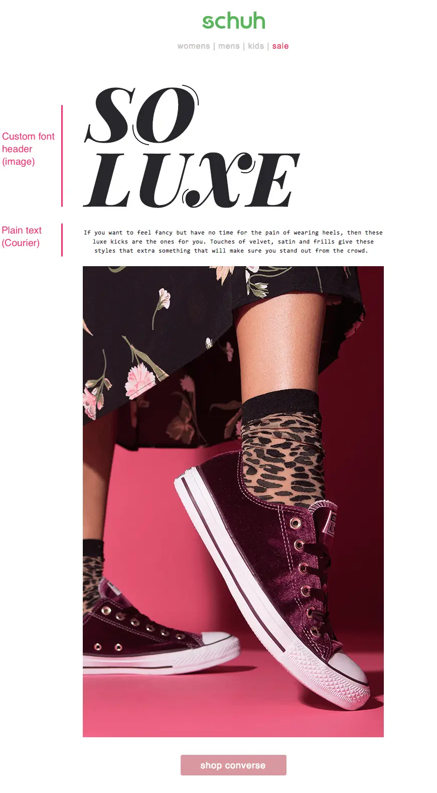
We talk a lot on the blog about "plain text" or "live text," which we generally mean to be the email safe fonts(or web safe fonts) that brands use, like Arial, Helvetica, Georgia, Times New Roman, Courier, and other default fonts that render on any computer or device. Choosing these fonts for emails is a design best practice because they're so reliable. This doesn't mean all your text needs to be "email safe," but the more that is, the better.Web fonts are designed specifically for the web. They're somewhat less reliable than plain text options, but they're still found on many—if not most—devices. These are fonts like Open Sans, Roboto, Lato, and others. Many popular web fonts are Google Fonts. Litmus offers a useful write-up on web font support.Obviously, there are many other fonts in existence beyond these web safe or web font categories. And many brands have custom fonts—typefaces that have been modified or designed specifically for a brand. These fonts can sometimes be coded into an email, but more often than not they're simply added as an image—commonly in the header, like in this email from Schuh.
Pro Tip: Don't forget about fallbacks!
Since web fonts and custom fonts can't be relied upon to appear across all mail clients and devices, fallback fonts should be selected as a backup."Email clients render fonts based on their presence in the system," Kevin explains. "If a system does not have a particular custom font, it proceeds to the first fallback, followed by the next fallback."This series of fallback options is called a font stack. Kevin describes it like three levels of fonts in the code:
- 1st level: The custom font that supports your copy and brand identity
- 2nd level: Web-safe font with the same x-height and kerning as the custom font
- 3rd level: Final fallback which will be present in every system and would render anyhow
For instance, say you use Open Sans in your email. If that doesn't render when a reader opens the message, the code will tell it to default to Helvetica, and if that doesn't render, then Arial.As with all matters of email design, it's critical to test. "No matter how good the fonts look at your end, make sure to set a fallback that displays the font or its matching fallback font properly at the receiving end," Kevin advises.Luckily for us, when designing emails with theBEE editor, you don’t have to worry about building your own font stacks. They're automatically generated when you choose your fonts.
2. Elevate the look of plain text with smart formatting
Any well-formatted text shows aclear hierarchy when used in headers and sub-headers, especially if there is a well-executed combination of fonts and font sizes. Here are some formatting tips to keep in mind:
- Section headers: Use 'em! Headers establish structure—and sometimes, they're all readers will pick up if they're skimming. Use a strong, consistent format—like a sans serif that's at least twice the size of your serif body text.
- Line height: A good rule of thumb: set your line height to be at least 1.3x the height of your letters. It'll help maintain a comfortable distance, between lines, that optimizes readability.
- Section breaks: Empty space is your friend. Offer ample padding between sections to mark a transition from one to another.
- Email width: If you're sending a text-heavy email (think paragraphs of text in a wordy update or newsletter), constrain the width—to about 500px—to improve readability.
- Links: Choose a fun, vibrant brand color that pops on the page, and be sure to keep the underline.
- Bold + italics: Use bold and italicized lettering sparingly and strategically. Ask yourself: is this text treatment serving a purpose?
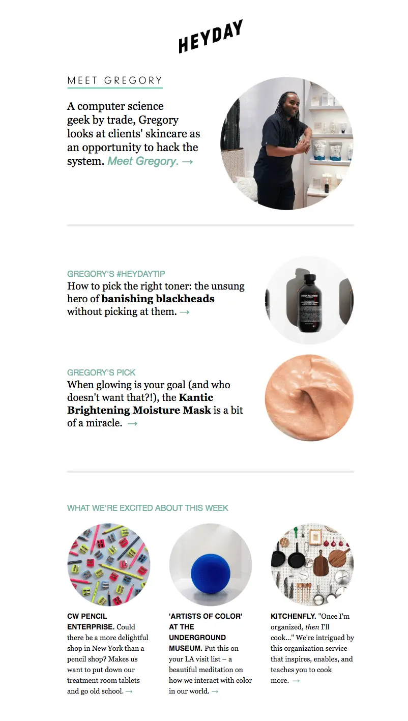
This email from Heyday is comprised of web safe fonts Arial and Georgia. Yet the strategic implementation of coloring, underlining, bolding, and italicizing font makes the lettering look sophisticated—and easy to read.
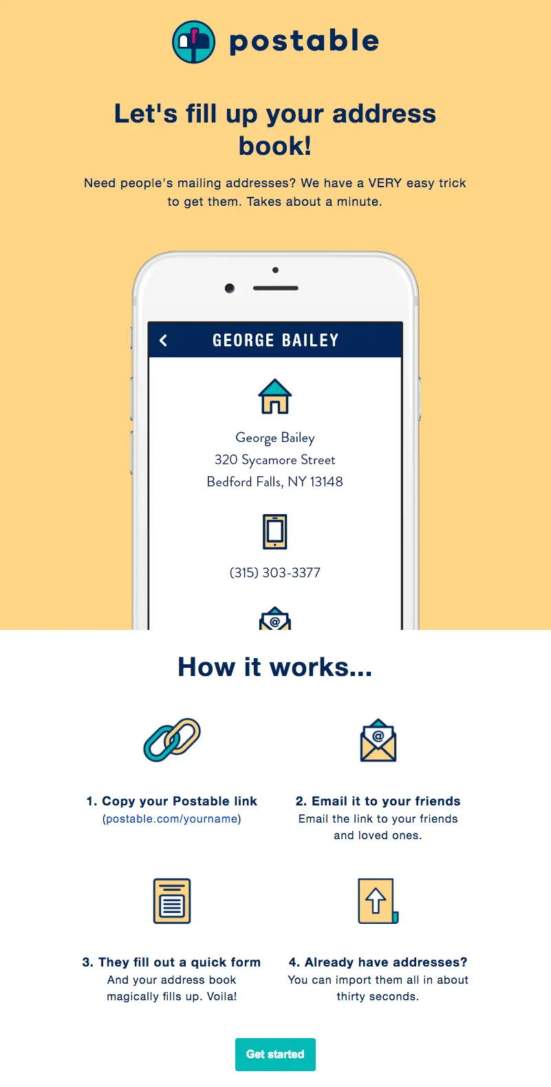
Here's another email from Postable that uses nearly all Helvetica text.
Pro Tip: Keep it accessible!
Make sure your email is accessible to everyone—including the vision-impaired—by formatting your text wisely. This means using large, legible fonts (at least 14pt), underlining links, and being mindful of color schemes. Kevin writes more about email accessibility here, and we also covered top accessibility tips in our post, Why Does Email Accessibility Matter? Insights and Advice From Email on Acid’s CEO.
3. Activate web fonts and upload custom fonts in BEE
Now that you're a typeface wizard, here's how to customize the fonts you can access in the BEE editor.
Add web fonts
First, log in and open a new or existing email design project.
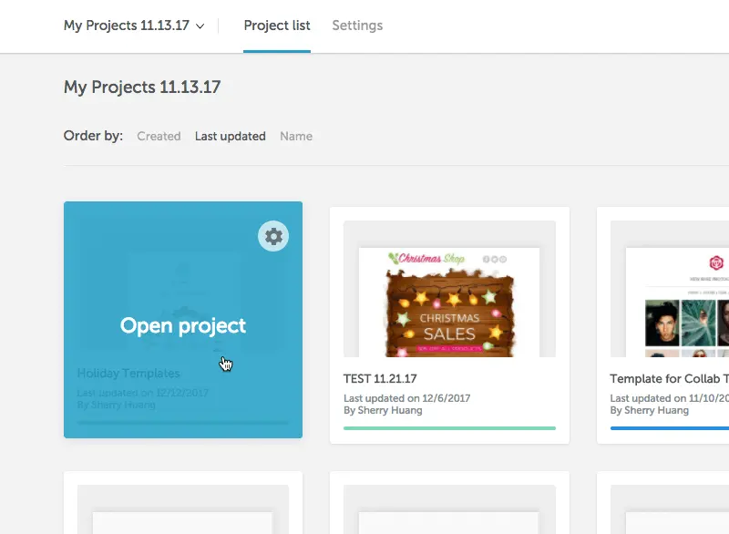
Navigate to Settings along the upper menu.

Click Brand Styles.
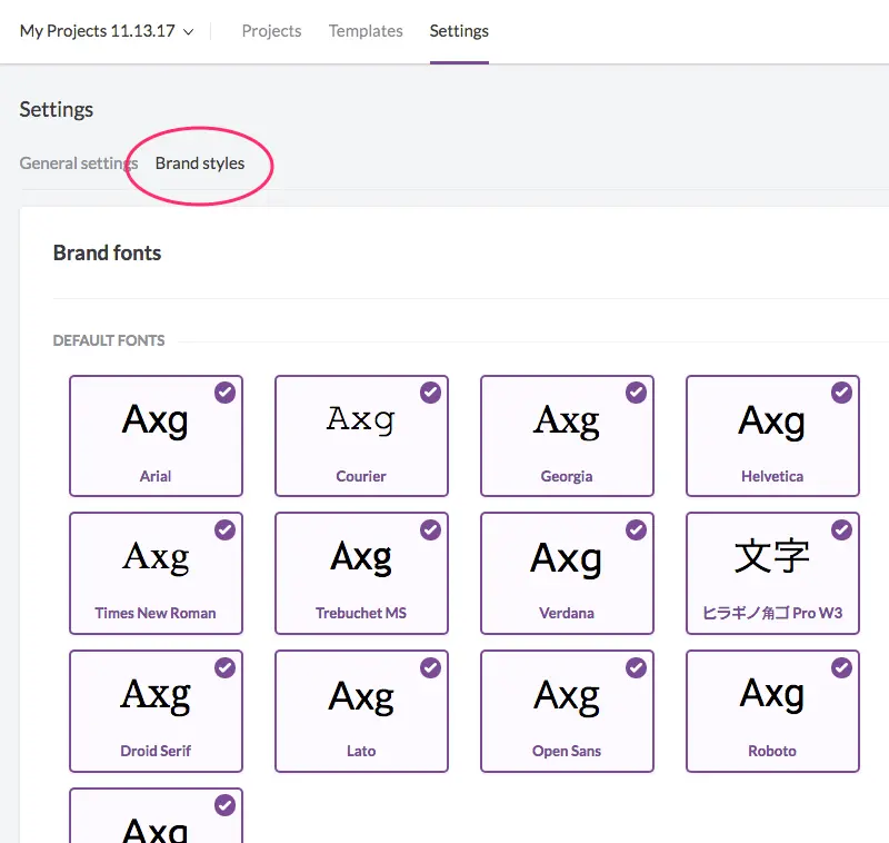
You'll see a menu of web safe fonts that are already available and loaded into BEE.Scroll down to the next menu, a selection of available web fonts that you can add to BEE for your use. Simply select the ones you want to add!
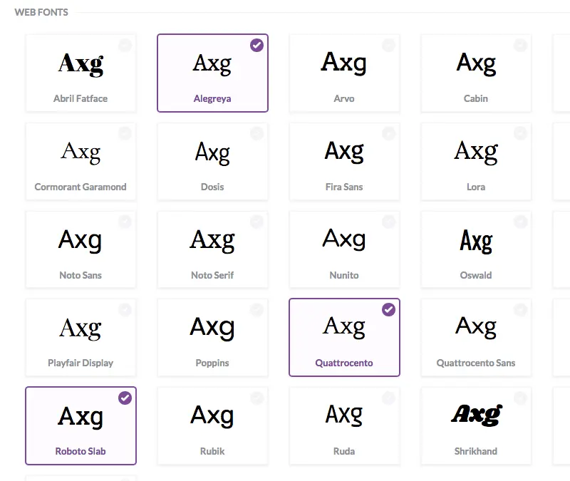
Add custom fonts
Within the Brand Styles menu under Settings, you'll also see a button to Add Custom Fonts.

Tap it, and a pop-up menu will appear to let you add your own custom brand fonts!

You now have the option to design your font stack of fallback options. Pretty neat, isn't it?Give it a try with a freeBEE Protrial.The drag-and-drop editor is easy to use, comes with built-in templates and stock image libraries, andallemails and design elements are mobile-responsive.Let us know if you have questions or ideas about font use in emails in the Comments area below! And, a special thanks to Kevin George of Email Monks for contributing!


