Solutions
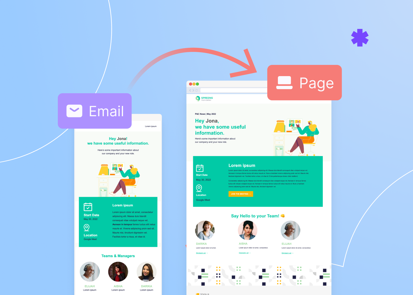
Collaborate on email and landing page design with view-only users
What if you want someone to provide feedback on your email or landing page, but don't want them to change the copy or the design? That's when view-only users come in handy!Viewers are a new type of User in BEE Pro. They can view and comment on your emails and landing pages, but they cannot edit them. This helps you invite colleagues, clients and other stakeholders into your design projects, without any worry that unexpected changes might occur.By leveraging Viewers in BEE Pro, you can get digital marketing campaigns done faster and in a more collaborative way, with total peace of mind.BEE Pro is a complete email and landing page design suite. It's the fastest way to create professional, mobile-ready campaigns in a no-code, friendly, collaborative environment. Sign up free for our email and landing page design tool today!For more details on working with Viewers in BEE Pro, please see our knowledge base.
How to add a video background to a landing page
Video backgrounds can help you create more visually exciting landing pages, leading to more customer engagement and better conversion rates.How do you add a video background to an HTML page? In BEE Pro, a no-code email and landing page design suite, this is very easy to do, and this short video tutorial shows you how. When creating a landing page in the BEE Pro visual builder, you can quickly pick a video and use it as a background for your page.You can choose from a collection of high-quality stock videos directly in the builder, paste a link from YouTube or Vimeo, or upload your own videos.BEE Pro makes it really easy to create more engaging and unique landing pages by using videos as backgrounds. Try adding a video background to your next page by using our free landing page editor and let us know what you think!
How to apply a background image to an entire email or landing page
You can now apply a background image to an entire email or landing page in BEE Pro. In fact, using background images has become even easier and more flexible from a design point of view: you can define a background for the entire asset or for a specific row or content area. The video quickly shows you how to use the image background controls in BEE's visual builder, and you can create a free account to try this out.So get creative and make your emails and landing pages more eye-catching by using background graphics!
Use Mailchimp? Gain more email design freedom with Beefree
Gain more design freedom for you Mailchimp-powered email marketing by leveraging BEE Pro, a no-code email and landing page design suite.Why have thousands of businesses used BEE Pro with their Mailchimp account? The reason lies in the extreme design freedom provided by BEE Pro's visual builder:
- add and remove columns to any row in the design
- granularly control spacing, padding, borders, for virtually any content element
- switch to Mobile Design Mode to create content directly in mobile view
- and much more.
Another reason why people love using BEE Pro with Mailchimp is that they can start from over 1,400 email and landing page templates, professionally designed by over 30 designers from around the world.In addition, strong collaboration features help get the design right, fast. For example, comments can be added at the individual content element level, directly in the visual builder, mentioning other users that are immediately notified.When the email is ready to go, the Mailchimp connector - available on all BEE Pro plans, including the Free plan - makes it seamless to export the design to Mailchimp with just a couple of clicks.If you need more design flexibility, BEE Pro is a fantastic email builder for Mailchimp.
A Flexible Email Builder for HubSpot
Looking for a flexible email builder for HubSpot?BEE Pro provides a visual editor for emails and landing pages that's a perfect addition to HubSpot.
- Granular control on design elements and column management
- Design directly in mobile view to create mobile-first campaigns faster
- Co-edit, collaborate, comment on individual design elements
- 1400+ editable email and landing page templates
- One-click export to HubSpot Marketing (emails)
BEE Pro is a complete email and landing page design suite that helps freelancers, teams, and agencies save time, collaborate, and follow branding guidelines. Create emails that convert with BEE Pro and send them with HubSpot. Sign up free today!And, by the way, BEE Pro is a HubSpot Certified App. You can find BEE Pro in the HubSpot App Marketplace.
Tutorial: How To Add Background Images on Emails and Landing Pages.
The continuous rise in email marketing makes finding new ways to enhance the subscriber experience increasingly important. Email is no longer just a few words of text on a screen. GIFS, animation, and even interactive content is becoming the new norm. Responsive background images joins the ranks of a rich email experience.Background images in newsletters and landing pages are not new by any means. But until now, only those with knowledge of HTML and code could take advantage of this design style.While it’s possible to create background images on tools such as Photoshop, the problem with image-based emails is that it doesn’t allow for additional HTML content to be placed on top. In the instance of image-blocking, this means that any text on the image cannot be read. This hurts the readability and responsiveness of your email.Keep reading to learn more about how BEE Pro has made it possible to quickly add responsive background images to emails and landing pages.
BEE Pro Saves The Day
The new background image feature inside of BEE Pro makes it easy for everyone to add responsive background images, without the need for code. This drag and drop tool allows for design flexibility and unlimited layering capabilities.With background images, you have the freedom to layer content such as text and CTAs to enhance the overall message of your email or landing page. Unlike with image-based emails,even if your subscribers have their images turned off, the readability of your content won't be affected. In terms of responsiveness, BEE Pro ensures the background image feature adapts to all screens resolutions.While background images make emails and landing pages look professional and grab the attention and interest of the reader, it does so much more. Background images support your message and allow you to set a scene that evokes emotion and enhances your reader’s experience. In return, your readers are likely to take action making your email marketing efforts effective.
Background Images In Action
Unlike GIFS and hero images, background images aren’t meant to be the main focal point of your emails or landing pages. Instead,theyhelp support and tie in the contents of the message to make it look more professional and entertaining.Here are some examples of how our Designer Community uses the feature to create email templates with background images.This email template by Andrea Dall’Ara uses a background image to create a scenery that makes the page more engaging and allows it to stand out from the dozens of other “Happy Easter” emails your clients may get that day.
In this email by Jesús Albusac, the row background image feature provides a visual representation of the message and helps evoke emotion in the reader.
In this newsletter by Kristina Bazaeva the row background image is subtle and adds texture to emphasize the content.
Lastly, in this email by Navid Nosrati the background image accentuates the focal point of the email and the content.
Step-by-step guide: Adding Background Images to Email & Landing Pages
Now that you’ve seen how background images are implemented, you are ready to start creating! Choose a template from our catalog or start from scratch. Then, watch the video or follow along with the steps down below:
Toggle On the “Background Image” Feature
In the BEE Pro editor, click on “setting” and toggle on “background image”
Choose an Image
Click on “Change Image” to upload your images. If you don't have any images, you can search for free stock photos within BEE Pro.
Fit to Background, Repeat, Center
You can choose to apply the background image to the entire design, a row, or just to a content area. At that time, you can also choose from
- Fit to background: Stretched the image to cover the entire email or landing pages
- Repeat: Places the image side by side to create patterns.
- Center: Sets the image at the center of your email or page and keeps the image’s original size.
Start Layering!
Overlay text and CTAs on top of images to allow your design and text to work together. Layering content provides a better reading experience and makes communication more impactful.
Ready to Explore The Unlimited Design Possibilities?
If you’re not already using BEE Pro, sign-up for a free account. Use the background image feature and start creating beautiful, professional, and engaging emails and landing pages that delight your readers every time.
How to Elevate Email Marketing and Create No-Code Custom Designs with Beefree and HubSpot
With global email users estimated to grow to 4.6 billion users in 2025, it’s no surprise that sales and marketing teams continue to use email marketing to engage with prospects and customers -- I mean, it’s quick, affordable, and a great way to communicate with your audience, wherever they are.
As designer, we are firm believers that even the most casual of email communication don't have to remain static. Creative email design infused with your unique brand elements helps pique your audience’s interest at just the right moment, encouraging them to engage. However, we acknowledge that good email design takes time and technical support, which is why Beefree exists.
Beefree is a complete no-code email and landing page design suite allowing you to creating digital content quickly and efficiently. With over 1,700 professionally designed email and page templates, teams of all sizes and expertise can drag and drop design elements in our easy-to-use editor.
Making room for more creative freedom
The BEE Pro Integration with HubSpot gives sales and marketing teams of all skill levels the ability to design emails and landing pages quickly. No matter your level of design skills, any user can create professional assets that are automatically linked to their contact database. Drag-and-drop modules are ideal for e-commerce, marketing, and sales emails, highlighting conversion elements.
Here are a few ways using design tools with your CRM benefits sales and marketing teams by establishing creative freedom and enabling design collaboration.
Collaboration streamlines the design process
Collaboration is a core element of the BEE Pro and HubSpot integration. Whether you are an individual freelancer working with clients or a large organization that wants to empower entire teams, the collaboration tools allow all users to work together while minimizing back-and-forth. Users can add comments to any element found in an email or page and admins can set predefined roles for all users. The tool also supports brand consistency with custom colors, fonts, and other details for each brand or team.
Design flexibility can take an email to a landing page quickly
Teams can transform any email that has been created into a landing page with one click — allowing them to reuse existing content. This flexibility allows marketers to design full digital campaigns quickly and easily. They can also add page-specific content like signup forms, images, and videos (including video backgrounds) before the landing page is published to QA for consistency and conversion opportunities. If they start with a page, they can go the other way around, quickly transforming a landing page into an email that will drive traffic to it.
Mobile design mode keeps your email designs fully optimized
Mobile design mode allows teams to ensure that their email and page designs are fully optimized for mobile devices without needing to switch between the editor stage and preview mode. A quick toggle switches views and users can continue editing in both modes — guaranteeing that the design looks exactly as it should.
3 ways BEE Pro and HubSpot give teams more design freedom and responsiveness in marketing campaigns
Email and landing page design with BEE Pro and HubSpot gives sales and marketing teams the ability to customize email marketing and content campaigns, incorporating visual elements, CTAs, and more. With the BEE Pro design suite and visual editor, teams can design, create, and maintain their email templates and campaigns all in one location — cutting out unnecessary applications that can make the process clunky and time-consuming.Here’s how users can leverage BEE Pro and HubSpot to enable more design freedom in their content marketing campaigns and better engage their audiences.
- Build out attractive and responsive custom emails
- Teams like our friends at Agropur build attractive custom emails with the built-in opportunity to track analytics in HubSpot. That ease of use makes creating responsive custom emails from scratch much simpler with full design flexibility and a library of over 1,300 email templates that can be edited to fit your industry or audience.
- Keep important data in one location while designing
- Users can create more sophisticated landing pages and emails while still maintaining all important data in HubSpot. There’s no need to move data to a completely different platform to design. Inari Medical, Inc uses the integration to create landing pages with an elevated layout before exporting them into HubSpot to send the final drafts to their associations. This streamlines the email design process from start to finish.
- Access design elements without interrupting the workflow
- When the design suite is part of the technical workflow, it reduces clicks significantly and helps ease the transition between working on different activities. For users like Thunder Funding, making use of the quick and easy process to create beautifully designed emails before exporting them to HubSpot is simple with access to granular design elements and powerful features like mobile design mode. "The integration with HubSpot works really efficiently. I design the email inside BEE Pro, once the design is ready I just have to click on the ‘Export to HubSpot’ , and... here we go, the message is ready to be used inside my HubSpot account. It perfectly tracks CTR and I didn't find any issues," says Matteo Mazzolari, a satisfied customer in the financial services space. "This helps me speed up the email creation process and helps me design amazing emails."
When design tools are more accessible, creativity can soar. These combined tools present tons of opportunities for new A/B tests, collaborations with other brands, and updated nurturing flows.Join over 400+ companies and teams across industries that have sped up their email and landing page design process with a stunning professional touch using the BEE Pro Integration with HubSpot.
How to Improve Engagement in Your MailChimp Email Marketing
Email marketing is a must for any business that wants to succeed in today’s marketing landscape. And with audience data, automation tools and insights all in the same place, MailChimp is a great tool for marketers to utilize. But if your engagement isn’t up to par, your outcome won’t be, either. Use these helpful tips to improve your MailChimp email marketing engagement and see better results from your efforts.
If your engagement isn’t up to par, your outcome won’t be, either.
Set expectations
Improve your MailChimp email marketing engagement by letting your subscribers know what they’re signing up for. Setting expectations with a welcome email will increase long-term engagement because it tells your readers what to expect. Communicate what type of content you’re going to send and how frequently so people don’t mark unexpected emails as spam. (Bonus: A strong welcome email gives readers a good impression of your brand, which also makes them more likely to continue engaging with your content.)(Pictured: Thank You For Subscribing designed by Navid Nosrati.)
Send segmented, personalized emails
Segmenting your email list allows you to send the most relevant emails possible to each individual subscriber — and that will improve your MailChimp email engagement. MailChimp has a wide range of segmenting options that fall into categories such as subscriber data, predicted demographics, behavioral targeting and more. MailChimp also offers advanced segmentation tools and gives you the ability to segment by purchase activity.Once you have your email list segmented and you’re ready for email design, make sure each email is personalized. Email personalization goes beyond simply sticking your customer’s first name in the subject line (although that’s a great idea). Create personalized campaigns based around more advanced subscriber data such as their past purchases (“Because you bought this, we think you might like this”) or their location (“It’s cold in Ottawa. Need a jacket?”).(Pictured: Don’t Forget About Me by Yuliana Pandelieva.)
Provide valuable content
Create MailChimp email templates that serve up relevant content instead of going straight for the hard sell. There’s a time and a place for promotional content, but when you’re trying to increase email engagement, content is king. Share articles, blog posts and other types of content that address your readers’ pain points and solve their problems. Your engagement will go up as your customers’ satisfaction does the same.(Pictured: E-Learning Blog by Regina Tagirova.)
Follow email design best practices
This should be a no-brainer, but to increase your MailChimp email marketing engagement, you need to make sure your emails look good. If your message isn’t visually attractive, your customers will probably click out. Email design is made easy with MailChimp email templates where all you have to do is customize the template with your information.(Pictured: How to Become A Yogi by Yuliana Pandelieva.)
Include your social media links
Adding social media links at the bottom of an email has been shown to increase click-through rates for marketers. With our free MailChimp templates, it’s easy to link your social media accounts in the footer of your message. You could also add a CTA inviting readers to join you on social media, boosting engagement even more.(Pictured: Fresh Spring Offer by Hector Titus Ruiz.)
Make sure the email is mobile responsive
The best MailChimp templates to increase engagement are ones that are mobile responsive. The majority of your readers are viewing emails on a mobile device: Over 70% of people check email in a mobile app. Make sure your emails show up correctly or they’ll get deleted fast.(Pictured: Stay Comfortable at Home by Derek Brumby.)
Wrap-up: Free MailChimp email templates
Wondering which MailChimp templates are responsive? Check out our free MailChimp email templates. Our catalog is full of MailChimp newsletter templates to help you deliver the content your customers want — and the content that will keep them engaged and coming back for more. Happy designing!
Share this post with your friends! Pin it on Pinterest ?
Tutorial: How to Add Anchor Links in Emails
Do you use HTML anchor links in your email campaigns? Anchor links in email are incredibly useful for newsletters that are long and content-rich. They give your subscribers a chance to quickly scroll down and directly skip to where they want to read. And when your emails are easier to navigate, your readers are more likely to stick around and take in the entire message. Let’s take a look at exactly how anchor links can help your marketing and what you need to do to use them.
Anchor links in email are incredibly useful for newsletters that are long and content-rich. They give your subscribers a chance to quickly scroll down and directly skip to where they want to read.
Why use anchor links in emails?
What exactly is an email anchor link? An anchor link is a hyperlink in an email. When that hyperlink is clicked, it takes you to another part of the email instead of opening a separate window. Anchor links are most helpful for long messages, which is why they’re generally used in email newsletters instead of sales emails.You might choose to include just a single anchor link, or add a full anchor menu in your email header. This menu acts like a table of contents so readers can see at a glance what’s included in the message.Anchor links are huge for your email UX (user experience). Keeping your email simple can capture a user’s attention. And adding an anchor menu is a great way to simplify your message.Here's a quick example from Mobile Marketing Watch, a company that adds anchor links at the top of their daily newsletter so readers can use a table of contents to quickly navigate to each section.
The MintLife Blog also uses anchor links (the three bullet points at the top) in its email newsletter. Like Mobile Marketing Watch’s newsletter, this email is plain text. The anchor links are helpful since these messages don’t have any colorful HTML subheadings to aid in navigation. A plain text email can be difficult to scan — anchor links eliminate the problem and make navigating these emails a whole lot easier.
How to create anchor links in an email
Good news! Adding an anchor link in your email campaign is easier than you might think. All you need is a basic know-how of the HTML link structure of your anchor links. As we'll see, an anchor link is made up of two parts: the URL link and the actual anchor tag that the link is "jumping" to in your email.Let's look at a specific newsletter example and show you how to replicate its anchor links using the BEE email editor. Follow along in this quick video recap or keep reading for a step-by-step tutorial:
Email anchor links example
We've always admired how anchor links were put to good use in Lenny Letter, a newsletter created by actor/director Lena Dunham and her best friend/director Jenni Konner. Lenny focused primarily on long-form content such as thought-provoking essays and stories, providing that content in the email itself. In this one, the header includes colorful anchor links to each corresponding story within the email. Here's how the links look across the top (starting with Jessica Grose and ending with Lena Dunham):
Each color corresponds with the author's story. If a reader wants to read Kaitlyn Greenidge's story first, tapping her name (the orange anchor link) takes the reader directly to her story section (where the title, "I Love Betty," is also in orange). Click here to see the newsletter (trimmed because of its length).
Getting started
Now that you're familiar with the concept of anchor links in emails, let's walk you through how to add them in the BEE editor. Open up the free BEE email editor to follow along.
Step 1: Build the email
To start, we'll recreate the Lenny email in BEE. The header is simple: Using a basic one-column design, drag in the Lenny image and add the text (in Courier) beneath it. Next, drag in a four-column structure to arrange the top anchors.
Continue to add text and images to recreate the header, intro and first story.
Afterformattingthe color of the text, get ready to add the links.
Step 2: Choose an anchor link name and its position
Now it's time to name and position the first anchor in the correct section of the email. For this step, we'll be using the custom HTML content block in BEE from the Content menu to add our anchor (think of it as a bookmark).
Drag and drop the HTML block to where you want the link to "jump" down to. In this case, it's right above Grose's story, titled "Namaslay."
This is how the HTML block looks onceit's in position but before we add code:
To create the anchor, paste in one line of HTML code in the Content Properties field of the custom HTML block on the right:
<a name="grose"></a><br />
The name in quotes ("grose") can be whatever you want. Just keep it simple and easy to remember — ideally one word — as this is the keyword you’ll use when linking to this anchor tag.
Step 3: Link the anchor
Now that the anchor's position has been specified, the text in the header needs to be linked to it. Simply select "Jessica Grose" and choose the Insert Link selection in the toolbar.
In the menu, link to the anchor by entering #grose in the URL field.
For the link to work, it's important to include the hashtag (#) before the name and to make sure the name matches the one you chose earlier. The shorter and simpler the name, the easier it'll be to remember.Now you’ve created the two parts of your anchor links: the anchor text and the link pointing to it.Duplicate that HTML content block, then copy it and drag it to the next section. Update the name that’s within the quotes and link the text at the top to the new anchors you’ve created.
Step #4: Send a test email to test the anchor links
Once you receive the email (BEE’s “Send test” feature lets you send a test email to yourself), click on the anchor links and watch the magic happen:
Voilà! If you’d like, you can add additional anchor links at the bottom of each section with text that says “Top of page” or something similar. This will let readers go back up to your anchor menu with a single click. But otherwise, your anchor links in email are ready to go.
Creating anchor links in email with BEE
Use the BEE email editor to create a table of contents with anchor links in your own emails. Our new Menu feature is the perfect way to add your links! With this feature, you can create an internal email menu that links to either internal or external links.Adding the menu is simple. Open up an email template in the BEE editor and drag a menu block onto the message. Click “Add new item” in the right-hand sidebar; this will allow you to add your text and then hyperlink that text with internal links. Set the link type when you add the URL’s.After you’ve set up your menu and added links, you can customize the layout and text of the menu to make it more visually appealing. You can also turn on the “Mobile menu” to access some additional design options. Mobile menus aren’t compatible with every email client. But for the clients that do support this option, this setting will optimize your menu for mobile viewing.BEE’s new Menu feature makes it easy and fast for you to create an anchor link menu for your email newsletters.
Email client support for anchor links
Anchor links are not supported by all email clients, so keep this in mind when deciding whether to add a table of contents to your newsletters. Here’s a quick report with some of the most popular email clients:Email clientSupport for anchor linksGmail (Web)YESGmail (Android app)YESInbox by Gmail (Android app)YESGmail (iOS app)NOApple Mail (iOS)NOYahoo! Mail (Web)YESOutlook.com (Web)YESOutlook (Android app)NOOutlook (desktop)YESOutlook for MACNOSamsung email app (Android)YESWindows Mail (Windows 10)YES(This table is based on our own data and data from Can I Email.)
Wrap-up: Using anchor links in email? Go Pro!
Email client support issues aside, adding anchor links to your email can be an effective and simple design tactic to help your subscribers read your content. Sign up for a BEE Pro free trial and follow the instructions in the workshop above to easily get this email marketing tactic down!Updated on July 21, 2020.
Share this post with your friends! Pin it on Pinterest ?
Save Time With Our ActiveCampaign Integration
BEE Pro and ActiveCampaign have merged marketing resources to streamline your workflow. With BEE Pro’s intuitive design tools and ActiveCampaign’s seamless automation services, this time-saving, email integration and partnership creates the perfect customer experience for email marketing growth.
How does this partnership work?
The ActiveCampaign integration in BEE Pro lets you connect your accounts with a click of a button. Choose from hundreds of customizable email templates, and when you’re ready to export, activate BEE Pro’s ActiveCampaign connector to instantly push BEE Pro emails over to ActiveCampaign.In order to fully enjoy the integration, you’ll need a BEE Pro Team or Agency subscription and an ActiveCampaign Lite plan. Both services, BEE Pro and ActiveCampaign, offer free trials to test out their offerings. Also, with a BEE Pro Agency plan, you are able to connect more than one ActiveCampaign account at a time so your teammates can gain access to this game-changing email integration as well.
Why use ActiveCampaign with BEE Pro?
BEE Pro is the best no-code design tool that empowers everyone to create beautiful emails in minutes. Enhance your emails with intuitive drag-and-drop functionalities, personalized brand kits, mobile design mode, co-editing and other time-saving features.ActiveCampaign activates your entire customer experience by automating a welcome series, contact engagement and more. Help your business grow by refining your email list, managing campaigns, tracking analytics and more.Combined, BEE Pro and ActiveCampaign provide a smooth design and exporting process to get your email campaigns out faster without sacrificing quality. It’s the best of both worlds with endless design capabilities and simple automation services. Users don't have to worry about migrating their email lists from one platform to the next, the direct integration in BEE does that leg work for you to enhance your experience.
How to connect BEE Pro and ActiveCampaign
Let’s take a look at how to connect your accounts to enjoy the benefits of both platforms.https://youtu.be/lJYNPzn2wU0Exporting your BEE Pro emails to ActiveCampaign is quick and easy. Here are steps on how to connect them:
Export your email
When you finish editing your email in BEE Pro, click “Export Message,” and choose “Export to Another Application” in the pop-up.
Then an “Export Option” pop-up will appear. Here you will click on the ActiveCampaign connector.
From there, an additional pop up will arrive, asking for your API URL and Key.
Retrieve your ActiveCampaign API
Find your ActiveCampaign API URL and key by heading to your ActiveCampaign dashboard. Click “Settings” on the left sidebar. Then, choose “Developer” in the dropdown bar.
This page provides your API URL and your API key. Copy and paste the ActiveCampaign API URL and key into the respective boxes on the BEE Pro connector pop-up. Then click “Create,” to automatically push your email to ActiveCampaign.
You will find the emails you push over from BEE Pro in your ActiveCampaign “Templates” section.
Another way you can connect BEE Pro and ActiveCampaign is through the “Settings” option that you will find on your BEE Pro dashboard. Click on “Settings” and then “Connectors.” ActiveCampaign will appear as the first connector on this list.
Click “Connect,” and that same box will appear asking for your API URL and key.
Again, retrieve the URL and key from ActiveCampaign, and paste them into their respective fields. Finalize by clicking “Connect” and you’re good to go.
Wrap-up: Using ActiveCampaign with BEE
Using automation tools such as ActiveCampaign and BEE Pro is a smart move for marketers — it will help you save valuable time and money as you work to promote your business. Get a BEE Pro free trial and connect with the ActiveCampaign integration for a more efficient email marketing workflow.
Your Two-Step Guide to Connecting Klaviyo With Beefree
Tools like the BEE email editor and Klaviyo are an email marketer’s best friend: They save you time and effort as you work to reach a wider audience and get more engagement with your email campaigns. Now, you can connect your Klaviyo account with BEE to easily create emails using the two platforms. Here’s how!https://youtu.be/xWVePKWIxEw
Why use Klaviyo with BEE?
If you aren’t familiar with Klaviyo, it's an email automation platform that’s especially ideal for e-commerce companies. Klaviyo supports your email marketing efforts by helping you analyze website data so you can send relevant, highly targeted email campaigns. When it comes to Klaviyo vs. MailChimp, the two platforms are comparable, but Klaviyo offers more built-in features — including a free account option that lets you send up to 500 emails with 250 contacts. Klaviyo can integrate with several other platforms, including Shopify, Stripe, and BEE.BEE is a drag-and-drop email design tool that allows you to easily create and customizestunning email campaigns. Its extensive catalog of free email templates are easy to use, with plenty of options for integrating your own branding and designs. Once you’ve finished creating an email, you can export it to any number of email service providers — including the Klaviyo software. Here is your easy, two-step guide to connecting your Klaviyo account with BEE. (The Klaviyo connector is only available for BEE Pro, so start your free two-week trial here if you need it.)
How to integrate Klaviyo
There are two processes you can follow to connect your Klaviyo account with your BEE account. Before you can begin either one, however, you’ll need to get an API key from Klaviyo.
Step #1: Retrieve your Klaviyo API key
From your Klaviyo dashboard, click “Account,” “Settings,” and “API Keys.” From there, you can create an API key by typing in a label and then manually copying the key. Now, you’re ready to head over to your BEE account and connect the two.
Step #2: Connect via BEE settings
Open your BEE account and go to “Settings,” then “Connectors.” Click on Klaviyo, and then paste your API key into the pop-up. (You’ll also be asked for your Klaviyo account name, but if you don’t know this, don’t worry — it’s not mandatory.) Click “Connect,” and you’re good to go! Your accounts are now connected.
If you want to export just a single template to Klaviyo, you can do that, too. Here’s how:
Step #1: Export your message
Create an email message in BEE. When it’s ready, click “Export Message” on the message details page and then select “Export to another application.”
Step #2: Choose Klaviyo
Choose Klaviyo from the list of options. If you’ve already connected your accounts via Settings, all you’ll have to do is click “Create campaign;” otherwise, you’ll need to paste your API key into the pop-up during this step. After that, you’ll be able to find your BEE email template in your Klaviyo account and send it from there!
Wrap-up: Connect Klaviyo with BEE
By connecting Klaviyo with BEE in this simple two-step process, you can create beautiful email templates in BEE and then send those email campaigns using Klaviyo. Connecting your accounts can save you time as you create beautiful and effective emails to market your brand. Happy designing!
How To Find A Responsive Email Template That Works In Outlook
With millions of users around the world, Outlook is a popular email platform that has a lot of benefits for marketers. It can be hard, however, to find a responsive email template that works in Outlook — and that’s where the BEE email editor comes into play. With simple HTML email templates that can be adapted for Outlook, BEE is an excellent solution to help any marketer’s Outlook dreams come true. Here’s how to find a responsive email template that works in Outlook by using BEE.
Making Outlook Work With BEE
Outlook is software created by Microsoft that lets you send, receive, and manage emails, among other features. Many users actually prefer Outlook over Gmail, appreciating Outlook’s offline email option, organizational features, and calendar integration. In 2018, Outlook was reported to have over 400 million active users.Since so many people receive emails using this platform, it’s important for email marketers to ensure their emails show up in Outlook. But desktop versions of Outlook for Windows are infamous for severe limitations when it comes to rendering HTML messages, and often marketers struggle to find a responsive email template that works in Outlook.The good news is, BEE’s email templates render wonderfully in Outlook, and they’re a good choice for any marketer looking to save time and create beautiful emails. There are dozens of ready-to-use templates in BEE’s catalog, such as this e-commerce template made by designer Andrea Dall'Ara; simply drag and drop your text, images, and other design elements and then send your email into Outlook inboxes without fear!
BEE uses a technique called “Conditional Comments” to minimize issues with Outlook. This technology allows complex multi-column layouts to be rendered correctly. BEE also uses VML, a Microsoft proprietary XML-based language, to make Outlook compatible with some advanced features (like rounded-borders buttons).To make sure your emails will render correctly in Outlook, there are a few extra – and simple! – steps to take. Here's a rundown of these workarounds and what you need to know:
Row Background Image
The Situation
In the BEE editor, you see the background image of an email. When you send that email with Outlook, however, you’ll see the background color of the email instead.
The Solution
You can solve this issue by either choosing a background color that matches your row image, or just not using a row image.
Custom Web Fonts
The Situation
Using custom fonts in your email can be a fun way to help your message stand out — but only if it works. Outlook won’t display a custom font unless that font is physically installed on the recipient’s computer, and in most cases the chances are pretty slim that someone will have a specific font.
The Solution
BEE Pro has a list of fallback fonts — normal fonts that can stand in for custom fonts — that will make sure Outlook displays the closest font to the one you defined. As you design your email, make sure the design looks good even with the relevant fallback fonts. For example, if you want to use the Open Sans font, the stack is Open Sans, Helvetica, Arial, and Sans-Serif. If Open Sans is installed in the system of the recipient, Outlook will use it. If not, however, Outlook will scan the font stack and use whichever font the system can read.
Animated GIFs
The Situation
Using GIF’s in Outlook doesn’t work — users will see only the first frame.
The Solution
Choose your first frame carefully so people will still get the gist of the gif. Don’t crop, expand, or stretch the gif — instead, show it in its own size.
Wrap-Up: Responsive email template that works in Outlook
It can be difficult to create HTML emails that look good in Outlook, but with BEE you can get around virtually any Outlook problem as you create your emails. Use BEE’s simple HTML email templates to design gorgeous emails that can be read by any recipient — Outlook users included!
Stay informed on all email trends
From the latest creative design strategies that inspire your next campaign to industry best practices and tech advancements, our newsletter is the go-to for all things creation.