Design

Valentine's Day Emails: Design Tips We LOVE

Connect with readers through a sweet Valentine's Day email and you can increase conversions and win hearts. Even if you're not in the business of selling chocolate or roses, celebrating the holiday with a special promotion and email campaign is a wise move!
Beefree team
Beefree team
Jan 21, 2020

If you don't have someone to snuggle up next to this Valentine's Day, don't worry: As an email marketer or designer, you know there are lots of brands eager to snuggle up to your email inbox! Valentine's Day is one big shopping event. According to the National Retail Federation, U.S. consumers' expected Valentine's Day spending surpassed $20 billion in 2019 — up by more than $1 billion from the year before. Even if you're not in the business of selling chocolate or roses, celebrating the holiday with a special promotion and email campaign is a wise move. Connecting with readers through a sweet Valentine's Day email can increase conversions and win hearts.

Valentine’s Day email marketing

Holiday marketing is a little different than everyday marketing. Around the holidays, people are more likely to make a purchase — but you also have more competition from other brands. So what are some Valentine’s Day marketing best practices? Discounts and coupon codes are helpful at any time of year, but for this holiday a two-for-one coupon that couples can use is especially fitting. Think about how to incorporate the romance of Valentine’s Day into every aspect of your email, from the subject line to the design and copy. And think a little more broadly about who you can target: many people like to mark the holiday with gifts for teachers, friends, or even pets – not only for significant others. Here are our top tips for successful Valentine’s Day email design:

Start early

If you’re running a special promotion or holiday campaign, let your customers know in plenty of time for them to make a purchase. That’s what Paper Source did here, announcing their Valentine’s Day collection on January 6th. While most people aren’t thinking about Valentine’s Day shopping quite that early, it can be beneficial to send a Valentine’s email a couple of weeks before the holiday — say, around February 1st.

valentine's email marketing

Show your copy some love

Don’t overlook the copy in the body of your email — make it snappy and sweet (and on-brand, of course). Take your cue from Harry’s, which came up with the cutest way to ask customers to redeem their trial:

valentine's email example

Plus, we loved this cute GIF!

elephant gif

Utilize Interactive Content

Interactive content is a huge email trend we’re seeing in 2020, so jump on board early and include a fun quiz, video, or countdown timer in your Valentine’s message. By doing so, you can expect to see more engagement and increased brand loyalty. Teen Vogue offered subscribers a fun piece of interactive content — a quiz that recommended a rom-com for the user to watch.

interactive content in email example

Sweeten up your Valentine's Day subject line

According to Email on Acid, Valentine's Day email volume is second only to the Christmas holiday season. That means it's time to put some extra TLC into a well-crafted subject line. High-performingV-Day subject lines have historically included gift and card ideas,personalized greetings,heart symbols,and the word "sweet." Here are some fun ones fromour inbox:

Top Valentine's Day Email Subject Lines

Don't overdo it

V-day is a holiday wherepeople tend to go to extremes to show their affection. (Does anyone really need a 195-piece box of chocolates?) But when it comes to showing your customers you care, don't go overboard. Keep your Valentineemail designconsistent with your brand identity, like Paper Culture does with their simple background and fonts.

Elegant Valentine's Day Email Design from Paper Culture

Here's what we loveabout this design:

  • The key message is incredibly short and focused, and it follows an inverted pyramid structure, beginning with a big 30% off headline, followed by a free shipping subheader, immediately followed by the CTA. It's clear and concise!
  • The key message claims most of the space in the email; follow-up content is smaller, deemphasized, and doesn't keep you scrolling on and on.
  • The story is super visual with images that are high quality, beautiful, and not over-the-top pink and red.
  • There's no distracting header, and the footer is simple and monochromatic.

However, the email doesn't have a good balance of text and images; it's too image-heavy.Even the small descriptions underneath the photos are images instead of plain text, along with the full-width "50% off stationary" section. It'd be so simple to make these items plain text instead of images. That would decrease the risk of getting caught in a spam filter, reduce message size, and improve the look of the message for recipients with image-viewing turned off.Check out our posts on how to avoid the pitfalls of image-only emails, how to create a responsive photo collage, and how to design bulletproof CTA buttons that convert.

Artfully arrange your message

Chaos isn't attractive. If you want to express your love this Valentine's Day—and you have a lot to say—present your content with care. Always designon a grid (it's easier to make responsive) and establish a consistent format inyour layout. Photojojo does just that. Each section of this sweet Valentine's Day email is organized in the same way: header, two lines of intro text, followed by two images with captions and "Buy now" CTA buttons. The great layout and use of white space makes this email delightfully light and airy, even with a lot of content.

Well-designed Valentine's Day email from Photojojo - nice design on a grid!

We admire this email's:

  • Streamlined, orderly layout that makes scanning easy
  • Playful infusion of pink with the HTML background color, CTA buttons, and section headers
  • Sweetly simple header and footer
  • Beating heart animated GIF! (A simple GIF is less likely to devour readers' mobile data)
Animated Beating Heart GIF

But we'd make a few touch-ups by...

  • Only using the Photojojo brand font in the headers (to decrease the number of images in the message and make it inbox friendly)
  • Swapping out the image CTA buttons for bulletproof ones
  • Optimizing for mobile with a responsive design. This one isn't!

Send in-email sweets

Instead of askingsubscribers to make a purchase, why not turn the tables and give them a gift? Notwith a discount or promotion on your products, but with free, useful, Valentine's Day content. It's the perfect way to show the love and build brand loyalty. Take this email from Oh Joy, the design studio and shop:

Great content in a Valentine's Day email, from Oh Joy

This email design is sweet because:

  • It offers readers interesting, authentic content in email (without asking them to click or buy anything!)
  • High-quality images are broken up by short text blocks
  • The header takes up very little space, so readers get right into the content
  • It's easy to read on mobile! Take a peek:
IMG_3583

Lovingly design a header

So many promotional V-Day emails out there are comprised of a single image. But it's a risky design move. A large image can increase yourspan score and be slow to load, or itmay not appear at all depending on a reader’s email settings. Plus, single-image emails are nearly impossible to make responsive. The solution? Break up images and add text.Capitalize onflat design tactics and bold HTML background colors to create visualinterest. We were inspired byTravel Zoo'sillustrated header—the style is super cute, it's unique, and it doesn't consume the entire email:

Unique Valentine's Day email header

Here's what we heart about this design:

  • Perfect balance of images and email-safe text!
  • The header is beautiful, one-of-a-kind, and garners attention
  • Bulletproof HTML CTA button

Lead with something other than hearts

Chances are, your customers' inboxes are already overflowing with cutesy images, hearts, and x's and o's. Choose a lead image for your email that's different—that says Valentine's Day with its allure and feeling of romance, rather than with cheesy or overplayed symbols. We love how Rancho Bernardo Inn does it here. It seems like the perfect place to spend Valentine's night. Plus, this is a great approach if you're short on time or resources: say Happy Valentine's Day in the text of your email; it doesn't need to be all about pink photography and art.

Alluring and romantic Valentine's Day email, without hearts! From Rancho Bernardo Inn, near San Diego

What's lovable about this design:

  • There's a healthy ratio of images to text
  • Brand colors and fonts are retained, so the email looks distinctly Rancho Bernardo
  • It's easy to design on a limited timeline (use existing brand photos and communicate your V-Day message in text)

But we'd sweeten it up by...

  • Making the CTA buttons bulletproof instead of images
  • Simplifying the header and footer
  • Cutting down on the secondary content text
  • Streamlining the variation in font sizes and styles (bold, italics, all-caps, and varied tracking)

Wrap Up: Top tips (and templates!) for the best Valentine's Day email design

These days, we all celebrate Valentine's Day in some way. Join the celebration and design a Valentine's Day email that's special and sweet!

  • Put some TLC into a creative subject line. Inboxes are getting flooded. Stand out!
  • Be short and sweet. Communicate your key message in a few lines of text. Try the inverted pyramid method.
  • Design on a grid. Build a layout with a repeating pattern to create order with a lot of content and to make scanning easy.
  • Offer added value content. Give a gift instead of asking readers to purchase one.
  • Kick off your email with a V-Day header. Try an illustrated design or an animated GIF, and follow it up with plain text in order to create a good image-to-text ratio.
  • Stay within your visual brand identity. Your email doesn't have to be top-to-bottom pink and red. (Plus, if you're in a time pinch, use existing visual assets and get festive with snappy text content or HTML background colors).

In honor of Valentine’s Day, we’ve put out two new Valentine’s templates designed by Andrea Dall’Ara:

Use this template in Beefree!

Use this template in Beefree!

These templates, Perfumery Valentine and Restaurant Discount, are the perfect way to spread the love and make conversions this February 14th!

Use this template in Beefree!

Use this template in Beefree!

5 Engaging Newsletter Templates That Will Hit Your Inbox in 2020

Beefree team
Beefree team
Jan 8, 2020

Ready or not, the new year has arrived — and that means it’s time to get on board with the email marketing trends of 2020. This year's trends are all about connecting with your customers, and finding newsletter templates to match the trends will help you stay ahead of the game. Today, we’re going to break down why you need an email newsletter if you don’t have one already, and we'll also discuss what features should go into the best newsletter templates. Let's get started!

Email Newsletter Benefits

An email newsletter can benefit your business in many ways. This type of content is very flexible, meaning you can use it to reach any number of goals — such as getting people to purchase a product, increasing your brand awareness, or establishing your brand as an expert in your industry. By consistently sending email newsletters, you can stay at the front of your customers’ minds.It’s easy to schedule newsletters in advance, and they're a fairly inexpensive marketing method. Plus, with tools such as the BEE editor’s free newsletter templates, email newsletters are easy to create.

What to Look for in a Newsletter Template

A good newsletter template will have well-designed, on-brand graphics that entice people to read. Most people remember only 10% of written content three days after reading it, but they remember 65% of visual content — so pick a newsletter template that highlights visuals.And don’t overlook the written content! Your subject line, CTA, and any body text in the email all come into play here. Either pick a template with text that's concise and punchy or make sure to craft your own language that your audience will relate to.A template for an email newsletter should also be customizable and allow you to add and move content to keep it relevant to your readers.

2019 Email Newsletter Trends

Thousands of newsletters hit our inbox in 2019, and sifting through them makes for a crash course in what to do (and what not to do) when it comes to email newsletters. Here are a few of the best newsletters of 2019. These emails utilized ideas that will continue to be relevant in 2020.

Personalization

Personalized content is becoming more and more popular as AI continues to evolve, helping you tailor your email newsletters to each individual customer. Now, sophisticated AI technologies can help your emails go far beyond simply including someone’s name in the subject line — you can also offer personalized recommendations of products to purchase or articles to read. (Learn more about AI and personalized content in our post on the top email design trends of 2020.)Subject line: Kelly, new inspiration for you: December 11, 2019

email newsletter

Interactivity

Interactive email content can increase your click-to-open rate by 73%. That’s a lot!In this email, Credo Beauty not only asks readers to take a survey, but also offers a quiz or the option to chat with an expert. Quizzes are hugely popular — just look at Buzzfeed, where 96% of users who start a quiz finish it. And chat marketing can pay big dividends for your business, too.Subject line: Take our survey and be entered to win

newsletter template

Live Content

Live content includes countdown timers, your current best selling products, real-time weather information, and more — and it’s an awesome way to provide relevant information to your readers.Subject line: Final countdown! Sale ends tonight!

email countdown timer

2020 Newsletter Templates

Keep these up-and-coming themes in mind as you customize your own newsletter templates in 2020. Here are a few we think are perfectly on-trend:

Charity Newsletter Template

Need a template newsletter for your charity? BEE has you covered. This sleek and modern nonprofit email template (created by the BEE team) utilizes a clean blue-and-white design to help you share all the news about what’s going on with your charity, and of course it can be adopted for other types of organizations and businesses as well!

Use this template in Beefree!

Use this template in Beefree!

Travel Guide

Available to all BEE users, this travel guide newsletter template was created by the BEE team to help travel brands reach their subscribers in an elegant way. Fill in your own text and images to give your email list a case of wanderlust.

Use this template in Beefree!

Use this template in Beefree!

Lifestyle Blogger Newsletter Template

BEE has a range of templates created for every type of business and even includes templates geared for influencers, like lifestyle bloggers. Use this pretty pastel template, designed by the BEE team and only available with BEE Pro, to share your latest blog post with readers.

Use this template in Beefree!

Use this template in Beefree!

Fashion Zine

Looking for a clean, minimalistic template that can showcase your latest products? Check out the BEE team’s free fashion zine template to promote your e-commerce deals.

Use this template in Beefree!

Use this template in Beefree!

Survey Newsletter Template

Incorporate some interactive content by using this survey template made by the BEE team. With sections to ask survey questions and include supplemental information, this customizable template is ready for you to edit and send.

Use this template in Beefree!

Use this template in Beefree!

Wrap-Up: Newsletter Templates for the New Year

2020 is coming in hot, but with these trends and strategies in your arsenal, you’ll be ready to take on the new year in style. Use BEE’s customizable templates for email newsletters to help your business boom in 2020. Happy New Year!

7 Simple Christmas Email Ideas for a Festive Holiday Season

Beefree team
Beefree team
Dec 11, 2019

Merry Christmas and Happy Holidays — the best time of the year is coming up fast, and it’s time to make your email list and check it twice! Holiday email marketing is an important way to connect with clients and customers at the end of the year, but your Christmas emails don’t have to be fancy to be effective. Let’s look at a few simple Christmas email ideas that can make your marketing efforts more festive this December.

Christmas email marketing campaigns

There are a few different types of emails you can send at Christmas. If you’re having any sales in honor of the holidays, you’ll want to promote those throughout the month. You can also send email newsletters with relevant seasonal information for your readers to enjoy. Sometimes, though, it’s nice to send an email that’s not selling anything — instead, that simply wishes your customers a merry Christmas. These kinds of emails can nurture relationships and help engage with customers. Let’s get into the design inspiration!

#1. Have clever Christmas email subject lines like Starbucks

Subject lines are important year-round, but Christmas email subject lines might be even more so: You have exciting things happening this time of year, and you need people to know about them! Starbucks kept things simple with a cute Christmas pun, and similarly, you can incorporate humor into your seasonal subject lines. Or if you’re not feeling in a particularly funny mood, just incorporate a line from a classic Christmas song to instantly make people feel warm and cozy. Chestnuts roasting…Subject line: We know yule love this

simple christmas email ideas

#2. Get personal like Draper & James

There’s nothing like a Christmas card with a family photo, even if that card comes from a brand. Reese Witherspoon founded a clothing brand called Draper & James in 2015, and last year the company sent a digital card to its email subscribers. Small businesses should consider doing something similar to put a face to their company name and help customers truly feel a connection.Subject line: Reese’s Christmas card

christmas card email

#3. Show the love like Yeti

In this Christmas email, Yeti went above and beyond by including a few simple lines of copy that thanked the customer for coming along throughout the year. Heartfelt lines like these can make your customers feel valued and appreciated — so don't be afraid to speak with emotion.Subject line: A quick note to say… 

christmas emails

#4. Send a newsletter like PureWow

At a loss trying to curate a beautiful Christmas newsletter? PureWow didn’t struggle at all: Their Christmas newsletter is full of helpful holiday tips. Focus on taking your normal newsletter and making it seasonally relevant. If your target audience is pet owners and your newsletters normally focus on pet health, for instance, then talk about pet health and safety during the holidays when the house is full of potentially toxic decorations and food. There’s always a way to find a timely hook and to send out content that’s truly valuable.Subject line: 20 extra-special Christmas breakfast recipes

christmas email newsletter

#5. Offer a discount like Sweaty Betty

Nothing says Merry Christmas like a discount code — or, at least, that’s what Sweaty Betty thinks. Surprise your customers with a sale that’s so tempting, they can’t help but hand over the cash they were gifted.Subject line: Merry Christmas from Sweaty Betty

christmas sales email

#6. Hold a contest like the Grommet

What’s better than a discount code? Answer: a contest! One of the best simple Christmas email ideas is to hold a contest for your customers. Here, The Grommet asked for photos of customers using their gifts and offered a $200 prize. You can do something similar to help your conversion rate continue to go up even after the holiday — and you’ll get some great user-generated content for your social media accounts, too.Subject line: Merry Christmas ? Let us see those smiling faces for a chance to win.

christmas email subject lines


#7. Encourage sales like Rag and Bone

Finally, take this Christmas email idea from Rag and Bone and remind your customers that even if Santa didn’t bring them everything they wanted, that’s okay — because your online store is still present and ready to go. Subject line: Get what you wanted?

GIF’s from a favorite Christmas movie are never a bad idea to make customers smile, either.

Wrap-up: Christmas email ideas

Use this template in Beefree!

Use this template in Beefree!

These simple Christmas email ideas are easy to implement in your own Christmas email marketing campaign. Christmas emails can be made even easier when you utilize BEE’s free Christmas email templates — such as this one created by designer Yuliana Pandelieva. These drag-and-drop templates are responsive, simple to use, and can help you get more conversions this holiday season!

8 Black Friday Sale Emails Built to Boost Conversions

Beefree team
Beefree team
Nov 6, 2019

For Americans, Thanksgiving is an important holiday that typically includes turkey, football, and time with family. But for many people, the day after Thanksgiving is just as exciting — and it’s celebrated not only in the U.S. but all around the world.Black Friday is an enormous event and marketers need to take notice. We've gathered some inspiring Black Friday sale emails just in time to help you build your own holiday campaign and increase conversions!

Why Black Friday?

Black Friday garnered $8.9 billion in sales in 2021, and you can get in on a corner of that revenue by ramping up your Black Friday email marketing efforts. Customers have positive feelings overall about Black Friday because it’s become a tradition — the day carries nostalgic feelings for many shoppers, meaning they’re more likely to keep buying year after year.Market your brand to help conversion rates improve this Black Friday. An email newsletter is a great channel to reach customers with new offers. Here are some of the best Black Friday emails to help you get some inspiration for your own promotional emails.

#1. Strategize

Before you can create your Black Friday sales emails, you need to decide two things: what you’re going to offer and the best method of getting that message across. Clothing company Pact mentioned several discounts in the subject line but focused on the best deal in the body of the email. Pact also did a good job pointing out that shoppers could buy gifts for others; often people are more likely to purchase for someone else than for themselves.Subject line: Doorbusters: $25 hoodies. $5 socks. $15 leggings & more

black friday sale email example

#2. Start early

It's best to begin sending emails about Black Friday well in advance — as much as a week prior. You can either start your sale that early too, or simply use the time to increase awareness and anticipation. Joe’s Jeans sent this email on the Tuesday before Black Friday. Since people’s inboxes will be flooded closer to the weekend, starting early is a good way to get out ahead of the deluge.Subject line: BLACK FRIDAY BEGINS! Up to 30% off

black friday email marketing

#3. Improve your Black Friday email subject lines

Black Friday email subject lines can be tricky, but it's worth spending some time getting them right since they can really help boost conversion rates. These four subject lines all have elements that make them successful:

  • WILDFANG’s subject line is clever
  • The New York Times promises major deals
  • Crate and Barrel announces multiple chances to save
  • Banana Republic creates urgency

According to one study, Black Friday email subject lines with the words “Black Friday,” “OFF,” and the symbol “%” perform well. Using these words in your subject line can help improve your conversion rate.

best black friday email subject lines

#4. Cover all your bases with your CTAs

In this Black Friday sales email, Yankee Candle offered two separate CTAs: one for shopping online and another that led to an interactive map to help readers find a store location near them. While many Black Friday shoppers still frequent stores, others prefer to do their shopping from the couch, with online sales going up by 26 percent in 2018. If you have an in-store option, create separate CTAs to cater to all shoppers.Subject line: LAST CALL: $5 Tumbler Candles

black friday sale email

#5. Create a countdown

Adding a countdown to your email is a fun way to add a sense of urgency, giving shoppers a visual to help them understand that the clock is ticking and they need to act fast to get the deal. Mattress company Leesa sent an email the day after Black Friday, letting customers know they had extended their deal — but that the offer was only available for so long, and their very visible timer reinforced that message. (If you create your Black Friday sales emails using the BEE drag-and-drop email editor, you can easily add a countdown timer.)Subject line: Kelly, we’ve EXTENDED our Black Friday offer

black friday email countdown

#6. Induce FOMO

The language you use in your email is important, and using a bandwagon approach can make your subscribers feel like they’re missing out if they don’t jump on board. Here, Function of Beauty added some creative CTA copy: NO MO’ FOMO. You can increase conversions by using language that suggests people need to shop with you during Black Friday because that’s what everyone else is doing.Subject line: ?ONE MORE DAY!? 25% off + the color everyone’s talk about

black friday sale email example

#7. Design strategically

Don’t forget about email design during the holiday rush — it’s more important than ever. Like Boll & Branch, play around with fun holiday imagery and use a holiday-centric color scheme. For Black Friday sale emails, it’s also important to design your email around your main selling point (in this case, a 25%-off discount). Use one of BEE’s drag-and-drop email templates to easily create a simple email that focuses on the main CTA without too many distracting design elements.Subject line: Last chance for Black Friday savings!

black friday email design

#8. Send an email on Saturday/Sunday

Consider surprising your customers by extending a sale through the weekend, in case their inboxes were too flooded on Friday to catch it the first time around. Crate and Barrel sent this email on Saturday, giving shoppers an opportunity to visit the sale one last time. (If you’ll be participating in Cyber Monday, you can tease those upcoming sales, too.)Subject line: missed Black Friday? today’s YOUR day.

Extending black friday sale email

Wrap-up: Black Friday email marketing

Are you ready to start designing your Black Friday sale emails? The BEE team has created Black Friday email templates, includingBlack Friday Discountby Jesus Albusac and Black Friday Sports E-commerceby Matteo Della Chiesa, in addition to a Black Friday Cosmetics template by designer Gaia Zuccaro to help you create emails that get more conversions this November.Just sign up for a free accountand start designing!

Use this template in Beefree!

Use this template in Beefree!

7 Great Email Signatures for Business

Your email signature is an important component of any marketing email — it provides essential information to the reader and is your last chance to get in som...
Beefree team
Beefree team
Oct 30, 2019

Your email signature is an important component of any marketing email — it provides essential information to the reader and is your last chance to get in some brand recognition before the email ends. Email signatures for business add a touch of professionalism; they act almost as a digital business card, offering ways for people to get in touch with you.What do you need to include in your email signature? How can you utilize colors, logos and other design elements to add a little pizzazz? Let’s look at some sample email signatures for business that can help answer these questions and inspire your own email sign-off.

#1. Include a photo like PinchMe

Many of the best email signatures for 2019 have photos. Including a photo of yourself in your email signature can help remind the reader that the email was sent by a real person. Most people are very visual, so an image can grab their attention and add a sense of intimacy, creating a personal connection between you and the reader. When you’re choosing a photo, select a simple headshot with an uncluttered background like Jennifer from PinchMe did here. Make sure to build the image into the structure of the email in a way that makes sense, too; PinchMe used a text box to make it appear as if the words came straight from Jennifer’s mouth.

email signatures for business example

#2. Use humor like Sendinblue

Axel from Sendinblue has a simple email signature with a lot going for it. His signature includes his title (“Growth hacker”) and a photo of himself. Something else this signature includes is humor, with Axel making a self-deprecating jab. If it’s on-brand, don’t be afraid to include a little humor in your sign-off — poking fun at yourself is a way to immediately make people more comfortable.

best email signatures 2019

#3. Consider a sign-off like Dr. Ruscio

Many people like to end their emails with a brief sign-off such as “Best Regards.” Is this a good idea? The answer really depends on your brand. Often, phrases like “Yours truly” or “Sincerely” can come across as platitudes and don’t really add much to your email. If you do decide to go with an email sign-off, choose one that ties in with your brand. Dr. Michael Ruscio ends his emails with “In health,” which makes sense considering his profession. Be strategic if you include a sign-off in your email signature.

email signatures for business sign off

#4. Use your actual signature like CoSchedule

Marketing platform CoSchedule sends emails from employee Mia, who closes her emails with a simple image of her actual signature. This is another way to add a personal touch to your email, and it’s also easy to do — just write your signature on a piece of paper, scan it into the computer, and save the file as an image (or use an online tool such as Signature Creator for an even simpler process). When you create your email with BEE’s free email templates, include the image at the bottom.

use your handwriting in your email signature

#5. Include a quote like Tony Robbins

In general, you should avoid email signature quotes; less is more, and since quotes can get pretty lengthy, it’s typically best to stay away from them. Overused famous quotes can come across as cheesy, too. But there’s nothing wrong with including one short, punchy phrase like author and coach Tony Robbins does. Tony ends his emails by saying “Live with passion!” before finishing with his signature. This works because the phrase is his personal mission statement and concisely sums up everything he stands for. Likewise, you might want to identify a similar brief on-brand statement to use in your own emails.

email signature quotes

#6. Add social media like Boris

Email marketers often debate what the best email signatures should include. You have several options when it comes to what to add:

  • Name
  • Job title
  • Company address
  • Phone number
  • Email address (some email services don’t show the sender email)
  • Website or blog
  • Social media links
  • Confidentiality notice (this states that the message should be read only by the intended recipient and cannot be shared)

The type of business you're in will help you determine which of these to include. For example, an e-commerce company doesn’t need to provide an address, while an influencer may care more about pointing people to Instagram than to a website. Instead of adding everything you can think of, choose what links are most important for you and include only those. For Boris from The Next Web, that was his job title, email address and Twitter.

email signature links

#7. Consider logo and layout like ClickUp

Including not only a photo of yourself, but also the image of your company’s logo is another way to increase brand awareness through your email signature. Getting your logo in front of people as much as possible is a great way to heighten brand recognition.The layout of your email signature is also something that should not be taken lightly. The best email signatures for business are structured in a way that’s easy to take in at a glance; Katie from ClickUp designed her email signature with the company information on the left and her own information laid out neatly on the opposite side.

email signature layout

Wrap-Up: Best email signatures for business

With BEE’s email templates, it’s easy to create email signatures for business; just select a template and add the elements of your signature at the bottom (check out this video tutorial that shows how to make an email signature in the BEE editor). Thanks to BEE’s free email signature templates, you can create effective emails that help your customers get in touch with you and increase brand recognition!

6 Chic Fashion Emails That Win Conversions

The fall is jam-packed with fashion events, from NY Fashion Week on Sept. 6 all the way to Paris Fashion Week on September 25th. In honor of the multiple fas...
Beefree team
Beefree team
Oct 2, 2019

The fall is jam-packed with fashion events, from NY Fashion Week on Sept. 6 all the way to Paris Fashion Week on September 25th. In honor of the multiple fashion events happening worldwide, we’re getting chic with some email design inspiration from top fashion brands so you can brainstorm the best ways to promote your own fashion company. Here are six of the best fashion emails we found, plus a few tips and some email templates to help you create your own fashionable emails.

#1. Highlight current events like Gilt

Cool colors and a Parisian-inspired collage are showcased in this email from Gilt, an e-commerce company that sent a Fashion Week Dispatch each week throughout the month of September. Gilt used the fashion events happening around the globe as a springboard, highlighting the best designers from each fashion week and pointing out that you can shop those same names on Gilt’s website. When it comes to fashion email marketing — or any type of marketing — it’s always effective to create a connection with what your customers see trending see on TV or social media, tying in your brand with the big names.Subject line: Inside: Your passport to Paris

good fashion emails

#2. Find a creative angle like Essie

Essie isn’t exactly a fashion brand — the company focuses on nail color. But this email still found a creative angle on Fashion Week, highlighting nail colors worn by designers and linking to the same nail polish on Essie’s website. The email is simple, but plays with color in a big way. This fashion email demonstrates how you can think outside the box and find a way to advertise your brand by making a connection with current events, even if you don’t think it’s a fit at first glance.Subject line: fashion week nail art is always our favorite…

creative fashion emails

#3. Mention big names like Monica Vinader

Fashion journalist Caroline Issa recently partnered with brand Monica Vinader to create an exclusive line of jewelry, and Monica Vinader sent a fashion email promoting the line that’s just as stylish as Issa herself. The email utilizes soft pastel images and video clips to showcase the pieces, including quotes from Issa and a few lines of copy to back up the images. Influencer marketing is a concept that’s popular on social media and can actually carry over to email marketing, too; mentioning a well-known industry name can draw more people to click and read your emails.Subject line: Style icon Caroline Issa’s guide to Fashion Week

fashion email marketing ideas

#4. Offer free content like Pantone 

You don’t have to make a hard sell every time you email your subscribers. In fact, it’s better not to. Here, Pantone offered a fascinating free report to its email list that detailed the most important color trends seen at London Fashion Week. Sending free content is a great way to engage your audience. And, like Pantone did, sending just one article instead of listing multiple stories is another effective fashion newsletter tactic; it’s less overwhelming and far more accessible.Subject line: See the top Pantone colors for London Fashion Week

fashion emails

#5. Optimize your copy like Bumble

There are a lot of good things about this Bumble email, but the copy is what especially jumps out. After all, who doesn’t want “off-duty model vibes?” Advertising a Real-Life Runway Kit, Bumble promises the products will make you look as if you’re straight off the runway — and after a full month of watching models walk runways around the world, that’s probably just what this hair care company’s customers want to hear. Give your fashion emails a makeover by using clever language that fits the industry.Subject line: EXCLUSIVE: Fashion Week sets are here

fashion email copywriting

#6. Embrace seasons like Moda Operandi

Moda Operandi’s recent email advertising fall coats is a great example of a seasonal fashion email, using a background shade of burnt orange to complement the brown coats. Best of all, the company includes a second section in the email that lists the most affordable pieces from Fashion Month, effectively whittling down the popular choices for people who might not want to spend thousands of dollars on their wardrobe.What’s the main takeaway here? First, seasonal fashion emails are always a hit — and since fashion is all about seasons, it’s easy to design this type of newsletter. And finally, make sure you know your target audience so you can offer content that’s relevant to them, such as Fashion Week options for cheap.Subject line: It’s time to buy your new hero coat 

seasonal fashion email

Fashion Newsletter Templates

BEE has several ready-made templates that you can use in your fashion email marketing. First up is Fashion Collection X, created by designer Matteo Della Chiesa: a template that’s ideal for a product launch. This elegant email has space for you to feature multiple new products in addition to any new accessories you’re promoting. It’s easy to customize in just about every way through BEE’s email editor (if you need a free trial of BEE Pro, get one here) and is a great choice for your next fashion email.

Use this template in Beefree!

Use this template in Beefree!

BEE has other templates that are ideal for fashion brands, too. Try the Online Fashion Store template to showcase your latest e-commerce arrivals plus any upcoming discount codes. If you curate fashion-related articles to send to your subscribers, check out the Fashion Zine template, while in-person events can be promoted with the Eventus template.Fashion Weeks around the world might be over, but your fashion email marketing is just getting started. Use these examples and templates to become one of the fashion brands with the best email marketing!

Captivating Newsletter Design Ideas & Layouts

Beefree team
Beefree team
Oct 1, 2019

Newsletters are a powerful tool for your business: They’re a way to keep customers and leads up-to-date on what’s happening with your company, cultivating long-term relationships with people who like your brand. A good newsletter goes beyond just plain text, incorporating exciting design elements to create a pleasant reading experience for subscribers. But sending newsletters is an ongoing commitment, and it can be hard to avoid getting into a rut with your newsletter design.If you’re looking for inspiration or ideas for your next email newsletter, we have you covered. Check out these ideas that can add variety to your newsletter and capture your readers’ attention and engagement.

Newsletter Layout Ideas

Creating an effective email newsletter starts with mapping out a structure or layout for your newsletter. The layout you use can affect how customers see your newsletter, where their eyes fall, and how much they engage. Use these newsletter layout ideas to mix it up and build your newsletter strategically.

Utilize content modules

How often do you see a big block of text and blow it off, not wanting to invest so much time and mental effort into reading about one subject? Probably more often than you realize…and your newsletter readers do too. Using content modules takes away that problem and presents your content to readers in an easily digestible way.Modular content simply means separating your content into bite-sized pieces. Each module contains, say, three sentences and an image. The idea is not to get too long-winded, but if you do need to say a lot, break down what you want to say into segments for easier reading and skimming. Use design elements to signal transitions such as:

  • Dividers or module borders
  • Headers
  • Images or design elements
  • Space / extra padding

You can take an approach like Kickstarter’s Drip, which uses lines, borders, and colors to separate one piece of newsletter content from the next.

Drip email newsletter design

As Drip has done, aim for 3 sentences max in each section or paragraph. This lets readers see the gist of your message in seconds so you don’t lose their interest when their attention span runs out.

Create an easy-to-follow pattern

You want your readers to take in as much of your message as possible, and one way to do that is to understand and work with the natural way they read emails. That’s why a common best practice in email marketing is to use a Z-pattern layout.

Many readers start reading an email from the top left and move down and to the right as they read before their eyes return to the left side again, following a Z-like pattern. You can use that knowledge by designing your email newsletter in that same pattern, putting key takeaways in the top left, then below and to the right, then back to the left side, and so on.

To see this newsletter format idea in action, check out this example from Lion Brand Yarn:

Lian Brand Yarn newsletter layout design

After the initial Granny Square Day graphic, this newsletter uses a Z pattern to highlight different crochet patterns that use granny squares, aligning with readers’ natural eye movements to encourage more engagement.

Consider an image-based layout

Images have a way of catching people’s eyes. Consumer surveys show that two-thirds of people prefer emails that have more images rather than more text, and the same study found that image-focused emails have higher open rates and higher click-through rates than emails without images.

You can harness that knowledge by putting more emphasis on images rather than texts in your email newsletters. Check out this email from Oprah for example:

Subject line: Malcolm Gladwell: The dangerous consequences of prejudging strangers 

newsletter design inspiration example

While there’s enough text to communicate the message and link readers to further engagement, most of the email’s space is spent on images rather than text. This draws in consumers’ attention and encourages them to click further.

Format your newsletter as a list

A great “trick” for your email newsletter layout is to put your content in a list. Just organizing information in a numbered list is soothing on the brain, isn’t it? Suddenly, what you have to say seems more organized. Many newsletters are formatted as round-up lists or bullet point lists. For example, the WW Club starts its newsletter with a numbered list each week:

WW club email newsletter design

What’s also great about this email is that each module offers different content, or at least organizes the content in a different way: a photo, a numbered list, and then a center-aligned list. The variety makes for a more visually interesting newsletter—and one we want to keep reading.

Email Newsletter Design Ideas

Choosing an email newsletter layout is a strong first step for creating an engaging and interesting newsletter, but then it’s time to dig further into the design. How can you design your email in a more appealing, effective way? Use these newsletter design ideas for your next campaign.

Focus on branding 

An effective email newsletter should work toward multiple goals. Not only should it entice readers to engage further with your organization but it should also contribute to building your brand awareness and brand loyalty. For that reason, be sure that every email newsletter is designed with your brand in mind. Readers who are already familiar with your brand should be able to immediately know that the newsletter is from you and readers who are seeing your brand for the first time should be able to form an immediate impression of who you are and what you’re about.

For instance, take a look at this newsletter from the Breast Cancer Research Foundation:

Subject line: What are you doing in October?

email branding

The Breast Cancer Research Foundation’s branding strategy is subtle but effective, with pops of bright pink throughout. The mysterious subject line compels readers to open up the email, and even the hyperlinks and CTA tie back into the branding strategy.

Create seasonal emails

The calendar will always hold the key to a piece of your consumers’ mindsets - in the summer, there are summer activities on their minds, and when there’s a particular holiday coming up, that holiday is in their thoughts. Designing your emails based on the season will make your newsletters more relatable to consumers because they appeal to a topic that they’re already thinking about.

Lifestyle website PureWow sent a fall-inspired email full of autumn colors and images — you can practically feel the autumn breeze just by looking at it. The newsletter layout is also well-designed, with images neatly lined up two-by-two.

Subject line: The easiest fall dinners ever

simple emails

PureWow knows that their consumers are already in a fall-inspired state of mind, so they capitalize on this by showcasing fall-themed content that will naturally interest their readers.

Incorporate color into your design

Color plays a big role in your newsletter design;for almost 93 percent of people, colors are actually the number one influencing factor in a purchase! You can use techniques such as incorporating colorful images or color blocking (click hereto learn how) in your newsletter design to create an on-brand email that’s fun to read. POPSUGAR utilized the power of colorful images here to create a beautiful newsletter showcasing its latest web articles.Subject line: Are you emotionally healthy? Here are the signs that you prioritize your well-being

simple emails

Keep your message simple

Simplicityin your newsletter design is a good thing; less is more. You don’t want to overwhelm your subscribers with multiple bright colors, long blocks of text, and so many images they have to scroll forever to reach the footer. And asThe Atlanticproves here, simple emails don’t have to be boring.Subject line: The Atlantic Photo - the photography of Margaret Bourke-White 

simple email newsletter

The Atlantic’s newsletter is simple but eye-catching and easy to read. The image at the top is striking and the pop of red on the logo and the CTA button help this email stand out.

Include interactive content

Which is more interesting to you: if someone teaches you a concept by telling you about it or if they have you perform an activity to learn it? The more interactive content is, the more engaging and interesting it is likely to be, and that holds true in email newsletters too.

Interactive content can be defined as anything your readers click on, manipulate, or interact with, and it leads to twice the conversion rate of passive content. Including interactive content in your own newsletter design is a great way to engage your subscribers. Check out the way Rover has done this:

Subject line: Which stores welcome pets like your dog

interactive email

Not only can readers click on the various links and articles throughout the newsletter but they can participate in the poll of the week too. People love to be asked for their input or opinion, so this poll is a fantastic way to engage readers.

Use Templates for Easy Newsletter Design

Reading emails from other companies is a good way to get the creative juices flowing, but now it’s time to go create your own newsletter. To save time, use Beefree’s free editable newsletter templates; these templates can help you create a beautiful newsletter that people want to read. Whether you’re a fashion brand, a charity, or a travel brand, Beefree has business newsletter templates that will work for you. Happy designing!Editor’s Note: This post was updated on September 2023 to ensure accuracy and comprehensiveness. 

How to Create Your Own Email Template So You Can Stay On-Brand Every Time

Have you had your coffee today? Or, perhaps more importantly, have you sent out a marketing email today? In honor of International Coffee Day coming up on Se...
Beefree team
Beefree team
Sep 25, 2019

Have you had your coffee today? Or, perhaps more importantly, have you sent out a marketing email today? In honor of International Coffee Day coming up on September 29th, we’re going to take an email from a coffee company and show you how to create your own email template in the BEE editor, making a top-notch brand email that your customers will want to read. Let’s get started!https://www.youtube.com/watch?v=buOlXJMgYC0

Coffee/food email inspiration: 

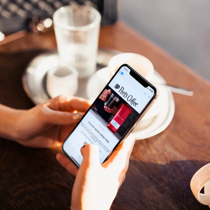
We loved this recent brand email from Peet’s Coffee, a popular coffee roaster and retailer based out of San Francisco. The email was advertising a sneak peek of the company’s upcoming holiday roasts:Subject line: 2 days left for 2 amazing coffees

coffee email template

The email has a high-quality photo and creates a sense of urgency by telling readers it’s their last chance to get free shipping. The template is simple, not cluttered, making it easy to understand the email and opt-in to the offer; the design of the email also evokes a holiday feel with tones of red and gold.Let’s jump into the BEE Pro editor and recreate this coffee email using a build-your-own email marketing template.

Tutorial: create your own email template in minutes

Step #1: Open a blank template

Go into BEE’s template library and select a blank template. With this email marketing template, you can build an email from the ground up to make sure it’s completely tailored for your brand. Grab a BEE Pro trial if you need it (two weeks free, no credit card needed) and you’re ready to start from scratch with this blank template.

Step #2: Add placeholders 

Next we’re going to drag-and-drop placeholders before we add the actual images and text. The first step here is to look under the “Rows” tab on the right, select “Empty” from the drop-down menu, and add seven total basic rows. Then we’re going to toggle back to the “Content” tab and add two image placeholders for the header and photo, three text placeholders to accommodate the three different fonts used in the body text, a CTA button, and one final text placeholder for the last line of text.

create your own email template

Step #3: Add photos and text

Now the email structure is all ready and we’re prepared to create the email template. First, add some images by searching BEE’s library of free images or uploading your own. Next it’s time to add the text; type in what you want to say and adjust the font, color, and size accordingly.

bee email template editor

Finally, you can edit the CTA button text by typing right onto the button. On the right, we can further customize the button by adding the URL it will link to, plus adjusting the color and alignment of the button if desired.

customizable email cta button

Step #4: Save rows

BEE recently came out with a new feature, Save Rows, that can help you save time and stay on-brand as you create your own email template. When you click on a section, you’ll see a “Save” icon; it’s the button to the left of the trash can. If you click that button, you can type in a name and save that row for later, like we did here with the Peet’s Coffee header.

save rows with bee

Next time you’re ready to create an email, you can go to the “Rows” tab on the right sidebar and click on the drop-down list. All of your previous designs will be under “My saved rows.” Instead of starting from scratch every time, Save Rows makes it possible for you to create your own email template that’s consistently in line with your branding. Your header and your footer are two important sections you’ll want to save, because although the rest of your email will vary, those two parts will usually always be the same.

my saved rows

Step #5: You’re done!

And that’s it — we just recreated Peet’s Coffee's holiday roast email! When you’re done creating an email template, just click “Save” in the upper right-hand corner of the editor and add the email to your template library. You can also preview your email on desktop and mobile, send a test email, or export to Gmail.

Wrap-up: Create your own email template

Now that you’ve seen how it works, it’s time for you to create your own email template in BEE. Remember, you can get a free trial of BEE Pro if you need it — click here for the simple sign-up process. And with the new Save Rows feature, it’s easier than ever to consistently produce on-brand emails with BEE, dragging and dropping the same design elements every time. Happy designing!

Top Email Design Trends to Look For in 2020

Dalila Bonomi
Dalila Bonomi
Aug 20, 2019

Believe it or not, 2020 is just around the corner, and that means it’s time to start looking ahead to the top email design trends we’re going to see next year. By analyzing some trends we’ve seen in 2019, you can get a jump start on 2020 now and focus on crafting an email design strategy that will help you see more results from your email marketing efforts.

#1. Videos in emails

Video content is only becoming more popular, and integrating video content into your email design can help entice more clicks and a higher open rate. In fact, a study showed that simply using the word “video” in your email subject line can boost your open rate by 19% and your click-through rate by 65%. Videos are easily shareable and can save time, quickly imparting important information to the viewer.Not all major email platforms support video playback within emails; Gmail, Outlook, and Yahoo, for instance, are on the no-go list. So don’t embed a video in your email. Instead, create a thumbnail image and use the image as a clickable link leading to the video on your website (here’s how to do this with BEE). Here, design tool Framer created a video case study highlighting one of their clients.Subject: Video story: Why Booking.com turned to Framer X

video email example

#2. User generated content

User generated content isn’t just for social media — one of the top email design trends we’re seeing now is that UGC is great for emails, too. Include five-star reviews you’ve received or images from customers. To source photos, create your own hashtag like Pottery Barn Kids did here, encouraging customers to share photos on social media. Then, pick some of the best images to share in your emails, remembering to give credit to the original photographer.Subject line: Share your #lovemypbk moments with us!

user generated content email

#3. AI and machine learning

The role of artificial intelligence in creating emails is picking up speed. AI and machine learning algorithms can help write emails that are tailored to each individual subscriber based on how that subscriber has behaved in the past. This email from Frank And Oak, for example, has a personalized subject line that’s most likely based on the recipient’s past interactions with the company.However, even though it’s almost 2020, don’t rely too much on artificial intelligence — humans are still necessary, too, making sure your emails sound personal.Subject line: Kelly, is that what you were looking for?

personalized email

#4. Technology and accessibility

More and more often, we’re noticing that the best html emails have technology embedded with design. Intelligent design means your subscribers can do what you want them to do without leaving the email — for instance, take a survey right in their inbox.Something that fits in here and that’s also very important to focus on is accessibility — making emails easily readable for individuals who have disabilities (whether those are physical disabilities such as low vision, or cognitive/neurological disabilities). Email accessibility can be simple (such as making your font sizes a little bigger) or can get into more complex methods.Subject line: ? Ebook: the ultimate guide to email accessibility

accessible email

#5. Interactivity and feedback 

Focus on creating interactive email experiences for your followers. Interactive emails are more convenient than traditional emails, as they let your subscribers engage with you right in the email.Interactive emails are also a great way to get feedback from your customers. Asking for feedback doesn’t have to be pushy, awkward, or unnatural — you can still create beautiful, well-worded emails that your audience wants to read and respond to.Subject line: We’d love your feedback!

interactive emails asking for feedback

#6. Animation and APNG images

Last but not least on the list of top email design trends: GIF’s and CSS animation. Not only does movement get people’s attention, but animation can be a fun way to set your brand apart and create a unique brand image. Use APNG images instead of GIF’s, as APNG files are a higher quality than GIF files.Here, Envelopes.com created a cute animation of a wiggling Santa hat perched on top of an envelope. As you integrate more animation into your emails, remember that less is more and stick to one primary animation per email.Subject line: ?? Just a few hours left for Christmas in July: Reveal the deal!

email animation

Wrap-up: Stay on top of trends in 2020

BEE can help support your email marketing in 2019, 2020, and beyond with its large collection of stunning email templates. By using these templates, you can easily incorporate all of the top email design trends in 2020 — from videos to user-generated content to feedback and more. Let BEE help you create the best html emails to get more subscribers and boost your open rate once and for all!PS: This article was honorably included in the famous annual Future of Email Marketing & Automation overview, the 2020 edition. Definitely worth checking out if you are a trend hungry email marketer, looking for predictions from several other industry experts.

Email Marketing Design Inspiration for Event Promotion That Works

If you have an event coming up, you’re probably thinking up a detailed strategy to make sure as many people as possible hear the news — and email should be a...
Dalila Bonomi
Dalila Bonomi
Aug 14, 2019

If you have an event coming up, you’re probably thinking up a detailed strategy to make sure as many people as possible hear the news — and email should be an integral part of your plan.Why exactly should you use email to promote your events? For one, email gives you a chance to manage your invitations and RSVP’s so you’ll have a head count of who’s planning to show up. For another, email is the perfect channel to keep in touch with your audience — a way to connect with them before, during, and after the event.Here are the key things you should know about creating an invitation email, plus the four-email sequence you should use for event email marketing that works.

Features of an invitation email

There are two types of events you can promote by email — online events and physical events.

Online events

Online events might include webinars, live streaming events or Twitter chats. An invitation email for an online event will include language explaining what’s happening, when it’s taking place and why the reader needs to come. For instance, software development company Workfront promoted their webinar with a simple block of text — a couple of sentences giving an overview of the event, three bullet points listing the main takeaways you’d get from the webinar, and the date and time.Subject line: Webinar: 3 ways to streamline product development

event email marketing example for webinar

Physical events

You can promote nearly any physical event via email — a conference, performance, trade show, or just about anything else you can think of.Event email marketing for a physical event will include the same details, talking about what value attendees will receive. In addition to that, provide the location of the event and any special instructions (for example, “only use upper parking lot”). Here, an email promoting an evening of fine jewelry included a paragraph of detail, provided an address and asked for RSVP’s.Subject line: Join us at 19 Bleecker this Thursday

email marketing for events

How to create an event promotion email series

Your event email sequence should have four emails: invitation, confirmation, reminder and follow up. Here’s a little more detail on what each email should include, plus some email marketing design inspiration you can draw from as you plan your own emails:

#1. Invitation

The first email in your sequence for event email marketing should be sent about two weeks prior to the event (unless you need to get a certain head count in order to book a venue, or participants have to pay). Really good emails will include the basics of the event — what it is, what value attendees will take home, as well as logistical information such as place, time and cost. Start the invitation email with a clear subject line such as “You’re Invited” and end with a strong, highly visible call to action (CTA) asking your readers to register for the event. Don’t overwhelm your readers with information in this initial email, though; specifics can come later.Subject: You’re invited: A webinar for event marketers

event email marketing example for webinar from Emma

#2. Confirmation

Once your readers have opted in to the invitation and signed up for your event, immediately send them an email confirming they have a spot. This email can be a little beefier, including more details on what’s going to happen (if relevant, send the event schedule) and where people should go. The idea is that, if needed, people can save the confirmation email and refer back for details. In some cases — such as this email from Atom Tickets in partnership with Fathom Events — the email might even serve as a ticket into the event.Subject line: Atom order confirmation

confirmation email example for event

#3. Reminder

People are busy, and upcoming events can easily slip their minds. So it’s up to you to send them reminders. Be clear from the very beginning what the reminder email is, including the event name and date in the subject line. In the body of the email, reiterate what’s happening, when and where it’s taking place, and why the reader should come (but keep this part concise, because you’ve already covered these details in previous emails). For newsletter design bonus points, consider including unique imagery like a map of the venue or a photo from last year’s event.When should you send a reminder email? Depending on the type of event, one to four days in advance is ideal. You can send it closer to the time for an online event (“Don’t forget, webinar in 24 hours”), or a few days ahead of time if people are preparing to travel (“We’ll see you in Chicago this weekend”). If you aren’t sure when to send a reminder email, the sweet spot is two days in advance. You could also do a series of countdown emails during the week leading up to the event, sending one email each day with a fun fact about the event or something else relevant; countdown emails are a great way to create hype around your event.Subject line: Reminder: Crit Group 2019 Opening Reception this Saturday

email marketing design inspiration for reminder email

#4. Follow-up

After the event is over, your job isn’t done: Don’t let your attendees slip away! A couple of days after the event, send a follow-up email. For online events, you could send a recording of the webinar or conference in case people want to listen back through and take more detailed notes. If your event was in-person, include a round-up of photos that people posted on social media during the event.If nothing else, say a simple thank you to people for attending — and if this is an annual or recurring event, tell them to keep an eye out for next year. Here, we have some email marketing design inspiration from Counter Culture, a coffee company that sent a follow-up email full of beautiful pastel colors and coffee pots (they even included an exclusive promo code for readers).Subject line: Thanks for coming by! ⚡

follow up email design inspiration

Wrap-up: email marketing design inspiration

With this four-email sequence, you’ll be ready to set your event email marketing plans in motion and draw attendees. Ready to build your own event marketing emails? Check out BEE’s free email templates! The templates are beautiful and painless to use, and BEE's email editor makes it simple to drag-and-drop images, text, and other design elements to create some really good emails. It's the quickest, most effective way to promote your next event.

5 Simple Emails That Did More With Less

Dalila Bonomi
Dalila Bonomi
Jul 17, 2019

Sometimes the best things in life are ... simple. When your readers are sifting through mailboxes that are overwhelmed with an extraordinary amount of content, simple emails earn customers' trust. Often, simple emails can get a message across more effectively because the reader doesn't have much skimming to do, and minimalist design and content offer audiences a sense of clarity and focus.A good basic email includes your logo, simple (yet well-written) copy, plain colors that match your brand and a clear call to action (CTA). If you do it right, simple emails can strengthen your relationship with readers while communicating key messages and even earning conversions!These brands have the right idea:

#1: Focus in on what counts

Bumble and bumble has managed to include a lot in this simple email example. They include uncomplicated and non-intrusive graphics that match their brand while still making sure their CTA pops. With minimal copy, readers can focus on the product photo and branding. And their simple review GIF adds just a touch of fun and message reinforcement!Subject: Your hair color saviors + FREE trial kit

simple email marketing example

Here's the review GIF:

customer review gif

#2: Use a photo montage

We regularly see fashion emails that are photo heavy, with lots of scrolling required. But here Lord + Taylor has simplified things by creatinga photo montage GIF, reducing visual confusion and boosting impact! This email made us stop and look – not only because of the montage but also due to the bright colors, large font and minimal copy.Subject: Our favorite dresses are $19.99... 

photo montage email

Here's the full photo montage GIF:

photo montage gif

#3: Be professional

Udacity's audience members are professionals, and here they're keeping things perfectly on-brand with a simple message that focuses in on their brand value: expertise. This email emphasizes two CTAs: one geared at readers already ready to make a purchase and one for those still learning about Udacity's offerings. The copy is short and succinct, and the design and on-brand color scheme draws everything together. In this case, the email's simplicity conveys confidence and reinforces the brand's reputation.Subject: Introducing the Java Developer Nanodegree program

on-brand email design example

#4: Be efficient

The folks at Mealpal understand how much you can say with just a few words (and images!) This oh-so-brief email can be understood at a glance, and the GIF is eye-catching and compelling. Both a discount offer and information on how the program works are all squeezed in here without it getting visually crowded.Subject: Let us manage your lunch calendar ?

simple email example

Their food calendar GIF:

simple email example gif

#5: Use white space

In this email, NiftyImages takes full advantage of white space and keeps color and illustrations to a minimum. This creates a calming visual effect that draws the eye to the straightforward messaging and imaginative GIFs.Subject: Here’s a quick summer recap

white space email example

GIFs galore:

minimalist gif
html email template gif
simple email design gif

Ready to make some quick and simple emails of your own? With BEE's email design tool, you can start from scratch to create an easy email, or you can quickly customize any of our 1000+ email templates with just a few clicks.

7 Inspiring Email Banner Design Ideas for Your Newsletter

What should readers see first when they open an email from you? Hopefully, something that catches their attention! An email banner is the first thing readers...
Beefree team
Beefree team
Jun 26, 2019

What should readers see first when they open an email from you? Hopefully, something that catches their attention! An email banner is the first thing readers see when they open an email. Creating an eye-catching, beautiful email banner design is key to capturing subscribers' attention and getting clicks. Need a little inspiration for your next newsletter? Scroll on for seven inspiring newsletter banner design ideas.

1. Present a gorgeous oversized product photo like Fenty Beauty

If you're designing a product introduction or promotion email, it's expected you'll open with an image of the item. But what if you show that item in an unexpected way? This stunning email from Fenty Beauty, with its bold email banner design, certainly made us scroll down.Subject line: Bee, 25% off sitewide ENDS TONIGHT!

newsletter banner design idea

This newsletter includes images of several of the company’s products, and the soft pastel colors are stunning and on-brand. We also love the clear CTAs and the countdown timer added below.

2. Display your discount like Ruggable

Including specific percentages when you’re having a sale is an effective way to catch your reader’s eye. Here, Ruggable does just that: When you open the company’s spring sale email, you’re greeted with a big “15% Off” so there’s no question about what’s happening.Subject line: Spring sale extended!

newsletter banner with text

It may not seem like the most exciting design move in the world to open your email with text, but Ruggable demonstrates how to do it well. Choose a short, bold statement (or question) and amplify the font size so it's at least twice the size of your body text. Then transition to supportive copy or an image. Ruggable also makes the text stand out even more with an underlying pop of yellow.

3. Animate your offer like Anna Sheffield

GIFs in email go a long way. They can showcase how a product works, flash through multiple products from frame to frame and/or simply delight! They make a perfect banner for almost any occasion and email type. Check out this newsletter banner design from Anna Sheffield Jewelry and keep scrolling for the GIF:Subject line: THIS JUST IN: The ASJ Signet 

newsletter banner inspiration
product gif

It's a simple concept, executed beautifully and highly effective. Why? Because it's attention-grabbing, of course! Imagine the email with a static product photo instead of the animated version shown here. It wouldn't have the same effect. The GIF lends the email some sparkle and is a great way to show off the signet ring.

4. Jump into user-generated content like Tea Collection

Sometimes your fans say it best, so you don't have to. Leading with user-generated content, like reviews or images shared on social media, is a great way to show social proof and legitimize your brand. Tea Collection pulled several customer photos in this recent email:Subject line: ? Love tea? Leave a review and win

newsletter banner inspiration

User-generated content is often saved for modules appearing in the middle or end of an email, but why not start off with a bang? Tea Collection shows how it's done with these adorable pictures spaced all throughout the email.

5. Create a countdown like Urban Stems

Want to instill a little urgency with your audience through your email banner design? Using a dynamic countdown timer as your banner is a great choice. Readers will understand from the get-go that your offer won't last, and that might be exactly what you need to create some clicks. Here's some newsletter banner inspiration from Urban Stems. The company started with a photo, added a little text and then inserted the countdown timer.Subject line: Now’s the time

newsletter banner with countdown timer

6. Start With CTAs like Crate & Barrel

You don’t have to wait to add a CTA. Check out this newsletter banner design from Crate & Barrel, which features two CTAs at the very top.Subject line: New kitchen essentials and serveware for spring

banner for email newsletter

This design choice doesn’t look out of place. In fact, it makes a whole lot of sense. If your customers are ready to shop, why make them wait? For those readers who do need a little more convincing before they click, Crate & Barrel also adds a CTA at the end of the email after showcasing the company’s new products.

7. Lead with a lifestyle photo like KiwiCo

You know what they say: A picture speaks a thousand words. Kicking off an email with a lifestyle photo like this one from KiwiCo definitely makes us want more (and the doodles are a fun touch).Subject line: Last chance to order gifts under $20 for Easter! Get eggcited for science with Eggsperiments

newsletter banner design

Wrap-up: Newsletter banner templates

Want to create your own engaging newsletter banner design? The BEE editor provides amazing design flexibility: use HTML background colors, import a timer, customize your photos or choose your own from our stock libraries and much more. Plus, BEE has dozens of beautiful newsletter banner templates to spark some newsletter banner inspiration. Happy designing!

Share this post with your friends! Pin it on Pinterest ?

inspiring email banner ideas

Stay informed on all email trends

From the latest creative design strategies that inspire your next campaign to industry best practices and tech advancements, our newsletter is the go-to for all things creation.

By clicking Subscribe you're agreeing with our Privacy Policy