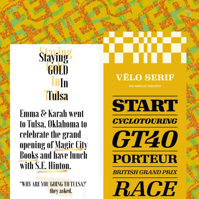
Ever spot a simple, stunning photo-less email in your inbox? For many brands—especially those that focus heavily on product images or illustrations—a no-image email is a nice change of pace. Readers can tell right away it's different, and that novelty can catch eyes (and earn clicks!) So if you don't have any photos or art in your email, what is in it? Text, of course! We're talking beautiful, typographic email design. With live text. Give your plain text a little formatting love, and your email will stand out from the rest. It's easy!
Inspiration: Beautiful, font-forward emails
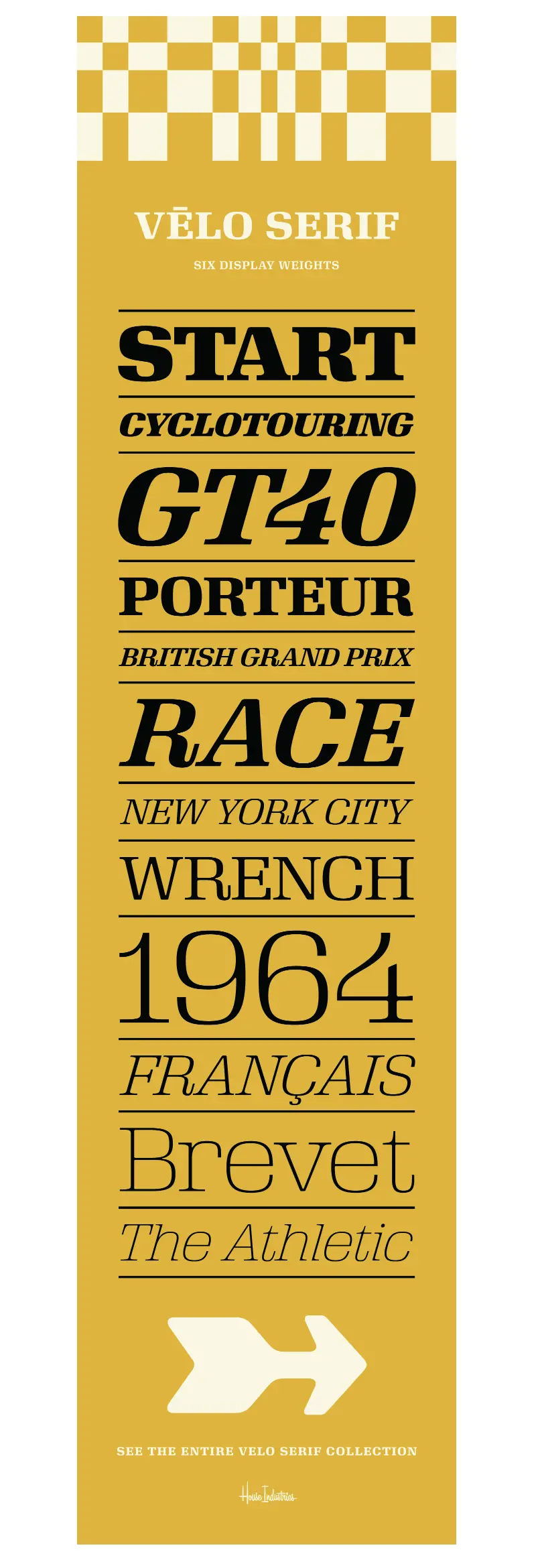
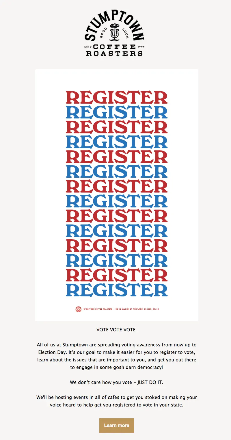
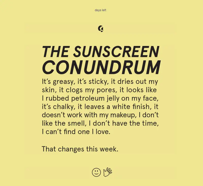
Check out the inspiration for today's typographic email design tutorial. Each of these emails relies almost entirely on creative copy and text formatting to shine.House Industries
Belletrist

Stumptown
Glossier
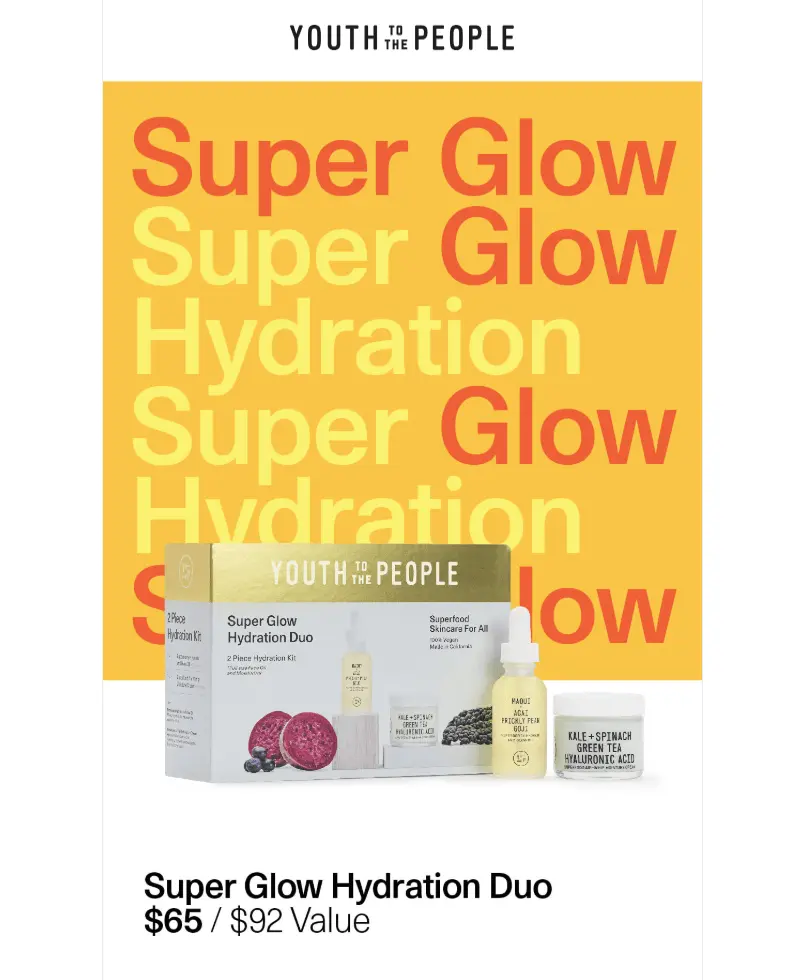
Youth to the People
Today's tutorial: build a beautiful typographic email
To create an eye-catching, text-based email, here's our secret: All you need is live text + HTML background colors. No Photoshop, no design assets, no images. Just great copy, styled smartly.Let's get started with a single-column blank template in BEE Pro.
#1: Narrow your width
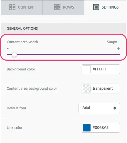
Since we're building an email comprised only of text, narrowing the width of the message body is an important step to making it easier to read. (Picture the way narrow newspaper columns make the content more legible.) A narrow width also helps the text stretch from edge to edge in the body of the email (like in a fixed-width message).To adjust your content area width in the BEE editor, navigate to the Settings menu on the right side. Drag the slider down to 500px (or as low as 480px).
#2: Choose a great serif or san serif—or both!
In the examples above, most emails stick with a single, large typeface. Glossier and Youth to the People stick with sans serifs, while Stumptown and Belletrist use serifs.Here’s a reminder of the difference between serifs and sans serifs—the red image shows where the little "serifs" are:
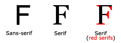
Image from w3schools.com
Quick font refresher: Email safe fonts vs. web fonts. vs. custom fontsEmail safe fonts (AKA "live text" or web safe fonts) like Arial, Helvetica, Georgia, Times New Roman, Courier, and similar default fonts render on any computer or device. Choosing these fonts for emails is a design best practice because they’re so reliable.Web fonts are designed specifically for the web and are somewhat less reliable than live text options, but they’re still found on many – if not most – devices. These are fonts like Open Sans, Roboto, Lato and others. Many popular web fonts are Google Fonts.Of course, there are fonts out there other than these web safe or web font categories. And many brands have custom fonts—typefaces that have been modified or designed specifically for a brand. More often than not they’re simply added as an image in email.Pro tip: You can customize the fonts you have access to in the BEE editor, adding additional web fonts and even custom ones (but be sure to have fall-backs!). Here's how.
Let's begin by drawing inspiration from Stumptown and choosing a serif font, like Georgia. In the Settings menu, you can set your default email font.

And not every text block we drag and drop into our email will be set to Georgia.

#3: Go BIG
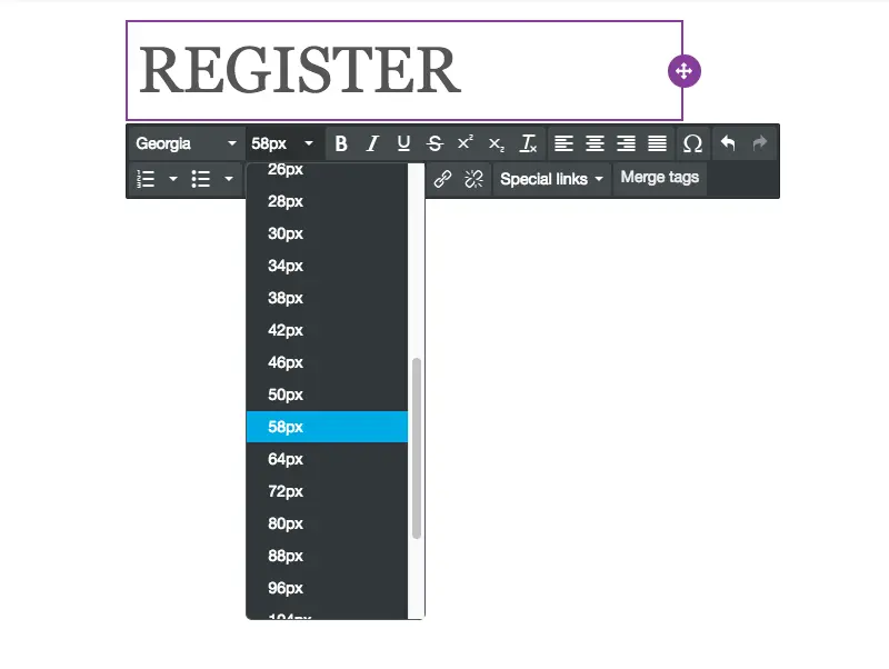
One thing all these great font-forward emails have in common? The text is LARGE. That's an intentional design move. Here's how to recreate it. Simply use your drop down menu to choose an ultra-big size. Test out a few to see which feels right. (You can preview your email on mobile, too.)
#4: Think contrast
Now, let's have fun with color. Not only do our inspiration emails use a large typeface, but they also use great bold colors. That's part of the appeal—and the fun!The trick is to choose a great font color that contrasts against the background so it's easy to read. For Stumptown, both blue and red contrast well against the white background. We'll use the Custom color option in the type menu to get the right shade.
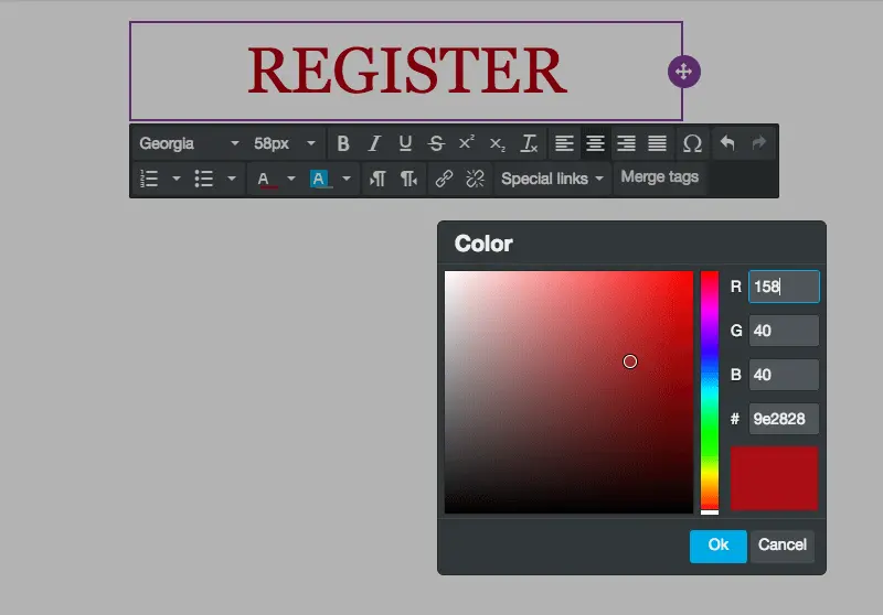
Note we're also centering our text. Since it's just one word in a column, centering is okay (for other long blocks of text that need to be read, stick with left-alignment).Now let's duplicate our row, making the next one blue.
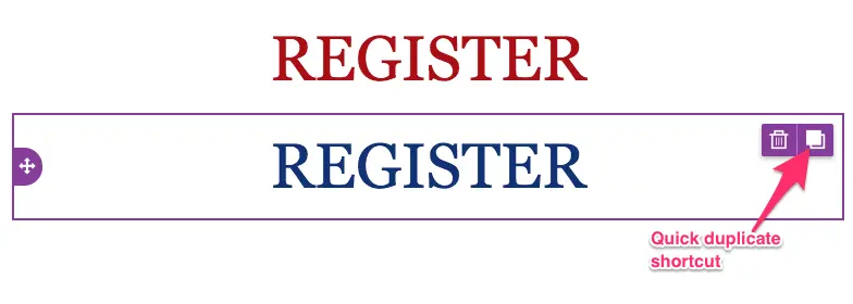
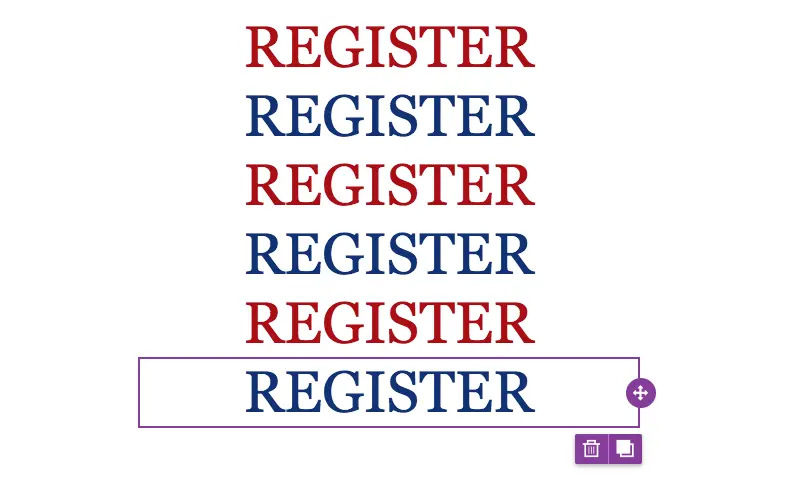
We can duplicate each row multiple times, then drag them so they're arranged by alternating colors. It's coming together!
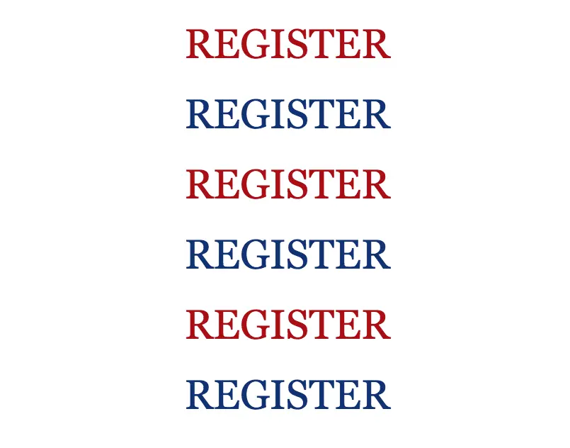
#5: Minimize padding
To achieve tighter spacing between each row, we need to decrease the padding on each row and content block.Use the Row Properties menu to reduce padding on the row....
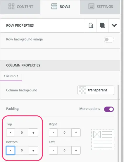
...then Content Properties > Block Options to decrease padding on the content block itself, making sure all padding is set to zero.

Now our message is much more condensed.
Important bonus tip: Have fun!
These emails are super fun to make, because you can essentially try different font and color combinations until you land on something you love. So play around a bit! You can mix-and-match fonts, like in House Industries' email, along with colors, like in Youth to the People's email. Just keep in mind your brand guidelines so that your email looks like it came from you. (Don't go too wild!)Watch our quick video for tips on how to have fun with colors and fonts. And happy designing!
