Photo collages (also called photo galleries) are a great way to add visual muscle to your email campaigns.Readers increasingly scanemails on mobile devices while they're on the go. Withonly a few seconds to capture subscribers' attention, photography is a great way to make an impact (especially if you're in thefood or fashion industries, where product pictures can make or break a campaign).A photo collage in email is the perfect way to display stunning images and tell a compelling visual story while avoiding the pitfalls of a single-image email. With great stock photos now easier to get than ever, even free of charge (we particularly likePexels), you're in the driver's seat.

Today we'll show you how to build a beautiful, responsive photo collage in email so you can design a message that looks awesome and converts.
Inspiration for our photo collage in email
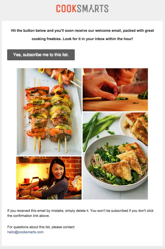
Many subscription confirmation emails look the same, but recently we took a look at how some brands are breaking the mold by giving subscribers a warm welcome and standing out from the crowd (on that, seeDesign a standout subscription confirmation email).One of them came fromCook Smarts, a company that emailscooking lessonsand recipes. After signing up for their mailing list, we received this confirmation email. The original, high-quality images made our mouths water. Thephoto collageserves as a delicious preview for the meal plans to come. Whata great way to get readers to tap"Yes, subscribe me to this list"!
But when we checked out the email on iPhone, we noticed it wasn't responsive.

The text doesn't get any larger (it's actually a bit hard to read), and the photo collage is all one image, so it scales down significantly to fit the screen's width. Sometimes, not having a responsive collage isokay—you might want the images in your collage to remain in place, even on a small device. It depends onthe amount of detail you want to maintain and if losing that detail due to scaling is okay for the purposes of your message. If you make a collage that's a single image, you'll have to do it in Photoshop or a similar program, but you can make a totally responsive photo collage entirely in our drag-and-drop BEE email editor, without needing to pre-format. Here's our quick video recap of today's workshop:
Tutorial: How to build a responsive photo collage
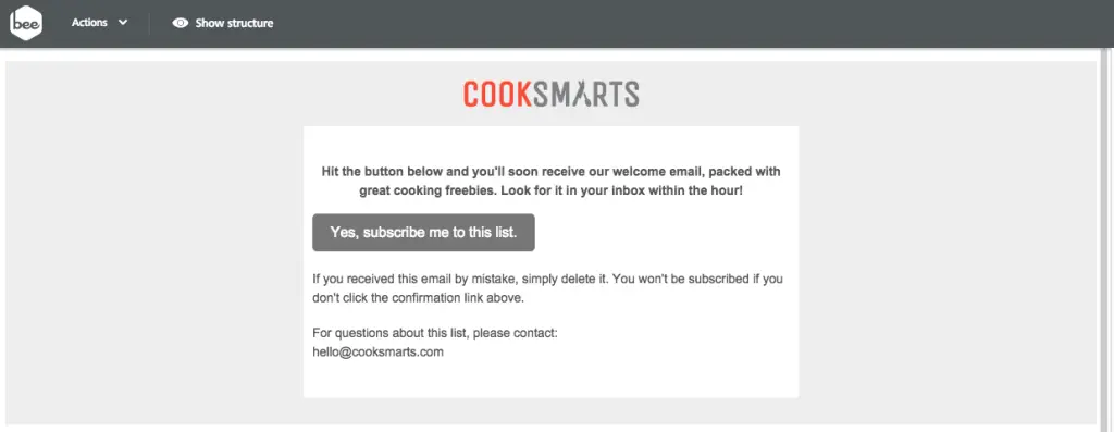
We recreated the basic structure of the Cook Smart email in the BEE editor to get started. Starting with a basic single-column layout, we brought in the logo as an image for the header, formatted the email background color to gray and the content background to white, and copy-and-pasted the text into the email. We also formatted our bulletproof CTA button. (For tips on how to make these formatting changes, check out our post on modular design and HTML colors in email).
Setting up the photo collage structure
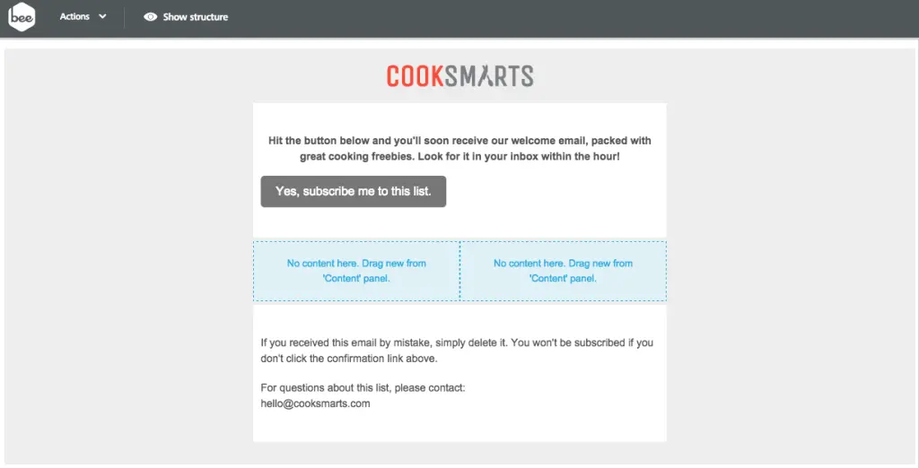
What we need to do next is set up the structure of the photo collage. While so far our email is a single-column layout, we'll need to add a two-column structure to arrange our photos. From the Structure menu, we'll drag one in.

Now we have a placeholder for our content.
From the Content menu, we can drag and drop in four image placeholders, two in each column.One...
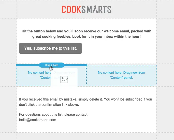
Two...
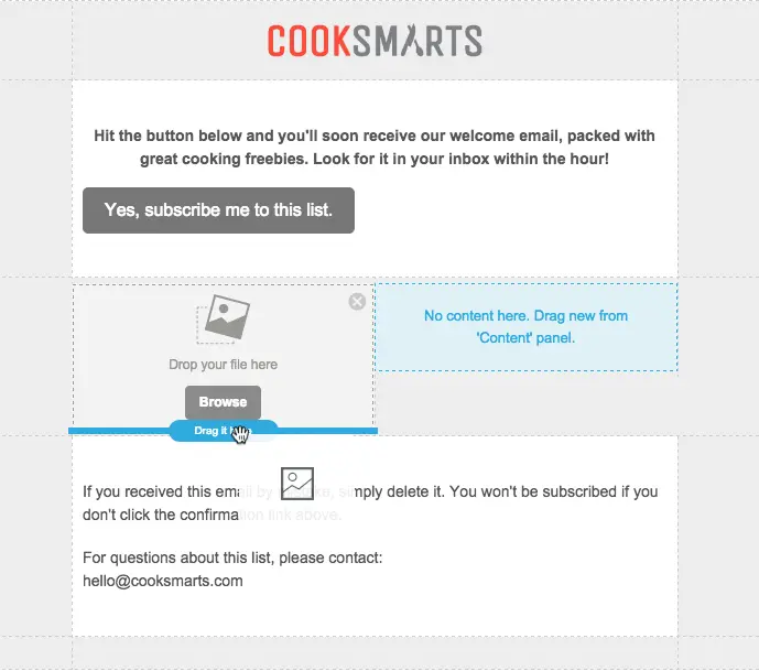
Three...
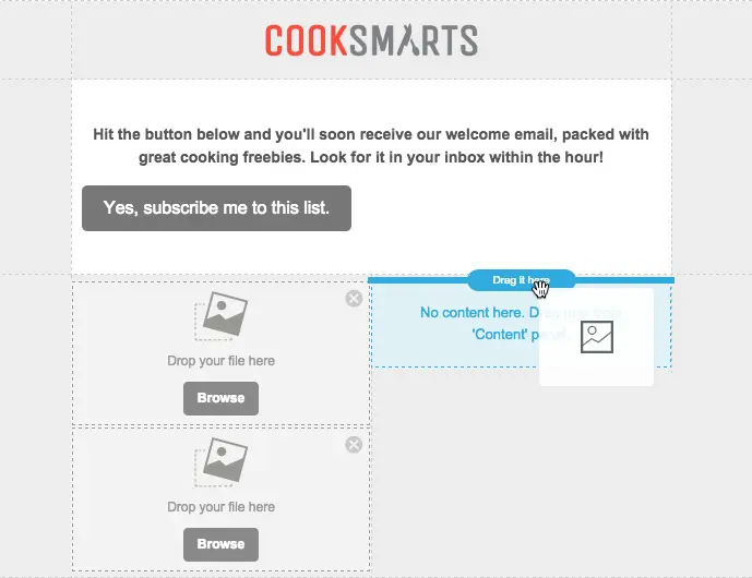
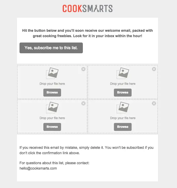
Four...
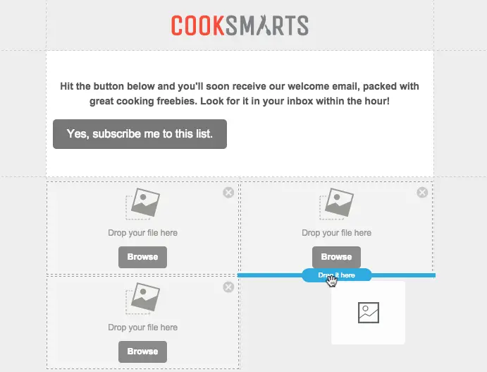
Ready to rock and roll!
Adding photos to the collage
We took Cook Smarts' single image collage and saved each portion individually so we have four separate images to work with. Now we'll drag them in one at a time into our placeholders.

The content placeholders automatically adjust in size to fit the heightof each image, making it super easy to maintain the look and feel of the Cook Smart collage.
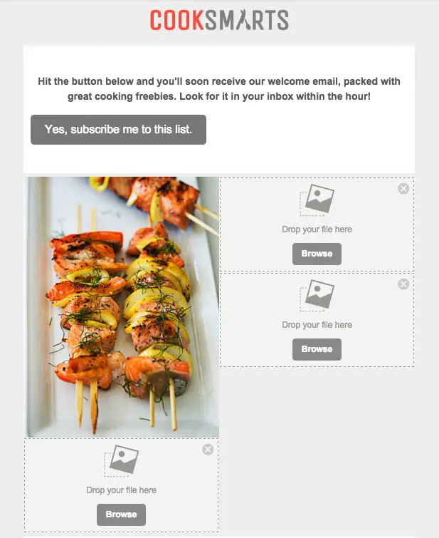
We can continue to add the images on at a time, dropping each one into place, until all four are in place.
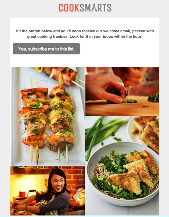
Fine-tuning with padding adjustments
The photo collage looks great, but we can more closely mirror the layout of Cook Smart's collage by adjusting the white space between the images andalong the outside borders on the right and left. We can adjust padding on any piece on content in BEE by clicking on it and navigating to the Content menu that appears on the right.To add white space on either side of our collage, we'll click the content row (the blank space to the right or left of our collage), so we can adjust both sides at once. Here's how:Turn on the "More options" slider under Padding.

In Column 1, we'll want to adjust the padding on the left only. By increasing the padding to 30px, we create a nice strip of white space on the left of our collage, similar to the original Cook Smart one.
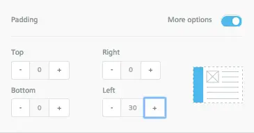
In Column 2, we will bump up the Right padding to 30px as well. Now there's white space on either side of our collage.

Looking good! Finally, we can make a similar adjustment for each image, so that there is a thin white border around the photos. Click on each photo, turn on "More options" for Padding, and fine-tune away! Here's our collage after we finished:

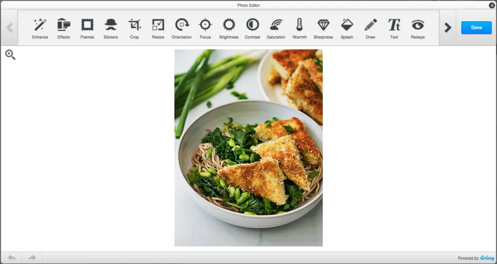
Ta da! The photos from Cook Smart are stunning and already look great, but the BEE editor also has a built-in image editor, from Aviary, that you can access to crop, orient, resize, and edit your images in countless ways. To access Aviary, just select an image, navigate to the menu on the right, and click "Edit image."

Aviary will load, and you can edit away!
Previewing our new email
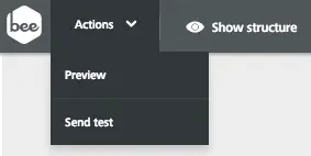
To get a glimpse of how our new responsive photo collage will look on mobile devices, we can preview it in BEE. Select "Preview" from the Actions menu in the upper left corner.
And here's our mobile preview:

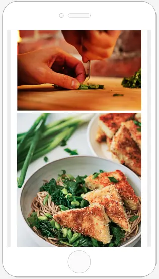
I love how we can see these beautiful images at full-resolution and takeadvantage of the full width of the smaller screen. The text is much easier to read, too. The email looks great, is fully responsive, and was easy to build! Give the BEE editor a try and tell us aboutyour creative collages in the comments.


