When it's your audience's last chance to snag a sale item, register for an event, get free shipping, or take advantage of a promotion, how do you get their attention? We culled our inbox to see how brands design final hours emails and found three common strategies:
- Show readers what they're missing by showcasing your product
- Grab attention and create urgency with animated GIFs
- Drive home the point with a dynamic countdown timer
Today we'll walk through how to use these design techniques in a final hours email of your own.
Final Hours Email Inspiration: Ursa Major
We're drawing inspiration from Ursa Major, which recently sent this elegant last call email alerting readers about the final hours of its sale:Subject: Hours left to save 10%
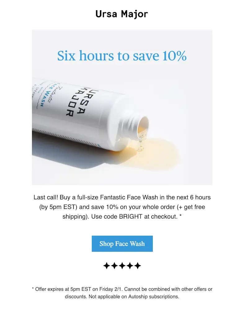
Here are the design moves we love about this sale email:
- Single-column, modular design ideal for mobile
- An inverted pyramid structure with a single message and call-to-action
- No navigation menu or clutter at the top
- Straightforward, well-formatted live text
- Quick-to-spot blue CTA button
Let's build it!
Tutorial: Design your own final hours email in minutes
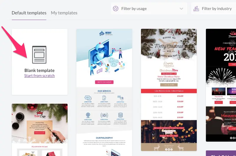
Step 1: Log into BEE and choose a blank template
BEE's blank template allows you to customize your last chance email starting with a clean slate. For a simple single column email like the one we're designing, it's the easiest one to start from. (And pssst, if you don’t use BEE yet, try a freeBEE Pro trial! You can use our email marketing templates or build an email of your own from scratch, then send away!)
Step 2: Build the email structure
Using the Content menu on the right, let's drag in each type of block we'll need in order: an image placeholder for the Ursa Major logo, an image placeholder for the hero image, a text box for the body text, and so on. The blank email template is already set up as a single column; now we just need our modules. Here's how it looks once we drop everything into place:
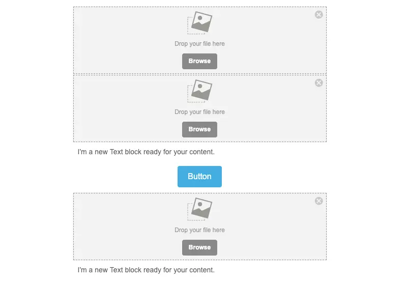
Step 3: Drop in your photos and text
Yep, it's as easy as it sounds. Simply drag your images into their respective placeholders, copy-and-paste (or type in) your text, and customize your button text right on the button itself. It's easy! Need images? Tap browse, then click Search free photos to browse BEE's extensive stock photo library.

Step 4: Format and finalize
Let's give this content a little TLC. First, we'll use the text menu to center-align our text, increase its size, and change the color to black. We can also use the Content menu on the right to adjust the line height.

Next, we'll customize the CTA button. Using the content menu, we'll set the border radius to 0, adjust the background color, and link it. We can use the text menu to switch to a serif font, too.

Lastly, we'll format our images. The star image at the bottom of our email is stretched out. To narrow the width, we can tap it, then use the content properties menu on the right to turn off auto width, then shrink its width using the slider.

Finally, we can tap on any content block and adjust its padding, making sure there's even spacing between elements throughout the email. Here's how our final email looks:
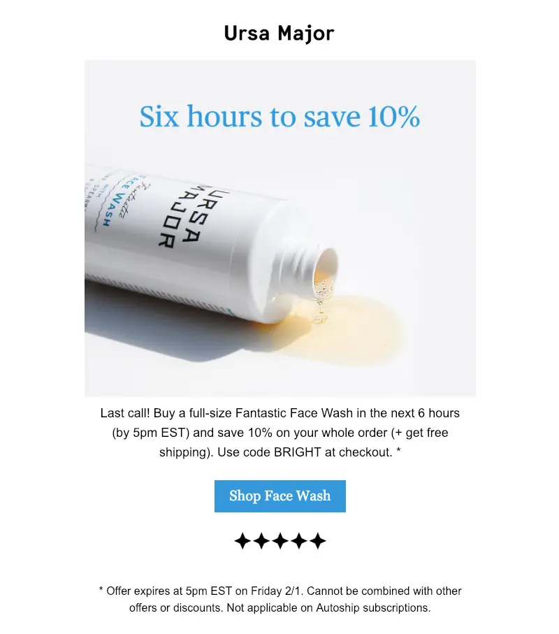
Looks pretty good, right?!Remember to link all images and your button! When you're finished, you can also:
- Preview how your email will look on desktop and mobile using the Actions menu
- Send a test email using the Actions menu
- Save your email and finalize later
- Export to Gmail, MailChimp, or Sendgrid
- Invite collaborators to review
- Turn your email design into an email marketing template for later use
Bonus: Add a countdown timer
Want to add a little urgency to your message with a countdown timer? It's easy! And countdown timers are great email marketing tools. Our favorite way to add a dynamic countdown timer to email is to use a free timer generator. Today we'll useSendtric; other easy-to-use countdown generators you might check out include:
Sendtric's interface makes generating a timer super simple. Go to sendtric.com and customize the fields on the landing page, including your deadline and the colors for your timer. This is how ours looks:
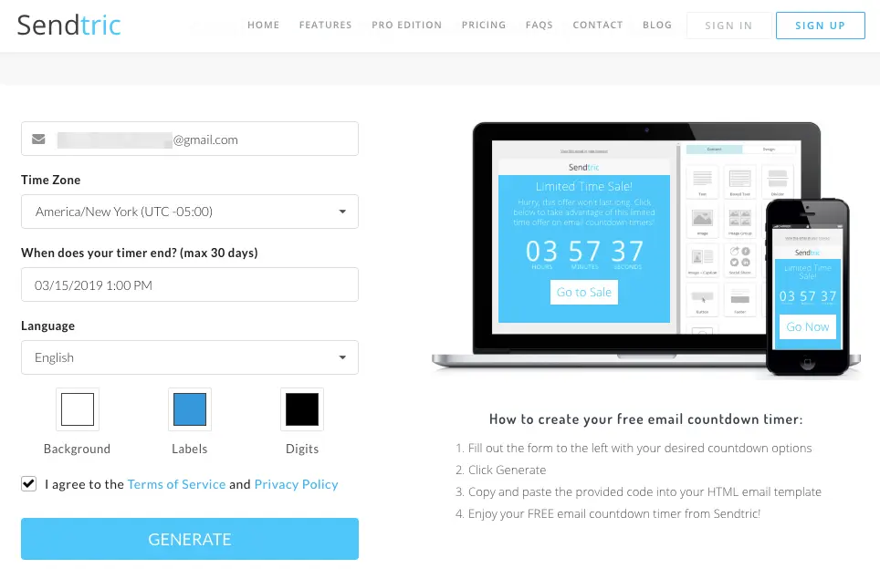
Tap generate, and you'll be presented with an HTML code you can copy and paste:
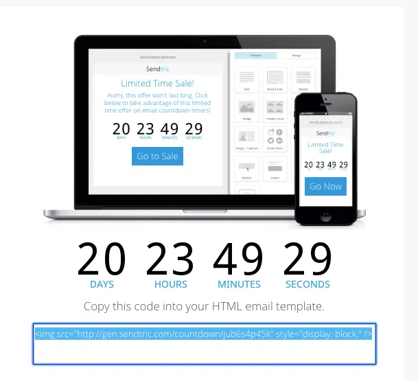
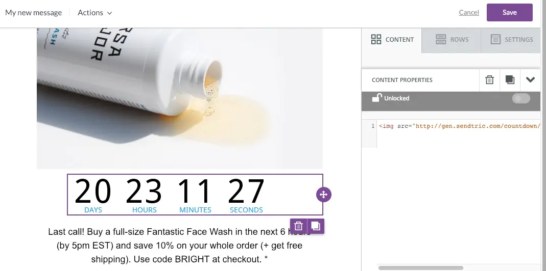
In BEE, drag and drop in an HTML block from the Content menu on the right. We'll place ours right under the hero image. Then, using the content properties menu, paste the HTML code into the entry field. Your timer will appear!
Excited to design your own final hours email? Sign-up for aBEE Pro free trial! You'll be able to create an email like this one in minutes. And if you want a head start on your design, check out our ready-to-use countdown email template andproduct promotion templates. Happy designing!


