As 2017 draws to a close, we're filled with gratitude for you, our beloved readers! We've rounded up your favorite Email Design Workshop posts so we can reflect on the biggest email design lessons of 2017.It's been a fantastic year of exploring and celebrating great email design, and we couldn't be more grateful that you tuned in. Our aim is to continue to make this an inspiring and informative space where we can all learn and grow together to send better and better emails. Cheers to more great email design in 2018! Before we roll into the new year, let's check out 2017's big email design takeaways. Here's what we learned!
#1. How to optimize event reminder emails
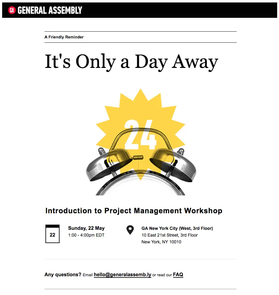
In our post, 5 Effective Strategies for Event Reminder Emails, we covered how to build an email thatkeeps registrants interested, provides essential event information, and helps bring in a final round of RSVPs. It's not an easy task! But it's an important one, and this was our most trafficked post of the year. In it, we took a closer look at how brands like General Assembly, Punchbowl, Course Horse, and Eventbrite design their emails for maximum impact.
#2. How to create a full bleed vs. limited width email
When an email has afull-bleed layout, the content has an edge-to-edge appearance. The design extends to the full width of your screen (typically more noticeable on desktop and tablets).On the other hand, in alimited-width design, content appears boxed in, typically surrounded by a pale HTML background color like gray. In this case, the width of the email's content remains fixed in and doesn’t stretch out. In our post, How to Design a Full-Bleed Vs Limited-Width Email Layout Design, we reviewed examples of both email types and showed you the super easy process of building either style.
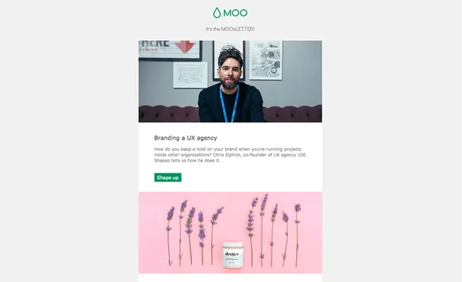
An example of a boxed email from MOO
#3. What to consider when choosing an email platform
What should you consider when searching for the perfect ESP design tool? In this post, we asked email marketing gurus to weigh in. And wow, we got some great advice from design directors, marketing specialists, developers, and email consultants. HTML flexibility and customization were big ones, along with great templates, intuitive UI, and more.

#4. How to wow subscribers with personalized images in email
This was one of our favorite tutorials of the year, and readers agreed. We're not talking about how to use a merge tag in the subject line or body copy here; we're talking about personalized images.Adding dynamic content like this to email campaigns is becoming easier and easier. Our tutorial shows how to take any image from your emails and turn it into one that's personalized anddynamic so subscribers see their names appear! If you missed this post, definitely check it out. Big thanks to NiftyImages for making this awesome capability easier than ever!
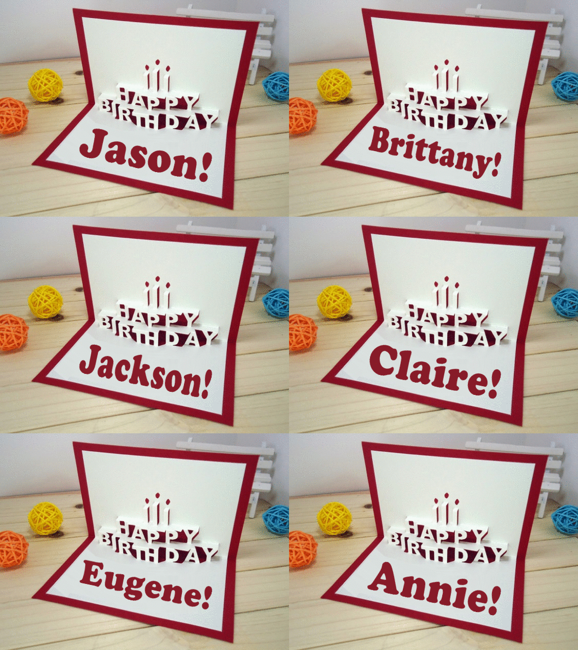
#5. Why event follow-up emails are so important
Planning an event takes so much time and energy that it's easy to forget to plan for after the event. But following up with your audience after a webinar, conference, or gathering is such an important engagement opportunity. In our post, we talk about three big design tips for event follow-up emails.

#6. What to take away from this year's #LitmusLive in Boston
What email geek doesn't love a good Litmus conference? While we can't always travel to each location, every year we spend extra time gathering the top tips from the event so that everyone—near and far—can be in the know. And 2017's #LitmusLive takeaways did not disappoint. Read all 10 in our post, The Best Email Design Tips from #LitmusLive Boston 2017, including the one on taking email design risks and making apologies.
#7. What makes a great header design
What makes a great header? This might not be something you consider in your day-to-day email design, especially when working with templates, but the header is the first thing a reader sees when opening your email. A header counts! This post includes5 simple, highly effective tips for your email header design.

#8. How to re-engage subscribers with an abandoned registration email that works
As consumers, we love simple, easy, single-click tasks. But not everything can be accomplished that quickly, and keeping customers engaged throughout a path to purchase can seem like a daunting feat. Often, users walk away from the registration process.Enter abandoned registration emails. We looked at how brands like HBO, Hulu, Indiegogo, and Resy re-engage potential customers who have walked away mid-signup. There are some great design tricks here!

#9. What you should do to prep for holiday email campaigns in July
It feels like we just worked on this post yesterday, and now it's the end of December! This post is still a great heads-up to help you get ready for next year! #2018goals, right? We covered 10ways to get ahead of end-of-year campaigns during slow summer months. You'll be glad you did.

#10. How to use millennial pink in your email design
We have to say, even after sharing this post, we continued (and still continue) to see millennial pink everywhere in email! Pantone declared it the color of the year in 2016, but at this rate, we don't think it's going out of style anytime soon. Incorporating the color doesn't have to mean making all your emails the color of the sunset. We looked at creative ways brands are using pink, and we think you might be inspired, too.

...And that's a wrap! Thank you again for following Email Design Workshop this year! If there were posts you found especially helpful, and if there are ones you want to see in 2018, we're all ears (and eyes)! Let us know in the comments. And best wishes for a happy 2018, from inboxes and beyond!
