Litmus is an online tool that allows you to test and track email performance. Marketers, designers, and agencies use Litmus to preview emails, test for spam, and run analytics, ensuring that they send good-looking messagesand hoping to better understand how— and on what devices— subscribers engage with their email campaigns.They have also been at the cutting edge of email design for quite some time, offering some of the industry's best email marketing campaigns. A perfect fit for our Design Inspiration series!
In focus: The recent Litmus product launch email campaign
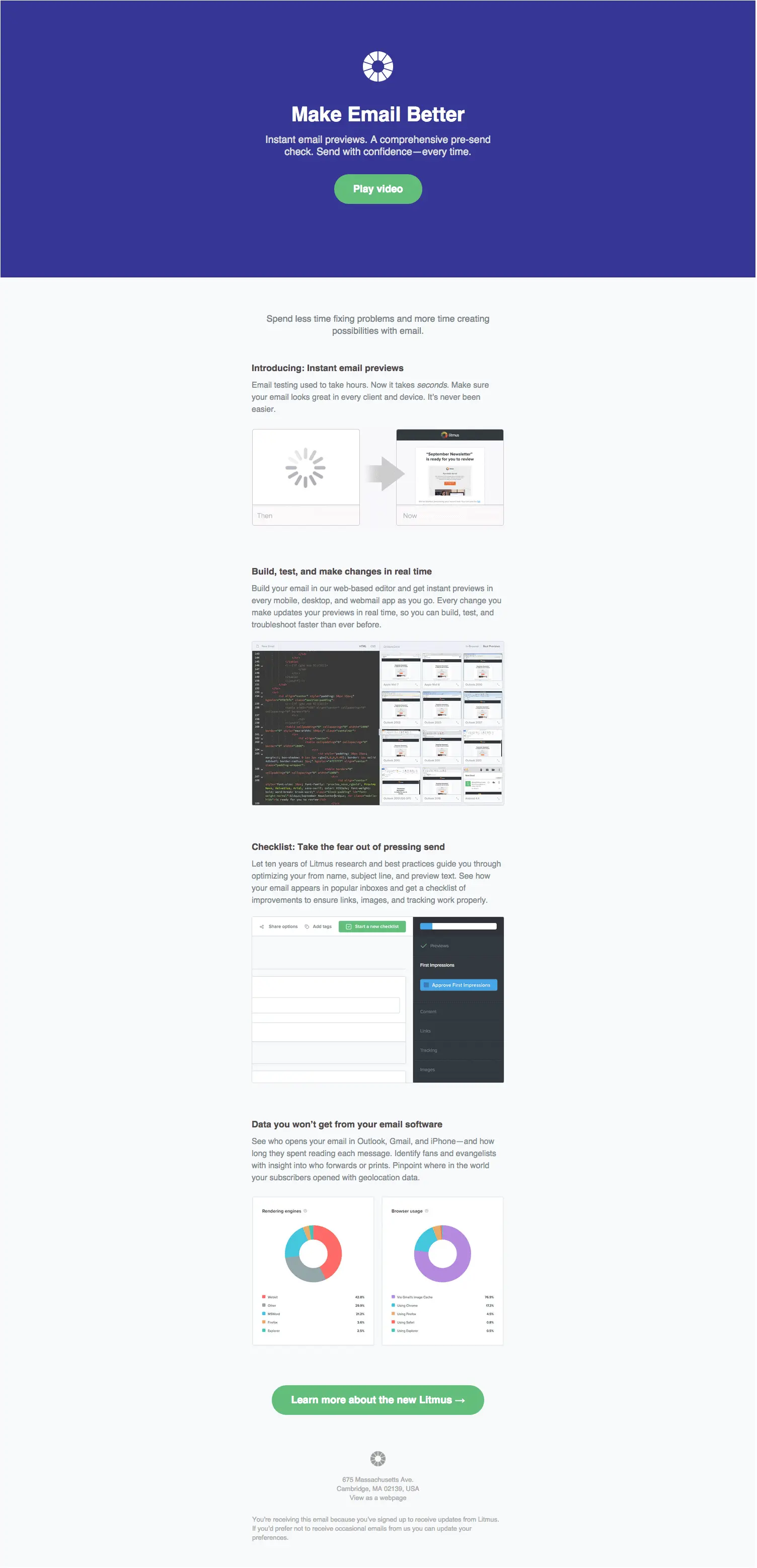
Over the past weeks, Litmus engineered a very engaging, integrated, and well-planned product launch around its latest release. Litmus started with a teaser email (part 1 of 3) and a social campaign around the Twitter hashtag #MakeEmailBetter to build engagement and start a conversation with its audience. Then, the companysent a follow-up email (part 2 of 3) announcing that "A new Litmus is coming...". And finally, they sent a detailed product announcement email about all the new features (i.e. part 3 of 3 of this multi-part email campaign).It's a great example of one of the best product launch emails we've seen, one that many B2B SaaS marketers can learn from. So forthis week’s Design Inspiration, we're going to dig into this Litmus campaign and focus on theirproduct announcement email(i.e. part 3 of 3; the last email they sent). Here it is!

Let's get inspired! And draw upon a few email design tips from the Litmus messageon how to send an email to sell a product (i.e., aproduct announcement email).
Tip #1 – Call to action email: provide multiple and be coherent
Notice that the Litmus email has two prominent call-to-action buttons (which are both "bullet-proof" buttons for email: they render well on most email clients)."Play video" (at the very top):

... and "Learn more about the new Litmus →"

In addition to these two CTA buttons, each product screenshot can be considered as an additional CTA, along with the "view as a webpage" link.What's interesting about these multiple CTAs is that they all point to the same, single landing page: the What's New section on the Litmus website. Practically speaking, it's a smart idea to have all your email CTAs point to one landing webpage: having to manage only one landing page for your product launch campaign can be a simple and very manageable approach, especially if you have limited resources or time.

What if I'm not readyor can't watch the video right now? No problem. That's why Litmus provides the additional CTAs within a visually engaging, product-focused section of the message. It's designed both for subscribersthat tend to quickly scan emails (screenshots) and for those who are looking for an easy read, without having to click (textual content).
Remember: Cover all your bases! Provide multiple, coherent CTAs that tailor to all of your subscribers' interests, device, and situation.
Tip #2 – Colorful, responsive HTML email templates: use a vibrant background color
What's an email header design you can use capture your subscribers' attention? Animated GIFs, vector graphics, photography? Yes, all of the above can work. But how about a simple background colorthat sets the right tone? It might be all you need!That's exactly what Litmus did. They chose a niceshade of blue for the background color (#363795 in hexadecimal format) and added a few elements to it. How cool is this? It's amazing how nice the header design is with just a cool color, a minimalist logo, and nice typography!

Stay tuned! We'll be showing you how to create a 100% width, flat design header in this Friday's email workshop.
Litmus has been one of the first companies to use background colors this way in email, following the flat design trend of recent years. There are a number of advantages in using an HTML color to provide rich backgrounds to different sections of your email messages. To name a few:
- HTML colors render across all inboxes, unlike images, which are not shown by default by some email clients.
- It's not an image file. You don't need to manage/store/link to it and it loads instantly.
- The HTML color takes up less than 1 line of code. The background color is simply an HTML style attribute.
- There's no need to ask your designer. Just look up which HTML colors to use (there are endless to choose from)!
Tip #3 – Know how to use video in email
What Litmus does best (and has surely tested!) is to lead with videoin this email as the first Call-To-Action presented to the reader. Video is arguably the most engaging, personable, and visual piece of content you can use to get a message across toyour customers. It's one of the few mediums that allows you to leverage storytelling, visually, and connect with your audience. Case in point, notice that the web version of the email uses a much more personable image instead of the blue background color from tip #2, enticing you to play the video.

Litmus implemented an interesting choice for the video content in their product announcement message.The strategy is not to embed the video in the email newsletter; it's to entice readers to click through to watch. In other words, Litmus decided not to use the HTML5 video tag toembed the video directly in the email, as they had donein a previous email. (If you're interested, here's a how-to guide on how to implement HTML5 video in email). What they did was instead to place the video in the landing webpage and simply link the landing page to the "play video" CTA button, as we covered in tip #1.Linking to a landing page thatcontains the video is a practical and simple way of including video in email. Yet embedding the video directly in the email had worked well for them in the past.So why didn't Litmus embed the video in this email? One reason couldbe that HTML5-embedded video starts playingdirectly in the email message on Apple email clients and mobile devices. That's great and that's exactly why the HTML5 video tag is used to do so. However... what if iPhone users in the Litmus' recipients base did not want the video to try to play in their inbox? With a product announcement as significant as this one, maybe Litmus didn't want its core audience to risk missing out on the video experience due to a problem with poor wireless connections or concerns with data plan usage.We're guessing that might be the reason why they decided not to embed the video in the email, and instead chose the more conservative route of linking to alanding page.
For all you designers and marketers, know that you have a number of ways to implement video in your email campaigns. And keep in mind that each solution has its pros and cons.
Tip #4 – Use screenshots to show your new product features
Show, don't tell! Screenshotsare a great way to display what's new. More than telling a story with words, you're doing so visually. And the message becomes particularly effective when you highlight how your new features solve a certain pain point.Litmus does a great job at this - at multiple levels - using the email layout, product-focused copy, and screenshots. For example, look at how thisscreenshot complements and adds to the copy:

And the animated GIF adds a bit of movement — a smart way to capture attention and a great way to communicate how email previews now work in Litmus: they're now instant. Say goodbye to the dreaded spinning wheel!

Tip #5 – Use screenshots to show your new product features
Litmus chose a modular, single-column layout for their product marketing email announcement, and it looks great on both mobile and desktop clients. Here's how it looks on an iPhone:


It goes without saying that the Litmus email is also responsive, automatically adjusting to the device. Litmus is at the forefront of responsive design!The email design tip we'd like to highlight here is to consideradopting a modular, single-column email layout, which should also be responsive (changes depending on the size of the screen) or at the least mobile-optimized (learn about the different options for mobile-ready emails).Let's cover these two aspects in more detail:
- Modular email design: You can greatly improve your email workflow (and workload) by adopting modular design. By this we mean organizing your email content as building blocks (i.e. modules) that you can stack up and drag-n-drop. Most modern email editors nowadays follow this principle. Take our BEE email editor for example!
- Single-column layout: The advantages of this email layout is that it's simple to work with, and helps you keep the message well focused. But be sure to use a single-column layout that is fully-responsive (or at least mobile-optimized) . It's an effective, simple email format you should try!
Key takeaways for a great product announcement email
To recap, here's what we can learn from the Litmus product announcement email:
- Put your most important call-to-action at the top. A clear call-to-action using a colorful button and clear, concise language makes it easy for your readers to understand what you want them to do.
- Use a vibrant background color to make your header design stand out. Use the principles of flat design and choose a vivid background color to make your message clear, without needing to incorporate complex design elements.
- Let readers see your new product features with screenshots. When using screenshots, make sure they’re clear and simple. Have a designer trim and format them so they render well in email. Incorporate animations to add visual interest.
- Choose a modular, single-column layout. A simple layout allows you to present your product features in a more linear way. And make sure the layout you choose responsive or at least mobile-optimized.
- Entice readers to watch your product video by making it the central component of your email. Starting your email off with a video signals to subscribers that you really want them to watch it (because you know it will get them to convert!). Use a bold color, a few lines of text, and an actionable “Play video” CTA button to encourage readers to watch.
- Tell the story of your new product features in multiple ways. You can’t bank on all subscribers being ready and willing to watch a video when an email lands in their inbox. If you use video, make sure to tell your story in another way, too, using images with supportive text.
If you want to create an engaging product announcement email like Litmus but need inspiration or are short on time, check out the BEE editor's templates. You can search by category, from newsletter templatesto product launch templates, including a ready-to-go app launch email template.What do you think of the Litmus email? Tell us in the comments. And stay tuned for our email design workshop this Friday, where we'll be showing you how to apply the email design tips covered here as we rebuild the Litmus email from scratch!


