
Political campaigning takes money. Alot of money. According to last year's estimate from The Hill, the 2016 presidential election could cost as much as $5 billion. Much of that amountwill go toward TV ads, but as campaign teams become savvier with onlinemarketing, spending on digital campaigning(everything appearing on computers, smartphones, or tablets) is increasingly important (accounting for up to$1 billionof spending by election day).While social media strategies are nowcritical for presidential candidates, email remains king.According to Michael Beach, co-founder of a digital campaign firm that works with Republicans,"nothing comes close" to an email list when it comes to fundraising.

Presidential email marketing is quickly evolving
In 2012, the Obama campaign changed the game when it leveragedemail marketing to drivedollars and votes like never before.By the time election day rolled around, the President's email list had 40 million names—a whopping 36 mil above Mitt Romney's 4 million. Email was responsible for 90 percent of the Obama team's online fundraising.This year's presidential candidates have taken note. Building those subscriber lists has becomeparamount as candidates strive toreach audiences. According to an October 2015 report from eDataSource,Hillary Clinton hada projected 5.1 million email subscribers. Jeb Bush had 2 million, and Bernie Sanders had 3.2 million. A more recent count put Ted Cruz's list at 3.6 million and Donald's Trump's at less than half a million.Millions of us, presumably, are receiving emails from one candidate or another. So, what do they look like? Let's check out the presidential campaign emails to see how their designs measure up.
Presidential campaign emails: a look at design
In the 2016 presidential campaign emailswe've seen, it's all about content—specifically plain text content imploring readersto donate. But is there more to it than meets the eye? Let's take a closer look.
Short subject lines
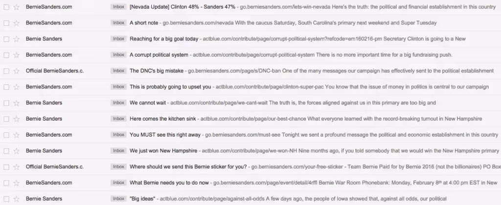
“The Obama playbook for subject lines was short, casual and provocative,”Arthur Sweetser, chief marketing officer of eDataSource reports. Many 2016 candidates seem to be following suit. Here's a look at subject lines from Hillary's campaign, for instance:

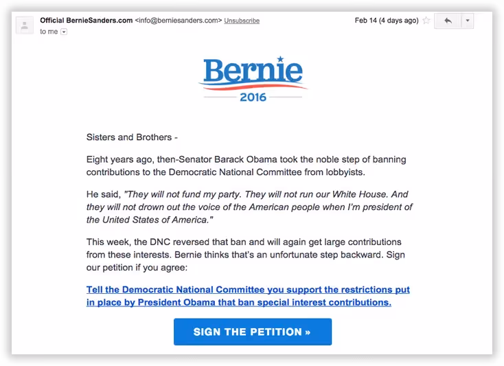
And here are some from Bernie's:
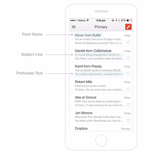
Interestingly, both camps seem tomiss an opportunity to optimize preheader text, the text that follows the subject line in an inbox. Much of what appearsare links. But as we've written about before, preheader text provides a valuable opportunity to show readers a preview of an email's content. Many subscribers use it as a screening tool when deciding whether or not to open an email. (Check out how to customize preheader text on the MailUp blog).
Emails from the Hillary campaign also alternatewho's sending them (we see Bill and Chelsea pop up in the "from" line from time to time). Other campaigners do this, too. But it's not an email best practice, and it actually goes against CAN-SPAM laws (but political ads are exempt).
Simple logo-based headers
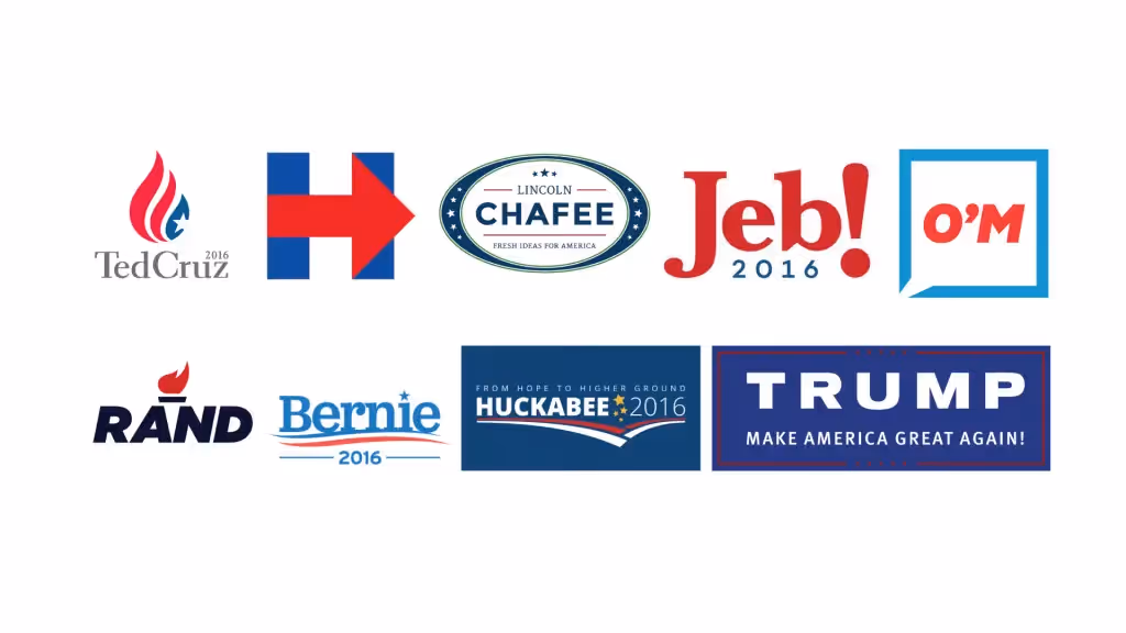
You've probably already read a thing or two about those presidential campaign logos. The design world seized the opportunity to rank, rate, and gradeeach one. Some reviews weren't so good. But the logos are here to stay—at least for the upcoming months.
In many emails, these logos double as theemail's header.
It's a simple way to reinforce the brand and leave the emphasis of the email on the message itself.
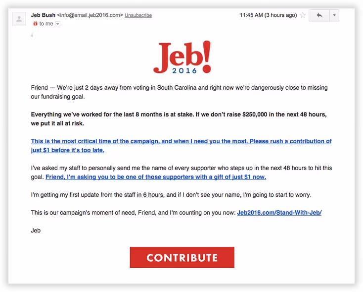
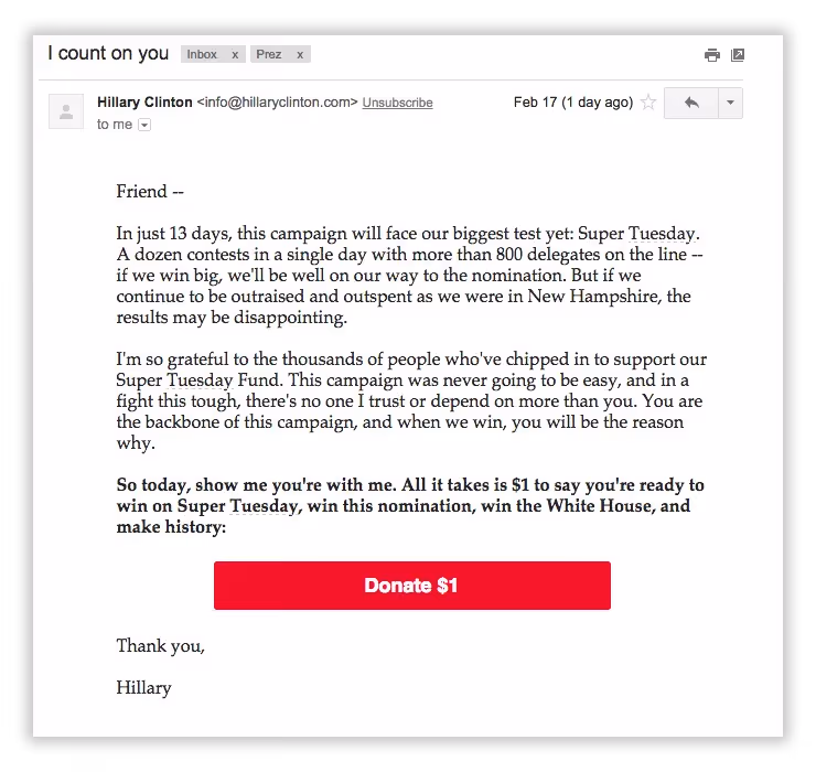
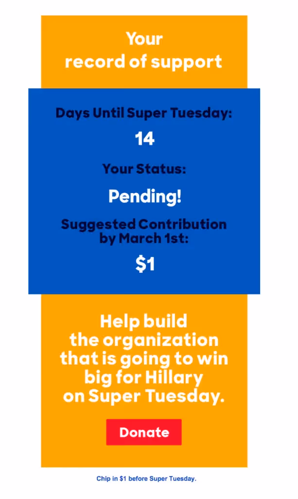
The candidates' campaign teams understand a best practice of email design: emails are not websites. Successful emails arefocused and succinct—there’s no need to crowd the header with extraneous links, menus, and messages. Hillary Clinton's emails actually skip a header altogether, making her emails seem more like a personal letter, from a friend:
Multiple opportunities to click
It's no surprise that content in nearly all of these emails is dominated by a call to donate. Or, we should say, by many calls to donate. Here's an example from Marco Rubio's campaign with an email from Nikki Haley, governor of South Carolina:
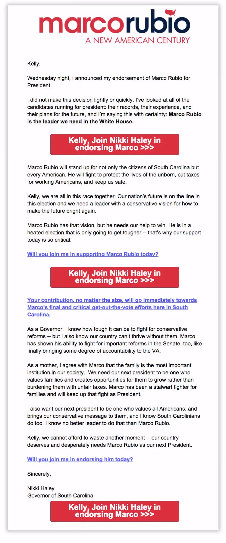
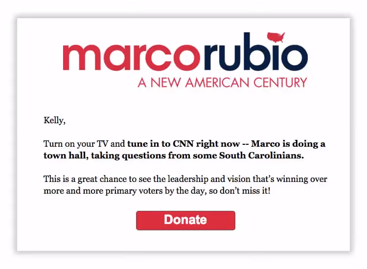
We count three large, red call-to-action buttons and three linked CTAs. That's six opportunities to click to endorse, and probably four or five more than we'd recommend. Our recommendation is (almost) always tocommunicate a clear, single message that leads to a clear, single call-to-action.Research has shown that placing a CTA button below the fold actually increases clicks by 304%! In general, CTA buttons in email stand out—they’re prominent and take up significant space. Even if readers skim or skip your body copy, they’ll likely still notice that big, bright, colorful button. So you don't need to overdo it with more than one or two. Better to use them sparingly. Here's another email from the Marco Rubio campaign that gets it right:
Most of the presidential emails we've seen make great use of bulletproof CTA buttons, making sure those calls to donate render well across email clients and devices. But a couple emails skipped the CTA route altogether and went with links instead, like this email from the Kasich campaign:
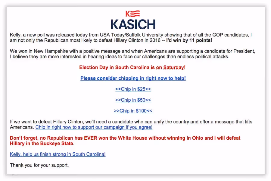
The links are easy to spot, but they aren't as easy to distinguish from one another, and they're a bit of an eyesore. With the BEE editor, the Kasich group could use bulletproof CTA buttons without having to code a single line of HTML!From what we've observed, CTAs in these emails focus on donating. That means little-to-no call to take other actions, like follow a candidate on social media. Social media buttons are generally secondary calls to action, which is why they're oftenseen in the footers of emails. But like the minimalistic headers we've seen, most candidates skip having much of a footer. One exception we noticed was from the Trump campaign:
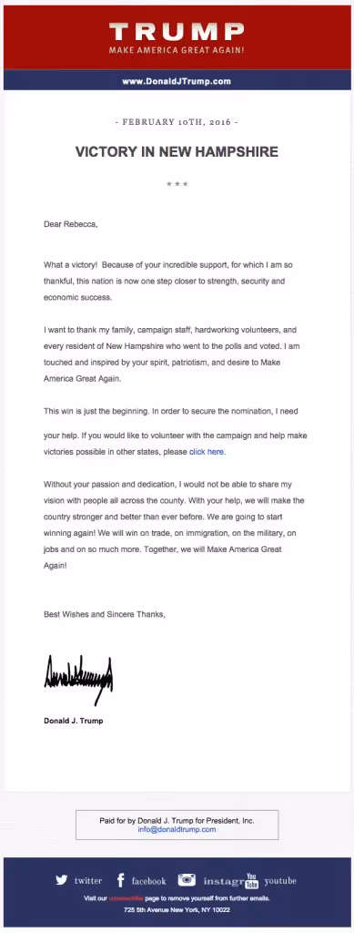
Looks like there are some distortion issues. Our advice would be to skip the social icons altogether, and add a bulletproof button instead of asking readers to "click here"!
Breaking the mold—a little bit
As you've seen, most of the presidential candidates' emails are straightforward: logo, plain text letter, call-to-action buttons. But a few emails tried something different—like an animated GIF! Here's one we spotted in a Kasichemail, with text above it reading, "If you have a moment, please watch our short video about our growing momentum in South Carolina!"

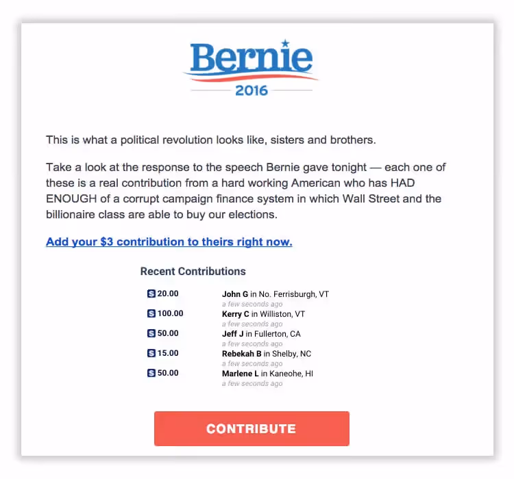
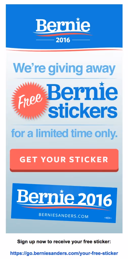
Sanderstried animation, too, with set-up text reading "Add your $3 contribution to theirs right now":

Here's the GIF in context:
And, just a few emails totally broke the letter-style mold and went a more artistic route. Here's one from the Hillary group:
And one from Bernie, too:
They're prettier, yes, butboth are single-image emails—a big no-no. At least each email includes a CTA link underneath the image, so that if the main image doesn't appear because of a reader's settings, there's still an opportunity to click.
Presidential Campaign Email Wrap-Up
While it's clear email has become a huge part of presidential campaigning, great email design isn't a big focus for these candidates. But there's still plenty to learn—
- Short, punchy subject lines get clicks (but be sure to optimize your pre-header text!)
- Always send emails from the sender subscribers signed up to hear from. It's CAN-SPAM law (for us email marketers, though not for presidential candidates).
- Emails aren't websites. A minimalistic header design gets readers focused on the main body content of your email.
- Optimize your calls-to-action with bulletproof buttons (but you only need 1 or 2!)
- Animated GIFs, like image files, are email-friendly. Use them! Follow our top four best practices.
- Skip the single-image email. Instead, balance images and text (and include at least 500 characters of text).
Did you spot a campaign email with an interesting design? Tell us about it in the comments!


