

Pretty much anything you want to learn, you can take a class online.When LinkedIn bought the online education website Lynda for $1.5 billion in 2015, it was clear that the e-learning industry was having a moment, and it's still growing by leaps and bounds. So we got curious: how do online education emails measure up? We researched how seven prominent online learning companies approached their email design to improve our knowledge.
#1. Webflow
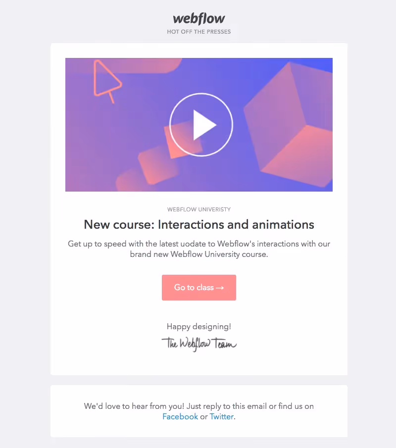
Webflow is primarily known as a responsive web design tool, but the company also offers courses through its "Webflow University." There, users can watch tutorials or take free video-based courses with lessons on building a blog, CSS styling, and more. When Webflow University recently added a new course on interactions and animations, this was one of the announcement emails the company sent.Subject: New course: IX2.0
The message below came on the heels of the above announcement, about a design tool upgrade to the brand's interactions capabilities. Webflow first rolled out the new feature and then followed up two days later with an alert about its latest training course. The two emails work together in messaging and in design.Subject: Interactions 2.0: Bring the web to life
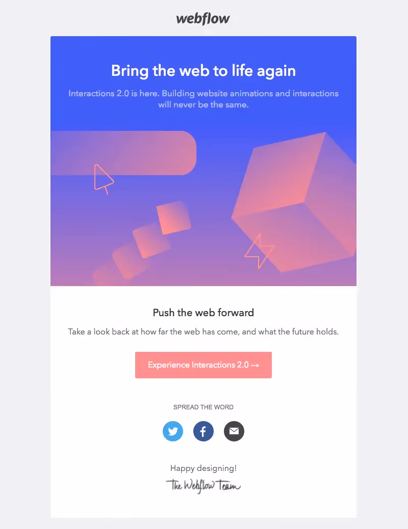
What we noticed right away is that the email's main header—Bring the web to life again—and the text beneath it, are both live. The text exists against a blue HTML background that blends seamlessly into the image beneath it. This isa simple trick that optimizes the email for mobile screens. The beauty of this email is that it shows how well-styled plain text is just as effective as a non-web-friendly brand font.
#2. Udacity
Udacity offers massive open online courses—MOOCs—mostly in the tech industry, from data science to machine learning to VR and more. Here's a look at its welcome email, which you can see is personalized in two places: in the subject line and at the top of the message.Subject: Welcome to Udacity, Kelly! Let’s discover what your future holds
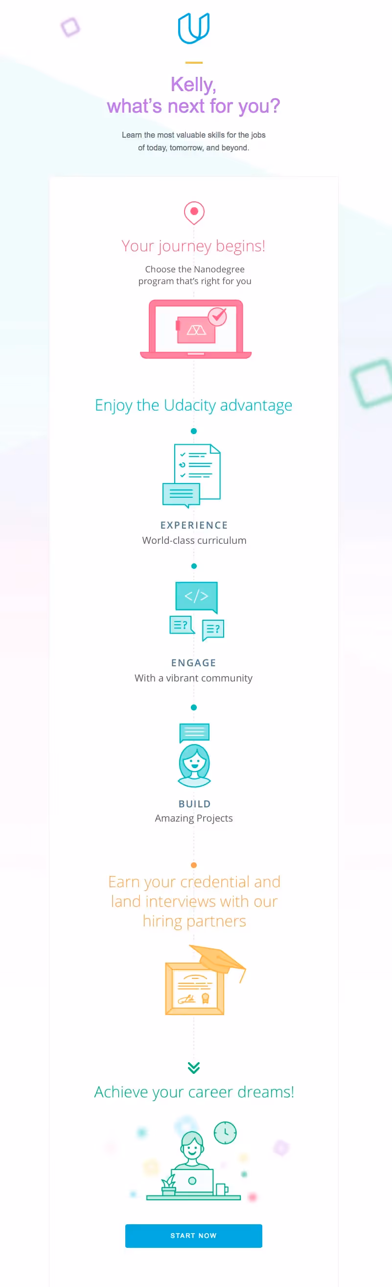
The email has a series of .JPGs that align to give the message an appearance of one cohesive infographic. The colors, spot illustrations, and minimal text make the "journey" easy to follow. Plus, the pot-of-gold payoff at the end is the email's single CTA button.
#3. General Assembly
General Assembly offers both in-person and online classes indesign, marketing, tech, and data. We've featured their emails beforebecause they tend to be clutter-free, direct, and visually effective. Here's the brand's recent announcement about a new course.Subject: UX skills + dedicated career coaching = A new path in 10 weeks
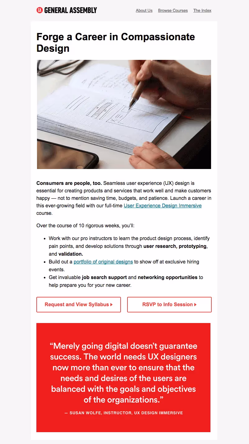
We don't often see two CTA buttons side by side, but this tactic meets readers where they are. Whether users are ready to attend an info session or to view the syllabus first, they can click on either CTA to check out more info. This approach might help remove the pressure for readers to decide immediately if they're ready to RSVP, which could also improve engagement.Here's a look at the cinemagraph from the header, too:

#4. Brit + Co
Brit + Co produces content and classes that center around all kinds of creativity. You can find courses like "Lettering for Lefties" and "Intro to Chalk Ink Art" on its site. Recently, the brand announced a new class in digital pet illustration with the message below.Subject: New Class! Digital Pet Illustration
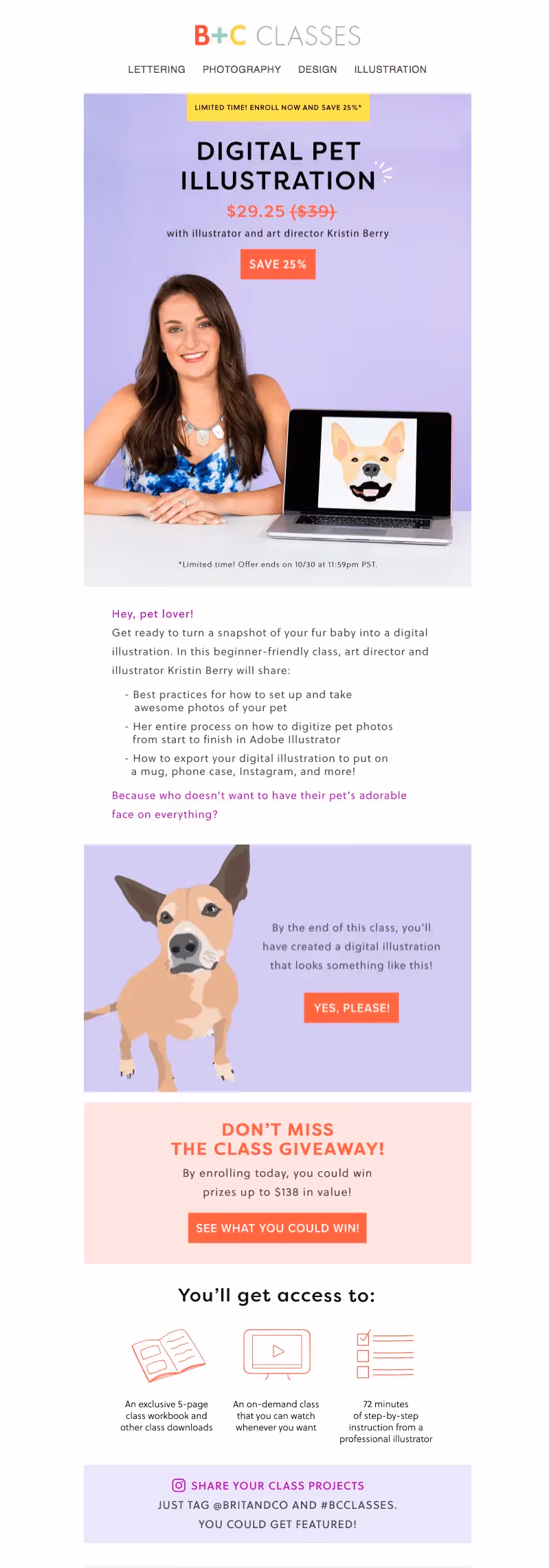
The email uses a combination of photo-based modules, text blocks, and illustrations to communicate its key value propositions. This is one of the denser online education emails, but it strongly conveys Brit + Co's visual identity.
#5. Codecademy
Codecademy offers—you guessed it—online coding classes. Here's an email introducing one of the brand's 10-week programs.Subject: Learn everything you need to build and deploy pixel-perfect websites


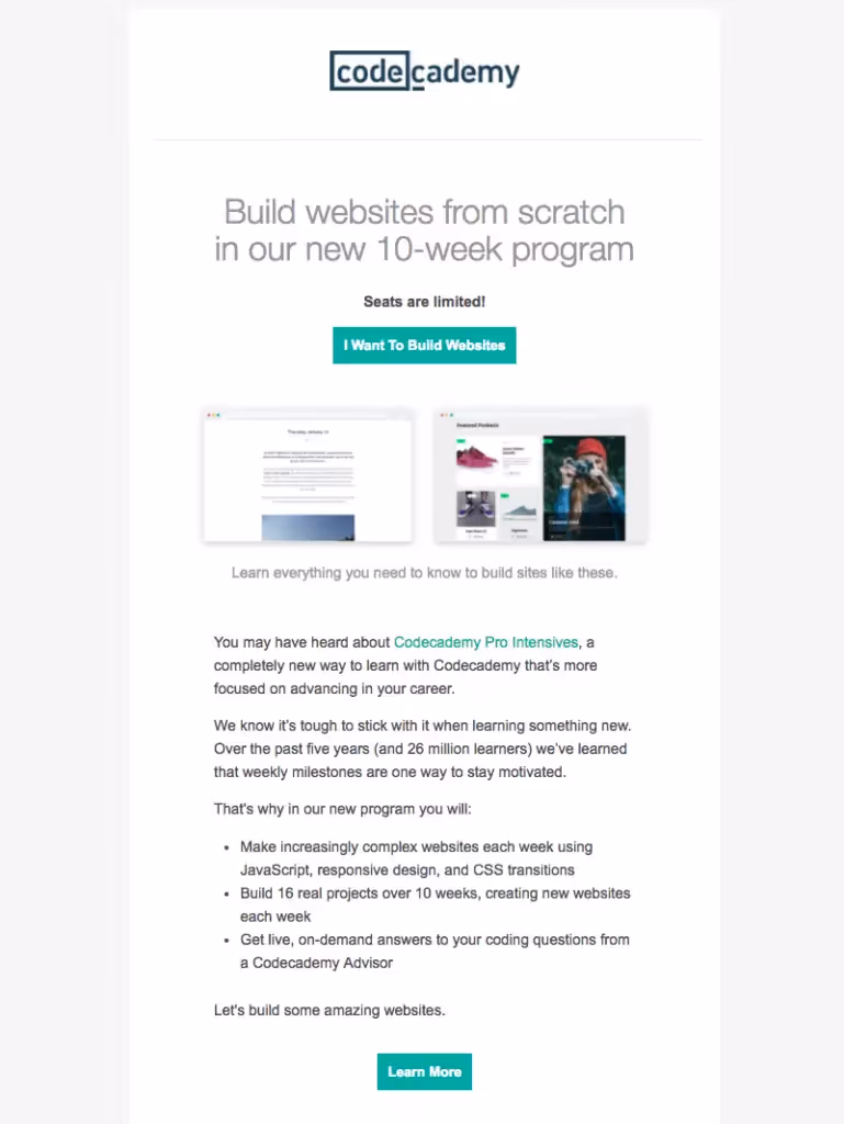
Somewhat similar to General Assembly, this brand also offers two CTAs: one at the top, for more eager and ready readers, and one at the bottom for those who still want to learn but don't want to take the plunge yet. The top half of the email is all about acting now—Seats are limited! I want to build websites!—with a sense of urgency, vs. the bottom half of the email takes an easy-to-read descriptive approach supported by aLearn More CTA.The layout makes an effort to meet two types of readers by offering different ways to capture clicks.
#6. Bloc
Bloc is another online coding school that offers "bootcamps" in areas likeweb development, mobile development, and design. A recent brand email introduced a scholarship opportunity for women in tech.Subject: $1 Million 'Close the Gap' Scholarship Fund
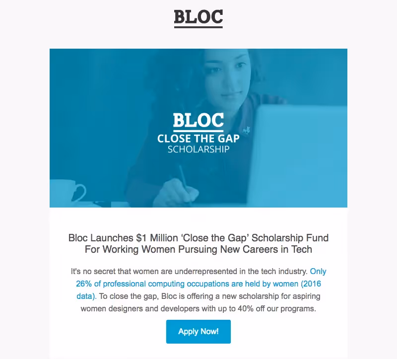
The email has a classic inverted pyramid layout, which is particularly effective when the purpose of an email is to alert readers to one important thing. This email is clean and simple, and that's the point: Bloc wants you to be able to read it, get it, and click on it without wasting time.
#7. Skillshare
Skillshare is another popular online learning platform. The company offers over 17,000 classes in categories like film, design, business, and tech. In a recent new class email, Skillshare introduced its floral lettering course, along with a few other new offerings (email trimmed for length).Subject: New Classes: Lettering with Gemma O'Brien, Marketing for Writers & More
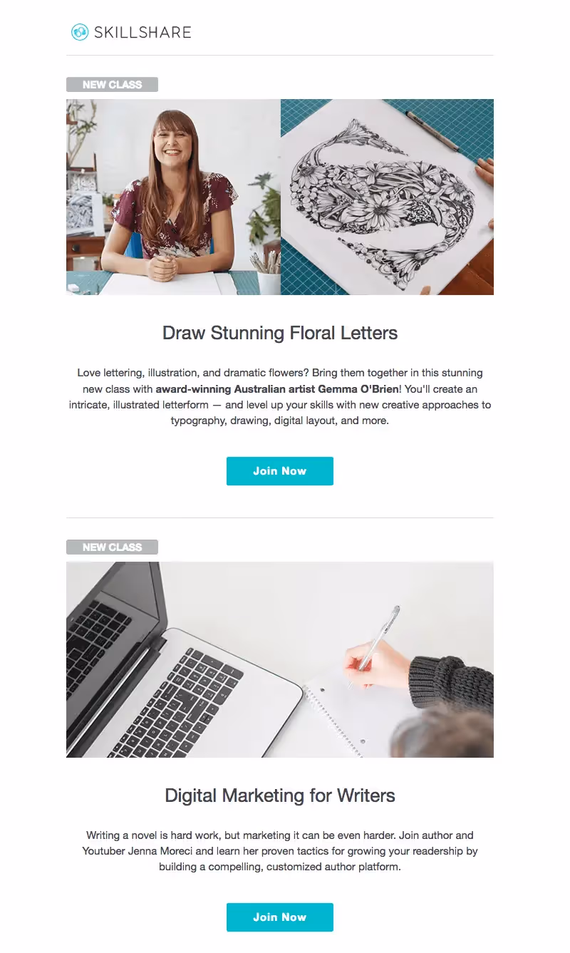
Skillshare follows in Bloc's footsteps and uses a simple inverted pyramid module layout. The email uses plenty of white space and a pared-down color scheme to create a light-and-bright aesthetic, which all works beautifully, though we'd love to see more creative CTA copy.
Inspired to level-up your own online education emails?
Any of the design tricks mentioned above can be easily executed in our own BEE editor. Just take the techniques and make them your own bytrying BEE Pro for free!You can build modular designs with a simple drag-and-drop functionality, and all your designs will even be mobile responsive (no coding needed).


