
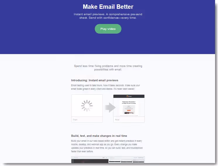
Modular email design is becoming a very popular trend for email marketers and designs alike. One of the biggest benefits of applying modular design tactics is that you can improve your email production process and speed up the way you build an email, a template, a campaign, and even how you work within your team.A recent product launch email from Litmus caught our eye where we can really see how to structure content (such as images, text, call-to-action buttons) through a modular layout. Let's have some fun and recreate theLitmus email and show you howto implement modular design tacticsto quickly build our email message. Be sure to follow along this workshop by opening the BEE drag-n-drop email editor in a new browser tab.Here's the email from Litmus that we're going to build in the BEE editor:

Getting started
Let's open the BEE editor and pick a basic one-column email templateto match the layout of the Litmus email:
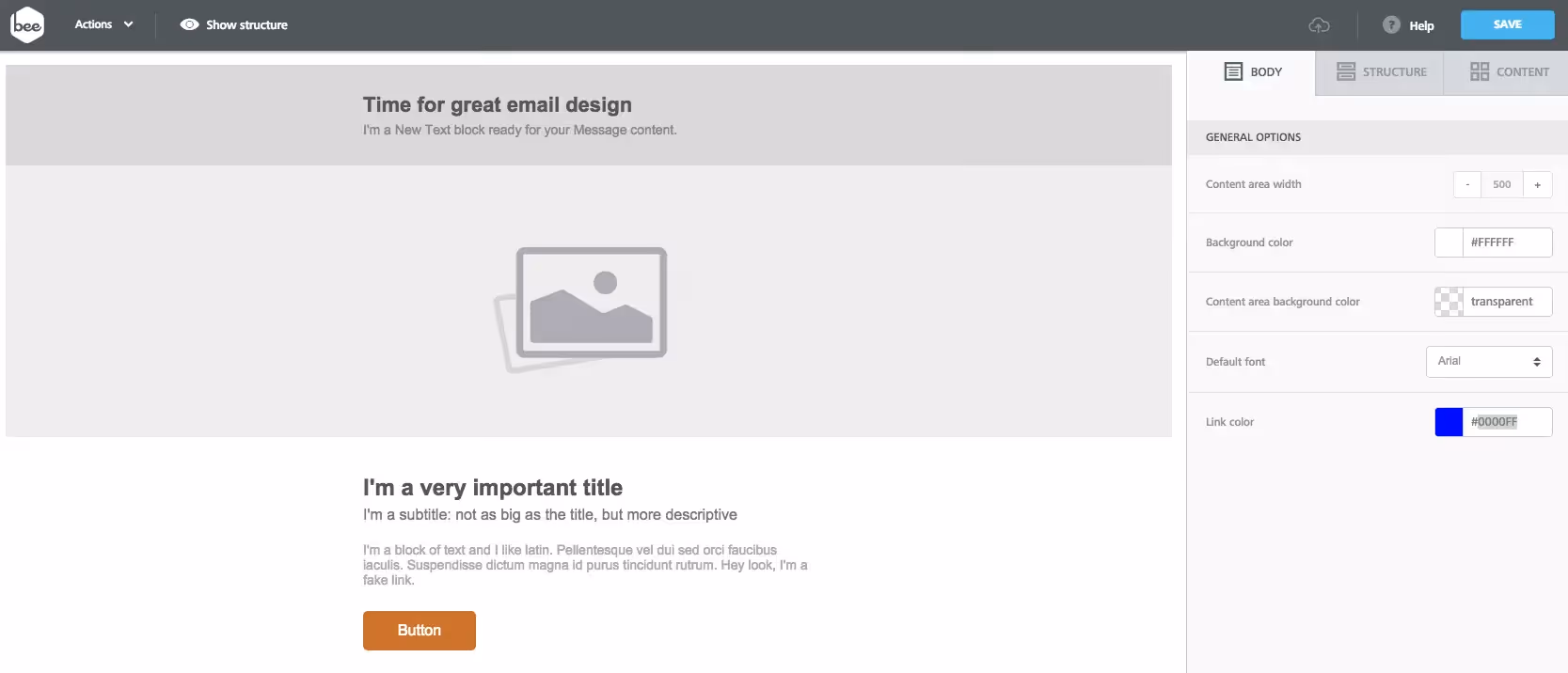
We're going to start off with this basic email template (think of it as our canvas) and customize it quite a bit by dragging and dropping structures and content blocks, including images and text blocks. This is where we can really see the efficient use of modular design in email. Let's go over this in more detail.
Modular email design in action
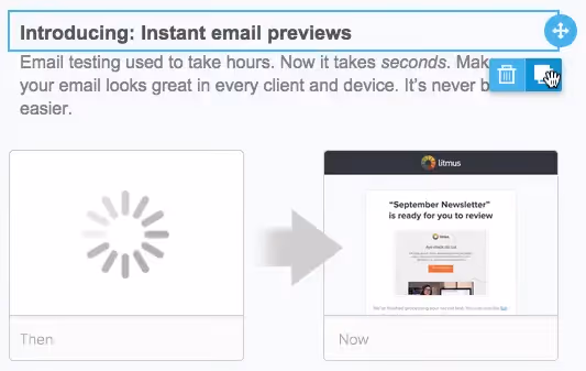
The Litmus email that we're looking at today is a perfect example of modular design (see also Tip #5: Use a modular, single-column email layout. Works great for mobile!).Notice that the Litmus email has 4 identical modules (i.e. sections) below the blue heading, with each module showing a new Litmus feature (such as "Instant email previews").
This means that we only need to create one module in the BEE editor instead of four, and then clone it a few times. This is a huge improvement in our productivity! Let's see how to do this.We first need to find the specs of the module, which are, in order:
- Heading text: font color #514E4C, size 18px, weight bold, line-height of 24px, padding 20px 0px 10px
- Text: font color #7F8C8D, size 16px, line-height of 24px,
- Image: width 500px
- Background color of module: light grey (#f8f9fc)
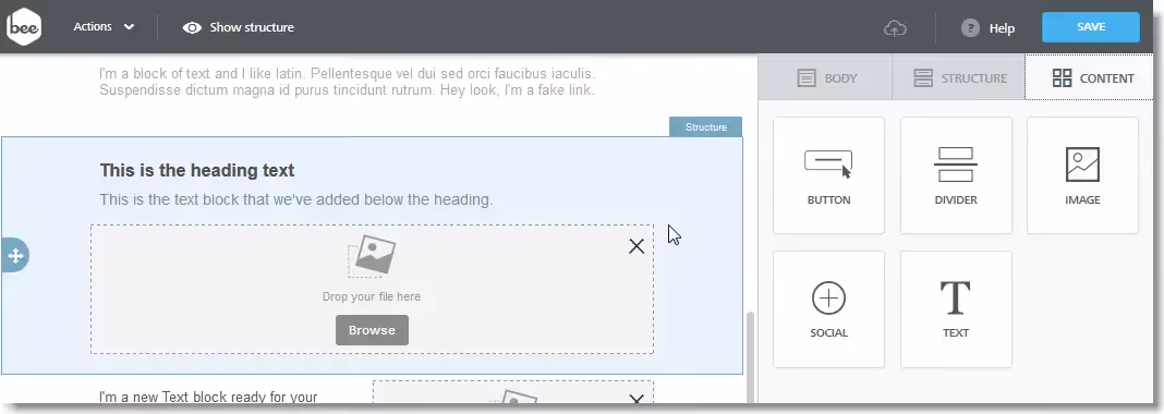
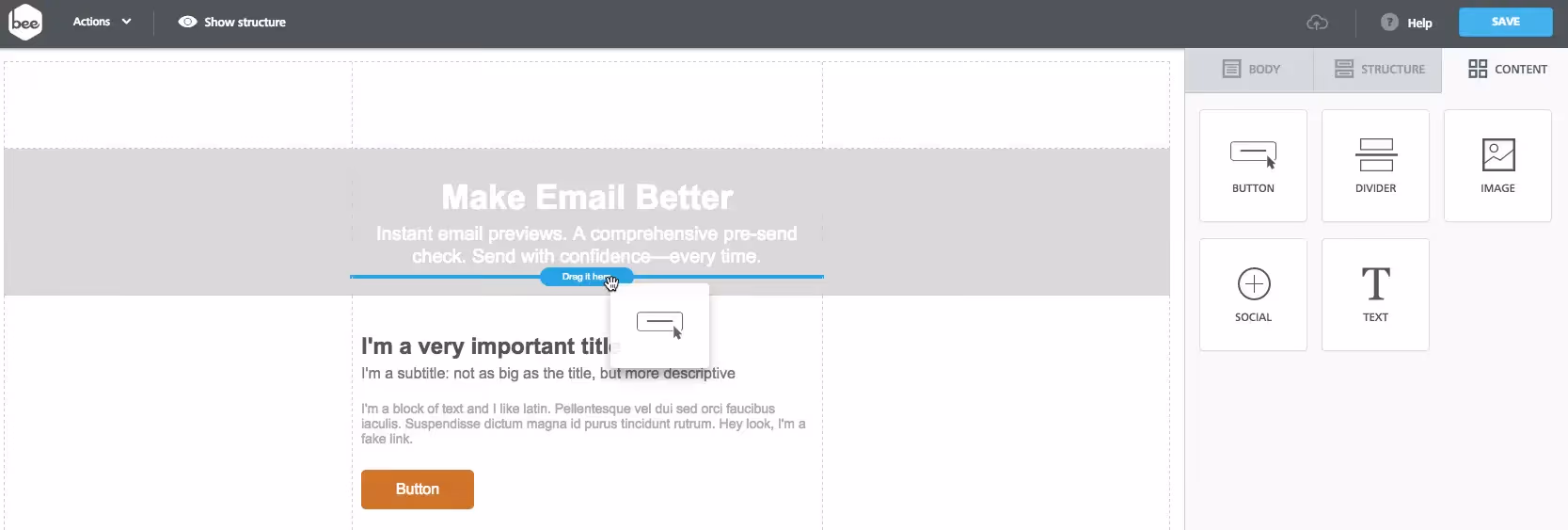
Let's drag-n-drop two text blocks and one image block into our module and apply the various specs. This is done under the Content tab on the top-right menu. Here's the finished module:
What is truly exciting is that we can duplicate this module three times by clicking on the square icon (to the right of the trashcan icon). We've just build our 4 sections in record time, thanks to modular design!

Now that we have created these modules, we can insert the text, and upload the images. For example, here's the first completed section:
Editing the remaining modules is just as simple; we've essentially cut our workflow 4-fold! In addition to the modular layout, the Litmus email has two noteworthy design elements:
- A header design using only HTML colors
- A bulletproof call to action button
Let's look at how to design each one in the BEE editor!
How to design your header with an HTML color
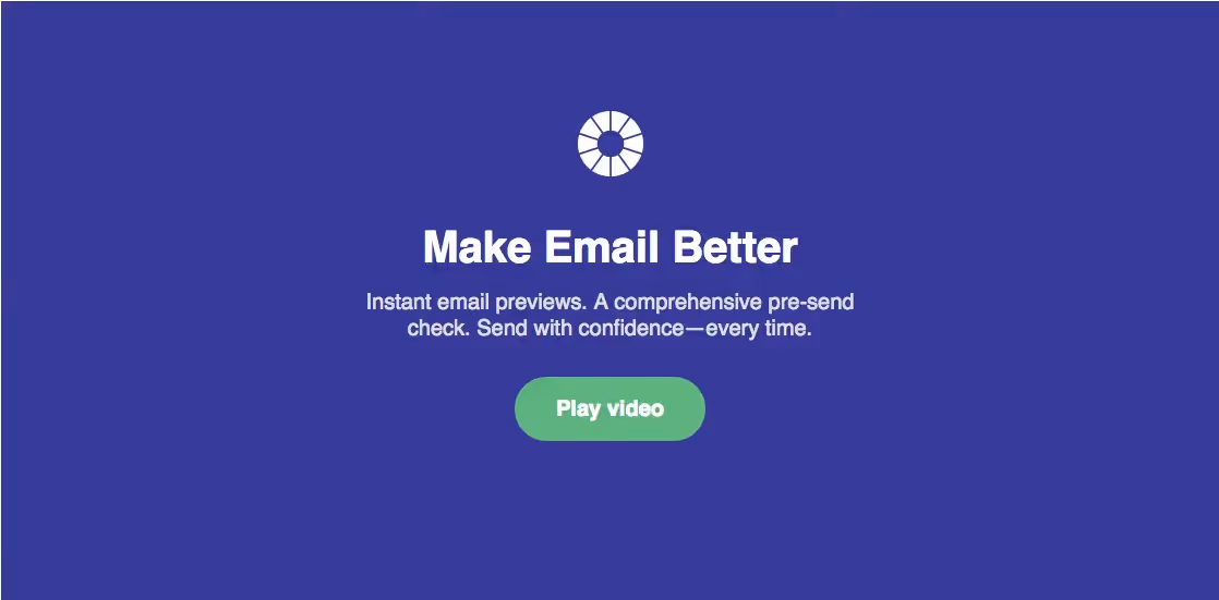
Notice that Litmus opted for a simple HTML color as the full-width background for its email header design. Read our Tip #2: Use a vibrant background color. Flat design is in! section.Now let's go over how to build the email header design from the Litmus email, taking advantage of the flexible background color settings in the BEE email editor. Here's our video tutorial:
Before customizing the background color of the header, we first need to add a newmodule to the message. As you can see below, the Litmus email header contains:
- The Litmus logo: 64 x 62px
- Heading text: font size 48px, bold, Arial
- Sub-heading text: font size 20px, and light grey color (#dddddd)
- CTA button: green (#62be7f)
- 100%-width blue background (#363795)
Let's get to work and build this email header design!We need to start with an image (i.e. the Litmus logo) followed by the text, then the CTA button.Using the single-column template we had selected, we'll simply movethe header text structure(click and hold the 4-directional arrow icon on the blue tab to the left) and drag it below the image:

With the beginning of our structure now in place, let's go ahead and dragthe white Litmus logo into the image placeholder (we right-clicked and saved the image straight from their email). You can drag and drop images directly from your desktop into the image block.

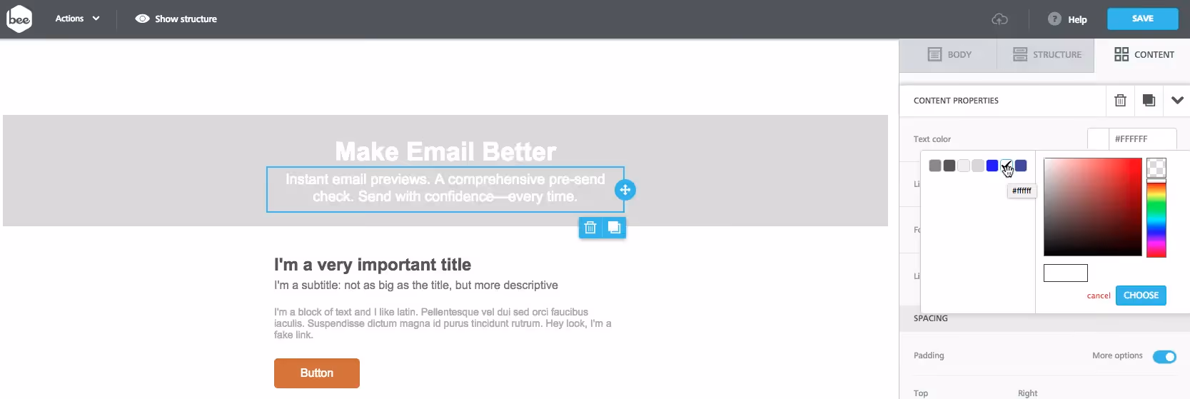
We can now focus on the text. As a font, we chose Arial - which matches the Litmus email the closest - so we won't change it. But we willformat the text by:
- Centering it
- Changing the color to white
- Increasing the font size (We chose 36px for the main header and 20px for the sub-header text)
How to design and customize a CTA button
Our header content is nearlyall in place. Lastly, we need to add the email's first call-to-action: the green "Play video" button. Navigating to the Content tab on the right, we'll grab the Button icon and simply drag it in place below our header text.
Let's customize the button to match the design used by Litmus. We'll need to:
- Update the text (adjust the size, color, and style)
- Change the background color
- Change the shape
- Link it
By double clicking on the button, we caneditthe text toread "Play video." We'll increase the font size to 18px and make the typeface bold—we can keep the default Arial font again.Next, using the Content Propertiespanelto the right, let's can change the textcolor to white, then adjust the button's color.

Finally, still in the Content Propertiespanel, let'salterthe shape of the button to match Litmus's by:
- increasing the border radius (we went up to 30)
- adjusting the button width (to 35%), which makes the button rounder and a bit longer.

The last step is tomake this button functional! In this case we want it to link to the Litmus video, just as it does in the original email. We'll copy the Litmus link, then navigate to the Action section of the Content Propertiespanel ,and simply paste the link into the link file field. Now our button works!
Workshop Recap
Let's recap what we covered in this workshop:
- We saw how to apply modular design in our email layout and how that speeds up our work
- We used a nice background color for a flat, full-width design for our email header: cool designs don't always require fancy graphics!
- We recreated an engaging call-to-action button by leveraging colors, padding, and rounded corners
All of this was inspired from the clever email design tactics from a product launch email campaign by Litmus.
Design your next modular email design and go Pro!
Design your next modular design-inspired email campaign in our easy-to-use, drag-n-drop BEE editor. No HTML knowledge is required, and your email will be mobile responsive. Sign-up for a BEE Pro free trial!


