
Originally published on April 25, 2016. Last updated August 13, 2021.
Never overlook the value of your email marketing strategies. While some may say email is dead, the data shows otherwise. Over 306 billion e-mails were sent and received every day worldwide in 2020, and it continues to be one of the most effective communication channels available to marketers. Now is the time to level up your email design. Design components make your email more engaging, with the power to increase both open rates and click through rates. Quickly enhance your emails and increase your open rates with these 9 email design best practices:
1. Optimize for mobile
We love to stress this best practice because it’s so vital to creating your best email design. About 50% of email opens occur on mobile devices. This means responsive email designs are no longer a “nice to have” —proper rendering is a must. The good news is that email editors like BEE Pro allow you to build a fully responsive mobile email without specialized coding or designing skills.
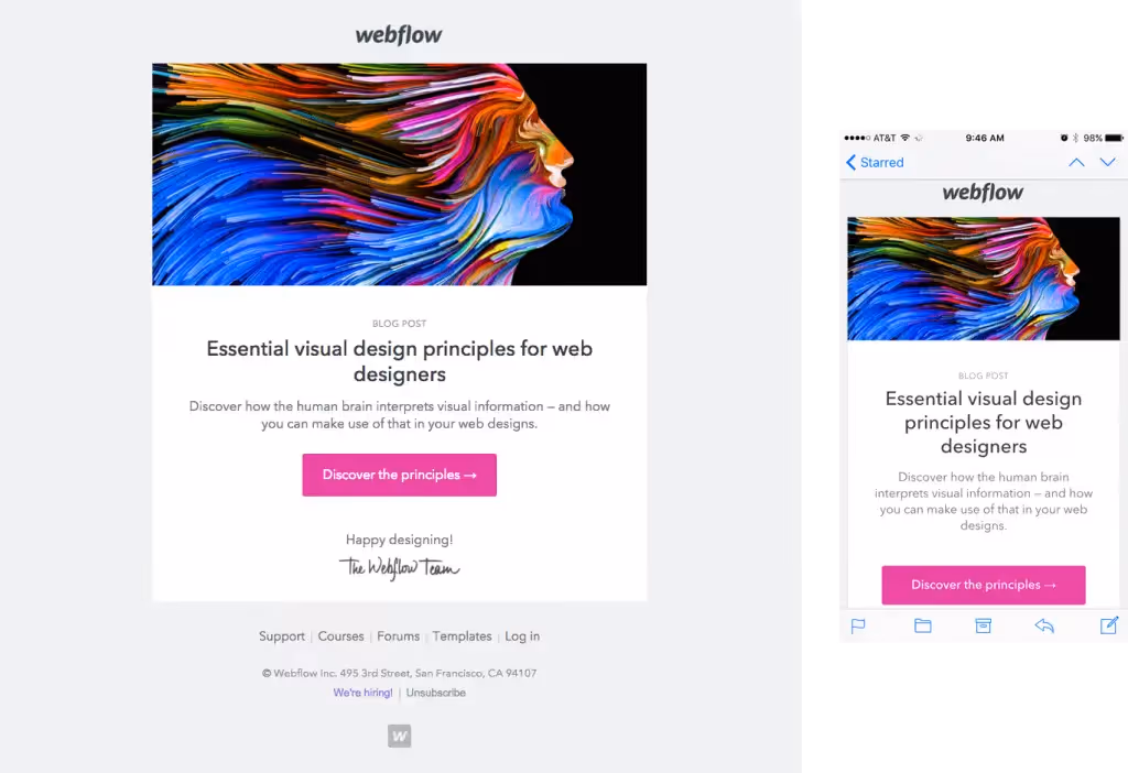
Desktop and mobile versions of Webflow’s well-designed responsive email.
In addition to using a responsive editor, you can optimize your messages for smaller screens by implementing these bonus design best practices:
- Minimalistic design (no complex headers, extra CTAs, or clutter)
- Large, easy-to-view content
- Clickable links and bullet-proof buttons
- Small image file sizes (allow for quicker load times)
- High-contrast design for mobile screens set to low brightness
- Proper balance of images and plain text (ALT text used for images)
2. Format text to improve readability
If you send newsletters, feature launch emails, or other text-heavy emails to subscribers, you’ll want to have a consistent, balanced approach to formatting text. As you build your email, make sure to:
- Stick to 1-2 email-safe fonts. Arial, Georgia, Verdana and Helvetica are popular email-safe fonts. They are reliable, classic, and easy to read. Once you’ve established your font, create structure and improve readability with styling techniques (bold, caps, size, color, and spacing).
- Include headers. Headers establish structure and break up sections of content. Generally, using a font size that’s 2-3 times the size of your body text will make your email easy to scan and clearly show readers when a new section begins.
- Use short paragraphs and bullets. Make your email content scannable by giving readers short bits of information. Nobody wants to read a long paragraph.
- Don’t over-format. It can be tempting to overdo styling techniques like bold, italicize, underline, color and more -but resist that temptation. A minimalistic approach to body copy is best for readability.
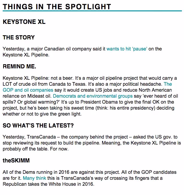
The Skimm newsletter uses solid font sizes and bold styling to create clear structure.
3. Don't underestimate color
In email, color is used to call attention to content, reinforce your brand identity, improve content organization and more.Background colors are a great way to organize content in email. HTML background colors are a great tool because they render across all inboxes (unlike images) and they’re easy to implement. Using different background colors in your email modules will properly organize your content and provide a seamless reading experience for subscribers.Looking for other creative uses of color in email? Try these quick tips:
- Labels. Organize long emails with eye-catching color tabs.
- Match photos. Grab attention with a monochromatic color scheme.
- Divide content. Use colorful lines and background colors to get organized.
- Photo collage. Break up images with blocks of color.
- Text. Use a high-contrast color other than black, like blue or grey.
- Links. Step away from that boring blue and create branded links.
- CTA buttons. Make sure they stand out more than any other message component.
- HTML backgrounds for ads. Improve transparency and make sure ads stand out from other content.
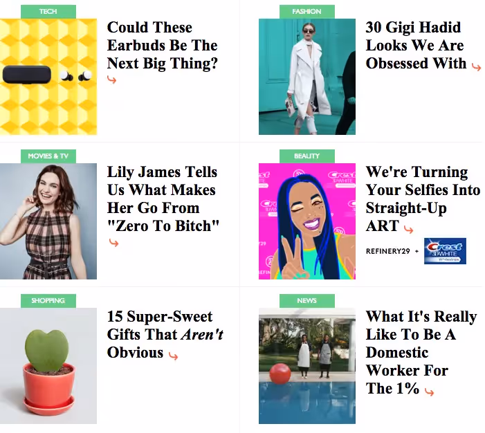
Refinery29 uses color tabs to organize content in this portion of their newsletter.
4. Create bold CTA buttons
All effective marketing emails have a call-to-action. You can ask your audience to sign up for an event, download white paper, snag a discount on a product or to share content. Whatever your CTA, it’s the driving force behind the entire email campaign. The goal of your email is to get subscribers to click on what you’re offering them, so it’s critical that your CTAs stand out. The best way to optimize CTAs is to form them into buttons. That way they will be clearly seen and clicked more frequently.Buttons written in HTML—also known as bulletproof buttons—will always render across all inboxes. Editors like BEE Pro generate bulletproof buttons with no-coding required on your end. Drag-and-drop your button into your email template, and you’re good to go.CTA button best practices:
- Write action-oriented, personal and compelling copy for your button. Keeping it direct and clear will ensure readers know exactly why they’re clicking
- Check that your button visually pops out. It should be quick and easy to find
- Make sure the color of the button is different than your email background and the copy inside the button is different than the button color - visibility is key
- Keep the style simple. Avoid gradients and multiple colors
- Place your button in an easy-to-find spot that fits organically in the story of your email (probably below the fold)
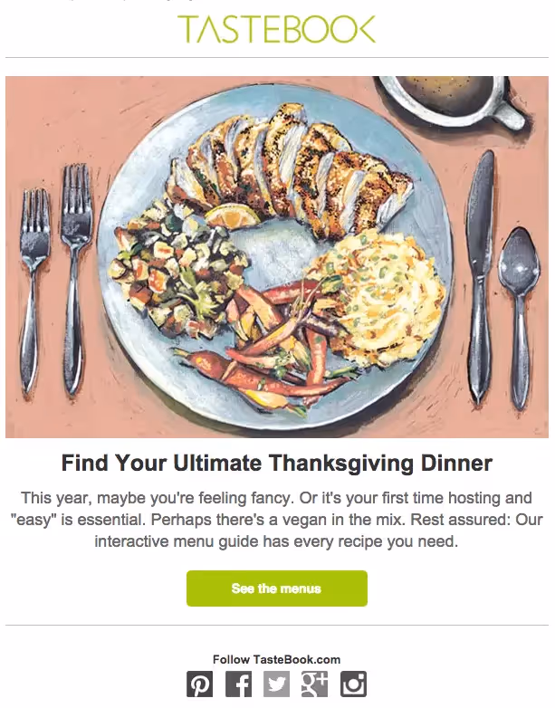
Tastebook’s CTA button is easy to spot and click, and it’s a brand color that contrasts against the white background.
5. Make sure your message can be read with image-viewing turned off
It’s tempting to build your email as one big image or as a series of images, but doing so means you’ll risk encountering a number of inbox and mobile rendering issues. Skip the image-only email and follow these design best practices:
- Don’t rely on images to be the only visually interesting part of your email. Clean, simple design best. Capitalize on this by using flat design tactics and bold colors to get the attention of your readers and to ultimately create an elegant, interesting email.
- Find a proper balance of live text and imagery.
- Bulletproof your buttons. Using HTML instead of an image ensures your call-to-action buttons look great on all devices and always render. (Bonus: With BEE Pro, you don’t have to actively use HTML. Your visual will automatically turn into code and render almost anywhere with the design-suite).
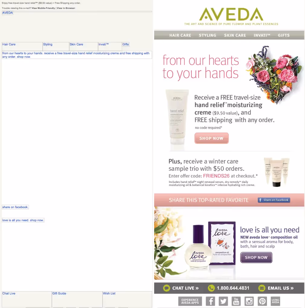
A side-by-side view of an email from Aveda: on the left, image-viewing is turned off, revealing that most of the message is composed solely of images.
6. Be selective with social media buttons
Social media buttons are secondary calls to action that invite readers to follow your social accounts or to share your content on social media.Because they aren’t usually as important as your email’s central CTA, social media buttons shouldn’t compete with your main content. That’s why they’re typically placed in the header or footer. If they need to be included in the body of your email, along with each featured story, choose no more than two sharing options (e.g., only Twitter and Facebook). Otherwise, an overwhelmed subscriber won’t take any action.Here are some social media button best practices:
- Social media buttons in email are usually secondary CTAs. Wherever you place them, these buttons shouldn’t compete with your main content. Try the header or footer.
- Choose a shape, size, color and customization that fits your visual identity. Make sure the buttons are clickable on mobile by including ample white space around buttons.
Decide which buttons to include based on the nature of your content and subscribers’ needs. Don’t overload readers with too many options.
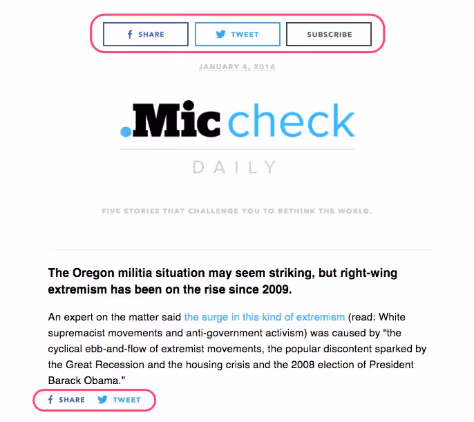
Mic includes two social media buttons in its header and two accompanying each story.
7. Incorporate dynamic content
Visual storytelling in email is growing increasingly sophisticated and effective. Animated GIFs are big contributors to that growth. GIFs communicate quickly and break down complicated concepts into a few frames of fluid messaging. To maximize their effect, use them intentionally and follow these tips for GIFs:
- Make sure your GIF serves a purpose in the story you want to tell. Does it improve your readers’ understanding of your message?
- Position GIFs to lead subscribers directly to your CTA. Let it show them where to click.
- Remember GIFs are image files - link them to your website and always use ALT text.
- Communicate your message in the first frame. There’s no guarantee your GIF will animate for all subscribers. Make sure the first frame is as effective as the whole animation.
- Don’t send out a huge file size. An enormous GIF may not load and can eat up mobile user’s data.
Like animated GIFs, countdown timers are another great way to call attention to special emails and compel readers to act. Position your timer at the top of your email, giving it room to breathe with some padding. Pair it with a CTA button, and choose a look and feel that aligns with your email and brand.
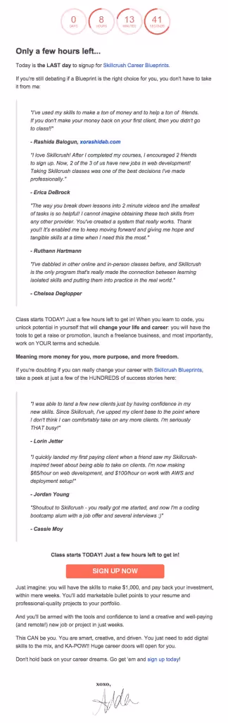
Skillcrush uses a dynamic countdown timer to urge readers to sign up for a workshop.
8. Enhance your footer
Even though they come last, email footers shouldn’t be overlooked. They’re often where readers go to find details about your brand, additional perks, and social media links.If you’re sending commercial emails (i.e., messages that sell or promote a product or a service), these pieces of information are typically required by anti-spam laws such as the CAN-SPAM Act of the USA, Canada’s Anti-Spam Legislation (CASL), and many others:
- A link to unsubscribe
- A link back to your site
- Your mailing address
- Contact email address
Footers can quickly become crowded with buttons, icons, links, and fine print. Before stuffing your footer with information, first evaluate what makes the most sense to include, and go with a minimalistic approach. Overwhelming readers with too much information can lead them to skip over the footer altogether. Keep it simple for subscribers.
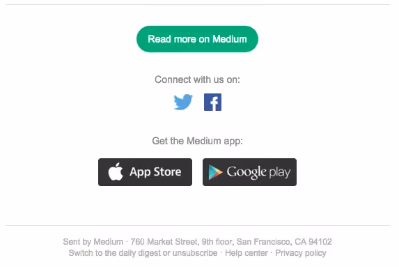
This footer from Medium is simple and well-organized.
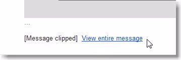
9. Don't get clipped
Message clipping is especially common for Gmail users, where HTML emails larger than 102 KB get trimmed. The Gmail app for iOS clips messages larger than 20 KB. This can cause an inconvenient roadblock for brands with Gmail subscribers, as their email is not fully shown, but rather clipped with a link to view the entire message.
Prevent clipping by:
- Optimizing for mobile. Don’t overload your emails with content, and be sure to use a mobile responsive design tool like BEE Pro to prevent clipping. Mobile design mode in BEE allows you to edit your email in mobile view while ensuring that your emails will look exactly the way you want them to upon sending.
Create in BEE Pro for long-lasting success with great email design
Enhancing your email design will provide your subscribers with a better understanding of the value you bring to their lives. While email design trends and best practices are constantly evolving, staying up to speed will result in increased email opens and higher conversion rates.Create authentic, eye-catching emails in BEE Pro, and be sure to refer back to this quick guide of design best practices before sending out your next email campaign.


