The Litmus Email Design Conference took place earlierthis week in Boston, bringing together some of the smartest designers, marketers, and thinkers in email. Wefollowed along onTwitterto pick up on all the juiciest design tips. (And we caught a big announcement, too, that Litmus and Microsoft are partnering). Update and upgrade your email design with these toptipsfrom the best in email.
Tip #1: First: Think big picture.
We're email geeks. We love to talk about the nitty-gritty: colors, pixels, code. But sometimes we need a reminderto take a step back and remember that sending email is a privilege. Through email, we get to communicate with our very own audience, and that's an amazing thing. We have to prioritize them first.
Email is a privilege, not a right. We don't *have* to send email. Customer trust comes 1st, money comes 2nd. @vickymakesstuff #LitmusLive
— Justine Jordan (@meladorri) August 16, 2016
Good design requires a time investment—and it's worth it to build trust and loyalty with your customers.
Do you intend to treat your customers like humans or cash machines? Build trust through good design + good intent #LitmusLive @pnts
— Justine Jordan (@meladorri) August 16, 2016
After all, each of our businesses is based on our customers, so our relationship with them is paramount.
Key takeaways from @matty_caldwell 'Good design takes time' & 'Creative is about relationships' #LitmusLive #design
— Uwa Oduwa (@uwaohh) August 17, 2016
Walk a mile in your user's shoes. Stop thinking like a marketer and be a human again. It's the secret to success. @asoehnlen #LitmusLive
— Justine Jordan (@meladorri) August 17, 2016
Tip #2: Simplify.
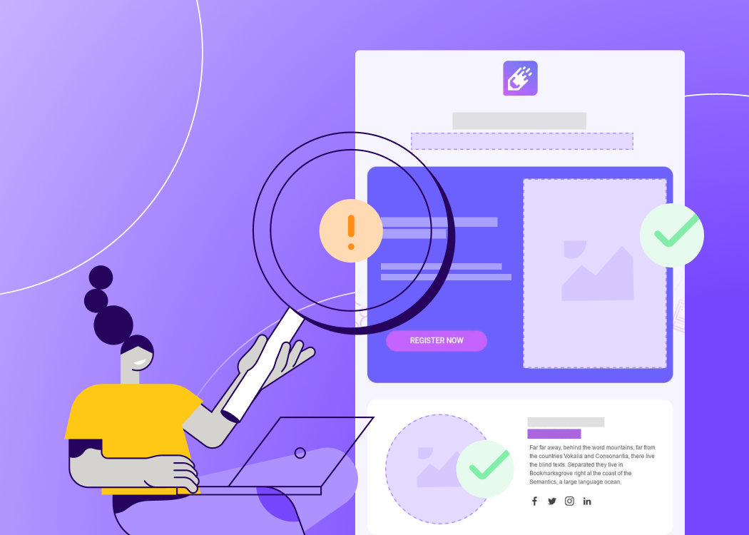
We say this all the time, but it bears repeating: good email design is simple. Readers should be able to easily understand your message quickly, without effort. No clutter, extra columns, or overabundance of calls-to-action. As Eric Lepetit points out, it should be intuitive.
Every user matters. @ericlepetitsf #LitmusLive pic.twitter.com/u5wKCTwcSA
— Litmus (@litmusapp) August 16, 2016
Part of making an email intuitive means leading a reader to your main CTA, not asking them to "choose their own adventure."
Having two buttons next to each other = "I can't decide what my main CTA is. You choose." @Ultra_K ???????? Bad. #LitmusLive
— email snarketing (@EmailSnarketing) August 17, 2016
As email designers, it's our job to simplify and clarify.
"A designer’s job: cut through the crap." -Matt Caldwell. Love it! #LitmusLive
— Analisa Capote (@AnalisaCapote) August 17, 2016
Tip #3: Sharpen your storytelling skills.
What's going to get readers to open an email? What'll get them to scroll, to click? Good storytelling. When you engage readers on a universal, emotional level, that's powerful.
Wrapping it up #LitmusLive with @thecrafty on creating emotion in email. pic.twitter.com/lxEtQAlxa9
— Litmus (@litmusapp) August 17, 2016
Good storytelling also strengthens your relationship with readers, building brand loyalty. When readers are inspired by you, that's big.
"Storytelling gives you a superpower, allows you to build a vision, inspire the future." - @pnts #LitmusLive Crushing hard. @HearsaySocial
— Xin Wang (@xinisterlayer) August 16, 2016
Tip #4: Get your templates ready.
If you missed our post on the five email templates you need to have on hand, take time to check it out. Working from templates improves your workflow and design consistency. Chad White suggests always working off a master template.
"You need an email template master just like you have a webmaster." Create new messages from the master. @matty_caldwell #LitmusLive
— Chad White (@chadswhite) August 17, 2016
Tip #5: Go modular.
We rarely talk about any good email without mentioning modular design. As Emma Goodman points out, it's a huge time saver. Working with blocks of content allows you to quickly copy, rearrange, and fine-tune your design without a threat to structure or clarity. It's how we build all our emails in the BEE editor.
Thinking about how to save time and still build amazing emails with Emma Goodman #LitmusLive pic.twitter.com/tVerOxodSG
— Litmus (@litmusapp) August 17, 2016
Tip #6: Know how to optimize CTA buttons.
Mike Nelson of Really Good Emails did some serious number-crunching and came up with the cold, hard facts about CTA button design. In terms of color, there's a clear winner: blue is by far the most popular.
It's the last day of #LitmusLive. Here's one of our fave new facts: Blue is the most popular CTA color. #emailtips pic.twitter.com/SisxWUbSsv
— BSTRO (@creativebstro) August 17, 2016
Wondering what to say with your CTA button? We have a lot of tips, and we couldn't agree more with this one: DON'T sayclick here!
Thank you for denouncing "click here." It's the worst. #judgejordan #LitmusLive @meladorri
— email snarketing (@EmailSnarketing) August 16, 2016
Know what a ghost button is? It's one where the background color is transparent, just like the Twitter "Follow" buttons on these tweets (if you're not already following these folks). Sometimes, these buttons blend in too much with the background, and readers miss them or don't even know they're a button. Use sparingly.
Be wary of using ghost buttons, especially for main calls-to-action. They don't stand out very well, creating a weaker CTA. #LitmusLive
— Chad White (@chadswhite) August 17, 2016
When it comes to shape, rounded buttons are the post popular, but the pill shape might bemaking a comeback.
Pill shape CTA making a comeback >26% this yr v @reallygoodemail #LitmusLive pic.twitter.com/fE8E6VH3dC
— Anna Yeaman (@stylecampaign) August 17, 2016
And adding arrows to CTAs? It's a go! They might actually improve your click through rate.
Arrows on CTAs improve CTR ➡️>> #LitmusLive
— Tatiana Mac (@tatianatmac) August 17, 2016
Tip #7: Don't underline text.
It's outdated, inefficient, and confusing to underline text that isn't a link. If you want to underline, do it for links only.
If you wanna be friends with @RodriguezCommaJ (and trust us, you definitely do)...#LitmusLive pic.twitter.com/h9hWiwXBjE
— Litmus (@litmusapp) August 15, 2016
Tip #8: Avoid trouble.
Don't kick off your email with the "Having trouble viewing this email?" disclaimer leading viewers to the web version. Move "trouble" to the footer.
Move "have trouble viewing this email" to footer. No one wants preview text to include "trouble" next to your brand name. #LitmusLive
— Tatiana Mac (@tatianatmac) August 17, 2016
Tip #9: Pay attention to plain text.
It's all about balance. Avoid falling into a spam folder by upping your word count, and make sure readerswith image-viewing turned off will see your key messages!
Form vs. Function: balance images + live text to maintain strongest messaging w/ images off, while keeping design on-brand. #LitmusLive
— Pete Biolsi (@pbiolsi) August 17, 2016
Tip #10: Think ahead to the next step.
You designed a great email. You told a story, used modular design, optimized your CTAs, and balanced your text and images. Readers are clicking through—amazing! But now what? Is your site or landing page optimized for good design and messaging the same way email is? Just like Tip #1: we all need to remember the big picture.
"It doesn't matter if your emails look great if your end experience on the site isn't good." - Rebecca Lewis #LitmusLive
— Analisa Capote (@AnalisaCapote) August 17, 2016
Did you attend #LitmusLive in Boston? Let us know what you learned in the comments!