Beefree blog

Best Practices for Formatting Text-Heavy Emails

Beefree team
Beefree team
Nov 10, 2015
Best Practices for Formatting Text-Heavy Emails

Have you noticed how brandstend tosit at twoends of the email design spectrum, sending either very image-heavy or very text-heavy newsletters? We've been known toadvocate for a healthy content-to-image ratio in emails, but our inboxes are full of newsletters that either communicate nearly entirely through images, or almost totally in words.Most image-reliant emailsfeatureproducts, where it makes sense to focus on showcasing what you're trying to sell (like Etsy, for example).But publishers do it too, often by including a roundup of links with a key image andheadline and not much else. Here's an example from It's Nice That, a company publishingstories about creative worktoinspire and connect people and artists:

it's-nice-that

From a design perspective, the approach is appealing because it keeps the email simple, straight-forward, visual, and clear of clutter. Readers can easily scan throughanddecide what's of interest, then tap to read more.

The text-heavy email approach

But we also see many brandstaking an alternate approach: instead of asking readers to click to read, content is placed directly in the email itself, in a "behind the headlines" kind of way.Buzzfeed, Vice, The Skimm, Mic, and others are doing it. Here's one recently sent by BuzzFeed News (it's a long email, so we trimmed it after the first story):

buzzfeed trim

Here, readersget a lot more (basically a beginning-to-end mini story)without having to navigateaway fromtheirinbox. BuzzFeed—and other publishers taking a similar approach—curates anddistills stories,leaving no onus on the reader to choose what to clickfrom a collection of headlines. It's sort of like a hassle-free delivery of information (notice there often aren't ads in these long content-driven emails).

Text-heavy or image-heavy emails? It's up to you, but keep an eye on the email message size

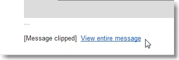
Like anything else, there are pros and cons to both theimage-heavy andtext-heavy approaches. Brands should try both—or find a happy medium—taking into consideration how their messages are best communicated, what best aligns withtheir brand identity, and what their readers most prefer (test and track those clicks!).It's worth mentioning that if your email message size exceeds a certain limit - regardless if it's text-heavy or image-heavy - it's possible that your email message may be clipped by some email clients.
ScreenShot1446

Prevent Gmail from clipping your email

In particular, Gmail clips HTML emails that are larger than 102 KB while the Gmail App for iOS clips emails that are larger than 20KB. This becomes a problem if the majority of your mailing list subscribers are on Gmail.An large email message size can happen when you create an email that is way too long with lots of content or when your email message contains a lot of HTML code - such as inline-CSS code that adds a number of lines of code.As of right now there isn't a universal or elegant solution to preventing a large email from being clipped by Gmail. The best solution from the email marketing community is to try to minimize the email message size by:

  • Optimizing and minimizing the HTML code. If your email is optimized for the Gmail client on mobile - which is achieved through inline-CSS code - you need to decide which is more important: a mobile-optimized email on Gmail that however is clipped or an email that is shown in full but that isn't responsive.
  • Reduce the amount of content in your email messages. If you send out a weekly newsletter digest with 15 in-depth sections and your message is getting clipped by Gmail, try lowering this number to 10 sections (or at the point where your newsletter is below 102 KB in size).

Best practices for text-heavy emails

Today, we'll look atcontent-formatting tips from brands who do it well, revealing how to makeany text-laden email look great and get read.

Start with hierarchy

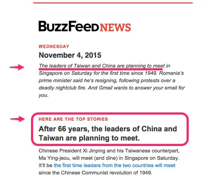
Putting all that content directly into the email itself usually means your message will be prettylong. Channel the thinking of a good oldprint newspaper and start off strong with your best content or biggest story right at the top. That's what BuzzFeed does, letting their readers know by stating: "Here are the top stories." The story aboutthe leaders of Taiwan and China meeting is the only one that has two sections and two photos. Since it's the biggest news story of that day, it gets the most real estate. Think of your subscribers and prioritize your content to reflect what's most valuable to them.
Screen Shot 2015-11-09 at 1.17.12 PM

Once your hierarchy is established, it's all about structure. Use consistent colors, styles, and spacing throughout the rest of your email to clarify where one story ends and the next begins. Read on for tips on formatting section headers.

Set a max width

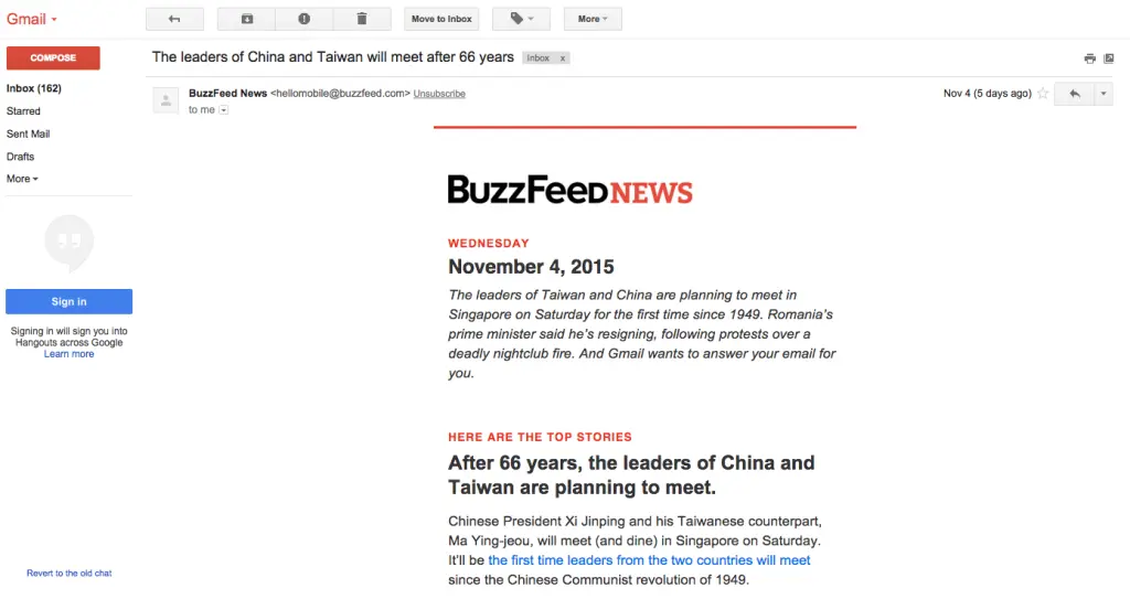
When lines of text stretch on and on across ascreen, it's easy for your eyes to lose track of where you are in a paragraph.Especially if your email is viewed on multiple devices and if your email message is mobile-optimized, it's a good idea to set a max width of your email message at around 500 pixels. This ensures that on wider devices such as on desktop and tablets your email will render at a readable size. And on mobile devices, the width and text will render as specified in your mobile-responsive code.Let's take this BuzzFeed email as an example: it's just shy of500 pixels wide. On a big desktop screen, there'splenty of white space on either side. This white space won't bother your desktop readers, and it will make your email easy-to-read on mobile devices.
Screen Shot 2015-11-09 at 1.13.28 PM

One or two fonts will do the trick

Keep it simple and stick to one ortwo fonts in your email. Arial, Georgia, and Helvetica are popular email-safe fonts that are reliably classic, elegant, and easy to read. BuzzFeed uses ArialwithHelvetica for section headers.Once you've established your font, createstructure and improve readability with styling, making use ofbold, caps, size, color, and spacing (Read on for how to format!).

Distinguish section headers and headlines

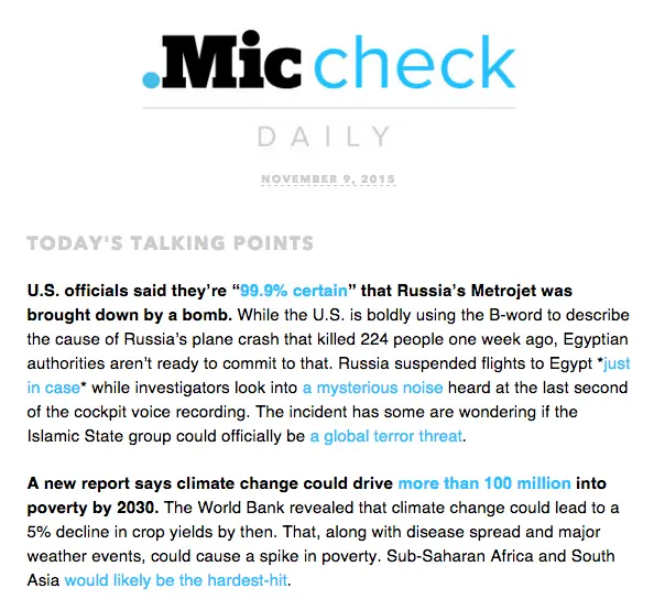
Headers are incredibly important to break up the flow of text and establish structure in your email. Buzzfeeduses the same treatment for all section headers (Helvetica, caps, red) and headlines (Arial, about 2x body size, bold).As a reader, this makes it super clear to know when you're reading a new section, and the big, bold headlines are easy to skim.Mic, a news publisherfor a younger audience, takes a similar approach in their daily newsletter. The section header—"Today's Talking Points"—is in a different font (Avenir) and is gray and all-caps, while the majortakeaways in the content below arebolded (but no line break or size difference).
Screen Shot 2015-11-09 at 1.35.01 PM

Note that the use of all caps for the header in the example above is on-trend, butit can still be a bit contentious. Most designers agree thatlowercase letters are easier to read (it's true they're more distinguishable, with ascenders and descenders and modulated widths that capital letters lack) and that all-caps makes readers feel like they're being yelled at.But we most often see the all-caps style used very sparingly, in headers, where the style is serving a purpose of setting the textapart from the rest of the content. In moderation, it serves a purpose.Whether you use all-caps or not, the font size of headers should be at least twice as large as body copy,with a generous line break between sections (at least the height of a full line of text).

Don't over-format

Notice neither BuzzFeednor Micstylizes their body text much. After the header, the text isall the same size, font, and color, except for links.The newsletter-only publisher The Skimm takessimilar simple approach. The body copy is all the same size, color, and font, while headers are in all-caps and bold (same font and color as body text). Here's a story from a recent newsletter:
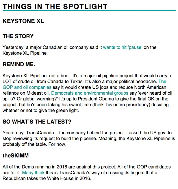
Screen Shot 2015-11-09 at 2.30.06 PM

It can be tempting to bold, italicize, underline, play with color, etc., but resist. A minimalistic approach to body copy is the best for readability, and the simple approach alsomakescalls-to-actions stand out all the more.

Capitalize on color

But don't go crazy. Your body copyshould be black on a white background. So where is color most effective? In links and headers. Capitalize onbranding your email by using an on-brand color (yes, just one color is enough!) The Skimm and Mic both make links appear in their brand color, while BuzzFeed leaves links the usual blue but uses red in section headers.Here's another example of great color use in text-heavy email from artist and designer James Victore, who sends out a weekly inspirational email.Using pink for calls-to-action really makes them stand out—the pink is a brightjuxtaposition tothe black-and-white email:
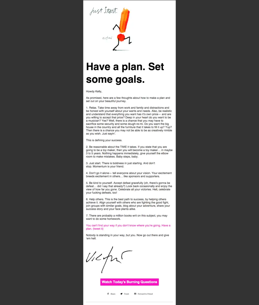
Victore

Remember line height and spacing

A good rule of thumb is to set your line height to be at least 1.3x the height of your letters. So if your body copy is12pt, your line height should be16. This maintains acomfortable distance between lines, optimizing readability. Copy should never feel too tight or too loose.Likewise, a break between sections is usually the height of a full line of text. Check out how TheSkimm optimizes line breaks to structure their emails. Notice the main header section and the sub-headers look similar; instead of changing the typefaceformat, they've varied the line breaks to distinguish hierarchy—i.e., the space after"Russian Plane" is greater than the space left after "The Story."
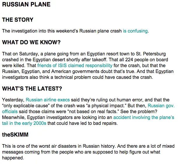
Screen Shot 2015-11-09 at 4.28.04 PM

Left-align your text

This almost goes without saying, but it's important. We read from left-to-right, and newsletters are best formattedthat way. Don't be tempted to center-align your headers or copy; keep it easy to read with left alignment. All the examples we've covered in this post have left-adjusted content.

Moderate white space with padding

Padding is the space between content and the container it sits within. When you're sending out a newsletter that's essentiallyone content structure (a long message of text), you'll moderate white space primarily with line breaks and line height. But when you add images and other design elements between text structures, you'll want to adjust thepadding to make sure the space above and below it is proportionate to line breaks in your text. In other words, the spacing should be relativelyequal between elements. Do this by adjusting the padding above and below a structure. In email, you generally won't need to adjust the padding on the left and right, as images and design elementstypically look best when they're the full width of the email, like the text.Below,we can see how BuzzFeed moderates the space between the end of a paragraph and an image, and then between the image caption and the start of a new section. The image is the full width of the email.
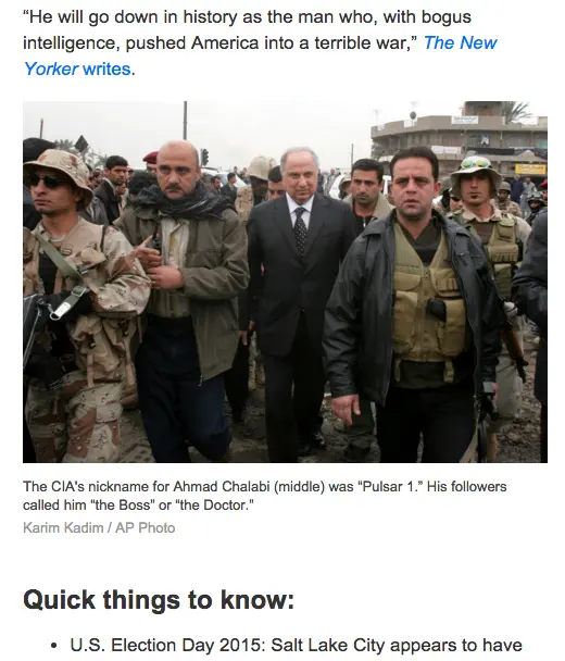
Screen Shot 2015-11-09 at 4.57.12 PM

When in doubt, keep it simple. Your quality content is what subscribers signed up for, so avoid getting in between the message and its readers with distracting formatting.We'll be back later this week with a workshop on how to optimize text-heavy emails. In the mean time, try out these design tips in the BEE editor.
Related posts

Design Award-Winning Emails with Beefree

A few weeks back, we kicked off the first-ever 2024 Really Good Email Awards (cue the confetti). Today, we’re taking it one step further and sharing how you can build award-winning emails in Beefree.
Emily Santos
Dec 26, 2024

A few weeks back, we kicked off the first-ever 2024 Really Good Email Awards (cue the confetti). The “award show” was paired with downloadable resources sharing the ins and outs of what made these emails winners. Today, we’re taking it one step further and sharing how you can build award-winning emails in Beefree.  

But first, what is an award-winning email? 

Winning emails like Miro’s welcome series and the AllTrails x Calm collab didn’t just meet expectations—they redefined them. Besides being the most loved by the RGE community, the winning emails beautifully balanced creativity, trends, and best practices. They gave us insight into the future of email design and how to break the rules intentionally. 

While each email was different in its own unique way, we noticed a consistent pattern in them all: On-brand, but never boring. Let’s take the emails by Sundays as a really good example of staying on brand. Everything from their Black Friday emails to their order confirmation emails follows the same brand guidelines, ensuring a cohesive experience at every touchpoint. 

Resource from our Award Ceremony

This realization was validating! As marketers, we know how important presenting a cohesive experience is for brand recognition, awareness, and loyalty. But as passionate designers, we're always looking at the next cool design trend. This pattern of "on-brand, yet never boring" pushes us to explore new and creative ways to showcase our branding and spread our message.

Designing on-brand, never-boring emails with Beefree

Beefree makes balancing creativity with your brand guidelines seamless. Its combination of brand management, productivity solutions, and a no-code drag-and-drop editor enables everyone to create beautiful designs that inspire people to action and drive results. 

uevi.co/4075ZNTX

Step 1: Set your brand guidelines

Your brand, your rules. Lock in colors, fonts, and logos so your emails look like you —even if Greg from accounting gets a little too creative with the copy. 

There are several ways to set your brand guidelines in Beefree, but our favorite is to use our “Get Brand Styles” feature, which can be accessed in your workspace’s style settings.


Once you’re in your settings, click on “Get brand styles” and input your website’s URL. From there, Beefree will retrieve your brand’s colors, fonts, and social links. You can learn more about this feature here

Once you import your brand’s essentials, you can continue to add brand elements. You can get as granular as you’d like. From a predefined width for emails and pages, to the appearance of your CTAs. 

With our Advanced Style Kit, you can even set predefined background colors, set the appearance of lists, and tables. 

Once you add your style settings, every email your team creates with Beefree will have the same brand colors, icons, links, fonts, and whatever else you decide to assign. Now, let’s say you want to take things one step further. 

Step 2: Create re-usable content blocks 

Beverage brand and winner of our Endless Cheer Award, “Athletic Brewing,” is a great example that following a template doesn’t have to be restrictive. 

All of their holiday templates follow a similar layout: A hero section with a standout image, a large title, body text, and a CTA followed by a similar content block below. 

Resource from our Award Ceremony


Beefree’s Saved and Synced Rows are an easy way to build out templated layouts for your emails. Most users turn frequently used content blocks, such as headers or footers, into Saved Rows so they can easily use them in other designs. You can also save rows as “Synced” when you want to apply any changes made to a row to all of your other email templates. 

You can find all of your Saved and Synced Rows in the builder's Rows tab by selecting “My Saved Rows.”

Templates and re-usable content blocks aren’t just made to help you speed up creation time; they’re about allowing you and your team more time to be creative. The less time you spend worrying about what layout to create, the more time you can spend coming up with clever messaging or taking high-quality product shots. 

uevi.co/1491YKUH

Let’s get to the fun stuff.

Step 3: Bring your visions to life 

In our downloadable resource, we shared the characteristics of each email that made it stand out. We highlighted key elements such as persuasive copy, value-driven content, actionable CTA’s, interesting layouts, and so much more. 

We could spend hours sharing tips and tricks to emulate the award-winning characteristics of an email, but for now, we’ll share some of Beefree’s features that can help take your emails from “meh” to “Why didn’t I think of that?” 

Display conditions

Why settle for one-size-fits-all when you can design emails that feel like a direct DM to each recipient? Beefree’s Display Conditions feature allows you to pick a condition (or write one from scratch if you are technically savvy), apply it to a row, and thus show different content based on the recipient. 

We can see a great example of how Display Conditions could be used in Rael’s award-winning email below: 

Really Good Email Awards Deck

The “Hook, Line, and Sinker” Awards goes to Rael for its charming abandoned cart email that feels like a warm reminder rather than a hard sell.  Instead of just pushing one product, the thoughtfully curated product suggestions make it easy to explore complementary items. 

uevi.co/7663GXCO

Interactivity

Throughout all winning emails, we saw brands bring their message to life with movement. Whether they used videos, gifs, icons, or crafted visually interesting layouts – making their emails interactive was crucial in getting our attention. 

Resource from our Award Ceremony

With Beefree, you can turn your designs into playgrounds. Easily add videos, GIFs, countdown timers, surveys, hover effects, and more. To see what’s possible, we recommend browsing through our template catalog! 

Mobile design mode 

Part of crafting a truly on-brand experience is ensuring that your brand looks good anywhere. Beefree takes responsiveness and dynamic design to the next level by allowing you to create custom mobile experiences. With Mode Design Mode you can re-arrange, re-size, and remove elements for smaller screens. 

uevi.co/2498UJQM 

Step 4: Let AI take care of the little things 

Creating award-winning emails takes vision, creativity, and time. But let’s be honest—sometimes, the little tasks, like tweaking ALT text or sourcing the perfect image, can slow you down.

With Beefree’s AI-powered solutions, you can let your eager intern handle the busy work while you focus on making your emails unforgettable.

AI Image Generator

Struggling to find the perfect image? Beefree’s AI Image Generator lets you create custom visuals that enhance your email’s message. Just add an image block to your email and in the Content Properties panel on the right, click “Create with AI,” then fill out the details. For additional prompt suggestions visit this support page

Alt Text Generator

For us, alt text isn’t just a best practice—it’s essential for creating accessible emails. But crafting the perfect descriptions for every image can feel like a chore.

 Beefree’s AI ALT Text Generator takes care of it for you, automatically generating accurate and descriptive ALT text for your images, gifs, icons, and stickers. 

AI Copy Assistant 

When Greg from accounting gets a bit of writer’s block or when you need a little help writing a catchy CTA, AI is here to help generate bold and fresh ideas. 

Ready to start designing? 

A really good email involves a balance of best practices and bold moves. The winning emails didn’t just make an impact; they set the standard for what’s possible in email marketing. Now, it’s your turn to take the lessons, insights, and inspiration from these campaigns and channel them into your next great idea. Start designing with Beefree for free!

If you’re looking for even more inspiration or tactical takeaways, don’t forget to download the deck or watch the Award ceremony replay! 

Simplifying Email Creation for Universities with Beefree

In a recent conversation with Rice University’s Owl Business Analyst, Sonja Fulbright, we revealed all the challenges that led the university to lean on Beefree—not only to bring their decentralized teams together in one platform but also to increase the speed and quality of the university’s emails. 
Emily Santos
Jan 2, 2025

Universities are like small cities. They are made up of dozens (sometimes hundreds) of departments, schools, and initiatives. Each of them has their own goals, audiences, and communication needs. While this decentralized structure is great for creativity and independence, it often leads universities to struggle to balance the creation of on-brand newsletters with data security. One always has to give, and it’s not the latter. 

So, how do you give all these teams the freedom to create without compromising brand integrity and data safekeeping? Well, the right tools and a little strategy can make all the difference.

In a recent conversation with Rice University’s Owl Business Analyst, Sonja Fulbright, we revealed all the challenges that led the university to lean on Beefree—not only to bring their decentralized teams together in one platform but also to increase the speed and quality of the university’s emails. 

What are the challenges universities face in email creation? 

As mentioned above, universities thrive on independence. Each department has unique needs, whether it’s rallying support for the latest research initiative or getting fans hyped about SEC football rankings. While this setup fuels creativity, it also brings some serious challenges:

  • Off-brand emails: A well-meaning department might throw together something that doesn’t quite hit the mark.
  • Inefficiency: Teams spend hours wrangling email tools that just don’t cut it.
  • Data risks: Sensitive info gets passed around in ways that make everyone nervous.

In an effort to tackle some of these challenges and unify teams, Rice University chose to integrate the Blackbaud CRM. However, for Sonja Fulbright and her team, this meant folks felt less empowered to design on their own. The accompanying Blackbaud Internet Solutions (BBIS) platform, used for managing emails and landing pages, was so complex that different schools and departments became heavily reliant on Sonja’s team for design support and sending. Sonja shares:

"Building emails in BBIS was like coding an entire website from scratch—it was a nightmare. 

Although we could create decent emails in BBIS, they were all built-in tables, which required someone skilled in HTML. When something went wrong, we had to dig through code to fix random formatting issues.”

It’s no wonder Universities sometimes feel stuck trying to stay on brand. But it doesn’t have to be this way.

Overcoming the challenges with Beefree

Decentralized teams doesn’t have to mean off-brand communications and bringing everyone in one place, and finding new solutions that don’t impact data security doesn’t have to be complex. For Rice University:

“Adopting Beefree was incredibly easy… We were able to get started right away.”

With Beefree, every department gets the tools they need to create standout emails without compromising the university’s brand or security – here’s how:  

#1: On-brand communication becomes a non-negotiable 

Your university’s brand is more than just colors and logos. It’s your identity. It’s how people recognize you, trust you, and connect with your mission.

When branding is inconsistent, it can cause confusion—or worse, make your school seem less credible. In many universities, the people creating and sending emails are not marketers or designers, just regular folks who have a message to get across.

Sonja states, “We're not the public affairs department. We're not the keepers of our University's brand, but we are trying to be good campus partners and encourage the use of Branding standards.

The best part about Beefree is being able to lock down assets like logos, colors, and fonts and say, ‘Here’s everything you need to follow the university’s brand guidelines—go forth and build emails.’”
uevi.co/8286DINJ

#2: Designing is faster than ever 

Sonja Fulbright from Rice University shared she “spent six hours trying to create one email template, and it still wasn’t finished.” 

This is a relatable challenge for many Higher Education teams juggling tight schedules. Time spent trying to figure out complex solutions is time taken away from what really matters, like connecting with their alumni, donors, and engaging their student body.

Sonja adds, “Even though it was not technically my job description, I got sucked up into building templates for people in that platform, and I was like, there has got to be an easier way to do this.”

Luckily, there was. In six hours, Sonja created 8 newsletter templates in Beefree, and designing an email went from a 48-hour affair to only 45 minutes. 

A standout time-saving feature for Sonja and other universities is the ability to save and sync reusable content blocks.

“The ability to save rows made a huge difference for us. We used building blocks like standard footers and headers to quickly assemble emails in various ways. It’s definitely made everyone’s job a lot easier.”

Additionally, our integrations have made designing for all sending platforms a breeze. Sonja shares, “Outlook is the ruiner of all things visual; it is at the absolute worst, so the fact that I can paste code from Beefree and it renders like 99% correctly in Outlook is huge.”

uevi.co/8286DINJ 

#3: Empowering everyone to create 

Many professionals in the Higher Education space struggle to bring their creative visions to life, often tied down to complex or limiting tools. For Rice University, this was no different. Remember the template referenced above that took Sonja six hours to make? Sonja shares the full story: Our Architecture School came on board and wanted us to build out templates in our old platform. I thought it was no big deal.

They had a designer share with me the most detailed markup I have ever seen in my entire life, with pixel dimensions and all of that. I knew that it'd be like coding a whole website from scratch kind of thing.” 

Whether you’re creating templates for your student body or engaging donors, your designs should make an impact. Beefree’s solutions are loved by universities because they empower anyone – regardless of skill level to design with ease. 

With a template catalog of over 1,700+ email and landing page templates and dozens of free guided courses and tutorials in our Beefree Academy, we have everything you need to get started. Sonja shares:

"Beefree has been a key tool in making it easier to get people on board. The [enterprise plan] lets us extend access to people using our database for email campaigns. At the same time, departments can set up their own [workspaces], and we can collaborate easily.”
uevi.co/9330DGSV 

#4 Data security is top of mind

If there’s one thing universities juggle as much as emails, it’s sensitive data—donor lists, alumni records, student info. The last thing you want is for that data to get mishandled in the shuffle of creating and sharing emails. That’s why many universities opt for Beefree. Beefree integrates seamlessly with your CRM, keeping all that valuable info exactly where it belongs.

As Sonja Fulbright from Rice University puts it:

“The fact that Beefree doesn’t store any of our data made adoption easy. Everything stays within our CRM.” 

The big picture: Empowered teams, consistent branding, zero hassle

Successful university communication comes down to balance. Departments need space to create and connect with their audiences. But that creativity doesn’t have to come at the cost of branding, security, or efficiency.

Beefree can bring it all together by providing a centralized university email tool that can help universities go from overwhelmed to organized and from inconsistent to cohesive.

The Senior Web Content Specialist at Rice University shares:

“Beefree is the best email designer I've ever used. It gives me the ability to take a design from a print piece and customize it for the best viewer experience in an email format." 

Ready to simplify your email marketing efforts? Join hundreds of university teams like Rice University in transforming their email workflows with Beefree. Sign up now -- it's free!

The Importance of Mobile Analytics in Improving Email Experience

Leveraging mobile analytics helps you create better mobile email experiences that drive sales, revenue, and loyalty. Discover how in this guide.
Beefree team
Dec 20, 2024

We live in a mobile-first world. We shop, socialize, work, and create on our phones, expecting seamless, intuitive, and frictionless experiences. As email marketers, we often rely on educated guesses and hard-to-win feedback to improve campaigns. But mobile analytics can revolutionize this process.

Mobile analytics unlock valuable real-time insights into user behavior, preferences, and engagement,  accelerating how fast we can make improvements to our email marketing campaigns.

Let’s discuss the role of mobile analytics in UX and how you can use it to boost satisfaction, sales, and loyalty.

What is mobile analytics?

Mobile analytics is gathering and analyzing user data and behaviors specifically on mobile websites, apps, and devices. This insight comprises of qualitative and quantitative data, such as:  

  • How long readers interact with your email or landing pages
  • Which elements (like CTA buttons) get the most clicks or which don't get interacted with at all
  • The navigational path that users take through your email.
  • The path users take after clicking an email link.
  • Points of friction such as poorly optimized layouts or broken links.
  • Performance issues like slow-loading images or inaccessible designs.

Key differences between mobile analytics and traditional analytics

While traditional analytics might measure desktop-based metrics, mobile analytics reveals how factors like responsive design, mobile-friendly layouts, and load times impact engagement.

From interactions like swipes, clicks, to even orientation changes (landscape vs. portrait). For email marketers, this means deeper insights into how users engage with your content on mobile.

Key email metrics in mobile analytics

These are commonly measured because each gives you important information about user engagement and your email's performance. Collectively, they give you an overarching view of what’s working well and what isn’t so you can improve your campaigns.

  • Open rate: Helps you assess whether your email captures interest at first glance. Low open rates on mobile may signal that your subject lines or send time isn’t aligned with user preferences. For mobile users, shorter, punchier subject lines often perform better, as they’re fully visible on smaller screens.
  • Device-specific click rates: Analyzing clicks segmented by device type (e.g., smartphones vs. tablets) can help you understand how different mobile experiences affect engagement. . For example, smartphone users may prefer more streamlined layouts, while tablet users may enjoy more detailed content.
  • Scroll depth: Tracks how far users scroll through your email on mobile devices. If users don't scroll past the top of your email on mobile, this may guide you to add the most important content above the fold.
  • Bounce rate: Measures how often users exit or leave your linked pages immediately after clicking through from an email. On mobile, high bounce rates might stem from slow-loading pages, confusing navigation, or unresponsive design.
  • Conversion rate: This is the percentage of users who complete a desired action, such as making a purchase or clicking on a landing page. It offers insight into how effectively your emails are in achieing the intended goals whether it is a traditional campaign or experiential.

Whatever metrics you prioritize, make sure to integrate a robust, accurate data processing pipeline. This guarantees real-time insights, so you’re always making decisions based on the latest figures. 

How mobile analytics can help you improve user experience

1. Identify gaps and friction early on

Delivering a smooth user experience is crucial for high engagement. If users encounter barriers that prevent them from taking action, it's best to know the root cause sooner rather than later. 

Mobile analytics uncover navigational and performance issues like confusing layouts, unresponsive buttons, or poor readability.

For example, if a significant portion of users drop off after opening your email, analytics might reveal slow-loading images or unclear CTAs as culprits. You can also pair your website's mobile analytics to inform your email campaigns.

For example, let’s say that a high volume of users is churning during your in-app checkout process, which according to the Baymard Institute study might happen for varying reasons.

Image sourced from baymardinstitute.com 

On your website you may integrate a solution like Vonage Cloud PBX to enable users to contact your customer support team directly from the checkout page. Or proactively offer support via live chat (just make sure to follow TCPA compliance). But then you can go one step further and set up abandoned cart campaigns to re-engage users. 

In short, mobile analytics can provide helpful insight into your users' actual experience, allowing you to explore new and creative solutions. You can use tools like a Kanban board to plan your approach, create visualizations of the user journey, pinpoint priority areas for improvement, and assign tasks to relevant teams.

2. Analyze user flows

Mobile analytics shares valuable insight on your user journey-- from opening and to become a customer. For example, if users abandon your landing page after clicking an email, it could signal that the page design or content isn’t aligned with their expectations. This could mean your page needs to be simplified or your emails need to be a lot more clear.

Again, you can pair your website's or apps mobile analytics to then guide your email campaigns. A recent survey by Newstore found that 60% of shoppers prefer mobile apps over mobile websites. Mobile apps are easier to use, leading to better UX, increased sales, and higher retention.

Image sourced from newstore.com

If you're noticing that users are not as active on mobile app, this could mean your app interface needs to be simplified or that folks may need more guidance. You could send a series of onboarding emails to help customers use your product effectively.

Along with understanding where the friction lies, mobile analytics tells you what motivates consistent engagement. Analytics opens and conversion rates on mobile vs. desktop can uncover the drivers behind engagement and retention for mobile users. It might be that certain types of notification emails encourage repeat interactions.

Overall, understanding what drives loyalty can help you optimize user journeys at scale to drive repeat engagement and long-term retention, making sure you get a good return on your email marketing efforts and app development cost.

3. Create personalize experiences

Mobile analytics offers a deeper understanding of user behavior and preferences. This can be used to segment users and create personalized experiences. You can feed mobile analytics into your CDP and CRM to help you accurately segment customers according to their preferences, user behavior, demographics, and stage in the customer journey. One way to personalize the experience is to tailor the timing of email notifications to when they are most active or recommending solutions to users based on their preferences.

From there, you can then A/B test multiple versions of a personalized email to asses what actually turns leads into customers. For example, you might test two different layouts or calls-to-action.

Design seamless mobile experiences with Beefree

Whether you're crafting emails for E-commerce, SaaS, or B2b, creating convenient, seamless experiences for mobile users is crucial. Mobile analytics keeps your business attuned to the unique needs of your mobile customers. From streamlining journeys to personalizing experiences, the valuable insights gleaned from mobile analytics help you drive sales and retain customers.

Beefree’s Mobile Design Mode eliminates guesswork, allowing you to design with confidence for the fastest-growing segment of email users: those on mobile devices. Our Mobile Design Mode feature allows you to preview and edit emails specifically for mobile devices, ensuring that your design elements—such as images, text, and buttons—adapt perfectly to smaller screens.

Start designing with ease now.

Design Award-Winning Emails with Beefree

A few weeks back, we kicked off the first-ever 2024 Really Good Email Awards (cue the confetti). Today, we’re taking it one step further and sharing how you can build award-winning emails in Beefree.
Emily Santos
Emily Santos
26 Dec
2024

A few weeks back, we kicked off the first-ever 2024 Really Good Email Awards (cue the confetti). The “award show” was paired with downloadable resources sharing the ins and outs of what made these emails winners. Today, we’re taking it one step further and sharing how you can build award-winning emails in Beefree.  

But first, what is an award-winning email? 

Winning emails like Miro’s welcome series and the AllTrails x Calm collab didn’t just meet expectations—they redefined them. Besides being the most loved by the RGE community, the winning emails beautifully balanced creativity, trends, and best practices. They gave us insight into the future of email design and how to break the rules intentionally. 

While each email was different in its own unique way, we noticed a consistent pattern in them all: On-brand, but never boring. Let’s take the emails by Sundays as a really good example of staying on brand. Everything from their Black Friday emails to their order confirmation emails follows the same brand guidelines, ensuring a cohesive experience at every touchpoint. 

Resource from our Award Ceremony

This realization was validating! As marketers, we know how important presenting a cohesive experience is for brand recognition, awareness, and loyalty. But as passionate designers, we're always looking at the next cool design trend. This pattern of "on-brand, yet never boring" pushes us to explore new and creative ways to showcase our branding and spread our message.

Designing on-brand, never-boring emails with Beefree

Beefree makes balancing creativity with your brand guidelines seamless. Its combination of brand management, productivity solutions, and a no-code drag-and-drop editor enables everyone to create beautiful designs that inspire people to action and drive results. 

uevi.co/4075ZNTX

Step 1: Set your brand guidelines

Your brand, your rules. Lock in colors, fonts, and logos so your emails look like you —even if Greg from accounting gets a little too creative with the copy. 

There are several ways to set your brand guidelines in Beefree, but our favorite is to use our “Get Brand Styles” feature, which can be accessed in your workspace’s style settings.


Once you’re in your settings, click on “Get brand styles” and input your website’s URL. From there, Beefree will retrieve your brand’s colors, fonts, and social links. You can learn more about this feature here

Once you import your brand’s essentials, you can continue to add brand elements. You can get as granular as you’d like. From a predefined width for emails and pages, to the appearance of your CTAs. 

With our Advanced Style Kit, you can even set predefined background colors, set the appearance of lists, and tables. 

Once you add your style settings, every email your team creates with Beefree will have the same brand colors, icons, links, fonts, and whatever else you decide to assign. Now, let’s say you want to take things one step further. 

Step 2: Create re-usable content blocks 

Beverage brand and winner of our Endless Cheer Award, “Athletic Brewing,” is a great example that following a template doesn’t have to be restrictive. 

All of their holiday templates follow a similar layout: A hero section with a standout image, a large title, body text, and a CTA followed by a similar content block below. 

Resource from our Award Ceremony


Beefree’s Saved and Synced Rows are an easy way to build out templated layouts for your emails. Most users turn frequently used content blocks, such as headers or footers, into Saved Rows so they can easily use them in other designs. You can also save rows as “Synced” when you want to apply any changes made to a row to all of your other email templates. 

You can find all of your Saved and Synced Rows in the builder's Rows tab by selecting “My Saved Rows.”

Templates and re-usable content blocks aren’t just made to help you speed up creation time; they’re about allowing you and your team more time to be creative. The less time you spend worrying about what layout to create, the more time you can spend coming up with clever messaging or taking high-quality product shots. 

uevi.co/1491YKUH

Let’s get to the fun stuff.

Step 3: Bring your visions to life 

In our downloadable resource, we shared the characteristics of each email that made it stand out. We highlighted key elements such as persuasive copy, value-driven content, actionable CTA’s, interesting layouts, and so much more. 

We could spend hours sharing tips and tricks to emulate the award-winning characteristics of an email, but for now, we’ll share some of Beefree’s features that can help take your emails from “meh” to “Why didn’t I think of that?” 

Display conditions

Why settle for one-size-fits-all when you can design emails that feel like a direct DM to each recipient? Beefree’s Display Conditions feature allows you to pick a condition (or write one from scratch if you are technically savvy), apply it to a row, and thus show different content based on the recipient. 

We can see a great example of how Display Conditions could be used in Rael’s award-winning email below: 

Really Good Email Awards Deck

The “Hook, Line, and Sinker” Awards goes to Rael for its charming abandoned cart email that feels like a warm reminder rather than a hard sell.  Instead of just pushing one product, the thoughtfully curated product suggestions make it easy to explore complementary items. 

uevi.co/7663GXCO

Interactivity

Throughout all winning emails, we saw brands bring their message to life with movement. Whether they used videos, gifs, icons, or crafted visually interesting layouts – making their emails interactive was crucial in getting our attention. 

Resource from our Award Ceremony

With Beefree, you can turn your designs into playgrounds. Easily add videos, GIFs, countdown timers, surveys, hover effects, and more. To see what’s possible, we recommend browsing through our template catalog! 

Mobile design mode 

Part of crafting a truly on-brand experience is ensuring that your brand looks good anywhere. Beefree takes responsiveness and dynamic design to the next level by allowing you to create custom mobile experiences. With Mode Design Mode you can re-arrange, re-size, and remove elements for smaller screens. 

uevi.co/2498UJQM 

Step 4: Let AI take care of the little things 

Creating award-winning emails takes vision, creativity, and time. But let’s be honest—sometimes, the little tasks, like tweaking ALT text or sourcing the perfect image, can slow you down.

With Beefree’s AI-powered solutions, you can let your eager intern handle the busy work while you focus on making your emails unforgettable.

AI Image Generator

Struggling to find the perfect image? Beefree’s AI Image Generator lets you create custom visuals that enhance your email’s message. Just add an image block to your email and in the Content Properties panel on the right, click “Create with AI,” then fill out the details. For additional prompt suggestions visit this support page

Alt Text Generator

For us, alt text isn’t just a best practice—it’s essential for creating accessible emails. But crafting the perfect descriptions for every image can feel like a chore.

 Beefree’s AI ALT Text Generator takes care of it for you, automatically generating accurate and descriptive ALT text for your images, gifs, icons, and stickers. 

AI Copy Assistant 

When Greg from accounting gets a bit of writer’s block or when you need a little help writing a catchy CTA, AI is here to help generate bold and fresh ideas. 

Ready to start designing? 

A really good email involves a balance of best practices and bold moves. The winning emails didn’t just make an impact; they set the standard for what’s possible in email marketing. Now, it’s your turn to take the lessons, insights, and inspiration from these campaigns and channel them into your next great idea. Start designing with Beefree for free!

If you’re looking for even more inspiration or tactical takeaways, don’t forget to download the deck or watch the Award ceremony replay! 

Simplifying Email Creation for Universities with Beefree

In a recent conversation with Rice University’s Owl Business Analyst, Sonja Fulbright, we revealed all the challenges that led the university to lean on Beefree—not only to bring their decentralized teams together in one platform but also to increase the speed and quality of the university’s emails. 
Emily Santos
Emily Santos
2 Jan
2025

Universities are like small cities. They are made up of dozens (sometimes hundreds) of departments, schools, and initiatives. Each of them has their own goals, audiences, and communication needs. While this decentralized structure is great for creativity and independence, it often leads universities to struggle to balance the creation of on-brand newsletters with data security. One always has to give, and it’s not the latter. 

So, how do you give all these teams the freedom to create without compromising brand integrity and data safekeeping? Well, the right tools and a little strategy can make all the difference.

In a recent conversation with Rice University’s Owl Business Analyst, Sonja Fulbright, we revealed all the challenges that led the university to lean on Beefree—not only to bring their decentralized teams together in one platform but also to increase the speed and quality of the university’s emails. 

What are the challenges universities face in email creation? 

As mentioned above, universities thrive on independence. Each department has unique needs, whether it’s rallying support for the latest research initiative or getting fans hyped about SEC football rankings. While this setup fuels creativity, it also brings some serious challenges:

  • Off-brand emails: A well-meaning department might throw together something that doesn’t quite hit the mark.
  • Inefficiency: Teams spend hours wrangling email tools that just don’t cut it.
  • Data risks: Sensitive info gets passed around in ways that make everyone nervous.

In an effort to tackle some of these challenges and unify teams, Rice University chose to integrate the Blackbaud CRM. However, for Sonja Fulbright and her team, this meant folks felt less empowered to design on their own. The accompanying Blackbaud Internet Solutions (BBIS) platform, used for managing emails and landing pages, was so complex that different schools and departments became heavily reliant on Sonja’s team for design support and sending. Sonja shares:

"Building emails in BBIS was like coding an entire website from scratch—it was a nightmare. 

Although we could create decent emails in BBIS, they were all built-in tables, which required someone skilled in HTML. When something went wrong, we had to dig through code to fix random formatting issues.”

It’s no wonder Universities sometimes feel stuck trying to stay on brand. But it doesn’t have to be this way.

Overcoming the challenges with Beefree

Decentralized teams doesn’t have to mean off-brand communications and bringing everyone in one place, and finding new solutions that don’t impact data security doesn’t have to be complex. For Rice University:

“Adopting Beefree was incredibly easy… We were able to get started right away.”

With Beefree, every department gets the tools they need to create standout emails without compromising the university’s brand or security – here’s how:  

#1: On-brand communication becomes a non-negotiable 

Your university’s brand is more than just colors and logos. It’s your identity. It’s how people recognize you, trust you, and connect with your mission.

When branding is inconsistent, it can cause confusion—or worse, make your school seem less credible. In many universities, the people creating and sending emails are not marketers or designers, just regular folks who have a message to get across.

Sonja states, “We're not the public affairs department. We're not the keepers of our University's brand, but we are trying to be good campus partners and encourage the use of Branding standards.

The best part about Beefree is being able to lock down assets like logos, colors, and fonts and say, ‘Here’s everything you need to follow the university’s brand guidelines—go forth and build emails.’”
uevi.co/8286DINJ

#2: Designing is faster than ever 

Sonja Fulbright from Rice University shared she “spent six hours trying to create one email template, and it still wasn’t finished.” 

This is a relatable challenge for many Higher Education teams juggling tight schedules. Time spent trying to figure out complex solutions is time taken away from what really matters, like connecting with their alumni, donors, and engaging their student body.

Sonja adds, “Even though it was not technically my job description, I got sucked up into building templates for people in that platform, and I was like, there has got to be an easier way to do this.”

Luckily, there was. In six hours, Sonja created 8 newsletter templates in Beefree, and designing an email went from a 48-hour affair to only 45 minutes. 

A standout time-saving feature for Sonja and other universities is the ability to save and sync reusable content blocks.

“The ability to save rows made a huge difference for us. We used building blocks like standard footers and headers to quickly assemble emails in various ways. It’s definitely made everyone’s job a lot easier.”

Additionally, our integrations have made designing for all sending platforms a breeze. Sonja shares, “Outlook is the ruiner of all things visual; it is at the absolute worst, so the fact that I can paste code from Beefree and it renders like 99% correctly in Outlook is huge.”

uevi.co/8286DINJ 

#3: Empowering everyone to create 

Many professionals in the Higher Education space struggle to bring their creative visions to life, often tied down to complex or limiting tools. For Rice University, this was no different. Remember the template referenced above that took Sonja six hours to make? Sonja shares the full story: Our Architecture School came on board and wanted us to build out templates in our old platform. I thought it was no big deal.

They had a designer share with me the most detailed markup I have ever seen in my entire life, with pixel dimensions and all of that. I knew that it'd be like coding a whole website from scratch kind of thing.” 

Whether you’re creating templates for your student body or engaging donors, your designs should make an impact. Beefree’s solutions are loved by universities because they empower anyone – regardless of skill level to design with ease. 

With a template catalog of over 1,700+ email and landing page templates and dozens of free guided courses and tutorials in our Beefree Academy, we have everything you need to get started. Sonja shares:

"Beefree has been a key tool in making it easier to get people on board. The [enterprise plan] lets us extend access to people using our database for email campaigns. At the same time, departments can set up their own [workspaces], and we can collaborate easily.”
uevi.co/9330DGSV 

#4 Data security is top of mind

If there’s one thing universities juggle as much as emails, it’s sensitive data—donor lists, alumni records, student info. The last thing you want is for that data to get mishandled in the shuffle of creating and sharing emails. That’s why many universities opt for Beefree. Beefree integrates seamlessly with your CRM, keeping all that valuable info exactly where it belongs.

As Sonja Fulbright from Rice University puts it:

“The fact that Beefree doesn’t store any of our data made adoption easy. Everything stays within our CRM.” 

The big picture: Empowered teams, consistent branding, zero hassle

Successful university communication comes down to balance. Departments need space to create and connect with their audiences. But that creativity doesn’t have to come at the cost of branding, security, or efficiency.

Beefree can bring it all together by providing a centralized university email tool that can help universities go from overwhelmed to organized and from inconsistent to cohesive.

The Senior Web Content Specialist at Rice University shares:

“Beefree is the best email designer I've ever used. It gives me the ability to take a design from a print piece and customize it for the best viewer experience in an email format." 

Ready to simplify your email marketing efforts? Join hundreds of university teams like Rice University in transforming their email workflows with Beefree. Sign up now -- it's free!

Stay informed on all email trends

From the latest creative design strategies that inspire your next campaign to industry best practices and tech advancements, our newsletter is the go-to for all things creation.

By clicking Subscribe you're agreeing with our Privacy Policy