Smart brands know it’s essential to make the right first impression with their welcome email — that very first message to newsletter subscribers. It's critical not only because it's the first contact they have with them after they sign up, but also because studies show that welcome emails are among the highest performing messages they will ever send.In fact, a study by Marketing Sherpa found that welcome emails were THE highest performing message - measured based on the open rate - with an average open rate of 50%.

Here are 10 not-to-miss welcome email design tips with examples from some of the brands that do it best.
1. Stay true to your brand
Warby Parker's mission is to make shopping for glasses simple, easy, and fun. The company's welcome email reflects that brand mission with a simple messagethat's easy on the eyes—clean and modern-looking with lots of white space—but still exudes a fun energy...

...with an animated graphic right at the top.

There is good support for GIFs in email clients (see this Litmus report on the subject), and they are a great way to put some fun in your messages.
Key Takeaway: Increase your padding to allow for plenty of white space... and consider a GIF animation for a bit of fun!
2. Keep it short and sweet
Rolling Stone doesn’t inundate subscribers with content right away. Instead, the magazine’s message is simple: "thank you". It confirms for subscribers that the newsletter will be on its way, and in the meantime lets them know where to connect with Rolling Stone on social media. This “content-lite” approach can be a nice change of pace, letting subscribers pursue more information if and when they want to.

Key Takeaway: Try out a simple Welcome with not much text. Create a strong call-to-action button, with a vibrant brand color, to draw readers back to your site.
3. Set the tone
The first thing you’ll read in Patagonia’s welcome email is “Welcome to the family.” Immediately, the company sets a tone of warmth and inclusion, making subscribers feel like they’re part of something special. With that personal, considerate tone, who wouldn’t feel good about their choice to sign up?

Key Takeaway: Choose a compelling photograph that expresses the right tone for your brand, then pair it with messaging that carries the same tone. If you put the photograph next to the message, as Patagonia does here, make sure the layout is responsive, so it switches automatically to one column on a mobile device.
4. Let your imagery do the work
Everlane has one of the simplest top navigations we’ve seen, allowing the eye to go straight to the brand’s beautiful black and white photography. The photo is right at the top, with barely any overlaid text. Subscribers who want to shop or read more can click through to the website, but for those who can only spend a few seconds, photography sends an immediate message about the style of the brand and what to expect.
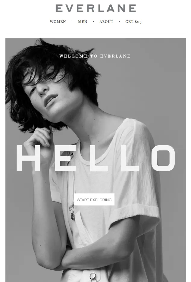
Key Takeaway: Try an email that’s one big postcard-style image, with a clear call-to-action button below. Make sure email renders correctly in the inbox, even with images disabled, by using a background color behind the image and styling the ALT text. More on that technique in a workshop coming soon!
5. Reinforce the value proposition
Lord & Taylor welcomes subscribers with a list of the three things you can expect from their emails: trends, brands, and deals. It's the value proposition behind their campaigns, the "why" you made a good move by signing up. The message is coupled with great photography, a pop of brilliant yellow, and one takeaway: shop now. There’s no need to scroll on and on; in fact, there’s barely any reading to do. The short list says it all quickly and beautifully.

Key Takeaway: Try a numbered list with three key messages that reinforce the WHY about your campaigns. Consider opting for a bold color choice for the numbers (by using images), and keep the text short and sweet.
6. Say thank you (with something tangible)
Bumble and bumble, like many retailers, offers an incentive to get shopping right away with a 10% off coupon. Special deals are a huge motivator in signing up to receive emails, and giving a gift right away is a great way to say thank you and keep subscribers coming back for more. Plus, Bumble and bumble keeps the email short and sweet and super visual, and they make it easy to find physical store locations with a clickable map.

Key Takeaway: If you offered an incentive for signing up, try showcasing your offer in big, bold type in the center of your email.
7. Don’t overwhelm
Moo does a great job of covering a lot of ground without overwhelming readers. By using a large, easy-to-read font, keeping messages brief, including great images, and allowing for white space and breathability between sections, they squeeze in multiple calls-to-action (go to the website, get 10% off, connect on social) without it feeling like too much. Because the email is well-designed, simple, and elegant, they’re able to cover a lot of ground.
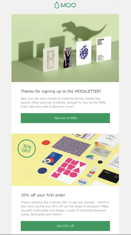
Key Takeaway: If you have multiple calls-to-action in a single email, use white space, background colors, and wide images to visually separate them.
8. Show; don’t tell
Mario Batali, renowned chef and restaurateur, doesn’t mess around with his welcome email. Open it up and readers find their first Mario recipe, front and center. By diving into quality content right away, Batali’s making an instant connection to readers and providing them exactly what they were looking for. Plus, the photography is gorgeous, the text is easy to read, and there’s no clutter.
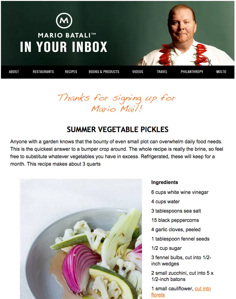
Key Takeaway: surprise your readers by providing outstanding content directly in the welcome email. They were expecting a simple Thank You, and instead get the full thing, right away.
9. Make it easy to find the best content
Similar to Mario Batali, Pop Sugar kicks off their welcome email with a focus on great content. But instead of including the whole message in the email itself, they offer readers top posts with photos and one-line descriptions. They also let readers know right away that the email content is customizable, inviting them to adjust their settings and optimize their experience. As you can see, your calls-to-action don’t have to be buttons.

Key Takeaway: Experiment with bold CTAs that break free of the button, just by changing the font color and putting the CTAs right under the relevant text.
10. Bring it home
West Elm truly motivates readers to jump over to their site and get shopping: they offer a coupon right at the top, anda simple, clickable menu reflecting the offerings of their site (furniture, bedding, etc.). By using gorgeous photography and keeping the email simple and full of links, readers almost can’t help but wander right over to its website.

Key Takeaway: if you are an ecommerce merchant, beautiful product photography, a discount code, and clear navigation might be the perfect mix to trigger a shop visit... and maybe a sale!
Recap: 10 tips for great welcome email design!
To recap, follow these 10 welcome email design tips and you’re guaranteed to engage with your new email subscribers right from the start:
- Increase your padding to create white space
- Limit the amount of text in the email
- Choose a compelling opening photograph
- Try a postcard-style email with a prominent call-to-action button
- Highlight the benefits of your newsletter with a cool numbered list
- Showcase any email offers or incentives in big, bold, centered type
- Visually separate call-to-actions throughout the body of the email
- Try showing off an individual piece of content, on top of or next to a beautiful photograph
- Experiment with bold calls-to-action that break free of the button
- Mix great photography, clear navigation and a discount code to trigger a shop visit
Ready to create your own welcome email? Use one of the above emails as a model and build it easily and quickly in the BEE editor.
