For small businesses, email marketingis a cost-effective way toboost sales, attract new clients, promote services, strengthen relationships, and a lot more, writes Constant Contact's Ryan PinkhaminForbes. What's more, data from MarketingSherpa indicates that 91 percent of U.S. adults report they'd like to receive promotional emailsfrom companies they do business with. It sounds like a match made in heaven: sending email benefits small businesses, and receivingemail benefits readers.If only it were that simple! Email marketers and designers know just how much work goes into building an audience, distributingcontent, and getting clicks. A huge step along the way? Actually makingthe emails themselves—with smart design. A well-designedemail communicates visually, is easy to understand, looks great on mobile screens, and converts. If you're a small business, be sure you're implementing theseemail design tacticsin your marketing strategy.
Tip #1: Know how your brand's visual identity extends to email
A common misstep of small businesses is not establishing a visual brand identity before undertaking an email marketing strategy. Having a logo is not enough. Small businesses need to understandthe full depth of their visual brand, from font families and text treatments, to photo and illustration styles, to primary and secondary colors, and more. Your emails are an extension of your brand. They should be professional-looking and consistently-designed—and they need to look great. Sending messages that aren't well branded, consistent, or are a departure from your visual identity on other platforms (your website, your social media accounts) is confusing to readers and can be damaging to your brand. Do the opposite, andyou can build brand loyalty and trust with your audience.AIGA, the well-known professional association for design, is a great place to look for design excellence. Here's a snapshot of three of their recent weekly newsletters, AIGA Eye on Design.Note the consistent approach used for email width, colors, layout, text, header, pre-footer, and footer.

Indetermining how your visual identity will function in email, here are some questions to ask:
- What font type, size, and treatment will we use for headers, body text, and call-to-action buttons?
- How will our headers and footers look?
- Which accent color will we use for links and call-to-action buttons?
- Which background colors will we use? Will they ever change?
- What visual treatment will ads receive so they stand out?
- How will our CTA buttons look?
- How will our social media buttons look? Which ones will we include?
- How often will we include animated GIFs, countdown timers, or other dynamic designs?
- How will we distinguish and divide content?
- How will we sign off our emails?
There should be a section in your style guide specifically for email designto insure the same approach is used by anyone designing emails over time. Here are some tips and tricks for being consistent with your email design:
- Use HTML color codes to establish color consistency (always use the exact codes, don't guess!)
- Duplicate content blocks so that text styling is carried throughout an email
- Set up each email the same way: adjust the width, background color, text color, font type, and link color consistently before you begin
- Moderate white space with uniform guidelines for text alignment, line height, and content padding
- Establish a standard practice for image sizing and treatment
- Use variations of the same basic layout each time
Tip #2: Think mobile first
Small businesses might find it daunting to optimize emails for mobile, making sure messages are responsive to all screen sizes. But plenty of email editors, BEE included, allow you to design emails that are responsive by default—without needing to code or know any HTML. It's so easy, there's no excuse not to.Up to 70% of email opens now occur on mobile screens, depending on your target audience, product, and email type. Responsive email is no longer a "nice to have" feature—it's a necessity for all small businesses.We recently received this responsive email from Webflow, the website design tool, that's optimized for desktop and mobile-viewing:

Not only is the email responsive—the image, text, and button all adapt well tothe mobile screen—butthe basic design of the email is optimal for on-the-go viewing.The email is perfect for mobile reading because:
- It has an easy-to-scroll-through single column layout
- It uses the inverted pyramid method to create hierarchy and drive readers to the CTA button
- It's just a teaser: the whole email consists of one image, one header, one line of body text, and one CTA button
- The body of the email is plain text
- The CTA button is bulletproof
Read more about how to design a responsive email in out post10 responsive email design tips.
Tip #3: Optimize your calls-to-action
First things first: each email you send must have a call to action.It could be to invitereaders to sign up for an event, download a white paper, snag a discount on your product, or share your content. Whatever it is, it’s the driving force behind your whole email campaign. Anyone sending a marketing email, especiallysmall businesses, must optimize their calls-to-action so that they're effective.Here's an email from Typeform, the online platform that allows your to build surveys, witha great CTA. You can find similar examples and templates on their customer feedback forms webpage.

What makes this button work?
- It's bulletproof. Bulletproof buttons—those written in HTML—will always render across inboxes (vs. buttons that are images and don't show up for readers with images disabled in their inboxes). To make one, you can either make a standard CTA button bulletproof by adding a few lines of HTML code or check that the email editor that you’re using generates bulletproof buttons (and that those buttons are not simply images).
- It's well-placed. Typeform's email communicates a clear, single message that leads to a clear, single call-to-action. The CTA comes after Typeform makes a case for why readers should click.
- It uses custom, on-brand language. Good CTA text reflects the tone of the brand. “Click here,” “Register,” “Learn more,” and “Sign up” are overused and generic. Using personal pronouns like “my” and “your” also helps to set a friendly tone and make a CTA more engaging. "Show me how to do less work" is a lot more compelling than "Read more."
Tip #4: Make it easy to scan
Don't assume subscribersare reading every line of your email. Small businesses should optimize messages for distracted, on-the-go mobile viewing by leveraging design best practices for formatting email text.This email from Sprout Social, the social media management tool, employsgreat design techniques to make the message easy to skim:

Theemail is comprised of modules that all have a consistent layout: header text, description text, and a call-to-action button. The format creates a hierarchy within each section of the message by using theinverted pyramid method, a smart approach for communicating todistracted readers who are only giving your email a cursory glance.

Sprout Social'semail also leverages largeheaders, two-to-three times the size of the body text,to reinforcestructure within theemail and make it easy to scan. The email also uses a single font and a generous standard line height to optimize readability. Without any competing images or graphics, the bright green call-to-action buttons stand out prominently on the screen. One change we'd recommend, though, is to optimize the text used within each CTA button. "Read more" is generic and doesn't communicate much to someone skimming through the message. A stronger CTA might be, for example, "Learn how to identify influencers now."
Tip #5: Use short subject lines
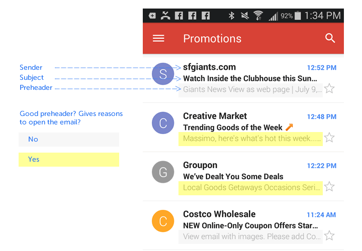
In overcrowded inboxes, what makes the difference between a message that gets opened vs. one that gets archived? The subject line.Salesforce reports that after sender name, thesubject line has the biggest impact on whether anemail is opened or not. Small businesses can stand out by putting some thought, planning, and testing into subject lines.Agood rule of thumb is to keep subject lines short. Most mobile devicesonly display the first six or sevenwords of a subject line, so using a shortsubject line is critical to get your message across. Data from Retention Science shows that subject lines with ten words or less tend to have higher open rates.

Try gettingreaders curious about your email with a line that asks a question, promises a deal or coupon, has a “how to,” or includes a number. You could also test howemoji does with your audience. Here's a snapshot of some current examples in our inbox:

Almost as important as the subject line—especially on mobile—is the preheader text that immediately follows is.Subscribers use preheader textas a screening tool, deciding whether or not the email is worth reading based on just a few words, so using compellingpreheader text can increase open rates.The first plain text that appears in your email will show up as preheader text. Optimize it!

Wrap Up: Email design for small business
It's a great time for small businesses to optimizetheir email marketing strategies. Now more than ever, free resources and tools tolevel-up your email design are at your fingertips. Email can't be overlooked. Improve your email campaigns with these five essential design tips:
- Consult your style guide. Your emails should be on-brand, consistent, and professional.
- Design for mobile first. That's where most of your clients likely read your emails.
- Optimize your CTA buttons. Good design goes a long way. Be bulletproof.
- Make your message skim-readable. The important stuff should stand out.
- Start with a great subject line. And preheader text, too!
Ready to design your email for your small business? It's easy to do with the BEE email editor! Try out BEE Free, or check out our new BEE Pro version which allows you to save your messagesand use them again.Save


