You’ve invested precious time and effort into crafting an email to send out a new survey, and you’re eager to see what insights the survey uncovers. You finally click “send,” and then…crickets, day after day. Why isn’t your survey email getting conversions? Hint: it’s not just because people are busy. We’re diving into the top strategies and templates to use to convert survey emails.
Why send survey invitation emails?
Sending a survey email to your customers or subscribers is a method of getting valuable information that can inform how you run your business. With an email survey, you can:
- Easily gather a large quantity of responses with a cost-effective method
- Get honest answers (most surveys are anonymous, so your customers feel free to truly express their thoughts)
- Reach your customers on a channel where they’re connected and engaged
Survey invitation emails are also a smart choice because they’re cost-effective and don’t require much time on your end. We can’t think of a reason why you shouldn’t send one! When you’re ready to launch your campaign, check out these tips to learn the survey invitation email best practices:
#1. Make your survey email subject lines engaging
A huge chunk of subscribers—about 35%—decide whether or not to open your email based on the subject line alone. Salesforce reports that after the sender name, the subject line has the biggest impact on whether an email is opened or not. So the first step to getting readers to open your survey invitation emails is to put some thought, planning and testing into your subject line.Here are some examples of survey invitation email subject lines in our inbox. Based on what you see, are there any survey invitation emails you would open?

When it comes to survey invitation email subject lines, a good rule of thumb is to keep your subject line short. Most mobile devices only display the first six or seven words of a subject line, so using a short subject line is critical to get your message across.
Most of the subject lines from the invitation emails we received are transparent, making it pretty clear that a survey is enclosed. Those offering an incentive, like Klean Kanteen and Anthropologie, present that information in the subject line, too—a smart move for encouraging opens. Many of these messages also include “you” or “your” in the subject line, making it evident that the message is all about engagement.One subject line that stands out is in the form of a question, from the city recommendation guide InsideHook NY. “Are you happy with your job?” reads the subject line, followed by snappy preheader text (“Prove it.”) that’s perfectly on-brand.Main takeaway: When crafting your subject line, think about keeping it concise, differentiating yourself from other invitations and intriguing your audience.
#2. Be concise In your survey emails
When you stick to a single message in your survey email—one that’s reiterated over and over in the subject line, images, content, and call-to-action—it’s more likely to sink in.Effective survey invitation emails will answer these questions right away:
- What: What is the email really about? What is the objective? Be clear about the survey’s purpose and why you’re doing it.
- Why: Why should readers participate? Are you offering an incentive, like a coupon? How will the survey results be valuable to you? Let readers know.
- How: How should readers engage, and how long will it take?(Is it less than 5 minutes?). Make sure the next steps are clear.
- Where: Where should readers click? Use one strong, compelling call-to-action button. It should be obvious to readers where to click to participate.
- When: When is the due date? Create urgency by providing a deadline. Consider doing a drip email campaign with two or three messages to remind subscribers to complete your survey.
In this invitation from 23andMe, a genomics and biotechnology company, the letter-style message gets straight to the point. This survey email example answers all of the important questions: What the message is about (genetics research), why the survey is important (to help improve research efforts), how readers should engage (by answering as many or as few questions as they’d like), how long it will take (a few seconds), and where to click (an obvious “Submit Your Answer” CTA button). The email also gets the ball rolling by asking the first survey question in the email itself.

In another survey invitation email from InsideHook, the company repeats the subject line in the message’s first line.
Subject line: Are you happy with your job?

Again, InsideHook tells readers what the email is about (a survey about work life), why participation is important (to contribute to a new story called “Men at Work”), how readers should engage (hit the hot-linked language or CTA), how long it will take (no more than five minutes) and where to click (“Take the Survey” button).
Main takeaway: Communicate clearly, letting readers know what you’re offering, why they should participate, and how they should respond. Don’t waste your readers’ time.
#3. Deliver a compelling call-to-action for survey emails
Once a reader has opened your survey invitation email and read the message, it’s the moment of truth: Will the reader become a survey participant?
The call-to-action you include in the email can make or break what happens next. There’s a good chance your reader will skip right over your body copy and read your CTA first, so make it easy for readers to click or tap by using a bulletproof CTA button. Buttons stand out and provide visual interest.
Allow ample white space around your button so it’s easy to tap on mobile, and choose a bright contrasting color for the button that’s easy to spot. Also, make the CTA language clear and compelling—three to four words should do it. The Muse, a career and job site, created an excellent CTA button in this survey invitation email example. The CTA states exactly what the action is and how long it will take, and also provides a little urgency with the word “now.”
Subject line: We need your help

Subject line: We need your help
When creating CTAs for survey emails, avoid overused and generic language (“Click here,” “Register,” “Learn more,” and “Sign up”). Instead, use personal pronouns (“my” and “your”) to set a friendly tone and make the CTA engaging and approachable.Main takeaway: Good CTAs are unique and customized to reflect the brand’s tone. Read more about how to optimize your CTA button with our Top Tips for Best Call-to-Action Button Design post.
#4. Do a one-question micro-survey
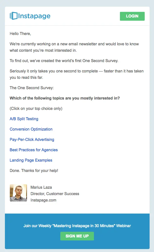
It takes a lot to get the attention of busy, on-the-go subscribers whose inboxes are flooded and who are reading emails while distracted and multitasking. It’s a tough crowd out there! Inviting readers to take a survey is a big ask. One way to make your survey as easy, simple, and quick as possible is to ask just one question right in the body of the email. This micro-survey tactic might just be the thing that gets readers to respond at higher rates.Instapage, a tool for creating landing pages, did just that. Here’s a survey email example of how they executed it.Subject line: A world premiere: The one second survey

Readers can select one of five choices right there in the email itself, and then the survey is over. There’s no need to click a CTA button or go to a landing page, and no need to spend even five minutes of their time.The Brooklyn Public Library takes the same approach in the email below, where subscribers choose an answer within the email.Subject line: Your answer needed: What’s your favorite genre?

Main takeaway: If getting a higher quantity of respondents is important to you, consider asking readers to answer the highest-value question by including it directly in your email.
#5. Avoid spam filters
All too often, survey emails end up in the recipient’s spam or junk folder, which is the last place you want yours to be! You can head straight for the inbox by avoiding spam trigger words in the subject line and not using all caps. You’ll also want to make sure your email doesn’t contain too many images or too many links.Other important tips to keep your survey emails out of the spam folder: Include a link to unsubscribe (which should be in all of your emails) and test your email deliverability with a few major providers before sending the message for good.
Survey email templates to get started today
Not sure where to start when crafting your survey invitation email? You don’t need to start from scratch. Check out these helpful templates you can use and adjust accordingly, each with a particular purpose in mind.
1. Survey email template with a giveaway
One of the best ways to encourage people to take your survey is to give them a concrete reason to do it…like the chance to win something exciting in a giveaway. You can use a template like this to entice people to participate:Subject: Feeling lucky? Get a chance to win !Body:We’d love to hear your opinion! We want it so badly, in fact, that we’re giving away a !Just click the button below and complete our simple survey. It will only take a few minutes of your time, and when you have completed it, you’ll be entered for a chance to win . Plus, you’ll be giving us valuable insight to allow us to serve you better. It’s a win all around!Example:Giveaway Survey Email Template
2. Survey email template with a gift card
Some people are more enticed by the chance to win a large prize while others are more enticed by the guarantee of a smaller token of appreciation like a gift card. Every audience is different, and it’s worth trying out both approaches to see which one your audience responds to best. To try out a gift card offer, try this survey template.Subject: You could have a gift card in 5 minutes!Body:We want to know what you think, and we’re offering much more than a penny for your thoughts!Complete our simple customer feedback survey to receive a [$] gift card to for you to use on your next purchase. Simply click the link below and complete our 5-minute survey to allow us to better serve you in the future. When you’ve completed the survey, you’ll receive a gift card you can use the next time you’re in the mood for (product name here)Thank you for helping us provide a better shopping experience!
3. Customer feedback email survey for a product
While it’s great to collect feedback on general customer experiences, you might want to know what customers think of specific products, especially new products. This is a great way to not only improve your product but collect marketable quotes and testimonials. Use this template to inspire your next product survey email.Subject: We’re dying to know what you thought of (product name)!Body:We saw that you ordered (product name here), and we’d love to hear what you think! We’re on a mission to bring our customers the best products we can offer, and you can help us make (product) better.To give us your thoughts on this product, click the link below and complete our product feedback survey. It’ll only take five minutes of your time, but you’ll be doing a solid for us and our future customers (including yourself).Thank you in advance for sharing your feedback!Example: Survey Email for Product FeedbackEach of these survey email templates has a different intent and use, but they’re all designed to engage your customers and encourage them to provide their feedback. Feel free to use them as they are or to customize them to suit your brand and your message.
Building great survey invitation emails
Designing survey invitation emails is no easy feat! Optimize your return on investment by getting readers to participate. If you need a little help getting started, check out our kit of survey email templates by designer Matteo Della Chiesa. The set includes five emails to take you from start to finish:
- Short invite
- Emoji invite
- Questionnaire invite
- Thank you
- Questionnaire results

Editor’s Note: This post was updated on May 2023 to ensure accuracy and comprehensiveness.


