So much goes into planning the perfect email campaign, from the visual content and the copy to the subject line and the call to action. Amidst the meticulous planning it can be easy to overlook a simple snafu: if your message exceeds a size limit—regardless if it's too text-heavy or image-heavy, or both—it can get clipped.
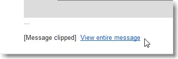
Message clipping is especially common for Gmail users, where HTML emails larger than 102 KB get trimmed. The Gmail app for iOS clips messages larger than 20 KB. This can cause an inconvenient roadblock for brands with Gmail subscribers, as their email is not fully shown, but rather clipped with a link to view the entire message as we see below:

Why is my message getting clipped?
Emails quickly become too large when they contain a lot of content or HTML code, especially if your email contains inline-CSS for example.Currently, there isn’t a universal or elegant solution to preventing a large email from being clipped by Gmail. But there are two main ways email marketers can minimize email message size:
Optimize and minimize the HTML code. Mobile responsive design adds lines of code and weight to your overall email message size. This is especially true if your email contains inline CSS code which is the only design tactic for responsiveness on the Gmail app for Android.
How? You can 1) ask your developer to optimize the HTML/CSS for you or 2) choose an email editor like our BEE editor that has built-in optimized HTML code.
Reduce the amount of content in your email messages. This allows you to optimize your email for mobile while preventing clipping.
If a substantial number of your subscribers are Gmail users (which is pretty likely—Gmail has 900 million users) and your readers check email on the go (also pretty likely: up to 70% of email opens occur on mobile screens), then the optimal solution for you is to prevent your emails from getting clipped by streamlining the content you include. Here are some tips for how to achieve this.
4 tips for streamlining your email (and preventing clipping)
Tip #1: Stick to one story
Email marketers often want to capture as many clicks in a single email, appealing to the broadest swath of their audience as possible. As a result, emails are long, long, long, inviting readers to click here, or here, or here. It's no surprise emails like this often get clipped.
For some e-commerce brands, or for newsletter-driven companies, this approach might work for your audience. (Do some testing and find out how bottom-of-email content is doing compared to what's at the top). However, for most brands, the vast majority of the time, a simple, focused email is more effective. The reality is that readers are checking email on their phones while multitasking, spending only a few seconds on your email. (Can you imagine how much scrolling you'd need to do to get through that Zulily email on your phone?) When you stick to a single message in your email—one that's reinforced by the subject line, images, content, and CTA—it's more likely to sink in. Here's a great example from Colgate (subject line: How to save 8 gallons of water per day):

The entire email has a single, simple message: save water. It's echoed in the subject line, header, lead image (which is an animated GIF), body content, and CTA. There's no need to continue explaining the message or add secondary content. By keeping the email focused, Colgate can drive home their point, minimizing distractions, unnecessary content, and an oversized email.SitePoint, the website and company for web developers, takes a similar approach in their webinar invitation email (subject line: Live Stream: Microsoft Build 2015):

The email is optimized to communicate a single message to its readers: watch this live stream! The inverted pyramid method is used to grab readers' attention, provide detail, then offer a well-placed and well-communicated CTA button. The only "extra" content in this email is the footer containing social media buttons. No other secondary content or calls to action are included, because they're not needed. In fact, additional information might even prevent readers from clicking on the primary CTA, and SitePoint knows this.Test out simple, single-message emails that are streamlined and focused. They won't get clipped, and they're likely to communicate faster and better for most audiences.
Tip #2: Use a template for your newsletter
If you're sending regular roundups or newsletters to subscribers, using a template provides consistency, reinforces your brand, and creates trust through transparency and reliability (subscribers know what to expect). On top of all that, when you have a tried-and-true template that you've tested, if one message doesn't get clipped, it's likely the others won't either. When you're always sending roughly the same amount of content, it eliminates the concern that an email might get too large and be clipped. And not all roundup newsletters need to be long-winded, either. A best practice is to feature a headline story, followed by some secondary content, without providing a long extended list of all the stories on your site. NY Mag's Science of Us newsletter does just that. Here are two recent examples:

The newsletters are well-organized and contain only those stories deemed most likely to suit subscribers' interests. And for subscribers who scroll through without clicking on a story, the full-width CTA button at the close of the email is a great, eye-catching opportunity for readers to go over to the site.The clean, simple template no doubt simplifies the process of putting together the newsletter, and it benefits readers, too: they're presented with a curated selection of content, and when the whole message appears, they don't need to click a link to view the entire message.
Tip #3: Don't over-format
It can be tempting to style the body copy in your email with bold, italics, underlines, and color treatments—but not only can this lead to a messy aesthetic, it also contributes to the total KB of your HTML code. A minimalistic approach to body copy is the best for readability, and the simple approach also makes calls-to-actions stand out all the more. Many e-newsletter publishers of text-heavy emails know this best. By streamlining content stylization, not only can they include more content, but they can make their emails reader-friendly. NeimanLab's Daily Digest, for instance, uses a single font, a black-and-gray color scheme, and a repeating module hierarchy with standard font sizes in their newsletter.

While there's very little color or embellishment, the large header text and ample white space makes it easy to skim—and the message remains un-clipped.
Tip #4: Simplify (or cut) your header
Emails are not websites. A focused, succinct email should be designed for clarity and should communicate a single call to action. So there’s no need to crowd the email, or the header, with extraneous links, menus, and messages, like in this email from Home Depot:

The navigation menu and extraneous header links take up a lot of real estate at the top of the email and may not reflect most readers' interests. Remember to use the data you have to make customizations. When visitors come to a website, you don't know much about them. For subscribers on your email list, on the other hand, you likely have some segmenting details, like gender, age, location, or interests. As a result, emails can—and should—be tailored for their audiences. For example, if I'm a reader who recently purchased items from the gardening section, send me a focused email on the latest deals in gardening. And cut the header altogether: I don't need to scroll through menus or offers for other items.Because tailored emails are going to a specific audience, they can be simpler and direct. Often, emails don't need complex navigation menus in the header because they take up unnecessary space and don't reflect a knowledge of the reader. Simplify your email to strengthen your message, save room, and prevent it from being clipped.
Wrap up: Prevent your email from getting clipped
When in doubt, keep it simple. Know your audience, and test messages to see what works best. Prevent your emails from getting clipped by following these best practices:
- Tell a single, focused story. Try using just one module, and use the inverted pyramid method to create a clear hierarchy.
- Use a template that's proven effective. It'll make emailing simpler for you, and it will benefit your audience.
- Simplify text formatting. Don't go overboard; use headers and white space to create clarity. Check out our tips for formatting text-heavy emails, too.
- Remove a cluttered header. It probably doesn't resonate with readers, and it's taking up space!


