
GOOD, “a magazine for the global citizen,” is a quarterly magazine known for its killer design aesthetics and fresh take on a variety of news topics, including the environment, education, urban planning, design, food, politics, culture, lifestyle, technology, and health.How well does GOOD use email design elements - such asillustrations and typography - to engage its subscribers and get them to click? For this week's Email Design Inspirationpiece, we took a look at a recent issue ofThe GOOD Dailyto see what we could learn from this design-forward publisher.
The GOOD Daily: A publisher's daily email newsletter
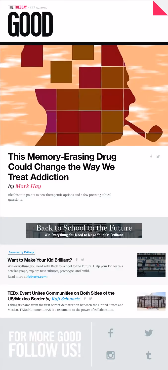
Here's the GOOD newsletter that we picked...
... and here are our thoughts on it.
1. Use color + typography to grab your readers’ attention
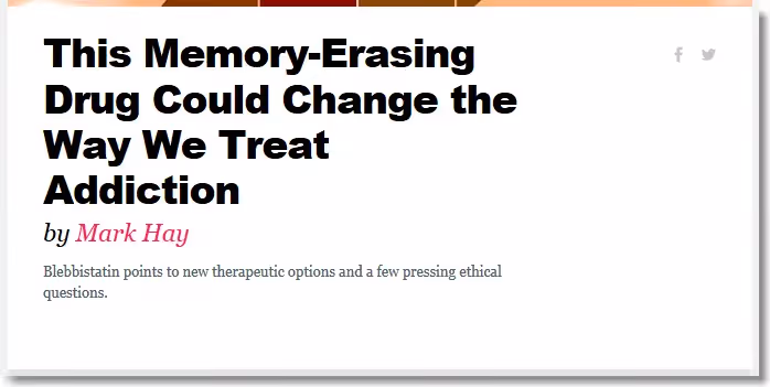
GOOD’s email color palette is primarily black, white, and gray, so any time a color is introduced, it grabs the reader’s eye. Pink and blue are used to highlight names and links; plus, at the top, the day of the week is always the same color (Tuesdays are always pink; Mondays are blue, etc.) along with a matching dog-ear effect in the upper right. These are small details, but have a big impact: they give the email a sleek, modern feel and help focus readers’ attention. What sets the GOOD email apart is the clever use of color in combination with close attention totypography. Notice the use of different font styles (and sizes) paired with a color palette. You can see this in action in the headlines of GOOD’s first story: the headline is large, bold and Helvetica; the byline uses pink, italics, and Georgia; and the article summaryis a much smallerGeorgia, gray.
2. No photo resources? Use an illustration!
One of the reasons we chose to highlight this email is because the illustration at the top is so compelling. It’s simple, unique, and attention-grabbing. Making sure your messages are visual and not text-heavy is incredibly important, but photography doesn’t always have to be the go-to option. GOOD does a great job of leading with a strong visual element, placing it above the header and any substantive text.
3. Visually separate ads from content
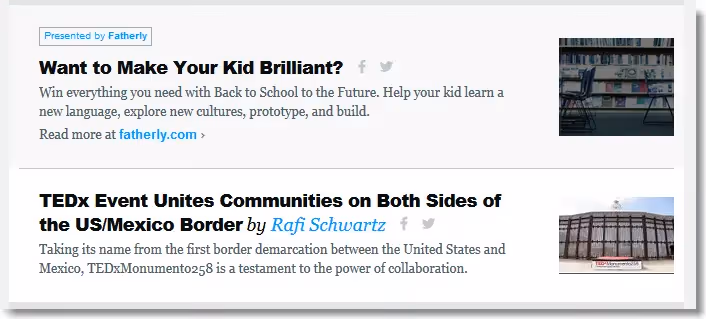
It's always a good idea to separate your ads from your main content. You want to be as transparent as possible to your subscribers, andat the same time give advertisers good enough visibility to deliver a positiveROI on their investment. Fortunately, this can be done easily with a few visual cues.Let's take the GOOD email. The ad appears only after the lead story and image, so it's not immediately in the reader's face. However, it's also not relegated to the bottom of the message. It's centrally located, but visually separated from the rest of the content with a subtle background color change and the blue “Presented by...” box. Transparency is essential. Advertisers' revenue is key. GOOD found a nicebalance.
Best practices for a daily newsletter for publishers
Email is an increasingly important traffic-driver for publishers, so much so that this year the New York Times increased its newsletter titles substantially and now sends 33 different newsletters. Knowing how important email newsletters are for publishers, it’s no surprise that GOOD is using a well-crafted daily email newsletter to drive traffic.So, how can you - as a publisher - follow what GOOD is doing to drive traffic through daily email newsletters? Here are a few takeaways foryour own email campaigns:
- Introduce one or two bright accent colors. Try using just one or two bright accent colors per email. Incorporate simple design elements (like that pink dog-ear) to bring your email to the next level. A muted background color (like gray, in this case) can help make the body of your email pop.
- Use different fonts by stacking your content areas. Try placing a post’s headline, byline, and summary in separate text boxes to customize them individually. You can see this in action in the headlines of GOOD’s first story: the headline is bold and Helvetica; the byline is pink, italics, and Georgia font; and the article description is also Georgia and gray.
- Commission illustrated work. Whether from an in-house designer, a freelancer, or a friend, consider incorporating effective, on-brand illustration into your email for important stories or messages. Alternatively, simple photo treatments, like adding a layer of color to an image, is an easy way to enhance your email design.
- Lead with your own content. Email ads can be great for both you and your readers when done well. One great rule of thumb to remember is to try to lead with your own content whenever possible. Remember, your readers subscribed to hear from you, not from advertisers.
- Label your advertisements, mind their ROI. Make your ad distinguishable from the surrounding email content with a special label and/or with a change of color in the header or background. Use a consistent approach so your readers always know when they’re looking at an ad. Make sure that they're placed prominently enough to deliver a positive return on the investment.
Want to create an email newsletter like this one from GOOD? We’ll be showing you how to do this on Friday in our email design workshop. So, stay tuned!What do you think of GOOD’s email? What would you do differently? Tell us in the comments.


