Beefree blog

How To Design Landing Pages That Convert

Emily Santos
Emily Santos
Oct 15, 2021
How To Design Landing Pages That Convert

Thoughtful content connects with your target audience and guides them to complete a specific action. Whether that action is to subscribe, purchase or review a product or service, a landing page serves as one of the best content forms to truly drive home conversions.At the core of a landing page is one defined intention. This intention or goal is more specific than only driving sales, it’s typically how you want to demonstrate value for each specific campaign: How can you show up for your customers and guide them towards a genuine solution to their problem? Once you narrow in on your goal, build a persuasive strategy and design the landing page to support that strategy: Why does your solution matter and how do you get customers to trust that it does?Understanding customer needs is the first step to creating an optimized landing page. Once you solidify that knowledge, you will be able to design and piece together your landing page elements that are geared towards customer personalities and interests.Let’s take this step-by-step so you can successfully craft a high-converting landing page.

What is a landing page?

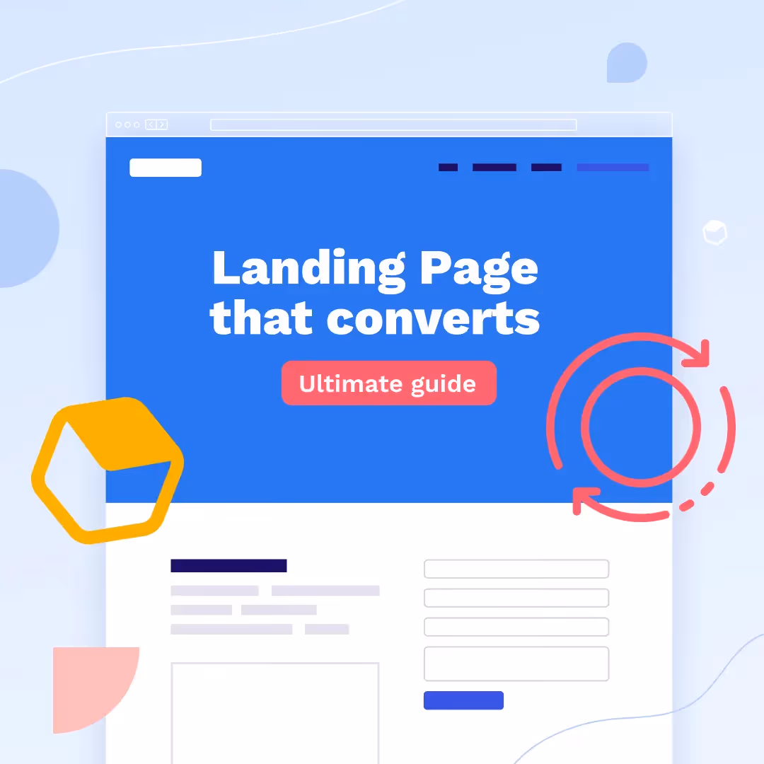
A landing page is a standalone web page that serves one focused goal. In digital marketing, this is where your visitors end up or “land” after clicking on a link from your emails, social ads, or digital promotions. The best landing pages are campaign-specific and guide your visitors towards a CTA button.While normal web pages and your website showcase several different goals and allow visitors to explore,landing pages stay laser-focused on one goal: pushing visitors into the next step of the buying cycle. Depending on the stage they are on, this may be capturing leads, converting browsers into buyers or creating repeat buys.With a single CTA and the inability to explore the web page, the landing page is your best bet to increase conversion rates and lower costs of acquiring leads due its clear and direct mission.

Use this template in Beefree!

Use this template in Beefree!

What is the difference between a landing page and a website? 

While the terminology seems similar, a landing page and a website have different makeups. Deciding on which to use will ultimately depend on your objective for creating the page.A landing page has one focused goal, and that is to convert visitors into customers. It will have the visitor fill out a sign up form, or simply click on a specific CTA. It partners a website but is used for a specific promotion, event or offering.However, a website is what finalizes the conversion. It gives visitors an opportunity to explore the offer in depth through other offerings and explanations. Here’s a quick breakdown of the differences:

Landing page vs. Website

website vs. landing page

(Website)

website example
landing page

(Landing Page) 

Benefits of a high-converting landing page

Landing pages that convert are highly valuable for your business. They work to advance your visitors along in their buying journey. Some benefits of effective landing pages include:

  • Driving conversion rates
  • Providing actionable data tracking
  • Building credibility
  • Increasing search traffic

These are only a few of the reasons why you should develop landing pages for your campaigns. Keep reading to find out how to create a high-converting landing page.

What are the key components of a landing page? 

Developing a high-converting landing page comes down to a clear formula. Honing in on your landing page development, design and follow up that will make or break the momentum of your landing page. Depending on the type of page you plan to design, your elements will vary from each form. Follow along with this list to develop a page that increases those conversions:

A solid CTA

  • One/few CTAs
  • Visibility - clear, it stands out
  • Placement - above the fold

To-the-point copy

  • Compelling/catchy header and descriptive subheaders - aligned with other copy
  • Short, concise, informative and customer-centric
  • Considerable offer that communicates value 
  • Emotional triggers
  • Benefits and pain points - write content with your goal in mind
  • Strong grammar and spelling

Optimized design

  • Align the elements
  • Use white space to your advantage - spread out your content, and make it easy for customers to find your CTA
  • Add brand personality but don’t overload
  • Zero distractions - simple, focused design
  • Bullet point copy for a lighter design appearance

A single defined goal

  • Understand the purpose and intention of your landing page - clear message and defined goals
  • Customers come first - focus on the offer not who you are as a company. Speak and design for your target audience

Eye-catching imagery

  • Engaging imagery - images/multimedia
  • Videos 

Reviews/Testimonials

  • Customer feedback and support
  • Credentials and promises

Unique value proposition

  • What do you stand for?
  • What makes your company, product or service different from the crowd?

What are best practices for a high-converting landing page? 

Keep forms short

  • Know what specific information you want from potential customers
  • Showcase your data security badges so customers trust your brand

Promote on social media

  • Take advantage of PPC ads
  • Leverage your social media and post landing pages to those platforms

Automate

  • Ease the day-to-day by automating your landing page shares from the get-go

A/B test

  • A/B test your design components and personalized copy on each landing page you create
  • Check your metrics - pay attention and measure to know what to change and how to improve for more conversions on your next landing page

Follow up

  • Thank your customers
  • Give access to your other marketing channels 
  • Follow up by letting customers know how to reach you

7 Types of Landing Pages that Convert

With one set intention, landing pages cut out all distractions and lead your customers step-by-step through the buying process. Each page you use throughout your sales funnel plays such a crucial role that works not only to drive the final sale, but to also genuinely help your customers face their challenges and find their solutions alongside them.Kath Pay, CEO at Holistic Email Marketing, explains that our drive should be to help customers not just sell to them. She says that, “Good marketing is helpful marketing. Customers are subscribed to you for a reason, so make their conversion as easy as possible. Don’t put barriers in front of them.”A 404 landing page is just as important as a lead capture page because they all direct customers towards content they need. Include each of these landing page types to effectively help your customers and remove any barriers from their buying experience.

Lead capture page

A lead-capture landing page is created to collect leads through a data capture form. This page encourages or incentivizes customers to fill out the form with their information to gain some sort of reward in return. It’s a win-win, your customer gets something they want and you get the conversion.When to use this page: Mid-sales funnel —Where your customers have learned about your product and are now evaluating if what you have to offer is a right fit for them.

Use this template in Beefree!

Use this template in Beefree!

Squeeze page

Similar to the lead-capture page, the squeeze landing page is another form-based page to collect data. They are used to gather email addresses from potential customers. A squeeze page needs to quickly get straight to the point with a bold headline, a clear CTA, an exit option and links to next steps if they decide to move forward.When to use this page: Top of sales funnel—Where you gather leads through bare minimum information (the email address) to create an email list.

Use this template in Beefree!

Use this template in Beefree!

 (Easily delete content to simplify the landing page) 

Splash page 

A splash landing page is a simple version of a landing page where an announcement or special offer is provided. There’s no data collection, it's simply about giving potential customers information. The splash landing page should have a clean layout with a clear CTA, minimal copy and few images.When to use this page: Any time in your sales funnel—Where you provide customers with general information before they end up on your main website.

Use this template in Beefree!

Use this template in Beefree!

 (Easily delete content to simplify the landing page) 

Sales page

The sales page is a landing page where you convince your customers to make a purchase. These pages are often touchy with design because it’s best to thoroughly understand your customers before finalizing any of the copy or design elements. If you push too hard or not hard enough, you could lose the sale. Your page length will depend on the details of the product or service you’re providing. Whether it be a small push with quick bullet points of benefits or a page filled with extensive info, make sure your push is backed by your intentions and clearly represents your value proposition.When to use this page: Bottom of sales funnel—Where you push visitors to become customers and make that purchase. Convincing people to buy from you is difficult so design with clear intentions.

Use this template in Beefree!

Use this template in Beefree!

404 page 

A 404 page is a safety landing page and pops up when the page customers landed on was not found. The error, “Page not found,” should be stated and then should offer a solution. That way, customers won’t simply exit your page, the solution will guide customers to an alternate form of assistance or page. Focus on keeping the mood light here by using funny copy, memes or other humorous content that your customer base will respond well to.When to use this page: Any time in your sales funnel (safety net)—Where you give customers the option to head to your website or other pages that will assist their needs. This shows that you care for their experience as a customer and want to help them in ways you’re able to.

Use this template in Beefree!

Use this template in Beefree!

(Customize design to fit 404 page standards) 

Unsubscribe page 

An unsubscribe page is a landing page where customers are able to opt-out of receiving your emails. It’s considerate to set this page up to show customers that you care about how you engage with them. Don’t feel discouraged by an unsubscribe page. Use this page as an opportunity to re-engage. Provide options to understand how frequently customers want to receive emails from you, or offer something of value like a tutorial on how to work with your product.When to use this page: Any time in your sales funnel (safety net)—Where you have the opportunity to gain insight and survey your customers. Try to understand the reason as to why they are leaving you and how you will be able to win them back and build trust.

Use this template in Beefree!

Use this template in Beefree!

(Customize design to fit unsubscribe page standards)

Thank you page

A thank you landing page is a great way to show appreciation of your visitors and customers. They are perfect for creating and nurturing your leads and should include a survey, customer feedback box or where you simply thank customers for making a purchase.When to use this page: Any time in your sales funnel—Where you thank your customers and then incentivize them to come back and purchase more or click further to learn more details.

Use this template in Beefree!

Use this template in Beefree!

(Customize design to fit thank you page standards)

Landing pages that convert: Expert insights with Emily Ryan

Now that you understand the importance of landing pages to support and drive conversions for your marketing campaigns, let’s open the conversation to an expert in the field.Emily Ryan, MailChimp PRO Partner and Digital Strategist, shared her thoughts on landing page best practices to thoughtfully drive conversion rates. Follow along with Emily to nail down your high-converting landing page for future campaigns:

Considerations before creating your landing page

Before you start designing your page, you need to understand what your main goal is for the page.

  • Is it to get more subscribers or clicks on your product?
  • Or offer a discount? 

Nail down your goal and then start to work backwards on how to get to that goal.You always want to consider your Audience too. 

  • Who is your landing page for? 
  • What do they like and want? 

If you understand your ideal customer then you can build a great page for them. Keep the tone natural and not too salesy. Write your headings/sub-headings as if you're writing to one person in your audience. 

Best landing page design elements 

A great landing page has a few important elements. Most importantly, it has to be easy to read and understand. Think 8th-grade reading level. You should have:

  • A strong headline
  • Simple body text/copy
  • Great images

You also want your landing page to flow naturally and not feel like you're selling. The simpler, the better. A great headline with a beautiful image and a big button can do wonders! 

Benefits of  landing pages that convert 

The benefits of a great landing page are that it increases conversions — whether that's more sales or more subscribers. A landing page is a simple and effective way to reach your goal without having to build an entire website. I often say that a landing page is like a one-page website. They take little time to create and can have massive ROI. They're also incredibly useful when you have a simple offer and a strong CTA. A single page lets you focus on one goal instead of many. 

Key takeaways

Simple is always better. Make it super easy for people to understand your offer and then click on your button. Landing pages do not need to be long or have a lot of copy. A great image and strong headline can do the trick -- so don't overthink it. Stay clean and simple and remember to make that CTA button stand out!

Design landing pages that convert with BEE Pro

An effective landing page will ultimately do two things:

  1. Focus in on one focused goal 
  2. Turn visitors into customers

When designing your landing page, think about how you want your customers to engage with your content. Follow along with the key design best practices and get creative in a way that’s going to intrigue your distinct customer base. BEE Pro offers a collection of professional landing page templates to customize to fit your specific brand needs.Adapt different elements to optimize landing page conversions, and be sure to take advantage of extensive features like Mobile Design Mode, co-editing and more. Try it out here.

How Beefree is Helping Email Makers Scale Their Production

2024 was a banner year for email markers everywhere. From sleek newsletters to interactive promos, you flexed your creative muscle to new heights and did it with a level of speed and efficiency that made crafting award-worthy emails look easy. Let’s dive into the numbers, trends, and stories that made this year unforgettable for email makers like you. 
Beefree team
Jan 6, 2025

Design Award-Winning Emails with Beefree

A few weeks back, we kicked off the first-ever 2024 Really Good Email Awards (cue the confetti). Today, we’re taking it one step further and sharing how you can build award-winning emails in Beefree.
Emily Santos
Dec 26, 2024

Simplifying Email Creation for Universities with Beefree

In a recent conversation with Rice University’s Owl Business Analyst, Sonja Fulbright, we revealed all the challenges that led the university to lean on Beefree—not only to bring their decentralized teams together in one platform but also to increase the speed and quality of the university’s emails. 
Stephanie Benoit
Jan 2, 2025

How Beefree is Helping Email Makers Scale Their Production

2024 was a banner year for email markers everywhere. From sleek newsletters to interactive promos, you flexed your creative muscle to new heights and did it with a level of speed and efficiency that made crafting award-worthy emails look easy. Let’s dive into the numbers, trends, and stories that made this year unforgettable for email makers like you. 
Beefree team
Beefree team
6 Jan
2025

2024 was a banner year for email markers everywhere. From sleek newsletters to interactive promos, you flexed your creative muscle to new heights and did it with a level of speed and efficiency that made crafting award-worthy emails look easy. 

At Beefree, we’ve had a front-row seat to all the incredible ways you scaled your email production. With templates that sped up creation and workflows that brought your team closer, you’ve redefined what it means to create emails that inspire and deliver.

Let’s dive into the numbers, trends, and stories that made this year unforgettable for email makers like you. 

Total number of emails created: 1,648,180

That’s right—over 1.6 million emails were crafted using Beefree this year, each one a testament to your creativity and efficiency. Everyone from small startups to large enterprises, and teams across the globe harnessed the power of Beefree.

The templates that powered your success

Out of the 1.6 million emails created this year, 178,199 started with a little help from our template catalog.

Our most loved categories included:

  • Templates for Gmail & Mailchimp: Whether you were crafting a campaign or a one-off blast, these platform agnostic templates made it easy to integrate design and delivery effortlessly.
  • Password-reset emails: You proved that even the most utilitarian messages deserve to be noticed.
  • Notification email templates: From order confirmations to system alerts, these templates kept your communications clear, concise, and on-brand.

These favorites highlight a vital truth: even the simplest communications can leave a lasting impression. Templates have become your secret weapon, allowing you to hit the ground running, save time, and focus on the creative flair that makes your emails stand out.

(source)

Total time saved per week: 2 hours

Time is money, and in 2024, Beefree users saved big. On average, 59% of users shaved off at least 2 hours per week on email creation, giving them more time to focus on strategy, creativity, and all the other things that make their emails shine. But that’s just the tip of the iceberg.

An impressive 81% of users reported being able to design emails at least 3x faster since implementing Beefree. What used to take hours now takes mere minutes with pre-designed templates and built-in collaboration tools. 

(source)

More time saved = more time to design

By cutting down on the nitty-gritty of email production, like formatting, coding, and repetitive edits, Beefree gave you the freedom to focus on what truly matters: design. 

With more time on your hands, you experimented with bold new layouts, fine-tuned your visual storytelling, and perfected those interactive elements that kept your audience engaged.

(source)

84% of Beefree users saw an increase in design quality after implementing our tool and 84% have increased on-brand email creation by 50% or more. 

Think about it: The less time on production meant more time to think creatively and innovate.

New height reached 

With more time on your hands and even more accessible design solutions, 2024 became the year you pushed boundaries and achieved more than ever before. And as your email production scaled, so did your ambitions. 

This surge in productivity and creativity signaled that you were ready for the next step—a plan that could grow alongside you and offer even more tailored support for your evolving needs. Recognizing this, we launched our Business Plan in May, designed specifically to meet you where you’re at. 

This plan was crafted to offer the advanced features and scalability that busy teams need, like enhanced collaboration tools and more customization options. 

Is the Beefree HTML Email Builder Right for You? >

After upgrading to a paid plan, 41% of Beefree users saw an ROI in just under a month! 58% report that Beefree has been a KEY part of scaling their email programs. 

(source)

Beautiful design matters 

A well-crafted email design does more than look good; it communicates your brand’s personality, values, and message in a way that’s instantly recognizable and engaging. It draws the reader in, guides their eyes through the content seamlessly, and encourages action, whether it’s clicking through to a website, signing up for an event, or making a purchase.

In 2024, you embraced the power of beautiful design like never before, and you were rewarded for it. Beefree users increased their CTR by an average of 25%.

The marketing ROI on the one email alone was immeasurable. Open rates increased by over 20%, engagement rates by 31%, and best of all, the subscribers fell under a healthy .1%. All are driven by the creative firepower of Beefree. 

Aimee Meester
, Founder and CEO, Madison Taylor Marketing 
Read the case study

In a digital landscape where first impressions are everything, beautiful design isn’t just nice to have—it’s a necessity. And with Beefree, creating visually appealing emails has never been easier, empowering you to continue delivering designs that captivate and convert.

We can’t wait to see what you create next.

Design Award-Winning Emails with Beefree

A few weeks back, we kicked off the first-ever 2024 Really Good Email Awards (cue the confetti). Today, we’re taking it one step further and sharing how you can build award-winning emails in Beefree.
Emily Santos
Emily Santos
26 Dec
2024

A few weeks back, we kicked off the first-ever 2024 Really Good Email Awards (cue the confetti). The “award show” was paired with downloadable resources sharing the ins and outs of what made these emails winners. Today, we’re taking it one step further and sharing how you can build award-winning emails in Beefree.  

But first, what is an award-winning email? 

Winning emails like Miro’s welcome series and the AllTrails x Calm collab didn’t just meet expectations—they redefined them. Besides being the most loved by the RGE community, the winning emails beautifully balanced creativity, trends, and best practices. They gave us insight into the future of email design and how to break the rules intentionally. 

While each email was different in its own unique way, we noticed a consistent pattern in them all: On-brand, but never boring. Let’s take the emails by Sundays as a really good example of staying on brand. Everything from their Black Friday emails to their order confirmation emails follows the same brand guidelines, ensuring a cohesive experience at every touchpoint. 

Resource from our Award Ceremony

This realization was validating! As marketers, we know how important presenting a cohesive experience is for brand recognition, awareness, and loyalty. But as passionate designers, we're always looking at the next cool design trend. This pattern of "on-brand, yet never boring" pushes us to explore new and creative ways to showcase our branding and spread our message.

Designing on-brand, never-boring emails with Beefree

Beefree makes balancing creativity with your brand guidelines seamless. Its combination of brand management, productivity solutions, and a no-code drag-and-drop editor enables everyone to create beautiful designs that inspire people to action and drive results. 

uevi.co/4075ZNTX

Step 1: Set your brand guidelines

Your brand, your rules. Lock in colors, fonts, and logos so your emails look like you —even if Greg from accounting gets a little too creative with the copy. 

There are several ways to set your brand guidelines in Beefree, but our favorite is to use our “Get Brand Styles” feature, which can be accessed in your workspace’s style settings.


Once you’re in your settings, click on “Get brand styles” and input your website’s URL. From there, Beefree will retrieve your brand’s colors, fonts, and social links. You can learn more about this feature here

Once you import your brand’s essentials, you can continue to add brand elements. You can get as granular as you’d like. From a predefined width for emails and pages, to the appearance of your CTAs. 

With our Advanced Style Kit, you can even set predefined background colors, set the appearance of lists, and tables. 

Once you add your style settings, every email your team creates with Beefree will have the same brand colors, icons, links, fonts, and whatever else you decide to assign. Now, let’s say you want to take things one step further. 

Step 2: Create re-usable content blocks 

Beverage brand and winner of our Endless Cheer Award, “Athletic Brewing,” is a great example that following a template doesn’t have to be restrictive. 

All of their holiday templates follow a similar layout: A hero section with a standout image, a large title, body text, and a CTA followed by a similar content block below. 

Resource from our Award Ceremony


Beefree’s Saved and Synced Rows are an easy way to build out templated layouts for your emails. Most users turn frequently used content blocks, such as headers or footers, into Saved Rows so they can easily use them in other designs. You can also save rows as “Synced” when you want to apply any changes made to a row to all of your other email templates. 

You can find all of your Saved and Synced Rows in the builder's Rows tab by selecting “My Saved Rows.”

Templates and re-usable content blocks aren’t just made to help you speed up creation time; they’re about allowing you and your team more time to be creative. The less time you spend worrying about what layout to create, the more time you can spend coming up with clever messaging or taking high-quality product shots. 

uevi.co/1491YKUH

Let’s get to the fun stuff.

Step 3: Bring your visions to life 

In our downloadable resource, we shared the characteristics of each email that made it stand out. We highlighted key elements such as persuasive copy, value-driven content, actionable CTA’s, interesting layouts, and so much more. 

We could spend hours sharing tips and tricks to emulate the award-winning characteristics of an email, but for now, we’ll share some of Beefree’s features that can help take your emails from “meh” to “Why didn’t I think of that?” 

Display conditions

Why settle for one-size-fits-all when you can design emails that feel like a direct DM to each recipient? Beefree’s Display Conditions feature allows you to pick a condition (or write one from scratch if you are technically savvy), apply it to a row, and thus show different content based on the recipient. 

We can see a great example of how Display Conditions could be used in Rael’s award-winning email below: 

Really Good Email Awards Deck

The “Hook, Line, and Sinker” Awards goes to Rael for its charming abandoned cart email that feels like a warm reminder rather than a hard sell.  Instead of just pushing one product, the thoughtfully curated product suggestions make it easy to explore complementary items. 

uevi.co/7663GXCO

Interactivity

Throughout all winning emails, we saw brands bring their message to life with movement. Whether they used videos, gifs, icons, or crafted visually interesting layouts – making their emails interactive was crucial in getting our attention. 

Resource from our Award Ceremony

With Beefree, you can turn your designs into playgrounds. Easily add videos, GIFs, countdown timers, surveys, hover effects, and more. To see what’s possible, we recommend browsing through our template catalog! 

Mobile design mode 

Part of crafting a truly on-brand experience is ensuring that your brand looks good anywhere. Beefree takes responsiveness and dynamic design to the next level by allowing you to create custom mobile experiences. With Mode Design Mode you can re-arrange, re-size, and remove elements for smaller screens. 

uevi.co/2498UJQM 

Step 4: Let AI take care of the little things 

Creating award-winning emails takes vision, creativity, and time. But let’s be honest—sometimes, the little tasks, like tweaking ALT text or sourcing the perfect image, can slow you down.

With Beefree’s AI-powered solutions, you can let your eager intern handle the busy work while you focus on making your emails unforgettable.

AI Image Generator

Struggling to find the perfect image? Beefree’s AI Image Generator lets you create custom visuals that enhance your email’s message. Just add an image block to your email and in the Content Properties panel on the right, click “Create with AI,” then fill out the details. For additional prompt suggestions visit this support page

Alt Text Generator

For us, alt text isn’t just a best practice—it’s essential for creating accessible emails. But crafting the perfect descriptions for every image can feel like a chore.

 Beefree’s AI ALT Text Generator takes care of it for you, automatically generating accurate and descriptive ALT text for your images, gifs, icons, and stickers. 

AI Copy Assistant 

When Greg from accounting gets a bit of writer’s block or when you need a little help writing a catchy CTA, AI is here to help generate bold and fresh ideas. 

Ready to start designing? 

A really good email involves a balance of best practices and bold moves. The winning emails didn’t just make an impact; they set the standard for what’s possible in email marketing. Now, it’s your turn to take the lessons, insights, and inspiration from these campaigns and channel them into your next great idea. Start designing with Beefree for free!

If you’re looking for even more inspiration or tactical takeaways, don’t forget to download the deck or watch the Award ceremony replay! 

Stay informed on all email trends

From the latest creative design strategies that inspire your next campaign to industry best practices and tech advancements, our newsletter is the go-to for all things creation.

By clicking Subscribe you're agreeing with our Privacy Policy